1
AESTHETIC BENCHMARKS SUPPORTING THE DESIGN OF
DOMESTIC SAFETY PRODUCTS: A SOCKET COVER
PROTECTOR
Riccardo Metraglia, Valerio Villa
Dept. Of Mechanical and Industrial Engineering – Faculty of Engineering – Università degli Studi di Brescia
Italy
[email protected]@ing.unibs.it
Abstract
In developed countries, the growing number of domestic accidents has pushed firms to find new devices (and to improve the current ones) in order to increase the level of domestic safety, especially for children, that are among the most affected. In order to prevent some of the “electrical risk” accidents, they have made various kinds of devices to cover the sockets (outlets) present in a normal house. These devices are called “socket cover protectors”, and, for the removable ones, their design has always been focused on the making of an object hard to be pulled out from the socket by children but easy to be managed by parents (so, easy to put in and to pull out for them). For all we know, it’s never been considered the possibility that the aesthetic appearance of a
device like that could be useful to dissuade a child from handling or trying to play with it. In this paper, we claim that a particular aesthetic analysis could be a useful tool if it would be introduced into the lifecycle design of a home safety product – like a socket cover protector - in order to make a more effective device. In fact, our aesthetic analysis is structured in order to make an object that doesn’t stimulate the curiosity of children (so, an object not aesthetically appealing), so that the likelihood of a contact between child and device is reduced (and so the likelihood for him to pull out the device).
To support this thesis, the paper shows the real case of an aesthetic analysis - made for an Italian firm - of various models of socket cover protectors, in order to find the most “not attractive” one for children. After reading it, the firm decided to manufacture the model of socket cover protector the analysis indicated as the best. In the paper, you could also find that the aesthetic analysis and the consequent adjustments of the designed models of the device have contributed to an improvement of its functionality.
Keywords: aesthetic, design, emotional, safety, socket cover protector
1.
INTRODUCTION
1.1. Child home safety and problems with current devices preventing electrical risk
Domestic injuries are the first cause of mortality of children younger than 5 years, and one of the firsts for children under 9 years both in Europe and in U.S.A. [1], [2]. In developed countries, among all kinds of injuries, the ones connected with electrocution or with “electrical risk” cause hundreds of children deaths every year, so
that the European Association for Injury
Prevention and Safety Promotion has
expressly hoped for the coming of new suitable technical solutions in order to attend family behaviours aimed to prevent this kind of risk [3].
Most of the electrical injuries are related with children inserting conductive objects (or fingers) inside electrical sockets [4]. To prevent this kind of injury, a long lasting research has been oriented to design an accidental contact free socket, such research aiming especially to define any kind of protective cover (socket cover
2 protectors). The required features of the
cover would have been: stress endurance; ease of use for adults; discouraging difficulty for children (with reference to removable models); adaptability for different kinds of sockets; low cost; ease of manufacturing.
These needs have been satisfied by various kinds of socket cover protectors – even if with different level of satisfaction. One relevant problem is related with children perceiving the protective socket as an interest stimulating thing. They want to play with or handle them. Doing so they risk to extract the cover protectors from the sockets they are plugged in.
1.2. Aim & scope of the paper
This problem is solved if the socket cover protectors don’t show visual features apt to attract the children. In fact, if the child should not find something attracting in the socket cover protector, he would probably divert his attention to something else. In order to satisfy these needs we propose to add a new step into the design cycle of the product “socket cover protector” (and as well in other devices oriented to childhood safety). The proposed step is an “aesthetic analysis” of the new models in development to check their potential appeal to children. If necessary such appeal will be weakened, although preserving other requirements. As a study case, the support offered by our department to an Italian firm is documented. The firm is a market leader in the childhood safety area, and was planning to develop a new socket cover protector. Some possible models were designed and an aesthetic analysis was performed at care of the department. Such analysis drove the development of a further model which was finally put in production. The models analysis was performed by way of aesthetic benchmarks. The “effective aesthetic features” were defined taking advantage of concepts and theories widely known in the fields of perceptual vision sciences and experimental psychology, and supported by a recent theory on aesthetics. The concerned manufacturer accepted the choice driven by the performed aesthetic analysis. To be noticed that the analysis was developed in two steps, at first finding out the best design between the proposed ones, and then suggesting further improvements to such design.
2.
“PERCEIVED
AFFORDANCE” AND DESIGN
LEVELS
In late 1977 the psychologist James J. Gibson [5] introduced the term “affordance” into the scientific literature. This term usually means “a quality of an object, or an environment, that allows – but we’ll use “invites” instead - an individual to perform an action” [5]. The affordance is not a characteristic of the object or the individual, but something that belongs to the relationship between them [6].
Professor Donald Norman extended this concept to the design field, with reference to the invites an object can address to an observer. To be noticed that what really matters are the perceived invites (perceived
affordances) rather than the actual or
possible ones which may not be perceived
(not-perceived affordances) [7].
As a consequence, the level of affordance of an object depends on how easily its “allows” are perceived. On this subject, an important study [8] states that the human qualities allowing to perceive, learn, remind and think depend on three different “levels of the brain”. They say the three levels are also the levels of elaboration the brain switches on when learning. These three levels are labelled as visceral, behavioral and reflective.
These three levels translate into three different kinds of design. In Norman’s opinion, we can say an object has a good
affordance if it’s able to make its “invites” perceived by an individual for every level of his brain [6].
The visceral level is the most primitive, the primordial one, biologically set, the same for all children all around the world and for many animals. It’s the level that “feels” and judges if a thing is good or bad, safe or dangerous, and after the judgment it sends the right signals for muscles and alerts the remaining parts of the brain. So, visceral design refers primarily to the initial impact of something, and to its appearance [6]. The behavioral level is the one able to analyze a situation and to consequently modify the behavior. This level, like the previous one, is unconscious, and lets its light shine in set or iterative operations [6]. So, this level judges functions, performance and usability of an object, also supported by experience. So, behavioral design is about
3 the “look and feel” [6] of the total
experience of using a product. Clearly, the more easy is to understand functions and to use the product in its best way, the more we can say the behavioural design is well done.
The reflective level is the one where there are conscience, the deepest of feelings, emotions and thoughts. It’s the level most influenced by individual culture, experience, education and so on. While visceral and behavioral levels are connected with a “current moment”, the reflective level makes much longer elaborations, because they involve also recalls of the past and analysis of the future possibilities. So, reflective design cares about ones thought after using a product, how it makes on feel, the image it portrays and the message it tell others [6], [9].
It’s interesting to notice that in Norman’s opinion, an object with a good “perceived affordance” means it owns, in various mixes, a good “visceral design”, a good “behavioral design” and a good “reflective design” for the individuals it’s in relation with [6].
An important study [8] says – and it’s easy to verify in the ordinary life – that an object owning a “bad” visceral design (it means that it doesn’t make good feelings in the perceivers), doesn’t generally induce people to wonder how it works. Besides, if an object is attractive for people (so with a “good” visceral design) but it’s hard to understand or to remember how it works (so with a “bad” behavioral design), they won’t be glad to use it and proud of showing it to someone. On the other hand, if an object will seem attractive, easy to use and with good “reflective” features, it will be very appreciated, and we’ll be able to say that it will own a good “perceived affordance”.
3.
“PERCEIVED
AFFORDANCE”
OF
HOME
SAFETY
PRODUCTS
FOR
CHILDREN
In Norman’s opinion in any object there are various mixes of the three kinds of design. Let’s see the case of safety home products for children. For this kind of products, the most important level is generally the behavioral one, because the main concern of parents is about the efficiency of the
object – to protect the child – and the ease of use for themselves. Reflective design is not very important, because they aren’t object suited to “emotional value”, and because the “satisfaction” or the pride are straightly connected with the good functionality of the object and again with the behavioral design.
In this situation, parents’ behavioral level is driven by visceral level. In fact, if a safety home product for children works very well (good behavioral design), it will seem more attractive for parents – more than what it really is [6].
Due to the importance of the behavioral design, the design of safety home products has always focused on models with the best behavioral design for parents and the worst one for children. As to say it must be easy to be handled by adults and difficult by children. This thinking procedure is apparent also in the kind of product of the presented case study – socket cover protector.
However, this trade-off between “good behavioral design” for parents and “bad behavioral design” for children is usually hard to manage. In fact, the aim of behavioral design is not just to make the product easy to use, but also to help making its handling automatic (as when we drive, for instance: we don’t pay attention to the way we move the steering-wheel, because it’s something we do “without thinking”).
4.
RELEVANCE OF VISCERAL
DESIGN
OF
HOME
SAFETY
PRODUCTS FOR CHILDREN
For safety home products for children, visceral design has always been little – or nothing – considered. But, while for parents behavioral design drives visceral design, for children it’s the opposite. In fact, for children, as above said, it’s the visceral level the one which “turns on” the other levels of the brain, at first the behavioral one. The object being attractive excites the interest to investigate how it does work. I would state that whenever a child’s visceral level is excited an effective visceral design can be acknowledged. And we can also say that a safety device for children – like a socket cover protector - would have not to be attractive for children, to prevent their investigations about how it works.4 The best safety device should feature a
“good” behavioral design for parents, a “bad” behavioral design for children, and – this is the real focus – a “bad” visceral design for children, so that their attention can be diverted to something else.
4.1. How to get a “bad” visceral design
How to achieve a “bad” visceral design to avoid capturing children’s attention? What we usually call “not interesting” is something that does not excite any sensation, neither good nor bad. In other words, something boring. This boring sensation is the one we want children feel when they look at the safety device, so that they will prefer to play with something else. That means that a “bad” visceral design doesn’t mean a good appearance nor a bad one, because a nice object, as an ugly one, captures attention and stimulates the brain – which we want to avoid. A “bad” visceral design induces few feelings and just a little “affordance” for aesthetics, so that it’s not easy to perceive any “invites” of the object. The problem is to identify what makes an object “boring” for the child so that he’ll be driven to play with something else. This isn’t a simple operation. It may be useful to upset the problem and to identify the features which appears to be attracting for children in order to “remove” them from the object so that children couldn’t find anything interesting.
To find out the features which look attractive to children is easier. Many answers can be found in the literature related to perceptual vision, experimental psychology and cognitivism fields.
Actually, most of those studies are quite complicated and contrasting. We selected some common principles to be used as parameters to evaluate the visceral design of the analyzed items. Of course the main purpose was to select the “worst” visceral design fit for a socket cover protector. These parameters mainly come from the Gestalt Principles of Perception, built primarily by Max Wertheimer (one of the founders of Gestalt Psychology), and from studies about visual perception and about the way we unconsciously look for a structure (or we try to compose one) when we look at a picture or at an image [10].
4.2. Four principles to get a “bad” visceral design
The following principles will be the parameters for the evaluation of visceral design (specifically intended for socket cover protectors). The more they are “followed” by the model, the more it will own a “bad” visceral design.
1° principle: avoid shapes “inviting” the eye to perceive turning movements, or better, any kinetics in the visual perception of the object. Instead, we have to look for the “balance” and “staticity” of the perceived object image. If the image perceived is symmetrical and well-balanced, our eyes feel a sensation of satisfaction, and our brain can “relax” contemplating a balanced composition of shapes [11].
If the image, instead, doesn’t show a good balancing of the “visual weights” of the parts, our brain perceives it as unstable, so that we feel a “wish to balance” the image [11], [12].
It has been shown that if the imbalance is due to shapes related to a couple of forces, a turning movement should be perceived. Moreover, the eye tends to divide the visual field into parts as harmonic and well-balanced as possible (Gestalt – law of “good shape”) [10]. That means that uneven shapes make it difficult to perform such natural process and the tension to simplify the image will induce people to pay more attention to it.
2° principle: avoid manifest lack of symmetry which may be perceived as injury to harmony and may induce the sensation of a “missing part”
The law of closure (Gestalt) says that, if something is missing in an otherwise complete figure, we will tend to add it. A triangle, for example, with a small part of its edge missing, will still be seen as a triangle. We will tend to “close” the gap [10]. This “tending to add”, however, will be done thank to a work by our brain, and this unconscious “closing” will raise our attention for the image. In fact, we pay more attention to a not-complete image than to a complete one.
Besides the law of “good shape” (Gestalt), it’s interesting to consider also the law of “pragnanz” (Gestalt). It says that reality is organized or reduced to the simpliest
5 possibile form. So, the more the shapes
and the parts of the image are regular, well-balanced, simple and homogenous, the higher is the possibility we understand and recognize the image in a short time [10]. This statement implies that if the child is not attracted by an object at the first sight, he will never be in the future, when the object looses also the appeal of the novelty. 3° principle: avoid the wish of the eye to balance elements that don’t seem perfectly lined up.
The law of good continuation (Gestalt) says that people tend to continue contours whenever the elements of the pattern establish an implied direction [10]. That means the eye tend to draw a “good continuation line” defending the most simple and balanced composing of the image.
In the same way for the previous points, our aim is to make it easier for the eye to do these simplifications, so that the brain will have to do the minimum possible work. Consequently, we have to avoid situations where the elements don’t seem lined up, cause the wish of balancing would stimulate the visceral level of the children.
4° principle: avoid shapes easy to handle or to turn, with “inviting” oxbows for children.
Cognitive ergonomics is concerned with mental processes, such as perception, memory, reasoning, and motor response, as they affect interactions among humans and other elements of a system [13]. The cognitive ergonomic studies are often the basis for the making of the behavioral design of an object. In our case the aim is to develop an object with “bad” visceral and behavioral design for children, and with “good” behavioral design for parents. Anyhow the basic need is for a “bad” behavioral design for children.
5.
A CASE STUDY: VISCERAL
DESIGN ANALYSIS OF SOME
SOCKET COVER PROTECTOR
MODELS
The above said 4 principles are to be referred to a study case: the design of a new socket cover protector. The case was proposed by a manufacturer who already had a socket cover protector in catalogue (Fig. 1).
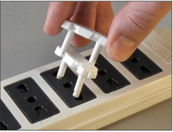
The requirement was for a model new in shape, but featuring the previous and successful working principle. Such principle being the procedure to pull out the cover protector from the socket by way of another protector used as an extractor, as shown in Fig. 2, with no need for any tool. To meet the requirements several models were designed and then analyzed using the aforesaid 4 principles. The analyses led to design improvements (in the direction of a “worse” visceral design for children according with a good behavioral design for parents).
Fig. 1. The starting model
Fig. 2. Extraction procedure
5.1. Aesthetic analysis of the 1° model
The first considered model is shown in Fig. 3. Let’s analyze it with reference to the 4 principles. About the 1° principle, we notice the eye perceives a not balanced rounding movement. The shapes “invite” the eye to see a rounding move by external shape (blue arrows) partially balanced by the opposite rounding move by the eyelets (purple arrows). Considering visual weights, if the socket cover protector is vertically positioned, the perceived image is almost stable, while if it’s horizontally positioned, it raises the sensation of rounding movement
6 and the wish to balance it. There aren’t
relevant benchmarks for the 2° and 3° principles, while about the 4° we can say the shape doesn’t “invite” too much the children to handle or manage the socket cover protector, apart from a soft wish of “turning” it to right.
Fig. 3. Model n° 1
5.2. Aesthetic analysis of the 2° model
The second considered model is shown in Fig. 4. About the 1° principle, for this model we notice that the bilateral symmetry of the external shape avoids perceived sensations of turning movements. There is just a little perception of movement (purple arrows) by eyelets, but the perceived image is really stable and well-balanced. The various visual weights are well arranged, apart from the not bilateral disposition of the eyelets (orange areas). There aren’t relevant benchmarks for the 2° and 3° principles, while about the 4° we can say that the biggest matter of this model is that it’s really inviting to be handled by fingers’ children (green areas). In this feature, visceral design and behavioral design are straightly connected, and the object looks “good to be handled”. Moreover, this model requires a lot of material to be made, and it doesn’t work good for more closed sockets, cause it’s too large.
Fig. 4. Model n° 2
5.3. Aesthetic analysis of the 2° model modified
The following considered model is shown in Fig. 5. This model is the previous one with an add: we designed a modify to solve the problem of the not bilateral arrangement of the eyelets, adding two eyelets. This new feature also allows parents to “decide” every time the way to pull out the cover protector from the socket, improving by this way the behavioral design for parents.
Fig. 5. Model n°2 modified
5.4. Aesthetic analysis of the 3° model
The following model is shown in Fig. 6. It could look nice…but that’s just what we want to avoid!
About the 1° principle, we notice the eye perceives a not balanced rounding movement. The shapes “invite” the eye to see a rounding move by external shape (blue arrows) just partially balanced by the opposite rounding move by the eyelets (purple arrows), because the external shape is much easier to be perceived. About the 2° and 3° principles, we can say that this object features many parts fit “to balance” or “to suit” for the eye, the more for the vertical parts (yellow areas) shown in the figure, the less for the presence of not balanced eyelets (orange areas). About the 4° principle, we notice this model owns both of the problems of the two (three) previous models: there are oxbows inviting children to handle (green areas), and the shape invites to try to turn the cover protector to the right. It’s interesting to see that sometimes the outcome that seems the nicest is the worst solution for aesthetic problems!
7 Fig. 6. Model n° 3
5.5. Aesthetic analysis of the 4° model
This model (Fig. 7) is a little variation of the 1° model. The vertical lines of the first model are now oblique. The model appears more attractive, and this is something we don’t want. About the 1° principle, we can see that, as for the 1° model, the eye perceives a not balanced rounding movement, cause the shapes “invite” the eye to see a rounding move by external shape (blue arrows) partially balanced by the opposite rounding move by the eyelets (purple arrows). Moreover, looking at the 1° and 3° principles, the shape invites the eye to “fix” the object turning it to the right. The two oblique parts (yellow areas) seem not lined up with the supposed vertical, and this invites the child to handle the object to balance this sensation. For the behavioral design (4° principle), the oxbows (green areas) aren’t so inviting as in the 2° and the 3° model, but more inviting than the 1° model, cause the angle of the oxbow is lower than 120°.
Fig. 7. Model n° 4
5.6. Aesthetic analysis of the 5° model
In the last model (Fig. 8), the only elements “inviting” the eye to see a rotation movement are just the eyelets (purple arrows), so the sensation is really soft. For the 2° principle, the perceived image induces to close the gaps due to the missing parts (yellow areas) of the shape that seems a rectangle…but it isn’t. As we
know, this wish raises the attention of the child. The problem of oxbows is fixed, so that the object doesn’t invite to handle it. One advice for the producers, if they will choose this model, is to make it by the typical color of sockets (usually white, black or gray), so that it would be hard for the eye to find the gaps to close (because the image perceived this way would be a perfect colored rectangle). A good feature of this model, opposite to the 2° model, is that it’s useful also for closed sockets, and that it requires less material to be made.
Fig. 8. Model n° 5
5.7. Aesthetic analysis of the 5° model modified
This last model finally modified is shown in Fig. 9. It is the previous one with the add of two more eyelets. They make the perceived image stable, with its bilateral symmetry, like the 2° model modified. There aren’t rotational movements, because the image is perfectly balanced, also for the visual weights. There aren’t oxbows to handle, and we can say that also the behavioral design for parents has improved from the previous model, because it owns the feature to be pulled out from the socket in two ways, like the 2° model modified (Fig. 10). For the colors, the benchmarks are the same of the previous model. At the end of the analyze of all designed models, we can say this is the one with the best trade-off among “bad” visceral and behavioral design for children, and “good” behavioral design for parents.
8 Fig. 10. Extraction procedure of the 5° model
modified
6.
CONCLUSION
Our “aesthetic analysis”, given as a consultancy to the firm, worked really well. They decided to manufacture the model the analyze indicated as the best (the 5° model modified) (Fig. 11).
Fig. 11. Examples of manufactured models At present a first stock of 50,000 pieces of the model are on sale, and will be probably over within some months.
It’s interesting to notice that the analyze of the visceral design of models, in order to find the most not-attractive one for children, has been also a good drive to improve the behavioral design of the two kind of “users” (children and parents), according to our aims. It would be interesting to insert the “aesthetic analysis” step also in the design lifecycle of other safety home products for children, to see if it works as well as in this case. At present a project is in kick off phase, the aim being to validate by test with children the described theory. If verified, the use of this kind of analysis could be successfully generalized to design other children safety devices.
7.
ACKNOWLEDGEMENTS
The authors would like to thank MSc (Eng) Gabriele Baronio for the drawings and Prof. Danilo Cambiaghi for the final revision of this paper and the precious suggestions.
8.
REFERENCIAS
[1] http://www.euro.who.int/Document/E92 049.pdf [2] http://ec.europa.eu/health/ph_projects/2 000/injury/fp_injury_2000_exs_16_it.pdf [3] http://www.euro.who.int/childhealthenv/ Risks/20041201_1[4] R.W. Byard et al., Death due to
electrocution in childhood and early adolescence, Journal of Paediatrics and
Child Health, Jan 2003
[5] J.J. Gibson, The Theory of Affordances, 1977, ISBN 0-470-99014-7.
[6] D.A. Norman, Emotional design, Apogeo, 2004, ISBN 88-503-2235-6
[7] D.A. Norman, The design of
everyday things, Doubleday, 1990
[8] A. Ortony, D.A. Norman, W. Revelle, The role of affect and proto-affect
in effective functioning, in Fellous, Arbib, Who needs emotions? The brain meets the machine, New York, Oxford University
Press, 2004
[9] D.A. Norman, Emotional design:
people and things,
http://jnd.org/dn.mss/emotional_design_peo ple_and_things.html
[10] M. Wertheimer, Gestalt Theory, Hayes Barton Press, 1944, ISBN 1593776950
[11] G.P. Ceserani, M.V. Masoni, Dietro
le immagini, Fabbri Editori, Milan, 1990,
ISBN 88-450-3422-4
[12] R. Metraglia, Teoria delle Simmetrie Infrante, Apt. 101/2008, Dept. Of
Mechanical and Industrial Engineering, Brescia, Nov 2008
[13] J.A. Fodor, The modularity of mind, Cambridge, MIT Press, 1983