a fair society?
a fair society?
Insights and evidence
If you would like to learn more about the activities of the JRC, please contact:
European Commission Joint Research Centre (JRC)
Strategy and Work Programme Coordination Director B-1049 Brussels Belgium Tel: +32 2 29 99158 Website: https://ec.europa.eu/jrc Email: https://ec.europa.eu/jrc/en/contact/form
A great deal of additional information on the European Union is available on the internet. It can be accessed through the Europa server (http://europa.eu/)
Table of Contents
Executive summary 2
Introduction 5
Chapter 1. Income inequality 7
1.1 Long and short-term trends 8
1.2 The impact of digitisation on income inequality and the world of labour 10
1.3 Public policy, income inequality and income growth 14
Chapter 2. Inequality of opportunity 19
2.1 Inequality of opportunity in education 20
2.2 Inequality of opportunity and health: Influence of childhood conditions 22
Chapter 3. The spatial aspects of fairness 27
3.1 Socio-economic factors with a geographical pattern 28
3.2 Second nature geographical factors 28
3.3 The relationship between socio-economic factors and second nature geographical factors 28
Chapter 4. Perceptions 33
4.1 Perceptions of inequality 34
4.2 Attitudes towards fairness 36
Chapter 5. Future Research Priorities 41
List of figures 45
Glossary 45
Bibliographic references 46
Authors and acknowledgements 51
Executive summary
This report takes as its starting point the anger currently felt by too many of our fellow citizens. It asks whether a rising sense of unfairness may be fuelling it.
There are always people who feel that society is unfair but, today, there are simply too many of them. Why is this? What has gone wrong? How can our political leaders fashion a set of policies which will deliver a society which sufficient numbers of people at least believe to be sufficiently fair?
This report is novel in three ways:
First, it acknowledges that fairness is subjective. All human beings care passionately about it. But they have very different ways of defining it. This has been demonstrated by behavioural science research.
So, rather than imposing an arbitrary definition of fairness, the report examines different possible angles.
It tackles both income inequality and equality of opportunity – because people will have different views as to their relative importance. It reveals some, frankly shocking, facts, for example:
• Income inequality has increased markedly in many EU countries since the mid-1980s. This development is mainly due to a broadening between the top and the bottom earners. From mid-1980s to 2008, the average annual real disposable income of the richest 10% increased more than 2.5 faster than that of poorest 10%.
• Individuals who have at least one tertiary educated parent have twice the chance to reach tertiary education themselves.
• Individuals whose parents have not achieved tertiary education have significantly lower literacy and numeracy scores. Those who are also first or second generation immigrants and who report bad health fare even worse.
• Individuals with a poor family background are more likely to smoke or be
overweight or obese than their counterparts from a privileged family background and they are less likely to have exercised in the past seven days.
• The chances of reporting poor health for those with a poor family background are almost 110% higher than for respondents with a privileged family background, even when biological dimensions (age and gender) are accounted for.
• Almost half (44.5%) of the EU population has insufficient skills to participate in the digital economy and society. Seventeen Member States have rates higher than this.
Secondly, it incorporates the spatial dimension of fairness. It finds great heterogeneity, not just across Member States, but regions too. There are large spatial disparities in terms of income, income inequality, unemployment, the share of people with tertiary education and access to basic services. This shows that a serious investigation of fairness must therefore focus on the sub-national level. Working solely with national averages is dangerous because it risks missing major disparities within countries. It also risks missing reasons for the popular discontent. This is visible across the developed world (and maybe other countries too), suggesting some common themes. At the same time, the reasons for it are likely to vary from one place to another.
Finally, the report explicitly tackles the issue of perceptions and attitudes. It produces some intriguing insights:
• There is some evidence that people over-estimate income
differences. However, data from 2009 indicate that concern about inequality does mirror measured inequality, at least to some extent. • Perceived inequality is a driver of individuals’ attitudes towards
redistribution. The more people agree that income differences are too large in their country, the more they want governments to take action to reduce them.
• They are more likely to tolerate income inequality if they perceive there to be a high degree of equality of opportunity (though this attitude is most prevalent in the US).
• However, popular perceptions of inequality of opportunity are only weakly linked to objective measures of the same phenomenon. • Inequality can result from good or bad luck (rather than effort or
opportunity). Attitudes to this kind of inequality are influenced by culture.
• Perceptions of fairness are highly influenced by reference points. People base their fairness judgment of the outcome of a given behaviour at least partly on a comparison of the situation of others or a situation that occurred in the past.
• However, it may be that people in countries or regions use different points of comparison. This could explain why, even though different regions have undergone changes in different directions, populist disaffection is on the rise everywhere.
• People care not just about 'distributive justice' – the share of resources or opportunities they get – but also how the decision was taken – i.e. 'procedural justice'.
Disaffection among large sections of the EU population is growing. It is fuelling support for populist parties, which are often anti-EU. It is very important that EU politicians and policy makers listen to this populist signal and understand it, so that they can respond to it more effectively and re-connect with these citizens. Many factors may be driving citizens' frustration. Some of these factors are not economic, or not obviously so. For example, people may be anxious about losing their cultural identity in the face of globalisation.
However, this report focuses on a possible driver, which is largely economic: fairness.
Economics focuses on efficiency in the allocation of resources. It can measure the inequality in distribution but has no scientifically underpinned message on the appropriate distribution of resources. Instead, people make value judgements about what they consider fair.
This report therefore takes an open approach. It begins by examining three different inequalities – because different people will have different views as to their relative importance:
Chapter one examines long and short-term
trends in income inequality. These are driven primarily by changes in underlying market income inequality, as well as changes in tax and benefit policies.
Many factors may be driving market income inequality, for example, changing trade patterns or the effects of labour market policies and institutions. However, this chapter looks at just one of the potential drivers: digitisation.
It also presents evidence on the redistributive effect of tax and benefits systems in the EU, their automatic stabilisation properties and the impact of tax policy changes since the crisis.
Chapter two assesses equality of opportunity
in the EU. It focuses on the impact of family background on education and health outcomes.
Chapter three looks at the spatial inequalities
because a person's life chances are also affected by where they live.
The fourth chapter of the report tackles the issue
of attitudes and perceptions. Using survey data, it asks how people perceive inequality and how much of it they are prepared to tolerate. It looks at how people form their judgments about fairness and how they react when they feel they have been treated unfairly.
This report is just a tentative first step towards building a knowledge base to support policies aimed at building a society that people feel is fair. Its final chapter identifies possible future research themes that DG JRC may wish to work on in the coming years.
Income inequality
This chapter asks how equal the EU is and whether it is becoming more or less equal. It finds that:
f Inequality within many countries has increased since the 1980s, while inequality between countries has broadly declined. f A closer look at the pre-, during and post-crisis
period (2006-2012) confirms that inequality declined in the EU as a whole, with the bottom 30% of households gaining. However, this was driven mainly by improvements in the position of these households in CEE (Central and Eastern Europe) Member States.
f All households lost in both the Mediterranean and the North West European Member States. In the Mediterranean Member States, inequality increased. In the North West European Member States, it decreased. f Income inequality varies significantly,
between countries, but also between regions.
Rising inequality is shaped largely by two factors: changes in underlying market income inequality and changes in tax and benefits policies.
This chapter looks at one of a number of potential drivers of market income inequality: digitisation. It appears that it has resulted in job, but not wage, polarisation in Europe. The relationship between routinisation, inequality and job/wage polarisation needs further exploration. Authors disagree about how many jobs will be replaced in the future by automation. The other question is whether new jobs will emerge to replace them. Some commentators believe that automation may mean the ‘end of work.' However, there is no sign of this, as yet.
The rise of the collaborative economy may spell the end of permanent, full time jobs, as more and more people become ‘independent service providers’ or ‘independent contractors'. More empirical evidence is needed to
understand its net effects on labour markets. In this new, more fluid world of work, people will have to be more flexible but not everyone has the tools to do this. Skills are unevenly distributed.
In terms of tax and benefits policies, this chapter finds that:
f Direct tax and social benefit systems have sizeable redistributive impacts in the EU, though the degree of redistribution achieved varies a great deal between countries. f A significant degree of automatic
stabilisation is achieved through tax and social benefits systems across all EU countries and household categories, with the burden falling largely on direct personal taxes, rather than social security contributions and social benefits.
f However, social benefits play a much larger role for the poorest households. Income stabilisation for these households is much larger and more heterogeneous across EU countries.
f In countries where major fiscal consolidation programmes have been undertaken, these programmes have tended to amplify the negative effect of the crisis on households´ disposable income.
Chapter Summary
1. Fredriksen, Kaja B., Income inequality in the European Union, OECD Economic Department Working Papers No. 952, 2012.
2. The Gini coefficient is an overall measure of inequality. Its value is between zero and one. Zero indicates full equality, while one corresponds to the highest possible inequality (everything is held by a single individual). 3. Ventiles divide a distribution
into 20 equal parts. They are similar to the better-known deciles, but provide finer resolution. The income concept used here is disposable household income with the following income components: labour income, capital income, private and governmental transfers and benefits net of taxes. It is measured in Euros at 2005 prices, adjusted for purchasing power as compared to EU 25 average and equivalised for individuals within the households. After these corrections, they represent income available for spending for an average individual, comparable across time and countries.
4. We define North-West Europe as being above, Mediterranean and Central and Eastern Europe (CEE) as being below the EU-average of pre-crisis GDP per capita (in 2006, Italy being borderline but assigned to Mediterranean). North-West Europe includes AT, BE, DE, DK, FI, FR, IE, LU, NL, SE and UK; Mediterranean includes EL, ES, IT, PT, CY and MT; Central and Eastern Europe includes SK, SI, CZ, P,L HU, EE, LV, LT, RO and BG.
There is clear evidence that income inequality has increased markedly within many EU countries since the mid-1980s (see Figure 1 for selected Member States and other OECD countries). This development is mainly due to a broadening between the top and the bottom earners. From mid-1980s to 2008,1 the average annual real disposable income of the richest 10% increased more than 2.5 faster than that of poorest 10%.
When looking at the development of inequality within the EU as a whole, a different pattern emerges. Figure 2 displays the evolution of another frequent inequality measure, the Gini coefficient, in a subset of the EU-11 during the years 1993-2013.2 One can see that inequality was decreasing notably until 1999. The pre-, during and post-crisis period brought a more hectic pattern, with some, but only partial, reversal of the original declining trend by 2013. Inequality in the EU-27 declined during the same period. This suggests an overall fall in inequality between countries.
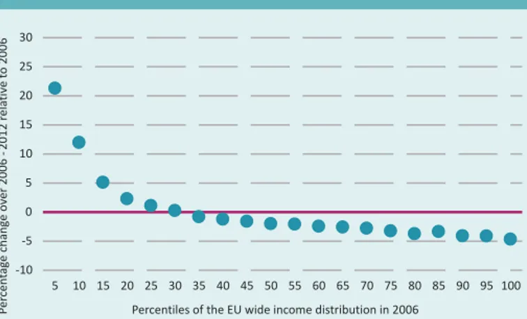
Figure 3 confirms the decline of inequality in the EU-27 in the pre-, during and post-crisis period. It shows the average percentage change from 2006 to 2012 in each ventile of individual income distribution.3 The first dot from the left reveals that the average income of the lowest 5% increased by a little more than 20%. Similarly, the last dot on the right shows the average income of the richest 5% of the EU population decreased by a bit less than 5%. There are great differences in growth at the two ends of the income distribution. In the lower third, we find that income has increased for each percentile. At the same time, income is decreasing at all ventiles above the 30th percentile, more
and more so as percentile values increase. It seems therefore that the crisis has benefitted the poor, but hit everyone from the middle-class upwards.
However, a more nuanced picture emerges from Figure 4 which
decomposes Figure 3 into country groups. It splits countries into 3 groups: North-West Europe, Mediterranean and Central and Eastern Europe (CEE).4 It shows that the improvement in the position of the bottom 30% of households was driven mainly by improvements in the position of these households in the CEE Member States. All households lost in both the Mediterranean and the North West European Member States. In the Mediterranean Member States, the bottom 30% lost more than richer households, so inequality increased. In the North Western Member States, richer households lost more than the bottom 30%, so inequality decreased.
states and some other OECD countries
Note: Inequality of household disposable income. 'Little change' in inequality refers to changes of less than 1.5 percentage points. Data year: 2013 or latest year (2013 for FI, HU, NL and the United States, 2009 for Japan, and 2012 for the other countries).
Source:In It Together: Why Less Inequality Benefits All, Organisation for Economic Co-operation and Development (OECD), 2015.
Figure 2. The Gini coefficient of net income per household, various EU
country groups, 1993-2013
Source: JRC calculations based on the European Community Household Panel (ECHP, 1993-2000) and the EU Survey of Income and Living Conditions (EU-SILC, 2004-2013). Both data sources provide income measures in a common currency. Income levels were adjusted to purchasing power parity differences using OECD data (this practice is discussed for example in Brandolini (2007). The unit of observation is the household, equipped with their corresponding equivalised per capita disposable income. In the EU-11, Austria, Finland, Luxembourg and Sweden are missing from the EU-15. From the EU-27, it is Croatia that is missing. See Benczur et al (2017) for further details.
Figure 3. Changes in the EU wide distribution of equivalised disposable
income 2006-2012
Source:JRC calculations using EU-SILC.
Figure 4. Changes in the EU-wide distribution of equivalised disposable
income 2006-2012 by country group
Source:JRC calculations based on EU-SILC.
0.27 0.28 0.29 0.3 0.31 0.32 0.33 0.34 0.35 0.36 199319941995199619971998199920002001200220032004200520062007200820092010201120122013 EU15 EU11 EU27
-10 -5 0 5 10 15 20 25 30 5 10 15 20 25 30 35 40 45 50 55 60 65 70 75 80 85 90 95 100 Pe rc en ta ge c ha ng e ov er 2 00 6 -2 01 2 re la tiv e to 2 00 6
Percentiles of the EU wide income distribution in 2006
-10 -5 0 5 10 15 20 25 30 5 10 15 20 25 30 35 40 45 50 55 60 65 70 75 80 85 90 95 100 Pe rc en ta ge c ha ng e ov er 2 00 6 -2 01 2 re la tiv e to 2 00 6
Percentiles of the EU wide income distribution in 2006 Central and Eastern Europe Mediterranean North-west Europe EU level
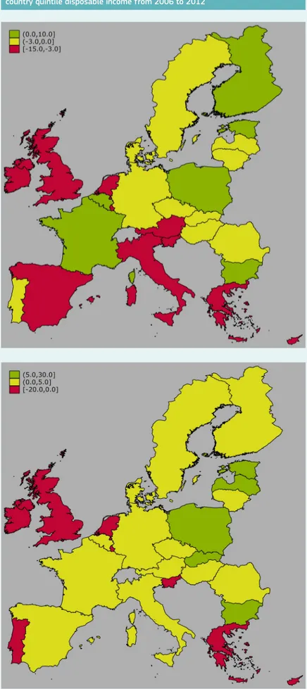
To look even deeper into the heterogeneity of income developments among Member States, we zoom in on individual countries, but only at the two ends of the income distribution. We try to illustrate how income changes move certain income groups within individual countries up or down the EU-wide income distribution. Figure 5 maps how many percentage points the average income in each countries’ lowest (top) and highest (bottom) quintile has changed in the ranking of the EU income distribution, from 2006 to 2012.5 At the lower end (see top map), income was decreasing in more than one Mediterranean- and some North-West countries, while those with growing and stagnant income are a mix of CEE and North-West countries. Increases at the top (see bottom map) affect fewer countries.
1.2 The impact of digitisation on income inequality
and the world of labour
The Routine Biased Technological Change hypothesis predicts that ICT developments and digitisation will change the pattern of capital-labour
substitution. In particular, it will lead to an increase in jobs that are rich in cognitive, non-routine tasks – typically high skill jobs – and a decline in jobs rich in routine tasks (both cognitive and manual). Many of these require middle level skills and are found in the middle of the income distribution. Some routine jobs are of the manual type and are at the lower end of the income scale. However, not all manual jobs will be eliminated by the digital revolution, as there is an increase in demand for manual non-routine jobs, due to population ageing and the increased demand for personal services from the richer part of the population.
The result of all this would be job polarisation, i.e. the relative decline of mid-skilled jobs and the expansion of low and high-skilled jobs. This could lead to a 'thinning out' of the middle class.
The evidence suggests that job polarisation has happened in Europe before, during and after the crisis. The crisis may have amplified the polarising trend. However, there is no consensus on the extent to which the various European countries have been exposed (to routinisation and hence) to job polarisation (see Annex 1). Job polarisation raises a number of questions for policy makers. For example, will the decline in intermediate level jobs make it harder for those in low wage jobs to move upwards? What will happen to those displaced from mid-range jobs? Will they move into non-routine jobs? If so, will these jobs be better or worse? Or are they more likely to become unemployed? Unless countervailing action is taken, there is a risk that polarisation could create losers, who might feel that they are not getting a fair deal.
In the US, job polarisation has been associated with wage polarisation, i.e. a situation where wages grow faster at the extremes of the distribution than at the centre. This might be expected if demand for mid-skilled workers declines, while demand for high and low-skilled workers increases.
5. To give an example, suppose that the cutoff income value of the bottom 20% of a given country corresponded to the 10th percentile of the EU-wide income distribution in 2006, while its 2012 value would put it into the 15th percentile of the 2012 EU income distribution. Then the increase we put on the map is 5 percentage points.
Figure 5. Changes in the lowest (top map) and the highest (bottom map) per
country quintile disposable income from 2006 to 2012
6. See http://bruegel. org/2014/07/chart-of-the- week-54-of-eu-jobs-at-risk-of-computerisation/. 7. See Brynjolfsson, E. and
McAfee, A., Race against the Machine: How the Digital Revolution is Accelerating Innovation, Driving Productivity, and Irreversibly Transforming Employment and the Economy, Digital Frontier Press, 2011; Brynjolfsson, E. and McAfee, A., The Second Machine Age, W. W. Norton & Company, 2014.
8. International Panel on Social Progress draft report.
However, there is no evidence of general wage polarisation in Europe. In particular, at the lower end of the scale, there has been a growth in jobs, but not in wages (see Annex 1).
Looking to the future
Frey and Osborne (2013) argue that 47% of current US jobs are at risk of disappearing, possibly in the next two decades, starting with jobs in transportation, logistics and administration support, followed by jobs in services, sales and construction (see Figure 6). Computerisation will mostly substitute unskilled labour – particularly in the service sector – hence putting an end to job polarisation in the US (a fact already suggested by existing data).
Applying the same methodology as Frey and Osborne, Bruegel6 found that the share of jobs at risk of substitution by ICT is even higher in Europe (54%) and particularly in Southern Europe, where employment in occupations at high risk of substitution is even higher.
However, Arntz et al. (2016) point out that Frey and Osborne focused on jobs as opposed to tasks, which may be inappropriate. They argue that, even if some tasks are substitutable by machines, this does not imply that the whole job will disappear. They estimate that around 9% of jobs are at high risk of substitution, ranging from around 12% of jobs in Austria, Germany and Spain to around 6% in Finland and Estonia.
The question is whether new jobs will be created to replace those being lost. This has happened with previous waves of technological change, though with major disruptions to the social fabric. However, some7 argue that this time may be different. They believe that highly autonomous robots may one day be able to carry out most of the tasks currently done by human workers.
Whether or not this happens will depend not just on technological change, but also on the relative price changes between human labour and
machines.
Over the past decade, the price of capital (interest rates) has declined dramatically, much more than the price of labour (wages). This may help to explain persistent unemployment.
However, so far at least, there is no clear evidence of the 'end of work.' Official statistics show no structural decline in paid employment between 1991 and 2014. This is true of all countries at all stages of development.8
Figure 6. The distribution of occupational employment over the probability of computerisation, using US Bureau of Labor
Statistics for 2010
Note: The probabilities of substitution are measured on the horizontal axis and they go from 0 to 1. On the vertical axis they measure the employment associated to a given probability of substitution by ICT. On the right we have employment in high risk of substitution occupations (also by sector). On the left we have the occupations at low risk of substitution. Overall they find that using as threshold values for probability of 0.3 and 0.7, 47% of US employment lies in occupations that have more than a 70% chance of being substituted.
Source: Frey and Osborne (2013).
0 0.2 0.4 0.6 0.8 1 Probability of Computerisation 400M 300M 200M 100M 0M Medium High
33% Employment 19% Employment 47% Employment
Low
Management, Business and Financial Computer, Engineering, and Science
Education, Legal, Community Service, Arts, and Media Healthcare Practitioners and Technical
Service Sales and Related
Office and Administrative Support Farming, Fishing and Forestry Construction and Extraction Installation, Maintenance, and Repair Production
9. The European Collaborative Economy: A research agenda for policy support, 2016. 10. See indicator 2a2 (http://
digital-agenda-data.eu/ datasets/desi/indicators). The digital skills indicator has been created using the Digital Competence Framework for European Citizens (https://ec.europa. eu/jrc/digcomp). In order to have 'basic skills', an individual has to be able to carry out activities in four areas included in the index (information, communication, content-creation and problem-solving).
11. See footnote 2 for a definition of the Gini index.
The rise of the collaborative economy
It may be that we should no longer be thinking in terms of full time, permanent jobs at all. With the rise of the collaborative economy, people may increasingly be 'independent service providers' or 'independent contractors', rather than employees. Platforms may create jobs for the non-active and unemployed. Workers may benefit from greater flexibility to choose their working hours and the type of work they pursue. However, they may face greater precariousness and a lack of social protection. A recent JRC report9 concluded that net effects of labour platforms on employment and income inequality are ambiguous, since empirical evidence so far is insufficient and inconclusive. It set out a forward looking agenda to strengthen the scientific evidence for the development of policies to maximise the benefits and minimise the costs for all stakeholders.
The centrality of skills
It is clear that in the new, more fluid, world of work, individuals will have to take more responsibility for their own professional development. They will have to adapt and remain relevant. However, it is clear that not all individuals have the tools that they need to do this.
For example, the EU-wide Digital Economy and Society Index (DESI) confirms that digital skills are not equally distributed.10Figure 7 shows that, on average, 55% of individuals in Europe have basic or above basic digital skills, 23% have a low level of digital skills and 21.4% have no digital skills at all. Taking low and no digital skills together, this means that almost half (44.5%) of the EU population has insufficient skills to participate in the digital economy and society. Seventeen Member States have rates higher than this. In Romania, 74% of the population does not have the digital skills they need to function effectively in the digital world.
1.3 Public policy, income inequality and income
growth
The evidence suggests that direct tax and social benefit systems have sizeable redistributive impacts in the EU. Figure 8 displays the Gini index of all EU countries measured on gross income and disposable income (i.e. income before and after taxes and social benefits apply).11
This figure shows that gross income inequalities vary in a range of Gini coefficient between 0.4 and 0.55 and the Gini index is, on average, reduced by half, once the tax and social benefits (including public pensions) apply. EU countries are also very heterogeneous in the degree of redistribution achieved through taxes and social benefits, with no clear connection between the level of inequalities in gross and net income.
0% 10% 20% 30% 40% 50% 60% 70% 80% 90% 100% LU NO FI DK NL SE UK DE EE AT BE CZ FR EU 28 ES SK MT LT HR SI HU LV PT IE EL IT CY PL MK BG RO TR
No Use Low Basic Above basic
Figure 7. Digital skills of the EU population (% individuals with above basic, basic and low
digital skills and no internet use)
Figure 8. Income inequality before and after taxes and social benefits in EU countries
Note:Original incomes are defined as market incomes. The impact of the tax and social benefits system is measured using the EUROMOD microsimulation model. A static microsimulation model, EUROMOD employs the information on individual characteristics and economic circumstances contained in survey data to simulate direct taxes liabilities and non-contributory benefit entitlement for a representative sample of households in each EU Member State. The data used are from the EU-SILC database for 2008, except for France and Malta where 2007 and 2009 are used respectively. For the UK, the Family Resource Survey (FRS) for 2008/09 is used. Income is equivalised income defined following the OECD modified scale. The tax and social benefit system considered is that of 2010 for all countries. All income and monetary variables have been adjusted using appropriate income and price indices, see Sutherland and Figari (2013).
Tax and social benefits systems also have automatic stabilisation
properties, which are good at macro-level (to limit falls in demand in major crises) and at social level (to reduce income losses during economic crises).
Figure 9 reports recent evidence on the degree of automatic stabilisation achieved through the tax and social benefits systems in EU countries. The impact of a hypothetical fall in market income will be reduced by between 20% and 45% on average across all EU countries and household categories, with most of the absorptive property stemming from direct personal taxes rather than social insurance contributions (SIC) and social benefits (see left-hand panel). Income stabilisation becomes much larger and more heterogeneous across EU countries for the poorest households (see right-hand panel). For the poorest households, social benefits play by far the biggest role for smoothing income shocks, especially in countries with the highest degree of automatic stabilisation.
Fiscal balances deteriorated in the Member States because of the crisis, resulting, in certain instances, in significant public expenditure cuts and tax hikes later on. Figure 10 shows that, in countries that undertook major fiscal consolidation programmes, policy measures have tended to exacerbate the negative evolution in households´ disposable income. However, these policies were not necessarily of a regressive nature. In most instances, inequality-reducing and inequality-increasing tax policy reforms have occurred with about the same frequency, although the former have resulted in significantly higher absolute variation in disposable income.
Figure 10. The impact of tax and benefit policy changes on disposable
income and inequality (gini index) in selected EU countries, 2008-2013
Source:JRC simulations based on the EUROMOD model. The simulations make use of 2014 country tax-benefit rules coded in EUROMOD and data from the 2012 European Survey on Income and Living Conditions (EU-SILC) and Family Resource Survey for the UK. The automatic stabilisation coefficient reported is calculated as which measures the ratio of the change in disposable and market income of a given household 'i' as a result of shock in market income of 5%. This indicator is based on the approach proposed by Dolls et al. (2012).
Figure 9. Household-level automatic income stabilisers and decomposition in EU countries
0 10 20 30 40 50 60 70 ES ITELBEHRBGPLCZNLPTEEDKFIMTHULTIESKUKSIDEFRLVSEROCYATLU Au to m at ic S ta bi lis er 1st Quintile Benefits SIC Taxes (Social Insurance Contributions) 0 10 20 30 40 70 50 60 BG EEESMTLTPLCZHRELCYSKITLVPTHUROFRUKSIFISEDENLBELUDKIEAT Au to m at ic S ta bi lis er All households Benefits SIC Taxes (Social Insurance Contributions) -20 -15 -10 -5 0 5 10 15 08 /0 9 09 /1 0 10 /1 1 11 /1 2 12 /1 3 08 /0 9 09 /1 0 10 /1 1 11 /1 2 12 /1 3 08 /0 9 09 /1 0 10 /1 1 11 /1 2 12 /1 3 08 /0 9 09 /1 0 10 /1 1 11 /1 2 12 /1 3 08 /0 9 09 /1 0 10 /1 1 11 /1 2 12 /1 3 EL ES IE LV RO % c ha ng e
Total change in average equivalised disposable income Change due to policy effects
-2 -1.5 -1 -0.5 0 0.5 1 1.5 2 2.5 08 /0 9 09 /1 0 10 /1 1 11 /1 2 12 /1 3 08 /0 9 09 /1 0 10 /1 1 11 /1 2 12 /1 3 08 /0 9 09 /1 0 10 /1 1 11 /1 2 12 /1 3 08 /0 9 09 /1 0 10 /1 1 11 /1 2 12 /1 3 08 /0 9 09 /1 0 10 /1 1 11 /1 2 12 /1 3 EL ES IE LV RO Ch an ge in G ini (t v s t -1 )
Total change in Gini coefficient Change due to policy effects
Source:JRC simulation based on the EUROMOD model and on the method developed by Bargain and Callan (2010). This approach is based on counterfactual scenarios fixing alternatively population, income and policy characteristics and using a decomposition approach. Income is equivalised income defined following the OECD modified scale. The value of the change in the Gini index was multiplied by 100.
This section examines two non-monetary dimensions of multi-dimensional poverty, education and health, and asks how outcomes in these areas relate to social background. If the social background of an individual is influential for health and education outcomes, this suggests an inequality of opportunity across citizens.
Chapter Summary
There is a high degree of inequality of opportunity in the EU. A large body of academic literature already shows this. Our analysis suggests that education and health outcomes are closely linked to family background. Specifically, this chapter finds that:
f Individuals who have at least one tertiary educated parent have twice the chance to reach tertiary education themselves.
f Individuals whose parents have not achieved tertiary education have significantly lower literacy and numeracy scores. Those who are also first or second generation immigrants and who report bad health fare even worse. This shows that inequality of opportunity can be multiple.
f The chances of reporting poor health for those with a poor family background are almost 110% higher than for respondents with a privileged family background, even when biological dimensions (age and gender) are accounted for.
2.1 Inequality of opportunity in education
Figure 11 presents the association between parents' and children’s education. Adults are divided into those with at least one parent having acquired tertiary education and those with neither parent having achieved a higher education degree. For each of these two groups, we look at the share that has achieved higher education themselves. Then we take the ratio. There are equal opportunities in education, if the share of those achieving tertiary education is independent of parental education and, as such, similar between both groups. This is only the case in Finland, where the ratio is close to 1. Finland – discussed in education literature as the European country with high educational achievement of students paired with low disparities (OECD, 2010) – however is an outlier; consistently across Member States, the ratio is considerably above 1.
The position of the US is interesting. There is a collective belief in America that they have a high degree of equality of opportunity in their country. They are much less concerned about inequality as a result (Redmond et al., 2002; Corak, 2013). Nevertheless, once we compare the US to EU countries, the US does not stand out, but rather seems similar in terms of the association between parental and offspring’s education.
On average, across the countries examined, individuals who have at least one tertiary educated parent have twice the chance to reach tertiary education themselves.
What drives these differences? Genetics play a minor part in explaining educational achievement and hence cannot explain unequal outcomes (Nielsen and Roos, 2015; Jerrim et al., 2014). The focus is rather on environmental factors and access to resources being determined by social capital (Bourdieu, 1986). Families from different social classes differ in their capabilities to take advantage of educational opportunities (Feinstein et al., 2004).
If an individual's background influences their chances of achieving tertiary education, is the same true for more basic knowledge and skills? Figure 12
shows that individuals whose parents have not achieved tertiary education have a literacy score only 89% of that of an adult who has a parent with higher education. An 11 percent decline reflects here about two thirds of a standard deviation of the literacy skill measure and, as such, is sizable. Since inequality of opportunity can be multiple, we also show the
association of low achievement with immigration and poor health (adding those variables as covariates into the skill equation). Immigrants whose parents did not achieve tertiary education have 20 percent lower literacy skills than their counterparts. Once individuals claim in addition bad health, their skills are less than three quarters of those of native adults with good
0 0.5 1 1.5 2 2.5 3 3.5 4 4.5 IT SK CZ PL FR AT ES IE NL DE BE US GB DK SE NO FI Ra tio o f s ha re e du ca te d to te rt ia ry le ve l b y pa re nt al e du ca tio n
Figure 11. Family background and tertiary education
Note:JRC elaboration, based on 2011/12 micro data of the Study of Adult Skills (Programme for International Student Assessment - PIAAC, OECD 2016). PIAAC contains nationally representative samples of individuals across EU countries. Average sample size is around 6 000 adults per country.
Figure 12. Average literacy score of individuals in disadvantaged group expressed as percentage of average literacy score of
advantaged group
Note:The figure provided is the ratio of the literacy score of the disadvantaged and the advantaged group multiplied by 100. For example, the value of 88.8 means that, on average, the literacy score of individuals from a disadvantaged group is only 88.8 % of that of an advantaged group. The first bar defines the advantaged group as those individuals with at least one parent holding tertiary education and the disadvantaged group as those with no parent educated to tertiary level. The second bar compares natives with at last one parent holding tertiary education with immigrants with no parent educated to tertiary level. The third bar adds to the advantaged group good health and to the disadvantaged group bad health. Individuals who evaluate their health to be fair or poor are defined as having ‘bad health’. Immigrant status refers to both first (adult and parents were born abroad) and second (adult born in country, both parents born abroad) generation immigrants. The predictions are based on country fixed effects and include the following countries: Czech Republic, Denmark, Estonia, Finland, France, Germany, Ireland, Italy, Austria, Netherlands, Belgium, Norway, Poland, Slovak Republic, Spain, Sweden and the UK.
Source: JRC, calculations based on Programme for International Student Assessment (PIAAC) 2012.
89 80 74 0 10 20 30 40 50 60 70 80 90 100
Parents not holding
tertiary education education and immigrantParents without tertiary Parents without tertiary education, immigrant and bad health
Rati o of th e literacy score of th e disadvanta ged and th e advanta ged group multi pli ed by 100
health and tertiary educated parents. The increasing gap between the groups focused on shows that each of the characteristics examined exerts an independent ‘effect’. If we look at numeracy skills instead of literacy skills, results are similar.
2.2 Inequality of opportunity and health: Influence of
childhood conditions
There is a large literature suggesting that health status during adult life is partly determined by childhood conditions. Jusot et al, (2013), Tubeuf and Jusot (2011), Trannoy et al (2010), Rosa-Dias (2009) or Case et al (2005) document that, in addition to the association between the socio-economic gradient and health, there is also a long-lasting effect of family circumstances during childhood on adult health. Jusot et al (2013) and Trannoy et al (2010) show that, in France, health inequalities would be halved, if the effect of family circumstances was removed. Similarly, Rosa-Dias (2009) reports that more than one fifth of health inequalities during adult life is driven by inequality of opportunity.
Some additional findings on the relationship between health and family circumstances are presented below.
Figure 13 displays the ratio of the share of respondents reporting bad health by father's education (i.e. father without and with tertiary education). This ratio should be approximately equal to 1 were the family circumstances are not related to health.
It is clear that growing up in family where the father has a low level of education is positively associated with the likelihood to report poor health. We observe large differences across countries. While in Portugal, Poland and Slovenia, respondents whose fathers are poorly educated are more than two and a half times more likely to report poor health than their counterparts, the opposite is found in the Netherlands and Germany, two countries displaying a lower level of inequality of opportunity.
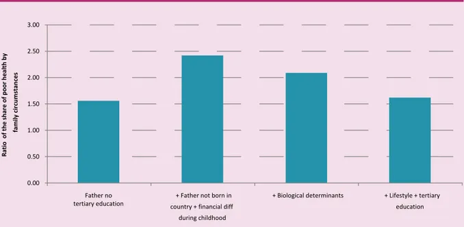
In order to go a little further in the analysis, we then study the family circumstance gradient in health, while controlling for important other determinants of health, such as biological factors and effort-related variables. The results are summarised in Figure 14.
• The first bar in Figure 14 shows that the respondents whose father does not have a tertiary education are, on average, 56% more likely to report a poor health status than their counterparts whose father has a higher level of education.
• The second bar displays the health penalty when, in addition to a father without tertiary education, two other unfavourable circumstances are added: (i) father born in a different country from
Figure 13. Family background and self-reported poor health
Source:JRC calculations based on the European Social Survey, 2014. The figure is the ratio of the share of respondents reporting bad health by father's education (father without and with tertiary education).
Figure 14. Family circumstances and self-reported poor health – multivariate analysis
Source: JRC calculations based on the European Social Survey, 2014. Figures are based on the estimation of health equations. The dependent variable takes the value one if the respondents report to be in fair, poor or very poor health and zero otherwise. Because of the binary nature of the outcome variable, a probit model is used. Country dummies are included in all estimates. The first bar is based on an estimation where the father's education is the only family circumstance variable. The second bar is derived from an estimation where the three family circumstances described above are included among the covariates. The third bar is based on an estimate where, in addition to the family circumstances, the age (in a nonlinear fashion) and gender of the respondents are partialled out. The fourth bar is drawn from an estimate where we control also for the health behaviours (smoking, physical activity and overweight) and the level of education of the respondents.
2.8 2.6 2.4 2.2 2 1.8 1.6 1.4 1.2 1 .8 .6 .4 .2 0 NL DE CZ GB IE EE FR DK ES LT SE AT FI BE PT PL SI 0.00 0.50 1.00 1.50 2.00 2.50 3.00 Father no
tertiary education country + financial diff + Father not born in
during childhood
+ Biological determinants + Lifestyle + tertiary
education Ra tio o f t he sh ar e of p oo r h ea lth b y fa m ily c irc um st an ces Ra tio o f the shar e of po or health b y f amily cir cums tances
12. The comparison group is made of the respondents (i) whose father has a tertiary education and (ii) is born in the country where the interview is taking place and who (iii) did not experience always or often financial difficulties during childhood.
13. The effect of family circumstances drops a bit because of compositional effects (i.e. positive correlation between unfavourable family circumstances and age). 14. Source: JRC calculations
based on European Social Survey, 2012 & 2014.
the one where the respondent is living and (ii) experience of severe financial difficulties in the family during childhood. In that context, the chances of reporting poor health are 142% higher than for individuals having experienced good family conditions.12 • The third bar shows the effect of all three unfavourable family
circumstances when we account for the age and the gender of the respondents, two biological dimensions associated with health. The chances of reporting poor health for those with poor family background are still almost 110% higher than for respondents with a privileged family background.13
• Unhealthy behaviours are responsible for a large part of health issues. This is in particular the case of tobacco use, poor diet, or lack of physical activities. The last bar of Figure 14 displays the health penalty associated with the three unfavourable family circumstances when the health behaviours and the education level of the
respondents are accounted for. In this case, the chances of reporting poor health are 62% higher for respondents with a poor family background, compared to those with favourable family conditions. • Health behaviours somehow capture respondents’ effort to invest
in good health. However, they are not independent of family circumstances. Individuals with a poor family background are more likely to smoke or be overweight or obese than their counterparts from a privileged family background and they are less likely to have exercised in the past seven days.14
• Family background therefore has a direct effect on individuals' health and an indirect effect via health behaviours. The fourth bar, where health behaviours are controlled for, does not therefore capture the indirect effects of family background. The third bar, where health behaviours are not controlled for, captures both the direct and indirect effects of family background.
This analysis suggests that, in Europe, health status is still largely determined by family circumstances.
As well as their family background, an individual's chances in life are determined by the opportunities available to them in their geographical context. This chapter therefore deals with the spatial aspects of fairness. It focuses, firstly, on socio-economic factors which are not randomly distributed in space (i.e. they have a geographical pattern). Secondly, it focuses, not on first nature geographical differences which cannot be changed (such as the presence of mountains), but on second nature geographical factors (such as access to basic services or
hospitals) which can be altered and which are important in overcoming a region's natural disadvantages. It then links the two.
Chapter Summary
This chapter explores the spatial dimension of fairness. It finds that:
f A number of key socio-economic factors (e.g. share of people with a tertiary education and unemployment) have a geographical pattern.
f Second nature geographical factors (for example, accessibility to basic services and degree of urbanisation) also vary across regions.
f There is a relationship between these socio-economic factors and second nature geographical factors, suggesting that they may reinforce each other.
The spatial aspects
of fairness
3.1 Socio‑economic factors with a geographical
pattern
These include, among others, GDP per capita, income inequality,
unemployment, crime and the share of people with tertiary education, which is shown in Figure 15. This figure shows that the lowest share of people with tertiary education is in the Mediterranean countries (with the exception of Spain) and in Eastern countries (with the exception of Poland). Interestingly, there are no observable territorial differences within these countries, unlike the ones with highest share of people with tertiary education.
The spatial dimension of unemployment (Figure 16) shows that the highest levels are in the Mediterranean countries (Spain and Greece), with a strong divide between north and south Italy. In the other countries, there is a much more random spatial pattern which may be determined by specific local labour conditions or by the capacity of regions to respond to the changing global environment following the crisis.
3.2 Second nature geographical factors
Second nature geographical factors include the degree of urbanisation, access to services and road accessibility. The first map (Figure 17) displays the accessibility to basic services in the NUTS315 (Nomenclature of
Territorial Units for Statistics 3) regions of Europe, i.e. the average distance per person to the nearest facility. A quite random spatial pattern is shown but with some regularities. The first is that sparsely populated areas, which are typically in Scandinavian countries, have less accessibility. The second is that country capitals and some other cities have higher access to basic services. The third is that Benelux and England have the largest agglomerations of the most accessible regions.
The degree of urbanisation (Figure 18) is recognised as a key development factor by the new economic geography, which was developed in the 1990s by Paul Krugman. Urbanised areas in Europe are quite clustered within the Member States, and the main cities (in red) are not always surrounded by towns and suburbs. This happens where various cities are located close to one another, like in Germany, Italy, Poland and the south of Spain. When this happens, cities tend to be 'isolated islands' in the middle of rural areas (Kompil et al., 2015).
3.3 The relationship between socio‑economic factors
and second nature geographical factors
Examples of this relationship are shown below. The aim is not to look for any type of causality or statistical correlation, but just to get an overview of the possible interpretation of a complex phenomenon using some visual tools.
15. The NUTS classification (Nomenclature of territorial units for statistics) is a hierarchical system for dividing up the economic territory of the EU for the purpose of the collection, development and harmonisation of European regional statistics, the socio-economic analyses of the regions, and the framing of EU regional policies.)
Figure 15. Tertiary education in 2015
Figure 17. Accessibility to basic services Figure 18. Degree of urbanisation
Figure 16: Unemployment rate in 2015
Source: EUROSTAT; JRC elaboration, 2017.
Source:LUISA Territorial Modelling Platform, 2017. Source: LUISA Territorial Modelling Platform, 2017. Source: EUROSTAT; JRC elaboration, 2016.
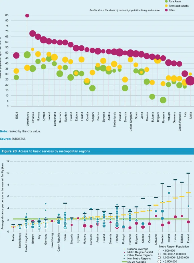
In Figure 19, the x-axis shows the countries, while the y-axis shows the share of population aged 30-34 with tertiary education. The colours of the bubbles correspond to the type of region. A quick look at the figure shows that, in cities, the percentage of population with tertiary education is always higher than in towns and rural areas, while the gap between towns and rural areas does not follow a regular pattern. Finally, the gap between cities and the rest of the regions is higher in Eastern and Mediterranean countries (with the exception of Spain and Italy), pointing to a more unfair territorial environment.
Figure 20 shows the relation between the average access to basic services (on the y-axis) by regional typology per country (on the x-axis). There is a big gap between the metropolitan and non-metropolitan regions in Europe, where metropolitan regions have higher accessibility to services, i.e. lower average distance per person to the nearest facility. The Netherlands, the UK, Belgium and Italy are among the countries with the highest accessibility, with highly urbanised environments. On the contrary, Finland, Ireland and Estonia are among the countries with lowest accessibility, due to the wider non-metropolitan structure. However, the metropolitan regions in these countries provide similar conditions to other metropolitan regions of Europe in terms of access to basic services.
Figure 19. Tertiary education vs. degree of urbanisation
Figure 20. Access to basic services by metropolitan regions
0 5 10 15 20 25 30 35 40 45 50 55 60 65 70 75 80 85 Cities Rural Areas Towns and suburbs
Bubble size is the share of national population living in the area.
E U 28 Lu xe m bo ur g Li th ua ni a N or w ay C yp ru s Ire la nd S w itz er la nd D en m ar k S w ed en P ol an d E st on ia Fi nl an d C ro at ia H un ga ry Fr an ce S lo ve ni a A us tri a N et he rla nd s Ic el an d S lo va ki a U ni te d K in gd om S pa in La tv ia G re ec e B ul ga ria B el gi um R om an ia P or tu ga l G er m an y C ze ch R ep ub lic Ita ly M al ta 0 2 4 6 8 10 12 M al ta N et he rla nd s U ni te d Ki ng do m Be lg iu m Ita ly G er m an y Lu xe m bo ur g C ze ch R ep ub lic Sp ai n Sl ov ak ia C yp ru s H un ga ry D en m ar k Au st ria Po la nd Sl ov en ia Fr an ce Po rtu ga l R om an ia Bu lg ar ia G re ec e C ro at ia Li th ua ni a Sw ed en Ire la nd La tv ia Es to ni a Fi nl an d Av er ag e di st an ce p er p er so n to th e ne ar es t f ac ilit y (k m )
Access to basic service areas/facilities by metro regions, 2011
Average distance per person to the nearest facility
National Average Metro Region Capital Other Metro Regions Non Metro Regions EU-28 Average
< 500,000 500,000 -1,000,000 1,000,000 - 2,500,000 > 2,500,000 Metro Region Population
Note: ranked by the city value. Source: EUROSTAT.
Source: LUISA (Land-Use based Integrated Sustainability Assessment ) Territorial Modelling Platform – based on the GEOSTAT 2011 population grid. The LUISA Territorial Modelling Platform is primarily used for the ex-ante evaluation of EC policies that have a direct or indirect territorial impact. It is based on the concept of ‘land function’ for cross-sector integration and for the representation of complex system dynamics. Beyond a traditional land use model, LUISA adopts a new approach towards activity-based modelling based upon the endogenous dynamic allocation of population, services and activities.
The previous chapters set out evidence on different inequalities. They present measured inequalities but they do not tell us how people might be perceiving, or experiencing, them. To understand this better, this chapter looks at data measuring people’s perceptions of inequalities. It asks whether these perceptions match reality. It looks at what influences them and whether there is an appetite for government intervention to reduce inequality. It also examines attitudes to fairness. How do people decide what is or is not fair?
Chapter summary
f Data from 2009 suggests that a majority of people believe that income differences in their country are too large. Are they over-estimating these differences? They may be; there is evidence that this sometimes happens. However, the 2009 data indicate that concern about inequality does mirror measured inequality, at least to some extent.
f The more people agree that income
differences are too large in their country, the more they are in favour of the government reducing income differences. The mandate for re-distribution in 2009 was considerable in all European countries examined (with more than 50 percent in favour).
f The 2009 data indicate that people may be more likely to tolerate income inequality if they perceive there to be a high degree of equality of opportunity, though this attitude is most prevalent in the US. However, Chapter 2 of this report suggests that this is not the case. There is a high degree of
inequality of opportunity in both Europe and the US. Equally, popular perceptions of inequality of opportunity are only weakly linked to objective measures of the same phenomenon but may be shaped by other country characteristics, such as wealth and growth. Chapter 2 seems to indicate that, although Americans are more convinced than Europeans that they have a high degree of equality of opportunity in their country, the US is actually similar to European countries in terms of the
association between parental and offspring’s education.
f What about inequality due to good or bad luck (rather than effort or opportunity)? Attitudes towards this type of inequality appear to be culturally determined. f We know that perceptions of fairness are
highly influenced by reference points but do people in different countries and regions use different points of comparison? This might explain why, even though different countries and regions have undergone changes in different directions, populist disaffection is on the rise everywhere.
f People care not just about 'distributive justice' – the share of resources or opportunities they get – but also how the decision was taken – i.e. 'procedural justice'.
Perceptions
4.1 Perceptions of inequality
The first question is whether people perceive the magnitude of inequality similarly to commonly measured inequality. There is relatively little
literature exploring this topic. However, some recent empirical contributions in psychology and economics have shown that the perception of inequality reported by people in opinion surveys does not correspond to income inequality as it is commonly measured (Chambers et al., 2014; Gimpelson & Treisman, 2015). Other contributions have shown that a society’s structure can be perceived as less equitable than it really is (Niehues, 2014). These contributions do not explore the factors which might explain this misperception of inequality.
The second question is the extent to which people are prepared to tolerate inequality, in other words, the extent to which they see it as justifiable or acceptable. Figure 21 indicates that, in 2009, there was a high level of concern about inequality, particularly in EU Member States. In all the countries examined, the majority of individuals agreed that income differences in their country were too large. The lowest percentage agreeing was in Norway, with as many as 60%, and the highest was in Hungary, with 97%. We include the US in the country comparisons, since this country is well known to differ in terms of inequality levels and perceptions (Redmond et al., 2002).
It seems that concern about inequality to some extent mirrors measured inequality. There is a slight association between concern of citizens about inequality and income inequality, with a correlation among European countries of 0.35.
Figure 22 shows that the more people agree that income differences are too large in a country, the more they are in favour of government reducing income differences. The mandate for government redistribution was huge in all European countries examined, with more than 50 percent of individuals in favour.
Among those agreeing that income differences were too large, more than 80% thought that the government should reduce these income differences. Perceived inequality seems therefore to be a driver of individuals’ attitudes towards redistribution.
It may be that people feel that inequality of outcomes is more acceptable if they believe that there is a high degree of equality of opportunity, i.e. if it is hard work that determines an individual’s success rather than factors beyond their control (such as race, gender, coming from a wealthy family or who they know). Figure 23 shows that the higher the percentage of people in a country believing that, in their country, hard work is important for getting ahead, the lower the percentage of people wanting the government to intervene to reduce inequality. However, this negative
Figure 21. Percent of individuals agreeing that income differences are too large in their
country and 80 to 20 quintile income ratio
Note: The y-axis shows the percent of individuals (strongly) agreeing that income differences are too large in their country (in contrast to other individuals who chose to answer ‘neither nor agree’, ‘disagree’ or ‘strongly disagree’). The x-axis provides the 80 to 20 percentile income ratio derived from Eurostat for European countries and OECD for US. For example, a value of 5 means that the individuals at the 80th percentile of the income distribution earn five times more than those at the 20th percentile of the income distribution. Correlation coefficient is 0.35 excluding US and -0.09 including US. JRC elaboration. Source: International Social Survey Programme (ISSP) 2009.
Figure 22. Perception of too large income differences go together with agreement that
the government should reduce them
Source: ISSP 2009 on percent (strongly) agreeing that income differences are too large (in contrast to the other answer categories ‘neither nor agree’, ‘disagree’, ‘strongly disagree’) and (strongly) agreeing that the government should reduce income differences. Correlation coefficient is 0.90 excluding US and 0.91 including US. JRC elaboration.
BG CZ FR DE HU IT LV NO PL PT SK SI ES SE UK US 0 10 20 30 40 50 60 70 80 90 100 0 1 2 3 4 5 6 7 8 9 10 % a gr ee in g th at th er e ar e to o la rg e in co m e di ffe re nc es
80 : 20 income quintile ratio
AT BG CZ FR DE HU IT LV NO PL PT SK SI ES SE UK US 30 40 50 60 70 80 90 100 30 40 50 60 70 80 90 100 Pe rc en t a gr ee in g th at th e go ve rn m en t s ho ul d re du ce in co m e di ffe re nc es
Percent agreeing that income differences are too large
Figure 23. Association between agreement that hard work is important and that
government should reduce income inequality
Source: ISSP 2009. Correlation coefficient -0.47 with US and -0.18 without US. JRC elaboration. AT BG CZ FR DE HU IT LV NO PL PT SK SI ES SE UK US 0 10 20 30 40 50 60 70 80 90 100 0 10 20 30 40 50 60 70 80 90 100 % a gr ee in g th at th e go ve rn m en t s ho ul d re du ce in co m e di ffe re nc es
16. Inequality will next be covered by the ISSP in 2019, with data becoming available in 2021. 17. In the ultimatum game,
the first player (proposer) receives a sum of money and proposes how to divide the sum between the proposer and the other player. The second player (the responder) chooses to either accept or reject the proposal. The game is typically played only once.
correlation coefficient of -0.47 is mainly driven by the US where the belief in equal opportunities is highest and the agreement with government interventions for tackling inequality is lowest among the countries considered.
It seems, therefore, that the perceived degree of equal opportunity may be one of the factors influencing peoples’ tolerance of inequality. However, Brunori (2015) has shown that, in Europe, individuals perceive equal opportunities within their country quite differently to those measured by scholars, as illustrated in Figure 24.
It appears that, although popular perceptions of inequality of opportunity are only weakly linked to objective measures of the same phenomenon, they may, strangely, be shaped by other country characteristics, such as wealth and growth. In richer, more dynamic countries, perceived inequality of opportunity is lower (Brunori, 2015).
In addition, income inequality and perceived inequality of opportunity could be related. Figure 25reveals a slight association between inequality of outcome in a country and the percent of individuals who believe that coming from a wealthy family is important in determining socio-economic success.
Brunori (2015) found that individual experiences play a role in the perception of equality of opportunity. Those who have experienced unemployment or downward inter-generational mobility are more likely to perceive a lower degree of equality of opportunity in their country. This suggests the existence of a self-esteem bias (those who have good reasons to perceive their experiences in the labour market as a failure over-emphasise the role of external causes in determining socio-economic outcomes in order to preserve their self-esteem).
Several notes of caution are important for interpreting the figures given above. Most use data from 2009.16 They do not necessarily tell us what is happening in 2017. Comparing with perceptions of inequality and the need for government intervention from earlier decades, they seem to have remained relatively stable (Redmond et al., 2002). The current drastic changes in the political landscape, however, could suggest that there have been dramatic changes in perceptions or tolerance of inequality during recent years. This shows the need for more data and more in-depth analysis of it.
4.2 Attitudes towards fairness
Behavioural science research confirms that human beings care deeply about fairness. A key finding is that people strongly resent unfair treatment when it is disadvantageous to them. This has been demonstrated through ultimatum games17, which are used in behavioural economics experiments.
Figure 24. Perceived and measured inequality of opportunity only weakly linked
Note: The x-axis provides a measure of Inequality of Opportunity (IOp) as the share of total inequality due to exogenous variables ranked by country. The y-axis provides a country rank of a perception measure of inequality of opportunity.
Source: Brunori, 2015.
Figure 25. Percent of individuals responding that coming from a wealthy family is essential or very important for getting ahead
in their country and 80 to 20 percentile income ratio
Source: International Social Survey Programme 2009 – y-axis: percentage responding wealth to be essential or very important for getting ahead (in contrast to the other answer categories ‘fairly important’, ‘not very important’, ‘not important at all’); x-axis: 80:20 percentile income ratio derives from Eurostat for European countries and OECD for US. Correlation coefficient is 0.35 excluding US and 0.26 including US. JRC elaboration.
BG CZ FR DE HU IT LV NO PL PT SK SI ES SE UK US 0 10 20 30 40 50 60 0 1 2 3 4 5 6 7 8 9 10 % a gr ee in g th at c om in g fr om a w ea lth y fa m ily is im po rt an t f or g et tin g ah ea d
80 : 20 income quintile ratio DK NO FI SE LT CY CH DE AT SK SI FR EE PL ES BG HU CZ BE UK 0 10 5 15 20 0 5 10 15 20