Open Data Analytics
Advanced methods, tools and visualizations for policy making
Supervisor(s):
Emanuele Frontoni
Donato Iacobucci
Phd candidate:
Roberto Palloni
Discussant(s):
Alessandro Aldini
Ugo Fratesi
Università Politecnica delle Marche
Facoltà di Ingegneria
Dipartimento di Ingegneria dell’Informazione
Dottorato di ricerca in ingegneria dell’informazione,
curriculum informatica, gestionale e dell’automazione
2
A Eleonora, complice e sostegno
Ad Andrea, sempre con noi
3
Open Data Analytics
4 Table of contents TABLE OF CONTENTS ... 4 LIST OF FIGURES ... 5 LIST OF TABLES ... 6 LIST OF ACRONYMS ... 6 FOREWORD ... 8 SUMMARY ... 9 1 INTRODUCTION ... 11
2 OPEN DATA FOR PERFORMANCE MONITORING AND ASSESSMENT ... 19
2.1 Technologies and monitoring tools at EU level ... 19
2.2 Monitoring ESIF: regulation and information reporting ... 20
3 MONITORING EU PROGRAMMES IMPLEMENTATION USING DATA VISUALIZATION ... 23
3.1 State of the art for visualizing monitoring data... 23
3.2 Data visualization theory ... 32
3.3 Interactive visualizations ... 39
4 ESIFY: A WEB TOOL FOR PERFORMANCE ASSESSMENT ... 41
4.1 Visualize policy performance ... 41
4.2 Developing Key Performance Indicators (KPI) ... 46
4.3 KPI for indicator achievement ... 54
5 OPEN DATA FOR DECISION MAKING ... 57
6 THEORETICAL BACKGROUND AND LITERATURE ... 59
6.1 Embeddedness ... 59 6.2 Relatedness ... 61 6.3 Connectivity ... 64 7 DEVELOPING INDICATORS ... 66 7.1 Methodology ... 66 7.2 Data ... 68 7.3 Measures of embeddedness ... 72 7.4 Measures of relatedness ... 73 7.5 Measures of connectivity ... 76 8 EMPIRICAL RESULTS ... 79
8.1 Embeddedness empirical results ... 79
8.2 Relatedness empirical results ... 85
8.3 Connectivity empirical results ... 91
8.3.1 Connectivity and research projects ... 95
9 FINAL CONSIDERATIONS ... 100
10 REFERENCES ... 108
11 ANNEXES ... 114
11.1 Domains and IPCs ... 114
5
List of figures
Figure 1 – Data management, data analytics and data analysis ...12
Figure 2 – Efforts to implement open data in OECD countries ...13
Figure 2 – Web development with a REST approach ...14
Figure 3 – API as ‘back-end for front-end’ to align IT and BI ...15
Figure 4 – A modern data architecture ...16
Figure 5 – The EU system for fund data management (SFC) ...19
Figure 6 – Budget by fund, percentage of total ...25
Figure 7 – Implementation progress by fund, share of planned ...25
Figure 8 – Implementation progress by country, share of planned ...26
Figure 9 – Regional planned investments in ESIF-viewer ...27
Figure 10 – OP monitoring ...29
Figure 11 – Project level monitoring: OpenCoesione (IT) ...30
Figure 12 – The data value chain ...33
Figure 13 – An example of scale bias ...35
Figure 14 – Time moves forward ...36
Figure 15 – A Simpson’s paradox example ...36
Figure 16 – Substance and form: improving interpretation ...38
Figure 17 – ESIFy architecture ...44
Figure 18 – Rate of project selection and expenditure declared by German OPs (share of planned financing) ...46
Figure 19 – Rate of project selection and expenditure declared by Member States ...47
Figure 20 – OP rate of project selection and expenditure declared by PA (share of planned financing) ...48
Figure 21 – The 11 TOs for the period 2014-2020 ...49
Figure 22 –OP rate of project selection and expenditure declared by TO (share of planned financing) ...50
Figure 23 – Time series of rate of project selection and expenditure declared ...50
Figure 24 – Rate of project selection and expenditure declared over time: OP (left) and PA (right) details ...51
Figure 25 – An overview of ESIFy ...53
Figure 26 – Nominal values of achieved and target values by Member State, CO02 (TO 01) ...54
Figure 27 – Rate of achievement by Member State (% of target), CO02 (TO01) ...55
Figure 28 – Comparison of Member State selection and expenditure efficiency ...56
Figure 29 – EU overview of TO project selection and declared expenditure ...57
Figure 30 – MS project selection and expenditure in TO1 (ERDF) ...58
Figure 31 – S3 principles ...59
Figure 32 – Related variety and relatedness ...63
Figure 33 – Database for TO1 analysis: merging datasets ...68
Figure 34 – Proximity matrix in a nutshell ...75
Figure 35 – Similarity matrix in a nutshell...77
Figure 36 – Complementarity matrix in a nutshell ...77
Figure 37 – An example of IPC revealed, declared and in common – Marche region ...80
Figure 38 – Regions by span of specialisation and degree of coherence (differences from the mean) ...82
Figure 39 – Span of specialisation and share of IPC codes in which the region shows absolute strength ...85
Figure 40 – The index of collaboration and the spatial distance between regions (in log) ...97
6
List of tables
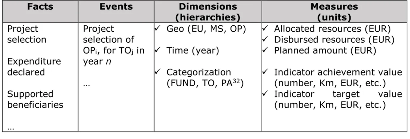
Table 1 – Dimensional fact model ...41
Table 2 – Main indicators of Italian regions ...69
Table 3 – Example of the semi-automated matching, domains-IPCs ...70
Table 4 – Indicators of coherence ...81
Table 5 – Indicators of coherence between regional S3 technological domains and those in which the regions showed a positive trend ...83
Table 6 – Share of IPC codes where region has patents near the EU median ...84
Table 7 – Correlation matrix of relatedness indicators ...87
Table 8 – Relatedness indicators (chosen technological domains) ...88
Table 9 - Relatedness indicators (actual technological domains) ...90
Table 10 – Similarity index ...91
Table 11 – Complementarity index...92
Table 12 – Matrix of complementarity increases and reductions ...94
Table 13 – Summary statistics of collaboration index ...95
Table 14 – Regression results: index of collaboration as dependent ...97
Table 15 – Regression results: log(index of collaboration) as dependent ...99
Table 16 – Overview of the new regulation for research and innovation ... 105
Table 17 – Current and future S3 ... 106
Table 18 – Semi-automated matching between technological domains and IPCs ... 114
List of acronyms
Acronym Full term
AIR Annual Implementation Report API Application program interface ARI Average Relatedness Index BI Business Intelligence
CPR Common Provisions Regulation
CORDIS Community Research and Development Information Service DBMS Database Management System
EAFRD European Agricultural Fund for Rural Development
EC European Commission
ELT Extract, Load, Transform (operations) EMFF European Maritime and Fishery Fund ERDF European Regional Development Fund ESIF European Structural and Investment Funds ESF European Social Fund
ESPON European Spatial Planning Observation Network ETC European Territorial Cooperation
ETL Extraction Transformation and Loading
EU European Union
FP7 7th Framework Programme for Research and Technological Development KPI Key Performance Indicators
IPC International Patent Classification MA Managing authority
NACE Nomenclature statistique des activités économiques NPL Natural Language Processing
7 OP Operational Programme OLAP Online analytical processing PA Priority Axis
PaaS Platform as a Service
REST Representational State Transfer R&D Research and development RCA Relative Comparative Advantage RSI Related Share Index
S3 Smart Specialisation Strategy
SFC EU system for fund data management TO Thematic Objective
8
Foreword
This document is the final version of the PhD thesis defended by Roberto Palloni as the final outcome of the three years (2015-2018) PhD programme at Università Politecnica delle Marche – Department of Information Engineering.
This thesis is the result of research under the supervision of two academic tutors, Professor Emanuele Frontoni and Professor Donato Iacobucci as well as Andrea Gramillano, t33 senior policy analyst.
The document has been reviewed and assessed by Professor Ugo Fratesi (Politecnico di Milano) and Professor Alessandro Aldini (Università degli studi di Urbino).
The thesis is structured into five chapters combining two principal areas of research under the common topic of public policy open data.
Chapter 1 is an introduction to the concept of open data and the transformation of public administration in progress as more and more decisions rely on data science.
Chapter 2 describes the status of data production and use at EU level, in particular for national and regional public investments financed by European Structural and Investment Funds (ESIF).
In response to literature critical of the abstract planning processes based on weak evidences and the adoption of open data initiatives as mere repositories of data, chapter 3 introduces the topic of open data analytics and visualization.
This includes examples of tools and methods currently available to support and ease policy decision using open data. This chapter also presents the current limits and partial use of data by these tools to introduce chapter 4 which describes ESIFy, the tool developed as a side project of this thesis.
This web application allows to explore ESIF open data to easily visualize the implementation and performance of investments across Europe as an attempt to improve the current state of the art.
Chapter 5 further extends the use of open data sources beyond monitoring and performance assessment to being able to support strategy planning. In particular, the chapter focuses on decision-making support for European innovation policy and the allocation of crucial regional investments in public and private research and development (R&D). A final consideration chapter concludes the research with a look into the future of the next programming period 2021-2027 and the potential for a new mindset of smart data.
9
Summary
The research discussed in this thesis is focused on developing and applying new methodologies for collecting, processing and visualizing large sets of open data for public policy performance assessment and decision making.
The research focuses on the effectiveness of ESIF and the use of other open data sources for data-driven decision making supporting public managers. While data analytics represents the research topic, public policy open data is the application domain.
Beyond the problem of transparency and accountability to citizens, accessible and usable public data have great informative value for public administration decision making. Open sources of data allow administrators, researchers and practitioners to develop new analysis and visualizations that can unleash the hidden informative potential of data with meaningful insights.
Data management and performance monitoring are core to business intelligence (BI) informing and supporting decision making, not only for private enterprises.
For this reason, recent years have seen increasing numbers of open data initiatives, public database diffusion, open data hackathons and data-related initiatives1.
Furthermore, the pari passu diffusion of recent technologies and data sharing systems such as application program interfaces (APIs) are also boosting the diffusion and use of public policy data.
Based on this framework, using opendata the research attempts to address the following two hypotheses:
H1: Open data platforms can be considered useful for policy making and not just as data tombs set up only to satisfy governmental digital agenda requirements.
H2: In allocating research and innovation investments, regions have developed their S3s according to embeddedness, relatedness and connectivity.
For this reason, this document has two main parts:
• The first gives a comprehensive overview of the use of open data at European Union (EU) level for monitoring and performance assessment. Using ESIF open data, the research focuses on developing a wider and deeper approach to the use of open data for simpler and more effective interpretation and insights;
1 The Global Open Data Index provides an overview of the state of open government data publication https://index.okfn.org/
10
• The second part uses additional open data sources (public documents, RegPat patents and CORDIS2 projects) to assist strategy development and assessment. The research in this second part highlights possible uses of open data to promote data-driven policy making.
In the first part is an explanation of a web tool dedicated to visualizing ESIF open data that improves on current methodologies and tools to expose insights based on:
Theoretical principles for simpler and more effective interpretation; Adoption of advanced technologies for a simple and flexible solution.
The second part includes an analytical framework with empirical results. This is based on the capacity of Italian regions to effectively allocate crucial regional investments in public and private R&D, according to the European innovation policy (Smart Specialisation Strategy).
Despite the wider diffusion and increase of open data availability and of more powerful technologies to exploit their potential, these resources present many issues (Schintler, 2014). Beyond the volume and the complexity of the available data, the velocity and veracity (uncertainty) of the data sources affect their quality, accuracy and completeness. ESIF open public information still lacks sufficient granularity and completeness to represent a full informative asset. This creates a blurred lens problem, with reduced informative power for the data available. For example, microdata on individual projects financed by ESIF are reported by only a few Member States despite they are the most detailed source of information at the deepest level possible for the problem under analysis.
Moreover, using open data often implies adopting only an approximation of the information needed. As with regional investments for innovation policies, patent and research project data are used as a proxy for innovation potential, though most enterprise innovation remains untracked, especially in many Italian regions. Different and more specific data should be collected and assessed to improve decision making regarding such topics. This problem goes beyond the scope of this document.
2CORDIS is the European Commission's primary public repository and portal to disseminate information on all EU-funded research projects and their results in the broadest sense:https://cordis.europa.eu/home_en.html.
11
1
Introduction
In recent years the political context as well as the financial and economic pressure on EU Member State budgets have imposed a change in terms of accountability and justification for public expenditure. There is a stronger need to inform taxpayers about public investments and to broaden the debate on European economic policy and its future orientation.
At the same time, entities involved in the management of public funds have seen a change in the need for strategic and operative information for decision about how to apportion and optimize public resources allocation.
Recent studies on policy data-related needs identify infrastructure planning (i.e. mobility and transport), regional economic development, and land-use planning as those policy areas that could benefit the most from the use of big data3 (ESPON, 2018) but, at the same time, are those that are still mostly leaning on more traditional data sources (e.g. statistical office).
Financial constraints have also exacerbated the focus on result-orientation and the performance of authorities in achieving investment objectives defined during design phases. These objectives should be tangible measures of benefits for citizens.
Furthermore, compared to the past, information management capacity has improved significantly, and more quality data is now available due to agile solutions for data sharing and usability.
These aspects have fueled the diffusion of data analytics also within public organizations, with a focus on tracking the ‘value for money’ of public investments.
Beyond traditional data analysis which looks to find patterns, trends and relationships, the new data life cycle covers all pre- and post-processing operations (Erl, Khattak, & Buhler, 2016). Typical data analytics encompasses identifying, accessing, collecting, cleansing, organizing, merging, storing, analyzing, visualizing and reporting (through static or dynamic outputs) diverse types of data. These activities should be considered in the broader framework of data management including data input processes, and the security, privacy and governance of the data system.
3 Big data describes broadly the volume and the complexity of the available data, as well as sources of data that are too large for traditional processing systems and thus require new technologies (Fawcett, 2014). In addition to the volume, ‘big’ refers also the variety, velocity and veracity.
12
Figure 1 – Data management, data analytics and data analysis
Source: Adapted from Erl et al. (Erl et al., 2016)
This data-driven framework could be the basis for other recent phenomena that evolved almost in parallel with the diffusion of data analytics.
The rapid growth in data sources and analytical tools has implied changes in the ways of policy making and its effects on citizens. The combination of the trend of digitizing administrative data, collecting data through diverse devices and rapid development in data storage has led to the establishment of numerous big and open data initiatives at diverse government scale (Giest, 2017).
In response to the new concepts of Digital Era Governance (DEG), Data Readiness and evidence-based policy making and design (Klievink & Cunningham, 2017), the European Commission big data strategy4 clearly states that data has become a key asset for the European economy and society similar to the classical economic factors, i.e. capital (K) and labour (L) (see also (McKinsey, 2011)).
Within the strategy, encompassing many data-driven subsectors as the cloud computing, industry digitalization, eHealth, Internet Of Things and Smart cities, large space is dedicated to open data5 as the public sector is one of the most data-intensive sectors. European public bodies at all level hold vast amounts of data, known as public sector information (PSI). The EC defines open data as PSI that can be readily and widely accessible and re-used under non-restrictive conditions.
More and more international, national and local public organizations and institutions are releasing quality open data that cover a variety of themes such as the environment,
4https://ec.europa.eu/digital-single-market/en/policies/big-data 5https://ec.europa.eu/digital-single-market/en/open-data
13
transport, infrastructure and public fund spending. According to the Open Data maturity report monitoring the status and progress of European countries, the surge of open data is driven by smart cities and in particular by mobility and connection needs (Radu, G. Cecconi, 2018).
The OECD monitors actively the many initiatives worldwide to publish public sector information as open data as presented in the following figure (OECD, 2018).
Figure 2 – Efforts to implement open data in OECD countries
Source: http://www.oecd.org/gov/digital-government/open-government-data.htm
According to the Italian cohesion agency, open data are defined as information published online that is:
• accessible (especially via the Internet) without limitations on to the user's identity or purpose;
• available in a machine language for any application processing without the need for specific software;
• accompanied by metadata and licenses that do not restrict use and re-use.
According to Janssen et al. (Janssen, 2012) open data are produced to be reused in innovative applications. Berners-Lee (Berners-Lee, 2013) and Martin et al. (Martin, Erika G., PhD, MPH; Begany, Grace M., 2018) defined quality open data through the following features:
• Online availability;
• Structured or semi-structured format (e.g. csv, JSON, etc.); • Usable in free software packages;
• Having a uniform resource identifier;
14
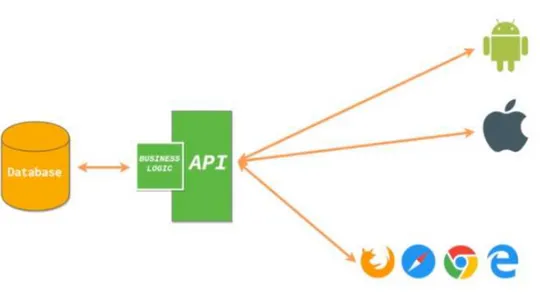
Usually these data are made available through dedicated APIs6 with REST architecture7 for easier access and reuse.
The REST acronym stands for Representational State Transfer, which is an architectural design. Usually when we use the term RESTful, we refer to an application implementing the REST architectural design. APIs are the interface part of this architecture and expose and receive data via their endpoints.
In other word, an API is the software to interact programmatically at the lower level of the source code, writing functions and algorithms instead of the usual graphical interface. In short, the main objective of the RESTful architecture is to keep applications back-end and front-end separate in order to easily manage requests from any device and for any purpose.
Figure 3 – Web development with a REST approach
At this regard, in the context of web development, usually when talking about a RESTful API we are referring to Web Services (or Web APIs). Web services are a common way to expose parts of an application to third-parties (external applications and websites). RESTful API usually expose information stored in SQL and NoSQL databases using a common format, such as XML or JSON. This way, any external application can interact with the API, without having to connect directly into the database. Furthermore, it doesn’t matter the type of DBMS queried (MySQL, PostgreSQL, MongoDB, etc) or if the application is written in Java, Python or C++ as the API standardize the data flow.
6 Definition source: https://opencoesione.gov.it/it/open data/; https://opencoesione.gov.it/it/api-faq/
7Representational State Transfer is an architectural style that defines a set of constraints to be used for creating web services. Web services that conform to the REST architectural style, or RESTful web services, provide interoperability between computer systems on the Internet - https://www.w3.org/TR/ws-arch/#relwwwrest.
15
The framework described implies the presence of producers and consumers of APIs services and resources. However, this research takes only into account and discusses a real example (ESIFy) of application consuming public APIs endpoints produced by dedicated web services.
RESTful web services allow requesting systems to access and manipulate data by using a standard and predefined set of operations independently of the programming language and the database system behind them. This implies a larger diffusion and use among developers with different skills and for different purposes. The use of APIs for sharing data, services and business functions between endpoints creates the opportunity to reduce costs and integration time.
Grant (Grant, 2016) provides a non-technical definition of APIs as standardized ways to connect to a database through another interface, and to query the database and get results as data in a standardized manner.
As presented in the following figure, APIs are a modern solution to facilitate data analytics. In the past an IT team was frequently asked to query large databases to produce specific outputs by the analytics team. The newest approach is to allow smaller datasets to be accessed and manipulated in diverse ways directly by a data analyst and data scientists. Data exposed by the API endpoint could be described as a semi-product that eases the work for both ends of the data processing pipeline. At one end, the analytical process is iterative depending on step-by-step results, where analysts are provided with a dataset instead of a single result. At the other end, the IT team generates a larger set of data without continuously refined queries to the main relational database.
Figure 4 – API as ‘back-end for front-end’ to align IT and BI
Source: own elaboration
Powerful analytics and visualization services are developed on top of the data layer and making the entire process faster and more flexible.
16
Furthermore, the increased flexibility of the analytical task is likely to produce parallel results that highlight erroneous or anomalous data, which helps refine data quality and that advise the extraction task with new information.
As data analytics become more and more indispensable to any public and private activity and decision-making process (European Commission, 2017), and both data and sources of data increase significantly, new paradigms are emerging on the IT side for modern data architecture. This involves organizing sources of structured, semi-structured, unstructured and real time data8 into a persistent data layer and active archive, depending on the immediate or future use.
This data storage area also has an accessible analytics layer for preliminary research and analysis without affecting the persistent strata, i.e. a sandbox. A preliminary analysis enables operational datasets to be organized in the data warehouse layer used by the BI team with online analytical processing (OLAP) and analytical tools. An example of a complex data flow and relative prominent technologies is presented in annex.
Figure 5 – A modern data architecture
Source: D. Ursino, 2018
According to this same paradigm, many public policy open data web services and databases have been made available for reuse in other applications or for analytics. Examples include the Eurostat9 web service and the OECD10 web service.
8 Structured data are organised in relational databases and are estimated to be only 20% of the data; unstructured data, the largest share, has neither a model nor a schema (e.g. text, video, image).
9http://ec.europa.eu/eurostat/web/json-and-unicode-web-services 10https://data.oecd.org/api/
17
In public sector, data can increase the efficiency of processes and increase quality and transparency of decision making with substantial cost savings.
Nevertheless, a common criticism about open data is that current efforts are focused on publishing data and not on its usability, i.e. how this data is consumed by end users (Helbig, N., Cresswell, A.M., Burke, G.B. and Luna-Reyes, 2012).
Many open data projects have been overly focused on technical issues such as formats, updates and endpoints without caring how this data can be used to produce value, so they remain largely unfamiliar to potential users.
This has caused many portals to become mere repositories of data rather than potential wells for data diving. Despite sources are growing rapidly, the extensive exploitation of them is still in its childhood.
As pointed out by Gascó-Hernández et al. (Gascó-Hernández, Martin, Reggi, Pyo, & Luna-Reyes, 2018) this is also largely due to a lack of technical skills and training to exploit the value of open data.
However, this lack of skills could be in turn related to the many issues presented by these resources (Schintler, 2014). Beyond the volume and the complexity of the available data, the velocity and veracity (uncertainty) of the data sources affect their quality, accuracy and completeness (Miller & St, 2013) (Hemerly, 2013).
This extensive availability of data11 with vast unused potential and informative power is the starting point of this document that seeks to exploit the high value of this information.
The four main sources of open data used in this research are12: • ESIF Open Data Portal;
• Smart Specialisation documents; • RegPat OECD database;
• CORDIS Research and Innovation database.
11Other open data platform and REST API: http://data.europa.eu/euodp/en/developerscorner https://www.europeandataportal.eu/en/ https://www.dati.gov.it/content/sviluppatori https://bdap-opendata.mef.gov.it/ https://opencoesione.gov.it/en/api-opencoesione/ http://www.agenziacoesione.gov.it/it/arint/OpenAreeInterne/index.html Agenzia Italia Digitale: https://developers.italia.it/it/api
12 Also Eurostat data via the web service endpoints have been merged to the core set of data as explained in chapter 5 (http://ec.europa.eu/eurostat/web/json-and-unicode-web-services)
18 This document is organized in two main parts:
• Firstly, a comprehensive overview of the use of open data at European level for monitoring and performance assessment. Using ESIF open data, the research focuses on developing a wider and deeper approach to the use of open data for simpler and more effective interpretation and insights;
• The second part presents additional sources of open data (RegPat patents and CORDIS projects) in the perspective of strategy development and assessment. The research topic of this second part highlights some ways open data can be used for data-driven policy making as regards the innovation strategy for R&D investments.
19
2
Open data for performance monitoring and assessment
2.1 Technologies and monitoring tools at EU level
The EU system for monitoring EU programmes implementing ESIF funds is based on different tools and technologies.
The system enables monitoring of ESIF programming and implementation to support the strong result-orientation approach of the 2014-2020 European legislative framework. It is mainly based on two web applications; the System for Fund data management of the European Union (SFC) and the ESIF open data portal.
The first application is a management tool for ESIF managing authorities (MAs) at national and regional level and the ESIF managing Directorates General: REGIO, EMPL, AGRI, MARE, HOME.
SFC's main function is the electronic exchange of information concerning shared Fund management between Member States and the European Commission as described in Article 74(4) of Regulation (EU) No 1303/2013.
In other words, the tool is mainly dedicated to programme data input by MAs of programmes implementation, verified by Directorates Generals and, if needed, corrected by the MAs.
National and regional MAs of financial programmes have specific deadlines to report financial and output information using a data structure detailed in the Current Provision Regulation and in fund specific regulations.
A view of the SFC portal is in the following figure.
Figure 6 – The EU system for fund data management (SFC)
20
Most of this information is then available to the general public for consultation using a web platform dedicated to data consultation and data visualization as presented below.
2.2 Monitoring ESIF: regulation and information reporting
The ESIF open data portal gives access to EU Cohesion Policy data, one of the western world’s largest collection of local and regional development policies operating under a single legal and institutional framework. It targets all EU regions and cities and is aimed at fostering competitiveness, economic growth and new jobs in regions.
The planned resources over the 2014-2020 period for different funds are almost EUR 650 billion with EUR 460 billion of EU resources. The use of resources is regulated by the Common Provision Regulation13 (CPR).
Each European region can access planned financing in the different funds according to specific investment strategies defined within their Operational Programmes (OPs).
These documents have a predefined structure for selecting and categorizing investment decisions and for reporting each year. In particular, data communication to the European Commission is regulated in the CPR under Article 112, regarding the transmission of financial data and Article 72(d) as regards the systems for accounting, storage and transmission of financial and indicators data for monitoring and reporting.
Selected projects, declared expenditure, output and result indicators must be monitored by the MAs responsible for the management of funds and reported to the centralized information system within the Annual Implementation Report (AIR) for European Commission approval.
ESIF data in the Open Data Portal covers more than 540 OPs under the five ESI Funds14. Data are available in many financial datasets which are related to planned, implemented and paid resources. Data on selected common indicators, targets and implementation relative to the actual output of deployed financial resources are stored in the achievement dataset.
Intended users of this data include anyone interested in monitoring policy development, especially EU citizens, Member State administrations, EU Institutions, policy makers, researchers and practitioners in regional development studies.
13 Common Provision Regulation (EU) No 1303/2013 of the European Parliament and of the European Council of 17 December 2013 laying down common provisions on the European Regional Development Fund, the European Social Fund, the Cohesion Fund, the European Agricultural Fund for Rural Development and the European Maritime and Fisheries Fund and laying down general provisions on the European Regional Development Fund, the European Social Fund, the Cohesion Fund and the European Maritime and Fisheries Fund and repealing Council Regulation (EC) No 1083/2006
https://eur-lex.europa.eu/legal-content/EN/TXT/PDF/?uri=CELEX:32013R1303&from=EN
14European Agricultural Fund for Rural Development (EAFRD), the European Regional Development Fund (ERDF), the European Social Fund (ESF) with distinct data for the Youth Employment Initiative, the Cohesion Fund (CF) and the European Maritime and Fisheries fund (EMFF).
21
There are an increasing number of EU open data discussions and initiatives at local, regional, national and EU levels with public events, workshops, conferences, presentations and use of data events such as hackathons and datathons.
These initiatives have multiple objectives and potential benefits including increased transparency and accountability, more efficient communication to citizens and journalists, supporting debates on policy performance and fueling a new data-driven decision mindset for policy makers.
For the performance of regions in implementing their OPs the two most important financial measures are project selection (resources allocated to investments) and expenditure declared (resources disbursed to beneficiaries) as reported by the MAs. The progress and performance of each OP is monitored against the financial amount decided during the planning phase which was at the beginning of the programming period in 2014.
Data are available disaggregated by regulation categories: • Fund
• OP
• Priority Axis
• Thematic Objectives (i.e. the macro priorities for investment) • Fields of intervention (i.e. the micro priorities for investment) • Category of regions (more developed, less developed, transition).
While the planned financial amount can only be updated within a reallocation of OP resources, the financial implementation data are updated three times per year, at the end of January, July and September.
Implementation data submission for common indicators is scheduled at the end of each year. Indicator targets (planned) are not subject to variations unless there are OP modifications.
According to the API paradigm, the platform exposes each of the above datasets using dedicated web services. The information in each dataset is organized in a clear JavaScript Object Notation (JSON)15 structure where each regulation dimension is the JSON key and the OP data is the specific value. The endpoint is referenced by a unique code and is accessible using an HTTP request from a browser16 or from the most common data analytics programming languages (e.g. R, Python, Javascript, etc.).
15JSON is a lightweight data-interchange format http://www.json.org/
22
The very large amount of information, complexity of data structure and frequent updates mean that advanced and agile tools are needed to easily fetch, parse, analyse and visualize information instantaneously.
However, many users primarily interested in policy progress find it difficult to explore and easily extract, transform and analyse the data. Visualizing up-to-date data in the form of charts, tables and other infographics, simplifies exploration of programme performance. This enables researchers, policy makers and the general public to assess the effectiveness of programmes in effectively deploying taxpayer money without data diving and regardless of their skillset and expertise level.
These aspects should be carefully considered, as noted by Gascó-Hernández et al. (Gascó-Hernández et al., 2018). Despite the potential transformative value of open data when they are made more discoverable, accessible and available in alternative formats, there is limited evidence of actual use. This is partly attributable to the lack of fundamental expertise and technical knowledge related to data management and visualization (Graves; Hendler, 2014). Most importantly, many users are not even aware of the data potential, its possible use and the technological and analytical impact (Ramon Gil-Garcia, 2017).
23
3
Monitoring EU programmes implementation using data
visualization
3.1 State of the art for visualizing monitoring data
The increasing and heterogeneous group of data users deciding and debating programme implementation of structural funds require information dissemination based on generally understandable concepts.
For this, visualizations are the easiest and fastest tools for human eyes to see and recognize patterns and trends.
However, the huge amount of multi-dimensional information raises the problem of successfully and easily stimulating visual reasoning using relatively simple tools to synthesize data. Researchers are adopting new tools and technologies to analyse increasingly large economic data sets generated in greater volumes.
Big data often offers valuable information to be extracted and interpreted but the time when simple bar charts or scatter plots were enough is long gone. Thus, the development of advanced data visualization techniques is becoming a necessary and challenging area of research and interest.
Data visualization can help in making sense of large data sets by presenting contents in an innovative visual format that does not require multiple tables, or lots of rows and columns. Furthermore, the connection between several data sources generates newer and larger datasets leading to further discovery and information.
However, there is an increase in the complexity and volume of data that is collected, stored and made available by institutions and public bodies. Literature shows that open data government datasets still have several barriers including inadequate collection, classification, processing and presentation tools, non-standardized data description and formats, as well as missing or incoherent data. This makes it hard for different users and analytical approaches (Dawes & Helbig, 2010).
IT investments and skills devoted mainly to storing systems, architecture, software, hardware, security, networks and Web technologies without an explicit purpose for data exploitation are poorly suited to the new paradigm for using data as an asset for BI and data science. This in turn affects the benefits of open data initiatives and sharing, especially at even lower levels such as local administrations and municipalities.
As a response to the challenges of managing vast amounts of government data and making it accessible for different purposes and informational needs, Dawes explains the concepts of stewardship and usefulness. Among the ‘stewardship proposals’ to improve he suggests creating and improving metadata for each data source, improving the data management system and adopting standard data formats.
24
As ‘usefulness proposals’, he suggests providing easy-to-use basic features as well as improving and enhancing searches and displays of data (Dawes, 2010). Noveck (Noveck, 2012) adds that it is also important to have high quality standards for dissemination catering to different needs and uses by citizens and other social actors. Merino et al. (Merino Huerta, Mauricio, 2010) consider the delivery of public data as opportune and reliable for better decision making in government as well as for government accountability concerning public decisions and actions.
The use of different technology tools to implement open data initiatives is recognized as a ‘fit-the-right-tool-for-the-job’ situation. So each complex economic, social and political issue along with the data it generates relates to different approaches and methods for information production and use (Birkland, 2014) (McCool, 1995).
Government open data across different end-users is available with intense use of technology such as IT tools and Web applications (Dawes & Helbig, 2010) (Noveck, 2012). IT tools and web applications are currently the engine of the debate concerning open data as they can both provide the ‘raw material’ for different types of users as well as receive new information and data from those users; decision makers, analysts, researchers or citizens (C.Hood, 2007).
There is a wide range of technological tools available for policy analysis and data visualization. Flexible and powerful information technologies and various analytical methods are supported by several open data initiatives. This scenario is constantly evolving, but a brief overview of current tools and platforms used to visualize and analyze open data is below.
Open Data Portal for ESIF
The Open Data Portal for ESIF17 proposes a visualization tool for broad aggregations of data at Member State, Fund and Thematic Objective levels in terms of planned, implemented and paid amounts.
Compared to the 2007-2013 programming period when information was only shared in spreadsheets and documents, the tool significantly improved accessibility and reuse of data for accountability and transparency. The tool allows the user to easily shift among the menu views to explore real time data on programme implementation and budget.
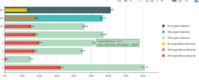
In the following figures are examples of the proposed data visualization and the budget by fund shows the aggregation of planned financial resources by fund highlighting the large share of ERDF within the policy.
25
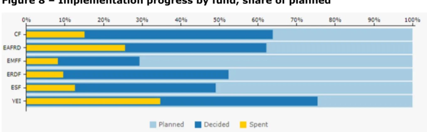
Figure 7 – Budget by fund, percentage of total
A different view (Figure 8), based on the fund dimension and financial implementation makes it easy to understand the progress by fund in terms of resources allocated and disbursed.
Currently, the Youth Employment Initiative has the highest share of both resources allocated (decided) and disbursed (spent).
However, when combining this information with the previous figure, Youth Employment Initiative planned resources are only a limited amount of the full budget, so they are more easily allocated.
Figure 8 – Implementation progress by fund, share of planned
This suggests the importance of a multi-dimensional approach combining more variables in the same analysis dashboard.
A similar graphical solution adopts the Member State as the aggregation dimension and orders by size to show a ranking.
26
Figure 9 – Implementation progress by country, share of planned
Many other visualizations on the platform cover the main variables of interest, providing a clear overview of the status of implementation and highlighting regional authority efforts. However, much of the data potential remains unexploited as only macro dimensions (e.g. Fund, Member State, Thematic Objective, years) are used for data aggregation and comparison.
This fundamental issue has driven the research and development of higher detail visualization supported by enhanced visualizations as presented in chapter 4.
Furthermore, despite the accessibility of data (in many formats) customized visualization tools (e.g. Plotly) are unlikely to be used due to the technical skills and domain specific knowledge needed (Gascó-Hernández et al., 2018).
27
ESIF viewer
ESIF - Viewer18 is a tool to search planned investments in ESIF data (ERDF, CF, ESF and Youth Employment Initiative) and contains data from ESIF OPs. The amounts are presented at regional level and include data from regional OPs, but also shares of national and transnational cooperation programmes. The user can search for planned investments per country, region, OP-type and different categories of intervention.
For a performance assessment approach, this tool has drawbacks:
• No real time data: currently the tool contains data from ESIF OPs retrieved on 20/01/2017 from the SFC2014 database;
• Planned data: only planned financial resources are presented in the current plot and table, without reference to progress and achievement indicators;
• Estimated data: the proposed visualization includes data from regional OPs, but also shares of national and transnational cooperation programmes. The total shares have been estimated by taking into account the population size of the regions. Therefore, these are estimates and do not reflect precise investment figures. • Unique visualization: despite the powerful geo representation, data are represented
using only one map for each selection.
Figure 10 – Regional planned investments in ESIF-viewer
28
ICT Monitoring
While the ESIF viewer covers planned investments overall, ICT Monitoring19 contains data from ESIF OPs on planned ICT related investments. The amounts in this tool are presented at regional level using a unique map. Users can search in three dimensions (amounts, keywords and financial forms) and four categories (Member State, Region, Thematic Objective and Categories of intervention).
As with the ESIF viewer this tool has updating and estimation drawbacks as well as a similar approach to presenting planned data in a unique view.
R&I Regional Viewer
R&I Regional Viewer20 enables visualization and comparison of planned Research & Innovation investments under different funding channels (i.e. ESIF and Horizon 2020) across EU Regions. The tool also combines financial data with Eurostat data sources, showing regional economic indicators (GDP, population, R&D, unemployment) as well. Although the tool enlarges and combines the set of data sources, its main topic and purpose mean that ESIF indicators are limited to resources dedicated to R&I. As with similar tools, Regional Viewer shows estimated planned data with a relatively large lag in data updates.
Monitoring Helpdesk project
A BI tool based on data visualization is helping EC geographic units and desk officers to monitor advancement of the programmes. The tool implements a deeper level of financial and indicator analysis with a wide set of data visualizations to assess each programme progress weekly with updated information.
The tool uses additional categories such as the form of finance (e.g. grant, loan, equity, etc.) and the intervention fields (e.g. research and innovation infrastructure, technology transfer, SME business support, advanced support service).
Furthermore, it covers additional variables and indicators including certified expenditure, resources paid and physical indicators.
Attention is also paid to comparison between years and programming periods as well as to the forecast and expected performance.
The following figure shows an example of the view using a combination of many variables aggregating planned, allocated and spent financial resources.
19http://s3platform.jrc.ec.europa.eu/ict-monitoring 20http://s3platform.jrc.ec.europa.eu/synergies-tool
29
Figure 11 – OP monitoring
Source: own elaboration
OpenCoesione
Despite the significant performance reporting and assessment tools at EU level, current regulation covers only programme level with no requirements for submission of further details at the deeper project level. Micro data at MA level on financed projects, aggregated for AIR submission is undoubtedly the most fundamental asset for monitoring and decision making as it gives access to crucial information at ground level.
Data on the types of beneficiaries, economic sectors, average size of projects, duration of implementation and geographic localization could exponentially increase the informative capacity of data and advise policy.
Furthermore, these data lead to an easy expansion of the information base. For example, including geolocalization and sectors enables combinations with information from other sources using these variables as sort of foreign key for joining.
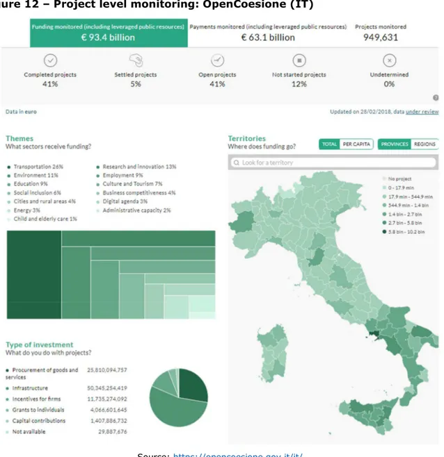
Currently, the Italian OpenCoesione is the only platform in the EU sharing information on Italian projects financed through cohesion policy resources. It covers almost EUR 100 billion of funding and almost 1 million projects over the 2014-2020 period.
This web application is organized as a powerful BI dashboard with a menu for data exploration that triggers several charts and visualizations that can be updated.
30
The main view shows an overview of the variables under three dimensions: • Themes: broad sectors (e.g. transport, environment, R&D);
• Territories: Italian regions (NUTS2) and counties (NUTS3);
• Type of investment: project action (e.g. infrastructure, firms support, etc.).
Furthermore, in line with advanced BI tools, filters, drill-down and roll-up operations are enabled with these three dimensions to which can be added the fund and beneficiary. For accountability and transparency, data are also available in common exchange format and exposed via API21 for reuse in applications. The OpenCoesione API is an application interface that allows any external software component to access OpenCoesione data on projects and entities financed by cohesion policy in Italy.
Figure 12 – Project level monitoring: OpenCoesione (IT)
Source: https://opencoesione.gov.it/it/
31
Beyond the specific domain of ESIF financial resources and programme monitoring, there are other tools at EU level that consider broader economic and financial aspects.
OpenBudgets
OpenBudgets22 is a Horizon 2020 project focusing explicitly on corruption and the comparison of budgets between administrative regions and other government levels. This web platform offers a toolbox to everyone who wants to upload, visualize and analyze public budget and spending data.
It has easy to use visualizations and high-level analytics along with fun games, accessible explanations of public budgeting and corruption practices as well as participatory budgeting tools. It caters to the needs of journalists, researchers, policy makers and citizens.
Regional Benchmarking
Regional Benchmarking23 is an interactive tool for Regional Benchmarking which helps identify structurally similar regions across Europe through statistical indicators that cover social, economic, technological, institutional and geographical characteristics. The objective of the tool is to identify regions with similar characteristics to foster cross regional cooperation and the exchange of knowledge, especially on innovation.
EU Trade
EU Trade24 is a fully interactive web-based application to visualize and analyze inter-regional trade flows and the competitive position of regions in Europe. This tool makes it possible to assess regional assets and to analyze a region’s economic position. This is a first, fundamental step in the process of building place-based and evidence-based regional policies and smart specialisation strategies.
Other Horizon 2020 projects
The Crowd4Roads25 project aims at engaging drivers and passengers in the development and adoption of more sustainable car usage habits and road maintenance policies. It is based on SmartRoadSense, a crowd sensing system which uses the accelerometers of car-mounted smartphones as non-intrusive sensors of road surface quality. This generates open data for an aggregated road quality measure shown in a geographical map26.
22https://openbudgets.eu/ 23http://s3platform.jrc.ec.europa.eu/regional-benchmarking 24http://s3platform.jrc.ec.europa.eu/s3-trade-tool 25http://www.c4rs.eu/ 26 http://www.smartroadsense.it/data/map/
32
Your Data Stories27 is a platform that helps make sense of open and social data. It looks to better satisfy the needs of the ‘demand side’ – meaning citizens, journalists and others with a better ‘supply’ of open data (traditional producers and user-generated content). YDS addresses professionals in government, public administration, business and journalism, but is also made for citizens.
ROUTE-TO-PA28 is a multidisciplinary innovation project that combines expertise and research in e-government, computer science, learning science and the economy. It aims at improving the impact, for citizens and within society, of ICT-based technology platforms for transparency.
Digiwhist29 looks to increase trust in government, improving the efficiency of public spending across Europe by sharing information. The systematic collection, structuring, analysis and broad dissemination of information on public procurement and mechanisms aims at increasing the accountability of public officials across the EU and in some neighboring countries.
Smarticipate30 gives citizens access to data about their city in an easy to understand way, enabling them to better support the decision-making process. Local governments will be able to tap into the ingenuity of their residents, gaining valuable ideas. This two-way feedback makes cities more democratic and dynamic. Residents will also play an active role in verifying and contributing to data.
3.2 Data visualization theory
The natural behavior of human beings before taking decisions is to acquire information. In an information technology process, this short sentence would delineate a situation in which there are two types of interacting classes of objects and where is of crucial importance the definition and quality of their attributes. On one side, enough level of cognitive capacity and skills is required on the human side, and correctness and timeliness of the information stands on the other side.
However, the two attributes follow different pattern of growth with small and slow acquisition of skills for human beings and an exponentially large and fast amount information available. Thus, despite correctness and timeliness of information, a new attribute of information is increasingly becoming important in modern decision science. The main reason behind the transformation of data into graphical images is that is far more
time-saving to get knowledge from depictions than looking through text and numbers.
27https://yourdatastories.eu/ 28http://routetopa.eu/ 29http://digiwhist.eu/
33
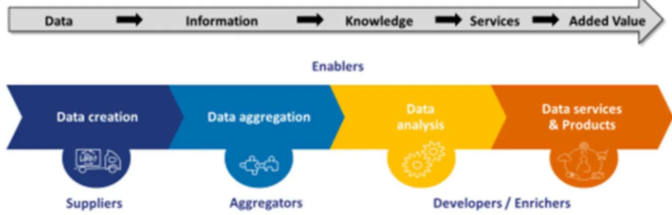
Millions of lines of raw data even if presented in a table would not tell nothing about the information they hide unless even the simplest figure aggregates and plots them all. Since it saves time, it could be encompassed within the realm of data services, final output of the data value chain (Berends, Carrara, Engbers, & Vollers, 2017).
Figure 13 – The data value chain
Source: Re-using Open Data (Berends et al., 2017)
As the information generated in the last years has been continuously soaring, decision makers have to access an increasing information amount per time unit. This could happen only synthetizing information in graphical form, as opposed to a tabular or textual form. Hence, data visualization encompasses all the set of techniques and tools for the acquisition, processing, transformation and communication of raw data into useful knowledge to satisfy an information need.
Data visualization is a quite new and promising field in computer science flourishing due to the growing data available in any field and, in parallel, to the changing mindset towards a more data-driven decision-making approach.
This changing approach relying on data for better decision-making supported by improved technologies and advanced systems to carefully craft messages is underpinned by the concept of data culture (Giest, 2017).
It represents the widest used BI tool for discussion and decision-making as it is usable and understandable by heterogeneous audience both in terms of size and skillset. It helps engaging more diverse audiences in the critical process of analytic thinking of quantitative and qualitative variables.
Modern techniques and algorithms for creating effective visualizations are based on principles from graphic design, visual art, perceptual psychology and cognitive science. Computer science plays the rule of process enablers using computer graphic effects to reveal the patterns, trends, relationships out of datasets.
Graphical representation allows decision makers to see analytics visually, to quickly grasp the concepts and insights relevant for the development of strategies and corrective
34
measures. It encourages appropriate interpretation, selection and association stimulating human senses and cognitive processes for pattern recognition, comparison and analysis. For example, the analysis and comparison of financial data could be an extremely complex task if not accompanied with an effective graphical representation able to synthetize the stream of data produced, especially when in real-time.
A fundamental question in the visualization is what constitutes an effective visualization within the domain of analysis. Despite some concepts and rules apply in general in the development of charts and graphical representation, the theory of data visualization drives the process of effective visualization production through some specific concepts.
According to Ward et al. (Ward, Grinstein, & Keim, 2010) […] to create the most effective visualization for a particular application, it is critical to consider the semantics of the data and the context of the typical user. By selecting data-to-graphics mappings that cater to the user’s domain-specific mental model, the interpretation of the resulting image will be greatly facilitated. In addition, the more consistent the designer is in predicting the user’s expectations, the less chance there will be for misinterpretation.
First, a fundamental aspect of data visualization is the knowledge of the audience and the understanding of how it processes visual information, even referring to tools already adopted and shared. At the same level of importance is the knowledge of the specific
domain and the variables to be visualized.
Thus, the second point refers to the process of data analysis oriented towards specific questions and issues of investigation for the specific audience. Only the true and deep understanding of the variables under analysis and the nature of the information of interest (i.e. the domain) can drive the effective representation of data.
In this sense, data visualization should be considered a topic-driven and audience-driven formatting process.
As the objective of the visualization is to give those caring about the topic the greatest number of concepts and information in the shortest time within a finite space (e.g. pdf page or a web page), the selection of the most important results to be displayed coming out from the data analysis should be based on:
• Focusing the attention and alerting on specific facts; • increasing the understanding and awareness of the fact; • simplifying the remembering of its main points.
Thus, the representation should immediately reveal patterns and peculiarities of data (e.g. trend, relationship, outliers, errors), organize complex information in a way accessible/tailored on the pertinent audience and highlight concepts to immediately remind in the aftermath of the discussion/presentation.
35
Third, the presentation of visualization should follow an order, usually form the general to specific, and reveal the data gradually in order to avoid confusing and overloading the viewer. This avoid the viewer an excessive cognitive processing task, keeping in mind the root of the issue under discussion while drilling down toward additional information and finally to the conclusion of interest. Conveying a narrative with visualizations often requires choosing an order in which to present visualizations. While evidence exists that narrative sequencing in traditional stories can affect comprehension and memory, little is known about how sequencing choices affect narrative visualization (Hullman et al., 2013).
Furthermore, visualization misuse and the harmful effect of driving audience towards misrepresentation, disinformation and even deception has to be carefully considered (Cairo, 2015) (Pickle & Monmonier, 1997). It should be noted that here the discussion refers to the visualization bias based on correct data, different from statistically biased underlying data as largely discussed by Schintler et al. (Schintler, 2014).
Aspects of substantial importance related to graphical perception have to be taken into account when designing outputs as for example:
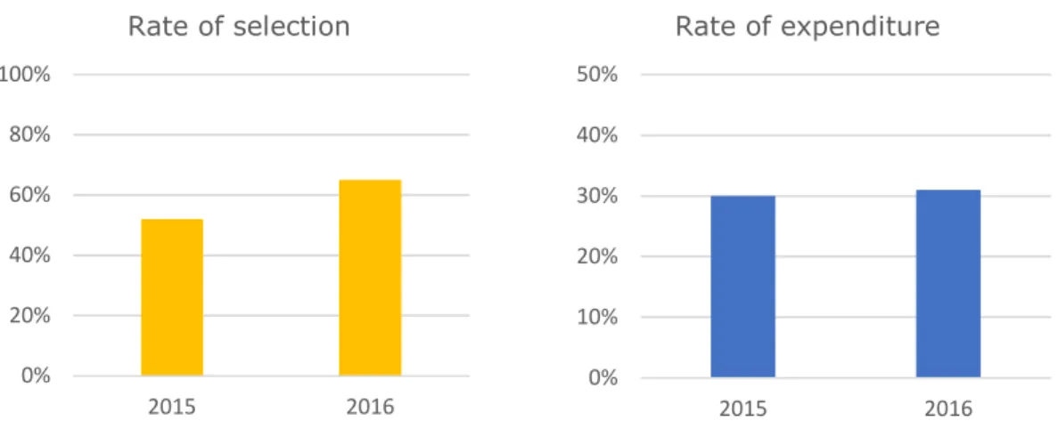
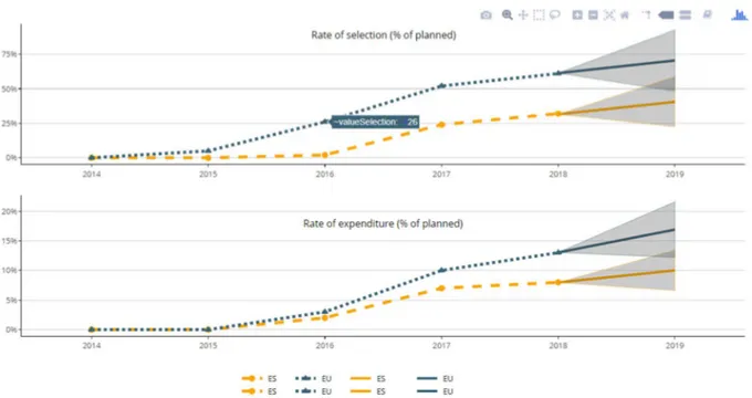
• scale bias: perspective distortion (Tufte, 2001) using the same proportions for comparable variables. The following figure creates the false impression of similar percentage level, but the rate of selection is relatively more advanced than expenditure. The absence of columns label on top does not help the reader as well.
Figure 14 – An example of scale bias
• meaningful order: the order of the visualization elements could improve the perception and make the message immediate whereas mixed elements complicate the interpretation. The following figure induces a misleading message (positive trend) because of the order;
0% 20% 40% 60% 80% 100% 2015 2016 Rate of selection 0% 10% 20% 30% 40% 50% 2015 2016 Rate of expenditure
36
Figure 15 – Time moves forward
• decoration consistency: if the visualization presents several graphics, colors must be consistent, e.g. the same colors represent the same aggregation across the different views;
• aesthetic moderation: the excessive use of grid, labels, notes, colors could lead to what Tufte (Tufte, 2001) indicated as chart junk, supplementary components useless to the interpretation;
• Simpson’s paradox: aggregation applied produces a certain trend that is reversed when a different aggregation is used (e.g. different subgroups);
Figure 16 – A Simpson’s paradox example
• Stacking bias: confusion in the perception of the element origin of values as it is unclear if the origin is in the axis level or stacked above another element.
0 20 40 60 80 100 120 140 160 180 2018 2017 2016 2015 T u rn o v e r (E U R m il li o n )
37
Hullman et al. (Hullman, Adar, & Shah, 2011) found that biased signals lead to biased interpretations with consequent unproperly decision process.
On the opposite, according to data visualization literature (Bateman et al., 2010) (Borkin et al., 2013), charts aesthetic factors may play a major role as regards comprehension and memorability of the message.
This poses several research questions on the development of the output concept:
how the visual factor should be appropriately chosen given the topic under analysis? What is the best visual solution to properly convey the message of interest?
How to synthetize the largest set of data available?
The following figures are an example of improved data visualization in terms of function and form, developed according to the theoretical principles examined and discussed in chapter 4.
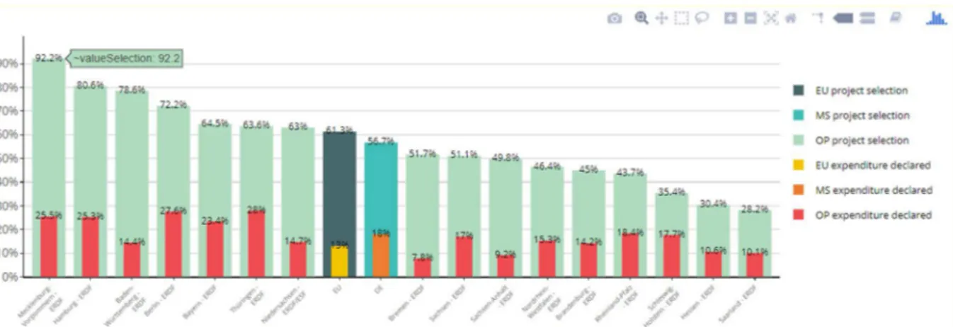
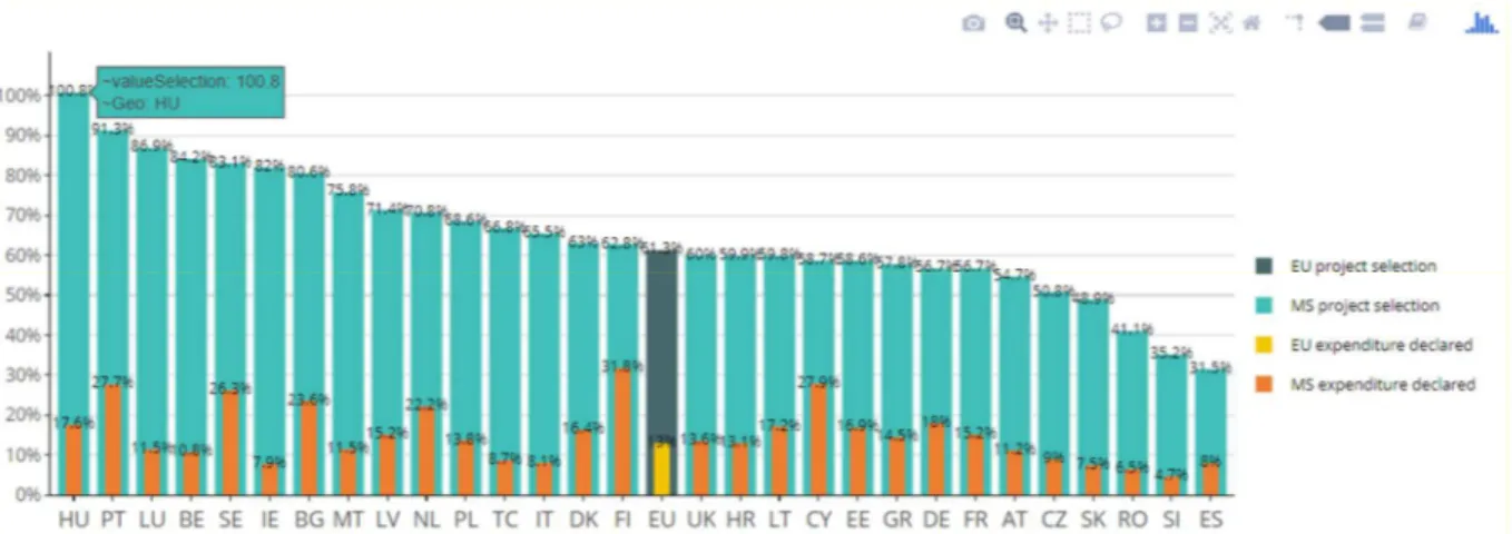
Both these figures compare the rate of selection and expenditure by Priority Axis of the OP with reference to the overall OP level, the MS and EU progress. They only differ substantially in the use of aesthetic factors from (a) to (b).
The main elements of improvement between the two, functional to the analysis and interpretation of data, are:
The adoption of nested variables to emphasize the selection and expenditure relationship given by the specific application domain. An important aspect is to avoid comparison only among the figure bars of the same colours (i.e. red with red, green with green) but also among red and green bars;
Directly related to the previous point is the possibility to indirectly bind business rules into visualization. The relationship between selection and expenditure implies that green bars shall always be greater than red allowing to easily spot any data errors;
The adoption of colours to reflect the different geographical levels represented as not immediately perceived with a unique colour scale. In the view of a benchmarking framework, the use of colours allows to better emphasize the comparison based on the spatial dimension;
Minimize the size of accessory but not central variables (milestone). Despite all the variables proposed in the image are important, they are not important the same way. This implies that some variables with a marginal role should have a different representation and importance in the output. In the example, despite the milestone conveys the same message, its relevance within the figure is reduced.
38
Figure 17 – Substance and form: improving interpretation
(a)
(b)
In the design and prototyping phase, these elements have to be considered when defining the aspects of interest to be conveyed through the image. Further details are presented in chapter 4.