Analyzing Social Media Activity Related
to the COVID-19 Pandemic
Alessandro Carughi
Student Id: 915626
Advisor: Prof. Marco Brambilla
Dipartimento di Elettronica, Informazione e Bioingegneria
Politecnico di Milano
This thesis is submitted for the degree of
Master of Science in Computer Science and Engineering
Ringraziamenti
Desidero innanzitutto ringraziare il professor Marco Brambilla per la disponibilità, per la costante presenza e il grande aiuto che mi ha dato nel mio lavoro.
Ringrazio tutta la mia famiglia, specialmente ringrazio di cuore i miei genitori Paola e Carlo, che ci sono sempre stati. Non mi avete mai fatto mancare nulla, e spero di riuscire a darvi quello che voi avete dato a me. Vorrei ringraziare anche la famiglia della mia ragazza, mi ha fatto sentire parte di un’altra famiglia, specialmente Sofia nella quale ho trovato la sorella che non ho mai avuto.
Vorrei ringraziare tutte le persone che mi sono state accanto in questi anni. I miei compagni di studio con i quali ho legato fin dal primo giorno e con i quali ho passato momenti bellissimi sia sui libri sia fuori. Ai miei amici da sempre soprattutto a quelli con cui ho legato negli ultimi anni, siete stati importanti per la mia crescita. Inoltre vorrei ringraziare tutti i compagni di squadra che ho avuto in questi anni.
Vorrei infine ringraziare Beatrice, persona alla quale devo quello che sono ora. Hai vissuto con me tutto questo percorso e non mi hai mai lasciato solo. Grazie per aver creduto in me, questo risultato non sarebbe stato possibile senza di te, davvero, grazie.
Abstract
With restrictions aimed at limiting travel and with the introduction, during the most critical moments of the COVID-19 pandemic, of bans that prevented people from leaving their homes, the platforms known as "social media" became an outlet for users to express their concerns, opinions and moods caused by the pandemic itself. People, as well as health agencies and governments, are still using Twitter as one of the main means of communication and information. Since the beginning of the pandemic, millions of tweets related to the topic have been posted. For this reason, since Twitter is also a protagonist of the reality we are living, it can, and has been, used not only to share news and information, but also to collect data aimed at providing an analysis of the current situation, both from a temporal and geospatial point of view.
Thus, the objectives of this study are to examine how the social phenomenon has evolved in relation to the pandemic phenomenon, thereby exploring how the key topics covered and the sentiment associated with them have changed in time. Based on a collection of 4.6 million COVID-19-related tweets from February 2020 to December 2020, we sought a correlation between the amount of tweets posted in a day and coronavirus infections per day. In addition we analyse the sentiments and the topic covered of the users of the Twitter social media platform by perform Topic Modeling and Sentiment Classification.
Finally, in order to have a more extensive overview of the still evolving situation, we analyzed the countries most involved at the infectious and media level.
Abstract
Con le restrizioni volte a limitare gli spostamenti e con l’introduzione, nei momenti di maggior criticità della pandemia di COVID-19, di veri e propri divieti che impedivano di uscire dalla propria abitazione, le piattaforme note come “social media” sono diventate uno sbocco per gli utenti, i quali hanno così potuto esprimere le loro preoccupazioni, le loro opinioni e gli stati d’animo altalenati causati dalla pandemia stessa. Le persone, così come le agenzie sanitarie e i Governi, stanno tuttora usando Twitter come uno dei principali mezzi di comunicazione e informazione. Dall’inizio della pandemia sono stati postati milioni di tweet relativi all’argomento. Per questo motivo, essendo Twitter anche lui protagonista della realtà che stiamo vivendo, può, ed è stato, utilizzando, oltre che per la condivisione di novità e informazioni, anche per la raccolta dati volti a fornire un’analisi della situazione in corso, sia dal punto di vista temporale, sia geospaziale.
Gli obiettivi di questo studio sono quindi volti ad esaminare come si è evoluto il fenomeno social in relazione a quello pandemico, esplorando in questo modo come siano cambiati, nel corso del 2020, gli argomenti chiave trattati e i sentimenti ad essi associati. Sulla base di una raccolta di 4,6 milioni di tweet relativi al COVID-19 da febbraio 2020 a dicembre 2020, abbiamo cercato una correlazione tra la quantità di tweet pubblicati in un giorno e le infezioni da coronavirus al giorno. Inoltre abbiamo analizzato i sentimenti e gli argomenti trattati dagli utenti della piattaforma Twitter eseguendo Topic Modeling e Sentiment Classification.
Infine, per avere una panoramica più estesa della situazione ancora in evoluzione, si sono analizzati i paesi maggiormente coinvolti a livello infettivo e livello mediatico.
Contents
List of Figures xii
List of Tables xiv
1 Introduction 1
1.1 Context and problem statement . . . 1
1.2 Proposed solution . . . 2
1.3 Structure of the thesis . . . 2
2 Background 5 2.1 Topic Modeling . . . 5
2.1.1 The Latent Dirichlet allocation (LDA) Algorithm . . . 5
2.1.2 The Model . . . 6
2.1.3 Understanding the Model . . . 7
2.2 t-SNE . . . 7
2.3 Sentiment Analysis . . . 8
2.3.1 Classification Level . . . 8
2.3.2 Sentiment Classification techniques . . . 8
2.3.3 Lexicon-based sentiment analysis . . . 9
2.4 Granger Causality . . . 10 3 Related Work 11 3.1 Correlation . . . 11 3.2 Topic Modeling . . . 12 3.3 Sentiment Analysis . . . 12 4 Methodology 15 4.1 Core idea . . . 15
x Contents
4.3 Data Analysis Pipeline . . . 16
4.3.1 Data Preparation . . . 16
4.3.2 Topic Modeling and Preprocessing for LDA . . . 18
4.3.3 t-SNE for LDA validation . . . 19
4.3.4 Sentiment Analysis with Lexicon based approach . . . 19
4.3.5 Temporal Analysis . . . 20 4.3.6 Geospatial Analysis . . . 20 5 Implementation 21 5.1 Data collection . . . 21 5.2 Data exploration . . . 22 5.3 Preprocessing . . . 23 5.4 Topic Modeling . . . 24 5.4.1 Application of LDA . . . 24
5.4.2 Representation with PyLDAvis . . . 26
5.5 Sentiment Analysis . . . 27 5.6 Data analysis . . . 27 5.7 Libraries . . . 28 5.7.1 Scipy . . . 28 5.7.2 Mapbox . . . 28 5.7.3 Plotly . . . 28 5.7.4 Scikit-learn . . . 29 5.7.5 PyLDAvis . . . 29 5.7.6 VaderSentiment . . . 29 5.7.7 NLTK . . . 29 5.7.8 Gensim . . . 29 5.7.9 statsmodels . . . 30
6 Experiments and results 31 6.1 Datasets . . . 31
6.1.1 Tweet Dataset . . . 31
6.1.2 Covid Dataset . . . 33
6.2 Temporal domain . . . 34
6.2.1 Number of tweets in comparison with covid cases . . . 34
6.2.2 Granger Causality . . . 36
6.2.3 Topic Modeling . . . 38
Contents xi
6.3 Geospatial domain . . . 40 6.3.1 A global view . . . 40 6.3.2 The USA case . . . 41
7 Conclusion 47
7.1 Summary of the results . . . 47 7.2 Discussion . . . 48 7.3 Future work . . . 48
List of Figures
2.1 LDA Model . . . 6
2.2 Sentiment Classification techniques . . . 9
2.3 General process of Lexicon-base sentiment . . . 10
4.1 Data Analysis Pipeline . . . 16
4.2 Data Preparation . . . 17
4.3 Data Collection . . . 17
4.4 Preprocessing for LDA . . . 18
4.5 t-SNE rappresentation . . . 19
5.1 Folder structure of data downloaded . . . 21
5.2 Hydrator . . . 22
5.3 Number of Topic . . . 24
5.4 Representation of Topic Modeling through the PyLDAvis library . . . 26
6.1 Number of daily cases (orange) and daily tweets (blue) comparison during from February 2020 to December 2020 . . . 34
6.2 Countries with the highest number of cases and tweet . . . 35
6.3 Trend during the pandemic of countries with the highest number of cases . 35 6.4 Time shifting of cases’ curve to the tweet’s curve . . . 36
6.5 Granger causality test result . . . 37
6.6 Granger causality test result . . . 37
6.7 Word cloud showing the keywords appearing most frequently in Topic analy-sis result . . . 38
6.8 Daily sentiment scores of tweets collected during the COVID-19 pandemic 39 6.9 Percentage of sentiment in topics deriving from LDA . . . 39
6.10 Heat map of tweets from all over the world . . . 40
6.11 Most discussed topic for each USA state . . . 41
List of Figures xiii
6.13 Percentage of state participation per topic[2-5] . . . 42
6.14 K-mean cluster of discussed topic for each USA states . . . 43
6.15 USA states distribution over the cluster with t-SNE . . . 43
6.16 Heat map of sentiment from USA . . . 44
List of Tables
4.1 Cleaned tweets sample . . . 18
5.1 Dominant_Topic_Distribution sample . . . 26
5.2 Sentiment output sample . . . 27
6.1 Structure of the tweet dataset . . . 32
Chapter 1
Introduction
1.1
Context and problem statement
The first cases of coronavirus disease (officially named COVID-19 by the World Health Organization [WHO] on February 11, 2020) were reported in Wuhan, China, in late December 2019; the first fatalities were reported in early 2020 [1]. The fast-rising infections and death toll led the Chinese government to quarantine the city of Wuhan on January 23, 2020. During this period, other countries began reporting their first confirmed cases of the disease, and on January 30, 2020, the WHO announced a Public Health Emergency of International Concern. With more countries reporting cases of the disease, and infections rapidly escalating in some regions of the world, including United States, India, and Brazil, the WHO declared COVID-19 a pandemic [2]. At the time of this writing, COVID-19 cases have reported in more than 200 countries and resulted in many deaths [3], leaving governments all over the world scrambling for ways to contain the disease and lessen its adverse consequences to people’s health and economy.
During a crisis, whether natural or man-made, people tend to spend relatively more time on social media than normal. As crisis unfolds, social media platforms such as Facebook and Twitter become an active source of information because these platforms break the news faster than traditional news channels and emergency response agencies. During such events, people usually make informal conversations by sharing their safety status, checking in on their loved ones’ safety status, and reporting ground level scenarios of the event. This process of continuous creation of conversations on such public platforms leads to accumulating a large amount of socially generated data. With proper implementation, social media data can be analyzed and processed to extract useful information to study how people react to these phenomena and how their thinking evolves over time.
2 Introduction
In recent times Facebook, Twitter and Reddit have enstablished as the most popular social media platform to informally converse. Amongst these, Twitter, is a microblogging platform that allows users to record their thoughts in 280 characters or less. The text-based content of these messages may include personal updates, humor, or thoughts on media and politics. This concise format allows users to update their “blogs” multiple times per day, rather than every few days, as is the case with traditional blogging platforms [4].
1.2
Proposed solution
The purpose of this thesis is to analyze the activity of Twitter users in order to understand how the COVID-19 pandemic has influenced people through social media.
Over the past year, various analyses have been carried out on this topic, mainly focused on political and socio-economic events. Our solution is based on analyzing people’s thoughts, through Twitter sharing, and how this event affected them mentally and emotionally.
Our approach is to use a collection of data that stored the tweets containing the keywords Covid, Coronavirus, Pandemic and COVID-19 posted between February 2020 and December 2020. The first step is to clean the data and geolocalize it. In this way we have all the data necessary to conduct temporal and geo-spatial analysis in order to determine a quantitative analysis of the data over the outbreak. In particular, we study the activity in terms of tweets’ frequency about first generic topics and we compare it with the covid cases trend in the world. Then using topic modeling and sentiment analysis, we understand the position of social media users with respect to the different topics in the outbreak and their related sentiment. Our comparative, temporal and spatial analysis of tweets can detect the critical periods of the coronavirus crisis and which areas are more active and influenced by this theme.
1.3
Structure of the thesis
The structure of the thesis is as follows:
• Chapter 2 defines and explains the background knowledge and concepts that are related to the work that has been performed for this thesis.
• Chapter 3 presents the past works that are related to this thesis in the problem they try to answer and the solution they propose.
• Chapter 4 contains a high level description of the employed methods that are used in this thesis.
1.3 Structure of the thesis 3
• Chapter 5 describes the implementations of the used methods.
• Chapter 6 presents the results of the experiments and discusses these outcomes.
• Chapter 7 concludes by summarizing the work, doing a critical discussion and advises the possible future work.
Chapter 2
Background
This chapter introduces the theoretical background on Topic modeling and Sentimental analysis. The first one is a technique to extract the hidden topics from large volumes of text, while the second is the automated process of identifying and classifying subjective information in text data. This might be an opinion, a judgment, or a feeling about a particular topic or product feature.
2.1
Topic Modeling
Topic modeling is a branch of unsupervised natural language processing which allows to represent a text document as a set of topics, that can best explain its underlying information. This can be thought in terms of clustering, but with a difference. Instead of numerical features, we have a collection of words that we want to group together in such a way that each group represents a topic in a document. This can be useful for search engines, customer service automation, and any other instance where knowing the topics of documents is important. There are multiples topic modeling algorithms, in our works we use Latent Dirichlet Allocation (LDA).
2.1.1
The Latent Dirichlet allocation (LDA) Algorithm
LDA is a form of unsupervised learning that views documents as bags of words. LDA works on a key assumption: the way a document was generated was by picking a set of topics and then for each topic picking a set of words. Thanks to a reverse engineering process it is possible to find topics. To do this it does the following for each document m:
6 Background
2. Distribute these k topics across document m (this distribution is known as α and can be symmetric or asymmetric) by assigning each word a topic.
3. For each word w in document d, assume its topic is wrong but every other word is assigned the correct topic.
4. Probabilistically assign word w a topic based on two things:
• what topics are in document m
• how many times word w has been assigned a particular topic across all of the documents (this distribution is called β , more on this later)
5. Repeat this process a number of times for each document
2.1.2
The Model
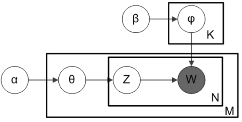
Figure 2.1 LDA Model
Where:
• α is the per-document topic distributions
• β is the per-topic word distribution
• θ is the topic distribution for document m
• ϕ is the word distribution for topic k
• Z is the topic for the n-th word in document m
2.2 t-SNE 7
2.1.3
Understanding the Model
In the model diagram above, you can see that W is grayed out. This is because it is the only observable variable in the system while the others are latent. Because of this, to tweak the model there are a few things you can do:
• α is a matrix where each row is a document and each column represents a topic. A value in row i and column j represents how likely document i contains topic j. A symmetric distribution would mean that each topic is evenly distributed throughout the document while an asymmetric distribution favors certain topics over others. This affects the starting point of the model and can be used when you have a rough idea of how the topics are distributed to improve results.
• β is a matrix where each row represents a topic and each column represents a word. A value in row i and column j represents how likely that topic i contains word j. Usually each word is distributed evenly throughout the topic such that no topic is biased towards certain words. This can be exploited in order to condition certain topics to favor certain words. For example if you know you have a topic about Apple products it can be helpful to bias words like “iphone” and “ipad” for one of the topics in order to push the model towards finding that particular topic.
2.2
t-SNE
A popular method for exploring high-dimensional data, like the one created from LDA model, is t-SNE [5]. This technique has become widespread in the field of machine learning, due to its ability to create compelling two-dimensonal visualizations from data with hundreds or even thousands of dimensions. t-SNE is a non-linear algorithm for dimensionality reduction, able to capture much of the local structure of the high-dimensional data very well, while at the same time also revealing global structure such as the presence of clusters at several scales. This feature allows similar data points be represented nearby and, in the meanwhile, different data points to be represented far in the new low-dimensional space. The algorithm converts the Euclidean distances among the data points into conditional probabilities representing similarities.
8 Background
2.3
Sentiment Analysis
Sentiment analysis (or opinion mining) is a natural language processing technique used to determine whether textual data is positive, negative or neutral. Sentiment analysis is fundamental, as it helps to understand the emotional tones within language. This, in turn, helps to automatically sort the opinions behind reviews, social media discussions, etc., allowing you to make faster, more accurate decisions.
2.3.1
Classification Level
There are three main classification levels in Sentiment Analysis:
• document-level
• sentence-level
• aspect-level
Document-level aims to classify an opinion document as expressing a positive or negative opinion or sentiment. It considers the whole document a basic information unit (talking about one topic). Sentence-level aims to classify sentiment expressed in each sentence. The first step is to identify whether the sentence is subjective or objective. If the sentence is subjective, Sentence-level will determine whether the sentence expresses positive or negative opinions. A study [6] have pointed out that sentiment expressions are not necessarily subjective in nature. However, there is no fundamental difference between document and sentence level classifications because sentences are just short documents [7]. Classifying text at the document level or at the sentence level does not provide the necessary detail needed opinions on all aspects of the entity which is needed in many applications, to obtain these details, we need to go to the aspect-level which purpose is to classify the sentiment with respect to the specific aspects of entities obtained in the first steps.
2.3.2
Sentiment Classification techniques
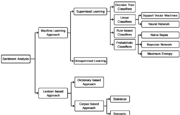
Sentiment analysis can be performed with different techniques, which have different ap-proaches and can lead to better or worse results based on the data provided. Figure 2.3 shows all the techniques with which this classification can be performed. For the purpose of this thesis a lexicon-based approach was used.
2.3 Sentiment Analysis 9
Figure 2.2 Sentiment Classification techniques
2.3.3
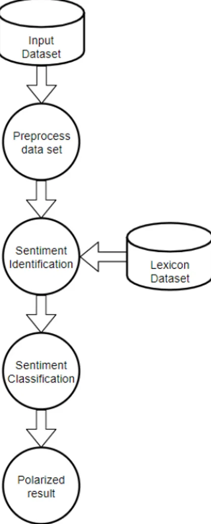
Lexicon-based sentiment analysis
Application of a lexicon is one of the two main approaches to sentiment analysis and it involves calculating the sentiment from the semantic orientation of word or phrases that occur in a text. With this approach a dictionary of positive and negative words is required, with a positive or negative sentiment value assigned to each of the words. Generally speaking, in lexicon-based approaches a piece of text message is represented as a bag of words. Following this representation of the message, sentiment values from the dictionary are assigned to all positive and negative words or phrases within the message. A combining function, such as sum or average, is applied in order to make the final prediction regarding the overall sentiment for the message. Apart from a sentiment value, the aspect of the local context of a word is usually taken into consideration, such as negation or intensification. The main advantage of a lexicon-based is that it works even in the absence of a labeled corpus with which to train a classification model.
10 Background
Figure 2.3 General process of Lexicon-base sentiment
2.4
Granger Causality
The Granger causality test is a statistical hypothesis test for determining whether one time series is useful for forecasting another. Causality is closely related to the idea of cause-and-effect, although it isn’t exactly the same. A variable X1is causal to variable X2 if X1
is the cause of X2 or X2 is the cause of X1. However Granger causality don’t test a true
cause-and-effect relationship. What the Granger Test will return is whether a particular variable comes before another in the time series, highlighting the link between the two.
The null hypothesis for the test is that lagged x − values do not explain the variation in y. In other words, it assumes that x(t) doesn’t Granger-cause y(t). Theoretically, the Granger Test is performed to find out if two variables are related at an instantaneous moment in time.
Chapter 3
Related Work
In this section we review the recent studies on the influence of COVID-19 on social media. We then review the literature on comparison algorithms, topic modeling and sentiment analysis and how these are applied on the data obtained by the tweets.
3.1
Correlation
There are a lot of studies that try to find a correlation between social media and the pandemic. Some works [8][9] aim to predict the development of this outbreak as early and as reliably as possible, in order to take action to prevent its spread. The data showed in this studies is collected from the two popularly used Internet search engines, Google and Baidu, and the chinese social media platform, Sina Weibo They were able to predict the disease outbreak 1–2 weeks earlier than the traditional surveillance systems.
Another study [10] research how the social media can be an early indicator of public social distancing measures in the United States by investigating its correlation with the time-varying reproduction number as compared to social mobility estimates reported from Google and Apple Maps.
This work [11] provides an in-depth analysis of the social dynamics in a time window where narratives and moods in social media related to the COVID-19 have emerged and spread. They analyze mainstream platforms such as Twitter, Instagram and YouTube as well as less regulated social media platforms such as Gab and Reddit and perform a com-parative analysis of information spreading dynamics around the same argument in different environments having different interaction settings and audiences. They collect all pieces of content related to COVID-19 starting from the 1st of January until the 14th of February. Data have been collected filtering contents accordingly to a selected sample of Google Trends’ COVID-19 related queries such as: coronavirus, coronavirusoutbreak, imnotavirus,
12 Related Work
ncov, ncov-19, pandemic, wuhan. The deriving dataset is composed of 1,342,103 posts and 7,465,721 comments produced by 3,734,815 users.
3.2
Topic Modeling
Studies have been conducted using topic modeling, a process of identifying topics in a collection of documents. The commonly used model, LDA, provides a way to automatically detect hidden topics in a given number [12]. Previous research has been conducted on inferring topics on social media. A study [13] investigated the topic coverage and sentiment dynamics on Twitter and news press regarding the issue of Ebola. Another work [14] found LDA-generated topics from e-cigarette related posts on Reddit to identify potential associations between e-cigarette uses and various self-reporting health symptoms.
While with regard to work relating specifically to the COVID-19, several studies have been made. For example, one study [15] focuses on the early stages of pandemic, the aim of this study was to collect media reports on COVID-19 and investigate the patterns of media-directed health communications as well as the role of the media in this ongoing COVID-19 crisis in China. Other studies have focused on political context, one [16] does qualitative study to viral tweets from G7 world leaders, attracting a minimum of 500 ‘likes’; containing ‘COVID-19’ or ‘coronavirus’; between 17 November 2019 and 17 March 2020 and performed content analysis to categorize tweets into appropriate themes and analyzed associated Twitter data. One [17] has studied the response to COVID-19 in the United States by analyzing Twitter data and applying a dynamic topic model to COVID-19 related tweets by U.S. Governors and Presidential cabinet members. They use the Hawkes binomial topic model network to track evolving sub-topics around risk, testing and treatment. They also construct influence networks amongst government officials using Granger causality inferred from the network Hawkes process.
3.3
Sentiment Analysis
Recent studies have also done a sentiment analysis on different samples of Coronavirus specific Twitter data. Many works analyze only the fist half of the year 2020, a study [18] analyzed 2.8 million COVID-19 specific tweets collected between February 2, 2020, and March 15, 2020, computing the frequencies of unigrams and bigrams, and performed sentiment analysis and topic modeling to identify Twitter users’ interaction rate per topic. Another study [19] examined tweets collected between January 28, 2020, and April 9, 2020, to understand the worldwide trends of emotions (fear, anger, sadness, and joy) and the
3.3 Sentiment Analysis 13
narratives underlying those emotions during the pandemic. Many works [20][21][22] focus on a specific geographic areas. For example, a regional study [23] in India performed sentiment analysis on 24,000 tweets collected, during March and April 2020, to examine the impact of risk communications on emotions in the Indian society during the pandemic. In a similar regional study [24] concerning China and Italy, the effect of COVID-19 lockdown on individuals’ psychological states was studied using the conversations available on Weibo (for China) and Twitter (for Italy) by analyzing the posts published two weeks before and after the first lockdown.
Chapter 4
Methodology
This chapter presents the main objective behind this work and all the various phases involved during the course of this thesis. So, once we have explained the idea behind this work and the related research questions, we will explain the proposed solution at a high level, dwelling on the definitions of the key terms of this topic through a detailed glossary.
4.1
Core idea
The core idea relies on the assumption that it is possible to obtain useful insights about world crisis phenomena, in our case COVID-19, from social media data. We are able to detect which locations are more involved, both in terms of infections and in terms of social data traffic, and to understand the position of social media users with respect to the different topics in the outbreak, classifying their sentimental status. Our temporal and spatial analysis of tweets can show the social trend of users with respect to the numbers and the evolution of the pandemic.
4.2
Objectives and research goals
The research starts with the purpose of achieve the following:
• Detect which location are more active, both in terms of cases and generated social traffic
• Understand the stance of Twitter users with respect to the different topic
16 Methodology
• Highlight social trends during the COVID-19 pandemic
The main goal of this thesis is to analyze first of all how the activity on Twitter varies day-by-day in face of COVID-19. At the same time it is interesting to analyze this context from the spatial point of view, so we can be able to study which are the most ’social’ areas regarding Coronavirus theme.
4.3
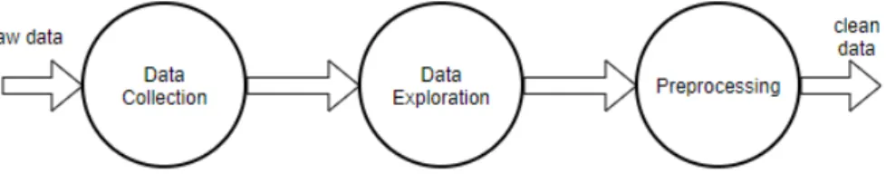
Data Analysis Pipeline
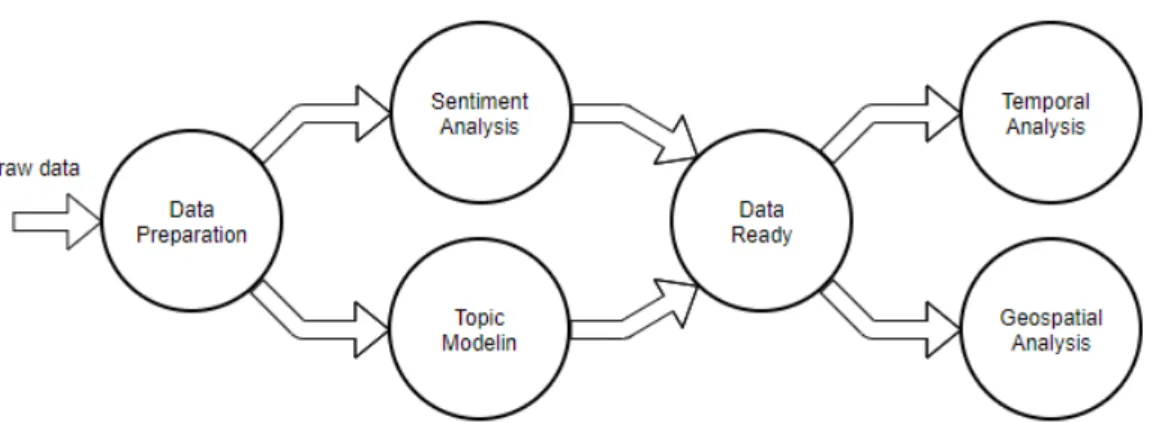
In this section we are going to explain the whole process we used to achieve our goals explained in Section 4.2. As shown in Figure 4.1, the first step is the one in which we take the raw data and prepare it for topic modeling and sentiment analysis. Once these two techniques have also been applied, we have all the data ready for final analysis, which we decided to divide into two different domains: temporal and geospatial.
Figure 4.1 Data Analysis Pipeline
4.3.1
Data Preparation
The data preparation phase, detailed in Figure 4.2, takes as input the raw data, as-is from Twitter, and standardizes it. The outputs are the cleaned tweets which will be processed by the Topic Modeling algorithm and the Sentiment Analysis classifier. Moreover in this phase, we retrive the geolocation of each tweet from its embedded location object or from a user’s profile. This phase is divided into three different steps:
4.3 Data Analysis Pipeline 17
Figure 4.2 Data Preparation
• Data collection: Figure 4.3, it is the first step, in which data are taken from a Github1 repository that has collect all tweet ID regarding the outbreak.
Figure 4.3 Data Collection
This phase is in turn divided into two substeps:
– Sampling: this step consists in sampling the data, remaining faithful to the real data, then taking a percentage proportional to the total data collected.
– Data hydration: at this point the sampled IDs are transformed into actual tweets thanks to an hydration software.
• Data exploration: data is studied to find characteristics and potential problems.
• Preprocessing: consists of all the actions that have to be done to clean and prepare the data. In our context it means removing all the useless features of tweet and geolocalizing it.
18 Methodology
country region place coordinates year month day dateRep text
0 United States Connecticut Trumbull [-73.2007, 41.2429] 2020 06 07 07/06/2020 The best thing about the AIDS epidemi... 1 United Kingdom England Bristol [-2.58333, 51.45] 2020 06 07 07/06/2020 RT @RussInCheshire: TheWeekInTory 1. The ... 2 South Africa Gauteng Johannesburg [28.0328, -26.1633] 2020 06 07 07/06/2020 Because of hard lockdown AKA level5, everyone... 3 India Delhi New Delhi [77.2, 28.7] 2020 06 07 07/06/2020 The latest The @delhi_russian Daily! https://t... 4 Portugal Lisboa Lisboa [-9.16667, 38.71667] 2020 06 07 07/06/2020 Fio: (pelo menos) 8 dispositivos...
Table 4.1 Cleaned tweets sample
4.3.2
Topic Modeling and Preprocessing for LDA
In our solution, we use LDA algorithm to extract topics that occur in the collection of documents that best represents the information in them. To do this analysis we have to prepare the data for the algorithm with another pre-processing steps:
Figure 4.4 Preprocessing for LDA
• Clean text: consist in removing the parts of the text repeated in every tweet, like introductionary sentence or fixed patterns
• Preprocess text: in this step we performed a tokenization that consist in splitting the text into sentences and the sentences into words. Then lowercase the words and remove punctuation. All stopwords are removed and also words are lemmatized and stemmed. The lemmatization process consist in substituting a word with its dictionary form (e.g. expressing verbs in infinitive form). Like lemmatization, stemming reduces a word to its root form but the result is not necessarily a word itself since this technique is heuristic-based.
• Bigram: at this point we identify word pairs within data indeed Bigrams help to provide the conditional probability of a token given the preceding token.
• Document-term matrix: The last step is to use count vectorisation to transform the data into a numeric term-document matrix.
At this point the dataset is in the right shape for the Latent Dirichlet Allocation (LDA) model, the probabilistic topic model which has been implemented in this work. A document-term matrix is in fact the type of input which the model requires.
4.3 Data Analysis Pipeline 19
4.3.3
t-SNE for LDA validation
At this point, to visually validate LDA topic model we use the t-SNE algorithm mentioned in subsection 2.2.
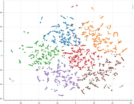
Figure 4.5 t-SNE rappresentation
When using t-SNE, the data is reduced in dimensionality can then be easily printed, in our case with a scatter plot, maintaining the original structure and relationships among data points. Figure 4.5 shows our t-SNE dataset visualization. It is possible to see how data points are grouped together based on their characteristics and how the structure of the dataset is maintained by the algorithm. Each dot represents a topic model document, moreover the points are colored based on the assignment to a specific topic, reflecting the results of the LDA model. From the figure, we can see that the subdivision between the groups of documents by topic is well defined so we can say that our result is valid.
4.3.4
Sentiment Analysis with Lexicon based approach
In our study we also decided to perform a sentiment analysis with a lexicon approach, to explore the feelings of the users during the pandemic.
In terms of human language, texts are made up of words. Words are defined in the dictionary. Thus, to understand a given text, we proposed to use a tool that look up the words of the text in the dictionary for their meanings then sum up the sentiment scores. Our proposed method actually replicates the way human beings do to solve this problem. The method, in details,
20 Methodology
consists of applying a Lexicon based technique to extract a score value for each tweet text. The result value is a score that ranging from -1 to 1, where -1 indicates a totally negative sentiment, 1 a totally positive sentiment and 0 a neutral sentiment.
4.3.5
Temporal Analysis
Now that we have all the data processed by the various previous analyses we can move on to the final analyses. About the temporal analyses, we focused on how social media data evolves with respect to number of cases globally registered. Then, having taken the information from each tweet, we analyzed, the average number of tweets posted every day, highlighting the periods containing significant events in the outbreak. In addition, in the temporal domain we also performed analyses regarding the topics and feelings of users and also how they evolved during the epidemic. Regarding this last two analyses, we have only taken into consideration the data related to the United State by displaying the most discussed topics and the trend of the sentiment. This because after carrying out our global statistical survey, we found a large number of tweets from the USA and we focused on the American case. We have also decided to intersect the analyzes concerning sentiment and topics.
4.3.6
Geospatial Analysis
Instead, concerning geospatial analysis we had to find each user’s Geodata needed to view for example the most active areas on Twitter in COVID-19, then focusing on comparing the results obtained from the collected data with the real dataset obtained from the World Health Organization. Also in this domain, after analyzing the world case on a quantitative level, by using the tweet and Covid quantity dataset, we focused on the US case on a qualitative level, by means of Topic Modeling and Sentiment Analysis.
Chapter 5
Implementation
In this chapter, we illustrate in detail the entire development and implementation, going through all the stages. In the end, we also briefly mention the libraries used in the implemen-tation.
5.1
Data collection
The process starts with the collection of data. To do this, we use a repository1 [25] that contains an ongoing collection of tweets IDs associated with the novel coronavirus COVID-19, which collected data commenced on January 28th, 2020. They used the Twitter’s search API to gather historical Tweets from the preceding 7 days, leading to the first Tweets in the dataset dating back to January 21st, 2020.
Once the data was downloaded, it is structured in this way:
Figure 5.1 Folder structure of data downloaded
So the first thing to do to make this data usable and ready to be cleaned is to merge them and sample them. To do this we have implemented a Python function, which takes for each day a percentage of tweets with respect to the total number of that day.
At this point, we have a list of IDs for each day, we have aggregated them to get one for each month. The last step for data collection is to transform these IDs into corresponding tweets.
22 Implementation
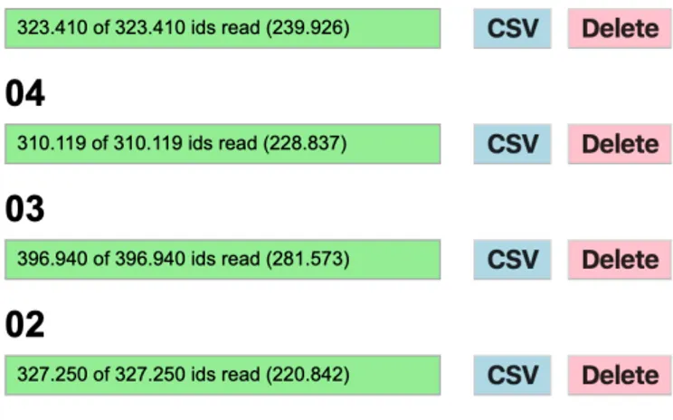
This step is called data hydration and consist of getting the complete details (i.e. fields) of a tweet, given an ID. To do this, we use the software Hydrator2, figure 5.2.
Figure 5.2 Hydrator
From this software we have obtained a csv file, containing the tweet sample of each month ready to be explored.
5.2
Data exploration
It is good practice to explore the data before starting to manipulate it. The goal of data exploration is to find characteristics of the data and drive the next operations accordingly. In our context, we studied hydrated tweets. To study them, we referred to the official documentation for Twitter developers, in which the structure of each response object is shown and all its properties are described.
5.3 Preprocessing 23
5.3
Preprocessing
The objective of this section is to present how Twitter related to COVID-19 data downloaded in Section 5.1 are transformed into a format suitable for our analyses. First of all, the data contains a lot of information that we are not going to use. For this reason the dataset scanned and for each tweet only the necessary information for the analysis are taken. For each tweet we consider only the text, for the content analysis, the date of its creation, for the temporal analysis and the user the location, for the spatial analysis. Starting from this last field we applied the Mapbox Geocoding APIs3in order to manually obtain the Geo metadata of each user.
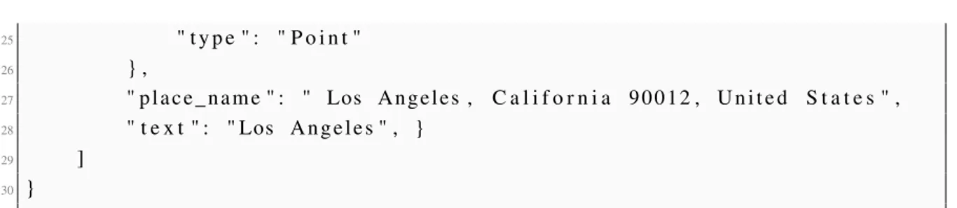
The Mapbox Geocoding API does two things: forward geocoding and reverse geocoding. In our case we used the forward geocoding to retrive coordinates from the user location text and reverse geocoding which converts the coordinates just found into geographic coordinates and context information like the country name, region, place as we can see in the following example of response object:
1 { 2 " f e a t u r e s " : [ { 3 " c o n t e x t " : [ 4 { 5 " i d " : " p l a c e . 6 6 9 4 7 9 0 1 4 6 4 2 7 6 4 0 " , 6 " t e x t " : " Los A n g e l e s " 7 } , 8 { 9 " i d " : " r e g i o n . 9 8 0 3 1 1 8 0 8 5 7 3 8 0 1 0 " , 10 " s h o r t _ c o d e " : "US−CA" , 11 " t e x t " : " C a l i f o r n i a " 12 } , 13 { 14 " i d " : " c o u n t r y . 1 9 6 7 8 8 0 5 4 5 6 3 7 2 2 9 0 " , 15 " s h o r t _ c o d e " : " u s " , 16 " t e x t " : " U n i t e d S t a t e s " 17 } 18 ] , 19 " g e o m e t r y " : { 20 " c o o r d i n a t e s " : 21 [ 22 −118.243865 , 23 3 4 . 0 5 4 3 9 6 24 ] , 3https://docs.mapbox.com/api/search/geocoding
24 Implementation 25 " t y p e " : " P o i n t " 26 } , 27 " p l a c e _ n a m e " : " Los A n g e l e s , C a l i f o r n i a 9 0 0 1 2 , U n i t e d S t a t e s " , 28 " t e x t " : " Los A n g e l e s " , } 29 ] 30 }
Listing 5.1 Mapbox response example
Once we obtained the GEOJson information of each tweet, we run a Python script that takes all these GEOJson and extracts for each tweet the context information like the place, region, country and coordinates in order to save them in different columns inside our dataset. We performed this procedure in order to easily access to this type of information which will be useful to do analysis at different levels of localization.
5.4
Topic Modeling
5.4.1
Application of LDA
To obtain a good result by applying LDA techniques is important to choose an appropriate number of topics for a given corpus. To decide a suitable number of topics, we compare the Coherence Score of LDA models with varying numbers of topics. Topic Coherence measures score a single topic by measuring the degree of semantic similarity between high scoring words in the topic. These measurements help distinguish between topics that are semantically interpretable topics and topics that are artifacts of statistical inference.
5.4 Topic Modeling 25
Figure 5.3 show us that the number of topic that best fits our problem is 6. At this point the LDA Model are built with the gensim library, the above LDA model is built with 6 different topics where each topic is a combination of keywords and each keyword contributes a certain weightage to the topic.
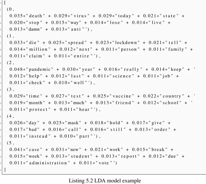
1 [ 2 ( 0 , 3 0 . 0 3 5 * " d e a t h " + 0 . 0 2 9 * " v i r u s " + 0 . 0 2 9 * " t o d a y " + 0 . 0 2 1 * " s t a t e " + 4 0 . 0 2 0 * " s t o p " + 0 . 0 1 5 * " way " + 0 . 0 1 4 * " l o s e " + 0 . 0 1 4 * " l i v e " + 5 0 . 0 1 3 * " damn " + 0 . 0 1 3 * " a n t i " ' ) , 6 ( 1 , 7 0 . 0 3 3 * " d i e " + 0 . 0 2 5 * " s p r e a d " + 0 . 0 2 3 * " lockdown " + 0 . 0 2 1 * " t e l l " + 8 0 . 0 1 4 * " m i l l i o n " + 0 . 0 1 2 * " n e x t " + 0 . 0 1 1 * " p e r s o n " + 0 . 0 1 1 * " f a m i l y " + 9 0 . 0 1 1 * " c l a i m " + 0 . 0 1 1 * " e n t i r e " ' ) , 10 ( 2 , 11 0 . 0 4 8 * " pandemic " + 0 . 0 3 0 * " y e a r " + 0 . 0 1 6 * " r e a l l y " + 0 . 0 1 4 * " keep " + ' 12 0 . 0 1 2 * " h e l p " + 0 . 0 1 2 * " l a s t " + 0 . 0 1 1 * " s c i e n c e " + 0 . 0 1 1 * " j o b " + 13 0 . 0 1 1 * " che ck " + 0 . 0 1 0 * " w e l l " ' ) , 14 ( 3 , 15 0 . 0 2 9 * " t i m e " + 0 . 0 2 7 * " t e s t " + 0 . 0 2 5 * " v a c c i n e " + 0 . 0 2 2 * " c o u n t r y " + ' 16 0 . 0 1 9 * " month " + 0 . 0 1 3 * " much " + 0 . 0 1 3 * " f r i e n d " + 0 . 0 1 2 * " s c h o o l " + ' 17 0 . 0 1 1 * " p r o t e c t " + 0 . 0 1 1 * " h e a r " ' ) , 18 ( 4 , 19 0 . 0 2 6 * " day " + 0 . 0 2 5 * " mask " + 0 . 0 1 8 * " h o l d " + 0 . 0 1 7 * " g i v e " + 20 0 . 0 1 7 * " bad " + 0 . 0 1 6 * " c a l l " + 0 . 0 1 6 * " s t i l l " + 0 . 0 1 3 * " o r d e r " + 21 0 . 0 1 1 * " i n s t e a d " + 0 . 0 1 0 * " p a r t " ' ) , 22 ( 5 , 23 0 . 0 4 1 * " c a s e " + 0 . 0 3 1 * " new " + 0 . 0 2 1 * " work " + 0 . 0 1 5 * " b r e a k " + 24 0 . 0 1 5 * " week " + 0 . 0 1 3 * " s t u d e n t " + 0 . 0 1 3 * " r e p o r t " + 0 . 0 1 2 * " due " + 25 0 . 0 1 1 * " a d m i n i s t r a t i o n " + 0 . 0 1 1 * " v o t e " ' ) 26 ]
Listing 5.2 LDA model example
Topic 0 is a represented as 0.035*"death" + 0.029*"virus" + 0.029*"today" + 0.021*"state" + 0.020*"stop" + 0.015*"way" + 0.014*"lose" + 0.014*"live" + 0.013*"damn" + 0.013*"anti". It means the top 10 keywords that contribute to this topic are: ‘death’, ‘virus’, ‘today’.. and so on and the weight of ‘death’ on topic 0 is 0.035. The weights reflect how important a keyword is to that topic.
LDA also provides a topic distribution for each document in the dataset as a sparse vector, making it easier to interpret the high-dimensional topic vectors and extract the relevant topics for each text. Typically only one of the topics is dominant, so we use an other algorithm to extract the Dominant topic and its percentage contribution in each document.
26 Implementation
Document_No Dominant_Topic Topic_Perc_Contrib Keywords Text
0 0 4.0 0.770872 case, death, report, help, day, today, call, back, update, yesterday [report, high, day, spike, case, death, morning] 1 1 2.0 0.542002 die, tell, new, virus, mask, world, ever, bad, positive, show [discover, new, virus]
2 2 4.0 0.832064 case, death, report, help, day, today, call, back, update, yesterday [report, crucial, wetmarket, permanently] 3 3 2.0 0.633758 die, tell, new, virus, mask, world, ever, bad, positive, show [bad, wish, man, die]
4 4 1.0 0.381871 year, still, time, test, leave, country, well, open, kill, kid [symptom, loss, taste, probably, year, taste, man]
Table 5.1 Dominant_Topic_Distribution sample
In our analysis we consider only the document which its Topic Contribution is higher than 0.4, to avoid bias problem.
5.4.2
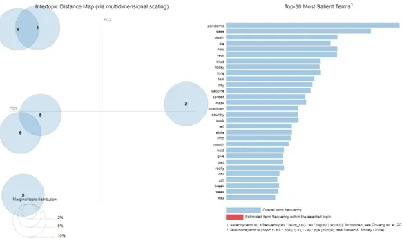
Representation with PyLDAvis
An other way to represent LDA is pyLDAvis library. Our visualization (illustrated in Figure 5.4) has two basic pieces. First, the left panel of our visualization presents a global view of the topic model, and represent which topic is prevalent and how the topics relate to each other. In this view, the topics are plotted as circles which centers are determined by computing the distance between topics, and then multidimensional scaling to project the inter-topic distances onto two dimensions is applied. Second, the right panel of our visualization depicts a horizontal barchart whose bars represent the individual terms that are the most useful for interpreting the selected topic on the left, and allows us to interpret the meaning of each topic. If no topic is selected, as in the figure below, the most used terms throughout the model will be displayed.
5.5 Sentiment Analysis 27
5.5
Sentiment Analysis
The practical approach that we chose for Sentiment Analysis is to use the VADER library [26]. VADER is a lexicon and rule-based sentiment analysis tool that is specifically attuned to sentiments expressed in social media. The VADER sentiment lexicon is sensitive both the polarity and the intensity of sentiments expressed in social media contexts, and is also generally applicable to sentiment analysis in other domains.
Table 5.2 shows a sample of data analyzed using VADER.
dateRep country region place coordinates positive negative neutral 0 07/06/2020 United States New Mexico Tres Piedras [-105.752831, 36.495348] 1 0 0 1 07/06/2020 United States Washington Spokane [-117.4247, 47.6589] 0 0 1 2 07/06/2020 United States California Novato [-122.5570975, 38.141847] 0 0 1 3 07/06/2020 United States Kansas Beloit [-97.9222112121185, 39.3812661305678] 0 0 1 4 07/06/2020 United States California Mission Viejo [-117.6594, 33.5966] 0 1 0
Table 5.2 Sentiment output sample
The VADER library, for each sentence of the tweet text returns a value called compound, which is a metric that calculates the sum of all the lexicon ratings which have been normalized between -1 (most extreme negative) and +1 (most extreme positive).
We classify the text as follows:
• positive sentiment : (compound score >= 0.05)
• neutral sentiment : (compound score > -0.05) and (compound score < 0.05)
• negative sentiment : (compound score <= -0.05)
5.6
Data analysis
The analyses carried out on the collected data were focused on answering the research questions reported in the objectives and research goals section. From the implementation point of view, the analyzes were all performed via python notebooks which allowed us to upload, study and visualize the data in the best way. We have created a notebook for each study domain. For what concerns the data, for each month we upload a csv that is loaded into a pandas dataframe, so in this way we are able to access it taking into consideration specific data to our use.
As regards topic modeling and sentiment analysis, we only used data from the United States, primarily for the fact that used libraries are based on collections of English texts. Secondly,
28 Implementation
studying America is interesting due to the sheer number of registered cases and tweets available.
For plotting the data we used Plotly, a library that allowed us to visualize the data in interactive graphs that are trivial to study.
5.7
Libraries
5.7.1
Scipy
Scipy is a Python-based ecosystem of open-source software for mathematics, science, and engineering. Among its core packages we used:
• NumPy4, the fundamental package for scientific computing with Python.
• Matplotlib5[27], a Python 2D plotting library.
• Pandas6, which provides easy-to-use data structures, the pandas dataframe, that are widely used.
5.7.2
Mapbox
Mapbox wrapper libraries in order to help us integrate Mapbox APIs into our existing application. In our case we used the Mapbox Python SDK7because it allows us to access to the Mapbox APIs through methods written in Python and in this way integrable with our application.
5.7.3
Plotly
The plotly Python library8is an interactive, open-source plotting library that supports over 40 unique chart types covering a wide range of statistical, financial, geographic, scientific, and 3-dimensional use-cases. Built on top of the Plotly JavaScript library, plotly.py enables Python users to create beautiful interactive web-based visualizations that can be displayed in Jupyter notebooks, saved to standalone HTML files, or served as part of pure Python-built web applications. 4http://www.numpy.org 5https://matplotlib.org/index.html 6http://pandas.pydata.org/index.html 7https://github.com/mapbox/mapbox-sdk-py/blob/master/docs/geocoding.md#forward-e 8https://plot.ly/python/
5.7 Libraries 29
5.7.4
Scikit-learn
Scikit-learn9[28] is an open-source library that provides useful tools for data mining and machine learning tasks.
5.7.5
PyLDAvis
The pyLDAvis is a Python library10 for interactive topic model visualization. It is designed to help users interpret the topics in a topic model that has been fit to a corpus of text data. The package extracts information from a fitted LDA topic model to inform an interactive web-based visualization.
5.7.6
VaderSentiment
VADER (Valence Aware Dictionary and sEntiment Reasoner)11 [26] is a lexicon and rule-based sentiment analysis tool that is specifically attuned to sentiments expressed in social media.
5.7.7
NLTK
The Natural Language Toolkit 12, or more commonly NLTK, is a suite of libraries and programs for symbolic and statistical natural language processing (NLP) for English written in the Python programming language. We use NLTK to download all the english stopwords that are removed in the preprocessing of LDA application.
5.7.8
Gensim
Gensim13 is an open-source library for unsupervised topic modeling and natural language processing, using modern statistical machine learning. Gensim includes streamed parallelized implementations of fastText, word2vec and doc2vec algorithms, as well as latent semantic analysis (LSA, LSI, SVD), non-negative matrix factorization (NMF), latent Dirichlet allo-cation (LDA), tf-idf and random projections. In our case we use Gensim to retrive LDA model. 9https://scikit-learn.org/stable/ 10https://github.com/bmabey/pyLDAvis 11https://github.com/cjhutto/vaderSentiment 12https://www.nltk.org/ 13https://radimrehurek.com/gensim/
30 Implementation
5.7.9
statsmodels
statsmodels14 is a Python module that provides classes and functions for the estimation of many different statistical models, as well as for conducting statistical tests, and statistical data exploration. An extensive list of result statistics are available for each estimator. Specifically in our study we used statsmodels.tsa.stattools.grangercausalitytests for implement the Granger causality test.
Chapter 6
Experiments and results
The goal of this chapter is to show how the methodology and the implementation, discussed in the previous sections, have been put to the test in different experiments. First, the used datasets, are presented and analyzed. Then, we focus on the results given by the different analyses.
6.1
Datasets
Our experiments were carried out on both tweets datasets and covid datasets. Twitter dataset is created by merging the previously processed csv files, one for each month, while the covid dataset is taken by the website of European Centre for Disease Prevention and Control1.
6.1.1
Tweet Dataset
In this context, the creation of the dataset takes place by merging monthly csv files starting from February 2020 to December 2020. We cleaned each month separately, to avoid big data computational problems. The final dataset counts 4 665 991 tweets, from all over the world. In the next table it is shown an exemplifying JSON tweet, taken from the preprocess dataset, as it was downloaded through the Hydration software.
32 Experiments and results 1 { 2 " c r e a t e d _ a t " : " Sun Oct 11 1 9 : 5 3 : 3 2 +0000 2 0 2 0 " , 3 " i d _ s t r " : " 8 5 0 0 0 6 2 4 5 1 2 1 6 9 5 7 4 4 " , 4 " t e x t " : "My f i r s t t w e e t t e x t " , 5 " u s e r " : { 6 " i d " : 4 2 3 2 3 4 1 1 3 3 2 , 7 " name " : " A l e s s a n d r o C a r u g h i " , 8 " s c r e e n _ n a m e " : " A l e 3 e " , 9 " l o c a t i o n " : " A p p i a n o G e n t i l e " , 10 " u r l " : " " , 11 " d e s c r i p t i o n " : "My d e s c r i p t i o n " 12 } , 13 " p l a c e " : { 14 } , 15 " e n t i t i e s " : { 16 " h a s h t a g s " : [ 17 ] , 18 " u r l s " : [ 19 { 20 " u r l " : " h t t p s : t . coBhedTgA " , 21 } 22 ] , 23 " u s e r _ m e n t i o n s " : [ 24 ] 25 } 26 }
Listing 6.1 JSON of tweet example
It is clear that there is more information than what we need and use. So from the preprocess step we obtain this data structure:
Columns Data Type country string region string place string coordinates array dateRep date text string
6.1 Datasets 33
In which:
• country, region, place and coordinates: these fields are obtained using the Mapbox API and is retrived from the user location field. They are required for geospatial analysis.
• dateRep: is retrived from the created_at field of the tweet, and preproccess to have the same format of the date in the covid dataset.
• text: is the text of the tweet and it is needed for topic modeling and sentiment analysis.
6.1.2
Covid Dataset
Regarding the dataset related to the COVID-19 pandemic, we download the data from the European Centre for Disease Prevention and Control (ECDC) website.
This dataset was composed as follows: every week, between Monday and Wednesday, a team of epidemiologists screen up to 500 relevant sources to collect the latest figures on the number of COVID-19 cases and deaths reported worldwide for publication on Thursday. The data screening is followed by ECDC’s standard epidemic intelligence process for which every single data entry is validated and documented in an ECDC database. The file we downloaded is a csv file which contains all the information of the outbreak day by day and country by country.
From this dataset we extracted only the information that we deemed useful for our study, for which a small subset of these is shown in Table 6.2.
countriesAndTerritories year month day dateRep popData2019 comulativeCases comulativeDeaths cases deaths 31690 Kuwait 2020 11 2 02/11/2020 4207077.0 126534 782 608 3 42970 Oman 2020 3 11 11/03/2020 4974992.0 18 0 0 0 59413 United States 2020 7 29 29/07/2020 329064917.0 4351997 149256 61734 1245 24180 Guernsey 2020 4 26 26/04/2020 64468.0 245 12 0 1 60080 Uzbekistan 2020 11 24 24/11/2020 32981715.0 71847 604 230 1
Table 6.2 Sample of covid dataset
At this point, by combining the two datasets on the country and on the date, we obtain a final dataset containing all the information we need for our final analyses.
34 Experiments and results
6.2
Temporal domain
6.2.1
Number of tweets in comparison with covid cases
In this subsection we compare the two newly created datasets in a temporal context. Figure 6.1 shows the totality of the data, by totality we mean the sum of the cases/tweets of each country. The blue curve represents the totality of the tweets day by day, whereas the orange one represents the totality of the cases day by day. The y axis on the left refers to the number size of the tweets and the one on the right to the number of reported cases.
Figure 6.1 Number of daily cases (orange) and daily tweets (blue) comparison during from February 2020 to December 2020
The first thing we notice is a drastic increase in tweets starting from June. This is due to a change in the data collection mechanism used by the owners of the aformentioned Github repository2storing the IDs of COVID-related tweets.
At this point we wanted to specifically analyze the temporal trend for each country, highlight-ing those with more cases, to see the behavior of the social population in those countries. To make this analysis we first chose the countries with the most cases and the most number of tweet. Figure 6.2(a) shows the total number of COVID-19 cases in the major countries of the world affected by the epidemic. The x-axis depicts the various countries considered, and the y-axis depicts the total number of cases per 10 million. The Figure 6.2(b) shows the countries with the highest number of tweets with their respective totals.
6.2 Temporal domain 35
(a) Total cases (y-axis in order of 10 million) (b) Total tweets
Figure 6.2 Countries with the highest number of cases and tweet
The x-axis depicts the various countries considered, while the y-axis depicts the total number of tweets per country. Comparing the two graphs, it was decided to consider the three countries with the most cases (USA, India, Brazil), the two where the pandemic spread earlier (Italy, Spain) and the one where there was the highest number of tweets on the topic (UK).
So we studied the graph of the temporal trend of social networks with respect to the cases for the chosen countries.
Figure 6.3 Trend during the pandemic of countries with the highest number of cases
For each graph, in Figure 6.3, curve of COVID-19 cases (orange color) is shown in relation to that of published tweets (blue color). For these curves, we plotted the moving average over 7 days since each country has different policies on the publication of COVID-19 cases per day. For example, in Spain and Brazil, data from Sunday tests are included on the following Monday. As previously shown (Figure 6.1), the graphs for the selected countries
36 Experiments and results
are shown here individually. In all of them, with particular evidence for Italy and Spain, it is possible to notice how there are peaks of tweets that anticipated the relative first waves of the infection. After this first phase between the two curves there was a correspondence, to then see the curve of tweets anticipate again that of cases.
6.2.2
Granger Causality
At this point, after analyzing all the data from a temporal perspective, we can notice (Figure 6.4) that the trend of the cases seems to follow the curve of the tweet, but shifted by a few days.
Figure 6.4 Time shifting of cases’ curve to the tweet’s curve
So we decided to look for a correlation between these two curves using a statistical test that matches time series. The test we decided to implement in our study is Granger causality, which is a statistical hypothesis test for determining whether one time series is useful in forecasting another one.
According to Granger causality, if a signal X1"Granger-causes" (or "G-causes") a signal X2,
then past values of X1should contain information that helps predict X2above and beyond
the information contained in past values of X2 alone. To carry this task out we use the
implementation provided by the statsmodels3python library. The Null hypothesis for this test is that time series X1, does NOT Granger cause the time series X2. We reject the null
6.2 Temporal domain 37
hypothesis that X1does not Granger cause X2if the p-values are below a desired size of the
test. In our cases we set the number of cases per day as the variable X2and the number of
tweet per day as X1, that means that we are trying to prove that the number of tweets Granger
cause the number of cases. The tests used in the library for the Granger causality are F Test and chi-square Test. In Figure 6.5 the label params_ f test, ssr_ f test refer to F distribution while ssr_chi2test, lrtest refer to chi-square distribution.
Figure 6.5 Granger causality test result
It is also possible to see from Figure 6.5 that for lags equal to 3, 4 and 5 the p-value is very close to zero, especially for number of lags equals to 3 where p-values of all tests are zero. This means that we can reject the Null hypothesis and we have strong evidence to say that number of cases is Granger cause by the number of tweet.
(a) ssr_ftest value (b) p-value
38 Experiments and results
In Figure 6.6 it is represented the result of the f test (Figure 6.6(a)) and the pvalue of the respective test (Figure 6.6(b)). Both show as it varies the result to vary of the lag. The result of the F test confirms that the best result is for lag equal to 3.
6.2.3
Topic Modeling
In this section, we use Topic Modeling to determine the most discussed topics during the pandemic. The objective of the Topic Modeling was to answer the research question, in Section 4.2: Which are the most discussed topic during the pandemic? We identified 6 topics based on the highest topic coherence of LDA algorithm result. Figure 6.7 depicts a word cloud for the 6 topics, where the size of each word is proportional to its density in the topic.
Figure 6.7 Word cloud showing the keywords appearing most frequently in Topic analysis result
At this point the goal is to label each topic with a word that represents it.
Topic 0 focuses on the coronavirus trend in general, as words virus, state, death and live may indicate. Topic 1 focuses on the lockdown. Examples of keywords include lockdown, family, spread, die and person. The words in Topic 2 collectively related to the pandemic evolution, with terms such as pandemic, year, last, and check, while Topic 3 is collectively associated with the country response to the outbreak. The top terms in Topic 3 are vaccine, country, protect and and time. The top word in Topic 4 are day, bad, mask, order and hold that may indicate the everyday life of people. Topic 5 involves discussion related to the daily report of COVID-19 pandemic. Examples of keywords include case, new, report, break and week. The word with the highest beta value is Pandemic.
6.2 Temporal domain 39
6.2.4
Sentiment Analysis
After analyzing the topics we focused on the sentiment analysis. Figure 6.8 shows the COVID-19 sentiment trend based on public discourse related to the pandemic.
(a) Both positive and negative tweets (b) Difference of positive minus negative tweet
Figure 6.8 Daily sentiment scores of tweets collected during the COVID-19 pandemic
In Figure 6.8(b), there are multiple drops in the average sentiment over the analysis period. In particular, we can see an average of the sentiment almost always negative, especially before the first wave of the outbreak, which highlighted how the population was scared for such a global phenomenon. The second wave of coronavirus in the US, although there were many more cases, was experienced better on a sentimental level. Another thing we can see in Figure 6.8(a) is how, also in this graph, the tweet curve precedes the curve of cases.
Once we studied sentiment by day, we correlated the topics and this last analysis, resulting in Figure 6.9.
40 Experiments and results
For the sentiment of these topics in tweets, the topic Pandemic Evolution and the topic Country response are undoubtedly the most positive. The band containing Routine of people, Lockdown, and Daily Report have a ratio of positive feeling divided by negative feeling of approximately 1. The topic Coronavirus trend, on the other hand, got the most negative and subjective wordings.
6.3
Geospatial domain
6.3.1
A global view
In the geospatial domain, our goal is to analyze how Twitter users are distributed around the world, differentiating them between users who follows this topic with more interest. First, we have plotted a heat map to see how densely tweets are distributed across the world. Warm colors, such as reds, oranges and yellows, indicate areas of greatest interest. In our case, the quantity represented is the number of tweet that are from a specific location set by users in their Twitter profile.
Figure 6.10 Heat map of tweets from all over the world
As we can see in the Figure 6.10, the areas where the virus has been discussed the most correspond broadly to the areas most affected by COVID-19 (Figure 6.2(a)), such as the US, India, Brazil, and Europe.
6.3 Geospatial domain 41
6.3.2
The USA case
After having studied the world case in a quantitative analysis, we decided to focus on the American case by proposing a qualitative analysis, first using the results provided by the analysis of topics and then focusing on the data resulting from the analysis of sentiment. As far as topics are concerned, we have analyzed state by state which of the 6 topics we found to be the most discussed.
Figure 6.11 Most discussed topic for each USA state
As we can see from Figure 6.11, there is no topic that prevails clearly over the others. At this point then we decided to specifically analyze each topic and see how much was discussed in each state.
(a) Coronavirus Trend (b) Lockdown
42 Experiments and results
(a) Pandemic evolution (b) Country response
(c) Routine of people (d) Daily Report
Figure 6.13 Percentage of state participation per topic[2-5]
So far we have studied the American case using only the most discussed topic for each state, but as we saw in the Figure 6.12 and Figure 6.13 in many states there is not only one dominant topic, we therefore decided to clusterize these states with respect to their participation on each topics. In particular we apply K-means clustering, that aims to partition data into k clusters in a way that data points in the same cluster are similar and data points in the different clusters are farther apart. In our case, using for each state a vector containing the percentage of participation for each topic, we obtain a division of states with respect to the most discussed themes in common.
Figure 6.14 shows how the states have been divided after performing a k-means clustering. We can notice that Cluster 1 includes the states that talk about the topic Pandemic Evolution, Cluster 2 those concerning the topic Lockdown and Cluster 3 includes the states where the topic Coronavirus Trend is more discussed. While regarding Cluster 4, we can notice that it includes some states having as most discussed topic Routine of people, Lockdown and Daily Report. Cluster 5 includes only South Dakota and Rhode Island, whose most discussed topics are Lockdown and Daily Report.
6.3 Geospatial domain 43
Figure 6.14 K-mean cluster of discussed topic for each USA states
It is important to distinguish this figure from the previous one (6.11), despite having the same colors, in the first one are represented the topic, in this second one are represented the cluster.
In order to better understand the distribution of the states in the newly created clusters, we have used again the t-SNE representation.
44 Experiments and results
In Figure 6.15 all states are represented as points, colored by the corresponding cluster. The proximity of each state to the others indicates how much similar topics are talked about in them. We can therefore see that although there are 6 topics, the discussions of the American states are divided into 5 macro-areas represented by the clusters.
At this point we move on to the last analysis regarding the geospatial domain, the sentiment analysis. For this analysis, we first compared two heatmaps representing the respective sentiment, positive or negative, Figure 6.16.
(a) Positive Sentiment (b) Negative Sentiement
Figure 6.16 Heat map of sentiment from USA
In the figure just mentioned, we can see that from both Figure 6.16(a), depicting the total number of positive tweets, and Figure 6.16(b), depicting the total number of negative tweets, the colors of the heatmap do not seem to be very different. Therefore, we decided to change the graph type and use a choropleth map.
Figure 6.17 Positive/Negative percentage of sentiment in each state
Figure 6.17 shows, for each state, the total number of tweets per population considering their sentiment ratio positive/negative. In this way we can see that in most American states
6.3 Geospatial domain 45
we have a less than zero sentiment, that means a prevalence of negative tweets, as studied also in the temporal domain. In South Dakota, however, we have an absolute prevalence of positive tweets, probably due to the fact that it was the only American state to have adopted a "Swedish model", i.e. no lockdown and no requirement to use masks.