POLITECNICO DI MILANO
Corso di Laurea Magistrale in Computer Science and Engineering
Scuola di Ingegneria Industriale e dell’Informazione
A Flexible Approach to Data Quality
Exploration for Big Data Analysis Results
Relatrice: Dr. Cinzia Cappiello
Tesi di Laurea di:
Pavel Gichevski
Matricola: 838627
3
Acknowledgement
I would like to acknowledge everyone who took part in the process of my academic accomplishments. It has been a long but incredible journey followed by lifelong experiences. First of all, I would like to express my gratitude towards Professor Dr. Cinzia Cappiello for her support and guidance while working together on this thesis.
Special thanks go to all my friends, especially the ones that came with me in Milan. Without you for sure it wouldn’t be the same, and I must say I am happy how we handled everything together. Last, but not least, my deepest appreciation goes to my family for their continuous support and belief in me. You all kept me going and I will always be grateful for that.
4
S
OMMARIO
Questo lavoro è realizzato per proporre un'implementazione di uno strumento di esplorazione della qualità dei dati che consente la visualizzazione e l'esplorazione dei risultati ottenuti da un modulo Data Quality as a Service. Il modulo è inserito nell'architettura del progetto EuBRA-BIGSEA dove il Politecnico di Milano entra come partner di collaborazione. In generale, il progetto mira a sviluppare una serie di servizi cloud che potenziano i Big Data Analytics per facilitare lo sviluppo di enormi applicazioni di elaborazione dati.
La qualità dei dati nei Big Data ha un enorme impatto nel processo decisionale e quindi richiede la comprensione dei risultati dell'analisi di qualità. Per comprendere i risultati di un'analisi di qualità, dobbiamo esplorarli e catturare il loro reale valore di qualità. Generare valore da Big Data è probabilmente la parte più importante di un'analisi di qualità perché l'utente deve prendere una decisione definitiva se i punteggi di qualità dei dati sono sufficienti per essere utilizzati nei prossimi calcoli e software di statistica, oppure i dati dovrebbero avere una nuova qualità analisi con impostazioni modificate.
I risultati di un'analisi della qualità dei dati possono variare in base a due fattori: l'oggetto dei dati di interesse e le misure che eseguono la valutazione. La ridefinizione dell'oggetto dati porta a una variazione dei risultati di qualità poiché ogni aspetto dell'origine dati può essere valutato su un insieme di misure e viceversa, ciascuna configurazione delle misure fornisce punteggi diversi. Al fine di aiutare gli utenti nell'esplorazione dei risultati e nel processo decisionale, questa tesi è stata proposta. Trova il suo posto come componente di supporto del servizio di qualità nel progetto BIGSEA. L'idea è di consentire ai professionisti e ai neofiti nel campo dell'analisi della qualità nei Big Data un modo di esplorare e apprendere il processo di analisi attraverso un'interfaccia utente guidata. Inoltre, l'interfaccia utente fornirà una serie di funzionalità che consentiranno l'ordinamento, la ricerca, il filtraggio personalizzato e persino l'esportazione dei dati. Ciò salverà l'uso iterativo dell'utente del servizio di qualità, che significa meno potenza di elaborazione.
6
A
BSTRACT
This work is realized to propose an implementation of a Data Quality Exploration Tool that allows visualization and exploration over results obtained of a Data Quality as a Service module. The module is placed in the architecture of the EuBRA-BIGSEA project where Politecnico di Milano enters as a collaboration partner. In general, the project aims to develop a set of cloud services impowering Big Data Analytics to ease the development of massive data processing applications.
Data quality in big data has a huge impact in decision making and so it requires understanding of the quality analysis results. To understand the results of a quality analysis we need to explore them and capture their real quality value. Generating value from big data is probably the most important part of a quality analysis because the user needs to make a final decision if the data quality scores are good enough to be used in next computations and statistics software’s, or the data should pertain a new quality analysis with modified settings. The results of a data quality analysis can change by varying two things: the data object of interest, and the measures that perform the evaluation. The re-definition of the data object leads to variation of the quality results since each aspect of the data source can be evaluated over set of measures, and vice versa, each configuration of the measures gives different scores. In order to help the users in results exploration and decision-making this thesis was proposed. It finds its place as a support component of the Quality Service in the BIGSEA project. The idea is to allow professionals and newcomers in the field of quality analysis in Big Data a way of exploring and learning the process of analysis by a guided User Interface. Besides, the UI will provide a set of features that will allow sorting, searching, custom filtering, and even exporting data. This will save the user iterative usage of the quality service, meaning less processing power.
8
T
ABLE OF
C
ONTENTS
Sommario ... 4 Abstract ... 6 Table of Contents ... 8 List of Figures ... 10 Introduction ... 13 1.1 General ... 131.2 EU-BRA BIGSEA Project ... 14
1.3 Structure of the thesis ... 15
State of the Art ... 16
2.1 Big Data Fundamentals ... 16
2.1.1 Big Data Characteristics ... 17
2.2 Data Quality in Big Data ... 20
2.2.1 Data Quality and Measurement ... 22
2.2.2 Big Data Architectures ... 23
2.2.2.1 NoSql ... 23
2.2.2.2 Apache Hadoop ... 24
2.2.2.3 Apache Spark ... 25
2.3 Big Data Visualization and analytics ... 27
2.3.1 Challenges in visualization ... 28
2.3.2 Visualization techniques ... 28
2.4 Conclusion... 29
EU-BRA Data Quality Service ... 30
3.1 EUBra-BIGSEA Project ... 30
3.2 Model Architecture of the Data Quality Service ... 31
3.3 Data Quality Service Interface ... 33
3.3.1 Data Object Identification ... 35
3.3.2 Quality Dimension Identification ... 36
9
3.4.1 Selection of Dimensions ... 38
3.4.2 Data Quality Service Interface Implementation... 42
3.5 Conclusion ... 42
A methodology for quality results exploration ... 43
4.1 Data Quality Exploration tool as a support component of the quality service - Model Description ... 44
4.1.1 Restrictions ... 44
4.1.2 Ideas and discussions ... 45
4.1.3 Summary on the model features ... 48
4.2 Model Architecture ... 49
4.2.1 DQ Exploration Tool Architecture ... 50
4.2.2 Working logic and complexity ... 51
4.3 Conclusion... 51
Model Implementation... 53
5.1 Assessment Results from the EU-Bra Data Quality Service ... 53
5.1.1 Global granularity results ... 56
5.1.2 Attribute granularity results ... 56
5.1.3 Value granularity results ... 57
5.2 Technologies used ... 58
5.3 Navigation models in the UI ... 59
5.3.1 Homepage ... 59
5.3.2 Attribute page ... 60
5.3.3 Value granularity and extra features ... 61
5.3.4 Custom filtering ... 62
5.4 User interface of the DQ Exploration tool ... 62
5.4.1 Data source selection ... 62
5.4.2 Home page ... 63
5.4.3 Attribute level of granularity ... 65
5.4.4 Value level of granularity ... 66
5.4.5 Custom filtering ... 71
Conclusion ... 75
10
L
IST OF
F
IGURES
Figure 1: The Five Vs of Big Data ... 17
Figure 2: Illustration of the Vs of big data (Source: [5] Information Catalyst for Enterprise (ICE)) .. 19
Figure 3: Data Quality Attributes (Source: [6] Data Quality in Big Data: A Review, Int. J. Advance Soft Compu., Vol. 7, No. 3, November 2015) ... 21
Figure 4: Problems due data quality (Source: [6] Data Quality in Big Data: A Review, Int. J. Advance Soft Compu., Vol. 7, No. 3, November 2015) ... 21
Figure 5: Scalability of NoSQL vs Traditional RDB (Source: [9] DataJobs.com) ... 24
Figure 6: Map Reduce Architecture (Source: [11] Introduction to the MapReduce Life Cycle) ... 25
Figure 7: Apache Spark Libraries (Source: [12] http://hortonworks.com/apache) ... 26
Figure 8: Architecture of the Quality Service ... 32
Figure 9: Service - User/app communication with User/Application and a DQ exploration tool as a support component ... 34
Figure 10: Quality Dimension Identification (Source: [16] Giacomo Maccagni, “A method for Raising Quality Awareness in Big Data Analysis”, 2016)... 37
Figure 11: Global Architecture of the Quality Platform... 49
Figure 12: Model Architecture ... 50
Figure 13: instance of user validation data source ... 54
Figure 14: Output of an analysis ... 54
Figure 15: DQ Assessment results ... 55
Figure 16: Global granularity evaluation ... 56
Figure 17: Attribute granularity evaluated over Consistency ... 56
Figure 18: Attribute granularity evaluated over Distinctness ... 57
Figure 19: Value level of granularity over CODLINHA and completeness frequency as evaluation dimension ... 57
Figure 20: Homepage of the UI ... 59
Figure 21: Exploration on attribute level ... 60
Figure 22: Exploration on value level ... 61
Figure 23: Custom filtering ... 62
Figure 24: Selection of a data source ... 62
Figure 25: Home screen of the UI ... 63
Figure 26: Data Mining view of dimensions ... 64
Figure 27: Attribute level of granularity ... 65
Figure 28: Value level of granularity (table filtering) ... 67
Figure 29: Exploring a single value of an attribute ... 68
Figure 30: Values classification ... 69
Figure 31: Comparison between values of the selected set and attribute level ... 70
Figure 32: Selection of attribute in custom filtering... 71
Figure 33: Filtering over two dimensions by choice ... 72
11
13
Chapter 1
I
NTRODUCTION
1.1 G
ENERAL
Since the beginning of the 21st century and the massive internet coverage that the world now
has, we are witnesses of big changes in the technologies. Not so long ago it was possible to read the news on our phones, to search for job opportunities, or even to chat with someone over the internet and be “online” without interruption. With this change every IT company oriented their services and adapted to the new era. This lead to the Internet of Things, to Cloud computing, and AI. As the technologies started being accepted by the world a lot of information started to be accumulated, processed, and even bargained on the market. Just the fact that we carry over 100GB of data on over phone tells us how the measurements and processing power changed with the years.
All these changes in the field of data and the IOT attracted the attention of a lot of leading companies and educational institutions to invest in further processing of the data they accumulate. Based on this we saw a lot of discoveries in terms of medicine, finance, statistics, weather, etc. Later, it became a trend to use Big data in order to understand the customers, to predict their logic, to sell them the things they exactly need.
It became possible to collect data from various sources and contents in instants of seconds and that lead to even bigger sets of information. However, it’s not about quantity but the quality, and so it is in the data. It must have a high-quality in order to bring value, which can later be used in decision-making. This requires an assessment framework and assessment process oriented on Big Data because once the size changes we cannot apply the same analytical processes we did on small sets of data. In order to propose a solution for this, Politecnico Di Milano as a collaboration partner of the EU-Bra BIGSEA project proposed an assessment framework as a Quality Service. The service can be invoked by users/applications by using API’s. Later, when the results are ready the user should be able to explore them and understand the level of quality of the data over different quality measures and aspects. This could be an issue since the results being evaluated on different
14
aspects and over different quality measures, all together in one place as a raw data can only cause a confusion and no pattern can be extracted. This is where this thesis finds its place, as a support component of the QS. The idea is to provide guided visualization and exploration over the results set so that the user can make a final decision if the data has quality to be used in further processing software’s, or it should pertain new quality analysis with modified settings.
1.2
EU-BRA
BIGSEA
P
ROJECT
EUBra-BIGSEA is a project funded in the third coordinate call Europe-Brazil and it is focused on the development of advanced QoS services for Big Data applications. The idea is to provide an architecture that will predict resource allocation and processing power when it comes to Big Data analysis. The project is based on API’s in order to serve request on different applications. In particular, the platform is able to manage and store different types of data and offers a set of Big Data services. The services are:
• Data ingestion service that is used to load the data from sensors and devices distributed over the city.
• Query service that is used to make selections on the stored data source in order to retrieve information.
• Data quality service that is used to evaluate the quality aspects of the stored data sources. The produced quality metadata from the quality analysis will be used by data mining applications, predictive models and descriptive models.
As stated, this thesis will relate to exploration of quality analysis over Big Data, so, in our interest will be the DQaaS (Data Quality-as-a-Service). The service was built in a collaboration between Politecnico Di Milano and the BIGSEA project. Its main goal is to provide information about the quality of requested Big Data sources. Also, the architecture behind the service allows parallel processing on a set of nodes in order to address volume and velocity requirements.
It is tested in a real scenario, the public transportation system of the city of Curitiba, in Brazil. The analyzed data sources are a heterogeneous data sources collection that includes: the registration of the ticket validation of the users, the records related to the localization of the buses in the city, the weather conditions, the events that are extracted from the social networks posts.
With a set of provided API’s the users/applications can request analysis in order to understand different aspects of the data set as being evaluated over different quality measures. The evaluation of the data is done over two different modules of the service:
15
Profiling and Assessment modules. The Profiling Module provides results related to the data in general, such as value ranges, uniqueness degree of each attribute, and number of represented objects. The second module is the one being responsible for the evaluation of the data set over set of defined quality measures [1].
After setting up the analysis and obtaining the result, the user should recognize if the quality of the data is good enough, or the testing didn’t cover all necessary aspects and it must be repeated. As the topic of data quality in Big Data is a new one we recognized that it would be hard for newcomers in this field to grasp all the details.
To help the user this thesis proposes a method that will act as a support component of the quality service in result exploration. The idea is to provide a graphical interface for visualization of the results in such a manner that every user would get more familiar and understand the most important aspects of the analysis. Besides that, it will offer detailed exploration and custom filtering in order to save the user from many repeated revocations of the quality service since it requires allocation of processing power.
1.3
S
TRUCTURE OF THE THESIS
The thesis is organized in six chapters. Chapter 2 introduces the fundamentals in the literature regarding Big Data and Data Quality in Big Data. An accent is also given on the selection of quality measures regarding this topic. We also go through technologies that allow the growth of quality assessment in Big Data. Last, but not least, we go through challenges and techniques regarding Big Data Visualization and analytics. Chapter 3 makes a brief description on the Data Quality-as-a-Service offered by the EU-Bra BIGSEA project. As stated, the service will be of huge importance of this thesis because the results exploration process is being implemented on top of its evaluations. In chapter 4 we go through the methodological aspect of the solution proposed. First, the main goal of the model is described, and it follows the working logic and complexity behind. Chapter 5 provides aspects of the model implementation and technologies used. Also, the user interface and each of its features is explored in detail. Chapter 6 gives an overview of the work presented in this thesis together with a future development possibilities and usage of the exploration tool.
16
Chapter 2
S
TATE OF THE
A
RT
2.1
B
IG
D
ATA
F
UNDAMENTALS
As much as we want to refer to the Big Data as a new term, we must agree that it has been around for a while. Thirty years ago, one gigabyte was taken as a Big Data and it required some special processing, and yet now we manage to download the same amount on our phones in a minute. The same thing occurs right now, but measures are much bigger, and of course the technology went rising and bringing higher processing power.
We can think of Big Data as a field that covers analysis, processing, and storage of large collections of data that most frequently arrive from different sources. The issues that regard problems with Big Data are arising just in the moment when the standard analysis and processing techniques are not enough. This is happening not just because of the amount of data that is being collected but also because the data is arriving from unrelated datasets in large amounts of unstructured sets. The whole process gets worsened since it is not possible to have errorless data while the records are of enormous size [2].
The analysis done over sets of Big Data can be explained as multiple distinct processes in the areas of mathematics, statistics, and computer science. Anyway, we should always consider the level of expertise of the one performing the analysis. Also, it should be clear of what it counts as a Big Data problem, since the times are changing, and the new advanced software and hardware technologies are stepping up.
Irrelevant how the data is collected in the data warehouse, if it is errorless, there are a lot of benefits such as [3]:
• Decision-making • Optimizations • Predictions
17
• Customer satisfaction • New discoveries
But, as said before, to be able to adopt all the analytics done over Big Data we need to be prepared for numerous issues. These can lead to wrong and costly decisions. So, in order to invest and adopt Big Data analytics we need to know more about our data source, the way we obtain the data, how we save it, and which are possible factors that can give wrongful information. That’s why we first must weigh the issues against the benefits in order to be sure that we can proceed with informed decisions [3].
2.1.1 Big Data Characteristics
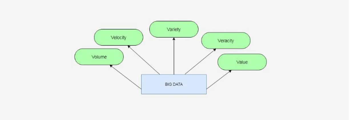
A dataset can be considered as Big Data, if it possesses various characteristics that provide the difference between a "Big Data" and normal data, which are also known as the Five Vs and include volume, velocity, variety, veracity and value.
Figure 1: The Five Vs of Big Data
These characteristics were initially recognized by Douglas Laney (analytics scientist) in an article in which he described the effects on enterprise data warehouses. Moreover, these characteristics prove to be essential for the solution design and for the architecture of the analytic environment. Out of these five, veracity is often overlooked since it deals with uncertain and imprecise data. The main objective is to reach results that would respect the aspects of quality data within a deadline, therefore, achieve optimal value for the enterprise [4].
18
2.1.1.1 Volume
The volume of data is constantly on the rise as its being processed by Big Data solutions. Big data volumes request extremely high amount of data storage and processing, as well as other data properties on a projectual level.
Data sources that can lead to high data volumes are: online transactions, scientific research (Large Hadron Collider and Atacama Large Millimeter/Submillimeter Array telescope), GPS sensors, RFIDs and nowadays the overused social media networks such as Facebook and Twitter [4].
2.1.1.2 Velocity
Represents usually the speed at which data transfer and accumulation can arrive, and this is essential because it can generate huge amount of data on a short period of time. On an enterprise level, this represents the time of data translation as soon as it enters it's perimeter. In order to achieve this, an enterprise must comply with high and efficient requirements. This may not always be the case though, as the velocity depends on the type of data source. Data velocity is not put into perspective about MRI scans as these are not often generated from high-traffic webservers. On the other side, data volume can be easily computed in a given minute for the following aspects: 350,000 tweets, 300 hours of video footage uploaded on YouTube, and 330GBs of sensor data from a jet engine [4].
2.1.1.3 Variety
Refers to different formats and types of data that are supported by Big Data solutions. These characteristics brings into focus data integration, transformation, processing and storage. Examples of data variety can be financial transactions, semi-structured data in the form of emails and unstructured data such as images [4].
19
2.1.1.4 Value
It is one of the most important aspects of Big Data. And it's intuitively related with veracity
in terms of data quality, which holds the key value of an enterprise. Volume is dependent on processing time, because the data analytics can have a shelf-life; for example, a 20-minute delayed stock quote has almost no value in comparison to a quote that is 20 milliseconds old. Overall, value and time are inversely relating i.e. the longer it takes for data to be transformed into useful information, the less value it has for an enterprise [4].
20
2.2
D
ATA
Q
UALITY IN
B
IG
D
ATA
When we say data quality we usually think of data that is errorless, but that is only one part of the equation. In general, the data quality depends on many factors that collectively give evaluation.
In order to be able to understand how each aspect evaluates we must distinguish data quality issues in different categories. Figure 3 shows attributes that describe the data in different aspects in terms of quality.
The first five attributes (Accuracy, Integrity, Consistency, Completeness, and Validity) are intrinsic to the content of the data. That covers data entry errors, misapplied business rules, duplicate records, and missing or incorrect data values. The remaining two attributes (Timeliness and Accessibility) are giving the user understanding of the current data in a timely manner. Of course, this data will be useful only to the ones that are familiar with the business in question [6].
The combination of both categories of attributes can increase the data quality value we can extract out of the data set. The following list describes characteristics of high quality data [6]:
• Complete: All relevant data such as accounts, addresses and relationships for a given customer is linked.
• Accurate: No misspellings, typos, and random abbreviations.
• Available: Required data are accessible on demand; users do not need to search manually for the information.
21
Figure 3: Data Quality Attributes (Source: [6] Data Quality in Big Data: A Review, Int. J. Advance Soft Compu., Vol. 7, No. 3, November 2015)
There are many ways which can lead to data quality problems such as valid, but not correct data, unexpected changes in the design of the system, lack of integrity checks, etc. Due to the poor quality of the data a lot of companies have suffered losses, problems, or costs for assigning new resources. In the figure bellow we can see which problems are most frequently occurring due to poor quality in the data according to a survey done by The Data Warehousing Institute (TDWI) [6].
Figure 4: Problems due data quality (Source: [6] Data Quality in Big Data: A Review, Int. J. Advance Soft Compu., Vol. 7, No. 3, November 2015)
22
2.2.1 Data Quality and Measurement
When we speak of measurement we usually think of taking notes of size, amount, or degree of something by using an instrument. But, in the case of Data Quality we think of a process that lets us compare values to a well-known standard, or in other words, to assess the information and draw a conclusion. This process in the world of experts in the field is called data quality assessment. The main goal of data quality assessment is to identify data errors and to measure impact of data-driven processes. The process can be done on general level concerning a data set but also it can go into detail and regard specific aspects [7].
The main idea behind quality assessment is to understand how the data weights against a company’s expectations. This implies the need also to understand how effectively the data represents the objects and its properties internally.
Professionals in the field of quality are referring to quality dimension as measures used to identify aspects of data that can be evaluated and through which data's quality can be described and quantified. So, it means that the quality of a data source can be analyzed from different perspectives, and on a different level of detail, also referred as granularity level. In other words, it will depend on the set of quality dimensions that we want to use. So, each quality dimension will give indication how good or bad that data object (subset of records selected from the whole data source) is.
There are 179 quality dimensions, but in the interest of the thesis we will focus only on 9 of them, since they are used in the Quality Service of the EU-BRA project. All Data Quality dimensions can be grouped in four categories [8]:
• Intrinsic: the data has a quality on its own. For example, Accuracy is a quality dimension that is intrinsic to data.
• Contextual: highlights the requirement that must be considered within the data source. It must be relevant, timely, complete, and appropriate in terms of amount. • Representational: focuses on aspects related to the quality of data representation • Accessibility: considers the accessibility of the data and its level of security
23
2.2.2 Big Data Architectures
As the world becomes more advanced on information aspects, a major challenge has become how to deal with the amount of data. Fortunately, in parallel the technology of data processing and management has advanced in such a level that can cope with the super-massive scale of information arriving and changing fast. These technologies also demand a new DBAs and developers to manage new type of systems.
It follows an overview of technologies that permit the growth of quality assessment in Big Data.
2.2.2.1 NoSql
Relation databases together with SQL programming language are still the only choice of database technologies for organizations. All the possibilities that are covered by these two now can be replaced and maybe a bunch of new ones can be offered by the evolution of various NoSQL software platforms. Databases support dynamic schema design, scalability and customization. This makes them a perfect fit for Web applications, content management systems and other uses that involve large amounts of data and frequent updates. Said so, NoSQL technologies cover all the issues that have been introduced in Big data [9].
NoSQL databases are centered around the concept of distributed databases where unlike relational databases that are highly structured, here the data can be unstructured and stored across multiple processing nodes, and also often across multiple servers. This allows the databases to be horizontally scalable. This means that if there is more data to be kept in the data base than just add more hardware to keep up and there will be no slowdown in performance [9].
The NoSQL distributed database infrastructure has been the solution to handling some of the biggest data warehouses on the planet – i.e. Google, Amazon, and the CIA.A comparison between the scalability of NoSql database vs Traditional Relational Database can be seen in Figure 5.
24
Figure 5: Scalability of NoSQL vs Traditional RDB (Source: [9] DataJobs.com)
2.2.2.2 Apache Hadoop
The Apache Hadoop library is a framework that can permit processing of large data sets across clusters of multiple nodes using simple programming logics. The idea is to change from the single servers to thousands of nodes so that the framework can detect and handle failures at application layer. This can allow delivering a highly available service on top of a cluster of computers, where each can be prone of failures [10].
The project includes these modules [10]:
• Hadoop Common: The common utilities that support the other Hadoop modules. • Hadoop Distributed File System (HDFS™): A distributed file system that provides
high-throughput access to application data.
• Hadoop YARN: A framework for job scheduling and cluster resource management. • Hadoop MapReduce: A YARN-based system for parallel processing of large data sets.
A crucial part of the Hadoop ecosystem is MapReduce, a computational model that basically takes high data processes and spreads the computation across a big number of servers (generally referred to as a Hadoop cluster). It has been a game-changer in supporting the enormous processing needs of big data; a large data procedure which might take 20 hours of processing time on a centralized relational database system, may only take 3 minutes when
25
distributed across a large Hadoop cluster of commodity servers, all processing in parallel [11].
Figure 6: Map Reduce Architecture (Source: [11] Introduction to the MapReduce Life Cycle)
2.2.2.3 Apache Spark
Apache Spark is a fast, in-memory data processing engine with development APIs to allow workloads that require iterative and fast access to datasets. This sounds like a major coverage of the issues addressed by Big Data. With Spark running on Apache Hadoop YARN, developers can now exploit Spark’s power. In general, The Hadoop YARN-based architecture is providing the foundation that enables Spark to share a common cluster and datasets while the level of service it is about normal processing on small data sets [12].
Apache Spark consists of Spark Core and a set of libraries (see Figure 7). The core is the distributed execution engine and the Java, Scala, and Python APIs offer a platform for distributed ETL application development.
26
Figure 7: Apache Spark Libraries (Source: [12] http://hortonworks.com/apache)
Additional libraries, built on top of the core allow diverse workloads for streaming, SQL, and machine learning.
Spark is designed for data science and its abstraction makes data science easier. Data scientists commonly use machine learning – a set of techniques and algorithms that can learn from data. These algorithms are often iterative, and that is where Spark’s ability to cache the dataset in memory comes handy [13].
Here are the biggest benefits of Apache and a comparison with Hadoop as defined by
Databricks Inc. 1:
• Speed: Engineered from the bottom-up for performance, Spark can be 100x faster than
Hadoop for large scale data processing by exploiting in memory computing and other optimizations. Spark is also fast when data is stored on disk, and currently holds the world record for large-scale on-disk sorting.
27
• Ease of Use: Spark has easy-to-use APIs for operating on large datasets. This includes a
collection of over 100 operators for transforming data and familiar data frame APIs for manipulating semi-structured data.
• A Unified Engine: Spark comes packaged with higher-level libraries, including support
for SQL queries, streaming data, machine learning and graph processing. These standard libraries increase developer productivity and can be seamlessly combined to create complex workflows.
2.3
B
IG
D
ATA
V
ISUALIZATION AND ANALYTICS
Within few years the topic of Big Data affected a lot of industries not only it the IT business. At the beginning the biggest issue was how to store the big amounts of data. Later, organization as companies, governments, and institutions recognized how it can be useful to explore the data and learn more for different aspects regarding their customers, needs, or even new scientific discoveries. Then, we got familiar for the first time with other problems that are rising with the Big Data. It became clear that it is not only about storing, but first capturing the right data through sensors, sharing, and most importantly analyzing it.
As complex it is the processing and analyzing huge sets of data, the output results should be precise and clear so the user can understand how the data can be used. But in fact, this is not always the case. Usually, the output results of an analysis are giving raw data that for the human eye is hard to read. This is a huge issue concerning the fact that companies started investing huge amounts of money but at the end they didn’t know how to use the collected data. So, in order to help the user, Big Data tools started using an old technique in the needs for results exploration - Visualization. With Data Visualization, companies started rendering results after their software finished the execution of processing. In this way the user could catch complex patterns that are hiding behind [14].
There is a huge importance in visualization of output results since the human brain cannot process huge amount of information given in a single report. It is always better to see the data organized in tables or graphs where we can experiment and form slight adjustments, in fact that’s how we will learn more about the data itself.
28
2.3.1 Challenges in visualization
The main goal of data visualization should be clear and concise patterns that describe a result set. With the evolution of the data amount it became impossible for traditional visualization tools to be used. In order to cope with the new era, the main challenge was to render as fast as possible, since no user would want to wait for visualization the same amount of time as for the data processing. Another huge issue was the fact that the data arrives in structured and unstructured forms and it became challenging to cope with two different modules of visualization in the same user interface.
The fact that the data evaluation is done over different aspects of the data object and with different measures of quality says that the visualization must show all this differences in levels. This became also an issue because exploring the data in high detail means a lot of similar information in one place, causing confusion to the user. On the other side, if the level of detail is too low the user is losing important aspects and patterns for decision making [14]. In order to solve the issues and propose faster visualization, companies started proposing a merged architecture. The idea is to process and render the data in the same time. Of course, this will increase the level of parallelism and allow the user exploration over aspects of the data object while the rest is still being evaluated.
2.3.2 Visualization techniques
Visualization approaches should always provide a general overview of the results set. This information can be exported from the software that does the processing, or if needed the visualization tool should provide it to the user with a self-processing of the result set. This is of a huge importance since it is suggested to explore results in iterative manner, from low to high detail. Of course, the visualization service should provide groupings, searching, and custom filtering on the result set as long the results are saved by a recognized standard. There are several methods for visualization. Follows a list of the most used ones [15]:
• Treemap: Used for visualization of hierarchical data. • Circle Packing: Different way of representing hierarchy.
• Sunburst: Polar coordinate system. Used to show similarities between data. • Parallel Coordinates: Allows exploration on multiple data factors
• Streamgraph: Used in representing similarities between data.
• Circular Network Diagram: Line and color used as indicators to show similarities between data
29
2.4
C
ONCLUSION
As Big data continues in growth, for sure all of the mentioned architectures in the likes of NoSQL databases and Hadoop software (in correlation with Spark) – will be central to allowing companies reach full potential with data. Additionally, this rapid advancement of data technology has raised a demand for a new working positions. Of course, the cost of the technology and the talent may not be cheap, but for all of the value that big data is capable of bringing to table, companies are finding that it is a very worthy investment.
Having in mind all the data quality dimension mentioned before, and all the technologies that can help us perform analysis over Big Data there is still a gap in the literature because there is no appropriate method to assess the Quality of Big Data.
Taking part in the EU-BRA project, Politecnico Di Milano proposed a method that will address this issue and regard the Quality of Big Data. The Quality Dimensions are being reinterpreted and redefined based on the type of considered data and new metrics consider the increased complexity generated by the volume, variety and velocity challenges. The proposed method was implemented as Data Quality Service and was tested on data sources offered on the cloud platform of the EU-BRA project. Also, an application that offers user interface was created based on the API’s that the service is providing. All with one purpose, to set up a quality analysis on Big Data which will allow further understandings when it comes to quality analysis as the data grows bigger. The implementation of the proposed model executes the computation of the quality dimensions using the Spark framework that allows to split the computation of the code over several nodes in order to speed up computation time of the quality analysis.
Once the quality service gives the results of the evaluation, in place comes the exploration part. At the current implementation of the Quality Service by BIGSEA the results are exported as a set of JSON files. Here in place comes the goal of this thesis, providing the visualization part in order to help the user in decision making. As we saw in section 2.3, the data visualization in Big Data should be carried with a huge importance. In order to take care of the visualization part this thesis will concentrate on the results exploration with a combination of techniques and user-friendly interface. The idea is to allow iterative exploration starting from lower to higher level in order to prepare the user with general quality results and yet not causing confusion right away with too many details.
In the following chapters we will describe the proposed method for quality analysis and the Quality service in details. This will be of a huge importance to the thesis since all the results are based on its output results. Chapters 4 and 5 will provide detailed information about the ideas and implementations leading to the data exploration tool as a support component of the QS.
30
Chapter3
EU-BRA
D
ATA
Q
UALITY
S
ERVICE
This chapter will go in details through the Data Quality-as-a-Service offered by the EU-Bra BIGSEA project. As stated, the service will be of huge importance of this thesis because the results exploration process is being implemented on top of its evaluations. A specific accent will be given on the Interface that the Quality Service provides in order to
communicate with users/application. This work was proposed by Giacomo Maccagni in the thesis “A method for Raising Quality Awareness in Big Data Analysis” [16].
3.1
EUB
RA
-BIGSEA
P
ROJECT
“EUBra-BIGSEA project aims to develop a cloud platform for Big Data Management and exploitation. It is funded in the third coordinated call Europe – Brazil, focused on the development of advanced QoS services for Big Data applications, demonstrated in the scope of the Massive Connected Societies. The idea of the project is to develop architecture that will predict resource consumption of Big Data Analytics applications in order to pre-allocate and dynamically adjust virtualized infrastructures. It leverages mixed horizontal and vertical elasticity on hybrid container and VM infrastructures to support Data Analytic framework powered by OPHIDIA, COMPSs, and Spark. The integrated technologies should support:
• Fast data analysis over continuous streams • Data mining and machine learning
31
The project is API oriented, which means it is oriented to service and application developers. In order to test the services and in the same time to offer the services the project is being tested in a real user scenario in Curitiba, Brazil.
The Data Quality Service is in charge to provide a quality analysis over a data sources that provide information about GPS location of local buses and ticket usage in the same buses.” 2
3.2
M
ODEL
A
RCHITECTURE OF THE
D
ATA
Q
UALITY
S
ERVICE
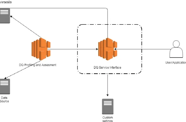
The data quality service provides additional information about the data sources saved on the platform. We can distinguish the information in two groups [16]:
• Data Quality Profiling results related to data that is in the data source, such as value ranges, and uniqueness degree of each attribute and number of represented objects. • Data Quality Assessment results based on the performed quality analysis over the
data source, obtained by evaluating specific data quality dimensions.
So, the Data Quality Service is composed of two modules: Profiling module and Assessment module. The first one executes periodically over the whole data source in order to produce general information. This information is being used as input in the second module. For example, when setting the Quality Dimensions for the analysis, the Assessment module uses the metadata of the first module, so it can know which data types can be used for each quality dimension. In case of adding a new attribute in the data source it is crucial to re-run the Profiling module, so all the information is up to date.
The Assessment module is run on demand of users or applications that specify the details of the quality analysis which is being run on the service. Also, the results of the assessment module are kept as metadata for a further analysis [16].
Follows a figure illustrating the global architecture of the model.
32
Figure 8: Architecture of the Quality Service
The Data Quality Service is in charge to provide a descriptive view of the quality of the sources with the aim to support the analytics applications in understanding which are the relevant and useful data to consider in more advanced analyses. Once the user specifies the sources of interest the Data Quality Service interface visualizes in the Quality Metadata Repository all the general information about the data, which is the number of records contained in the data source, data ranges of values that each attribute can have. After the data source registration phase the user/application sets up a quality analysis over it. The Assessment module also has access to the Quality Metadata Repository, so the service interface will be familiar with any restrictions on the data source (for example, allowed data types for each dimension).
Once the user sets up the quality analysis, all the settings are being saved in the Custom Settings Repository. The purpose is to keep the quality analysis settings for each quality analysis for a possible re computation and modification on the data object or varying values on the dimension set.
33
The quality request set by the user/application is submitted to the Data Quality Assessment module where all the computations specified in the request take place. Once the results are ready they are saved in the Quality Metadata Repository. The quality information of the selected object can let the user be aware of the quality of the input data, so it can be useful to consider in more advanced software’s for statistics and predictions.
To make a brief recap, the Quality Metadata Repository stores metadata both from the results of the Profiling and Assessment Module, and metadata used to define parameters that will be selected using the available interface of the Service.
Parameters are being inserted by the user/app when interacting with the service interface. As far we thought of the user as a professional in the field of data analytics, but the service is also providing an applicable interface for semi-professional users, so it can make the data analysis process more user friendly. For example, the user can select a list of data mining applications in order to set up a quality analysis based on the quality dimensions that the selected data mining application requires. Also, the service is providing an interface where the user can choose from a group of quality dimensions instead of choosing all dimension one by one [16].
3.3
D
ATA
Q
UALITY
S
ERVICE
I
NTERFACE
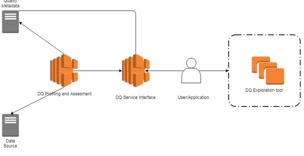
The user interacts with the Data Quality Service Interface using a set of Application Programming Interfaces(API’s). An API allows a user to manipulate resource remotely using communication protocols. The service provides many API’s. Each of them is defining a portion of a quality analysis defined by a user/application. The whole set of communication between the Service and the user is saved into a configuration file. The configuration file keeps all the details of the configuration defined by the user/application and it will be saved in the Custom Settings Repository, from where it is passed to the Data Quality Assessment module [16]. From the figure below, we can also see how an exploration tool would be placed in the architecture, right after the results are returned to the user.
34
Figure 9: Service - User/app communication with User/Application and a DQ exploration tool as a support component
When making a quality analysis over a data source the user/app should enter information about the part of the source that is going to be exploited. This is the process of selecting a Data Object of interest and it forms one of the two main nodes of the service: Data Object Identification Module. Depending on the level of granularity the user is interested to explore, there are three submodules of parameters that are composing this module [16]:
• Data Source Selection Module: selection of a data source (for example it can be the one that keeps track of the BusGPS, or the other with User-ticket information)
• Data Attribute Selection Module: selecting attributes of interest from the data source (for example we can select the code number of the bus only)
• Data Value Selection Module: selecting data values for each of the selected attributes. We can either select a range of values, or specify which values exactly are in our interest.
35
The module where the service offers the user an interface to select the quality dimensions that will be computed over the previously defined object is Quality Dimension Identification Module. It is composed of four other submodules that will help user either professionals or not to set up a quality analysis. The submodules are the following one [16]:
• Automatic Dimension Identification Interface: it is mainly used by the unexperienced data analysts that want to perform a quality testing on the data source, but they don’t have deeper knowledge in the quality dimensions.
• Focus Category Dimension Identification Interface: Used to set up a quality analysis by selecting a group of dimensions. So, the user has to choose one of the predefined groups which the service determines by reading the profiling data from the Quality Metadata Repository.
• Data Mining Dimension Identification Interface: It proposes to the user a set of data mining applications. If the user knows which data mining application is going to use afterwards than it is a good idea to choose this option.
• Custom Dimension Identification Interface: It is used in the case when the user manually enters each quality dimension that will be computed over the data object. This is mostly used by data analysis professionals.
3.3.1 Data Object Identification
The process of selecting the data object has a big importance for the data analysts because it helps them understand interesting information about the whole data source, and usually that’s why the data quality analysis is being re computed many times. If there is no selected portion of interest the whole data object is selected automatically, but this can be risky since the results of the analysis can return an unexpected value which can cause confusion. When interacting with the Data Quality Interface, the user/application can define the data object in three granularities [16]:
• Source schema selection - The user is obligated to select the source of interest, because without any source the quality analysis cannot continue. Or, alternatively it is also possible to select more than one data source, in a case the user wants to compare the results over the same quality analysis.
36
• Attribute schema selection - For each data source there is a set of attributes that can be selected by the user. Also, the user is allowed to select multiple attributes of the data source. This will help to gather more knowledge for the data source. This is a crucial process when building the configuration file because the service can check the metadata of the Profiling module and get to know which dimensions can be computed over the selected attributes.
• Value schema selection - The set of attributes selected in the Attribute Schema Selection allows the user to select values for each of them. Without any attribute selected it is not possible to select values, and the quality analysis will be done only on data source level.
There are two possible way to select values. One way is to select a set of values which we are familiar with and we want to observe all quality dimension only on them. The second way is to select a range of values.
3.3.2 Quality Dimension Identification
After selecting the data object of interest in the first module, the Data Quality Service provides interface for selecting the Quality Dimension Identification node. This is the most important module since it shapes the quality analysis the user wants to perform over the data object. Each of the selected submodules in a combination with the previously selected Data Object, gives a different quality analysis results [16].
The identification of quality dimension and theirs level of granularity can differ from user to user, because some of them are more skilled than the others. So, the interface provides step by step dimension identification. The four submodules of the interface are grouped in two groups (se Figure 10).
37
Figure 10: Quality Dimension Identification (Source: [16] Giacomo Maccagni, “A method for Raising Quality Awareness in Big Data Analysis”, 2016)
3.3.2.1 Automatic Interfaces
Assuming the user that performs the analysis is not skilled and it is only interested in some generic quality indicators about the data object that was firstly selected. With the selection of the automatic interface the user is helped for the setup of the quality dimensions [16].
• Automatic Dimension Identification: Knowing the attribute that the user previously selected, the data quality service will infer all the available dimensions that can be set to make an analysis. There is need of some metadata parameters of level 2, but in this case, they are already stated by the administration. The level of granularity in which the user can explore the results is the lowest one. It means that the quality dimensions will refer only to the data source.
• Data Mining Dimension Identification: The user chooses a data mining application that will be run over the data object. There are three levels of granularity on which the selected data object can be analyzed, from which the user has to choose only one level of detail on which the quality analysis will be computed.
If the level of detail is “low” it means that each quality dimension will be computed over the data object without giving any attribute quality indicators.
If the level of detail is “medium” it means that the service will produce a quality evaluation over each attribute of the selected data object.
Leve of detail “high” means that the service will produce quality evaluation for each value of the selected attributes from the data object.
38
3.3.2.2 Manual Interfaces
Assuming the user that performs the quality is an experienced one. The interface offers two possibilities [16]:
• Focus Category Dimension Identification: it is an interface that offers to simplify the setting up of the quality dimensions. Basically, all the dimension are grouped in categories where they have something in common. Each group contains dimensions that are exploiting the same aspect of a data object. The metadata of level 2 Is automatically set by the model.
• Custom Dimension Identification: In this interface the user specifies all the quality dimension on its own, supposing that is an expert and knows which aspect of the data source will be compute by each dimension. In case that some of the quality dimensions require an additional parameter, the user has to provide it on its own (for example the user has to define volatility when choosing timeliness as a quality dimension).
In both manual interfaces the user is required to specify the level of detail on which each quality dimension will process the analysis (global, attribute, value).
3.4
D
ATA
Q
UALITY
S
ERVICE
I
MPLEMENTATION
In this section we can see how the architecture of the proposed method for a Data Quality Service was implemented, which technologies were used, and API communication with user/app.
3.4.1 Selection of Dimensions
The quality evaluation of a data object can be performed over many quality dimensions. The Data Quality Service implements 9 dimensions [16]:
39
3.4.1.1 Accuracy
It is defined as a closeness between a data value V and a data value V0. Basically, it is the ratio between the two values, letting us know how close is the data value of exploration to the one that is considered as a real-life phenomenon. Returns two indicators:
• Static Accuracy: if a value is in the admirable interval or not
• Dynamic Accuracy: Represents how the value is close with respect to the mean It is represented as a linear value ranging from 0 to 1.
Granularities: global, attribute, value Allowed data type: float
3.4.1.2 Completeness
It is used to estimate how many items in the data collection are included in the expected item set. This dimension can be viewed from many perspectives and levels of detail which leads to different dimension metrics:
• Completeness Missing: measuring the number of missing/or present values in a data set
It is represented as a linear value ranging from 0 to 1.
Granularities: global, attribute, value Allowed data types: float, string, datetime
• Frequency Completeness: derived as a ratio between effective frequency of a value Vi measured over the data object represented by parameter Fi, and expected frequency of a value Vi over the data object represented by Hi
It is represented as a linear value ranging from 0 to 1
Granularities: global, attribute, value Allowed data types: datetime
• Population Completeness: defining how many instances of the data source are included in the data object. If all instances are present, the Completeness population value is 1. Otherwise, the value can be between 0 and 1.
Granularity: attribute
40
3.4.1.3 Consistency
It is a metric that helps the user to understand if there is a logical association between records of the selected data object. It is calculated with the following ratio:
𝐶𝑜𝑛𝑠𝑖𝑠𝑡𝑒𝑛𝑐𝑦 = 1 − 𝐶𝑜𝑛𝑠𝑖𝑠𝑡𝑒𝑛𝑐𝑦𝑉𝑖𝑜𝑙𝑎𝑡𝑖𝑜𝑛𝑠 𝑇𝑜𝑡𝑎𝑙 𝐶𝑜𝑛𝑠𝑖𝑠𝑛𝑡𝑒𝑐𝑦 𝑅𝑢𝑙𝑒𝑠⁄
It is represented as a linear value ranging from 0 to 1
Granularities: attribute, value Allowed data types: all
3.4.1.4 Precision
It is defined as the degree to which repeated measurements show the same or similar results, and it means that all the values should be equally distributed
and not too distant between each other. Returns three output data related to the analyzed value:
• Precision of the value: how the aggregated values are close to each other • Association mean of the values
• Standard deviation: In the literature the standard deviation is often used to assess the dispersion of the data, leaving the interpretation of the obtained value to the application or user that requested the analysis, but in order to access the Precision dimension of an entire source, a value between 0 and 1 is returned.
Granularities: global, attribute, value Allowed data types: float
3.4.1.5 Timeliness
It is defined as “how current the data in the data source is”. Of course, it can be derived if only we have information when the data was created. It is calculated with the following ratio:
𝑇𝑖𝑚𝑒𝑙𝑖𝑛𝑒𝑠𝑠 = max (0.1 − 𝐶𝑢𝑟𝑟𝑒𝑛𝑐𝑦 𝑉𝑜𝑙𝑎𝑡𝑖𝑙𝑖𝑡𝑦⁄ )
Where, the currency is defined as deliveryTime – inputTime in which the first refers to when the data is delivered to the user, and the second refers to when the data is received by the system. Volatility gives information for how long the data is usable.
41
It is represented as a linear value ranging from 0 to 1
Granularities: global, attribute, value Allowed data types: timestamp
3.4.1.6 Distinctness
Used in defining how much records in the data is unique. It can be calculated over the whole data source, attributes, or for each value. It is calculated by removing duplicate elements. It is represented as a linear value ranging from 0 to 1
Granularities: global, attribute Allowed data types: float, string
3.4.1.7 Volume
It is defined as “number of instances in a selected data object”. So, basically it represents count of each record that forms the data object from the data source. In example if our data source keeps names of users, by performing quality analysis with Volume as a measurement dimension we can get the count for each name in the data source.
It is represented as a linear value ranging from 0 to 1
Granularities: global, value Allowed data types: float, string
42
3.4.2 Data Quality Service Interface Implementation
The Data Quality Service Interface is implemented as a collection of API’s. The service is developed using Jersey RESTful Web Services. The framework itself is open source, production quality, framework for developing RESTful Web Services in Java.
There are two types of resources offered by the service, one to define the data object and another to set up the quality analysis. Each of the resources is defined with an URI. Using HTTP, the request can be GET, POST, PUT, and DELETE. The responses to the API can be in XML, HTML, or JSON format [15].
3.5 Conclusion
The proposed Data Quality as a Service Module took place in the EUBra-BIGSEA project. The Profiling and the Assessment module are scalable because are developed using a Spark code. They are being executed over a number of nodes depending on the volume of the object and with there is a big save done concerning processing and time of execution.
It found good acceptance because not only it offers a data quality over Big Data, but proposes a redefinition of quality dimension, and also helps users that are not professionals. It is an adaptive model because for each change of the data object the quality analysis will change. To capture the characteristic of a data object we must explore the results of the quality analysis. As the final step of the quality analysis it is crucial to understand the results, so we can proceed by performing a preprocessing task before making available the data object, or in the other case to make another analysis quality that is more focused on a specific aspect of the data object. We can improve the results obtained of the analysis by changing the data object (for example we are interested only in one attribute, or in other case we want to limit values on some of the attributes), or set up different quality dimension to evaluate the same data object.
By varying the quality dimensions, we can also even change the level of detail we want the analysis to take place on. This will make the quality of the results to increase.
In the next chapter we will go in detail over a proposed data exploration tool that helps the users examining the produced results as a support component of the EU-Bra Data Quality Service.
43
Chapter 4
A
METHODOLOGY FOR QUALITY
RESULTS EXPLORATION
The core of the thesis will be a proposition and implementation of a model that will act as a support component (User Interface) of the Quality Service by BIGSEA. The main task on which this model will be concentrated is exploration and guidance over the results that arrive after a quality analysis performed on the Quality Service.
This is probably the most important part of a quality analysis because the user needs to make a final decision if the data quality scores are good enough to be used in next computations and statistics software’s, or the data should pertain a new quality analysis with modified settings. In order to help the user with decision making and save future and unnecessary re-processing tasks on the Quality Service we propose our method in this thesis.
In this chapter we will discuss main ideas and decisions that are behind the thesis. First in 4.1 we will briefly introduce the model and approach in its creation. In section 4.2 we will narrow down the need for a data exploration tool as a support component of the Data Quality Service and application tools depending on the service. Then, in 4.3, we will concentrate on the model’s architecture.
44
4.1
D
ATA
Q
UALITY
E
XPLORATION TOOL AS A SUPPORT
COMPONENT OF THE QUALITY SERVICE
-
M
ODEL
D
ESCRIPTIO
n
The results of a data quality analysis can be improved varying two things: the data object of interest, and the configuration applied to the quality dimensions offered by the service. The group of quality dimension on which a user wants to perform an analysis can always be manipulated, as it is possible to select the level of details on each of these dimensions. As stated in Chapter 3, the configuration of the service allows the user to manually pick quality dimensions and their level of detail. By detail we mean the granularity level with which the quality dimension will produce an indicator of quality about the data object. This change in granularity level can lead to improved or worsened results.
The re-definition of the data object also leads to variation of the quality results since each aspect of the data source can be evaluated over set of dimensions. Having in mind these two factors that are shaping the quality analysis we must be able to understand how they work together and which aspects of the results are affecting. With that the need of a data quality exploration tool emerged.
4.1.1 Restrictions
To be able to explore results of different aspects of the data source first we must be sure the configuration of the quality analysis allows that. The selection of the data object will change also the possibilities of exploration that our model can propose to the user. For example, if the analysis was done only on attribute CODLINHA, of course it wouldn’t be possible the explore different aspects of the data set.
A core part of the configuration of a quality analysis covers the selection of quality dimensions. Each quality analysis permits a level of detail over which the selected dimensions are computed. As a recap from chapter 3 follows the list with granularity (detail) levels on the dimensions:
• Low – evaluates the dimension globally in respect to the whole data source • Medium – evaluates the dimension both over the data set and each attribute
selected
• High – evaluates the dimension on the data set, each attribute and value selected
45
Clearly, the explorations that the model could allow would be possible only on the granularity levels selected in the configuration. Note that if the user selected the dimensions automatically the model will allow inspection of the results only on global granularity level.
4.1.2 Ideas and discussions
The proposed model will be built over the correlation between data object and quality measures configuration. The idea is to divide the level of detail in a way that the user can see how the quality dimensions are performing for different aspects of the data object. It can be the case where some dimensions are giving low scores when evaluated over the lowest detail level (global), but when observing attribute level of granularity, we see that the reason is that one of the attributes caused this low score in the first place. Also, it can happen that some dimension scores over an attribute are showing low scores, but when inspecting value level of granularity, we can see that the reason is that only few of the records performed bad and that affected the score in the first place.
Beside the division on levels of granularity, in the user interest is to know how a group, or single records of an attribute are performing in comparison with the rest. This taking place in our model can save the user from making another quality analysis just on few records from the data set. Last, but not least, a custom filtering over the records of a data source against selection of quality dimensions can be a huge plus for the user in terms of time and processing power.
As we can see the usefulness of the model finds it place in two categories: guided tool for newcomers and conductive support of the QoS. In the following sections we will give further details about the features and practical usage of the model proposed.
![Figure 2: Illustration of the Vs of big data (Source: [5] Information Catalyst for Enterprise (ICE))](https://thumb-eu.123doks.com/thumbv2/123dokorg/7497853.104288/19.918.114.791.369.706/figure-illustration-data-source-information-catalyst-enterprise-ice.webp)
![Figure 3: Data Quality Attributes (Source: [6] Data Quality in Big Data: A Review, Int](https://thumb-eu.123doks.com/thumbv2/123dokorg/7497853.104288/21.918.279.637.110.449/figure-data-quality-attributes-source-data-quality-review.webp)
![Figure 5: Scalability of NoSQL vs Traditional RDB (Source: [9] DataJobs.com)](https://thumb-eu.123doks.com/thumbv2/123dokorg/7497853.104288/24.918.218.703.101.401/figure-scalability-nosql-traditional-rdb-source-datajobs-com.webp)
![Figure 6: Map Reduce Architecture (Source: [11] Introduction to the MapReduce Life Cycle)](https://thumb-eu.123doks.com/thumbv2/123dokorg/7497853.104288/25.918.218.704.264.526/figure-reduce-architecture-source-introduction-mapreduce-life-cycle.webp)
![Figure 7: Apache Spark Libraries (Source: [12] http://hortonworks.com/apache)](https://thumb-eu.123doks.com/thumbv2/123dokorg/7497853.104288/26.918.238.683.111.483/figure-apache-spark-libraries-source-http-hortonworks-apache.webp)

![Figure 10: Quality Dimension Identification (Source: [16] Giacomo Maccagni, “A method for Raising Quality Awareness in Big Data Analysis”, 2016)](https://thumb-eu.123doks.com/thumbv2/123dokorg/7497853.104288/37.918.139.782.117.424/quality-dimension-identification-giacomo-maccagni-raising-awareness-analysis.webp)