Dipartimento di Scienze Aziendali - Management & Innovation System
Dottorato di Ricerca in Management and Information Technology
Curriculum Informatica, Sistemi Informativi e Tecnologie del Software
XVI Ciclo
Ph.D. Thesis
Information Visualization:
from Petroglyphs to CoDe Graphs
Candidate Dr. Paola de Roberto
Coordinator Tutor
Prof. Andrea De Lucia Prof. Genoveffa Tortora
Data visualization concerns the communication of data through visual representations and techniques. It aims at enhancing perception and support data-driven decision making so enabling insights otherwise hard to achieve. A good visualization of data makes it possible to identify patterns and enables better understanding of phenomena. In other words, data visualization is related to an innate human ability to quickly comprehend, discern and convert patterns into useful and usable information.
Humans have used visual graphical representations as early as 35.000 B.C., through cave drawings. Indeed, human ancestors already reasoned in terms of models or schemata: the visual representation of information is an ancient concept, as witnessed by the rock carvings found. Over the centuries, information visualization has evolved to take into account the changing human needs and its use has become more and more conscious. The first data visualization techniques have been developed to observe and represent physical quantities, geography and celestial positions. Successively, the combined use of euclidean geometry and algebra improved accuracy and complexity of information representation, in different fields, such as astronomy, physics and engineering. Finally, in the last century most modern forms of data representations were invented: starting from charts, histograms, and graphs up to high dimensional data, and dynamic and interactive visualizations of temporal data [41].
Nowadays, the huge amount of information enables more precise interpretation of phe-nomena so fostering the adoption of infographic techniques, in particular, for supporting managerial decision-making in the business area.
Actually, data visualization represents the heart of Business Analytics, which needs to
intuitive description of phenomena.
Information visualization uses visual reports which can be considered sentences of a proper visual language in a given specific domain. Then, there exists the need to examine and to address the main issues related to visual languages and information visualization in different domains: i) through the analysis and the interpretation of visual information; ii) by investigating the use of information modeling and the representation techniques needed to design and implement User-Centered decision support systems.
In the first part of the thesis, we propose a Visual Analytics system applied to the archaeological area; this system supports rupestrian archaeologists in the analysis and classification of thousands of reliefs and artifacts; each artifact contains different engrav-ings, often called petroglyphs.
Rock art is a term coined in archeology for indicating any human made markings carved on natural stone [19,65]. The most part of the symbols concerning rock art are represented by petroglyphs, which were created by removing part of a rock surface by incising, picking, carving, and abrading. Although it is not possible to give certain interpretations to these petroglyphs, archaeologists have proposed many theories to explain their meaning, e.g., astronomical, cultural, or religious [105]. To this aim, we presents a visual analytics system, named DARK, for supporting rock art archaeologists in exploring repositories of rock art scenes each consisting of hundreds of petroglyphs carved by ancient people on rocks. With their increasing complexity, analyzing these repositories of heterogeneous information has become a major task and challenge for rock art archaeologists. DARK combines visualization techniques with fuzzy-based analysis of rock art scenes to infer information crucial for the correct interpretation of the scenes. Moreover, the DARK views allow archaeologists to validate their hypothesis against the information stored in the repository. In addition, we describe and detail the main features of the PetroSketch mobile application for supporting archaeologists in the classification and recognition of petroglyph symbols. PetroSketch is a virtual notebook enabling users to draw a petroglyph symbol on a white page, or by following the contour of a symbol captured with the camera, and to obtain its classification and the list of symbols more similar to it. The latter is performed by
using a distance, derived from the image deformation model, which is computationally efficient and robust to local distortions.
In the second part of the thesis, we focus our attention on investigating the data visualization problem in the area of Business Analytics. In this context, the visual report of information extracted from data sources and in particular from data warehouses is faced. Visualization tools play a central role in contexts where information must be represented by preserving both the accuracy of data, and the complexity of relationships between data. Much attention has been paid to the problem of effective visualization of data in individual reports that usually are viewed through different types of standard graph (histogram, bar-plots, etc.) or in a tabular form. However, this kind of representation provides separate information items, but gives no support to visualize their relationships, which are the basis for most decision processes. Indeed, decision makers spend significant time and effort interpreting graphics derived from large multidimensional databases. Then, the choice of a graphical representation is critical whenever it is necessary to interpret data. Data are usually represented by several dashboard diagrams, such as histograms and pies, which do not highlight logical relationships among them.
The CoDe (Complexity Design) language allows to organize visualizations, named CoDe Graphs, by composing and aggregating dashboard diagrams through graphical conceptual links. The CoDe-based graph composition modeling allows to visualize relationships be-tween information in the same image following the definition of efficiency of a visualization given by Jacques Bertin [9]: "The most efficient (graphic) construction are those in which any question, whatever its type and level, can be answered in a single instant of perception, that is, in a single image". This representation named CoDe model can be considered a high-level cognitive map of the complex information underlying the ground data. The choice of the final visualization layout in terms of standard graphs is left to a visualization interface which provides the necessary implementation constructs.
The application of the CoDe methodology impacts principally on the Business Ana-lytics field where the knowledge, management and analysis of company data (e.g., sales, production, costs and profits) are fundamental requirements for a valid decision-making
ity and survival of business companies. In addition, CoDe is an alternative graphic model for the representation of data that reduces the gap between the data warehouse expert and company management. Indeed, CoDe allows to select the information of interest, to model the relationships between them and to automatically generate the diagrams containing this information linked through the relationships identified. To this aim, we presents the generation process of CoDe Graphs, and after analyzing the state of the art concerning the evaluation of graphical representation comprehensibility, we first propose a classification of that evaluation approaches and then perform the evaluation of the comprehensibility of CoDe Graphs with respect to dashboard reports by means of a controlled experiment, involving 47 participants. Results show that CoDe Graphs reduces participants’ effort, while improving effectiveness and efficiency when a comprehension task is performed, so witnessing the usefulness of the CoDe methodology.
Firstly, I would like to express my sincere gratitude to my tutor Prof. Genny Tortora for her continuous support, patience, motivation, and immense knowledge. Her guidance helped me pursue my research goals. I could not imagine having a better tutor and mentor for my Ph.D studies.
Moreover, I would like to thank Prof. Michele Risi for his precious assistance and expertise.
Last but not the least, I would like to thank my family for supporting me spiritually throughout this period of my life.
Abstract v
Acknowledgements ix
Contents xi
1 Introduction 1
2 Visualization of Archaeological Information 7
2.1 Rock Art . . . 9
2.2 Image Processing of Petroglyphs . . . 9
3 A Visual Analytics System for Rock Art Knowledge Discovery 11 3.1 Digital Preservation of Rock Art . . . 12
3.2 The DARK System . . . 13
3.2.1 Structural and Semantic Abstraction through Bubble View . . . 15
3.2.2 Scene Spatial Analysis using Ring View . . . 16
4 Classification and Recognition of Petroglyphs 23 4.1 Rock Art . . . 24
4.2 An Approach for Petroglyph Classification . . . 25
4.2.1 Shape Normalization . . . 26
4.2.2 Feature Set . . . 26
4.2.3 Classification . . . 27
4.3 PetroSketch . . . 29
4.4 The Experiment . . . 31
4.4.1 Settings . . . 32
4.4.2 Results . . . 32
4.4.3 Discussion . . . 33
5 Visualizing Information in Data Warehouses Reports 35 5.1 Evaluation of Graphical Representations . . . 37
6 Complex Graphs generated by the CoDe Methodology 43 6.1 Modeling and Generation of CoDe Graphs . . . 43
6.1.1 Code Models and CoDe Graphs . . . 44
6.1.2 Conceptual Organization of Report Visualization: the CoDe Paradigm 49 6.1.3 Generating CoDe Graphs . . . 56
7 User Comprehension of CoDe Graph Reports 61 7.1 Definition and Planning of the Empirical Evaluation . . . 61
7.1.1 Context Selection . . . 62
7.1.2 Variable Selection . . . 63
7.1.3 Hypothesis Formulation . . . 65
7.1.4 Experiment Design, Material, and Procedure . . . 66
7.1.5 Analysis Procedure . . . 68
7.1.6 Threats to Validity . . . 69
7.2 Results of the Empirical Evaluation . . . 73
7.2.1 Hypotheses Testing . . . 74
7.2.2 Analysis of Co-factors . . . 75
7.2.3 Post-Experiment Results . . . 75
7.2.4 Implications . . . 76
8 Conclusions and Future Works 79
Introduction
Data visualization concerns the communication of data through visual representations and techniques. It aims at enhancing perception and support data-driven decision making so enabling insights otherwise hard to achieve. A good visualization of data makes it possible to identify patterns and enables better understanding of phenomena. In other words, data visualization is related to an innate human ability to quickly comprehend, discern and convert patterns into useful and usable information.
Nowadays, the huge amount of information enables more precise interpretation of con-sidered phenomena so fostering the adoption of infographic techniques, in particular, for supporting managerial decision-making in the business area. Moreover, data visualization represents the heart of Business Analytics, which needs to transform a large amount of complex data into comprehensible information for the most intuitive description of these phenomena.
Information visualization uses visual reports which can be considered sentences of a proper visual language in a given specific domain. Then, there exists the need to examine and to address the main issues related to visual languages and information visualization in different domains: i) through the analysis and the interpretation of visual information; ii) by investigating the use of information modeling and the representation techniques needed to design and implement User-Centered decision support systems.
In the first part of the thesis, we propose a Visual Analytics system applied to the archaeological area; this system supports rupestrian archaeologists in the analysis and
(a) (b) (c)
Figure 1.1: The picture of a petroglyph supposed to represent a Christ (a) [11], a picture interpreted as the stellar cluster of the Pleiades (b) [36], and the relief depicting priests making water spout from the rock (c) [27].
classification of thousands of reliefs and artifacts; each artifact contains different engrav-ings, often called petroglyphs.
Rock art is a term coined in archaeology for indicating any human made markings carved on natural stone [19,65]. The most part of the symbols concerning rock art are rep-resented by petroglyphs, which were created by removing part of a rock surface by incising, picking, carving, and abrading. Although it is not possible to give certain interpretations to these petroglyphs, archaeologists have proposed many theories to explain their meaning, e.g., astronomical, cultural, or religious [105]. For example, Figures 1.1(a) and 1.1(b) show the pictures of two petroglyphs interpreted as a Christ [11] and the stellar cluster of the Pleiades [36], respectively, while Figure 1.1(c) depicts a digitalized relief interpreted as a priest making water spout from the water basin [27].
Petroglyphs are engravings obtained by hitting or scraping stone surfaces with sharp tools made of stone or metal. These symbols were used by prehistoric people to commu-nicate with their divinity or with other men. Basically, we find these carvings as a set of symbols called scenes, which depicts daily life situations. Therefore, the study of the petroglyphs is very important to gain new knowledge and awareness about the periods in which the petroglyphs were created.
Petroglyphs are prehistoric stone engravings unrevealing stories of ancient life and describing a conception of the world transmitted till today. Although they may seem
as durable as the rock they reside on, petroglyphs are inevitably deteriorated by natural causes as well as vandalism. As an example, some of them have been destroyed by tourists, while others are disappearing due to acid rain and sunshine. Hence, it is very important to preserve the petroglyphs trying to identify and archive them for future generations.
In the second part of the thesis, we focus our attention on investigating the data visualization problem in the area of Business Analytics. In this context, the visual report of information extracted from data sources and in particular from data warehouses is faced. During the history, information visualization has evolved starting from visualization techniques developed to observe and represent physical quantities, geography and celestial positions up to the definition of dynamic and interactive techniques to visualize multi-dimensional data, abstract data, and temporal data [41]. To this aim, many techniques have been introduced and used in the centuries. The techniques, currently used, have their origin in the proposal of William Playfair. In 1786, he introduced the first line graph; since then bar, line and pie graphs (also called charts) have been largely adopted in day-by-day activities [78]. Such large use of graphical representations is motivated by the effective support they provide to a quick understanding of data and of the phenomena they de-scribe. Indeed, they ease the communication process among managers and stakeholders, and support decision making [85].
Several visualization tools, such as Spotfire [91] and Tableau [94], support the repre-sentation of data extracted by data-warehouses through different graphs that contribute to the description of a single phenomenon. The comprehension of the phenomenon in its completeness is left to the user that has to understand it by relating the information rep-resented in each graph. Generally, managers acquire information in the form of a digital dashboard, which displays graphs of key performance indicators on a single screen [63]; they spend significant time and effort to make decisions, by interpreting graphics derived from large multidimensional databases.
Data can be reported by using interactive tools [38, 80, 86, 94] or through graphical printed reports [1, 83, 96, 104]), where "the static representation shows the entire story and gives context" [37]. Static representations highlight data relationships among charts. Following Jaques Bertin, one of the most influential theorists in the field of graphic design semiotics: "the most efficient (graphic) constructions are those in which any question, whatever its type and level, can be answered in a single instant of perception, that is, in a
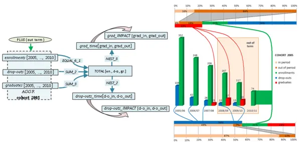
Figure 1.2: A CoDe model and the generated CoDe Graph.
single image." [10].
A graphical report could be designed based on metadata and independently of specific data instances and chart types, so that the execution of such a graphical model could generate the correct graphical instance, once specific data instances and chart types have been selected. As data change, the same graphical model can be re-executed so generating an updated report with the same semantics on the new data.
The Complexity Design (CoDe) methodology provides a technique to model graphical reports on data extracted by a data-warehouse [82,83]. This graphical model, named CoDe model, enables users to describe the semantics of a graphical representation independently of specific instances of data, similarly to programs, which implement algorithms (inde-pendently of the specific data provided as input). The execution of a CoDe model could generate the correct graphical instance, once specific data instances and chart types have been selected. As data change, the same CoDe model can be re-executed so generating an updated report with the same semantics on the new data.
Graphical representations involving one or more graph types (e.g., pie-chart, bar-chart or histogram) can be obtained: CoDe models enable users to generate CoDe Graphs, which integrate different dashboard charts with conceptual links, as shown in Figure 1.2.
The CoDe Graph Generator tool interprets a CoDe model and automatically generates the corresponding CoDe Graph.
In the following, we provide a detailed description of the thesis content and how it has been organized into two main parts. In the first part, the chapters are organized as follows: In Chapter 1, we describe the main contexts related to the research activities. In particular, we outlined the principal aspects concerning the Rock art and petroglyphs, and successively data visualization and report modeling and generation.
In Chapter 2, we outline related work concerning visualization of archaeological infor-mation and image processing of Petroglyphs.
In Chapter 3, we discuss the importance of visual analytics systems and the interactive visual analysis process in the Rock art domain. In particular, we present a visual analytics system, named DARK, for supporting rock art archaeologists in exploring repositories of rock art scenes each consisting of hundreds of petroglyphs carved by ancient people on rocks. DARK combines visualization techniques with fuzzy-based analysis of rock art scenes to infer information crucial for the correct interpretation of the scenes.
In Chapter 4, we propose and describe a petroglyph classification methodology based on the Image Distorsion Model, and then we introduce the tool PetroSketch for supporting archaeologists in the classification and recognition of petroglyph symbols. PetroSketch is a virtual notebook enabling users to draw a petroglyph symbol on a white page, or by following the contour of a symbol captured with the camera, and to obtain its classification and the list of symbols more similar to it. The latter is performed by a flexible image matching algorithm that measures the similarity between petroglyph by using a distance, derived from the image deformation model, which is computationally efficient and robust to local distortions.
The second part of the thesis is organized as follows:
In Chapter 5, we discuss the related work about the representation of information ex-tracted from data warehouses and then the evaluation techniques adopted for the compre-hension of graphical reports. To this aim, we analyzed state of art approaches concerning the evaluation of graph representation in terms of comprehension. We extracted and then classified them in order to evaluate the comprehensibility of CoDe Graphs with respect to dashboard reports.
In Chapter 6, we outline the methodology based on the Complexity Design (CoDe) modeling to conceptually organize visualizations of data warehouse reports. In particular, the CoDe methodology provides a technique to model graphical reports on data extracted
by a data-warehouse. Indeed, a CoDe model enables users to describe the semantics of a graphical representation by abstracting from the specific instances of data, similarly to how a program abstracts from a specific assignment of values to the input data. Moreover, we illustrate the syntax and semantics of the CoDe visual language. In particular, in Section 6.1, we describe the main concepts of CoDe Graphs and present the CoDe Graph Generator tool for generating them.
In Chapter 7, we discuss the evaluation of CoDe Graphs comprehension through an empirical evaluation. In particular, we detail the design and planning of the controlled experiment in Section 7.1. To this aim, we assessed user comprehension by evaluating the Effectiveness (i.e., the correctness and completeness in the comprehension of a phe-nomenon), the Effort (i.e., the time required to comprehend the phephe-nomenon), and the Efficiency (i.e., the ability to effectively comprehend the phenomenon without wasting time). Moreover, in Section 7.2, we summarizes the experiment results and discuss their practical implications, together with possible threats that may affect the validity of our study.
Final remarks and future research directions about information visualization are dis-cussed in Chapter 8.
Visualization of Archaeological Information
Cultural heritage studies are basically analytical in nature and involve several disciplines, each providing a different contribution. Although the systematic study and analysis is a desirable requirement, in practice most of them are subjective and based on personal observations and impressions. In the recent years some works have been carried out to automate the analysis and reasoning activities. As an example, the site geographical rep-resentation can assist archaeologists to interpret data and formulate new theories [21]. GIS tools have been equipped with increasing capabilities and employed for decision support applications [101], analytical and modeling applications [28, 62], and even, used in ar-chaeological research for analysis and reasoning activities [68]. The GIS spatial analytical application presented in [106] allows domain experts to investigate the potential extent of a habitat/environment through the analysis of a series of maps, graphs, and tabular data. The geovisual analytics environment presented in [50] exploits the space time cube to investigate the relationships between sites and artifacts discovered at various sites in order to understand the interaction between cultures. The space time cube is a GIS based implementation of Hägerstrand’s original Spacetime Aquarium, which allows to represent the three main components of spatio-temporal data, namely when, where, and what. The space time cube visualizes the space time archaeological data and provides interactive filtering and sorting functions that can be applied to clarify patterns and relationships hidden in the data. They also present the preliminary results on the development of functions for archaeological investigation within a geovisual analytics environment.
The Cyber-Archaeology project is focused on developing technologies and tools for the documentation of cultural heritage [52]. A central component of Cyber-Archaeology is
a visual analytics system that supports the collaborative analysis of multispectral data spanning the broad scales of time (temporal) and space (spatial). This system can also be used to guide the knowledge discovery process and unlock the underlying meaning of an artifact, while determining if the artifact needs to be monitored or requires any type of intervention.
Inkpen et al. proposed a protocol based on GIS to monitor stone degradation [54]. The proposed system integrates images from different time periods and different sites to yield useful information.
In [25] visual analytics has been used to facilitate the interpretation of multi-temporal thermographic imagery for the purpose of restoration of cultural heritage. The proposed visual environment allows to explore thermographic data from the unifying spatiotempo-ral perspective aiming to detect spatial and spatiotempospatiotempo-ral patterns that could provide information about the structure and the level of decay of the material.
Vis4Heritage is a visual analytics framework for discovering wall painting degrada-tion patterns [109]. The framework provides users with a set of analytic and hypothesis verification tools to support the multi-resolution degradation analysis.
In the context of the IndianaMAS project, Deufemia et al. [33] presented Indiana Finder, a visual analytic system supporting the interpretation of new archaeological find-ings, the detection of interpretation anomalies, and the discovery of new insights. The approach introduced a data view based on ring charts and an interpretation summary view based on 3D maps.
To the best of our knowledge, no specific approach has been developed for supporting archaeologists to discover new relationships between petroglyphs. The most related idea is proposed in [100] where authors introduced ArchMatrix, a visual interactive system that supports archaeologists in archiving, managing and studying the findings collected during archaeological excavations. The system implements the Harris Matrix method, used to describe the position of stratigraphic units, and provides advanced information retrieval strategies through the use of a graph database.
The approach proposed in this thesis differs from the previous analytics systems both in the managed information, i.e., the relationships between interpretations and spatial relationships between the petroglyphs in the scenes, and how to represented them. Indeed,
the proposed data views are able to summarize this information allowing archaeologists to rapidly infer new ones.
2.1
Rock Art
Petroglyphs are images created by removing part of a rock surface by incising, picking, carving, or abrading, as a form of rock art. This art can be found in many cultures around the world and at many times. Many theories have been advanced and advocated to explain their purpose, depending on their location, age, and the type of image. Some petroglyphs are thought to be astronomical markers, maps, or other forms of symbolic communication, including a form of "prewriting". The form of petroglyphs is described by a variety of terms in the archaeological literature. One of the most common forms of rock art around the world is the anthropomorphic depiction. They are pictures that resemble humans, but sometimes can represent something else, such as the personification of a spirit or other nonliving thing. Other common images are animals, weapons, and tools.
Mont Bego, in the extreme south-east of France, is the most important alpine rock art site. Archaeologists consider this place as an incredibly valuable source of knowledge, due to the up to 40,000 figurative petroglyphs and 60,000 non-figurative petroglyphs [27]. The figurative petroglyphs represent corniculates, harnesses, daggers, halberds, axes, reticu-lates, rectangular or oval shaded zones, and anthropomorphous figures. Between 1898 and 1910, Clarence Bicknell realized up to 13,000 drawings and reliefs, part of which were pub-lished in [12]. Bicknell identified seven types of figures taking a natural history approach: horned figures (mainly oxen), ploughs, weapons and tools, men, huts and properties, skins and geometrical forms [18]. From 1967 Henry de Lumley is in charge of performing research on the site.
2.2
Image Processing of Petroglyphs
The symbol recognition problem is one of the most studied and analyzed research topic in the field of the image processing [67, 97]. But surprisingly, the study of the rock art was only minimally touched by these investigations. Probably, this is due to some unique properties of the petroglyphs (e.g., different petroglyphs may share more or less the same patterns while being different), which make them unsuitable for recognition tasks.
The work presented in [90] aimed to catalogue petroglyphs in terms of lengths of parts of animal bodies, and relations among petroglyphs of several regions. In [95] Takaki et al. proposed new methods to characterize shapes of the petroglyphs and the properties of the group they belong to. In particular, they first extract the skeleton of the petro-glyph by applying different image processing algorithms, then the structures are expressed through elementary symbols in order to allow a quantitative comparison. The properties of petroglyph groups are expressed by statistics of simple quantities, such as the numbers of animals and men.
Recently, Zhu et al. applied a distance measure based on the Generalized Hough Transform to find meaningful motifs within large collections of rock art images [111]. They also proposed a tool called PetroAnnotator, which allows human volunteers to "help" computer algorithms to segment and annotate petroglyphs [110]. Finally, in [87] Seidl and Breiteneder proposed an pixel-wise classification for rock art image segmentation and presented some preliminary results.
A Visual Analytics System for Rock Art Knowledge
Discovery
Rock art is a term coined in archeology for indicating any human made markings carved on natural stone [19,65]. The most part of the symbols concerning rock art are represented by petroglyphs, which were created by removing part of a rock surface by incising, picking, carving, and abrading. Although it is not possible to give certain interpretations to these petroglyphs, archaeologists have proposed many theories to explain their meaning, e.g., astronomical, cultural, or religious [105].
In order to digitally preserve, study, and interpret these artifacts the archaeologists have created repositories containing heterogeneous informations, like pictures, 3D images, textual descriptions, GPS coordinates, black and white reliefs, and so on. The exponential growth of these repositories and the high dimensionality of the stored data have made their analysis a major task and challenge for rock art archaeologists. Even though in the recent years several image recognition approaches have been proposed for automating the segmentation and classification of petroglyphs [32, 87, 88, 111], few work has been done to automate the analysis of these repositories in order to support archaeologists in their investigative tasks.
In this chapter, we introduce novel abstraction techniques for ontology-based, inter-active visual analysis of large repositories of petroglyphs. These abstraction techniques are based on structural and semantic information and allow users to easily discover new information about petroglyph shapes and relationships. The structural information in-cludes the shape of the carved symbols and the spatial relationships between them. The latter represent a valuable information for the correct interpretation of petroglyphs since
many correlations exist between the spatial relationships of the carved symbols and their interpretations. The semantic information is extracted from the interpretations given by archaeologists and organized according to an ontology. We also present a new data view that uses fuzzy-spatial relationships to visually summarize the scene topological structure. This data view can be used to study petroglyph correlations, infer new information useful to correctly interpret the scenes, and validate new hypothesis.
A prototype system, named DARK (Discovery of Ancient Rock art Knowledge) [29], has been implemented as a component of IndianaMAS, a framework for the digital pro-tection and conservation of rock art sites [72, 73]. DARK supports archaeologists in their investigation activities by performing analytics on the dataset and providing appropriate visualization and interaction techniques. The prototype has been evaluated using data from the database containing information about the rock carving reliefs of Mount Bego.
3.1
Digital Preservation of Rock Art
Petroglyphs are among the oldest form of art known to humans. A petroglyph consists of a single carved symbol as in Figure 1.1(a), or can be the composition of two or more symbols as in Figure 3.1(a) up to several hundreds. Usually the archaeologists working on a rock art site collect petroglyphs, classify them based on their shape, and define dictionaries. Moreover, since petroglyphs were used to convey messages and ideas, archaeologists try to give interpretations to the compositions. The latter are called scenes in the rest of the thesis.
The scenes of petroglyphs can be composed of groups of animals, weapons, and so on, and they can be interpreted as religious beliefs, aesthetic concepts, warfare, and modes of life. Although in some cases the symbols composing a scene seem to be arranged without an apparent order, in many others, repetitive logical relationships can be recognized [11, 27]. Such recurrent combinations are called pattern. As an example, Figure 3.1(b) depicts a petroglyph interpreted as the mother goddess located above a bull. By analyzing the Mount Bego’s petroglyphs, archaeologists have observed that this motif frequently occur in scenes and have interpreted this recurrent pattern as the birth [27].
To promote the awareness and the preservation of rock art and to support archaeologists in their investigation activities we are developing a platform, named IndianaMAS [72], that
(a) (b)
Figure 3.1: A scene composed of several corniculates and halberds (a) [11], the pattern mother goddess giving birth to the bull (b) [27].
integrates and complements the techniques usually adopted to preserve cultural heritage sites. The platform exploits ontologies to provide a shared and human-readable represen-tation of the domain [43], intelligent software agents to analyze the digital objects analysis and perform reasoning and comparison activities over them [56], and standard tools and technologies for Digital Libraries to manage and share digital objects [13]. IndianaMAS enables the digital preservation of all kinds of available data about rock carvings, such as images, geographical objects, textual descriptions of the scenes. It provides the means to organize and structure such data in a standard way and supplies domain experts with fa-cilities for issuing complex queries on the data repositories and making assumptions about the way of life of ancient people.
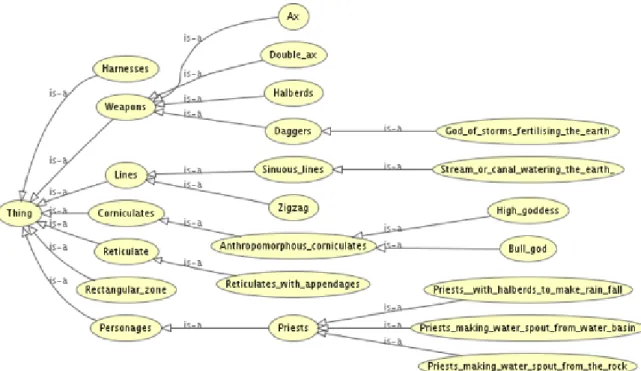
The database of petroglyphs consists of textual interpretation descriptions, ontological information, geographical coordinates, pictures and drawings of the reliefs. The ontological information is a list of concepts that summarizes the interpretations given by archaeologists. Figure 3.2 shows a part of the ontology we defined for the rock art archeology domain.
3.2
The DARK System
As said above, the recurrent combinations of petroglyph symbols are very important for the correct interpretation of scenes. However, their identification is a very challenging
Figure 3.2: Part of the ontology defined for the rock art archeology domain.
task mainly due to the size and complexity of data stored in the repositories. So far, archaeologists have identified these patterns in an empirical way. In this section we present the DARK system whose aim is to support archaeologists in the detection and analysis of these patterns in a systematic way.
DARK is a visual analytics tool designed to take advantage of semantic information (i.e., ontological concepts) associated to the interpreted petroglyphs. It allows users to more easily isolate petroglyph symbols and their relationships for inferring and validating new patterns. The tool performs both a structural abstraction by clustering the petroglyphs with similar shapes and a semantic abstraction by exploiting the ontological information associated to the scenes. Moreover, to visually represent and summarize the spatial ar-rangement of the petroglyphs in the scenes, DARK includes a data view exploiting fuzzy theory to manage the uncertainty of spatial relationships. The tool also includes com-mon visual interaction techniques, as zooming and filtering, in order to assist users in the investigation process.
3.2.1 Structural and Semantic Abstraction through Bubble View
The aim of the structural and semantic abstractions is to extract relevant information from the scene repository in order to simplify the detection of recurrent patterns. In the following we formalize the abstraction process and present the data view implemented in DARK that visually summarize the abstracted information.
The Abstraction Process
Let S = {s1, . . . , sn} be the set of symbol classes defined by archaeologists to classify
petroglyphs and O = {o1, . . . , om} be the set of concepts contained in the ontology. The
set of scenes P stored in the repository can be formally defined as P = {p1, . . . , pt} where
pi = {ri,1, . . . , ri,q} contains the petroglyph reliefs of the i-th scene. Each relief ri,j ∈ pi is
associated to a symbol in S by using the function Shape, i.e., Shape(ri,j) = sk∈ S, which
applies an approximate image matching algorithm. Moreover, the function Sem provides the set of ontology concepts associated to a scene, i.e., Sem(pi) ⊆ O.
Given an ontology concept oi, DARK constructs a graph where the nodes correspond
to the symbol classes obtained by applying the Shape function to the reliefs of pj such that
oi ∈ Sem(pj) of petroglyph symbol classes from P by including all nodes whose classes
are related to oi. The goal is to visualize the most frequent symbol classes co-occurring
with a concept. In order to achieve this goal, abstraction hides the symbol classes non relevant for the selected concept and clusters the petroglyph reliefs having similar shape. More formally, an abstraction with respect to an ontology concept oi is defined as a graph Goi = (V, E) with:
• V = {sx∈ S | ∃ rj,k ∈ pj with Shape(rj,k) = sx and oi ∈ Sem(pj)} and
• E = {(sx, sy) | sx, sy ∈ V , ∃ rj,k, rl,m∈ pj with Shape(rj,k) = sx and Shape(rl,m) =
sy, and there exists a spatial relationship between rj,k and rl,m}.
Thus, the graph constructed for an ontology concept oi represents the petroglyph sym-bol classes co-occurring with oi and the spatial relationships between them. In DARK, the
Shape function has been implemented by using the IDM algorithm used in [31], while the approach for computing the spatial relationships between the petroglyphs in the scenes is described in Subsection 3.2.2.
The Bubble View
DARK visualizes the graphs obtained from the abstraction process by using the Bubble view.
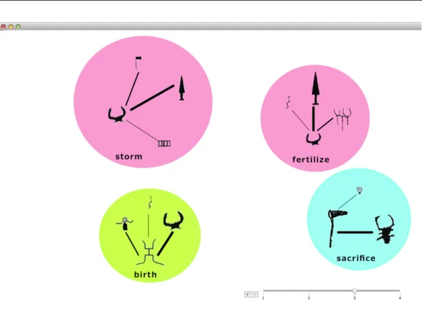
In particular, the view shows a colored bubble Boi for each graph Goi. The color of each Boi depends on the position of the concept oi in the ontology hierarchy, namely we
assign a different hue to each subtree of the nodes at level two, then we decreases the saturation on the basis of the level. As an example, Figure 3.3 depicts the Bubble view constructed for the ontology concepts at level three1. Fertilize and storm, being children of the Agriculture level-two node are pink-colored, while birth and sacrifice, being children of Earth and Religion, are green and cyan-colored, respectively. It is worth to notice that the bubbles corresponding to semantically similar concepts are depicted with similar colors so as the fertilize and storm bubbles.
The size of a bubble indicates the frequency of the concept oi in the scenes (small = low frequency, big = high frequency). In the example, we notice that the most frequent concept is storm.
The bubble Boi also visualizes both the most frequent symbols co-occurring with oi
and their relationship degree. In particular, the size of symbols indicates how much they frequently appear in the scenes, while the size of the links provides a suggestion about their relationship degree.
In this way, the Bubble view allows archaeologists to discover candidate patterns by highlighting the prevalent key symbols and common relationships. As an example, the graph inside the sacrifice bubble shows a potential pattern. The bull and halberd symbols are very frequent in the scenes associated to the sacrifice concept, thus, their size appears bigger with respect to the other symbols. Moreover, the bold line indicates a high spatial relationship degree between them in the scene set.
3.2.2 Scene Spatial Analysis using Ring View
The information visualized in a Bubble view provides an overview of the correlations be-tween the symbol relationships and the ontological concepts extracted from their
inter-1
Archaeologists can select the ontology concepts either by interacting with a zooming bar, where it is possible to choose the granularity level of the concepts, or by navigating the ontology through the taxonomy relation (IS-A).
Figure 3.3: A Bubble view constructed for the concepts: fertilize, storm, birth, and sacrifice.
pretations. When the archaeologist discovers a candidate pattern, s/he needs fine-grained information on the symbols relationships involved in the pattern in order to validate it. In particular, s/he has to analyze the spatial relationships existing between the petroglyph symbols and their correlation with the selected concept.
Fuzzy Spatial Analysis of Scenes
Since the petroglyph symbols were carved in an inaccurate way, the spatial relationships between petroglyphs cannot be computed using crisp relations. We use the fuzzy logic to model the uncertainty, as this logic allows to express the concept of belonging where can not be easily defined [111]. For example, in spatial reasoning, two entities cannot fully belong to only one relation space so the fuzzy logic helps us to model the concept of uncertainty. In particular, in order to obtain the topological structure of a scene we use the region connection calculus (RCC) [79], while the directional properties between objects have been computed using the Cardinal Direction Calculus (CDC).
The RCC is a topological approach to the qualitative spatial representation in which the regions are regular subsets of a topological space. This method gives information about the topological structure of an image by associating it one of the topological relationships in a two-dimensional space. The RCC-8 calculus considers eight basic topological relations, which are: externally connected (EC), disconnected (DC), tangential proper part (TPP), tangential proper part inverse (TPPi), non-tangential proper part (NTPP), non-tangential proper part inverse (NTPPi), partially overlapping (PO), equal (EQ). However, it is possi-ble to reduce the number of spatial relationships required by decreasing granularity. As an example, it could be possible to use either RCC-5 or RCC-3. This granularity reduction process has been extensively discussed in [52]. In general, the scene interpretative process does not require a fine relationship granularity, thus we use a low level RCC so as RCC-3 which includes the relationship types, disjoint, overlap, and meet.
As said above, cardinal directional relationships can be computed through CDC. It specifies the direction which one object is cardinally related to one another. It can be com-puted to obtain different levels of granularity, as the CDC-8 which correspond to determine the north, south, west, east, south-east, south-west, north-east, north-west directions, or the CDC-4 which corresponds to the north, south, west, east, or even the CDC-1 where the information represents only a relationship in any cardinal direction. In our case it would be useful keep the fine-grained information, thus we use the CDC-8.
In order to use this information we start applying the method proposed in [84], that combines fuzzy Allen’s relationships, specifically designed to manage topological relation-ships, to directional relationships in the two-dimensional space. The Allen’s relationrelation-ships, explained in [3], are based on the algebra of the time intervals and are labeled as follow: A = {<, m, o, s, f, d, eq, di, fi, si, oi, mi, >}. These relationships assume the meaning of:
before, meet, overlap, start, finish, during, equal, during by, finish by, start by, overlap by, meet by, and after. Successively, the method applies a fuzzification process to obtain the fuzzy value of the spatial information. It creates a matrix 8x8, where the rows hold the CDC-8 topological relationships and the columns have the qualitative directional aspects of the 2D scene information. The relationships are expressed using numeric values repre-senting the percentage area of two objects under a specific topological relationship in the qualitative direction. More precisely, the cell value for a topology relationship of a given direction is obtained using the fuzzy contributes of some Allen’s relationships calculated
on specific angles depending on the direction. For instance, in case of north direction, it is possible to calculate the fuzzy value of the disjoint topological relationship by means of the after Allen’s relationship over the angles between 1/4π and 3/4π according to the following formula: Disjoint_N orth = 3/4π X Θ=π/4 af ter(Θ) ∗ cos2(2 ∗ Θ) (3.1)
For the sake of clarity, let us shown two examples describing how this model works. In the first example, shown in Figure 3.4(a), we have a scene where the god petroglyph is located above (north) the goddess petroglyph. The petroglyphs are disjoint to each other as well. The matrix associated with this scene contains higher values in correspondence of the cells indicated by the rows 1-disjoint and the columns 2-north-east, 3-north, 4-north-west (see Figure 3.5(a)).
In the latter example, shown in Figure 3.4(b), bull and goddess petroglyphs overlap to each other. A the same time, goddess is located at north side of bull. As shown in Figure 3.5(b), the matrix representation of this relationship involves several rows, 1-disjoint, meet, 3-partial overlap, 4-tangent proper part, 5-nontangent proper part, and columns, 2-north-east, 3-north, 4-north-west. In this case, it is possible to notice that the higher value is obtained in correspondence of the cell [3-partially overlap, 3-north].
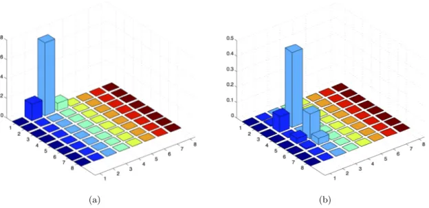
The Ring View
For assessing a topological-directional fuzzy relationship, DARK analyzes its frequency (how many times the relationship is satisfied) and its strength (how high is the fuzzy value) and visualizes this information in the Ring view. In order to visually represent this information the Ring view shows three concentric circles, which corresponds to the topological relationships of RCC-3 obtained following the reduction process from RCC-8 described in [52]. The inner circle refers to the partially overlap relationship, the middle one to the meet relationship, while the disjoint relationship is associated with the outer sector. Each circle is divided into eight sectors, which correspond to the directional relationships. The fuzzy values obtained for a topological-directional relationship between two pet-roglyphs are mapped into the corresponding cells of the Ring view. In particular, we have proposed two different visualizations of the fuzzy relationships. Let S = {S1, S2, . . . , Sn}
be a set of scenes, A and B be two petroglyphs related by means of the R(A,B) relation-ships, and V(R) be the corresponding cell in the Ring view. The first visualization colors V(R) using the average of the fuzzy values obtained evaluating the fuzzy relationship R for each instance of R(A,B) in S. The red color is used for the disjoint sectors in the outer cir-cle, purple for meet, and green for partially overlap as shown in Figure 3.6(a). Notice that more intense colors imply higher values of the relationship while the black color indicates the total absence. In the second visualization, the fuzzy values of R(A,B) in S are mapped using the color gradient, which highlights at the same time the frequency and the strength of the relationship. Let us suppose we divide a sector into n parts P = {P1, P2, . . . , Pn}
each associated with a strength range F = {F1, F2, . . . , Fn}, the size of the sector part Pi
is proportional to the frequency of the R(A, B) fuzzy values falling into the range Fi, while
the color intensity of Pi is given by calculating the average of such fuzzy values. The gray color indicates the absence of relationship, while the purple indicates the presence. For example, in the Disjoint-North-East sector of 3.6(b), the number of times the relationship R(A,B) has high fuzzy values is medium as well as the number of intermediate values, low values are a few. On the other hand, if we consider the Disjoint-North sector, we have medium quantity of high fuzzy values and high intermediate values.
(a) (b)
Figure 3.4: A petroglyph scene containing the god and the goddess (a), and an example of interpretation of the overlap-north relationship between the mother goddess and the bull (b) [32].
(a) (b)
Figure 3.5: The matrices representing the fuzzy relationships between the symbols in the scenes of Figure 3.4. The correspondence between numbers and relationships is the follow-ing: on rows, 1-disjoint, 2-meet, 3-partially overlap, 4-tangent proper part, 5-nontangent proper part, 6-tangent proper part inverse, 7-nontangent proper part inverse, 8-equal, and on columns, 1-east, 2-north-east, 3-north, 4-north-west, 5-west, 6-south-west, 7-south, and 8-south-east.
(a) (b)
Figure 3.6: Two different visualizations of the Ring view: average fuzzy values (a) and gradients (b).
Figure 3.7: A Ring view with the Metadata view generated by selecting the North-Disjoint sector.
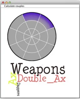
Archaeologists can also interact with the Ring sectors for analyzing the ontology con-cepts associated to the set of scenes. To this aim, we defined the Metadata view. It shows the most frequent ontology concepts of the scenes by using a tag cloud visualization. As an example, Figure 3.7 depicts the Metadata view generated by selecting the North-Disjoint sector of the Ring. The most frequent terms in the scenes containing such an arrangement are Weapons, Double_Ax, and Ax. By using this view, archaeologists verify the correctness of the discovered pattern.
Classification and Recognition of Petroglyphs
Petroglyphs are engravings obtained by hitting or scraping stone surfaces with sharp tools made of stone or metal. These symbols were used by prehistoric people to communicate with their divinity or with other men. Basically, we find these carvings as a set of symbols called scenes, which depicts daily life situations. Therefore, the study of the petroglyphs is very important to gain new knowledge and awareness about the periods in which the petroglyphs were created.
Petroglyphs are prehistoric stone engravings unrevealing stories of ancient life and describing a conception of the world transmitted till today. Although they may seem as durable as the rock they reside on, petroglyphs are inevitably deteriorated by natural causes as well as vandalism. As an example, some of them have been destroyed by tourists, while others are disappearing due to acid rain and sunshine. Hence, it is very important to preserve the petroglyphs trying to identify and archive them for future generations.
Research challenges have to be addressed for digital preservation of petroglyphs, includ-ing the integration of data cominclud-ing from multiple sources and the correct interpretation of drawings. The IndianaMAS project is aiming to integrate heterogeneous unstructured data related to rock carvings into a single repository, organizing classified data into a Digital Library, interpreting data by finding relationships among them, and enriching them with semantic information [33, 74]. However, the large number of sites where petroglyphs have been discovered, and the different methodologies they were made, makes their study a complex task. Archaeologists have to deal with a hard and tedious job because they have to report each symbol shape on a notebook paper and search any related information by consulting different books. To address these issues, we present PetroSketch [30], a mobile
application for supporting archaeologists in the classification and recognition of petroglyph symbols.
PetroSketch is a virtual notebook enabling users to draw a petroglyph symbol on a white page, or by following the contour of a symbol captured with the camera, and to obtain its classification and the list of symbols more similar to it. The latter is per-formed by a flexible image matching algorithm that measures the similarity between petroglyphs by using a distance, derived from the Image Deformation Model (IDM), which is computationally efficient and robust to local distortions. The classification system has been applied to an image database containing 17 classes of petroglyph symbols from Mount Bego rock art site achieving a classification rate of 68%.
4.1
Rock Art
Petroglyphs are a form of prehistoric art found in many cultures around the world and at many times. There are many theories to explain their purpose, depending on their location, age, and the type of image. Some petroglyphs are thought to be astronomical markers, maps, or other forms of symbolic communication, including a form of "prewriting". The form of petroglyphs is described by a variety of terms in the archaeological literature. One of the most common forms of rock art around the world is the anthropomorphic depiction. They are pictures that resemble humans, but sometimes can represent something else, such as the personification of a spirit or other nonliving thing. Other common images are animals, weapons, and tools.
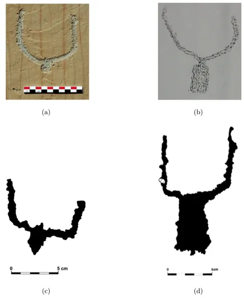
We experimented our approach on the reliefs collected and cataloged from Mont Bego, in the extreme south-east of France, which due to the richness of the place in both qualita-tive and quantitaqualita-tive terms it is ideal for analysis. Archaeologists consider this place as an incredibly valuable source of knowledge, due to the up to 40,000 figurative petroglyphs and 60,000 non-figurative petroglyphs [27]. The figurative petroglyphs represent corniculates, harnesses, daggers, halberds, axes, reticulates, rectangular or oval shaded zones, and an-thropomorphous figures. Between 1898 and 1910, Clarence Bicknell realized up to 13,000 drawings and reliefs, part of which were published in [12]. Bicknell identified seven types of figures taking a natural history approach: horned figures (mainly oxen), ploughs, weapons and tools, men, huts and properties, skins and geometrical forms [18]. From 1967 Henry
(a) (b)
(c) (d)
Figure 4.1: A picture of a bovine engraving of the Mont Bego (a), a picture of a bovine relief made by Bicknell on botanic sheet (b), two digitalized reliefs made by de Lumley’s team (c) and (d).
de Lumley is in charge of performing research on the site. Figure 4.1 shows a picture of a bovine engraving, a Bicknell’s relief, and two digitalized reliefs made by de Lumley’s team.
4.2
An Approach for Petroglyph Classification
One of the most promising approach to achieve low error rates in the classification of images with high variability is the application of flexible matching algorithms [8]. Among them,
the deformation models are especially suited to compensate small local changes as they often occur in the presence of image object variability [59]. These models was originally developed for optical character recognition by Keysers et al. [59] but it was already observed that it could be applied in other areas such as recognition of medical radiographies [60] and video analysis [35]. The IDM yields a distance measure tolerant with respect to local distortions since in the case two images have different values only for a few pixels, due to noise or artifacts irrelevant to classification, the distance between them is compensated by specifying a region in the matching image for each picture element in which it is allowed to detect a best matching pixel.
These properties motivate its use for petroglyph classification. In the following we describe the steps of our petroglyph classification system.
4.2.1 Shape Normalization
To recognize a petroglyph symbol regardless of its size and position, the input im-age is normalized to a standard size by translating its center of mass to the origin. The resulting image f (x, y) is the grid image of the symbol. Then to increase tolerance to local shifts and distortions we smooth and downsample the feature images. In particular, first, to ensure that small spatial variations in the symbol correspond to gradual changes in the feature values, we apply a Gaussian lowpass filter
G(x, y) = e−12( x2+y2
σ2 ) (4.1)
to obtain the smoothed image g(x, y) according to the following equations
g(x, y) = f (x, y) × G(x, y) (4.2)
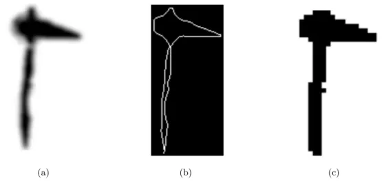
We then downsample the images by performing symbol removing and resizing (see Fig-ure 4.2). This further reduces sensitivity to small shifts and improves runtime performance.
4.2.2 Feature Set
To achieve better performances, instead of directly comparing image pixels, we use deriva-tives. In particular, for each pixel we consider the horizontal and vertical gradients as
(a) (b) (c)
Figure 4.2: An example of normalization of an ax petroglyph: The image smoothed with the Gaussian filter (a), the point removed image (b), and the image resized at 32 × 32 pixels (c).
features for image matching. Each pixel of a gradient image measures the change in in-tensity of that same point in the original image, in a given direction. Thus, the horizontal and vertical gradients allow to get the full range of directions.
4.2.3 Classification
For the classification of petroglyphs we use a deformation model that is robust to distortions and local shifts. In particular, the image deformation model (IDM) performs a pixel-by-pixel value comparison of the query and reference images determining, for each pixel-by-pixel in the query image, the best matching pixel within a region around the corresponding position in the reference image.
The IDM has two parameters: warp range (w) and context window size (c). Figure 4.3 illustrates how the IDM works and the contribution of both parameters, where the warp range w constrains the set of possible mappings and the c × c context window computes the difference between the horizontal and vertical gradient for each mapping. It should be noted that these parameters need to be tuned.
The algorithm requires each pixel in the test image to be mapped to a pixel within the reference image not more than w pixels from the place it would take in a linear matching. Over all these possible mappings, the best matching pixel is determined using the c × c
Figure 4.3: Example of areas affected by the comparison of pixels with IDM, where w = 3 and c = 2. The query pixel context (indicated by the orange area in the query image) is compared with each equal-sized rectangle within the warping area (dark-green rectangle of the reference image). The warping area is calculated by building a m × m, with m = (w + c) ∗ 2 + 1, square around the corresponding reference pixel (dark-green pixel).
local gradient context window by minimizing the difference with the test image pixel. In particular, the IDM distance D between two symbols S1 (the query input) and S2 (the
template) is defined as:
D2 =X
x,y
min
dx,dy
|| S1(x + dx, y + dy) − S2(x, y) ||2 (4.3)
where dx and dy represent pixel shifts and Si(x, y) represents the feature values in Si from
the patch centered at x, y.
4.2.4 Performance Optimization
One of the limitations of IDM algorithm is the high computational complexity, which is even further increased when the warp range and local context are enlarged. Thus, since applying IDM to all the reference images is too slow, we introduce two optimization strategies to speed up the IDM algorithm.
The first optimization is to prune the set of candidates before applying IDM. We use the simple Euclidean L2 distance as the pruning metric, and the first N nearest neighbors
found are given in input to the IDM. In particular, we use the distance: D2 = K X k=1 (v1(k) − v2(k))2 (4.4)
where vi(k) corresponds to the horizontal and vertical gradients of the i -th image.
The second optimization is the early termination strategy proposed in [92], which relies on the consideration that in k NN classifiers only the k nearest neighbors are used in the classification step. Therefore the exact distance of any image with rank greater than k is not used by the classifier. This means that we can abort the computation of the distance between two reliefs as soon as it exceeds the exact distance of the image with rank r. Since the latter can only be known after all images in the collection have been compared to the query, we approximate it with the distance of the k nearest neighbor identified so far.
4.3
PetroSketch
PetroSketch is a mobile application developed with the Titanium1 framework that allows generic users (which in most cases are tourists, trekkers or just archeology interested people) to support archeologists in collecting and interpreting petroglyph scenes.
Figure 4.4 shows the architecture of PetroSketch. Since the IDM recognition algorithm has been implemented in Matlab environment, we developed a proxy to manage the com-munication between the server part of the web services and the MCR (MATLAB Compiler Runtime) by using the MATLAB Builder JA.
Figure 4.5 describes the user interface of the application. It appears as a mobile ap-plication where the main part of the screen is occupied by the camera view. We did this choice to focus the user’s attention in providing better sketches of the petroglyphs. The remaining part of the screen is employed for managing the menus and the corresponding functionalities. It also provides users with drawing, storing, and retrieving capabilities. In particular, its main functionalities are:
• Camera: This item allows users to start the picture acquisition process. It works very similarly to other capture software so we do not need to enter in details. From
1
Figure 4.4: The architecture of PetroSketch.
this phase, it is possible to automatically enter in the drawing mode to trace the borders of the petroglyphs;
• Pencil Tool: Here, the user traces the petroglyph borders. S/he can enable this mode for drawing the contours of each petroglyph appearing in the picture or simply choosing the colors or the size of the pencil. Generally, in order to distinguish different single petroglyphs, it is necessary to use different colors for each of them;
• Album: The repository of the captured pictures is the Album. Here, photos are stored and previewed. The user can browse the content and choose the one s/he wants to manage;
• Recognition: This item allows to begin the recognition phase. By using the previ-ously described approach, the system enables the search and comparison of similar petroglyphs contained within the main remote repository. The image shown in Fig-ure 4.5 presents an example where the borders depicted in the center of the pictFig-ure is compared to the remote repository and the final results are presented in the top-right corner of the screen highlighting the most similar together with the similarity values.
4.4
The Experiment
To demonstrate the validity of the proposed approach an experiment focused on measur-ing the effectiveness of the IDM algorithm on a real dataset has been per-formed. The considered dataset was extracted from the image reliefs presented in [27] and it is a rep-resentative sample of the Mount Bego petroglyphs. Basically, it contains a number of petroglyph reliefs falling into 10 main classes (anthropomorphic, ax, bull, bullgod, dagger, goddess, oxcart, personage, reticulate, stream). These classes were successively refined, with the help of several archaeologists participating to the project, into 17 classes based on the shape of the petroglyphs and additional in-formation, such as the estimated date of the engravings.
The 3-fold cross validation test has been successively applied to analyze the performance of the IDM algorithm on the test set. The difficulty to collect data makes particularly suitable this choice. Generally, in k -fold cross-validation, the original sample is randomly partitioned into k subsamples. Of the k subsamples, a single subsample is retained as the validation data for testing the model, and the remaining k − 1 subsamples are used as dataset. The cross-validation process is then repeated k times (the folds), with each of the k subsamples used exactly once as the validation data. The k results from the folds
then are averaged to produce a single estimation. In this way all petroglyph reliefs are considered for both dataset and validation, and each relief is used for validation exactly once.
4.4.1 Settings
The best performance of the algorithm was achieved using the following configuration settings:
1. Image size. this value was set to 16 pixels. It indicates the size of the reduced image fed to the IDM. We tried also 24 and 32 pixels but no substantial differences have been found. Thus, we preferred to use the minor size for improving time performance.
2. Warp range. Together with the local context is one of the parameters of the IDM algorithm. The algorithm obtained the best performance using the value of 3 pix-els.
3. Local context. This value was set to 2 pixels.
4.4.2 Results
To evaluate the achieved results we used the k-nearest-neighbor (kNN) classification method [24], which consists in the examination of the first k results produced by the algorithm.
The overall results of the experiment are listed in Table 4.1. Data are presented in a 20x9 table where the first row represents the classification method, namely 1-NN for the best matching class, 3-NN and 5-NN for the nearest neighbors methods with 3 and 5 considered hits, respectively. The first column lists the 17 classes considered in the experiment. Basically, each data cell indicates the percentage of times a petroglyph relief is correctly classified by considering the first i hits of the IDM algorithm result and by applying the classification method (1-NN, 3-NN or 5-NN). As an example, let us consider the AxB row. As for the 1-NN method, during the experiment the AxB images were
correctly associated to the class, namely another AxB image appeared as first hit of the IDM algorithm, only in the 33%. In the 67%, it appears either as first or second hit, and finally, it appears in 100% either as first, second, or third hit. If we consider the 3-NN method, the images of the same classes falling into the first three hits are aggregated using the inverse distance weighting. In this way, the class having the highest distance in the
Table 4.1: Classification rates of the proposed IDM algorithm. Symbol 1-NN 3-NN 5-NN 1st 2nd 3rd 4th 1st 2nd 1st 2nd Antropomorphe 67 100 100 100 67 100 33 67 AxA 33 67 67 100 33 67 0 100 AxB 33 67 100 100 33 100 33 100 BullA 100 100 100 100 67 100 100 100 BullB 100 100 100 100 100 100 100 100 Bullgod 67 100 100 100 67 100 67 100 DaggerA 100 100 100 100 100 100 100 100 DaggerB 33 67 67 100 67 67 33 67 GoddessA 67 67 67 67 33 67 33 67 GoddessB 67 67 67 67 67 67 67 67 GoddessC 67 67 100 100 67 67 67 67 GoddessD 67 67 67 67 33 67 0 67 Oxcart 100 100 100 100 67 100 67 100 P ersonage 33 67 67 67 33 67 0 67 Reticulate 67 100 100 100 67 100 67 100 StreamA 100 100 100 100 100 100 100 100 StreamB 67 67 100 100 33 100 67 67 total 68 82 88 92 61 86 54 84
new ordered list is suggested to be the class that the query drawing image belongs to. In case of AxB, its images are correctly classified in the 33% considering only the first hit of
the result list and in the 100% considering the two best hits. The same analysis has been performed for the 5-NN classification method.
The last row in Table 4.1 indicates the average values of the columns. Basically, they erase the differences among classes in terms of correct response percentages and report the average behavior of the IDM associated with the different classification methods.
4.4.3 Discussion
By analyzing the results shown in Table 4.1 it is possible to notice that the IDM associated to the 1-NN classification method has a precision of 68%, slightly worst in case of 3-NN
(61%), and even more worst for 5-NN (54%). Probably, this is due because even though the most similar relief falls into the same class of the query, allowing the 1-NN classifier to correctly recognize, the other hits are not so different from the query but belong to different classes (two symbols for class are in the dataset). In this way, aggregation of the 3-NN and 5-NN makes the choice of the class more difficult and address it towards wrong classes rather than the class the query belongs to.
Another consideration concerns with the ability of the approach to suggest a number of possible solutions among which to choose the correct class. It is possible to notice that, even if the best classification approach is 1-NN, this is not always true when the algorithm try to suggest a range of possible solutions. Indeed, when considering the most scored two, 3-NN and 5-NN work slightly better than 1-NN (86% and 84% versus 82%). Unfortunately, due to the low number of symbols for class, we cannot extend this consideration for the three or four most scored hits. Anyway, for these cases, the 1-NN allows to correctly classify in the 88% and 92% of cases.
These results highlight the quality of the IDM algorithm in the handling of image deformation but also the natural complexity of the problem faced in this thesis. Indeed, in most cases, different classes contain similar reliefs and only reasoned-contextual information may help to correctly classify them.
Visualizing Information in Data Warehouses
Reports
Several techniques and tools have been proposed in the literature to relate and display information extracted from a data warehouse (DW), but to the best of our knowledge, no one allows to graphically represent relationships between data in different reports and consider visualizations that involve more than one type of graph. In particular, these approaches usually just provide standard graphical tools and do not allow to compose, aggregate and change the different visualizations. Moreover, these tools allow to represent data with a dashboard visualization that shows graphs separated without displaying their connections. On the contrary, our tool represents both graphs and their connections in a single visualization.
Ma et al. [69, 70] describe the design and the implementation of a meteorological DW by using Microsoft SQL Server. In particular, the proposed system creates meteorolog-ical data warehousing processes based on SQL Server Analysis Services and uses SQL Server Reporting Services to design, execute, and manage multidimensional data reports. Moreover, the generated data reports are represented as folding tabular form related to two-dimensional maps available through the browser, but users cannot choice the type of visualization.
Hsu et al. [48] apply a clustering analysis on OLAP reports to automatically discover the grouping knowledge between different OLAP reports. In particular, the proposed approach highlights this knowledge by using a dendrogram/icicle plot representation and histograms. The data interrelationship is computed by using a data mining approach in
![Figure 1.1: The picture of a petroglyph supposed to represent a Christ (a) [11], a picture interpreted as the stellar cluster of the Pleiades (b) [36], and the relief depicting priests making water spout from the rock (c) [27].](https://thumb-eu.123doks.com/thumbv2/123dokorg/7198520.75406/16.892.221.669.169.421/picture-petroglyph-supposed-represent-interpreted-pleiades-depicting-priests.webp)
![Figure 3.1: A scene composed of several corniculates and halberds (a) [11], the pattern mother goddess giving birth to the bull (b) [27].](https://thumb-eu.123doks.com/thumbv2/123dokorg/7198520.75406/27.892.172.790.171.438/figure-composed-corniculates-halberds-pattern-mother-goddess-giving.webp)
![Figure 3.4: A petroglyph scene containing the god and the goddess (a), and an example of interpretation of the overlap-north relationship between the mother goddess and the bull (b) [32].](https://thumb-eu.123doks.com/thumbv2/123dokorg/7198520.75406/34.892.239.663.674.982/figure-petroglyph-containing-goddess-example-interpretation-overlap-relationship.webp)