Drawn Reflections and Reflections on Drawing:
the “Anti-perspectives” of Abstractionists and Figurativists
at the VchuTeMas
Fabrizio Gay, Irene Cazzaro
1921: Archaic and modernist “anti-perspectives” The twelve studies collected in the volume Il disegno
obliq-uo [Scolari 2005] concern themes and times in the history of images that are very far from each other, ranging from the Egyptian writing system to the modes of figuration of building, urban and mechanical devices, to illusive decora-tion (from the Apulian vases of the 4th century BC to the
Pompeian pseudo-perspectives), to the diagrams annotat-ed in the marginalia of the scientific literature, to the mod-ern codes of technical representation in the military art treatises of the 16th century and patented in the 19th
cen-tury, also touching the 20th century techniques of mimicry,
from camouflage to disrupting image. Those twelve studies only partially concern the history of the geometric meth-ods of projective representation which led to descriptive
geometry and modern axonometric drawing (parallel perspective); they also deal with visual artefacts, theories and practices of figuration which are very different and far from each other, bringing them all together – as the sub-title of the book indicates – as moments of “a history of the anti-perspective”, that is, – as the prefix “Anti” suggests – as “antagonists” with respect to Renaissance and mod-ern perspective theory. Therefore, the “anti-perspectives” studied by Scolari constitute an “anachronic” ensemble be-cause they group objects attributable to “other” forms of representation –from some pictographic systems to spe-cific modes of spatial figuration–, geographically distant or chronologically previous, contemporary and subsequent to the Renaissance and modern perspective.
Abstract
The essay investigates some aspects of the “anti-perspective” – i.e. the drawing that tries to figure the intrinsic spaces of Things, to graphically translate them on the plane with effects of ambiguous, reversible, reflected spatiality, reversing the (topological) meaning of interior/exterior, centre/periphery, enclosed/enclosing – in the opposite formulations of the theme that coexisted in the framework of the Muscovite VchuTeMas. The difference between (Florenskij’s) “figurative” and (the constructivists’) “abstractionist” anti-perspective is studied by means of a comparison between coeval drawings, emblematic of the two opposite aesthetics. On the one hand (the abstractionist one) it mainly concerns the graphic genre of the unfolded and reversed axonometry, developed through El Lissitzky’s projects for the installations of the spatial Proun works, then spread as a visual theme in the abstractionist international in the 1920s and in its subsequent American diaspora. On the other hand (the realist one) it deals with Florenskij’s anti-perspective theory, as well as some examples that testify to it: the woodcut covers by Vladimir Favorskij (instructed by Florenskij) in which the techniques of reflection and inversion are highlighted. Translating the opposition between “abstractionists” vs. “figurativists” into the one between “palingenists vs. anachronists”, we clarify the difference between the two opposite “anti-perspectives” as a difference between two models of visual signification: the first excludes the “figurative” and allegorical dimension on which the second is based.
ancient idealist and transcendentalist aesthetics– still arises today, even though secularised and put in technical terms –the “iconic effectiveness” of figuration– even for our con-ception (the authors’ one) that, as opposed to the Plo-tinian one, it is realist, immanentist and scientific. In our opinion, “icon” indicates today a set of semiotic questions related to the fact that the icon does not represent, but “exemplifies” its (transubstantiated) content in the same substance as its expression.
We will explain this by starting from the fact that the questions of the icon and the anti-perspective, jointly, are found at the beginning of the (first Russian, then Euro-pean) theories of abstract art –from the “suprematist” mysticism of Malevič, Puni, Rozanova and Lissitzky to Kan-dinsky’s “spiritualism” and Mondrian’s “theosophy”– but, in the same years, in Soviet Russia, they found their most argued formulation from an opposite position: the one coming from the anti-abstractionist rearguard that Pavel Florenskij [Bertelè, Barbieri 2015] formulated from 1919, through his writings on the late medieval Russian icon [Flo-renskij 2012], on the Orthodox liturgical space and with the courses on the “theory of space” that he held at the VchuTeMas in Moscow in 1921-24 [Florenskij 2007]. Florenskij, in the first years following the Soviet revolution, strenuously defended the value of the historical heritage of medieval icons and Orthodox architecture, specifying its relevance as opposed to what he described as “per-spectival degeneration of Western art”. He explained that the advent of the “linear perspective” was the cause of the impoverishment of the figurative spatiality expressed by the previous pictorial and graphic traditions: perspective blocked the viewer’s gaze degrading it to a “point of view”, calling him to (ideally) put only one eye in the peephole of an (ideal) prefabricated camera obscura: a sort of
ante-litter-am camera. By turning the graphic or pictorial image into the surrogate of a static and monocular optical experience, perspective –according to Florenskij– took away from the gaze the freedom to “wander” on the image plane in order to capture, from different directions and itineraries, the true features of the figured objects according to “images” that he already possesses in his own consciousness. In short, ten years before Erwin Panofsky published the famous es-say on The Perspective as symbolic form [Panofsky 1961], Florenskij –through an aesthetic of the symbol intended as consubstantial to the symbolised– claimed the primacy of the “symbolic form” for anti-perspective, based on the prototypical value of the medieval icon. However, the argu-Scolari had already [argu-Scolari 1984] identified a common
motivation for these different “anti-perspectives” in the passages of Plotinus’ Enneads, in which the late antique neoplatonic philosopher, on the subject of painting, affirms the ideal of a figuration purged of the cognitive defects of sight. It is the (regulatory) ideal of a figuration “cured” from “eye diseases”, purged from the contingencies of the optical effects of perspective and illumination, that is, freed from the deficiencies of the “percept” with respect to the “concept” of the figured thing. This “good” figuration was what had the Greek name of “icon”, intended as “image object”, which –unlike the eidolon– revealed only the es-sential and true features of the intelligible idea of what it figures –the traits of its “true” (more adequate) model– in the sensitive matter of the support. According to Ploti-nus, this figuration set itself the aim of rendering the pres-ence of things by representing them in a “true form”, in a “true colour”, in a “true distance” and “in full light”, doing it through shapes, colours (materials) and the intrinsic tex-tures of the planar body of the figurative support (fresco, mosaic, etching, ceramic painting, …). In short: the icon does not represent, but rather exemplifies something [1]. It is almost impossible to indicate pictorial documents of the third century that show the qualities indicated by Plo-tinus, that is, the ability to reveal the true appearances of things (by exemplifying them). Generally they are imagined on the basis of what Plotinus could have seen between Asyūṭ and Rome; especially from the few remains of pre-Byzantine paintings, such as those of Dura Europos, or as-suming a common hybrid –really ante-litteram– origin of the early Christian and Byzantine art. This would involve flat fig-urations, made with materials that appear as light-bearers, in almost pictographic forms, portraying bodies rendered in a praying iconic planar appearance, including the details of these everyday things (hairstyles, embroidered fabrics, …) and landscapes, but translated into ornamental schemes. If we think, nowadays, of paintings that minimise the differ-ence between naturalist portrait and decorative pattern, we would think, for example, of paintings by Casorati or Campigli; but this is not true. The current domain of the figurative arts is not at all comparable to the sacred dimen-sion, to the ritual (religious and funerary) and theurgical practices that, in the culture of late Greek-Latin antiquity, were carried out through sacred image-objects.
However, the icon –as Plotinus’ passages define it– is not just a matter of canons or historical genres of figuration; it is above all a problem that –although it comes from
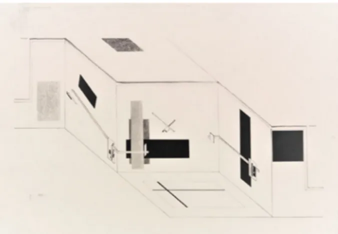
Fig. 1. El Lissitzky, project for the Prounenraum at the Große Berliner Kunstausstellung, cavalier unfolded axonometry, 1923; lithography on parchment paper, 44 x 60 cm, 1st Kestner folder, Stedelijk Museum, Amsterdam.
ments conveyed by Florenskij’s plotinian aesthetics [2] in the early 1920s were not unrelated to those supported by the constructivist and abstractionist faction –predominant in the VchuTeMas–, a faction that, on the contrary, pursued the constitution of the work of art as a “thing” and not a representation of “things”, eliminating the distinction be-tween the domains of visual arts and design. As an example, El Lissitzky’s Proun works (fig. 1) were de facto considered anti-perspectives, that is, –physically flat and sometimes spatial– objects that do not represent anything, but arouse the sense of an intense, ambiguous, bivalent, multiple and reversible spatiality [Bois 1988, Gay, Cazzaro 2019]. 1921-24: palingenists and anachronists
In 1921 and in the same Muscovite circles –in the VchuTe-Mas laboratories, in the editorial and seminar programmes of the Institute of Artistic Culture (INChUK) and in the psychophysiology department of the Russian Academy of Artistic Sciences (RAChN)– at least two ways of under-standing the anti-perspective, and the drawing techniques that derive from it, intersect and collide: the one of the ab-stract artists and the opposite one of Florenskij. In these environments Florenskij was in contact at least with the ab-stractionists who supported pure art –against the faction of the “productivists” led by Rodcenko– going so far as to share two encyclopedic projects, initially supported by Kan-dinsky’s direction of the psychophysiological department of the RAChN in the last months of the ’21:
1) the programme of a “Scientific dictionary of artistic terms” –on which various departments of the RAChN worked through a “Cabinet of artistic terminology”– which collected an extensive bibliography and started a discussion on different entries: “Absolute”, “Empathy”, “Point”, “Sign”, “Sexuality”, “Meaning”, …, as well as the entry “Space”, on which –as Nicoletta Misler explains [Misler 1990 and 2007]– the debate ran aground;
2) the drafting of the Simbolarium: a register of the elemen-tary archetypes that would make up the “language of visual forms”, a sort of “alphabet” of the “visual entities” of artistic expression in the hypothesis that they constitute a set simi-lar to the “symbols” of the logical-mathematical and kinesic notations [3].
These two projects suggest that opposite abstractionist and realist theories had had common scientific sources – irst of all the perceptual phenomenology [4] of the work of art and
the aesthetic theories of “pure visibility” [5]– and that both had suffered from the principles of the rising “Russian formal-ism”, that is to say, of an already structuralist and semiotic (rhetorical) [6] conception of the functioning of the work of art: be it literary, auditory, visual or spatial [Tafuri 1979]. Between “figurativism” and “abstractionism” there was no contradiction, but only a difference in degree and values [7], since, by all accounts, the work of art is above all an autono-mous and figural object. Florenskij and the (spiritualist and suprematist) abstractionists of pure art shared many traits of an objectivist and purovisibilist conception of the work of art, as well as the study of archetypal (universal) semantic forms of the artistic expression. But how did they differ?
The most salient difference is not the one between abstrac-tionists and realists, but the one that was dug into the dynam-ics of the Russian (earlier) and Soviet (later) avant-gardes by parthenogenesis of the symbolist movements of the begin-ning of the century. As it is known, the two revolutions –the Russian and the Soviet one– also marked two profound and subsequent boundaries between the artists theorists of art: 1) at first (1905-08) the opposition between modernly “his-toricist” movements against the actual modernist and anti-historicist avant-gardes –such as “cubofuturism”– similar to the European art movements, but closer to the political di-mension that will mark (then) the Berlin Dadaism in the early 1920s – [Tafuri 1980, pp. 141-182];
Fig. 2. Piet Mondrian, project for Ida Bienert’s study in Dresden, cavalier unfolded axonometry, 1926; gouache and pencil on paper, 37 x 97 cm, Staatliche Kunstsammlung Dresden.
2) then (1917-20) the secession of the avant-gardes, which –by connecting themselves to the political-social dimension and contributing to the first Bolshevik ideals (the “utopian communism”)– supported a palingenetic ideal, that is, a “rein-itialisation” of History and Arts. Especially the productivists and constructivists tried to position themselves as a revo-lutionary institution, becoming a “school” and a propaganda tool, considering art as a form of “total design”, namely, antici-pating the overcoming of any distinctions between arts, de-sign and urban planning, becoming dominant at the VchuTe-Mas: the first “polytechnic of the arts”.
Thus, in the early 1920s, in the classrooms of the VchuTeMas the most radical opposition in the conception of the work of art was the one that separated the “palingenists” –the con-structivists and the productivists (Rodčenko, Stepanova, Vesi-nin, Lissitzky, …) [8] proponents of art as “total design”– from the “realists”, supporters of the fact that History and Arts can-not be “reinitialised” and that the revolution can only take an anachronical form, but not a tabula rasa of techniques and traditional genres of the arts. Florenskij –who did not despise abstract art but supported a religious dimension of art– sided against the productivist abstractionism in which he saw a form of “artistic nihilism” which –by reducing the arts to design– would have humiliated the –individual and collective, past and
present– anthropological reality of the human “lineages” hand-ed down through the traditional domains of the arts. The opposition between “palingenists” and “anachronists”, thus, translated into that between “abstractionists” and “figu-rativists”. Florenskij clarified this, especially in a lecture at the VchuTeMas in 1923-24, in which he contested the “naive” forms of abstraction, believing them to be the promoters of a dissolution of art into pure technique. The abstractionist denial of any form of representation –that is, «taking one thing as such and its action as such, but not their representa-tion»– would have led, in Florenskij’s words, only to three possible consequences:
a) “First solution: creating natural things – organisms, land-scapes, etc. It is clear not only that this would be impossible, but also that we do not really need it. Nature already exists and duplicating it would be a useless operation”;
b) “The second solution is the creation of things that do not exist in nature: the machines”;
c) “the third solution is the creation directed towards things that are not physical. A work of this type is a machine as well, but a machine of its kind, a magic machine, an instrument of magical influence on reality. These tools already exist: the political and propaganda posters, for example, are specifi-cally designed to encourage people who look at them to
act in a certain way and even to force people to look at them. In this case the action on the people and the change in their spiritual life must be achieved not through a mean-ing, but through an immediate presence of colours and lines. In other words, these posters are essentially machines for suggestion and suggestion is the lowest step of magic” [Flo-renskij 2007, pp. 96-97].
By introducing the solutions “b” and “c” Florenskij refers to the “constructivist-productivist” concept that considers the work of art as a self-referential aesthesic machine (b) used as a tool of ideological propaganda and social conditioning (c). He does not at all despise abstract artwork or political propaganda posters, but contests the naivety and limits of abstract art theory because it flattens the complex semi-osis of the work of art into a simple matter of “conditioned reflexes” –stimulus-answer– (b) trusting only on the supersti-tion of the recipients (c).
Therefore, it is essentially a difference of “semiotic model” what opposes Florenskij to his contemporary abstraction-ist theories. But how does this “difference” manifest itself on the merits of the (technical) theme of the anti-perspective devices?
1923: reflected axonometries and unfolded spaces on the plane
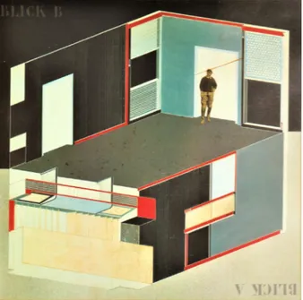
Both the anti-perspectives –that of Florenskij and that of the constructivists– developed in relation to the theme –inher-ited from symbolism– of the “total work of art”, which raises the question of the actual relationships between the artistic object and the physical and ritual environment in which the work of art lives. According to Florenskij, the prototype of the total work of art is the Byzantine-Orthodox liturgical space [9]; on the contrary, according to Lissitzky, the “total work” includes the reformation of the city –i.e. his horizontal sky-scrapers for Moscow– and the reinvention of what we would now call “interior design”, finding its emblem in the new exhi-bition spaces, such as his Prounenraum (fig. 1) and museum rooms (fig. 3) in which the work of art, from enclosed space, becomes an enclosing environment. In Florenskij’s opinion, it is the anachronic reformulation of the spiritual rite; in Lissitzky’s opinion, it is the “re-initialisation” of the categories of the inte-rior, overcoming and hybridising the traditional ideas of home, factory, laboratory, museum, theatre, etc.
It is above all in the design of these exhibition spaces – objects that become an enclosing space – that the architect Lissitzky
develops an anti-perspectival, or pan-perspectival, method of representation: the technique of “unfolded axonometry” (figs.1-3) in which the interior is represented unfolded in two contiguous axonometries, captured by two directions of projection symmetrically opposite to the horizontal or fron-tal positions of the represented space, producing a panoptic spatial image. From the 1923 Berlin Prounenraum, this meth-od spread immediately within the abstractionist international – from the design diagrams by Vantongerloo, Mondrian (fig. 2) – entering into resonance with the synthetic cubism (pur-ism) of Le Corbusier’s early works, with Sartoris’s rationalism, with De Stijl’s analytical elementarism, making axonometry [Reichlin 1979, Bois 1981, Scolari 1984, Bois 1988, Pérez Gómez, Pelletier 2000, Scolari 2005] the figurative label of the modern movement and its schools: from the Bauhaus in Weimar (after 1923) to the Muscovite Vchutemas where Lissitzky introduced interior design.
In interior design, the unfolded axonometry became the method to graphically calculate the spatial (topological)
Fig. 3. El Lissitzky, project for the Kabinett der Abstrakten at the
Provinzialmuseum in Hanover, oblique unfolded axonometry, 1927; gouache, inks, enamels and collage on cardboard, 39,9 x 52,3 cm, Sprengel Museum Hannover.
concomitance of the eidetic and chromatic formants, just as an orchestral score does with the temporal concomi-tance of the sounds. But these representations, in addition to their instrumental purpose, also assumed an autono-mous artistic value in the course of the geometric and el-ementary abstractionism as flat images with a perceptually unstable spatial content –such as the psycho-perceptive test of the “Necker cube”– linked to a reflection and dif-fraction effect of the point of view. An example of this is Albers’s series of woodcuts (fig. 4), which facilitates our comparison with other typographic woodcuts, testifying the opposite conception: the realistic and figurative one expressed by Florenskij’s anti-perspective.
Florenskij –although an excellent draftsman– was a graphic artist only by intermediaries, instructing the execution of three woodcut covers traced by his friend Vladimir An-dreyevich Favorskij: director of the Polygraphic Faculty of the VchuTeMas where he was an exponent of the realist, figurative and archaic faction.
The first of these covers (fig. 6) also allows us to clarify, on the concrete level of drawing, the difference that opposes Lissitzky’s geometric abstractionism to Florenskij’s realistic ge-ometry. Both wrote about geometry; but it would make no sense to compare Lissitzky’s manifesto Kunst und Pangeom-trie [Darboven, Lissitzky 1973] to the mathematical texts by Florenskij who was a professional mathematician and
physi-Fig. 4. Josef Albers, Multiplex D, woodcut on Neenah Resolute Ledger paper, 1948, 22,7 x 30,5 cm (image) [31,7 x 41,5 cm, sheet].
cist, exponent of a “scientific realism” which postulates both the unamendable “reality” of physical space, and the multiplic-ity of forms that space assumes through our senses, in our consciousness (fig. 5). According to him, geometry is a batch of models of “abstract space” that may prove relevant to de-scribe aspects of the phenomenal space of perception and physical space where it cannot appear to our senses and our imagination. As a result, he believes i) that mathematical enti-ties are endowed with real existence and ii) that art and ge-ometry are different means of a single philosophy of Nature. 1922: the graphic plane as a stratification
of geometric spaces
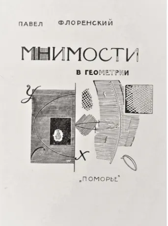
Imaginary spaces in geometry, the expansion of the domain of two-dimensional images in geometry [Florenskij 2016] is the 1922 book in which Florenskij demonstrates the ontological and physical reality of numbers technically called “imaginary”, like the one that expresses the square root of “ –1” (imagi-nary unit). The text also includes a chapter on the “Explana-tion of the cover” (fig. 6), where it shows how Favorskij’s woodcut transforms a (mathematical) “abstract” topic into a “figurative” one, expressing other modes of existence of space, visually “co-present” on the printed page plane. In order to explain how Favorskij’s woodcut on the cover aims at visually showing the “co-presence” of the “imaginary” in a concrete graphic representation on the geometric (dia-grammatic) plane of the “real” numbers, Florenskij –accord-ing to the imposed order of the mathematical discourse– premises the definition of that “co-presence” in our spatial consciousness. These premises are not mathematical, but
Fig. 5. Tree diagram of the explicit categorisation of the term “SPACE” in Florenskij’s works: see for ex. Florenskij 2007, pp. 271-73.
phenomenological and psycho-perceptual. With the example of concrete visual experiences, he argues that the perceived space is always the stratification of the other sensory spaces (fig. 5) in praesentia or in absentia, that is, exhumed in memory, as if they were (topologically) “framed” in each other. The recognition of what the cover “represents” is only one of these visual experiences. It can be recognised as a “cardboard page” subjected to the essential registers of ty-pographic layout –title, author, publisher, etc.– and one can recognise the representation of a sort of “open book” with “geometric graphics”. Only later are the perceptive levels of the picture ‘exfoliated’, distinct –in order of evidence– above all from the visual qualities of the textures of the signs. 1°) First of all, we “read” (fig. 7 right) the figures of a plane that Florenskij calls “paradoxical” because it does not even belong to the physical plane of the sheet on which, instead, the actual typographic characters are “quilted”: the latter must appear physically present on the paper page, but it is the plane of the pure notational inscriptions of the geom-etry of the “real plane” that “transcends” the paper support and indicates a space which is only coded in the signs of the vertical axis X and the digits “O”, “X” and “Y”, the only letters printed in solid black.
2°) The figured book shows us an open page on the left, with a “path” (an ellipse of the XY plane) and, on the right, a flap of that same page that frays in a mysterious “thickness”, which Florenskij defines “almost only tactile”.
3°) In order of evidence, there is then, in front view, the rectangle of the actual “real geometric plane” (fig. 8 left) marked by a thick horizontal hatch that Florenskij says is made of “warm black” and “fully visible”, a rectangle that bears the sharp (black) path (with white edges) of a semi-ellipse whose minor axis is the X axis.
4°) The figure of the “imaginary plane” opens instead on the right side, like a page that, rotating around the X axis, touches the eye of the spectator-reader (fig. 8 right). 5°) The instruction to perceive the image on the right as the “verso” of the “sheet” comes to us from the image on the left (on the figured recto) which proposes on the opposite side the same cursive figure “O”, but mirrored and inverted in its hatching: the black mark of the real “O” (of the recto side, on the left) is transformed here into a white section surrounded by a black “scar”, i.e. with the effect of a sign “in relief” on the verso of the sheet, a sign “caused” by the impression of the same sign imprinted on the “recto”. Therefore, the real (opti-cal) reading direction “XO” is also inverted in the imaginary “OX” direction, a dimension accessible only to the touch,
Fig. 6. Vladimir Favorskij, Cover for P.A. Florenskij’s book, Imaginary spaces in geometry: the expansion of the domain of two-dimensional images in geometry, woodcut on paper, 1922.
Fig. 7. Analysis of the cover: evidence (with respect to the typographic plane) of the notation indicating “real” geometric plane (left). Fig. 8. Evidences of the figure of the “real plane” (right) and the “imaginary plane” (left).
with the movement of an ideal hand that touches the verso of the sheet, accompanying the eye that runs along the visible side. Even the horizontal hatched pattern of the left portion is rendered with strokes of the same type: white and scarred with black at the edges, signs that Florenskij describes as “cold white”. This is also the case of the figure corresponding to the real semi-ellipse, which has become an imaginary hyper-bola segment on the right. In short, the whole right side tries to render a tactile perception (“cold white”), therefore the sense of visual distance, of optical scale is lost; consequently the texture is grainy and enlarged in samples, in touches. 6°) Finally, there are (fig. 9) some “pieces” that escape the rigid distinction in one of these two opposite visual catego-ries. At the centre, near the axis, we find (fig. 9 right) a hybrid ellipse: half “real” (warm black) and visible, and half imaginary (cold white) and tangible. Finally (fig. 9 left), the symbol ap-pears –the Greek letter iota– designating the imaginary unit (number whose square is = –1) rendered on both sides (recto and verso) of the figured plane, but rendered, from a graphical point of view, even more paradoxically than the
Fig. 10. Semiotic square of the terms used by Florenskij to indicate the categories of the graphic expression on Favorskij’s cover.
characters O, X, Y of the real plane. It appears as “tactile” on the verso (on the left) of the plane and “optical” on the recto. In summary, Florenskij builds a (semi-symbolic) system of ho-mologies between pairs of expressive categories and pairs of content categories. These graphical-geometric categories can be represented in the form of the semiotic square (fig. 10) where the opposite terms are the “directly visible and real plane” (in a mathematical sense), and the “imaginary plane”, equally “real” (in an ontological sense), but only tan-gible and made visible thanks to the artifice of the drawing. Among the opposites, the hybrid range of a figured inter-mediate space lies as if it were the thickness of the sheet, enlarged in a tactile way, where visual information is confused with tactile information. Finally, we must also admit the “sub-opposite roles” of the real geometric notation –the visible but not tangible numbers– and of the imaginary unit, rendered as if it were impressed from the verso of the sheet and paradoxi-cally surfacing on the recto with the “scar” that connotes it as a tactile entity. These writings seem to escape the senses, but not the graphic artifice of the drawing that presents them.
Fig. 11. Vladimir Favorskij, Proposed cover for the third number of the journal
“Makovec”, woodcut on paper, 1923. Fig. 12. Analysis of the Favorskij’s cover: the symmetric reversal of the central image (b) of the cover around the vertical axis highlights homographies: direct and inverse homoteties (i.e. “reflections”).
1923: an anti-perspectival allegory of drawing
We do not know how Florenskij in 1923 instructed Favor-skij’s woodcut for the cover of the third –never published– issue of Makovec journal (fig. 11), organ of the homonymous association of realist artists. It is only certain that the wood-cut was born for didascalic and militant purposes as a sort of figurative “manifesto” of the “realistic figuration”, presenting itself as an allegory. And as an allegory, it evokes “things” by “depicting” them through figures shaped as “stencils”, steotyped, as if they were “typographic characters”, thus re-minding us that “images” are above all “social objects”. Therefore, the figure represented at the centre of the woodcut –included in the “frame” that delimits a “figu-ration within the figu“figu-ration”– does not indicate the ap-pearance of a man, but “the man”: the human being in its intension and generality. The man is shown twice, partially superimposed and turned inside out:
1°) “in the “frame” –picture inside the picture”– the man is rendered as a black field in which the white traces of “little figures of Things” emerge –as if they were his X-rayed bowels– appearing like impressed in the flesh of his memory, in his own mnestic traces. These “Things” graphi-cally traced in ‘white on black (and internal) field’, seem almost the same “Things” that appear outside, otherwise figured, with black traces on the entire external and (ide-ally) unlimited white field. But compared to the external ones, the internal ones are inverted in negative and specu-larly reversed.
2°) among the figures rendered in black traces on the white field outside the figure of the “picture, placed be-hind the picture”, there is still the man, this time figured as
an “external Thing” (black on white). This is the reason why the man appears to be doubled: he is in front of the figure in the picture –as in a Byzantine icon rendered in white traces on a black background– and reappears seen from the back, in half, behind the picture, while holding out his open hand with a wide gesture of the right arm, giving us the instruction to mentally reverse the figure.
We do not enter here into the allegorical reading of the “figured Things” by resurrecting the scattered vestiges of Florenskij’s Simbolarium, but we limit ourselves to seeing the geometric relationship between the “Things” represented within “the man in the picture” and those “outside” him. a) Following the gesture of the man from the back, we mirror the central figure (fig. 12 b), we see that “Things figured inside” are rendered as homothetic images (similar and similarly placed) of “Things figured outside”. And we see that the centres of these homotheties are mainly at the edges of the page.
b) Bringing (fig. 12 c) the figurative “picture” in the centre of the cover to its original state, we see that the “things inside” are rendered as homothetic and mirrored figures of the “things” figured outside the picture, and we see that now the centres of these different homotheties gather on the figure of the “frame of the picture”, also rendered with the features of a “Thing outside”.
Therefore, the figure of the “frame” of the picture repre-sents what is placed outside the picture at the edge of the space, as if the exteroceptively learned space folded “at the mirror” in the – interoceptively learned – space of the figuration at the centre. Here is, therefore, a radically (figu-ratively) “reversed perspective”: a (figurative and didactic)
manifesto of (realistic) “Drawing”.
Notes
[1] The notion of “exemplification” as opposed to that of “referential denotation” is introduced by Nelson Goodman: Goodman 1976, pp. 51-63.
[2] Cf. e.g. Cantelli 2011.
[3] Cetverikov and the “Choreological Laboratory” of the RAChN, founded in 1923 (under the direction of Sidorov and Larionov) worked on a “dictionary of gestures” that studied the movement of the human body in its various manifestations, from rhythmic, artistic gymnastics, to contemporary dance: Sidorov’s “free dance”: cf. Misler 2017.
[4] First of all, the psychophysiology of Hermann von Helmholtz (1821-1894) and Ernst Mach (1838-1916) are sources cited by Florenskij as
well, especially in his theory of sensory space (fig. 5) as a synaesthesic whole of “states of consciousness”: cf. Florenskij 2007, pp. 265-280. [5] On the evolution of purovisibilist aesthetics in a semiotic perspec-tive cf. Lancioni 2001.
[6] “Rhetoric” in a semiotic perspective, in the sense of Groupe μ 1976 and (for visual Rhetoric) 1992.
[7] From a semantic point of view it is a difference in terms of density of “iconic semes”: cf. Greimas 1984.
[8] For an anthology of the abstractionist position cf. Magarotto 2016. [9] Cf. The Church Ritual as a Synthesis of the Arts, in Florenskij 1990, pp. 57-67.
Reference List
Bertelé, M., Barbieri, G. (a cura di). (2015). Pavel Florenskij tra icona e
avanguardia. Atti del Convegno internazionale, Venezia, Università Ca’ Fo-scari – Vicenza, Palazzo Leoni Montari (3-4 febbraio 2012). Crocetta del Montello: Terra ferma.
Bois, Y.-A. (1981). Metamorphosis of Axonometry. Daidalos, No. 1, pp. 40-58.
Bois, Y.-A. (1988). El Lissitzky: radical reversibility. Art in America, No. 4, pp. 160-181.
Cantelli, C. (2011). L’icona come metafisica concreta. Neoplatonismo e
ma-gia nella concezione dell’arte di Pavel Florenskij. Palermo: Centro interna-zionale studi di Estetica.
Darboven, H., Lissitzky, E. (1973). El Lissitzky. Art and pangeometry [Kunst
und Pangeometrie]. Hamburg – Brussels: Daled; Hossmann; Y. Gevaert, So-ciété des Expositions.
Florenskij, P.A. (1990). La prospettiva rovesciata. Roma: Gangemi Editore. Florenskij, P.A. (2007). Lo spazio e il tempo nell’arte. Milano: Adelphi. Florenskij, P.A. (2012). Le porte regali. Saggio sull’icona. Milano: Adelphi (Pri-ma ed. 1922).
Florenskij, P.A. (2016). Les imaginaires en géométrie. Extension du domaine
des images géométriques à deux dimensions. Essai d’une nouvelle concréti-sation des imaginaires. Bruxelles-Paris: Zones sensibles-Belles Lettres dif-fusion (Prima ed. 1922).
Gay, F., Cazzaro, I. (2019). Topology and topography of the interior. Lis-sitzky vs. Florenskij. In Cicalò, E. (ed.). Proceedings of the 2nd International
and Interdisciplinary Conference on Image and Imagination IMG 2019, pp. 817- 827. Cham: Springer.
Goodman, N. (1976). I linguaggi dell’arte. Milano: Il Saggiatore.
Greimas, A.J. (1984). Sémiotique figurative et sémiotique plastique. Paris: Groupe de Recherches Sémio-Linguist., Ecole des Hautes Etudes en Sciences Sociales.
Groupe μ, (1976). Retorica generale. Le figure della comunicazione. Milano: Bompiani.
Groupe μ, (1992). Traité du signe visuel. Pour une rhétorique de l’image. Paris: Editions du Seuil.
Lancioni, T. (2001). Il senso e la forma. Il linguaggio delle immagini fra teoria
dell’arte e semiotica. Bologna: Esculapio.
Magarotto, L. (2016). L’avanguardia dopo la rivoluzione. Le riviste degli anni
Venti nell’URSS. Il giornale dei futuristi, L’arte della Comune, Il Lef, Il nuovo Lef. Napoli: Immanenza.
Misler, N. (1990). Il rovesciamento della prospettiva. In Florenskij P.A., La
prospettiva rovesciata e altri scritti. Roma: Gangemi Editore, pp. 3-51. Misler, N. (2017). L’arte del movimento in Russia: 1920-1930. Torino-Mo-scow: Allemandi-AVC Charity Foundation.
Panofsky, E. (1961). La prospettiva come forma simbolica e altri scritti. Milano: Feltrinelli (Prima ed. Die Perspektive als «symbolische Form», in Vorträge der Bibliothek Warburg 1924-1925, Leipzig-Berlin 1927, pp. 258-330). Pérez Gómez, A., Pelletier, L. (2000). Architectural representation and the
perspective hinge. Cambridge, Mass.: MIT Press.
Reichlin, B. (1979). L’ assonometria come progetto: Uno studio su Alberto Sartoris. Lotus international, No. 22, pp. 82-93.
Scolari, M. (1984). Elementi per una storia dell’axonometria. Casabella, No. 500, pp. 42-49.
Scolari, M. (2005). Il disegno obliquo. Una storia dell’antiprospettiva. Venezia: Marsilio.
Tafuri, M. (1979). Formalismo e avanguardia fra la NEP e il primo piano quinquennale. In AA.VV. U.R.S.S. 1917-1978, la ville, l’architecture = U.R.S.S.
1917-1978, la città, l’architettura. Paris: L’Equerre.
Tafuri, M. (1980). La sfera e il labirinto. Avanguardie e architettura da Piranesi
agli anni ’70. Torino: Einaudi. Authors
Fabrizio Gay, Department of Cultures of Project, Iuav University of Venice, [email protected]

![Fig. 4. Josef Albers, Multiplex D, woodcut on Neenah Resolute Ledger paper, 1948, 22,7 x 30,5 cm (image) [31,7 x 41,5 cm, sheet].](https://thumb-eu.123doks.com/thumbv2/123dokorg/5490263.62839/6.892.87.426.102.355/josef-albers-multiplex-woodcut-neenah-resolute-ledger-image.webp)