Design and Development Approaches
for Creating a Mobile Learning System – Mobile ELDIT
Anna Trifonova
International Graduate Schoolof Information and Communication Technologies University of Trento, 38050, Povo (Trento), Italy
Marco Ronchetti
Department of Information and Communication Technologies University of Trento, 38050, Povo (Trento), ItalyAbstract
The paper aims to describe in some details a system called Mobile Eldit (m-Eldit) that is under development at the University of Trento, Italy. It is a mobile version that can be accessed from mobile devices like PDAs, of an existing language learning platform, developed at the European Academy of Bolzano, Italy. The paper also gives description of the theoretical bases behind the system – a general architecture for supporting mobile learning.
1. Introduction and motivation
The use of mobile devices for educational purposes is explored for the first time quite long time ago [2] but the term mobile learning can be more and more often found in the literature in the recent years. This is due to the fast advances of the mobile devices industry. On the market a large variety of devices with already reasonably powerful characteristics is available. The prices also allow almost everyone to be in a possession of such a toy.
Our project aims to development of a mobile version of a language learning system. An extended review of the research activities in mobile learning domain in the last few years [9] and the conclusions extracted there motivated our work and influenced our choice of field. In different projects observations were that probably mobile devices will be most useful in learning activities that can fill learner’s small gaps of waiting or idle time and the learning process should be contextualized or should provide some added value. The user interest and motivation is an important issue that should be surely considered. This led us to select the field of language learning for our experimentations in mobile learning, as language learning fits well in the boundaries that we placed. The system that we chose to get as a starting point is an Electronic Learner's Dictionary of German and Italian, called ELDIT [5]. It is an innovative electronic language learning system especially designed for the needs of the population of the South Tyrol region in Italy. The system could be used by anybody interested to study Italian or German languages, though it is mainly helpful for preparation for the exams in bilingualism in the mentioned area. We should state that our goal from the beginning of the current work was to support grown and self motivated users that need not supervision and guiding during the study process. We should also point out that our research interests slowly moved its focus into the area of pre-fetching and caching in the mobile learning context and our efforts recently are mainly in this direction. These facts influence some of the decisions we made during the development of the described system, called mobile Eldit or m-Eldit.
Further the paper is organized in the following manner: section 2 talks about the differences between e- and m-learning that should be considered when we create an application that will be accessed from mobile devices. In section 3 the architecture of the mobile learning platform is presented and later in section 4 is described briefly the practical development approaches that are used in the creation of a mobile version of ELDIT. The article finishes with short conclusions section and references.
2. Differences between e-learning and m-learning
In general e-learning systems have wide spectrum of functionalities and responsibilities [1]. Maybe the distribution of didactic material stays in first place, but other important functionalities are the management of the learning resources; the support of different user roles and thus identification of users and authorization of their access to the system; often also the personalization of the learning experience, based on the knowledge about the user, collected during the system usage or through questionnaires and assessments; the support of collaboration between the participants and etc.
The scenario: We can imagine a scenario in which a user requests an interaction with the mobile learning system from her PDA (Personal Digital Assistant). The system shows to the user the services which it can provide and the user selects to request more information about a seminar. The system provides to the user the data about the subject, speaker and location of the seminar, and asks the user if he is interested. When the user responds positively the system also creates a reminder, which is triggered depending on what time the user needs to get to the seminar room. Later the systems gives to the user direction how to get to the seminar room. Though in the seminar room no internet connection is available during the seminar the user is able to watch the slideshow of the presentation on the PDA display. The student takes notes and later is able to see them from the desktop PC in the library from a standard web browser.
Confronting this scenario with a common e-learning scenario we have discovered three main differences: • Context – In the mobile scenario it is important to obtain the context information that might be
dynamically changing and might influence different behaviour of the user to which the system should react accordingly. By contextual information we mean for example the spatial data (i.e. the location in the scenario given previously), other environmental information, which might be obtain with special sensors, like surrounding noise level, changes in the available light, availability of resources, like battery condition of the device and etc.
• Device hardware and software characteristics – The most obvious difference between e-learning and mobile learning is the usage of ‘mobile devices for learning’. There is often a discussion what exactly devices might be considered ‘mobile devices for learning’. Should we stress on the size of the device or to underline the fact that the device is mobile (not fixed)? Should laptops be considered ‘mobile devices for learning’? To be more clear we define a ‘mobile devices for learning’ as ‘any device that is small, autonomous and unobtrusive enough to be carried in everyday life with the user and that will be used to support the educational processes, teaching or studying’. Typically compared with a desktop PC these devices are much smaller, e.g. PDAs with a 16bit colour 240x320 pixels screen. And the screens are not the only hardware difference. Some devices have touch screens instead of keyboard. Other, like mobile phones do have keyboard, but in this case the input speed is much more limited. It is visible that the input sometimes could be difficult but in all cases it is different from the PC. Another very important difference is in the available software, both in sense of existing programs and difference in versions. Even if a mobile version of an application exists most often it is very limited. For example most e-learning systems strongly depend on frames to present their content, but the current Internet Explorer version of the Pocket PC has no support for frames.
• The connectivity – The connectivity is one of the main pre-requirements for any e-learning system. Not to mention that recently also the high bandwidth requirements are quite strong. Nowadays there are lots of technological ways to access internet from a mobile device: WAP, GPRS, UMTS, WiFi, Bluetooth. Though the options grow fast still very often the bandwidth is comparatively smaller, the user often gets disconnected, either because the infrastructure is not provided or because the expenses are still high and the user prefers to connect when a cheep connection is again available. We can distinguish disconnected periods that are intentional or not.
Depending on the concrete application that is being created it is possible that only some of these differences will appear between the desktop and a mobile version of a system. For example if the mobile devices that will be used are laptops, than the software and hardware characteristics are practically the same as in e-learning. Still the connectivity is not guaranteed and the environment of the user might be changing periodically.
3. The m-learning architecture
To support the described in section 2 differences we proposed a general mobile learning architecture [8] that, if needed, sits on the top of an e-learning system, thus reusing some of the e-learning system functionalities, like for example the repository with the study materials or in other cases the authorization of the user and assigning proper access rights.
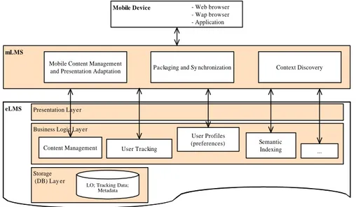
The so called mobile learning management system (mLMS) consists of three modules that are mapping of the three main differences we talked about. The modules are called 1) “Context Discovery” - the module responsible for finding out the context data, 2) “Mobile Content Management and Presentation Adaptation” - the module where the presented data should be especially adapted to fit the devices limitations (hardware or software) and finally 3) “Packaging and Synchronization” - the module which should prepare the system for the periods of disconnection, such that the user can study even in those circumstances. The modules should communicate between themselves for optimal performance. The architecture is presented on figure 1 below.
mLMS
Mobile Device
eLMS
Packaging and Sy nchronization - Web browser - Wap browser - Application
Presentation Layer
Business Logic Layer
Content Management User Tracking
Storage (DB) Lay er
LO; Tracking Data; Metadata
User Profiles
(preferences) Semantic
Indexing
Context Discovery Mobile Content Management
and Presentation Adaptation
...
Figure 1: Mobile Learning General Architecture
Scenario Explanation: Considering previously introduced scenario here is how it will be supported by the proposed architecture: First the user request is captured and in order to proceed the system need to know who is the user and what is the device used. This is done automatically by the “Context Discovery” module, which (based on the first request or additional interaction) already holds the information about the user id and the capabilities and limitations of the device (both software and hardware). Based on this data the system can check the user role (student, teacher, guest, etc.) and access rights in the eLMS and decide what services can be offered in this moment and propose a list to the user. After the next interaction with the user the m-learning system requests information about the seminar from the eLMS and triggers the “Mobile Content Management and Presentation Adaptation” module. Knowing the capabilities of the device (from the “Context Discovery” module) the data is redesigned and returned to the user. Afterwards the user requests the reminder to be set up for her. The system needs additional context information, namely the user location, in order to calculate the needed time to get to the seminar room. Once again the “Context Discovery” module is triggered to track the user current position. Meanwhile, as the system ‘knows’ that the network is not accessible in the seminar room, it triggers the “Packaging and Synchronization” module. The eLMS might contain big amount of materials concerning the seminar – the presentation itself, including explanations from the lecturer; related links; additional papers and examples; etc. As the system already knows the limitations of the device the “Packaging” module selects (with certain confidence) what part will be more useful and important during the seminar (for example only the presentation). In order to fit the device memory the system also ‘asks’ the “Presentation Adaptation” module to resize the images used. Afterwards the presentation is seamlessly uploaded to the user’s PDA and is accessible when needed. During the presentation user’s notes are saved locally on the device, but on next connection to the internet synchronization is done and the notes are uploaded to the server in device independent format. The system also saves the interesting and important parts of the presented material together with the notes in the student’s personal folder on the server, so that they are accessible later from the desktop PC in the library.
4. Mobile Eldit → from general architecture to concrete solutions
Mobile Eldit (or m-Eldit) is a mobile version of existing online language learning platform [4]. From the users’ point of view Eldit consists of two types of data – a searchable dictionary of words both in German and Italian and a set of texts, also in German and Italian, divided thematically into groups. The texts are especially designed for the preparation for the exam in bilingualism. The user might use the system as a normal electronic dictionary and search for unknown words or might browse the texts for more systematic studying.
From more technical point of view the data in Eldit consists of XML files (both for Words entries and for texts) with low granularity and all the entries are highly interconnected. The web server transforms the XML files into HTML + Java Script and the user can browses by clicking on hyperlinks.
For developing the mobile version of Eldit we applied the previously described principles, i.e. the three functionalities in the above architecture – “Context Discovery”, “Specific Adaptation” and “Packaging and Synchronization”. We wanted to keep the user experiences during the usage of the mobile version as close as possible to the online version, so we used a browser on the mobile device as interface to mobile Eldit. This also makes the system very easy for the user to get used to.
4.1 Context Discovery
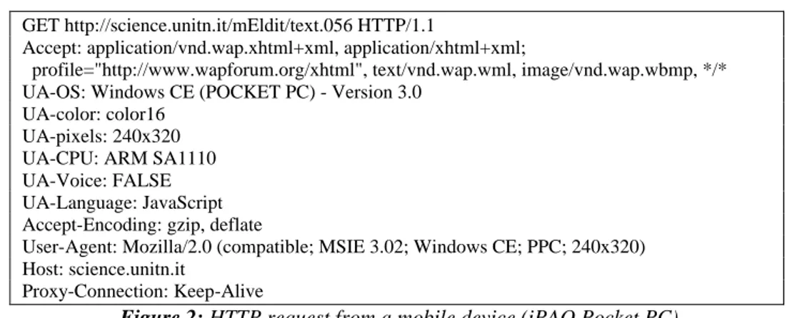
For the adaptation needs of Mobile Eldit the only context information that has to be discovered is the device hardware and software limitation. Knowing the screen size, the browser type and the device’s browser support for scripts and frames will allow the “Adaptation” module to create the proper ‘look’ for the mobile Eldit pages. As a first step we chose the easiest way to discover the context – through the device browser’s HTTP request that is captured on the server site.
GET http://science.unitn.it/mEldit/text.056 HTTP/1.1
Accept: application/vnd.wap.xhtml+xml, application/xhtml+xml;
profile="http://www.wapforum.org/xhtml", text/vnd.wap.wml, image/vnd.wap.wbmp, */* UA-OS: Windows CE (POCKET PC) - Version 3.0
UA-color: color16 UA-pixels: 240x320 UA-CPU: ARM SA1110 UA-Voice: FALSE UA-Language: JavaScript Accept-Encoding: gzip, deflate
User-Agent: Mozilla/2.0 (compatible; MSIE 3.02; Windows CE; PPC; 240x320) Host: science.unitn.it
Proxy-Connection: Keep-Alive
Figure 2: HTTP request from a mobile device (iPAQ Pocket PC)
As shown on the figure above the HTTP request contains what we needed, i.e. what is the device (Windows CE device), what is the screen (240x320), the colour resolution (color 16), what is the browser (Mozilla/2.0) and etc. In a more complicated version of mobile Eldit it is possible to use other context discovery methods. There are quite a lot technological solutions nowadays (for example the device independence initiative [10]). One can imagine also other scenario where adaptation can be used to show to the user context-dependant (e.g. location-dependant) language learning material, like for example the system presented in [6], thus other methods of context discovery will be also needed, but it is out of the scope of our current work.
4.2 Content Adaptation
In order to keep the mobile Eldit users’ experiences as close to the experiences with the online Eldit system we chose to use a browser as an interface to the learning material. Most of the browsers on the mobile devices nowadays still do not support frames and support only limited versions of script languages. This leads to the need of specific adaptation of the content. The adaptation is also needed because commonly web pages are designed for screen size at least 800x600 and in most cases are hard to read and/or navigate from devices with smaller screen. Eldit does not make an exception. Different adaptation techniques can be used to attack
this problem [3]. The adaptation can be server-side, can be done in a proxy between the server and the client or can be done on the client side. Every of these solutions has its pros and cons.
As mentioned earlier the data of the Eldit system consists of XML files, both for the texts and for the words entries. For displaying the data to a desktop PC on the server site on every user request (on the fly) are produced HTML pages containing frames and Java scripts. The data is mainly text, but the entries are highly interlinked. For the mobile Eldit we have decided to use server-side adaptation, namely a XSLT transformations of the XML data on a Cocoon server. Our decision was pushed by two facts – on one hand our data was already in XML format, which lets us an easy creation of the adaptation rules, using XSLT; second the adaptation on the server side is a much better solution in the mobile context, as the adaptation process consumes quite a lot of computational power and will not fit well on a mobile device, as the devices are limited in CPU speed, operational memory and battery.
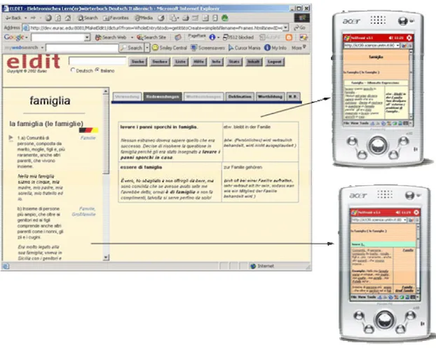
Figure 3: M-Eldit Content Adaptation
3a (on the left): browser view of Eldit word entry with three frames;
3b (right top): m-Eldit additional information (idiomatic expressions) for a word entry; 3c (right bottom) m-Eldit basic word entry screen.
The figure above shows a screenshot of a word entry from the Eldit system, displayed in a desktop PC browser. One can see that it is made out of three frames that contain the main information about the selected word in the left-hand frame and additional information in the right-hand frame. The frame above is dedicated to the searching functionality of the system. In the mobile version we do not support searching. This decision is because the row data of Eldit is much bigger amount than the available memory of standard mobile devices, thus we are not able to provide all the dictionary in the device anytime (see next section about packaging and synchronization). It is also impossible to predict what word a user might be searching for. Thus we have ‘converted’ the screen on the left into a series of interconnected screens on the mobile device. When a user wants to see a word entry first the main screen is displayed and the user might select to view more detailed information by clicking the links that were added during the XLST transformations on the server.
4.3 Packaging and synchronization
In the literature one can see that quite a lot of years pass, but the supposition that ‘very soon’ every device will have always on connection has still not become true. In the fall of 2000 Clark Quinn says [7]:
“The vision of mobile computing is that of portable (even wearable) computation: rich interactivity, total connectivity, and powerful processing. A small device that is always networked, allowing easy input through pens and/or speech or even a keyboard when necessary (though it may be something completely different like a chord keyboard), and the ability to see high resolution images and hear quality sound.”
Though we also agree that this will sooner or later happen the current situation is not like we would like it to be. The devices had really became mobile in the sense of light and small for impressively short period of time and though there are quite a lot of technological ways to connect to the internet, through WAP, GPRS, Wi-Fi and etc. still users have long periods of disconnection. These periods might be intentional or not - because of the lack of proper infrastructure or because the connection has high costs. Nevertheless our vision is that it is important that the user has access to his data and to the materials that he/she wants to study even when the connection is not presented.
After short experimentation with other sub-areas in mobile learning our attention was captured by so called hoarding problem. Hoarding is a technique for automatic selection and caching of the data that the user will need during his offline periods. Hoarding is needed whenever the full data set of a certain application is bigger than the device available memory, i.e. it is not possible to have all the data on the device all the time. In such case it is necessary to select only the most relevant information and to consider how much memory is available. In our mobile learning context the data is the learning material that the user intends to study during the next offline session. We should underline that our interest is in the automation of the process. In other words we don’t want that the learner explicitly says what he/she wants to study, but on the contrary – the system should be able to predict this.
The hoarding process should consist of few steps that we can formalize as follows:
1. Predict the ‘starting point’ – the algorithm should start by finding the entry point of the current user for the next learning session.
2. Set the hoarding priority of the ‘starting point’ to MAX (biggest value).
3. Predict the most probable session path - the algorithm should discover the most probable sequence of LO the user will be following.
4. Create a candidate set - all related documents (objects) should be found and a ‘candidate for caching’ set of objects should be created.
5. Prune the set - the candidate set should be pruned, i.e. the objects that will not be needed by the user should be excluded from the candidate set, thus making it smaller. This should be done based on user behavior observations and domain knowledge.
6. Find the priority to all objects still in the hoarding set - when the candidate set is pruned, using all the knowledge available about the user and the current learning domain, to every object left in the hoarding set should be assigned a priority value. The priority depends on how important the object is for the next user session and should be higher if we suppose that there is a higher probability that an object will be used sooner.
7. Sort the objects, based on their priority - the hoarding algorithm produces an ordered list of objects 8. Cache, starting from the beginning of the list (thus putting in the device cache those objects with bigger
priority) and continue with the ones with smaller weights until available memory is filled in.
Figure 4: Architecture for deriving user profiles
Transaction Data Preprocessing & Integration Knowledge Extraction Log Files Metadata User Profiles Usage Patterns
As one can see the hoarding process and its predictions should be based on the system knowledge about the learner style, preferences and previous experience. Very useful knowledge can be extracted from the students’ previous interactions with the system. These interactions are usually written and saved into log files that can be analyzed. In anyway for doing analysis some processing of the log files is needed. The pre-processing is commonly one of the most time and computationally consuming process, though in our context this process will be performed offline. The deriving of user profiles is shown on figure 3 above.
In the context of hoarding we recognize two groups of characteristics that should be ‘known’ to the system about the user. We schematically call the first ‘user behavior’ and will be kept in ‘Usage patterns’ profiles and the second is ‘user knowledge’ that will be kept in individual user’s profile. The two groups of characteristics will be used differently by the hoarding algorithm. The user behaviour can be described in terms of browsing styles (e.g. consecutive, random, interest driven, etc.); preferred type of educational media (e.g. prefers video to combination of text and pictures); etc. Based on the user behavior we can group the learners and analyze the similarities and differences between the groups and between the members of the same group. This should help us to predict what will be needed, i.e. this data will be used to fill-in the hoarding set. On the other hand the user knowledge profile should consist of everything that the system knows about what the user already knows. Example is the system awareness of the user’s competence in a certain subject (i.e. beginner, intermediate, advanced) or a list of all the topics already covered by the user previously. In contrast of the user behavior the profile of the user knowledge will be used for pruning the entries from the hoarding set, i.e. for excluding objects in order to decrease the size of the hoard. The user behaviour analysis will be discussed in more details elsewhere.
5. Conclusions
We have presented an ongoing work on the creation of a mobile version of an existing e-learning system. Our system is called m-Eldit and has the goal to give the opportunity to people preparing for the exam in bilingualism in South Tyrol to utilize mobile devices, like PDAs in their studying process. For this the system converts the data which is in XML format in a proper format for the small mobile device. We also show that it is important to support the content access during the offline periods, thus a packaging and synchronization is needed. The hoading process is discussed shortly together with the need to analyze the user behaviour.
References
1. Aggarwal, A. Web-based learning and teaching technologies: Opportunities and challenges. Hershey, PA: Idea Group 2000.
2. Brooke Broadbent, “Designing Training for Mobile Computing", a paper presented at the Annual International Conference of the American Society of Training and Development, May 1997
3. Butler, Mark H., Crrent Technologies for Device Independence, HP Labs Tech. Report HPL-2001-83.
4. Gamper J., Knapp J., “A Data Model and its Implementation for a Web-Based Language Learning System”, In
Proceedings of the Twelfth International World Wide Web Conference (WWW2003)
5. http://www.eurca.edu/eldit
6. Jung Li, “Context-Aware Support for Computer-Supported Ubiquitous Learning”, In proc. of the 2nd IEEE International Workshop on Wireless and Mobile Technologies in Education (WMTE'04) 7. Quinn, "Mobile, Wireless, In-Your-Pocket Learning", LiNE Zine “Learning in the new economy”,
available online: http://www.linezine.com/2.1/features/cqmmwiyp.htm , (last visited 12.11.2004) 8. Trifonova A., Ronchetti M., “A General Architecture to Support Mobility in Learning”, Proc. of the 4th IEEE
International Conference on Advanced Learning Technologies (ICALT 2004 - "Crafting Learning within Context”), August 30 - September 1, 2004, Joensuu, Finland.
9. Trifonova A., Ronchetti M., “Where is Mobile Learning Going?”, Proc. The World Conference on E-learning in
Corporate, Government, Healthcare, & Higher Education (E-Learn 2003), Phoenix, Arizona, USA, November
7-11, 2003.