The evolution of income inequality
and relative poverty in Italy: 1987‐2010
2 0 1 2 Federico Biagi and Giorgia CasaloneEuropean Commission Joint Research Centre Institute for Prospective Technological Studies Contact information Address: Edificio Expo. c/ Inca Garcilaso, 3. E‐41092 Seville (Spain) E‐mail: jrc‐ipts‐[email protected] Tel.: +34 954488318 Fax: +34 954488300 http://ipts.jrc.ec.europa.eu http://www.jrc.ec.europa.eu This report is a Technical Report by the Joint Research Centre of the European Commission. Legal Notice Neither the European Commission nor any person acting on behalf of the Commission is responsible for the use which might be made of this publication. Europe Direct is a service to help you find answers to your questions about the European Union Freephone number (*): 00 800 6 7 8 9 10 11 (*) Certain mobile telephone operators do not allow access to 00 800 numbers or these calls may be billed. A great deal of additional information on the European Union is available on the Internet. It can be accessed through the Europa server http://europa.eu/. JRC76236 EUR 25573 EN ISBN 978‐92‐79‐27162‐5 (pdf) ISSN 1831‐9424 (online) doi:10.2791/25041 Luxembourg: Publications Office of the European Union, 2012 © European Union, 2012 Reproduction is authorised provided the source is acknowledged. Printed in Spain
Acknowledgements
The authors would like to thank the Italian Ministry for Education, University and Research (MIUR) for financial support.
Preface
In this report, we study the time evolution of (real) income inequality and poverty from 1987 to 2010, using repeated cross-sections from the Bank of Italy Survey of Household Income and Wealth. We focus on decomposable indexes, as we are interested in identifying the most important determinants of the observed patterns. We create five different groupings: gender, geographical areas (North West, North East, Centre and South), class age (less than 30, between 30 and 40, 40 and 50, 50 and 60 and over 60), education (compulsory school or less, upper secondary and tertiary education) and employment status (employee, self-employed and unemployed).
For inequality, we assess the evolution of four inequality indexes and the role of the “within” relative to the “between” component, where the first captures inequality within each group and the second expresses differences in mean incomes across groups. For poverty we look at the evolution of three indexes and then focus on “poverty risks” dynamics.
Our results show that the main determinants of the inequality and poverty evolution in Italy can be traced to geographic factors and educational attainment (for poverty the age composition seems to matter as well).
The findings presented here are specific to the case of Italy and cannot be easily generalized at the EU level, but we believe this study to be very interesting in light of the adopted methodological approach, in particular, for computing real incomes that are comparable across years and regions (something that is often overlooked by the literature), for the discussion of the relationship between equivalence scales and inequality and poverty, and for the use of decomposable indexes.
Our findings on the role of education in accounting for observed inequality are also relevant for the labour market part of the Digital Economy Research Program at the IS Unit of IPTS, as they are consistent with the skill-biased technological change hypothesis, which states that the diffusion of ICT has had the effect of increasing both the education premium and within-group inequality.
Table of Contents
Acknowledgements ... 1 Preface ... 2 List of Figures ... 4 List of Tables ... 4 1. Introduction ... 52. Welfare comparisons and equivalence scales ... 9
3. Data ... 9 3.1 Inequality and equivalence scales: the evidence ... 11 3.2 Poverty and equivalence scales: the evidence ... 12
4. Population and income shares ... 15
5. Evolution of aggregate inequality ... 19
6. Inequality decomposition and counterfactuals ... 21
7. Evolution of aggregate poverty ... 25
8. Poverty decomposition and counterfactuals ... 27
9. Conclusions ... 29
List of Figures
Figure 1: Generalized Entropy indexes by theta in 1987 and 2010... 33
Figure 2: Generalized Entropy indexes by theta and year ... 33
Figure 3: Poverty indexes by theta in 1987 and 2010 ... 34
Figure 4: Poverty indexes by theta and year ... 35
Figure 5: Income shares over population shares (equivalent income - theta=0.5) ... 37
Figure 6: Mean and median, Gini index and p90/p10 ratio (equivalent income - theta=0.5) ... 39
Figure 7: Gini and GE indexes (equivalent income - theta=0.5) ... 39
Figure 8: GE indexes by gender (equivalent income - theta=0.5) ... 40
Figure 9: Inequality decomposition by gender (equivalent income - theta=0.5) ... 40
Figure 10: GE indexes by area (equivalent income - theta=0.5) ... 41
Figure 11: Inequality decomposition by area (equivalent income - theta=0.5) ... 41
Figure 12: GE indexes by age class (equivalent income - theta=0.5) ... 42
Figure 13: Inequality decomposition by age class (equivalent income - theta=0.5) ... 42
Figure 14: GE indexes by education attainment (equivalent income - theta=0.5) ... 43
Figure 15: Inequality decomposition by education attainment (equivalent income - theta=0.5) ... 43
Figure 16: GE indexes by employment condition (equivalent income - theta=0.5) ... 44
Figure 17: Inequality decomposition by employment condition (equivalent income - theta=0.5) ... 44
Figure 18: Counterfactual GE(0) obtained by keeping constant two decomposition factors out of three (equivalent income - theta=0.5) ... 45
Figure 19: Poverty lines (equivalent income - theta=0.5) ... 46
Figure 20: Poverty indexes (equivalent income - theta=0.5) ... 46
Figure 21: Poverty indexes decomposition by gender (equivalent income - theta=0.5) ... 47
Figure 22: Poverty indexes decomposition by geographical area (equivalent income - theta=0.5) ... 47
Figure 23: Poverty indexes decomposition by age classes (equivalent income - theta=0.5) ... 48
Figure 24: Poverty indexes decomposition by education attainment (equivalent income - theta=0.5) ... 48
Figure 25: Poverty indexes decomposition by employment condition (equivalent income - theta=0.5) ... 49
Figure 26: Counterfactual Poverty indexes obtained by keeping constant one decomposition factors out of two (equivalent income - theta=0.5) ... 50
List of Tables
Table 1: Population share and equivalent income share by gender in 1987 and 2010 ... 36Table 2: Descriptive statistics (equivalent income: theta =0.5) ... 38
Table 3: Gini index and percentile ratios (equivalent income: theta =0.5) ... 38
1 Introduction
This study explores the evolution of inequality and poverty in Italy in the period 1987-2010. Our strategy is to use decomposable inequality and poverty indexes and to characterize the patterns of inequality and poverty in income over the relevant period, focusing on the contribution to overall inequality and poverty by specific subgroups (gender, age, area, education and employment).
The data come from the Bank of Italy Survey of Household Income and Wealth (SHIW Historical Archive) which covers the period 1977-2010. Since data are more reliable and comparable from 1984 we excluded the initial years. The variable of interest is income, defined as the sum of receipts from labour and capital. SHIW data report nominal income and from these we have obtained real values using the appropriate price indexes. A novelty of this study is that our measures of real incomes are comparable across regions. Traditionally, researchers in income inequality that wanted to compare real incomes in different areas of the country were forced to use region or province specific price indexes. These have the plus of allowing for region/province specific dynamics, but do not allow comparisons in the reference year (i.e. they implicitly assume that prices are identical in the reference year). In this paper we abandon this hypothesis and use price indexes that allow both the dynamics and the levels of real incomes to differ. Since these indexes can be constructed only starting from 1986, we have limited our attention to the period 1987-2010. These are very interesting years, since they correspond to a period of increasing wages and income inequality in many countries.
Our results indicate the following pattern for overall income inequality, as measured by either the Gini index, or by the three most commonly used Generalized Entropy indexes (GE(0), GE(1) and GE(2)): in the years between 1987 and 1991 we observe a decrease in the values for the four indexes, followed by an increase up to 1998. After this year the series do not show the same pattern. While Gini and GE(0) show an overall stable pattern up to 2008 (with some evidence of a decline for the Gini Index), GE(1) and GE(2) evidence a decline up to 2002, followed by an increase up to 2006 and a decrease thereafter. This different behaviour is due to the fact that the latter indexes tend to be more sensitive to inequality in the upper part of the distribution. We also notice that all these indexes are higher in 2010 than in 1987 (by a percentage ranging from 2.52 for Gini to 15.61 for GE(0)).
When considering the decomposition of economic inequality and its time evolution, we find that the most interesting groupings are those by geographic area, education and age. Inequality has been increasing within the four macro-regions, and the increase has been particularly evident for the Southern regions (South and Islands). Moreover, area-specific mean incomes have been moving away from each other, the South and Islands being particularly disadvantaged. Both elements have been contributing to the rise in inequality, but the “between” component - smaller than the “within” component when looking at levels- has been gaining relative importance with time.
As for education, income inequality tends to be higher in the group with lower education when using GE(0) and among university graduates when using GE(2). Every index shows a mild positive trend since 1991. As for the “within” and “between” components, the first one is always dominant and both have been rising, especially in the years 1989-1995.
The decomposition by age shows that after 1991 inequality has been rising for all the groups considered (but no consistent ranking among age-groups emerges). We also find that the “within” age-group inequality component (as a determinant of overall inequality) has been rising from 1991 to 2006, with differences across age-class specific mean incomes rising only after 2006.
When looking at aggregate poverty, the evolution of the Head-count ratio indicates an increase from 1989 to 1995, followed by a decrease up to year 2000 (when around 19% of Italians are counted as relatively poor), and by a stabilization in the period 2000-2006, after which the incidence of poverty rises again. For the other two indexes here considered (FGT(1) and FGT(2)), the rise in poverty ends in 1998, which is followed by a very mild decline up to year 2008, after which poverty indexes rise again. The pattern up to 1998 is due to both an increase in the income gap (captured by FGT(1)) and an increase in inequality among the poor (as captured by FGT(2)), and is consistent with the overall rise in inequality in the same time-span previously documented.
Finally, when considering the evolution of the poverty risk for the various groups considered, once again we find that the geographic dimension appears as the most relevant one: if the percentage of poor individuals in the North and in the Centre is always around 10% (slightly lower in the North East), in the South and in the Islands this percentage is three times as high, and the trend is positive. The picture emerging for the FGT(2) index is particularly worrying as well, as it signals that inequality among the poors is rising in the South and Islands. When looking at the contribution of each subgroup to the overall poverty indexes, it is evident that poverty in Italy is largely dependent upon the evolution of poverty in the Southern regions. The education dimension appears to be interesting as well: poverty is much more widespread among less educated people irrespective of the index used. As for the time-evolution, we notice that both FGT(0) and FGT(2) are increasing significantly in the period 1991-1998. Then, poverty incidence (FGT0) stabilizes for individuals with at least secondary education, while -after year 2000- it keeps rising (but at a smaller rate) for the group with lower education. However, under FGT(2), there is a generalized post-1998 decline that is stronger for the group with College education, which stops –for all the three groups- in 2008. The decomposition of poverty indexes by age is also interesting as it shows that the two youngest groups (below 30 and between 30 and 40) are those in which poverty incidence is highest (after year 1995) and increasing, while for the older cohorts it is declining.
The paper proceeds as follows: Section 2 discusses the relationship between inequality and poverty measurement and equivalence scales. In Section 3 we present and discuss the data used in this paper and
the methodology used to construct real incomes that are comparable across-regions. We also discuss how the choice of the equivalence scale affects the measurement of inequality and poverty with SHIW data. In Section 4 we document the evolution for population and income shares for the various groups analyzed in our work, while in Sections 5 and 6 we discuss the evolution of, respectively, overall inequality and inequality decompositions. In Sections 7 and 8 we discuss the evolution of overall poverty and poverty decomposition. Section 9 concludes our work.
2.
Welfare comparisons and equivalence scales
Finding the appropriate equivalence scale for income is not an easy task, as equivalence scales originate from household behaviour given exogenous variables.1 Moreover, “simple” equivalence scales implicitly assume
that every household’s member has access to the same share of total income so that, de facto, they measure potential (as opposed to actual) equivalized (or equivalent) income. Consequently, when we compute inequality and poverty indexes based on such “simple” equivalence scales, we are effectively working with a transformed economy, consisting of “single household equivalent” individuals (this is what makes across-household comparisons possible).
The choice of the equivalence scale can significantly affect our welfare judgements.2 As shown in Cowell and
Mercader Prats (1992) and Coulter et al. (1992a, 1992b), the choice of the equivalence scale has relevant effects on inequality and poverty measurement since, typically, inequality and poverty indexes are non-linear functions of equivalent income and household’s size (Cowell and Mercader Prats, 1999). This implies that, in general, our measurement of inequality or poverty will not be independent from the choice of the equivalence scale.
The literature on intra-household comparisons has documented a wide range of available techniques that can be used to obtain equivalence scale (see Buhmann et al. 1988) and the impression that one gets from this literature is that it is very difficult to obtain some consensus on the appropriate equivalence scale.3 Our
approach is mostly pragmatic: given the absence of a generalized consensus on the appropriate equivalence scale, we choose to work with a tractable family of equivalence scales, for which analytical results on the effects on inequality and poverty measurement exist (at least partially). This is the family of equivalence scales that depend only upon the household’s size (i.e.: number of household’s members), and not upon the household’s demographic composition or income, according to the formula ES N, where measures
the elasticity of needs with respect to household’s size.4
One point deserves our attention: as shown by Cowell and Mercader-Prats (1999) and Coulter et al. (1992a), the relationship between welfare comparisons (as expressed by inequality and poverty indexes) and equivalence scales is not monotonic. In general it depends upon the functional form of the index. In the case
1 Equivalence scales are supposed to make perfectly comparable the services of consumption obtained by individuals pertaining
to households characterized by different needs and structures. They are the solution to the problem of making the indirect utility of a given household with characteristics zeta equal to the indirect utility of the reference household with equivalent income.
2 In this paper we do not address the issue of within-household consumption allocation (see Browning et al., 2004) and focus on
the issue of how are equivalence scales relevant for inequality and poverty measurement.
3 It is useful to remember that equivalence scales are extremely complex objects, whose value changes across countries and time
periods since the way in which real income satisfies different needs depends upon the needs (which depend upon subjective and objective elements), prices, and typically the assumptions about the household’s utility function.
4 On this see Coulter et al., 1992 and Buhmann et al. 1988. Notice that Buhmann et al. show how this family of equivalence scales
encompasses most of the commonly used scales, going from those based on subjective studies (where is closer to 0.2) to those based on econometric models (where is closer to 0.6).
of Generalized Entropy inequality indexes
1 ) 1 ( 1 ) ( 1 n i i i y fGE where represents mean
equivalized income, is equivalized income of individual i, and N represents the number of individuals in the equivalized economy, measured inequality depends upon the values of and upon the distribution of income and household’s characteristics used to determine the equivalence scale. This class of indexes is particularly interesting because it has some desirable properties and because it is exactly decomposable. In the remaining part of our work we will consider three elements of this class, corresponding to the following cases:
N i yi N GE 1 ln 1 ) 0( , corresponding to the mean logarithmic deviation,
N i i i y y N GE 1 ln 1 ) 1 ( corresponding to the Theil index and
1 1 2 1 ) 2 ( 1 2 N i i y N GE corresponding to half the square of the
coefficient of variation.5
Focussing now on the relationship between the elasticity of needs () and family size, Coulter et al. (1992a) show that there are two effects of variations in . When household’s size and unadjusted household’s income are positively correlated, the equivalization process has the effect of lowering more above-average unadjusted incomes (as long as is between 0 and 1), and this makes the distribution of equivalized incomes more compressed (less unequal) when compared to that of unadjusted incomes. Moreover, the process of equivalization has the effect of changing the rankings of (equivalized relative to unadjusted) incomes and this might affect the value of the inequality index (depending on how the index aggregates income differences). In the case of the GE inequality indexes, Coulter et al. (1992a) document that, for a range of values of in the interval (-1, 2), we are likely to observe a U-shape relationship between the value of the inequality index and the parameter capturing the elasticity of needs6. This is confirmed in our analysis (see paragraph 3.1).
As for poverty, we consider the class of relative poverty indexes developed by Foster, Greer and Thorbecke
(1984)
q i i z y z N P 1 1 where z is the poverty line (defined for the reference household), z is the yi
poverty gap, i1...q indexes the poor (so that q is the number of poor individuals) and N represents the total
number of individuals in the equivalized economy. When is equal to 0,
N q
P0 corresponds to the Head-count ratio, which is insensitive to the degree of poverty experienced by the poor and is then scarcely
5 It is perhaps useful to remember that, for values of in the interval (0, 2) the index tends to become more sensitive to income
differences at the lower end of the distribution for close to zero and to differences at the upper end for close to two, whereas the index is equally sensitive to change along the whole distribution for equal to one.
6 In the case of a GE inequality index the analytics for the derivative of the index with respect to show that such a derivative
depends upon the covariance of equivalent income and family size, the ratio of group mean equivalent income to population mean equivalent income, within-group inequality and the value of .
informative from a welfare point of view. When is equal to 1, the index
z z N q z g N P z q i i 1 1 1corresponds to the product of the Head-count ratio and the Income gap ratio (where
z represents mean income among the poor and gi z yi is the poverty gap for individual i). While the Income gap ratio inherits some interesting properties from the Aggregate poverty gap7 (defined as
q i i q i i g y z 1 1 ), it has the disadvantage of being independent from transfers from poorer-poor to richer-poor (unless they are such that the richer-poor exits from poverty), i.e. to inequality among the poor. Hence, we also
consider
q i i i q i i z g q z g N q z g N P 1 1 1 1 2 2 / 1, which weights the relative deprivation of individual i (defined as gi/ ) by the factor z
q z
gi/ , which is increasing in the value of relative deprivation of individual i (this has the effect of giving more weight to poorer individuals8). Notice that the FGT indexes have the property
of being exactly decomposable, which we will exploit in the remaining part of our work.
In paragraph 3.2 we verify empirically whether, for values of in the (0,1) interval, one distribution dominates another one (in our case the comparison is across years), according to some welfare criterion embedded in the inequality or poverty index.
3
Data
Our data come from the SHIW dataset9 and cover the period 1987-2010. SHIW data report nominal incomes
and from these we have obtained real values using the appropriate price indexes. Differently from previous studies,10 we have used varying region-specific price indexes, which take into account both the
time-fluctuations of prices within the same region and the different purchasing powers across Italian regions. To construct this index we relied on two sources. First, we used the monthly consumer price indexes released at the provincial level by ISTAT (the Italian Statistical Institute) since 1987. From these indexes we have calculated the corresponding regional annual average indexes, by weighting each provincial index by the share of regional population residing in the province. Accordingly, we have ended with 20 time-series, one for
7 It satisfies the Focus and Monotonicity axioms, besides informing us about the total cost (ignoring incentive effects) of
eliminating poverty.
8 More in general, given
z g q z g N q P i q i i 1 1 / , the weight given to poorer individuals increases as grows. 9 In Biagi et al (2009) the role of attrition on the measurement of inequality with SHIW data is assessed.
10 We are aware of only one study that looks at the changes in income inequality due to spatial price differences (Pittau et al. ,
2011), with focus only on 2006. For previous studies on inequality and poverty in Italy that use price indexes that do not allow across-regional comparisons in price levels see Baldini (2002), Biancotti (2002), Brandolini (2001), Cannari and D’Alessio (2003). For an application of spatial price differences to US data see Moretti (2012).
each Italian region, with price indexes calculated with base 2009=100 for each region. We have chosen 2009 as the base year because ISTAT, for that year, has estimated the differentials in consumption prices levels across regional capitals,11 based on the methodology of purchasing power parity (PPP). 12 Hence, we have
normalized regional time-varying indexes by applying these PPA indexes, and, for each region, the final indexes have base 2009=100. Once applied to equivalent incomes, these indexes take into account variability in price levels both across time and regions.
3.1 Inequality and equivalence scales: the evidence
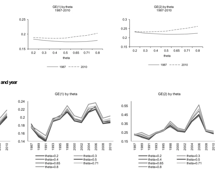
When we look at the relationship between equivalence scale and the inequality indexes in the first and in the last years of observation (Figure 1), we observe that, for any value of , by any index, inequality is higher in 2010 than in 1987. On the one hand, the fact that this result holds for all the indexes makes us confident of its robustness, but on the other one, it is important to understand how the choice of the equivalence scale affect measured inequality. Focusing on the different equivalence scales we find a slight U-shape relationship between measured inequality and (in the interval 0,1) for all the values of considered. Moreover, we notice that the U-shape tends to be a little more evident when is equal to zero relative to when it is equal to 2, especially in 2010.13 It is interesting to note that values of between 0.4 and 0.65 correspond to points in
the relationship between the elasticity of needs and inequality for which the latter is at its minimum. A value of
equal to 0.5 is very common in the literature and our results show that by moving away from this value both to the right and to the left we would get higher values for the GE inequality indexes.
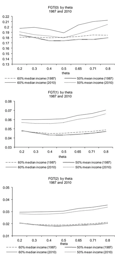
When looking at the time evolution of the inequality indexes as a function of (Figure 2), we observe14 an
initial decline in inequality from 1987 to 1991, followed by a steep increase from 1991 to 1998 (when the indexes reached their first peak value), higher for GE(2) than for GE(1) and GE(0) (but the timing is different: according to GE(0) and GE(1) the largest change is between 1991 and 1993). After 1998, the indexes show diverging pattern: while the GE(0) index declines until 2008 and then rises again, the GE(1) index and, especially, the GE(2) index exhibit fluctuations around a rising trend between 1998 and 2006, followed by a decline (while GE(1) shows an increase from 2008 to 2010).
Overall, we notice that the evolution of inequality depends both on the choice of the equivalence scale and on the choice of the GE index. More importantly, we are not able to draw unique welfare conclusions (based on first order stochastic dominance) when analyzing the evolution of inequality.15 At the same time we do not
believe this problem to be too serious when observed from a pragmatic perspective. If, for each index of
11 In that we are assuming that the price level of the regional municipal capital can be applied to the whole region. 12 See Cannari and Iuzzolino (2009) and Istat (2010).
13 Coulter et al., 1992a show that, as tends to 2, the shape of the relationship tend to become less convex.
14 Concerning the equivalence scale, we observe that the GE indexes - in each year - tend to reach a minimum for values of
between 0.5 and 0.65.
15 This would be possible if, for any GE index, the -specific profiles describing the relationship between time and the value for the
income inequality, we look at the time patterns, we notice that the trends are generally very similar for the different values of and that the likelihood of crossing diminishes largely if we exclude extreme values for
. Following most of the literature, for the remaining part of this study we focus on the case of 0.5 (so that the equivalent scale is just the square of the number of household members).
3.2 Poverty and equivalence scales: the evidence
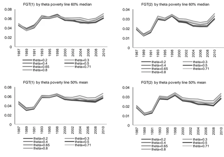
Prior to looking at the relationship between poverty measurement and equivalent scales, we need to define the poverty line (which is later computed using equivalized incomes). In our exercise we have used two different poverty lines: one is set at 60% of the value of median equivalized income and the other one is set at 50% of the value of mean equivalized income. Both measures are arbitrary, but they are also quite common in the literature.
Notice that the use of relative poverty lines has some serious consequences. On the one hand, it is not informative with respect to the income levels of individuals (if all equivalent incomes are multiplied by the same number, relative poverty does not change). On the other one, it is affected by changes in the shape of the distribution of income over the business cycle. An increase in incomes concentrated at the top of the distribution (as expected in times of economic booms) can lead to an increase in measured relative poverty simply because the poverty line has increased. Similarly, in times of recessions, in which we typically observe a contraction of income more concentrated in the upper part of the distribution, we might observe a decrease in the value of the poverty line and hence a reduction in the number of poor individuals.16
When looking at the relationship between equivalence scales and poverty, we consider the effects of changing the value of the elasticity of needs on the three most popular indexes belonging to the Foster, Greer and Thorbecke (1984) class (P , 0 P1 and P2). As in the case of inequality indexes, changes in affect both the distribution of (individual) equivalized income (as opposed to unadjusted household income) and the poverty index (in a way that depends on the value of ). In general, three are the things that matter for all the indexes here considered: where are the poverty lines set, how many poor individuals we have and how relatively deprived they are (this is relevant only for the cases in which >0). The choice of can have an effect on each of them, since, it affects: 1) the overall income distribution which is used to define relative poverty lines, 2) the ranking of individual incomes (which is used to obtain the Head-count ratio) and 3) the inequality among poor individuals (which matters for >0). In general, as shown by Coulter et al. (1992a), the effect of changes of on the FGT poverty index cannot be unambiguously signed, but a U-shape relationship is more likely to occur.
16 Notice also that secular changes in the demographic and household composition can affect inequality and poverty
When we go to the SHIW data for 1987 and 2010, we observe (Figure 3) that a (slight) U-shape relationship between the value for and the poverty indexes appears. We also notice that, for all the FGT Poverty indexes here considered, the relationship between the poverty index and the value of tends to reach a minimum for values of in the 0.4-0.7 interval, particularly concentrated around 0.5. Similarly to inequality, we find that, for any given value of , all poverty indexes are higher in 2010 than in 1987.
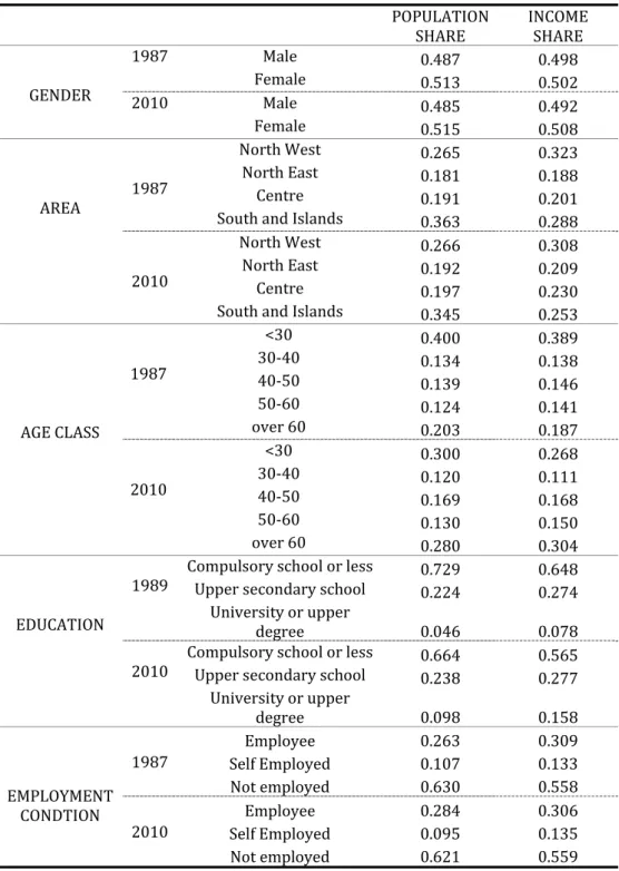
When looking at the time-evolution for the poverty indexes defined for the various values of (Figure 4), we observe some crossings but, at the same time, we can also detect a clear pattern: whatever the poverty index used, poverty went down from 1987 to 1989, then it raised substantially up to 1993, went up slightly from 1993 to 1998 and declined up to 2008, when it started to increase once again.
4
Population and income shares
Given our interest in analyzing the evolution of poverty and inequality, it is important to look at both the aggregate indexes and their components. Some help in this direction can be obtained by looking at the decomposition of overall inequality into the “within” and “between” components. Given the definition of non-overlapping groups (whose choice should be directed mainly by an interesting economic question), the “within” component for an inequality index measures the inequality that is originating from within each group (assuming that all the groups have the same mean income), while the “between” component measures the contribution to overall inequality coming from the differences in mean income among groups.17
We consider different partitions of our datasets, according to characteristics that we believe are economically interesting. These are: gender, geographical areas (we consider 4 areas: North West, North East, Centre, South and Islands), age of individuals (5 classes: less than 30; in the 30-40 interval; in the 40-50 interval; in the 50-60 interval; above 60), education of individuals (compulsory school, upper secondary and university degree or more) and employment (self employed, employee and unemployed).
Before considering the various decompositions, it is useful to compare the share of income held by each subgroup to its share in the total population, as the Income to Population (IP) ratio18 for a given group is equal
to the inverse of the ratio
g
that contributes to the determination of “between” inequality: across-year variation in group-specific mean incomes relative to overall means leads to across-year variation in the “between” component.
In Table 1 we report these values for all the partitions (gender, geographical area, age class, education attainment and employment condition) in 1987 and in 2010.
As regards to the gender decomposition, it appears that females are more numerous than males (around 51.4% of the population). However, when looking at the shares in total (equivalized) income, we observe that females tend to have slightly lower shares (compared to their population share) than males: in every year the
17 The precise definition of the within and between components depends upon the index considered. For instance, in the case of
GE(0) we can write ∑ ∑
= = + = + = G 1 g g g G 1 g g g B W μ μ ln N N ) 0 ( GE N N ) 0 ( GE ) 0 ( GE ) 0 (
GE , where Ng represents the
number of individuals belonging to group g, GE )(0 g represents the values for the inequality index GE(0) computed for each
group g separately, and g represents the values of mean income for group g (where g=1…G).
18 Notice that this variable is a ratio of shares, so that it can be informative only about changes in the relative position of the
different groups and not about changes in the levels of income. For this we would need to look at group-specific mean (or median) values. This can be confirmed when looking at the value of this expression for a generic group i:
(
(
)
)
(
(
)
)
t t it it t it t it n / y n / y n / n y / y =
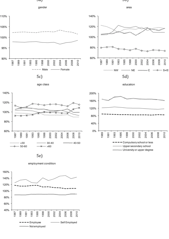
IP ratio is greater than one for males and lower than one for females. However, we also observe that the IP ratio for females has been rising after 200419 (Fig. 5a).
Very interesting results are obtained when looking at the population and relative income shares by geographic area. In fact, we can notice that if the share of the population residing in the different areas has not changed much through the years,20 the shares of total income show some remarkable changes. This implies that, when
looking at the IP ratio (Figure 5b), we find some remarkable across-area variation. First, we notice that the IP ratio for the North-West area (including Piemonte, Valle d’Aosta, Lombardia, Liguria), which – among the areas- was the highest up to 1991, shows a declining profile from 1987 to 1993, so that, in 1993, we observe the North-East taking the lead (up to 2002). The IP ratio for the North-West later rises again and its 2010 value is only slightly below its 1987 value (but higher than the value for the East). When we look at the North-East (which includes Veneto, Emilia Romagna, Friuli Venezia Giulia, Trentino Alto Adige), we observe a different pattern: the ratio of the IP ratio has been increasing from 1987 to 1993 (1995 and 1998 show values slightly below the maximum), reflecting the tremendous growth in per-capita GDP experienced by this area, but has declined thereafter, especially after 2004. When we look at the ratio of the Income share to Population share for the South and Islands (Abruzzo, Molise, Campania, Basilicata, Puglia, Calabria, Sicilia and Sardegna) we note a clear declining pattern. As for the Centre (Lazio, Toscana, Umbria, Marche), a stable IP pattern up to 2000 is followed by a steep increase, which brings its value at the same level as that of the Northern regions (in fact, higher that the value for the North-East after 2004), thus evidencing an improvement of the economic condition of this area of the country.
The evolution of the demographic patterns in Italy (Table 1) shows an increase in the share of those older that 60 (from 20% in 1987 to 28% in 2010), a decrease in the population shares of those younger than 30 (from 39% in 1987 to 27% in 2010) and overall stable patterns for those between the ages of 30 and 40 (14-15% until 2008), those between 40 and 50 (14-15% until 2008) and those between 50 and 60 (12-13%).When looking at the ratio of the Income to Population shares (Figure 5c), we notice an overall increase in the value for the oldest cohorts21 (below 100% in 1987 and above 100% in 2010) and stable patterns for the 50-60 group
(close to 110%) and for the 40-50 group (around 100%). For the 30-40 group, a stable pattern (around 100%) dominates until 2008, when we observe a sudden decline that becomes stronger in 2010. As for the younger
19 Notice that this result is not immediately interpretable in economic terms, since, for each household, we are first computing
equivalized income and then we are allocating it evenly among the household’s members. The fact that females tend to have a lower proportion of aggregate income than males is likely to depend on either lower participation by females to the labour market (implying that equivalized income decreases as the proportion of females in a given household goes up) or lower wages (not necessarily due to discrimination). This explanation does not take into account the fact that in households where females do not participate to the labour market or earn lower wages, males could potentially be earning higher incomes.
20 This is due to the sampling techniques used by the Bank of Italy survey.
21 As already mentioned, there is a general problem concerning the interpretation of these numbers. The assumption underlying
our work is that, within a given household, every household’s member has access to the same amount of resources. Changes in household composition, besides changes in earned income, determine the results that we observe (which is affected by the value chosen for the equivalence scales as well).
group (less than 30), a declining pattern becomes more evident after 2008. We also notice that the IP share for the group in the age interval 50-60 dominates all the others.
Another relevant subdivision is that by education. We have identified three main sub-groups: those with compulsory education or less, those with upper-secondary education and those with a university degree.22 The
Bank of Italy dataset show positive trends for both the share of the population with a university degree (from 4% in 1989 to 10% in 2010), and the one with completed upper-secondary school (from 22% in 1989 to 30% in 2006; in 2010 is back to 24%). These findings, which are consistent with models that generate increasing returns to education, imply a decline for the share of those with only compulsory education (or less). Notice that the changes in educational attainment are also affected by demographic trends (the changes in the level of educational attainment from a year to the next are mainly driven by the younger cohorts, so that the demographics contribute to the overall pattern).
When looking at the IP ratio (Figure 5d), we observe that those with the lowest educational attainment tend to have access to a share of income which is substantially lower than the mean.23 As for the groups with
university education, we find that they rank highest and that their IP ratio exhibits a positive trend up to 1995, followed by a decline (so that the 2010 value is slightly below the 1989 value). The IP ratio for those with upper secondary education shows some initial rise followed by a declining trend after 1993.
The last group division that we consider is that by employment status. We have analyzed three groups: employees, self employed and not employed (we do not distinguish between those that are out of the labour force and the unemployed). When looking at population shares we observe some fluctuations but no clear trends24 (60-63% for the share of unemployed or not at work, 9-11% for self-employed and 25-29% for
employees).
When looking at the Income to Population shares (Figure 5e), we observe that the group of self-employed clearly dominates over the group of employees, which, in turn, dominates over the remaining group. As for trends, the self-employed appear to be on the winning side and the distance with respect to the two other groups (and especially to employees) remarkably increased in the last years (the not employed show a stable pattern).
22 We start this decomposition exercise from 1989 since up to 1987 (included) the Bank of Italy collected information on the
educational attainment of income earners only.
23 The relationship between cohort size and labour income has been analyzed in Card and Lemieux (2002), Brunello et al, (2000),
Brunello and Lauer (2004), Brunello (2010). The effect of cohort size on unemployment has been studied by Biagi and Lucifora (2008).
24 This could be the outcome of two forces that move in opposite directions: on the one hand, we have the rise in female labour
5
Evolution of aggregate inequality
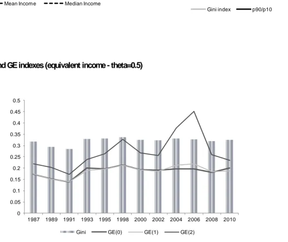
As an initial step, it is useful to briefly look at the evolution of mean and median equivalent incomes (for 5
. 0
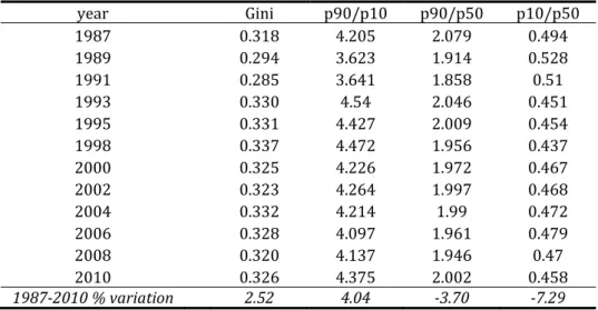
). From Table 2 and Figure 6a we can notice that both exhibit positive trends (more evident for mean income). Next we look at the evolution of some commonly used measures of inequality, like the Gini index and the decile ratio for the top and bottom deciles. The evolution of the Gini index (Table 3 col. 2 and Figure 6b) (which tends to be more sensitive to changes around the mean/median of the distribution and less so to changes in the lower and upper parts) suggests that inequality has gone down from 1987 to 1991, has increased substantially from 1991 to 1993 and has remained fairly stable afterwards (the percentage change from 1987 to 2010 is equal to 2.52). When we look at the evolution of the deciles ratios,25 we notice that the
p90/p10 ratio (Table 3 col. 3 and Figure 6b) decreases from 1987 to 1991, jumps up in 1993, when it reaches its peak level, and then goes down until 2006, when it starts rising again (the 9th decile has incomes that are about four times higher than those of the 1st decile). The ratio of the incomes of the 9th decile to the median one shows a fairly stable pattern after an initial drop from 1987 to 1991 (overall this ratio is close to two, and the percentage change from 1987 to 2010 is equal to -3.7; see Table 3 col. 4). When we look at the lower tail of the distribution we notice that the initial increase from 1987 to 1989 is followed by a steady decline until 1998, followed by a rise from 1998 to 2000 and a stable pattern thereafter (Table 3 col. 5). Overall, incomes in the first decile tend to be about half of the incomes of the median decile and less than ¼ of the incomes in the 9th decile. It is worth noting the worsening of the relative condition of the lowest decile in the time-span 1987-2010: the p90/p10 ratio has gone up by 4.04 percentage points and the p10/p50 has gone down by 7.29 percentage points.
We now consider the evolution of three inequality indexes belonging to the GE class, corresponding to the cases GE(0), GE(1) and GE(2) (Table 4, col. 2, 3, 4). We can see that the evolution of inequality according to GE(0) and GE(1) is very similar to the one observed for the Gini index (Fig. 7): after an initial drop from 1987 to 1991, inequality rises up to 1998. Then it fluctuates mildly without evidence of clear trends. The picture is different when we use GE (2): while for the period 1987-1998 it is close to the one observed for the other indexes, according to GE(2) the period 1998-2010 is characterized by very large fluctuations with a peak in 2006.26
Considering the fact that both mean and median incomes exhibit an overall positive trend, it appears that the growth process has not been associated to increased inequality: in the period 1987-1991, when mean and median incomes are rising, inequality is dropping and the reverse is true for the period 1991-1995. Then, after 1995, both mean and median incomes rise while inequality shows some year-to-year variation, but no clear trend.
25 We report the results for 0.5 but those for 0.65 are very similar.
26 By looking at the overall equivalent income distribution it is possible to argue that the high values of the GE(2) index in 2004 and
6
Inequality decomposition and counterfactuals
When studying the evolution of inequality it is important to understand the dynamics of its various determinants. Throughout the decomposition of inequality indexes it is possible to assess whether inequality is generated by variation within groups or by differences between groups.27
In the case of decomposable inequality indexes, we can do this by rewriting the overall index as B W B B W GE GE GE GE GE
GE 1 , where the overall inequality index can be expressed as the product
of the “between” component and one plus the ratio of the “within to between” components. Accordingly, overall inequality is a function of inequality among groups’ means and within-group inequality relative to inequality among groups’ means.28
Notice that we are interested in two things: first, we want to know whether overall inequality tends to be determined mainly by the “within” or by the “between” component; second, we want to see how this relative importance evolves with time. We see that the answer to the first question is clear: inequality is driven mainly by the “within” component (as should be expected given the broadly defined categories that make up our groups), while for the evolution of the “within-between” ratio we find a more complex picture.
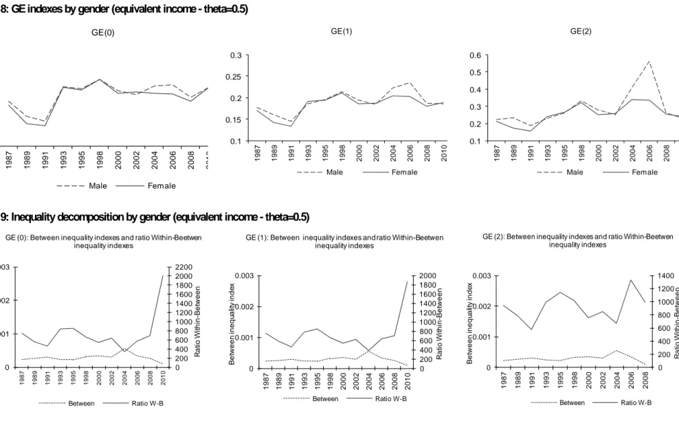
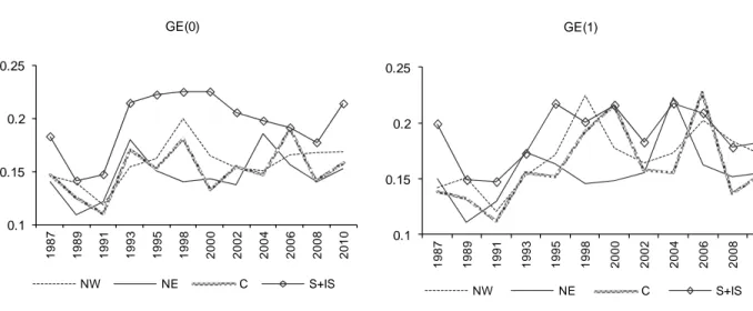
First, we look at the decomposition by gender (Figure 8). The evidence shows that the inequality patterns for males and females are quite similar (with inequality for males slightly higher than inequality for females up to the early 1990s and in the mid-2000), but for GE(2), for which income inequality for males shows a very significant jump from 2004 to 2008. As regards to index decomposition, in Figure 9 we report two lines for each index: the first one (dotted) represents the “between” component and the second one (solid) shows the ratio of the “within” to the “between” component. When considering the time pattern of the “between” component, we notice a slight inverse U-shape, with the decline starting after 2004. As for the ratio of the “within” to the “between” component, for GE(0) and GE(1) we notice a declining pattern from 1987 to 2004, followed by a strong increase. For GE(2), we do not find a consistent pattern. It is remarkable that the value of the WB ratio for the gender decomposition is in the interval 400-1800, hence indicating that the “between” component is really not able to account for overall inequality.
When looking at the decomposition by area, we find (Figure 10), that, under GE(0), income inequality tends to be higher in the South and in the Islands, and this is someway expected given that GE(0) tends to be more
27 The theoretical and empirical literature on inequality decomposition is very large. From a methodological point of view see for
instance Mussard et al. (2003), Silber (1993) and Shorrocks (1980). For an empirical exercise close to the one proposed here see for instance see Jenkins (1995).
28 Hence, if the “within” component and the “between” component change by the same proportions, the overall dynamics are
determined by the “between” component; conversely, if the “between” component is stable, the overall dynamics are determined by the ratio of the “within to the between” components. Alternatively the index could be written as
GE GE GE GE GE GE GE GE W B B
W , which shows separately the contributions of both “within” and “between”
sensitive to inequality in the lower part of the income distribution. The positive inequality gap characterizing the South and the Islands is reduced as we move to GE(1) and GE(2). When comparing the other areas among themselves, no clear inequality ranking emerges (not even for the same type of GE index). However, when looking at time-patterns, we observe large year-to-year fluctuations but also a general positive trend, for all the areas and under all the inequality indexes, from 1991 up to 2010 (with the only exception of the South and Islands under GE(0), for which the increase in inequality stops in year 2000).
When looking at the relative importance of the “within” and “between” components (Figure 11), once again we find that the “within” component is dominant, but we also observe that the WB ratio is much lower than that observed for the gender grouping (the range for WB goes from about 8 to about 25), hence confirming that across-area differences are important in accounting for overall inequality. We also find that the “between” component exhibits a clear positive trend starting from 1991, so that differences in mean incomes across the macro regions (relative to overall mean income) have been increasing with time. Moreover, we find that the relative importance of the “within” component has been decreasing under the GE(0) and GE(1) indexes, implying that across-area differences in mean incomes have been increasing more that within-area inequality. No clear pattern for WB is visible when looking at GE(2), so that the “within” and the “between” component, in this case, evolved in a similar fashion.
The implications for economic policy are particularly interesting: inequality has been increasing within the four macro regions, and the increase has been particularly evident for the Southern regions (South and Islands). Moreover, area-specific mean incomes have been moving away from each other, with the South and Islands being particularly disadvantaged. Both elements have contributed to the rise in inequality, but the “between” component, smaller than the “within” component when looking at levels, has been gaining relative importance with time.29
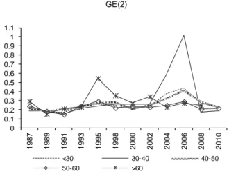
As for the age-class decomposition, after 1991 income inequality is increasing for all the groups considered. However we do not observe an across-indexes consistent ranking among groups (Figure 12). When using GE(0), we notice that inequality is higher among the younger group and lower among the oldest one, as expected given that incomes tend to be lower at the early stages of working life. However, this clear ranking disappears as we move to GE(1) and GE(2). We also notice (Figure 13) that “between” inequality has been quite stable from 1987 to 2006, when it suddenly increased (the values in 2010 are more than twice the values in 2006), that the “within” component is dominant (from about 40 to about 250 times higher than the “between” component) and that the WB ratio exhibits a positive trend from 1991 to 2006 –indicating that “within” inequality has gone up in this period- after which it drops (mostly due to the rise in “between” inequality observed after 2006).
29 This result is in line with the regional economics literature showing that the convergence patterns across Italian regions slowed
Overall we read this as an indication that the relevance of “within” age-group inequality as a determinant of overall inequality has been rising from 1991 to 2006, with differences across age-class specific mean incomes rising only after 2006.
Concerning the education component, every index shows a positive trend and income inequality tends to be slightly higher for the group with lower education when using GE(0) and among university graduates when using GE(2) (Figure 14): this is to be expected as incomes tend to be positively correlated to educational attainment. As for the “within” and “between” components (Figure 15), the first one is always dominant (the values for the WB ratio goes from 7 to 13) but we observe a positive trend for the “between” component especially in the period 1989-1995. The fact that the WB ratio is fairly stable, together with the rise in the “between” component, indicates that “within” inequality has been rising as well. These results are consistent with models, such as those based on the skill-biased technological change hypothesis, in which income inequality rises due to increasing returns to both observable and unobserved abilities. Observable abilities are captured by education and their contribution to income inequality are well expressed by the increase in the income education gap30 (i.e. the difference between the mean income of the more educated -i.e. College
Graduates- and the mean income of the less educated, i.e. those with compulsory education or less). While the increase in the income education gap contributes to the rise in “between” inequality, our evidence shows that inequality within education groups has been rising as well. While we cannot be sure about the reasons for such an increase, we suspect that it could be due, among others,31 to the rise in the return to unobserved
ability.
Finally, if we look at the decomposition by employment status, a clear ranking emerges, as inequality is always higher, whatever index is used, among the group of self-employed,32 while employees present the most equal
distribution (Figure 16). From Figure 17 we also notice overall positive trends for both the “between” component and the WP ratio, indicating that the “within” component has been rising even more than the “between” one, which still represents a small share (less than 10%) of overall inequality.
Finally, we consider some counterfactual exercises.33 We focus on the following variables: 1) the groups’
demographic composition; 2) the subgroups’ mean incomes relative to the overall mean; 3) the subgroups’ specific inequality indexes. By fixing the values for two of these elements to the 1987 values (1989 in the case of education) and letting the third follow its observed path, we obtain a counterfactual inequality profile that would be observed if only the third factor was allowed to vary. We do this for each of the three above mentioned elements, for each relevant grouping (i.e. gender, area, age cohort, education, employment).
30 For an analysis of the education premium using life-cycle wages of Italian male workers see Biagi (2012).
31 Within each group there are important compositional changes, such as those due to the demographics, which have important
effects on labour income, given the typical concave age profile observe for this variable.
32 Self-employed show the largest increase in overall inequality from 1991 to 2006. 33 For simplicity sake we perform the counterfactual exercises using only GE(0).
In general, we find that, for every grouping, the variable that determines by large the overall GE(0) trend is the variation in the subgroups’ specific inequality indexes. In all cases, when this is the only factor allowed to change we get a profile very close to the actual one (Figure 18). However, for some groupings, we also observe that the other two variables have been playing a non negligible role during the analysed period. This is not the case, for instance, for the gender subdivision, where the demographic composition and the ratio of the subgroups’ means to the overall mean have no effect on the evolution of the overall index: only the gender-specific inequality index matters. As for the geographical area decomposition, the demographic factor has had a minor negative effect on inequality (the profile has a mild negative slope and its shape is very different from the one of overall inequality) while changes in relative mean incomes have had some positive effect on overall inequality. This reinforces our previous conclusion on the role of “between” inequality among geographical areas.
When looking at the decomposition by age class, we find a similar pattern: the changes in demographics (the ageing of the population) have had a minor but negative effect on inequality, while the changes in relative mean incomes have positively affected inequality (at least after 1993). The factor that clearly dominates the others is the across-group variation in group-specific inequality indexes.
When considering the education subdivision, we notice that demographic changes have contributed negatively to overall inequality. Given that in the period 1989-2010 in Italy we observe a rise in the share of those with at least upper-secondary education, this result is due to the fact that these groups are those that, in 1989, had low values for the group-specific inequality index. At the same time, we find that both across-group variations in relative mean incomes and changes in subgroups’ specific inequality have had a strong and positive effect on overall inequality.
As for the employment subdivision, we find that neither the demographic composition nor the changes in relative mean incomes have had any substantial effect on overall inequality and that the absolutely dominant factor is the evolution of the group-specific inequality indexes.
7.
Evolution of aggregate poverty
In this study we use two poverty lines: one is set at 60% of the value of the median (equivalent) income and the other one is set at 50% of the value of the mean (equivalent) income (Figure 19)34. Both lines exhibit a
clear positive trend (inherited by the trends in mean and median incomes previously described), but the poverty line set at 60% of the value of the median (equivalent) income (line a hereafter) tends to lie slightly above the one set at 50% of the value of mean income (line b hereafter),35 implying that the number of poor
individuals (and hence the head-count ratio) is higher when using the first measure.36
Figure 20 confirms that the value of the head-count ratio - FGT(0) - is higher with the poverty line a in every year. Data show that the same occurs, although to a lesser extent, for the other two indexes (i.e. FGT(1) and FG(2) are always higher under poverty line a).
When looking at trends, for both poverty lines a and b, the head-count ratio increases from 1989 to 1995, declines in the period 1995-2000, stabilizes between 2000 and 2006 (with the exception of a jump in 2004 under poverty line b), and then rises again. The increase in poverty in the first years of our analysis is confirmed when looking at both FGT (1) and FGT (2)37 which, however, show a longer positive trend (up to
1998). The post-1998 behaviour of FGT (1) and FGT (2) is different from that of FGT(0): while the latter stabilizes between 2000 and 2006, the formers show a declining profile, indicating that in this period both deprivation and inequality among the poor are (mildly) declining.
It is also interesting to note that, in 2010, around 18% of Italians are counted as (relatively) poor, a number very close to the one observed for 1987 (the minimum is reached in 1989: 16% under poverty line a and 14% under poverty line b).
.
34 Here we report the evolution of the poverty lines for the relevant variables computed for a value of 0.5. For brevity we are
not reporting the time patterns for all the poverty lines computed for the various values of . They can be obtained from the authors upon request. The evidence shows that they are very similar, irrespective of the values of used.
35 Under poverty line a, the value of the poverty line in 1987 is 8.448 euro (in terms of 2009 real equivalent income), while its value
in 2010 is 10.928 euro. Under poverty line b, the poverty line in 1987 is 8.338 euro and in 2010 it is equal to 10.580 euro.
36 As for the poverty indexes that embed some notion of inequality among the poor, we cannot say much a priori, since inequality
among the poor can be higher or lower under the different poverty lines.
37 Remember that FGT(0) reflects only the number of those that are considered as relatively poor but gives no relevance neither to
the individual deprivation (which is captured by FGT(1)) nor to the distribution of deprivation (i.e. inequality among the poor, which is captured by FGT(2)).
8 Poverty
decomposition and counterfactuals
When looking at the decomposition of the poverty indexes, it is useful to analyse both the subgroup-specific trends and the contribution of each subgroup to the evolution of the overall index. This can be done by introducing the “poverty risk”. This is simply the ratio of the value for the poverty index referred to a given group to the value of the aggregate poverty index.
Notice that when looking at decompositions by groups we consider only two poverty indexes: the headcount ratio (FGT(0)) and the average squared normalised poverty gap (FGT(2)), since the latter embeds both the poverty gap and its distribution among the poor. Moreover, we concentrate on a unique poverty line, represented by line a (60% of the median income).
When decomposing by gender, we find that poverty is higher among females under both indexes (Figure 21a). The time-profiles for both indexes resemble very closely the patterns of the aggregate indexes. Females’ poverty risks is higher than males’ poverty risk (Figure 21b). We also find evidence of an increase in poverty risk for females between 1989 and 2002 (under FGT(2)), followed by a decline (under FGT(0) the decline in poverty risk is between 1991 and 2006).
Decomposing by geographical areas (Figure 22a and 22b) makes clear the across-area differences that characterize Italy: if the share of individuals below the poverty line in the Centre and Northern regions is always around 10% (slightly lower in the North East, at least until 2002), in the South and Islands area it is about three times higher (around 31% in 1987 and around 33% in 2010), with a steep increase from 1989 to 1995, followed initially by some stability and by a (slow) decline after 2002. It is worth noting that, in the period 1991-1998, inequality among the poor (expressed by FGT(2)) increases substantially more in the South and Islands than in the rest of the country. After some years of decline, FGT(2) picks up again in the South and Islands area in the late 2000s, but this time all the other areas experience an analogous (but less pronounced) trend. When looking at the contribution of each subgroup to the overall poverty indexes, it is evident that poverty in Italy is largely dependent upon the evolution of poverty in the Southern regions (especially for FGT(2)).
When we consider age classes, we notice that poor individuals are more frequent in the oldest cohorts up to 1993 and in the youngest ones after 1993 (Figure 23a). The incidence of poverty (FG(0)) grows especially among the two younger age groups (but some evidence of a positive trend can be found also for the 40-50 group), while for the older age groups the trend is negative (and more so for the group above 60). This is expected, given that the two oldest cohorts have the highest values for the IP ratio. When we look at the FGT(2) index, it is clear that poverty is inversely proportional to age and the post-1989 increase in inequality is particularly evident for the two youngest cohorts (but is visible also for the 40-50 age group). An age effect is also evident when we consider the pattern for the poverty risk for the various subgroups (Figure 23b). In
particular, after 1991, the contribution to overall poverty from the two younger cohorts and from the 40-50 cohort are increasing, while the oldest cohorts are improving their relative condition.
Looking at education, the picture is very clear (Figure 24a): under both indexes, poverty is inversely related to the educational attainment of individuals. Moreover, we find that there is a positive trend (stronger in the period 1991-1998) for all the education groups under both FGT(0) and FGT(2). The picture for poverty risk confirms the clear rankings by education level.
As regards to employment (Figure 25), poverty is obviously strictly related to a non-employment status (around 23-24%, accounting for about 80% of the total number of poor individuals). As for the time profiles, under FGT(0) we observe a slight positive trend for individuals not employed (at least in the interval 1989-1998) and a clear positive trend for employee. Both are confirmed (for not employed the evidence is -in fact- stronger) under FGT(2). In terms of poverty risks, positive trends are visible for both employees and not employed (in this case more clearly after 1993). Self-employed, as compared with the other two groups, show a less regular trend and large fluctuations for all indexes that are particularly high during the 1993-1995 period. These fluctuations are probably due to the higher pro-cyclicality of self-employed incomes relative to the other categories.
In the case of poverty, the counterfactual exercise is obtained by fixing all the elements of a given index but one and allowing only this last element to change. To keep things simple we concentrate only on two variables: group demographics and group-specific poverty indexes. Hence, the proposed exercises are the following: 1) we maintain the group demographics at the reference-year values (i.e. the values observed in 1987, with the exception of education, in which case we use the 1989 values) and we allow the group-specific poverty indexes to take their observed values; 2) we keep the group-specific poverty indexes at their reference-year value and let the group demographics follow the observed pattern. In case 1) we obtain a pattern for poverty that is just the effect of changes in group-specific poverty indexes and is hence “purified” of the demographics, while in case 2) we can observe the pure effects of the demographics, keeping fixed the group-specific poverty indexes. From Figure 26 we notice that for the gender, area and employment grouping, what drives the overall indexes are only the group-specific poverty indexes. In fact, in all the three cases, the profiles obtained keeping the demographics at the reference-year values and allowing only changes in the group-specific poverty indexes are almost identical to the profiles for the overall indexes, confirming that the group demographics are irrelevant. Changes in subgroups’ relative size matter more in the remaining cases. As for age decomposition, the profile obtained keeping the demographics fixed tends to dominate the profile for the actual index past year 1995. This means that the demographic transition experienced after 1995 has reduced overall poverty. Equally interesting is the case for the education decomposition: in this case the rise in the share of those with at least secondary education has reduced the poverty index after 1993.