1
A Geography of Multidimensional Inequalities
in the European Union
Ph.D. Candidate: Supervisor:
Francesca Parente Prof. Giuseppe Croce
Academic Year 2016/2017
Sapienza Università di Roma
Department of Economics and Law
2
Introduction
This dissertation is a cumulative one. It is a collection of three papers, which represent at the same time three separate and independent research articles, as well as three consecutive sections of the same analysis. Aim of this dissertation has been the study of the relations in place between socio-economic inequalities and the spaces they concern. Main research questions have been about the effects of territorial characteristics specific to the EU regions on their levels of multidimensional inequality. First, they asked what have the between and within inequalities been in terms of human development across European regions. Then, investigated the spatial distribution of inequality at the regional level within the EU15 when accounting for dimensions other than income. Finally, tried to understand what can be relevant drivers of this multidimensional inequality within specific regional characteristics. Underlying hypotheses assumed social capital and local economic specialisation in industrial clusters to play a crucial role.
Concerning the theoretical framework, the dissertation combines several strands of literature.
The definition of inequality assumed here is multidimensional, and relates to the human development economics and capability approach1. Therefore, this is the main theoretical reference in the first paper, and the methodological choices made throughout the analysis it presents. The second paper looks specifically into localisation dynamics of firms and the spatial disparities they engender. Consequently, the economic geography is the theoretical framework it moves within, because in the economic literature, it is the discipline that has mainly dealt with agglomeration externalities and related research questions. The third paper focuses on the role of social capital in the determination of inequality, and thus it includes also sociological references besides the ones on economics of inequality.
Concerning the conceptual framework for the analysis, two layers have been investigated in parallel. The first one is the territorial inequality, associated with the spatial distribution of resources. These could be both the economic (factor endowments, industrial clusters, labour markets, etc.) and social ones (both human and social capital), in terms of local characteristics that are considered to provide people with a better quality of life and opportunities. To say it in terms of capability approach, these endowments are assumed to allow people to include some capabilities in their own capability set. If I have a strong civic association network and voluntary organisations active in my territory, I can wisely assume that social climate in that place is higher than where that kind of sociality is missing. Talking at the level of capabilities, it is irrespective of the actual functionings realised by individuals, and look just at the availability of access to place-based social networks.
1 This explicitly refers to Sen, and will be properly explained throughout the dissertation, especially in the first paper. For the scope of this
introduction, it is worth clarifying just that this approach defines capabilities as the opportunities people have of either doing or being in their lives, and functionings as what people actually are or do.
3 These are instead accounted by the second layer. It is the individual level of inequality, which represents the inequality in the accessibility of territorial resources differently experienced by each individual. The opportunities of taking part in social activities and build a personal network of effective social relations, from which one benefits in the daily life and thanks to which one plays an active role in the society, can be significantly different for every each of us.
Now, underlying hypothesis is that these two levels of analysis are mutually connected, and reinforce each other. If you live in a region with good socio-economic endowments, your capability set will be wider than a person’s living in a deprived region. One’s ability to convert these capabilities in functionings, will be biased by the inequality he experiences in his region though, due to the lack of accessibility of (economic, social, and environmental) resources in the first place, and that translates also into an individual conversion factor that varies from person to person. What one can measures are both the available regional assets and the individual achievements, or to better say, some proxy of them. GDP, employment rate, value added in economic activities, pollution and geographic accessibility indicators, quality of local government and educational institution, are some common proxies for the local (economic, environmental, and social) assets. Wage, disposable income, educational attainments, life expectancy, (declared) participation in social activities, (declared) happiness and life satisfaction, are just a few examples for the individual level. The variable you use among them will depend on the measurement approach you are referring to, and the specific domain of the analysis of course.
In the case of this work, specific attention has been devoted to the regional characteristic of economic production structure and social capital (in its collective sense). This will mean trying to link the territorial inequality in the distribution of these socio-economic resources, to the individual level of inequality in the multidimensional achievements in basic capabilities’ domains- especially health, education, and income.
Based on this, the dissertation has been structured according to the following scheme.
1. A multidimensional analysis of the EU regional inequalities. First section explains the procedure
followed to construct the measure of inequality assumed as dependent variable in the study. It was obtained comparing the estimated Human Development Index (HDI) to its adjustment to within-region inequalities. Following the related literature and the most recently applied UNDP methodology (HDR, 2016), regional HDIs and Inequality-adjusted Human Development indices have been calculated over a span of time of twelve years, from 2000 to 2011. The territorial unit of analysis has been set at the Eurostat NUTS2 regions, within the EU15 only. Results say that despite a general increase in the potential human development across regions, the levels of its loss due to inequality have not significantly improved over the selected period. Especially, its spatial distribution reveals complex dynamics, showing an increasing concentration of better performances around some more advanced and educated core regions, and confirming the well-known North-South contrast.
Preliminary findings of this work were presented in several occasions at Humboldt University BGSS in Berlin during the 2nd year’s research stay, and at the SESS PhD Annual Seminar at Southampton in
4 December 2016. The final version of this article has been already accepted for publication by the “Social Indicators Research” journal (Springer).
2. Exploring the spatial context: economic specialisation and inequality. Second section looks into the
territorial inequalities in the spatial distribution of socioeconomic variables assumed meaningful in establishing those preconditions that allow individuals to achieve vital functionings. Specific attention was given here to regional production structure and local economic specialisation. The descriptive analyses it presents rely on ecological data about employment structure and economic production of regions, and follow a literature review on their importance with regards to inequality and spatial imbalances. Moreover, an explorative Principal Component Analysis was used to synthesise the available information on industrial clusters of firms across regions, for the same 205 territories in the same twelve-years’ time of the first paper. Extracted indicators have been compared to the levels of the estimated multidimensional measure of inequality in the regions. Findings say that spatial distributions of considered domains share similar patterns, opposing better performances of the North to worst of the South of Europe.
Preliminary findings from this article were presented at the Postgraduate Research Conference within the International Research Week at Salford University in September 2017 (after a blind referee process started in April 2017), and at the 5th Master Class on EU Cohesion Policy within the European Week of Regions and Cities at the EU CoR in October 2017.
3. Social capital and inequality in EU regions. Third and last section serves to reconcile the two layers of
the analysis, aiming at investigating the levels of individual inequality of the first paper by means of the levels of territorial inequality of the second paper. That is, to explain the individual experience of inequality focusing on the spatial disparities at the regional level in the selected economic domains. Social capital is assumed to be the link between the two levels, so specific theoretical attention has been given to it here. The paper presents the econometric analysis performed in order to test the relations assumed relevant. The interrelations within panel data on social capital and inequality in EU regions have been tested by OLS, and GLM with both fixed and random effects. In order to test the robustness of the model, it has been run on different dependent variables. Besides the constructed measure of multidimensional inequality object of the first section, other economic inequality indices have been used (i.e. Gini and Atkinson measures). Significance of results did not change. Also, synthetic indicators for cluster specialisation and social capital -constructed by means of the Factor Analysis exposed in the second section- were used as predictors, and degree of urbanisation and quality of local institutions as control variables. Findings provide statistically significant results, and seem to confirm the hypotheses.
The final version of this article has been already accepted for publication by the “Regional Studies, Regional Science” journal (Taylor & Francis).
A further section was initially foreseen. It would have been devoted to the more in depth analysis of the inferred relations, by mean of a mixed method approach in case study analyses. The initial idea was to replicate the study in different territorial levels and contexts, in order to test its significance with differing
5 databases too. Also, results would have been combined with qualitative data collected by semi-structured interviews. Due to my participation in a Marie Sklodowska-Curie funded research project, in an international and multidisciplinary research networks with US Universities partners, I got the chance to undertake this challenge in the San Diego area. Moreover, the interest in production cluster dynamics and their relation with regional development and well-being is very much related to my participation in this project. The research has been about innovative strategies for the implementation of smart specialisation strategies and cluster policies by a multidisciplinary and comparative case study approach between the US and the EU. It gave me the chance to spend six months in San Diego, researching on the local processes of urban and regional redevelopment- collecting both secondary (quantitative) and primary (qualitative, via semi structured interviews) data. Findings from the case study I realised there were presented in the MAPS-LED Mid-term meeting of June 7, 2017 at the San Diego State University, and have been selected to be shown at the Human Development and Capability Association 2018 HDCA Conference in Buenos Aires. Due to the extension and complexity of the outputs though, and to the willingness to be as consistent as possible with the cumulative structure of dissertation, this research has eventually fallen within a parallel paper and is not included here. Furthermore, specific case study analyses within the EU area were planned too, to go more in depth within analysed territories and making use of a comparative approach between them. Due to unforeseen issues with data collection and time constraints, this section is not included either and is still open to further refinements beyond the scope of this dissertation.
To conclude, I acknowledge the precious support received by my supervisor throughout these long years, along with the knowledgeable advise provided by scholars I encountered during my Ph.D. journey- within and outside my Department, they have been too many to name them all. Hence the recognition of the vital role played by the research stays I spent abroad, at BGSS of Humboldt University in Berlin and at SDSU in San Diego. Both of these experiences provided me with new and enlightening insights- for my dissertation, my present and future research interests, and my personal development. All of this might not appear explicitly in these pages, but this final outcome -which would not have been the same without them- necessarily conceals it.
6
A MULTIDIMENSIONAL ANALYSIS OF THE EU REGIONAL INEQUALITIES
Abstract: This article illustrates the steps followed to construct a measure that accounts for multidimensional inequality across European regions in terms of human development. First, a multidimensional index to explore the between inequalities across regions has been produced. Referring to UNDP updated methodology (2015) and integrating it with the European Commission contributions (2011, 2014), a Human Development Index has been calculated for 205 regions in the European Union, within the span of time from 2000 to 2011. These estimates have then been adapted to inequality, based on intra-regional distribution of selected variables following the UNDP methodology to calculate an Inequality-adjusted Human Development Index. This allowed to explore how the human development pattern changes when accounting for within inequalities, and to estimate the Loss in potential human development due to inequality in the society. The latter can serve as a measure for multidimensional inequality. Results show a generally increased level of human development achievements despite a widespread persistent level of inequalities in its distribution, as well as a spatial connotation of both dynamics.
7
Introduction.
Geography as a determinant of human beings and their communities’ development is undisputable: coming from a particular territory strongly influences the fate of our lives and this is dramatically evident nowadays (Scott, 1998). However, if this is undoubtedly comparing extra-EU to communitarian citizens, what about the situation within the European Union borders? Unfortunately, even here there is sound evidence that inequality of outcomes exists, persists and possibly is currently increasing (Vacas Soriano, Fernández-Macías, 2017; OECD, 2016; Ramos, Royuela, 2014; Vieira, 2012). The reason why these inequalities should matter in a socioeconomic context is that public policies can potentially either reduce or produce them, both at the local and the national level, still in the European framework. Recently, the OECD stated that “many multidimensional inequalities are spatially concentrated” explaining how many dimensions of well-being are to a great extent determined by where people live, and stressing how inequalities’ level between regions can be almost doubled than that between countries (OECD, 2016). In its analysis of multidimensional living standards in the OECD countries (MDLS), the same study states that these differences have recently increased during the 2000s, and that multidimensional inequality has raised comparatively more than the income one. Furthermore, the authors explain that most worrying trends are those of disposable income, life expectancy, employment and environmental quality parameters.
Due to the recognised importance of taking into account several dimensions of analysis, and the nowadays shared belief that the sole economic performance indicators are not sufficient means to report about levels of either development or well-being, many multidimensional analyses and indices have been recently produced (OECD, 2014, 2011; Istat, 2013; Porter et al., 2013). Especially after the reflections of the Sen-Stiglitz-Fitoussi Commission on the Measurement of Economic Performance and Social Progress (2010) the analysis perspective has been broadened, but most of the available contributions to the study of inequality is still unidimensional though. On the one hand, economic inequality scholars focus on various measures of income and wealth, and the country level of analysis is often still preferred because of wider data availability (Atkinson et al., 2011; Piketty, 2014). On the other hand, spatial inequality dynamics at sub-national level are otherwise inferred mostly looking at productivity and GDP gaps, or income as well, analysing convergence/divergence processes (Quah, 1996; Martin, 2005; Rodrìguez-Pose, 2009; Alcidi et al., 2018).
Willing to go beyond traditional measures, it becomes clear that also a paradigm shift is needed. The frame can be set by the human development economics and the capability approach, elaborated since the second half of 1980s (Deneulin, Shahani, Alkire, 2009). This is the conceptualisation that mostly oriented the change of course towards a multidimensional view of well-being happened not only in the academic environment but also in the policy analysis context (Brandolini, 2008). It is worth underlining that this approach radically focuses on human lives, claiming that the real wealth of nations is not their GDP but their people. Development becomes that process enabling people’s freedom to grow, expand their capabilities and make them able to live the life they want to live (Sen, 1982). Also, the capability approach is intrinsically multidimensional, aiming to take into account as many domains as possible among those potentially affecting people’s lives. Capabilities represent its core concept, and the opportunities people have of either doing or being. The individual capability set is indeed the whole basket of them, among which anyone operates her or his life choices. Based on individual conversion factors, means of living will be transformed in functionings, so to say what people actually are or do (Sen, 1980). And this passage is pretty much related to the importance of the evaluative change proposed to standard approaches widely used in social sciences. To cite Sen, “there is evidence that the conversion of goods to capabilities varies from person to person substantially, and the equality of the former may still be far from the equality of the latter” (Sen, 1979). Income being only a mean in this framework, studying inequalities in its distribution alone may not be enough to know about inequality. In the end, territories are made of people, and a better understanding of actual people needs and capabilities seems vital then in order to get a complete knowledge about the space they live in, especially for regional policies to be effective on a local basis.
8 Despite some criticalities (Noorbakhsh, 1998), an accepted measure of human development is the Human Development Index. The UNDP calculates it yearly since its conception by Mahbub ul Haq in 1990, and many national and subnational reports are regularly produced based on this example2. It can be intended as a proxy of a complex concept, but it has had the undeniable pro of shifting the attention of policy making from GDP to new measures of well-being, thanks to one of the basic properties of synthetic measures: collapsing all the information in one number, it is more straightforward in communicating that complexity also to the general public in an effective way. Furthermore, being a multidimensional index, it allows for a complete ordering that associates a real number to any multivariate distribution (Brandolini, 2008). Other pro is to draw attention to the strict relation between dimensions of development, their non-substitutability given. One of the evident cons of a synthetic index is the loss of information due to the aggregation strategy. A recurrent critic to Human Development Index is its being blind to underlying distribution of considered variables, relying on average values only. Even if it is clear that inequalities matter for the evaluation and analysis of human development achievements - in both the between country-average HDIs and the within country HD-, inequality in the distribution is still rarely measured for domains other than income or wealth. This would be the starting point towards accounting for inequality in the human development achievements. Scarce availability of appropriate data is surely a real difficulty to face when willing to address this issue, as well as the lack of a broad consensus about how to measure inequality in HDI’s distribution (Kovacevic, 2010). But this is not a reason good enough to stop walking in this direction.
The aim of this article is an attempt to reconcile these themes looking at regions in the European Union. It illustrates the steps followed to construct a measure that accounts for multidimensional inequality, and which serves to produce a systematic investigation over space. Compared to other contributions on inequality in the EU (Fredriksen, 2012; Di Falco, 2012; Vacas‑Soriano, Fernández-Macías, 2017, just to name a few), this work is intended to go beyond the sole income dimension, and to do this at the regional level. Compared with similar studies in the frame of regional human development (DG Regio, 2011; JRC, 2014), this analysis aims to go further than the HDI calculation and explore the inequality in its distribution. Also, a more comprehensive picture is provided by the yearly replication of the calculated measures, instead than one-time exercises. The main research questions to be answered are the following:
What have the between inequalities been in terms of human development across European regions? How does the human development pattern change when accounting for within inequality?
How much does the loss in potential human development reveal of regional inequality differentials? Preliminary hypotheses consider that between variations have probably reduced, in line with the convergence process almost closing some national gaps between territories in Europe, while within variations have raised. Looking at both the Members States and the regions’ level, the intra-national and intra-regional ranges of variations are the worrying ones and those determining the overall increase in the level of inequality (OECD, 2017; Inchauste, Karver, 2018; Ridao-Cano, Bodewig, 2018). Human development levels have generally increased, but with different patterns internal to the regional distribution, so differently influenced by inequality dynamics both within people groups (e.g. gender differentials between male and female HDI) and the territories they live in.
Aiming to explore which these recent patterns of regional inequality have been in the EU in this multidimensional framework, the work starts with the estimation of a regional Human Development Index for a twelve years’ time that spans from 2000 to 20113
. This index’ spatial distribution can give an intuition
2 UNDP website provides related sections for both territorial level of analysis. The Measures of America program from
the US Social Science Research Council is an example of independent research in the same evaluative framework.
3 The choice of this period of analysis has been driven by data availability issues. Due to the combination of several
different statistical sources and databases, the time interval ensuring wider coverage has been selected. Further details are provided in the “Data and methodology” section as well as in the Annex.
9 of the unequal development of territories and of between-inequalities across them. More interestingly, its distribution can serve as first step to inquire on the multidimensional inequality trends in the same regions. Additionally, the inequality in the distribution of the index has been estimated, referring to the methodology currently used by UNDP (2015) for the calculation of the Inequality-adjusted Human Development Index. Drawing on both indices, a synthetic measure of multidimensional inequality has been produced in accordance with the same background methodology (Alkire, Foster, 2010; Kovacevic, 2010). Regardless of the focus that different studies can have, all of the existing approaches to inequality have one thing in common: the pursuit of equality of something. And even when dealing with the measurement of inequality, one can distinguish between different aspects to give priority to. They can be summarised by three main strands: inequality of process, inequality of opportunities and inequality of outcomes. Here we take into account the last one, defining our outcomes of interest referring to Sen’s capability approach and measuring inequality as Loss of human development due to the inequality present in the society.
The article is then structured as follows. The first section provides a brief overview of the rationale behind the Human Development Index and its adjustments to inequality. The second section explains data and methodology here followed to construct the Index for the 205 selected regions, and to adjust it to sub-regional distribution of the included dimensions. The third section discusses some results comparing estimations for the considered period. The Annex contains some additional notes on data and methodology.
1. Between and Within Inequalities in the HDI.
Since its first calculation in 1990, the UNDP Human Development Index has gone through many refinements. Last published version from 2016 Human Development Report consists of three dimensions, i.e. health, education and income. First one is expressed by life expectancy; the second, by aggregating expected and mean years of schooling; last one, by logs of Gross National Income (GNI) (UNDP, 2016).
Worldwide, regional analyses have been produced so far (e.g. Quadrado et al., 2001), and some important exercises remain as recognised references like the one on Mexico by Foster, Lopez-Calva and Szekely (2005). In Europe, researchers from DG Regio produced two relevant papers in this regards: Bubbico and Dijkstra in 2011, and Hardeman and Dijkstra in 2014. In the first case, UNDP report is a more direct reference in applying the same methodology to the same three dimensions. The sole exceptions adapting it to the specific case of the EU concerns two variables: educational attainments instead of years of schooling; disposable income instead of GNI4. All data here used were from 2007 (Bubbico, Dijkstra, 2011). In the second case, researchers from the JRC produced a more accurate work in the specification of dimensions and indicators, drawing on European regional specificities and providing a more in depth analysis of variables and correlation between them. Some interesting measures were added, like the NEETs percentage within the education dimension for example, and the final index accounted for three dimensions made up of six indicators5. Despite the valuable contribution of this work, it rests on 44% of missing data in selected variables, in the time range 2006-2012 (Hardeman, Dijkstra, 2014). The latter represents one of the main reasons why the 2011 EU exercise has been here used as primary reference in the translation of the UNDP methodology to the regional context within Europe. Furthermore, the will of keeping the composite measure as simple as possible played a role, in order to derive a comprehensible measure of multidimensional inequality from it, and to make this one more easily interpretable and finally used as a dependent variable in further applications.
4 When available as in the European case, disposable household income is a more precise measure than the national
aggregate. Tertiary education was instead preferred over years of schooling as a better representative of educational attainments in the case of advanced economies (Bubbico, Dijkstra, 2011).
5 Health: life expectancy and healthy life expectancy, plus infant mortality; Knowledge: NEET and general tertiary
10 As already introduced, one of the recurrent critics to the Human Development Index is that of not taking into account the inequality existent in the underlying distribution of considered items. When we calculate the traditional HDI, we aggregate average values in different dimensions, so we are considering how the achievement would be for each person if there was a perfectly equal distribution of achievements. As a matter of fact, two regions with different distributions of achievements can score the same average HDI values.
In order to deal with this limitation, different strategies have been proposed, based on different needs to accomplish with. Indeed, inequality is something recognised as hampering development, in the human development framework especially, valuing equality as something important also per se (Sen, 1992). Attention to this point has been drawn since 1990, but a first measure of the level of human development that accounts for inequality in the society has been introduced in the 2010 Human Development Report only, straight following the preliminary studies carried by Alkire and Foster at OPHI (2010).
Since then, the IHDI is produced too, intended to account for the within-dimension inequality. This can be done by combining the estimate of the basic HDI to the Atkinson measure of inequality. The reasons why exactly this one has been preferred to other measures of inequality (HDR 2010, 2011, 2015) are at least three, as explained by the authors who developed the IHDI methodology now in use6. It satisfies four basic properties7 that an inequality measure should have together with the peculiar one that others like Gini do not- the subgroup consistency8. Its interpretation is intuitive and meaningful: it is the share of per capita achievement wasted as a result of inequalities in the distribution of achievements. It has a neat connection with the general means, such as the geometric mean which is used to penalise inequality between dimensions (Alkire, Foster, 2010).
Atkinson theorised it (1970) on income inequality referring to the social welfare function. The core concept in his reasoning is the Equally Distributed Equivalent (EDE): given the distribution of considered achievement, the equally distributed equivalent achievement is the level of achievement that, if assigned to all individuals, would produce the same social welfare than the observed distribution. When there is perfect equality in the distribution, this means that the EDE achievement is equal to the distribution mean, and the Atkinson measure is 0. When the EDE achievement is less than the distribution mean, then the Atkinson measure assumes positive values. This can be summarised by the following equation:
𝐴𝑥 = 1 − 𝑥𝐸𝐷𝐸
𝜇𝑥 𝑠𝑜 𝑡ℎ𝑎𝑡 {
𝑥𝐸𝐷𝐸= 𝜇 → 𝐴𝑥= 0
𝑥𝐸𝐷𝐸 < 𝜇 → 𝐴𝑥> 0 (𝑎)
Since the Atkinson measure Ax presents a parametric family, there are several possible formulas to compute the 𝑥𝐸𝐷𝐸. One particular case, that is the one implemented by UNDP since 2010, is the geometric mean. It can be derived through subsequent steps to obtain the following9:
𝑥𝐸𝐷𝐸= { [1 𝑁∑ 𝑦𝑖1−𝜀 𝑁 𝑖=1 ] 1 1−𝜀 𝜀 ≠ 1 ∏ 𝑥𝑖1/𝑛 𝑁 𝑖=0 𝜀 = 1 (𝑏) 6
The Alkire and Foster (2010) adaptation of the Foster, Lopez-Calva, Szekely (2005) method. That is why this index is somewhere also referred to as “FLS IHDI”.
7 1.Population invariance= the amount of inequality does not depend on the population size; 2.Symmetry (or
anonymity)= the amount of inequality does not depend on who has each achievement; 3.Scale invariance= the amount of inequality does not depend on the total achievement; 4.Pigou-Dalton Principle= if there is a regressive transfer, inequality increases (Salvareda, Nolan, Smeeding, 2011).
8 That is, if inequality in one population subgroup decreases (increases), and inequality in the other population subgroup
remains unchanged, overall inequality should decrease (increase).
9 This case assumes an additive social welfare function, defined itself by a utility function with a constant risk aversion
11 This formulation can be differently declined so depending on the aversion to inequality ε one wants to use. The inequality aversion parameter concerns the degree to which lower achievements are stressed and higher achievements are de-stressed. It has important intrinsic implications on the theoretical ground, as it represents the assumed level of societal aversion to inequality. When ε is equal to 0, society is not interested in distributive issues; when it is equal to ∞, the aversion to inequality is instead at its peak.
Previously to this formulation of IHDI, there had been a very few attempts to reframe the HDI so that it accounts for both the average achievement in HD’s relevant dimensions in a country, and for inequality in the distribution of HD achievements within that country (Hicks, 1997, Foster et al, 2005, Stanton, 2006). These adjustments have been particularly useful for international comparisons of disparities among countries. To examine HDI inequalities within territories otherwise, another useful approach is to calculate separate HDIs for different groupings, disaggregating by ethnic groups, by income quintiles, or across gender for example. Such disaggregation helps provide a better understanding of human development and of gaps between different groups, revealing part of concealed inequalities of the average index.
The pattern shown by the HDI changes a bit when looking at values separately for men and women indeed. The index has here been recalculated separately for men and women, using gender-specific values of life expectancy and educational attainments for the same 205 NUTS2-level regions between 2000 and 2011. Obtained results, enclosed in the Annex, confirm the importance of a joint analysis at different levels.
2. Data and Methodology.
Data have been collected using the Eurostat NUTS10 regions as territorial unit of analysis, within the EU1511 and excluding the extra-continental regions12. The level of detail has been set to NUTS2 for at least two reasons: wider and more homogeneous availability of human development variables in the selected span of time for countries of interest; comparability to other regional performance and innovation indicators not available yet at a lower territorial specification. As regards the HDI, ecological data aggregated at the regional level come from Eurostat and OECD databases. As for the IHDI, individual microdata were taken mainly from the EU Survey on Income and Living Conditions (EU-Silc). The selected period is a twelve years’ time, from 2000 to 201113
. The following paragraphs explain in detail procedure and data used per each indicator, starting from the HDI, passing by the IHDI, estimating the inequality via the comparison between the two, and concluding with a look at other indicators.
2.1. Inequalities between regions.
Health indicator has been obtained by normalising the values of life expectancy at birth provided by
Eurostat regional database, which are estimated on the basis of National Statistics Institutes14. Normalisation has been done using min and max values internal to distribution of life expectancy across the considered European regions, in the time range 1990- 201315, applying the following formula:
10 From the original French definition: Nomenclature des Unités Territoriales et Statistiques. The higher territorial level
in the NUTS hierarchy is 0, which stands for countries. Sub-national levels slightly vary across Member States, adapting to national administrative systems. Generally speaking, level 1 represents macro-regions, level 2 regions and level 3 sub-regional partitions. The classification here used is that from 2010 revision.
11 The choice of restricting the study to 15 Member States only has been due to data availability and comparability
across countries.
12 Four French, three Spanish and two Portuguese oversea departments (FR91-FR94; ES63, ES64, ES70; PT20, PT30). 13 Due to the wider coverage it ensures across the considered domains of the analysis.
14 Life expectancy at given exact age is defined by Eurostat as “the mean number of years still to be lived by a person
who has reached a certain exact age, if subjected throughout the rest of his or her life to the current mortality conditions (age-specific probabilities of dying)”.
15 Min appears to be Norte (PT11) in 1991 with 74 years, and Max is Comunidad de Madrid (ES30) in 2013 with 84,8
12 𝑁𝑜𝑟𝑚𝑎𝑙𝑖𝑠𝑒𝑑 𝑣𝑎𝑙𝑢𝑒 =𝑎𝑐𝑡𝑢𝑎𝑙 𝑣𝑎𝑙𝑢𝑒 − min 𝑣𝑎𝑙𝑢𝑒
max 𝑣𝑎𝑙𝑢𝑒 − min 𝑣𝑎𝑙𝑢𝑒 (𝑐)
A few regions presented missing data for some years, and in those occurrences the values have been imputed from previous available year, assuming that life expectancy is something not suddenly changing from one year to the following one16.
Education indicator has been estimated following the first proposed methodology for the application
of HDI at the regional level in Europe (Bubbico, Dijkstra, 2011). As introduced, it combines low and high educational attainments, respectively coded by ISCED levels 0-2 and 4-517. Low education has been considered in its complementary to one, in order to convert it in a positive measure and so to consistently contribute to the overall HD index. These two separate indicators have been aggregated into the Education one by means of a weighted geometric mean, attributing 1/3 weight to lower and 2/3 to higher levels.
Main source is the Eurostat regional database of Labour Force Survey. In addition, the Danish National Statistical Institute has been the reference to estimate some missing data for Denmark regions18.
Income indicator has been obtained by normalising the values of regional disposable income per
equivalised households provided by the OECD19. The selected variable has been here considered in purchasing power standards per capita20, so to represent the income each individual has at disposal thanks to the “sum of primary income and social benefits and transfers other than in kind (monetary transfers) and less taxes on income and wealth, social contributions and effect transfers” (OECD Regional Economic dataset – Metadata, 2015).Refined figures have been normalised, using min and max values internal to distribution of disposable incomes across the considered European regions, in the Eurostat database for the time range 1995- 201321. Following Bubbico and Dijkstra and their regional HDI paper (2011), normalisation without a natural logarithm22 have been used, because the differences in net adjusted household income in the EU 15 can be reasonably considered smaller than worldwide so to not follow the log transformation that UNDP normally applies. Even though that choice would have stressed the diminishing returns of income, its results appeared to over-smooth the existent differences in income values’ among selected regions: the range size between minimum and maximum values is notable indeed, but it is biased by the distribution extremes and the Inner-Outer London outlier behaviour also, concealing a less impressive variance in terms of purchasing power parities- which would have been partly lost in the logarithm transformation.
HDI composite index. Health, education and income have then been aggregated into the
multidimensional index of human development by a simple geometric mean as the following: 𝐻𝐷𝐼 = (𝐼𝐻𝑒𝑎𝑙𝑡ℎ∙ 𝐼𝐸𝑑𝑢𝑐𝑎𝑡𝑖𝑜𝑛∙ 𝐼𝐼𝑛𝑐𝑜𝑚𝑒)
1
3 (𝑑)
The choice of weightings follows the UNDP considering implicit equal weights. Assigning no particular weight to any dimension ensures that each of them has the same incidence in the final index. The selection of geometric mean as way of aggregation depends instead on the willing of penalising inequality
16 Cheshire (UKD6) and Merseyside (UKD7) in 2000/2001; The Netherlands in 2001; Germany in 2000/2001 [Detmold
(DEA4) and Arnsberg (DEA5) also until 2009].
17 Used data represent the percentage of people aged 25-64 with these levels of education, as derived from the Labour
Force Survey and provided by Eurostat and available from 2000 to 2016.
18
The applied estimate is explained in the Annex.
19 Its data sources are National Institutes for Statistics. Since OECD territorial units’ classification slightly differs from
the Eurostat one, some preliminary data processing was needed. Detailed data treatment is reported in the Annex.
20
PPS are an artificial currency unit derived by dividing any economic aggregate of a country in national currency by its respective purchasing power parities. Here they have been calculated by means of PPPs at EU15=1 (provided by Eurostat). Original data have been selected in national currency per head at current prices from OECD database. Additional notes on methodology and implications of conversion to PPS are provided in the Annex.
21
Min appears to be Extremadura (ES43) in 1995 with a 6.519 PPS value, and Max is Inner London (UKI1) in 2013 with a 39.577 PPS value.
13
between dimensions of development: higher level of the income indicator could not compensate lower levels
of education, for example. Substitutability between dimensions is not allowed anymore, differently than how it was until arithmetic mean was used (HDR, 2010), and in this way each dimension is clearly considered intrinsically important and different. Furthermore, geometric mean confers higher importance to low values, so that they can hardly be balanced by higher values in the same dimension.
2.2. Inequalities in the Human Development.
Relying on available intra-regional distributions, Atkinson measures have been estimated for all of the three considered dimensions of human development, and then used to weight the three components of the composite index. Used methodological procedure follows Alkire & Foster, and Kovacevic (2010) and foresees three consecutive steps to compute the inequality-adjusted index.
First of all, one needs to calculate inequality in the underlying distribution of each component. In this case, ε has been set to 1, following Kovacevic (2010) and UNDP (2015). This means that the (a) equation here becomes: 𝐴𝑥= 1 − 𝑔𝑥 𝜇𝑥= 1 − √𝑋1… 𝑋𝑛 𝑛 𝑋̅ (𝑒)
In order to estimate Ax for each variable (life expectancy, educational attainments and disposal income), some previous data treatment has been necessary. Computations have been specific to each case, and include the following.
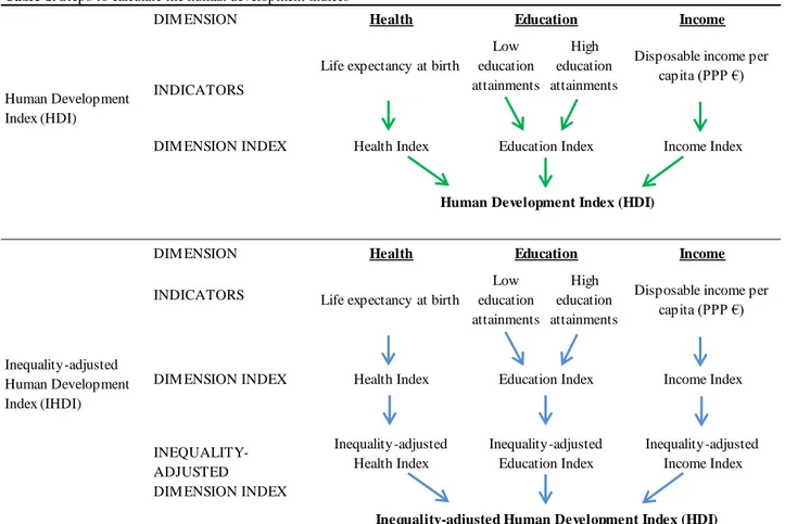
Table 1. Steps to calculate the human development indices ¹
DIM ENSION
INDICATORS
DIM ENSION INDEX
DIM ENSION INDICATORS
DIM ENSION INDEX
¹ Author's adaptation of the 2015 HDR Technical Notes
Inequality-adjusted Human Development Index (HDI)
Inequality-adjusted Human Development Index (IHDI) Human Development Index (HDI) INEQUALITY-ADJUSTED DIM ENSION INDEX
Inequality-adjusted Education Index Education Education Health Index Inequality-adjusted Income Index Inequality-adjusted Health Index
Health Index Education Index Income Index
Health Income
Income Health
Human Development Index (HDI)
Life expectancy at birth
Low education attainments High education attainments
Disposable income per capita (PPP €) Life expectancy at birth
Low education attainments High education attainments
Disposable income per capita (PPP €)
14
Health dimension index. As regards life expectancy at birth, the inequality in its intra-regional
distribution has been directly calculated on the available life tables provided by Eurostat23. The distribution of the expected age at death has been defined drawing on the procedure explained by Kovacevic (2010). He refers to a model life table, which he describes being as normally following “a hypothetical cohort of 100,000 people born at the same time as they progress through successive ages, with the cohort shrinking from one age to the next according to a set of death rates by age until all people eventually die. Such a table is used for computation of life expectancy at birth broadly defined as the average number of years a group of people born in the same year can be expected to live under the constant-mortality assumption, i.e., mortality is maintained constant at the level estimated for the reference year or period”.
Education dimension index. Considered variable from the EU-Silc is higher educational attainment,
labelled PE040 in the EU-Silc survey24. It represents the ISCED level attained by the survey respondent, so ranges from 0 to 525. The adjustment of education indicators for inequality in the distribution of educational attainments has been done applying the (e) formula to the available microdata. It is worth reminding that UNDP quantifies educational attainments by years of schooling (expected and mean), so the IHDI contains a dimension of education inequality-adjusted based on the distribution of these variables. Here in the HDI calculated in the previous paragraph, main reference for the education dimension was Bubbico Dijkstra (2011) so using percentage of people with higher and lower ISCED level26. That is why now the ISCED level reported in the EU-Silc is the sub-regional distribution on which the inequality-adjustment is computed, as explained. However, in order to better fit the distribution of this proxy to that of educational attainments among population, the reported ISCED levels have been converted in number of years presumably necessary to obtain them, on average within the EU1527. This underlines the non-linear scale it has differently from the 0-5 ISCED range, and so estimates the unequal distribution of achievements across levels of the scale more appropriately.
Income dimension index. Disposable household income, labelled HY020 in the survey, expresses
the total household disposable income in national currency, and here it has been equivalised per capita dividing it by the equivalence scale parameter28, labelled HX050. Also in this case, available surveyed distribution of selected variable has been used to estimate an Atkinson measure of inequality, applying the
(e) equation. Since zero values are not allowed in the Atkinson measure formula though (due to the presence
of a geometric mean) disposable incomes have been further treated. Zero and negative incomes have been set equal to the lower value of the bottom 0.5 percentile of positive incomes in each yearly distribution. Also, top 0.5 percentile incomes have been truncated to avoid distortion by these extreme higher values on the final measure29. Furthermore, data have been converted to purchasing power standards30.
IHDI composite index. After all of these refinements, application of equation (e) produced three
new variables, which are the estimated Atkinson measures in education, income, and health. By means of
23 It has to be noted that UN life tables are abridged ones with five-years age interval, while Eurostat available ones are
year-by-year. The used age interval here considered has then been 𝑛 = 1.
24 Considered available data range from year 2004 to 2011.
25 EU-Silc data refer to 1997 classification of International Standard Classification of Education. ISCED were designed
by UNESCO in 1970s to ease the comparability of educational attainments across different national educational systems.
26 See previous paragraph 2.2.
27 Correspondence has been set to: 0=two, 1=seven, 2=ten, 3=fourteen, 4= seventeen, 5=twenty-two. 28
Equivalence scales are the parameter by which, in income analysis, members of a household receive different weightings based on their age as the ability to earn and spend the household income. Dividing the total household income by the sum of the assigned weights produces a representative income per person. In the EU-Silc, Eurostat uses the "Modified OECD equivalence scale", which counts: 1 for the first adult (≥14 years); 0.5 for other adults; 0.3 for children <14.
29 For more details on the sensitivity analysis of income data, see Kovacevic (2010).
15 them, a coefficient can also be calculated here to quantify the human inequality. It is obtained as an unweighted arithmetic average of the inequalities in the three dimensions, using the following formula:
𝐶𝑜𝑒𝑓𝑓𝑖𝑐𝑖𝑒𝑛𝑡 𝑜𝑓 𝐻𝐼 = 𝐴𝐻𝑒𝑎𝑙𝑡ℎ+ 𝐴𝐸𝑑𝑢𝑐𝑎𝑡𝑖𝑜𝑛+ 𝐴𝐼𝑛𝑐𝑜𝑚𝑒
3 (𝑓)
Once inequality within separate dimensions has been estimated, the second step is to apply this measure to development indicators previously calculated, by simply multiplying them to obtain the inequality-adjusted indicators per each 𝑥 dimension:
𝐼∗= (1 − 𝐴
𝑥) ∙ 𝐼𝑥 (𝑔)
Now that each dimension accounts for within-inequality, the three can be aggregated into the composite inequality-adjusted index, using a geometric mean again, in the third step as follows:
𝐼𝐻𝐷𝐼∗= (𝐼
𝐻𝑒𝑎𝑙𝑡ℎ∗ ∙ 𝐼𝐸𝑑𝑢𝑐𝑎𝑡𝑖𝑜𝑛∗ ∙ 𝐼𝐼𝑛𝑐𝑜𝑚𝑒∗ )1/3=
= [(1 − 𝐴𝐻𝑒𝑎𝑙𝑡ℎ) ∙ (1 − 𝐴𝐸𝑑𝑢𝑐𝑎𝑡𝑖𝑜𝑛) ∙ (1 − 𝐴𝐼𝑛𝑐𝑜𝑚𝑒)]1/3× 𝐻𝐷𝐼 (ℎ)
The main disadvantage of the IHDI is that it is not association sensitive, so it does not capture overlapping inequalities, that is it does not account for if a person experiences one or multiple deprivations. Despite this, the FLS inequality adjustment of HDI has the relevant pro of being comparable with unadjusted HDI. When there is inequality in the distribution of a variable, the IHDI of an average individual in the considered territory will be less than the aggregate HDI: the greater the difference between the two indices, the higher the inequality in the concerned society. The loss in potential human development due to multidimensional inequality is often expressed as a percentage and can be then quantified as:
𝐿𝑜𝑠𝑠 = 1 −𝐼𝐻𝐷𝐼 ∗ 𝐻𝐷𝐼 =
= 1 − [(1 − 𝐴𝐻𝑒𝑎𝑙𝑡ℎ) ∙ (1 − 𝐴𝐸𝑑𝑢𝑐𝑎𝑡𝑖𝑜𝑛) ∙ (1 − 𝐴𝐼𝑛𝑐𝑜𝑚𝑒)] 1
3 (𝑖)
When inequalities are of similar magnitude in all dimensions, the loss in HDI assumes values close to the coefficient of human inequality. When inequalities differ between dimensions, the loss in HDI tends to be higher than the coefficient. Under the perfect equality ideal circumstances, IHDI and HDI are equal and the loss is zero.
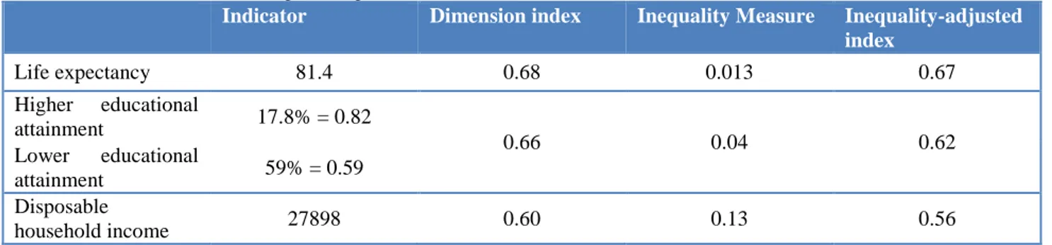
Through the example of Inner London, the following tables 2. and 3. provide a summary of all steps followed in the indices’ calculation. Also, they highlight how good performances in development indices may however conceal high inequalities31. Displayed region is often ranked first both by HDI and IHDI, nevertheless joining four times the worst 20 regions in terms of estimated inequality, and showing one of the highest Loss in 2011 (i.e. 7%).
Table 2. Indices’ calculation, example of steps for Inner London (UKI1) in 2011.
Indicator Dimension index Inequality Measure Inequality-adjusted index Life expectancy 81.4 0.68 0.013 0.67 Higher educational attainment 17.8% = 0.82 0.66 0.04 0.62 Lower educational attainment 59% = 0.59 Disposable household income 27898 0.60 0.13 0.56
16
Table 3. Calculated indices, Inner London (UKI1) in 2011.
Human Development Index
Inequality-Adjusted Human Development Index
Percent Loss in Human Development Coefficient of Human Inequality (𝟎. 𝟔𝟖 ∙ 𝟎. 𝟔𝟔 ∙ 𝟎. 𝟔𝟎)𝟏𝟑 = 𝟎. 𝟔𝟒 (0.67 ∙ 0.62 ∙ 0.56) 1 3 = 0.62 1 − (0.62 0.⁄ 64) = 0.07 0.013 + 0.04 + 0.13 3⁄ = 0.06
2.3. Robustness’ analysis of indices
Robustness is a propriety of estimators, by which the characteristics it has under certain hypotheses continue mostly to hold even when far from the starting hypothesis. In this case, the initial hypothesis is that regional human development in considered space and time is influenced -and can so be reasonably approximated- by dimensions and indicators selected. The robustness analysis is then carried out by testing if it confirms or not this hypothesis when slightly modifying the index. Two different strategies have been here used. In the first one, a weighted geometric mean is calculated instead of the simple one previously employed, and dimensions’ importance changes three times, so that the formula is:
𝑟ℎ𝑑𝑖𝑥= (𝐼𝑥2∙ 𝐼𝑦1∙ 𝐼𝑧1) 1/4
(𝑗) where x is first income, then health and finally education.
In a second check, the aggregation procedure is used as it is in the main index, but each dimension is left out of the calculation once, following a “leave one out” approach.
Six new indices have been obtained this way, and related new rankings of 205 considered regions have been calculated. Rank correlation has been calculated on these rankings, and the Pearsons’s correlation coefficients have been estimated32.Spearman’s tests have been run by each year separately as well, and results are significant at the same percentage. The performed analysis can eventually say that the estimated index of regional human development is robust. In fact, only three coefficients are below 0.7 and all of them prove a level of significance at 1% or lower.
Robustness of IHDI has been checked as well. As suggested by Alkire and Foster (2010), tests for this index should focus especially on the sensitivity to certain aspects of variables’ distribution. They might include sensitivity to: a change in the lower bound (e.g., of 15 vs 20 years for life expectancy); a change in the upper bound (e.g., of disposable income); transformations of income (e.g., using log values for income); alternative forms of generating the educational index (using arithmetic rather than geometric mean of educational achievements). Since similar considerations about the index composition have already been done regarding the estimate of the HDI, further attention has here been given to the distribution of variables used to account for inequality. Therefore, other four versions of the IHDI have been estimated.
The first and second ones change respectively the lower and the upper bound of the income distribution, using the 1st and 99th percentiles’ thresholds respectively to trim the income distribution, instead of the 5% and 95% values. The third one considers equally specified years of schooling for each ISCED level, as if they were unvarying in their levels’ distribution. And finally, the one with abridged age intervals in the life tables.
Once these four additional indices have been done, their results have been checked by the Spearman’s rank correlation test, as already done with the HDI. All ranking correlation coefficients produced by the test are above 0.75 threshold in values33 and show significance level at the 1% or lower, meaning the index can be considered robust. Spearman’s tests have been run by each year separately as well, and results are still significant at the same percentage.
32 Detailed description of applied methodologies are reported in the Annex, along with obtained results of tests. 33 Six out of ten are above 0.9. Summary of results is provided in the Annex.
17
3.
Results Across EU Regions.
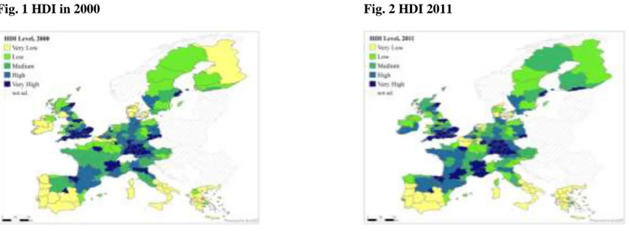
Looking at HDI first, the comparison between 2000 and 2011 in terms of human development says that it has generally increased across European regions. As can be seen from the summary maps below, some of the regions with lower values in the index at the beginning reached those with medium level of development, as the reduction of the extension of lighter colours at the end of the considered range of time shows. It can also be noted how an overall increased level of development seems to go hand in hand with a raise in spatial concentration of higher values around some dynamic cities’ areas, identified by darkly coloured spots. These regions, which confirm their better performances over time, increased their level of the index, but have been approached just by a few of those that were lagging behind. Despite increased values, southern regions confirm their poor scores at the bottom of the distribution. Besides London (UKI1) and Paris (FR10), among highest values in 2011 are those of Oxfordshire (UKJ1) and Sussex (UKJ2), Antwerp (BE21), Upper Bavaria (DE21), Luxembourg (LU00), Spanish and Scandinavian capitals (ES30 and SE11 respectively).
Fig. 1 HDI in 2000 Fig. 2 HDI 2011
Classes of values reported in the above Fig. 1 and 2 represent the magnitude of deviations from the mean, and the cut-off points roughly correspond to the quintiles of the distribution.
Rankings show how the variation range of values is on average 0.4 points in the index scores, and that the performance of regions is different irrespective of their nationality. In pole positions we always find UK Sussex and Oxfordshire, followed by Paris, London, Flanders regions (BE24) in Belgium, País Vasco (ES21) and Madrid for Spain, Upper Bavaria and Stuttgart (DE11) in Germany, Stockholm in Sweden. Surprisingly, most Scandinavian regions are just in the middle of the rankings. True for all of them but especially for Copenhagen (DK01) and Helsinki (FI1B), this seems due to the proportionally lower scores performed in the Income dimension. Disposable household income is relatively lower in Scandinavian countries compared to the rest of western Europe, despite their higher performances in terms of welfare state. At the bottom of the rankings we always find Portugal, Macedonia and Crete Island in Greece, and southern Italy.
Moreover, changes in the values of best and worst ranked regions can be looked at in the following graphs, along with their trends over the considered twelve years.
18
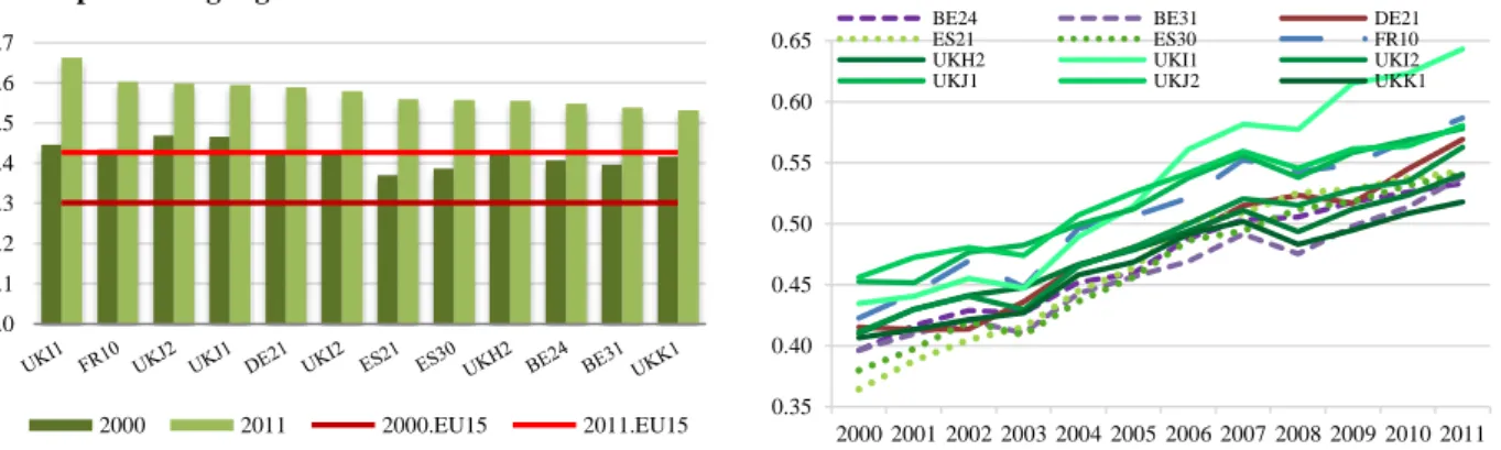
Fig. 3 Best performing regions in HDI and their trends over time
Here the already recognised increase in the level of HDI can be observed. If we look at the value scales though, a considerable gap can be noticed: higher values of the right end side of Fig.4 (blue lines) do not even reach the bottom ones of the right hand side of the Fig.3 (green lines), exception made for Border, Midland and Western Ireland (i.e. IE01). Same remark is evident looking at the EU15 lines34 in both graphs: bottom ranking regions appear always around 15 percentage points below the European average value, while the top ranking ones are above of at least 10.
It can also be noted how the gain has been more homogeneous across the latter, along with a smoother path in their growth trends. At the same time, an interesting remark seems to be the trace of the economic crises in these trends. On the one hand, the external shocks in 2003 and 2008 evidently hit those high ranking regions who are more rewarded by their similarly better performances in the Income dimension of the composite index and whose economies are more tied with the financial sector (e.g. London and Paris in Fig.3). On the other hand, regions displayed in Fig.4 that come from a lower initial performance show a smoother growth over time, except for Greek regions that present more fluctuation, and especially Ionia Nisia (i.e. EL22) which is one of the main touristic destinations in Greece and has a remarkable shortfall in 2004.
Fig 4. Worst performing regions in HDI and their trends over time
Considering now the IHDI, the following maps in Fig. 5 and 6 summarise the comparison between first and last year of considered time period. Changes in pattern over time are in line with those previously observed with the HDI. Spatial persistence of difference in distribution rewards some more advanced core areas, and leaves behind the regions of southern Europe. Even if they register an increase in their values, the latter cannot reach the range of performance above the very low one.
34 EU15 lines displayed in the graphs correspond to median values of the HDI values across regions per year. It counts
0.307 in 2000 and 0.441 in 2011. simple arithmetic mean were also calculated, and variation was minimal: -0.007 in 2000 (0.300) and -0.004 in 2011 (0.437). 0.0 0.1 0.2 0.3 0.4 0.5 0.6 0.7 2000 2011 2000.EU15 2011.EU15 0.35 0.40 0.45 0.50 0.55 0.60 0.65 2000 2001 2002 2003 2004 2005 2006 2007 2008 2009 2010 2011
BE24 BE31 DE21
ES21 ES30 FR10
UKH2 UKI1 UKI2
UKJ1 UKJ2 UKK1
0.0 0.1 0.2 0.3 0.4 2000 2011 2000.EU15 2011.EU15 0.10 0.15 0.20 0.25 0.30 0.35 0.40 0.45 2000 2001 2002 2003 2004 2005 2006 2007 2008 2009 2010 2011
EL11 EL12 EL22 EL23
EL25 ES43 IE01 ITF3
ITF4 ITF6 ITG1 PT11
19
Fig. 5 IHDI in 2000 Fig. 6 IHDI in 2011
Classes of values reported in the above Fig. 5 and 6 represent the magnitude of deviations from the mean, and the cut-off points roughly correspond to the quintiles of the distribution.
Generally speaking, values of IHDI can be either equal to HDI ones, in the occurrence of perfect equality in the society, or lower than HDI levels, depending on the extent of the measured inequality. As can be seen also in the following graphs, performances of regions in IHDI generally follow those in HDI for the same year. First ranks are still occupied by UK and Germany best performing regions, along with the French Île de France (FR10).
Fig. 7 Best 10 regions, 2000 Fig. 8 Best 10 regions, 2011
Their values of IHDI in 2000 shown in Fig. 7 appear only a bit lower than IHDI reported in 2011, Fig.8. Also bad performances are quite persistent, and the location of the worst ten regions has not substantially changed across years. It has to be remarked that this small differences increase in the central part of distribution, where more adjustments have occurred as can be noticed comparing HDI and IHDI results per each year35. Moreover, an intuition of the gap range between better and worst performing regions can be given by the median levels of IHDI outlined by the red lines, which are way lower than the top regions’ scores in both years.
However, the situation appears slightly different if we turn to the results in the measure of multidimensional inequality previously introduced, the loss in potential human development. Here rankings clearly change, and top regions include those traditionally recognised for low levels of inequality in the society across Europe: Denmark, Sweden, Austria, along with a couple of best German performances as presented below.
35 Maps have been realised per each year, and can be provided upon request.
0.27 0.32 0.37 0.42 0.47
IHDI HDI EU15.HDI EU15.IHDI
0.40 0.45 0.50 0.55 0.60 0.65
20
Fig. 9. Percentage Loss in Human Development, best regions in 2000 and 2011.
The graph in Fig. 9 shows the first ten regions in 2000 and the first ten in 2011 together, according to their levels in percent loss in potential human development- so those who score the lower values signifying a less unequal society. The comparison of performances in both years tell us that, despite multidimensional inequality remained almost invariant on average between the examined points in time, some changes occurred among the top rankings too. Just two regions are twice in the top ten, which are the Austrian Oberösterreich and Tirol (i.e. AT31 and AT33). Interestingly, the only capital region in this chart is Berlin (DE30), which is fourth in 2000 but falls down to the 62nd position in 2011. As in previous charts, the median red lines36 implicitly unveil the magnitude of the values range between the top and the bottom ranking regions, and the gap between the highest ranks and the majority of regions. What has to be considered are the changes in the distribution indeed. It seems to be quite persistent, with lagging regions left behind, a few changes in the values at the top, and some more variations in the middle section.
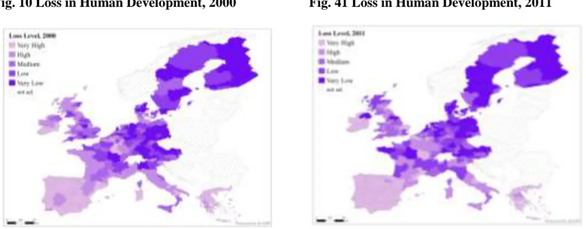
A cartographic representation of the same values may better help understand the spatial dimension of this distribution. The following Fig. 10 and 11 display reported levels of inequality, where classes of values represent the magnitude of deviations from the mean, and the cut-off points roughly correspond to the quintiles of the distribution.
Fig. 10 Loss in Human Development, 2000 Fig. 41 Loss in Human Development, 2011
Despite some changes in the values of the index and a slight reduction in the average scores, the spatial connotation and persistence of the considered phenomenon is here evident. Lighter colours, corresponding to higher level of the estimated measure of inequality, are lingeringly associated with the southern regions. Lower levels of loss in human development, so to say lower levels of inequality, are
36 Here median value is 0.052 in 2011 and 0.048 in 2000. Simple arithmetic mean is instead 0.055 in 2011 and 0.050 in
2000. Average values fluctuates around a percentage loss of 5%. 2.0% 2.5% 3.0% 3.5% 4.0% 4.5% 5.0% 5.5% 6.0% 2000 2011 2000.EU15 2011.EU15
21 always more concentrated in the Scandinavian countries. Regions in the middle section of the distribution are those experiencing more fluctuations in their performances, and a general decrease can be seen for German and UK ones, with a wider subnational variation between the French territories instead. Nevertheless, these results might mean that further hidden dynamics are in place, besides the ones that spatial distribution patterns can suggest at a first glance.
3.1. How do these results compare with other indicators?
Finally, it can be interesting to compare the estimated measures to indicators traditionally used to evaluate regional performances in the economic dimension alone: production, income, unidimensional inequality.
Fig. 5 Comparing HDI to GDP, 2011
Fig. 6 Comparing Loss to GDP, 2011
Fig. 7 Comparing IHDI to GDP, 2011
Fig. 8 Comparing Loss to Disposable Income, 2011
As shown in Fig. 12 to 15, the pattern results less clear than one could expect. The indicators partly capture the same variation, whilst the behaviour appears to be different among Member States, and not necessarily following a linear correlation. GDP data come from OECD regional database; originally expressed in national currency at current prices, they have been converted to PPS and then normalized in order to make them comparable to the values of estimated measures37
.
Disposable Household Income is the same variable used for calculating the HDI in the previous sections38.
Better performing and richer regions do not imply a more equal distribution, as well known, and not even a higher inequality. Other variables and dimensions may play an important role, and these have to be further explored. As predictable, passing from HDI in Fig.12 to IHDI in Fig.13, the position of some outliers like London is resized making clearer that higher values may conceal higher inequalities in its outcomes’ distribution. This is confirmed by Fig.14, where the same region shows one of the highest values of loss in potential human development. Additionally, Fig.15,37
Min and Max used have been selected among the internal distribution on extended time range, and happen to be respectively: UKI1 Inner London in 2013 with a PPS value of 100958, and ES43 Extremadura in 1999 with 11652.
38 See paragraph 2.3 for further details. 0.2 0.3 0.4 0.5 0.6 0.7 0.0 0.2 0.4 0.6 0.8 HDI GDP BE DK DE IE EL ES FR IT LU NL AT PT FI SE UK -0.10 0.10 0.30 0.50 0.70 0.90 2% 3% 4% 5% 6% 7% 8% 9% GDP
LOSS in potential Human Development
BE DK DE IE EL ES FR IT LU NL AT PT FI SE UK 0.2 0.3 0.4 0.5 0.6 0.0 0.2 0.4 0.6 0.8 IHDI GDP BE DK DE IE EL ES FR IT LU NL AT PT FI SE UK 0.1 0.2 0.3 0.4 0.5 0.6 2% 3% 4% 5% 6% 7% 8% 9% 10% DI S P OS AB L E I NC OM E
LOSS in potential Human Development