Master of Science in Nuclear Engineering
“Image processing based on Wavelet Transform and
Colour Spectrum for diagnosing faults in sensors in
Nuclear Power Plants”
Supervisor:
Prof. Piero Baraldi
Co-advisors:
Prof. Enrico Zio
Francesco Cannarile
Candidate: Gerard Noel Clarke
Student Number: 10487243
2
Table of Contents
Abstract ... 2 Introduction ... 2 Problem Statement ... 3 Method ... 5Subsection 1: Continuous Wavelet Transform ... 5
Subsection 2: Scalogram and Greyscale ... 6
Case Study ... 9
Subsection 1: Simulated Abnormalities ... 9
Subsection 2: Threshold Selection ... 9
Subsection 3: CWT and AAKR performance ... 11
Subsection 4: Alternative Approach ... 13
Conclusions ... 16
Acknowledgements ... 18
3
Abstract- Nuclear Power Plant monitoring is based on a system of sensors. During operation, some
sensors may experience faults which might convey inaccurate or misleading information about the actual plant state to automated controls and to operators. In this thesis work, we develop a methodology automatically diagnose sensor faults in Nuclear Power Plants. The proposed methodology involves i) performing the wavelet transform of a measured signal, ii) creating the associated coloured spectrum and iii) using image processing techniques to compare the coloured spectrum with the coloured spectra obtained from historical data collected when the sensor was healthy. The performance of the proposed method in terms of false and missed alarms has been compared with that of traditional sensor monitoring techniques such as the Auto Associative Kernel Regression (AAKR) method. The proposed method is shown to be superior in the detection of sensor freezing.
1. INTRODUCTION
Sensor malfunctions in Nuclear Power Plants must be promptly detected to avoid lost power production, lost revenues and accident events which may pose harm to the personnel, public and environment. On the other hand the cost of sensor maintenance has become significant given the thousands of sensors installed in a Nuclear Power Plant. Sensor maintenance is typically performed during refuelling of the reactor and is causing some hours of plant unavailability. This results in a large economic impact. In this respect, the development and application of methods for continuous and effective monitoring of sensor health state, the timely detection and identification of faulty sensors, the reconstruction of the incorrect signals before their use in the operation, and control and protection of the plant can be quite beneficial1. On-line calibration monitoring typically evaluates the performance of instrument channels by assessing their mutual consistency and possibly their
consistency with other plant measurements.
Traditional on-line calibration monitoring techniques include Auto Associative Kernel Regression (AAKR) and Principal Component Analysis (PCA). AAKR is an empirical model that estimates the values of some measurable variables in normal conditions and triggers the fault alarm when the reconstruction deviates from the measured signal9. PCA is a multivariate technique that analyses correlations among signals with the objective of representing them in a set of new orthogonal variables called principal components which are uncorrelated and ordered in such a way that the first few retain most of the variation present in all the original signals. Both modelling approaches require the availability of a dataset containing signal measurements collected by healthy sensors, typically referred to as Training set.
Since, however, most applications of traditional on-line calibration techniques in Nuclear Power Plants have been confined to the monitoring of a relative small number of sensors, some issues still remain open about the scalability of these methods to the overall fleet of the thousands of sensors installed in the Nuclear Power Plant. Three main concerns arise from the prospect of large scale applications: 1), the amount of fast access memory needed to store all the training data is extremely large, 2) the complexity of performing multisignal reconstructions in such a highly dimensional space and 3) the cause of dimensionality for which larger the number of signals results in exponentially larger training patterns necessary to properly cover all possible plant situations and thus guarantee satisfactory sensor monitoring performances. A possible solution based on the reduction of the total on-line calibration monitoring task into a set of smaller sub-tasks of manageable size is explored in Ref.1. In particular, a solution based on a multiple objective genetic algorithm search for purposely grouping the signals has been proposed. The main advantage of the proposed approach lies in the ease of implementation of the task decomposition objectives of interest. Notice, however, that the proposed method provides a signal grouping specific for the plant under consideration, which cannot be applied to the entire fleet. Furthermore, the obtained signal reconstruction suffers from
4 spill-over effects, i.e. detection of abnormal conditions on signals different from those which are actually impacted by the abnormal behaviour15.
In Baraldi et al, an ensemble of randomly generated groups of signals has been proposed. Although this approach is shown to be able to reduce the spill-over problem and it does not require long multi-objective searches for grouping the signals, it is characterised by the necessity of using several multivariate reconstruction models, which can be quite demanding from the computational point of view.
The present work investigates the use of continuous wavelet transform (CWT) for sensor fault detection. A CWT is performed on the corresponding sensor signal and a coloured spectrum is extracted. Then, process image techniques are used to compare the pixels of the extracted coloured spectrum with that of the coloured spectra from historical signal sequences collected when the sensor was healthy. Finally, an alarm is given when the difference between the images is above a certain threshold properly set according to a proposed procedure based on the use of the receiver operation characteristic curve.
The practical industrial benefits of the proposed method for sensor diagnostics are: 1) it provides a visual representation of the sensor fault, 2) the simplicity of the approach which is easy to develop and thus not require setting many parameters and 3) the methods robustness to the spill-over effect. The proposed methodology is applied to a real industrial case study concerning the identification of anomalous operational transients in a rotating machine of an energy production plant (whose detailed characteristics cannot be reported, due to confidentiality reasons).
The remainder of the paper is organised into six chapters. Section II illustrates the problem statement. This section highlights the issue associated with sensor validation, the kind of available data used and a general description of the methodology. Section III discusses the simulated sensor abnormalities and provides an in depth discussion of the methodology. Section IV presents the case study and the method performance. In addition, the results are compared to the industrially recognised Auto Associative Kernel Regression (AAKR) model. Section V provides considerations which include limitations of the model and areas for further research. Finally, Section VI concludes the paper with some acknowledgements.
5
2. MAINTENANCE PRACTICE IN NUCLEAR POWER PLANTS
Transmission of accurate and reliable measurements is central to safe, efficient, and economic operation of nuclear power plants (NPPs). Current instrument channel maintenance practice in the United States utilizes periodic assessment. Typically, sensor inspection occurs during refueling outages (about every two years). Periodic sensor calibration involves (1) isolating the sensor from the system, (2) applying an artificial load and recording the result, and (3) comparing this “As Found” result with the recorded “As Left” condition from the previous recalibration to evaluate the drift at several input values in the range of the sensor. If the sensor output is found to have drifted from the previous condition, then the sensor is adjusted to meet the prescribed “As Left” tolerances. As an example, Coolant temperature in light water reactors (LWRs) is measured using resistance temperature detectors (RTDs) and thermocouples. The calibration of the RTD is performed after each refuelling outage. The procedure involves isolating and manually reading from all RTD whilst the plant is maintained at a constant and uniform temperature (known as isothermal plateau). This results in a period of plant activity of 8 hours. If a deviation from the accepted level exist following inspection of all the RTD’s, the replacement and recalibration can lead to an additional 36 hours of plant activity. The current approach to sensor fault detection in operating light water reactors is expensive and time consuming, resulting in longer outages, increased maintenance cost, and additional radiation exposure to maintenance personnel, and it can be counterproductive, introducing errors in previously fault free sensors.
Previous reviews of sensor recalibration logs suggest that more than 90 percent of nuclear plant transmitters do not exceed their calibration acceptance criteria over a single fuel cycle. The current recalibration practice adds a significant amount of unnecessary maintenance during already busy refueling and maintenance outages. Additionally, calibration activities create problems that would not otherwise occur, such as inadvertent damage to transmitters caused by pressure surges during calibration, air/gas entrapped in the transmitter or its sensing line during the calibration, improper restoration of transmitters after calibration leaving isolation or equalizing valves in the wrong position (e.g., closed instead of open or vice versa), valve wear resulting in packing leaks, and valve seat leakage. In addition to performing significant unnecessary maintenance actions, the current sensor calibration practice involves only periodic assessment of the calibration status. This means that a sensor could potentially operate out of calibration for periods up to the recalibration interval. These issues are further exacerbated in advanced reactor designs (Generation III+, Generation IV, and near-term and advanced SMRs), where new sensor types (such as ultrasonic thermometers), coupled with higher operating temperatures and radiation levels, will require the ability to monitor sensor performance. When combined with an extended refueling cycle (from ~1.5 years presently to ~4–6 years as advanced reactors come on line), the ability to extend recalibration intervals by monitoring the calibration performance online becomes increasingly important.
Due to these drawbacks, performance monitoring of NPP instrumentation has been an active area of research since the mid1980s (Deckert et al. 1983; Oh and No 1990; Ray and Luck 1991;
Ikonomopoulos and van der Hagen 1997). Online calibration monitoring has become a prevalent area of research and can enhance reactor safety through timely detection of drift in sensors deployed in safety-critical systems. In addition, it can reduce the maintenance burden by focusing sensor recalibration efforts on only those sensors that need to be recalibrated, avoiding wasted efforts and potential damage to sensors for which recalibration is not necessary. The movement from analog to digital I&C within the nuclear power industry further supports online calibration monitoring through enhanced functionality. As a consequence, it is anticipated that online recalibration monitoring within the nuclear power industry will become more widespread. The
6 advantages of such a monitoring technique are the elimination of the 8 hour isothermal plateau which results in saving of $750 K per cycle. Current online monitoring work at Sizewell Nuclear power plant suggest the calibration period can be extended to 8 years. This enables management to achieve the goal of 20 day outage and a 75% reduction in workload.
3. PROBLEM STATEMENT
For this thesis work, our objective is to develop a method capable of on-line detection of transient faults in sensor readings. Typical faults in sensor readings are (Ref.16)
1. Freezing: the sensor reports a constant value for a large number of successive samples (see Figure 1);
2. Noise: the variance of the sensor readings increase (see Figure 2);
3. Quantisation: a reduction in the resolution of the analogue-to-digital conversion is observed (see Figure 3);
4. Spike: a sharp change in the measured value between two successive data points (see Figure 4);
To undertake the fault detection task at time 𝑡, we consider the latest 𝐿 > 0 measurements provided by the sensor. These measurements are collected in the vector 𝒙(𝒕) = {𝑥(𝑡 − 𝑙 +
1), … . , 𝑥(𝑡)} . In addition, we assume to have available 𝑁 vectors 𝒙𝐽(𝑡) = {𝑥𝐽(1), … , 𝑥𝐽(𝐿)} where
𝐽 = 1,2, … , 𝑁 of historical signal values collected in nominal condition. Ideally, we want to maximise the number of nominal signals. The larger the normal set is the better performance of the fault detection method. Following this, a comparison is made between the on-line time window 𝒙(𝒕) and the entire set of nominal signals 𝒙𝑱(𝑡) . The result is compared with an optimised threshold 𝑷 for
fault detection.
7
Figure 3: Quantisation Figure 4: Spike
4. THE METHOD
The methodology proposed in this work for addressing the sensor validation issue is based on the following steps:
Step 1: Compute the continuous wavelet transform 𝐶𝑊𝑇𝑥 𝛙
(𝜏, 𝑠) of signal 𝒙(𝒕) and the corresponding scaologram image S.
Step 2: Convert the truecolour scalogram image S into a greyscale image G.
Step 3: Compute the dissimilarities 𝑑𝐽, 𝐽 = 1, … , 𝑁, between the greyscale image G and all the greyscale images 𝐺𝐽, 𝐽 = 1, … , 𝑁, obtained by applying CWT to all historical signals 𝒙𝐽(𝑡),
𝐽 = 1, … , 𝑁 and then converting their scalograms 𝑆𝐽 into greyscale images 𝐺𝐽.
Step 4: Find 𝐽∗ such that
𝐽∗ = min(𝑑𝐽),
𝐽 = 1, … , 𝑁
Step 5: Compare 𝐽∗ with a fixed threshold value 𝑇; If 𝐽∗ is greater than 𝑇, an anomaly is detected. If 𝐽∗ is less than 𝑇, the signal is nominal.
8
Figure 6: Schematic of the CWT method
4.1. Continuous Wavelet Transform and Scalogram
A wavelet function (or wavelet, for short), is a function ψ ∈ L2(ℝ) with zero average (i.e.∫ ψℝ = 0), normalized (i.e.∥ ψ ∥ = 1), and centered in the neighborhood of t = 0 (Mallat, 1999). Scaling ψ by a positive quantity s, and translating it by u ∈ ℝ, we define a family of time-frequency atoms, ψu,s , as
ψu,s(t): = 1 √𝑠ψ (
t−u
s ) , u ∈ ℝ, s > 0 Eqn. (1)
Given f ∈ L2(ℝ), the continuous wavelet transform (CWT) of 𝑓 at time 𝑢 and scale 𝑠 is defined as 𝑊𝑓(𝑢, 𝑠) ≔< 𝑓, ψu,s≥ ∫ 𝑓(𝑡) +∞ −∞ ψ ∗ u,s(𝑡)𝑑𝑡 Eqn. (2)
and it provides the frequency component (or details) of 𝑓 corresponding to the scale s and time location t. The revolution of wavelet theory comes precisely from this fact: the two parameters (time u and scale s) of the CWT in (2) make possible the study of a signal in both domains (time and frequency) simultaneously, with a resolution that depends on the scale of interest. According to these considerations, the CWT provides a time-frequency decomposition of 𝑓 in the so called time-frequency plane. This method is more accurate and efficient than other techniques such as the windowed Fourier transform (WFT). The scalogram of 𝑓 is defined by the function
𝑆(𝑠) ≔ ||𝑊𝑓(𝑠, 𝑢)|| = ( ∫+∞|𝑊𝑓(𝑠, 𝑢)|2 𝑑𝑢 ) −∞
1
2 Eqn. (3)
representing the energy of W f at a scale s. Obviously, S(s) ≥ 0 for all scale s, and if S(s) > 0 we will say that the signal 𝑓 has details at scale s. Thus, the scalogram allows the detection of the most representative scales (or frequencies) of a signal, that is, the scales that contribute the most to the total energy of the signal.
9 If we are only interested in a given time interval [𝑡0, 𝑡1], we can define the corresponding windowed
scalogram by 𝑆[𝑡0,𝑡1](𝑠) ≔ ||𝑊𝑓(𝑠, 𝑢)||[𝑡 0,𝑡1] = (∫ |𝑊𝑓(𝑠, 𝑢)| 2 𝑡1 𝑡0 𝑑𝑢 ) 1 2 Eqn. (4) A base wavelet and wave (or component time-frequency signal in the case of this work) are required to perform the continuous wavelet transform. The base wavelet chosen for the analysis was the Morlet wavelet given by ψ(𝑡) = 𝑒𝑖2𝜋𝑓𝑜𝑡𝑒−(
𝛼𝑡2
𝛽2) . Fig.6 provides a visual representation of the Morlet
wavelet.
To implement the CWT, the wavelet coefficients are obtained directly from (2). The wavelet is placed at the beginning of the signal, and set s=1 (i.e. the original base wavelet). The wavelet function at s=1 is multiplied by the signals 𝑓, integrated over all times. The wavelet is shifted to t=τ, and the transform value (also known as the wavelet coefficient) is obtained at t=τ and s=1. The procedure is repeated until the wavelet reaches the end of the signal. Following this, the scale s is increased by one and the procedure is repeated for all s values. Each computation for a given s fills a row of wavelet coefficients of the time-scale plane (Figure 5). For further information about wavelet transformation consult Appendix 1.
Figure 5: Illustration of wavelet transform
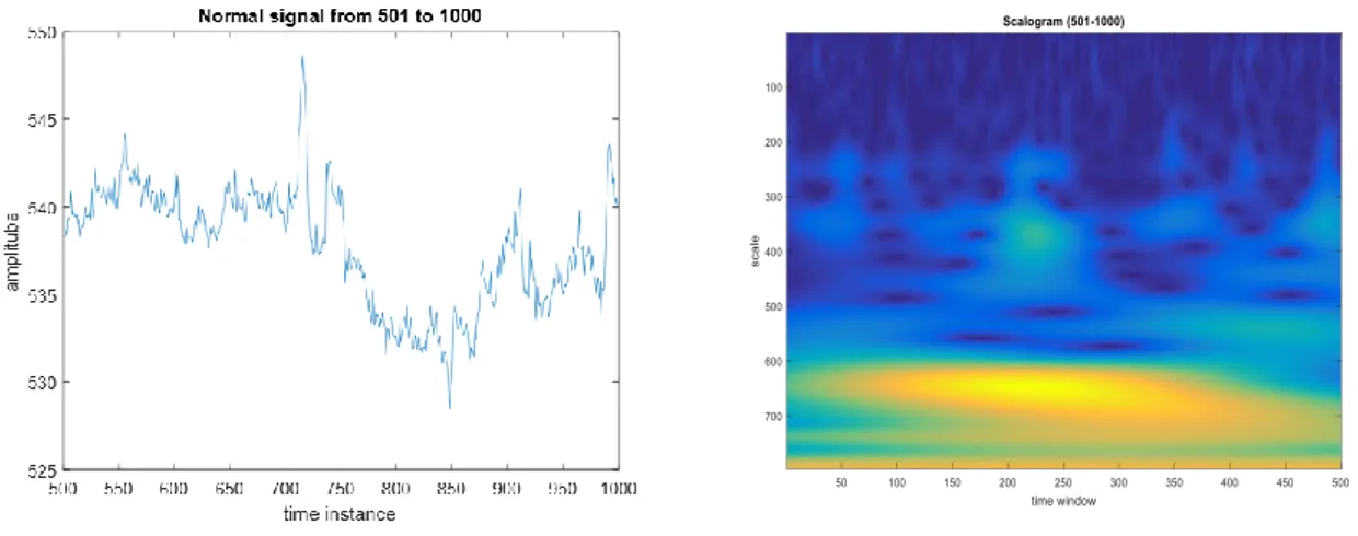
10 In signal processing, a scalogram is a visual method of displaying a wavelet transform. There are 3 axes: x representing time, y representing scale, and z representing coefficient value. The z axis is often shown by varying the colour of brightness. As an example, Figure 8 is the scalogram representation of the normal signal in Figure 7 following a wavelet transform using the Morlet wavelet as the base wavelet.
Figure 7: normal signal Figure 8: Scalogram of normal signal
From the scalogram, we see that the colour map ranges from dark blue to yellow. The dark blue represents the minimum value and corresponds to the most similar reconstruction between the base wavelet and the signal. While, yellow represents the maximum value and corresponds to the most dissimilar reconstruction between the base wavelet and the reconstruction. The colour representation of the wavelet coefficients between these extremes was given by a linear interpolation.
4.2. Greyscale Image
Following the performance of the CWT and conversion to a scalogram, the image is then converted to a greyscale image to perform the image comparison. In photography and computing7,
a greyscale digital image is an image in which the value of each pixel is a single sample, that is, it carries only intensity information. Images of this sort, also known as black-and-white, are composed exclusively of shades of grey, varying from black at the weakest intensity to white at the strongest. The advantage of converting to a greyscale image is that it allows for a direct comparison between other greyscale images. Figure 9 is the greyscale image of the normal signal in Figure 7.
11
4.3. Dissimilarity between greyscale images
Having achieved a greyscale image from the sensor data, this image is then compared to a backlog of greyscale images. These greyscale images have been created by the same method. The comparison between the images is made through the image pixels. However, instead of a pixel to pixel
difference, the relative percentage difference was calculated. To describe a relative percentage difference method, consider two greyscale images which each contained 1 pixel of data. As they are greyscale images, their pixel values vary between 1 (white) and 0 (black). The Arithmetic difference is computed between the two pixels. Following this, the result is divided by the original pixel value. In our case, the original pixel value is the pixel value of the backlogged greyscale image. The result is then multiplied by a factor of 100 to convert it into a percentage difference from the original pixel value. In practice, we do not consider just single pixel images but images which contain a large number of pixels. The new sensor greyscale image is compared with each of the backlog greyscale images in this way. In addition, the resultant value is summed up for each comparison and the minimum total is the value chosen to compare with the predetermined threshold.
4.4. Threshold Learning
As previously stated, the developed procedure involves the comparison of the summation of pixels from a difference greyscale image with a defined threshold. The threshold was set such values lower than the threshold were interpreted as normal operation while values greater than the threshold represented abnormal behaviour.
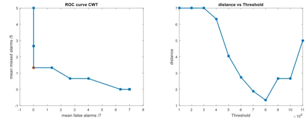
As the signals which represented normal and abnormal operation were known, it was decided to optimise the threshold with a ROC analysis. A ROC analysis involves recording the number of false alarms (i.e. detections of faulty behaviour when no fault has occurred) and missed alarms (i.e. detection of normal behaviour when a fault has occurred) for a given threshold and repeating the process for different threshold values8. A graph of false alarms vs missed alarms for different threshold values is plotted and through statistical analysis an optimal threshold is chosen. Figure 13 illustrates the result of a ROC analysis. This curve is characteristic of a ROC curve with the sharp decline at lower values followed by a plateau.
.
12 The optimal threshold is the threshold which corresponds to zero missed alarms and zero false alarms. (0, 0) represents the ideal value. Therefore, it was decided to calculate the distance between each point on the ROC curve and the ideal value using Eqn.3:
𝑑 = √(x1− x2)2+ (y1− 𝑦2)2 Eqn.3
13
% %%%% %%%%%%%%%%%%%%%%%%%%%%%%%%%%%%%%%%%%%%%%%%%%%%%
From here onwards is my first thesis draft Includes case study and conclusion Subsection 2: Scalogram and Greyscale
The normal signals were divided into smaller 500 time instances signals. This meant the result, following the wavelet transform, was a 797 x 500 element matrix with each element a wavelet coefficient for a given scale s and shifting parameter τ. However, as previously stated, the fault detection method developed is a comparison of pixels from an image not matrices. In signal processing, a scalogram is a visual method of displaying a wavelet transform. There are 3 axes: x representing time, y representing scale, and z representing coefficient value. The z axis is often shown by varying the colour of brightness. From the scalogram, we see that on the y-axis the scales were varied between 1 and 797. While the x-axis is the signal length of 500 time instances. The z-axis is a colour representation of the differing values of the wavelet coefficients. The colour map ranges from dark blue to yellow. The dark blue (minimum value) was given by a wavelet coefficient of 0.0013 which was the lowest recorded matrix element and corresponds to the most similar
reconstruction between the base wavelet and the signal. While, yellow (maximum value) given by a value of 38.1775 was the most dissimilar reconstruction between the base wavelet and the
reconstruction. The colour representation of the wavelet coefficients between these extremes was given by a linear interpolation. As a point to note, we notice that the normal signal is quite noisy to begin with and, therefore, the signals frequency is high. This means that high scales (i.e. lower frequencies) would provide large coefficient values while low scales (i.e. high frequencies) would result in coefficient values approaching 0 and would be a close approximation to the actual signal. This observation is clear from the scalogram of the normal signal as the dark blue values tend to accumulate at the lower scale values.
Fig. 7 normal signal Fig. 8 Scaologram of normal signal
The developed methodology requires a large amount of normal signals to train the model. All of the normal signals, denoted Training Set, were converted to scaolgrams and subsequently greyscale images. The limits of the greyscale images were set to 0 (black) and 1 (white). These limits were fixed among all the greyscale images. The advantage of converting to a greyscale image is that it allows for a direct comparison between other greyscale images. Fig. 9 is the greyscale image of the normal signal in Fig. 7.
14
Fig. 9 greyscale of normal signal
Once a new signal from the sensor becomes available, denoted Test signal, the same procedure is performed. The Test signal undergoes a wavelet transform, then is converted to a scalogram and finally a greyscale image.. The threshold was an integer number with was achieved through a ROC analysis using normal and faulty signals. The Threshold was optimised such that if MIN_TEST was less than the Threshold the model classified the original signal as normal. Obviously, if MIN_TEST was greater than the Threshold the method determined the signal as abnormal. Fig. 10 provides a visual representation of the developed method. Fig. 11 displays the results of the CWT. The model
correctly classified that the first 6 signals were normal while the remaining 4 were abnormal.
15
Fig. 11 Plot of fault detection model
IV. CASE STUDY
Subsection 1: Simulated Abnormalities
16
Fig.3 Quantisation Fig.4 Spike
Subsection 2: Threshold Selection
As previously stated, the six temperature signals represented normal operation of the component. It was decided to divide each signal into 8 time windows, each containing 500 time instances. The divided signals were placed into a cell, denoted Normal Set. Obviously, the Normal Set contained a total of 48 signals, each 500 time instances in length. Taking advantage of a matlab function which randomly permutes cell elements, The 48 signals of the Normal Set were randomly separated to three cells named Training, Validation and Test Set. The Training Set contained 33 signals, the Validation Set contained 7 signals and the Test Set contained the remaining 8 signals. In addition to the 7 normal signals, the Validation Set contained 5 simulated abnormal signals: 1 freeze, 1 spike, 1 noise, 1 high level quantisation and 1 low level quantisation. Therefore, the Validation set contained 12 signals each with 500 data points. The first 7 elements contained normal signals and the last 5 simulated abnormalities.
Once the three sets had been created, the next challenge was to determine an appropriate threshold for fault detection.
The Training and Validation Sets were used for threshold optimisation. The 40 normal signals contained among the Training and Validation set were randomly distributed among the two sets at each iteration. The Test Set was neglected here but would be reintroduced to determine the methods performance
17 .
Fig.13 CWT ROC curve Fig.14 CWT distance vs Threshold
Summing the percentage difference pixels of an image resulted in a value of the order of 106. Therefore, it was decided to vary the threshold between 1x10⁶ and 11x106 in steps of 106. The number of missed and false alarms were recorded after each iteration. The program calculated the number of missed and false alarms at each threshold value for a fixed Validation and Training Set. Following another execution of the program, the normal signals of the Validation and Training Sets were randomly divided among the two sets. However, the position of the normal and abnormal signals in the Validation set remained the same so a ROC analysis could be performed. Having executed the program 10 times, the mean number of false and missed alarms at each threshold value was calculated. Fig.13 shows the obtained ROC curve. This curve is characteristic of a ROC curve with the sharp decline at lower values followed by a plateau.
The optimal threshold is the threshold which corresponds to zero missed alarms and zero false alarms. (0, 0) represents the ideal value. Therefore, it was decided to calculate the distance between each point on the ROC curve and the ideal value using Eqn.3:
𝑑 = √(x1− x2)2+ (y1− 𝑦2)2 Eqn.3
Fig.14 shows the results of the analysis. It is clear from the graph that a value of 8x10⁶ represented the best comprise between false and missing alarms and was chosen as the threshold value.
Subsection 3: CWT and AAKR method performance
Having determined the optimal threshold, the performance of the method could be calculated. The performance was defined as the number of false and missing alarms given the optimal threshold using new, ‘unseen’ data. Here the Test Set was reintroduced which contained signals which had not been used to optimise the model. The Test Set was made up of the 8 normal signals along with 20 simulated abnormal signals i.e. 5 spike, 5 freeze, 5 noise and 5 quantised signals. These 28 signals were compared with the 40 normal signal which had been used to optimise the model. The developed CWT method was implemented and the results are as follows:
CWT
normal
/8 freeze /5 spike /5 quants /5 noise /5
Performance 1 0 0 1 0
18 It is evident from the above data that the method performs very well in identifying normal signals. Similarly, the method shows very promising results for the detection of a sensor under freezing, spike and noise. However, the method was unable to 1/5 of the quantised signals. The only incorrectly identified abnormality came from a very highly quantised signal (Fig. 16). Fig. 15 is the scalogram of the normal signal that the quantised signal was created from. It is difficult to notice differences in the scalograms. However, the numerical values of the coefficients differ. In fact, the MIN TEST of the missed alarm was 7.935x10⁶ which is within one standard deviation of the threshold of 8x10⁶. Further investigation into the reason for the false alarm is discussed in the conclusion and it emphasises a limitation of the model.
Fig.15 normal signal used to simulate abnormalities Fig.16 highly quantised signal
Having achieved these results, a comparison was made to an industrially recognised model. Typically monitoring the condition of a component is based on an empirical model that estimates the values of some measurable variables (signals) in normal conditions and triggers the fault alarm when the reconstruction deviates from the measured signal9. The model considered in this work for
reconstructing the component behaviour in normal conditions is the Auto Associative Kernel Regression (AAKR) method10 whose basic idea is to reconstruct the signal values in case of normal conditions given a current signal measurement vector as a weighted sum of historical observations. Thus, the application of the AAKR method requires the availability of a set of historical
measurements. Having achieved the signal reconstruction, a residual is obtained between the observed signal and the reconstruction. If the residual is above the optimised upper limit or below the optimised lower limit, the model interprets an abnormal behaviour. Fig.17 shows a typical scheme of condition monitoring of a component using AAKR. Fig. 18 and Fig.19 shows an AAKR analysis of a normal and abnormal signal, respectively with the upper and lower limits. Reference 3 provides a complete description of the method.
19
Fig.18 AAKR results from a normal signal Fig.19 AAKR results from an abnormal signal
The AAKR used the same temperature signals (i.e. six signals with 4000 time instances) which had been used for the CWT method. However, the signal lengths had been reduced to maximise the AAKR efficiency. A 120 x 200 matrix was created and denoted normalsignals. The division of the signals were as follow: values 1-20 of the six signals made up the first row of the matrix. Following this, inputs 21-40 made up the second row and so on until the matrix had been filled. Each of the 200 rows became a vector, of length 120, and placed into a cell. The 200 vectors were randomly divided amongst three sets: Training, Validation and Test Set. The Training Set contained 140 signals, the Validation consisted of 30 signals and the Test Set consisted of 30 signals.
Similar to the CWT method, the AAKR procedure requires the optimisation of a threshold. However, in this case, the threshold is the upper and lower limits. Again, the Training Set and Validation Set were used to optimise the limits while the Test Set was used later for performance evaluation. Along with the 30 normal signals in the validation set, 5 abnormal signals were added. These simulated abnormalities were 1 freeze, 1 spike, 1 noise, 1 highly quantised and 1 low level quantised signal. In total, the Validation Set contained 35 signals of which the position of the normal and abnormal signals was known. This meant that a second ROC analysis could be performed. After a trial was performed, it was decided to vary the upper and lower limits between a value of 6 and 12 in steps of 0.1 to limit the computational time. Fig.20 and Fig.21 display the results of this optimisation process. The optimal threshold was chosen using the already described distance formula and was found to be 9.
20 Using the value of 9 as the upper and lower limits, the methods performance could be determined. The Test Set was reintroduced and, again, 20 abnormal signals were added to the Test Set i.e. 5 freeze, 5 spike, 5 quantised and 5 noise. An AAKR analysis of the 50 signals was performed and the results are shown in Table 3.
AAKR normal /30 freeze /5 spike /5 quants /5 noise /5
Performance 0 4 0 0 0
Table 3. Performance of AAKR model
The devised method performed better in the determination of frozen sensor signals than the industrially recognised AAKR method. While, the other performance indicators, both normal and abnormal signals, were on par with the AAKR method. However, a major downside to the percentage difference method is the large computational time.
Subsection 4: Alternative Approach
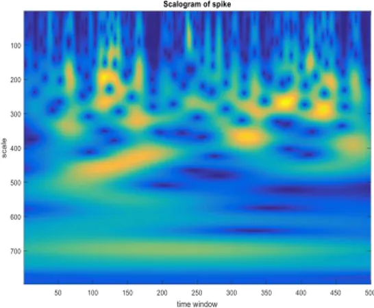
In an effort to rectify this, the same procedure was followed. However, during the comparison between the greyscale images, a direct pixel to pixel difference was performed. In addition to this, an investigation into the nature of the simulated abnormalities was conducted. As previously stated the abnormalities were simulated from a normal signal (i.e. signal 3 time window 500-1000) and a total of 797 scales were chosen to create the scalogram image. Both frozen and spiked signal scalogarms (Fig.22 and Fig.23, respectively) resulted in differences from the normal signal scalogram (Fig.15) over a larger number of scales which would allow a pixel to pixel model to detect a sharp difference between what it considered normal signal and the simulated abnormality. However, a signal that is quantised or has noise added (Fig.24 and Fig.25, respectively) varies slightly from the normal signal throughout the signal length. This means that when the wavelet transform is performed on these signals the larger scales (i.e. lower frequencies) would reproduce results that were analogous to that of the normal signal resulting in similar images at higher scales which the pixel to pixel model would interpret as a normal signal and thus a large number of missed alarms would result. However, the differences in the images could be identified with an investigation into then lower scales (i.e. higher frequencies).
21
Fig.24 Example of highly quantised signal Fig.25 Example of signal with noise
Therefore, it was decided to filter the number of considered scales and concentrate on the lower scales. Through observation, it was clear that the images varied substantially for the first 300 scales and with larger scale values were indistinguishable. Therefore, the model was set to focus on scale values from 1-300 which would reduce the computational load and, thus, the computation time. Fig. 26 and Fig.27 are scalograms of Fig. 24 and Fig. 25 respectively with scales from 1-300.
The same CWT method was performed except the number of considered scales had been reduced. As before, the threshold was optimised for the lower scaled images. A value of 2700 was found to be the optimal threshold. Following this, an evaluation of the methods performance was conducted with new, ‘unseen’ data. The results are as follows:
CWT (scales 1-300) normal /8 freeze /5 spike /5 quants /5 noise /5
Performance 1 2 0 1 0
Table 3. Performance of CWT model considering scales 1-300
The filtered pixel to pixel method performance for normal signal detection was on par with the percentage difference method. It was also the same in the determination of quantised, noisy and spiked signals. But, the drawback is that 40% frozen signals were determined as normal which would cause safety concerns being applied at an industrial scale. While the overall pixel to pixel method performance was not as good as the percentage difference method, the computational time is significantly less. Therefore, a trade off exists between the two methods. The chosen method would depend on the work that needs to be done. If performance is desired, the percentage difference method is optimal. However, as a first tentative step, the pixel to pixel method would be better.
Fig. 26 Normal signal with 300 scales Fig.27 highly quantised signal with 300 scales
23
V. CONCLUSIONS
In this article we have devised an alternative condition monitoring model using continuous wavelet transform (CWT). A case study which used real industrial temperature measurements and simulated abnormalities has been considered. The devised CWT model provided satisfactory performance in both false and missed alarm detection. The performance results are comparable to the traditional AAKR method. The devised method performed better in the determination of frozen sensor signals than the AAKR method. While, the other performance indicators, both normal and abnormal signals, were on par with the AAKR method. However, the main drawbacks of the approach are:
(1) No shifting window. The normal signals were arbitrarily split into 500 time instant signals. Following this, the model was trained to identify these signals as normal operation. Now consider, a signal of length 500 being created from two consecutive normal signals which would itself be a normal signal of the component. However, having performed the wavelet transform and fault detection technique, the model would conclude that the signal is abnormal. Fig. 28 gives a visual representation of the limitation. This limitation can be overcome by introducing a shifting time window across the normal signals with the result being a larger collection of normal signals.
(2) The developed method suffers from a lack of training data which represent normal operation. As previously mentioned a total of 33 signals of length 500 were used to train the model. This limitation can be seen as a consequence of the fixed time window. Furthermore, this limitation is evident in the method performance results. The method recognised one normal signal as abnormal. Upon further investigation into this incorrect determination, it was found that the MIN_TEST value was 8.1725 x 10⁶ which is just above the threshold and Fig. 29 displays the Training signal which was used to determine the MIN_TEST value. Notice that the two signals are of the same type however they have been offset by a factor of 7. Therefore, it was decided to repeat the calculation with a normal signal of that type but reduced offset. Fig. 30 displays all the normal signals of that type. Signal 3 (which was the TEST signal) and Signal 4 were used to perform the CWT and the MIN_TEST value was 7600000 below the Threshold. So this problem stems from the lack of normal signals to train the model as signal 4 was not contained in the 33 Training signals. Further investigation with a larger training set would be required and would reproduce greater method performance.
Fig.28 The bottom normal signal is created from the end of the top normal signal and the beginning of the middle normal signal. The CWT concludes that this signal is abnormal.
24
Fig. 29 Training and Test signal for MIN_TEST Fig. 30 The 6 normal signals from 1001-1500
(3) The high computational time required for its application, which is owing to the computation of the percentage differences between the current Test set greyscale image and all the Training data greyscale images. However, as addressed in the Case Study, an alternative method is proposed which involves the calculation of the pixel by pixel difference. Unfortunately, the proposed method results in reduced method performance.
Overall, the results achieved using the percentage difference wavelet transform are very promising and would be an ideal starting point for future investigation. Other possible future works would involve the extension of the method to more simulated abnormalities and possible incorporation of a real signal abnormality. Furthermore, the Morlet wavelet remained the mother wavelet
throughout the analysis, it would be interesting to vary the mother wavelet and perform a similar analysis. Finally, as an extension of the performed work, the CWT could be used in the classification of the different abnormalities present.
25
VI. ACKNOWLEDGMENTS
I would first like to thank my thesis advisor Prof. Piero Baraldi of the department of Energy at the Politecnico di Milano. He consistently allowed this paper to be my own work, but steered me in the right direction whenever he thought I needed it. I would, also, like to thank Francesco Cannarile for all his help and advice throughout my research project. Mr. Cannarile’s door was always open whenever I had a question about my research.
VI. REFERENCES
1. D. Roverso, M. Hoffmann, E. Zio, P. Baraldi & G. Gola, Solutions for Plant-wide On-line Calibration Monitoring.
2. Andrei V. Gribok, Aleksey M. Urmanov, J. Wesley Hines, Uncertainty Analysis of Memory
Based Sensor Validation Techniques.
3. Sun K, Gao J, Gao Z, Jiang H, Gao X, Plant-wide quantitative assessment of a process industry system’s operating stat based on color-spectrum
4. http://www.omega.co.uk/prodinfo/thermocouples.html
5. Baraldi P, Advanced computational methods for condition monitoring of components of electricity productions plants.
6. Abhishek B. Sharma, Sensor Faults: Detection Methods and Prevalence in Real-World Datasets
7. http://gwyddion.net/documentation/user-guide-en/wavelet-transform.html 8. R.X. Gao and R. Yan, Wavelets: Theory and Applications for Manufacturing 9. http://whatis.techtarget.com/definition/grayscale
10. http://gim.unmc.edu/dxtests/roc2.htm
11. Baraldi P, Di Maio F, Poppaglione L, Zio E and Seraoui R. Condition monitoring of electrical power plant components during operational transients
12. Baraldi P, Canesi R, Zio E, et al. Signal grouping for condition monitoring of nuclear power plant components. In: 7th American nuclear society international topical meeting on nuclear plant instrumentation, control and human-machine interface technologies (NPIC&HMIT 2010), Las Vegas, Nevada, 7–11 November 2010.
13. Ole J. Mengshoel, Adnan Darwiche, Serdar Uckun,Sensor Validation using Bayesian Networks. 14. Herve Abdi and Lynne J. Williams , Principal component analysis
15. Piero Baraldi, Francesco Di Maio, Pietro Turati, Robust signal reconstruction for condition monitoring of industrial components via a modified Auto Associative Kernel Regression method
16. LEANA GOLUBCHIK, RAMESH GOVINDAN, ABHISHEK B. SHARMA, Sensor Faults: Detection Methods and Prevalence in Real-World Datasets
17. Baraldi P, Gola G, Zio E, Roverso D, Hoffmann M, A randomized model ensemble approach for reconstructing signals from faulty sensors