Federal Republic of Nigeria
Poverty Work Program
Poverty Reduction in Nigeria in the Last Decade
October 13th 2016GPV01 AFRICA
The material in this publication is copyrighted. Copying and/or transmitting portions or all of this work without permission may be a violation of applicable law. The International Bank for Reconstruction and Development/ The World Bank encourages dissemination of its work and will normally grant permission to reproduce portions of the work promptly.
For permission to photocopy or reprint any part of this work, please send a request with complete information to the Copyright Clearance Center, Inc., 222 Rosewood Drive, Danvers, MA 01923, USA, telephone 978-750-8400, fax 978-750-4470,
http://www.copyright.com/.
All other queries on rights and licenses, including subsidiary rights, should be addressed to the Office of the Publisher, The World Bank, 1818 H Street NW, Washington, DC 20433, USA, fax 202-522-2422, e-mail [email protected].
Public Disclosure Authorized
Public Disclosure Authorized
Public Disclosure Authorized
Report No. -NGA
Poverty Reduction in Nigeria in the Last Decade
October 13, 2016
Poverty Global Practice Africa Region
CURRENCY EQUIVALENTS
(Exchange Rate Effective January 1, 2016) Currency Unit = Nigerian Naira (₦)
US$1 = ₦200
FISCAL YEAR
July 1 – June 30
ABBREVIATIONS AND ACRONYMS
DHS Demographic and Health Surveys GDP gross domestic product
GEP growth elasticity of poverty GHS General Household Survey HOI human opportunity index
HNLSS Harmonized Nigeria Living Standards Survey LGA local government administration
MPI multidimensional poverty index NFE nonfarm enterprise
NLSS Nigeria Living Standards Survey PPP purchasing power parity
RIF recentered influence function TFP total factor productivity
WDI World Development Indicators
Vice President: Makhtar Diop Country Director: Rachid Benmessaoud
Sector Director: Ana Revenga Task Team Leader: Vasco Molini
ACKNOWLEDGMENTS
This poverty assessment was prepared by a core team consisting of Eleonora Bertoni, Fabio Clementi, Vasco Molini, Francesco Schettino, and Hitomi Teraoka. The report was prepared under the guidance of Pablo Fajnzylber and Pierella Paci. Luis Alberto Andres, Andrew Dabalen, Foluso Okunmadewa, and Kinnon Scott provided useful feedback on some of the modeling in an earlier version of the report. We would also like to thank the Nigeria National Bureau of Statistics for their collaboration and willingness to share their data and the Central Bank of Nigeria and the Nigerian Economic Society for their useful feedbacks. Final editing was done by Robert Zimmermann
Table of Contents
Executive Summary ... x
Introduction ... 1
Data... 2
Definitions and technical notes ... 4
Chapter 1 : Poverty and Inequality in Nigeria ... 6
Poverty rates declined, but the number of the poor remained unvaried ... 6
Rapid population increase and persistent high inflation contributed to the limited poverty impact of GDP growth ... 9
GDP per capita did not entirely trickle down to household consumption and job creation ... 14
Widening inequality cut the gains from consumption growth in half ... 16
Lower poverty rates and a growing middle class, but also more vulnerable households... 18
A profile of the poor, the vulnerable, and middle-class households ... 21
In poverty reduction, progress in nonmonetary indicators is slower in Nigeria than in other Sub-Saharan African countries ... 24
Chapter 2 : Mind the Gap ... 28
Poverty rates in the north are higher and decreasing much more slowly ... 28
Poverty is more chronic in the north ... 30
Poverty trends at the national level average two (or more) heterogeneous dynamics ... 32
The variations in performance contributed to widening inequality and polarization ... 34
Several nonmonetary outcomes confirm the breadth of the north-south divide... 38
Poverty maps show the big divide, but also suggest high heterogeneity within zones ... 41
Chapter 3 : The North-South Divide: An Econometric Analysis ... 47
Decomposing the north-south poverty differential ... 47
The chronic and transient poor: an econometric analysis ... 51
Chapter 4 : The Drivers of the Divide ... 56
The south is ready to benefit from the demographic dividend; the north is not ... 56
Access to electricity, water and sanitation, and roads is better in the south ... 58
The index of the concentration of productive assets is higher in the south ... 63
Southern zones developed economies of agglomeration owing to more rapid urbanization ... 65
The Southern zones show higher levels of human capital ... 70
Agriculture is still the prevailing activity in the north ... 73
Other constraints to poverty reduction are generally more binding in the north ... 78
After many episodes of conflict in the last decade, conflict is now focused in the upper north ... 82
Findings ... 85
A preliminary policy roadmap... 87
Appendix A Technical Notes ... 92
The anomalies in the HNLSS 2009–10 ... 92
Comparing NLSS 2003–04 and GHS 2010–11 and 2012–13: the survey-to-survey method ... 97
Appendix B Zone and State Summary ... 101
North Central ... 101 North East ... 103 North West ... 105 South East ... 107 South South ... 109 South West ... 111
Appendix C Econometric Results ... 113
Appendix D Agriculture and Conflicts addendum ... 116
The market dynamics of Nigeria’s major crops ... 116
Deaths caused by farmer-pastoralist violence in the Middle Belt ... 118
Map C.2. Deaths Caused by Farmer-Pastoralist Violence, Middle Belt States, Five-Year Increments ... 118
References ... 120
Boxes Box 1. Middle Class in Nigeria ... 19
Box 2. Poverty Mapping in Nigeria ... 42
Maps Map 2.1. Predicted Poverty Rates, Local Government Administration Units, Nigeria, 2012–13 ... 43
Figures Figure 1.1. Number of Poor at the National Level, 2004, 2011, 2013 ... 7
Figure 1.2. Number of Poor by Area (thousand), 2004, 2011, 2013 ... 8
Figure 1.3. GEP, 2003–2013 ... 9
Figure 1.4. Real GDP Growth Rate, 1991–2014 ... 10
Figure 1.5. Population Growth, 1991–2014... 10
Figure 1.6. Real GDP Per Capita Growth, 2000–2014 ... 11
Figure 1.7. Growth and Population Effect, 2004–2013 ... 12
Figure 1.8. Fertility Rate, 1990–2014 (Births Per Woman) ... 13
Figure 1.9. Inflation Rate, 1990–2014 ... 13
Figure 1.10. GDP by Industry (%): 2004–2013 ... 15
Figure 1.11. Growth Incidence Curve, 2004–2013 ... 16
Figure 1.12. Consumption Per Capita Cumulative Curves: 2004–2011–2013 ... 18
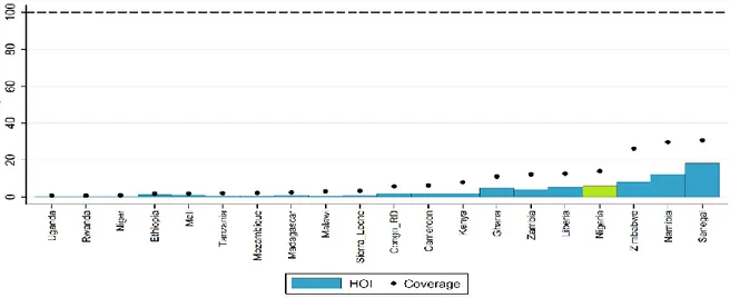
Figure 1.14. HOI: Access to Water for Children (0–16 years) ... 26
Figure 1.15 HOI: Access to Sanitation for Children (0–16 years) ... 27
Figure 2.1. Poverty Headcounts by Zone, 2004, 2013 ... 29
Figure 2.2. Number of Poor by Zones, 2004, 2013 ... 29
Figure 2.3. Middle-class Households by Zone, 2004, 2013 ... 30
Figure 2.4. Regional Differences in Household’s Dynamic Poverty Profile, Panel 2011–2013... 31
Figure 2.5. Counterfactual Elasticities ... 32
Figure 2.6. Gini Index by Zones, 2004, 2013 ... 33
Figure 2.7. Shapley Value Decomposition by Zones ... 34
Figure 2.8. Gini Decomposition by Location, 2004, 2013 ... 35
Figure 2.9. Relative Consumption Distribution 2004–2013 ... 36
Figure 2.10. Median-adjusted Relative Consumption Distribution, 2004–2013 ... 37
Figure 2.11. Median-adjusted Consumption Distribution by Zones, 2004–2013 ... 38
Figure 2.12. Enrollment Rates across Age-groups in South vs. North ... 39
Figure 2.13. Basic Children Competencies after Completing School ... 40
Figure 2.14. Predicted Poverty Rate at the LGA Level ... 43
Figure 2.15. Predicted Number of Poor at the LGA Level ... 44
Figure 2.16. Predicted Number of Poor at the State Level ... 45
Figure 4.1. Regional Trends in Dependency Rates, 2004, 2013 ... 56
Figure 4.2. Evolution of Population Structure, 2004, 2013 ... 57
Figure 4.3. Regional Trends in Fertility Rates, 2004, 2008, 2013 ... 57
Figure 4.4. Access to Electricity, 2004, 2013 ... 59
Figure 4.5. Power Plants, Power Line, and Night Light Intensity ... 60
Figure 4.6. Household Access to and Cost of Power ... 61
Figure 4.7. Access to Improved Water Source ... 61
Figure 4.8. Access to Sanitation ... 62
Figure 4.9. Road Accessibility and Condition ... 63
Figure 4.10. Productive Asset Index, 2003 and 2013 ... 64
Figure 4.11. Households’ Cell Phone Usage and Monthly Cost ... 64
Figure 4.12. Nightlight Satellite Image ... 66
Figure 4.13. Population by Area and Zone, 2004, 2013 ... 66
Figure 4.14. Nigerian Cities with a Population of 300,000 and Over, 2015... 67
Figure 4.15. Nigerian Cities’ Clusters ... 68
Figure 4.16. Trans-African Highways in West Africa ... 68
Figure 4.17. Travel Cost and Time to Cities ... 69
Figure 4.18. Major Nigerian Ports ... 70
Figure 4.19. Illiteracy Rate by Age-group, 2011 ... 71
Figure 4.20. Labor Force Educational Attainment by Zone, 2013 ... 72
Figure 4.21. Labor Force Educational Attainment by Gender and Zone, 2013 ... 73
Figure 4.22. Structure of Employment by Zone (%), 2011 ... 74
Figure 4.23. Households' Income Participation Rates by Zone (Shares of Income), 2004, 2013 ... 74
Figure 4.24. Employment and LQ in High-growth Service Sector by State, 2010 ... 75
Figure 4.26. TFP and Labor Productivity in Nigerian Zones, Compared to a Median Firm in Lagos ... 76
Figure 4.27. Proportion of NFEs by Sector, 2013 ... 77
Figure 4.28. Performance of Non-Farm Household Enterprises by Regions, 2013 ... 77
Figure 4.29. Labor Productivity by Gender of NFE Owner ... 78
Figure 4.31. Spatial Distribution of Farms by Classes, 2007 ... 79
Figure 4.32. ‘Hot spots’ - High Yield but Low Connectivity Areas ... 81
Figure 4.33. Cost of Transportation to Nearest Staple Crop Processing Zone ... 80
Figure 4.34. Market Dynamics of Maize ... 82
Figure 4.35. Conflict Events by Zone, 2000–2015 ... 83
Figure 4.36. Average Number of Conflict Episodes by State (2000–2015) ... 84
Figure 4.37. Type of Conflict Events by Zone, 2000–2015 ... 84
Figure A.1: Average Expenditures (2010 Prices and in thousand Naira) by Month of interview: September 2003-August 2004 and November 2009-October 2010 ... 93
Figure A.2: Cumulative Distribution of Food expenditures: by Geographical Zones ... 95
Figure A3: Cumulative Distribution of Non-Food Expenditures: by geographical zones ... 95
Figure A.1. Quantile to Quantile Analysis... 99
Figure A.2. Kernel Distributions ... 100
Figure B.1 North Central - Household head employment, 2004, 2013 ... 102
Figure B.2 North East - Household head employment, 2004, 2013 ... 104
Figure B.3 North West - Household head employment, 2004, 2013 ... 106
Figure B.4 South East - Household head employment, 2004, 2013 ... 108
Figure B.5 South South - Household head employment, 2004, 2013 ... 110
Figure B.6 South West - Household head employment, 2004, 2013 ... 112
Figure A.3. Yield’s Geographical Distribution of Other Major Crops ... 117
Figure A.4. Deaths Due to Farmer-pastoralist Violence in Selected Middle Belt’s States (by 5-year Increments) ... 118
Tables Table 1.1. Poverty Rates, Poverty Gap, and the Severity of Poverty, 2004, 2011, 2013 ... 7
Table 1.2. Mean and Median Per Capita Expenditure by Area (thousand), 2004, 2011, 2013 ... 14
Table 1.3. Gini, Theil, and Deciles Distribution, 2004, 2013 ... 17
Table 1.4. Shapley Decomposition of Poverty Rate Variation, 2004, 2013 ... 17
Table 1.5. The Profile of Poor, Vulnerable, and Middle-class Households, 2004, 2013 ... 22
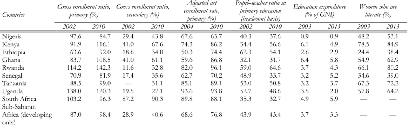
Table 1.6. Anthropometric Indicators, 2003, 2013: Nigeria and Selected Developing Countries in SSA ... 24
Table 1.7. Education Indicators: Nigeria and Selected Developing Countries in Africa ... 25
Table 2.1. Households’ Dynamic Poverty Profile, Panel 2011–2013 ... 31
Table 2.2. Mean and Median Consumption Per Capita by Zones, 2004, 2013 ... 33
Table 2.3. Health Care Indicators from 2003 to 2013 ... 40
Table 2.4. Consumption Poverty and MPI by States: Headcount and Ranking ... 46
Table 3.1. RIF Regression Results on Poverty, 2013... 47
Table 3.2. Oaxaca-Blinder Poverty Decomposition between North and South, 2013 ... 49
Table 3.3. Oaxaca-Blinder Middle-class Decomposition between North and South, 2013 ... 50
Table 3.4. Ordered Logit on Households’ Dynamic Poverty Profile, Panel 2011–2013 ... 53
Table 4.1. Mean Yearly Precipitations by Zones and Year (cm), 2001–2012 ... 79
Table 4.2. Selected Conflicts in Nigeria ... 83
Table A-2: Implied Caloric intake by Month of Interview ... 96
Table B.1 North Central - Summary ... 101
Table B.2 North Central - Education and Infrastructure ... Error! Bookmark not defined. Table B.3 North East - Summary ... 103
Table B.5 North West - Summary ... 105
Table B.6 North West - Education and Infrastructure ... 105
Table B.7 South East - Summary ... 107
Table B.8 South East - Education and Infrastructure ... 107
Table B.9 South South - Summary ... 109
Table B.10 South South - Education and Infrastructure ... 109
Table B.11 South West - Summary ... 111
Table B.12 South West - Education and Infrastructure ... 111
Table A.1. The Profile of Chronic Poor, Transient, and Permanent Nonpoor Households, Panel 2011–2013 ... 113
Table A.2. RIF Regression Results on Middle Class, 2013 ... 115
Executive Summary
According to new estimates, per capita poverty rates in Nigeria declined by 10 percentage points, from 46.0 percent in 2004 to 35.6 percent in 2011 and 36.1 percent in 2013. The
new estimates of poverty rates and trends indicate that Nigeria has been performing above expectations based on previous official poverty figures, which showed stagnation in the national poverty rate at above 60 percent during the period.
The reduction in the poverty rate was not commensurate with the rapid growth in the gross domestic product (GDP) of the country, however. Although it is one of the most rapidly growing
economies in the Sub-Saharan African region, Nigeria is struggling to translate the growth into quick poverty reduction. Compared with the rest of the region and other lower-middle-income countries, poverty reduction in Nigeria has been less responsive to economic growth. Estimates of the growth elasticity of poverty (GEP) indicate that, for every 1.0 percent growth in GDP per capita, poverty declined by only 0.6 percent. Nigeria’s GEP is half that of the regional average and only a fourth of that of lower-middle-income countries. The GEP was also lower than the GEPs of a number of African countries that enjoyed high growth rates in the last decade.
Three factors determined this lack of responsiveness. First, high growth rates have been
accompanied by comparatively high rates of population growth. Population has been expanding at an average pace of 2.7 percent a year, and the fertility rate is among the highest in the developing world. Second, like other resource-rich economies in the developing world, Nigeria has been exhibiting a capacity to absorb labor. The most recent estimates of employment elasticity indicate that, for every 1.0 percentage point growth in GDP, employment increases by only 0.1 percent (Ajakaiye et al. 2015). Third, inequality has been widening quickly and has adversely affected poverty reduction; only half the consumption per capita growth has translated into poverty reduction. If inequality had not widened, poverty would have dropped 18 points rather than 10.
In a disaggregation of the national poverty rate, the lack of responsiveness of poverty reduction to growth can arguably be attributed to the performance of two of the six geopolitical zones into which the country is often divided: North East and North West.
Together, these two zones experienced stagnation in poverty rates, while the other zones showed a reduction in poverty rates. Should the GEP be calculated without the two northern zones, it would double, and the speed of poverty reduction would be above the growth rate.
The large poverty differential between the north and south of the country reflects two different growth paths. The divide is not a feature of the last decade only; rather, it reflects a gap, accumulated
over years, in various socioeconomic indicators and in economic opportunities. An examination of only national-level indicators thus provides an incomplete picture. If data are decomposed at the subnational level (zones and states), significant differences in many socioeconomic indicators and the related trends clearly emerge.
This divide is caused by the higher concentration of drivers of poverty reduction in the south.
A regression-based decomposition can be used to identify the factors that have contributed to widening the divide in poverty rates between the country’s zones, thereby exhibiting the main drivers. The results of such an exercise show that, relative to the northern zones, the southern zones benefited from an initial demographic dividend and managed to foster urbanization and accumulate more productive assets, more human capital, and more job opportunities.
The southern zones are closer than the northern zones to the realization of the demographic dividend. The econometric analysis identified household demographic structure as one of the most
important drivers of the north-south divide. Dependency ratios in northern Nigeria were rising consistently during the last decade, reaching an average ratio of 103.6 percent against the southern ratio of 73.4 percent in 2013.
Urban residence has a strong impact in reducing the risk of poverty, and the southern zones tend to be more highly urbanized. Urban areas have an advantage over rural areas in the provision
of several basic services such as electricity, water, and sanitation, and urban areas tend to offer more jobs opportunities. Agglomeration economies can emerge only in urban areas. The economies of scale and network effects that help grow business activities are characteristic of urban areas, where communications are speedier and less expensive, inputs are more easily accessible, and the size of markets is relatively larger. For example, while, in the South West, the urban population was 20 million in 2004 and had expanded to 30 million by 2013 (75 percent of the zone population), the population in the North West remained below 10 million (22 percent of the zone population) during both periods.
Human capital is greater in the southern states, where the labor market is more modern and dynamic. Whereas about 40 percent of the labor force in the north has never attended school, the
proportion of the labor force without any education is around 20 percent in the south. A breakdown of labor force illiteracy rates by state and age-group reveals a country that is struggling to reduce the gap in literacy between the northern and southern zones. In the labor market, the southern zones show a higher level of diversification outside agriculture and a higher share of waged jobs. In the North East and North West, wage jobs account for less than 10 percent of total employment, while almost two-thirds of the population remain active in farming. By comparison, fewer than one worker in five in the South West is involved in farming, but over half the employed are self-employed, and one worker in four is a wage worker.
From the overall analysis, Nigeria emerges as a country harnessed by tight constraints, but with great potential. The overall picture is further complicated by the absence of a one-size-fits-all
solution. The performances of northern and southern Nigeria could not be more at odds. The coastal parts of the South West and South South states can be considered middle-income economies that have achieved important results in poverty reduction, but are facing the typical constraints of this group of economies, such as chaotic urbanization, unmet demand for high-quality services, and an unfavorable business climate. Meanwhile, the upper northern states have been experiencing deep poverty, sluggish growth, and limited access to basic services and infrastructure. In policy intervention, this implies that, whereas the focus of the more dynamic states should be on improving the business climate and the quality of services, the poorer states face a rather more complicated set of challenges.
The conditions and growth perspectives of Nigeria have, however, changed since the end of the period analyzed in the report. The current crisis in the country has substantially reduced growth
and, as a consequence, limited the trickle of growth down from more well off areas to poorer areas. Furthermore, it is likely that the conflict in the North East and parts of the North West has caused conditions to deteriorate among the local populations, and, as a result, many socioeconomic indicators have worsened. The new situation thus calls for additional analysis to form a clearer picture of the implications of events since 2013 for poverty rates and poverty reduction strategies.
The report concludes with a preliminary policy road map that can help the new government identify a comprehensive set of policies to address some of the structural problems the
country is facing. Two sets of policies are proposed: distribution-blind interventions and
poverty-targeted interventions. Among the distribution-blind interventions, priority should be given to those aimed at diversifying the Nigerian economy away from oil. Rapid diversification in growth and more job creation in Nigeria depend on the twin forces of industry and service-driven wages in urban areas and agricultural productivity in rural areas. Policy interventions should thus focus on increasing the number of jobs in the modern private sector, boosting the productivity of traditional economic sectors, and fostering the occupational and geographical mobility of workers.
The poverty-targeted interventions could, on the other hand, directly reduce the gap between the southern and northern zones by tapping the potential of the northern zones. The first set
of policy interventions pertains to the demographic dividend. Nigeria, particular the north, needs to implement policies aimed at generating the kind of demographic dividend that has played an important role in the growth of East Asia and other economies. The second set is directed toward the provision of basic services and infrastructure. Reducing the north-south divide requires a renewed effort to expand the supply of basic services, ranging from education to water and sanitation, and basic infrastructures, such as secondary roads and electricity. Finally, great emphasis should be put on constructing a social safety net system at the federal level. If well targeted, social protection can help reduce the inefficiencies in the allocation of resources and boost the productive potential of individuals and communities by breaking the vicious circle that links inequalities in income and opportunity across generations.
Introduction
Whether poverty has declined and by how much: the debate has been lively in Nigeria recently. Data from the last comprehensive Harmonized Nigeria Living Standards Survey (HNLSS)
in 2009–10 indicated that the official poverty rate remained stubbornly high, at 62 percent of the population; this represents only a slight drop from the 64 percent that was recorded in the Nigeria Living Standards Survey (NLSS) in 2003–04. These figures betray a Nigerian performance that is at odds with the general international trend of poverty decline, particularly the decline in similarly rapidly growing developing economies. On a list of developing countries ranked by the speed of poverty reduction, Nigeria would be in the lowest 20 percent of the distribution. To meet the World Bank target of a reduction in poverty to 3 percent by 2030, Nigeria would have to generate a poverty decline that would mirror the decline in some of the leading countries in the world in reducing poverty, such as Brazil, China, and Vietnam.
It appears increasingly likely that the household consumption of Nigerians was underestimated in the 2009–10 HNLSS. A World Bank report of 2013raised the hypothesis that consumption may have been significantly underestimated in the 2009–10 NHLSS (see appendix A) (World Bank 2013). This report notes a strange decline in reported monthly consumption in early 2010 relative to the second half of 2009 that would seem to have little economic rationale. This decline did correlate with some technical difficulties experienced during the implementation of the household survey in 2010.
The current report provides a reassessment of the poverty trends in Nigeria based on recently available data. The report makes use of new data of the National Bureau of Statistics that became
available from two smaller (5,000 households) General Household Survey (GHS) panels conducted in 2010–11 and 2012–13. The GHS panel survey is largely representative at the macro-regional level in the same sense as the HNLSS. It is not representative across Nigerian states, however. There are also important differences in methodology—discussed in the data section below and in appendix A—that prevent the direct comparison of results from the GHS with the HNLSS.
Unlike the official figures that indicate a poverty rate stubbornly above 60 percent, the new data show a decline by 10 percentage points from about 46 percent in 2004 to 36 percent in 2013. Also, the new data offer a clearer and more consistent story of growth and poverty reduction in
Nigeria relative to previous data. Poverty rates are more in line with the per capita gross domestic product (GDP), both the old level and the rebased level, and it appears that the rapid GDP growth made a dent in poverty, whereas, in the old data, there was no significant impact of growth on poverty.
The new estimates also suggest that the divide between the north and the south of the country in poverty levels and trends in poverty reduction is significant. Based on this evidence, the report
attempts to look at Nigeria not as a monolithic country, but, rather, to allow the substantial differences between parts of the country emerge. Nigeria presents some complex development challenges; this complexity is accentuated by the absence of a one-size-fits-all solution. While parts of the South West and South South states illustrate characteristics of a middle-income country and achieved important results in poverty reduction, several northern states are still afflicted by deep poverty and violent conflicts. In terms of policy intervention, this implies that, whereas the more dynamic states are mainly constrained by the lack of infrastructure and an unfavorable business climate, the poorer states face a more complicated set of challenges.
The main caveat of the present report is that it only covers the period from 2004 to 2013; new survey data (the GHS panel, round 3) will start to be available at the end of 2016. It is worth
mentioning this since the scenarios that the Nigerian economy is currently facing are different from those of the past decade. Between 2004 and 2013, Nigeria enjoyed high rates of growth. The growth was driven by a few growth poles concentrated in coastal areas and around the capital, Abuja, and a limited trickle down to the rest of the country. In 2015, the economy grew at only 2.7 percent compared to 6.3 percent in 2014. This decline was driven by decelerating growth in the nonoil sector and a larger contraction in the oil sector. As a consequence, fiscal revenues dropped significantly, and this greatly affected Nigerian states. State governments are heavily dependent on federal transfers, which mostly consist of oil revenue distributed from the federation account (on average, almost 85 percent of state revenues come from federation account allocations), and face greater borrowing constraints than the federal government because most states have accumulated arrears, some in excess of six months.
The report does not assess the poverty impact of the recent insurgency in the North East and parts of the North West. The new GHS panel survey will contain a specific module and sampling
strategy aimed at evaluating the impact of conflicts on the livelihoods of households in the north. The analysis of the socioeconomic impact of conflicts is thus deferred to 2017.
The report consists of four chapters. Chapter 1 profiles the trends in growth, household
consumption, and poverty rates at the national level between 2004 and 2013. Descriptive statistics on consumption and selected poverty indexes are presented, as well as a profile of the characteristics of the poor. The chapter concludes with an analysis of nonmonetary indicators. Chapter 2 unpacks the national level data into subnational results (six zones) and shows the wide and expanding divide in socioeconomic indicators. Chapter 3 uses descriptive and econometric techniques to identify the drivers of this divide. Chapter 4 concludes and provides a road map for effective policy action to address the divide.
Data
A comparison of measures such as indicators of poverty, inequality, and polarization computed on surveys relatively distant in time capture more accurately the effect of structural modifications in income distribution. Excluding cases of sudden shocks, these measures generally
tend to shift relatively slowly. Comparisons over time, however, can be made difficult or even impossible by changes in data collection methodologies (Tarozzi 2007). In particular for survey data, there is increasing empirical evidence that questionnaire revisions can affect survey responses in relevant ways (Deaton and Grosh 2000). For example, the choice of recall period (7, 30, or x days before the interview) or the disaggregation of expenditure items can deeply influence reports on expenditure.1 Other changes, such as the switch from a diary-based collection to a recall-based
collection, can dramatically change aggregate food consumption expenditures, on average accounting for about 50–60 percent of household expenditures in Nigeria (World Bank 2013).
1 For example, in Tanzania (Beegle et al. 2010), recall modules measure lower consumption than a personal diary, with larger gaps among poorer households and among households with more adult members. Ahmed et al. (2014), looking at Bangladesh data, also find that a switch from diary to recall often reduces consumption aggregates simply because households remember their expenses better when entering them regularly in a diary. Therefore, switching the data collection methods from diary to recall likely underestimates household consumption data and thus makes poverty estimates incomparable with those of previous rounds in which consumption data were collected by diary.
In Nigeria, the National Bureau of Statistics uses the NLSS 2003–04 and the HNLSS 2009–10 to monitor progress in poverty reduction in the country. These surveys are representative at the
state level. They used a month-long diary to collect consumption data, and enumerators were in the field over a period ranging from October to September. The National Bureau of Statistics also conducts other household surveys, most notably the GHS cross section and the GHS panel.
The GHS cross section is a survey of 22,000 households carried out periodically throughout the country. It is freely downloadable from the website of the National Bureau of Statistics upon
request. Available datasets include six rounds from 2004–05 to 2010–11. Enumerators visit households once, generally in March, and ask a standard set of questions. Data on consumption are collected by asking the households about broad categories of consumed items in the previous months: food, health care, school, and so on. In 2004–05 and 2010–11, data on consumption were not collected.
The GHS panel is a randomly selected subsample from the GHS cross section consisting of 5,000 households; the panel covers the period 2010–11 (1st wave) and 2012–13 (2nd wave). It is
representative at the national and zonal levels (that is, the six geopolitical divisions, the North West, the South East, and so on). Besides the questions asked in a normal GHS survey, the GHS panel captures data on agricultural activities and other household income activities. Consumption data are collected using a seven-day recall period. In every panel wave, households are interviewed twice, once in the postplanting period ranging from August to November and once in the postharvest period ranging from February to April.
Consumption data—the welfare measure use in the report analysis—from these three sources are not directly comparable. Analysis reveals that results based on poverty and inequality data
computed on the GHS panel and corresponding results computed on the HNLSS look substantially different. Deriving comparable data thus requires some type of homogenization of consumption figures.
To enable data comparisons over a longer span (a decade), the analysis relies on survey-to-survey imputation techniques; notably, wave 1 of the panel is used to impute consumption on the NLSS survey 2003–04 (see appendix A). Given the importance of obtaining accurate estimates
that are comparable over time, it is important to calibrate models in a year in which both household consumption data and nonconsumption data are available and then use the model to impute household consumption data for the years in which only nonconsumption data are available. In this report, panel wave 2 is used as a benchmark to check the accuracy of the predictions emanating from the analysis, and, in a second stage, the same model is used to impute 2003–04 data.
For most measures, such as poverty, inequality, and polarization indicators, the trend between 2003–04 (with consumption reestimated and henceforth referred to as “2004”) and the last two GHS rounds, GHS 2010–11 (“2011”) and GHS 2012–13 (“2013”), are compared.
Trends are compared at the national and zonal levels because the GHS can yield estimates only at these levels. Poverty estimates at the state level are obtained using a new poverty mapping technique developed at Oxford University (discussed at the end of chapter 2). Other data sources include Demographic and Health Surveys (DHS) from 2003, 2008, and 2013; World Development Indicators (WDI) downloaded from the WDI website; and income data from the Rural Income Generating
Activities project protocol on income information from NLSS 2003–04 data and the two GHS rounds.2
Definitions and technical notes
The selected measure of welfare is consumption per capita. Consumption has proven preferable
to income as a measure of poverty because it is less volatile (for example, see Deaton and Zaidi 2002; Haughton and Khandker 2009). In agricultural economies in particular, income is more volatile and more highly affected by the growing and harvest seasons; relying on income as an indicator of welfare might therefore under- or overestimate living standards significantly. Consumption is also a better measure of long-term welfare because households can borrow, draw down savings, or receive public and private transfers to smooth short-run fluctuations. The GHS collects sufficiently detailed information to facilitate estimates of the total consumption of each household. The 2003–04 consumption survey data are reestimated using 2010–11 household data.
The terms poverty and poverty incidence refer to the poverty headcount index, unless otherwise specified. The poverty headcount index measures the proportion of the population with
per capita consumption below the value of a minimum basket of food and nonfood items, that is, the poverty line.
The report uses the 2004 poverty line of ₦28,830 a year. The line is deflated temporally using the
national consumer price index provided by the International Monetary Fund and spatially using zonal-level price data.
The poverty gap index measures the extent to which individuals fall below the poverty line (the
poverty gap) as a proportion of the poverty line. The sum of the poverty gaps so calculated yields the minimum cost of eliminating poverty if transfers were perfectly targeted. The squared poverty gap index (or the index of the severity of poverty) averages the squares of the poverty gaps relative to the poverty line.
The growth elasticity of poverty (GEP) is the percentage reduction in the poverty rate that is associated with a percentage change in mean (per capita) income. A numerical example clarifies
the concept. In Nigeria between 2004 and 2013, the GEP value was 0.6 (see chapter 1). This value implies that a 1 percent increase in per capita income was associated with a 0.6 percent decrease in the poverty rate.
The growth incidence curve plots the growth rate at each quantile of per capita consumption (or income). Graphs of growth incidence curves allow a comparison of differences in the incidence
of growth between poorer and richer segments of the population or a comparison of the former with the rate of growth of mean consumption (or income) (see chapter 1).
2 See, respectively, Data (database), DHS Program (Demographic and Health Surveys), ICF International. Rockville, MD (accessed January–April 2016), http://www.dhsprogram.com/Data/; WDI (World Development Indicators) (database), World Bank, Washington, DC (accessed January–April 2016), http://databank.worldbank.org/data/reports.aspx?source=world-development-indicators; RIGA (Rural Income Generating Activities) Database, Food and Agriculture Organization of the United Nations, Rome, http://www.fao.org/economic/riga/riga-database/en/.
The cumulative consumption curve shows the level of welfare enjoyed by various percentiles of the population in any particular year. In a graphic presentation, distributions to the right reflect
an improvement in the overall welfare of the population, that is, they are statistically dominant and can be considered. The horizontal axis represents consumption measured as a percentage of the poverty line. The vertical axis represents the percentage share of the population, and each point on the distribution function shows the share of the population below a certain percentage level of the poverty line. The point on the vertical axis that corresponds to the vertical line that indicates 100 percent of the poverty line yields the poverty rate. There are several measures of vulnerability to poverty. In this report, we use a simple, unsophisticated measure: 140 percent and 180 percent of the poverty line.
The Oaxaca decomposition explains the gap in the means of an outcome variable (consumption in the case of this report) between two groups (for example, between two survey rounds, 2004 and 2013) (Oaxaca 1973). The gap is decomposed into that part arising because of
group differences in the magnitudes of the determinants (endowment effect) of consumption and that part arising because of group differences in the effects of these determinants (coefficient effect).
Polarization is the combination of the divergence from the global mean income and the convergence toward local mean incomes. Polarization differs from inequality because the latter is
the overall dispersion of the distribution, that is, the distance of every individual from the median or mean income. In income-polarized societies, people are clustered around the group means and tend to be remote from the mean or median of the overall distribution. Within each group, there is income homogeneity and often narrowing income inequality; thus, one may talk of increasing identification. Between the two groups, one might talk, rather, about increasing alienation (Duclos, Esteban, and Ray 2004). The overall impact of the forces of identification and of alienation between two groups of significant size leads to effective opposition, a situation that may give rise to social tensions and conflict (Esteban and Ray 1999, 2008, 2011). Also, the group at the top of the distribution possesses voice, while the other group, which is made up of those at the bottom, is voiceless in matters that affect the welfare of the group and society at large.
Chapter 1 : Poverty and Inequality in Nigeria
Although it is one of the most rapidly growing economies in Sub-Saharan Africa, Nigeria is struggling to translate its rapid growth into accelerated poverty reduction. Relative to poverty
reduction in the rest of Sub-Saharan Africa and other lower-middle-income countries, poverty reduction in Nigeria has been less responsive to economic growth.
Three factors determine this low responsiveness. First, high growth rates have been accompanied
by comparatively high rates of population growth. Second, similar to other resource-rich economies in the developing world, growth does not necessarily translate into more jobs or more opportunities for everyone. Third, inequality has been expanding quickly and has adversely affected poverty reduction.
Compared with other Sub-Saharan African countries, Nigeria is also losing ground on a number of key indicators. Nigeria has not done well on indicators such as the rate of accumulation
of physical and human capital and in the household access to basic services. Underperforming in these indicators can have a long-term negative impact on growth and can hamper the country’s capacity to reduce poverty.
Poverty rates declined, but the number of the poor remained unvaried
Poverty declined by about 10 percentage points between 2004 and 2013. Poverty figures
computed from the General Household Survey (GHS) data and from 2004 data re-estimated using survey-to-survey techniques support the hypothesis that poverty rates in Nigeria are significantly lower than official estimates based on the 2003–04 Nigeria Living Standards Surveys (NLSSs) and the 2009– 10 Harmonized Nigeria Living Standards Surveys (HNLSSs) (see appendix A). At the national level, per capita poverty rates declined from 46.0 percent in 2004 to 35.6 in 2011 and 36.1 in 2013.3 The two
NLSS surveys showed per capita rates of 64.0 and 62.0 percent.
Data show a stagnation in poverty reduction in 2011–13. A set of contemporaneous factors explain
this deceleration. Growth in 2012 slowed somewhat relative to the recent past especially in oil, trade, and agriculture. Slower growth in trade and agriculture reflected a combination of fallout from the national strike in January, higher energy prices (tariffs), severe floods, and the expanding security challenges in some parts of the north.
Urban and rural areas reduced poverty at a different pace. Relative to rural areas, urban areas
experienced both a significantly lower poverty rate and relevant progress in poverty reduction (table 1.1). Whereas the poverty rate fell by almost half in urban areas after 2004, it barely declined in rural areas, where 50 percent of the population is living below the poverty line. The interpretation of these results is complicated by the fact that the last classification of urban and rural areas in Nigeria dates from 1991. Nonetheless, the results fit well with the findings of official reports that suggest urbanization and urban growth to be a primary driver of poverty reduction in Nigeria. Moreover, the slow progress in poverty reduction in rural areas is consistent with recent trends in agriculture.
3 In the “Nigeria Economic Report” (World Bank 2014), preliminary results on the poverty rate in the country are reported at 35 percent in 2011–12 and 33 percent in 2012–13. In the revision in 2015 (World Bank 2015a), new consumption conversion factors were introduced for nonstandard units collected in 2015. The new conversion factors vary across zones and measure more accurately the quantities of goods and services purchased and produced. The results here were obtained by applying the new conversion factors that will also be used for the GHS panel, round 3.
Estimates for 2011–14 (World Bank 2014a) suggest that growth in agriculture averaged only 2.3 percent during this period, significantly lower than previous estimates. This is less than the population growth in many areas and thus consistent with stagnation in poverty reduction.
Table 1.1. The Poverty Rate, Poverty Gap, and Severity of Poverty, Nigeria, 2004, 2011, 2013
Source: World Bank calculations based on NLSS 2003–04 (reestimated) and GHS 2010–11, 2012–13.
The depth of poverty has declined at the national level. Both the poverty gap and the severity of
poverty fell. This suggests that changes also occurred in consumption among people living below the poverty line. The more rapid growth at the bottom of the distribution is also shown in the growth incidence curves (see figure 1.11); the growth rate of per capita consumption was most rapid among households in the bottom 10 percent and less rapid in the part of the distribution between the bottom 10th percentile and the top 10th percentile. Likewise the poverty headcount ratio, the poverty gap, and the severity of poverty dropped much more quickly in urban areas than in rural areas: while both the poverty gap and the severity of poverty fell by more than half in urban areas, the decline was on the order of a few percentage points in rural areas.
The number of Nigerians living in poverty has not changed significantly. Because of rapid
population growth of close to 3 percent, Nigeria must experience a steep reduction in the poverty rate to lower the absolute number of the poor. The estimates presented above imply that the number of poor Nigerians rose by 788,000 between 2004 and 2013 (figure 1.1), but the difference is not statistically significant. The trend also indicates that, while there was some reduction between 2004 and 2011, the stagnation in the poverty rate between 2011 and 2013 and the increase in population completely offset these gains.
Figure 1.1. Number of the Poor, Nigeria, 2004, 2011, 2013
Source: World Bank calculations based on NLSS 2003–04 (reestimated) and GHS 2010–11, 2012–13.
2004 2011 2013 2004 2011 2013 2004 2011 2013 Rural 51.61 46.35 48.49 18.97 14.78 14.8 9.45 6.47 6.16 Urban 34.16 16.69 15.92 10.52 3.83 3.85 4.65 1.33 1.45 Nigeria 46.42 35.64 36.19 16.45 10.82 10.66 8.02 4.61 4.38
Poverty rate Poverty gaps Severity of poverty
63,663 57,402 64,451 -10,000 20,000 30,000 40,000 50,000 60,000 70,000 2004 2011 2013 '00 0 IND IV IDUA LS
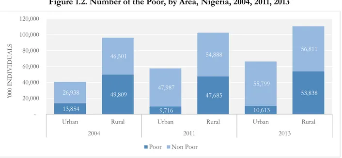
The stagnation in the poverty rate was the outcome of two offsetting trends: a decrease in urban areas and a surge in rural areas. While the population increase in urban areas did not slow
the pace of poverty reduction, the increase in rural population mainly meant more poor people. The population rose by 40 million between 2004 and 2013, which was almost evenly split between urban and rural areas. From this perspective, the performance of urban areas appears even more remarkable because the big population inflow did not increase the number of the poor; indeed, the number actually declined by 3 million (figure 1.2). Although, in rural areas, the number of the poor rose more slowly than the number of the nonpoor, the net effect was a rise among the poor by about 4 million people.
Figure 1.2. Number of the Poor, by Area, Nigeria, 2004, 2011, 2013
Source: World Bank calculations based on NLSS 2003–04 (reestimated) and GHS 2012–13.
Poverty reduction, however, was not commensurate with the rapid growth in gross domestic product (GDP). For every 1 percent growth in GDP per capita, poverty declined by only 0.6 percent.
Nigeria did worse than the rest of Sub-Saharan Africa, where the growth elasticity of poverty (GEP) was even lower than the GEP in other regions of the developing world. Nigeria’s GEP is half the Sub-Saharan African average GEP and only a fourth of the average across lower-middle-income countries (figure 1.3). The GEP in Nigeria was also lower than the GEP of a number of African countries that enjoyed high growth rates during the decade. Ghana, for example, saw a decline in poverty similar to that experienced by Nigeria (both around 10 percent) in the same period, but its economy grew less. Poverty elasticity was therefore slightly higher in Ghana than in Nigeria even though this was not a period of rapid poverty reduction in Ghana (Molini and Paci 2015).
13,854 49,809 9,716 47,685 10,613 53,838 26,938 46,501 47,987 54,888 55,799 56,811 20,000 40,000 60,000 80,000 100,000 120,000
Urban Rural Urban Rural Urban Rural
2004 2011 2013 '00 0 IND IV IDUA LS
Figure 1.3. GEP, 2003–13 a. Nigeria vs. Sub-Saharan Africa and
Lower-Middle-Income Countries b. Nigeria vs. Selected African Countries
Source: World Bank calculations based on GHS 2010–11; NLSS 2003–04; PovcalNet (online analysis tool), World Bank,
Washington, DC, http://iresearch.worldbank.org/PovcalNet/; WDI (World Development Indicators) (database), World Bank, Washington, DC (accessed January–April 2016), http://databank.worldbank.org/data/reports.aspx?source=world-development-indicators.
Rapid population increase and persistent high inflation contributed to the limited poverty impact of GDP growth
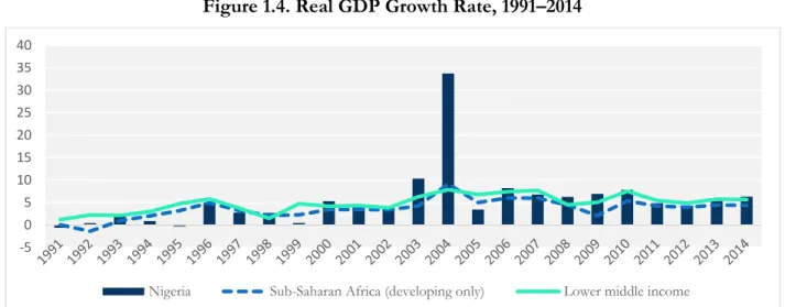
Poverty reduction was slow compared with the remarkable GDP growth. Nigeria’s GDP has
grown more quickly than the average in Sub-Saharan Africa; it is similar to the growth in other lower-middle-income countries (figure 1.4). On average, since 2004, Nigeria grew at 8 percent annually. If the outlier, 2004, is excluded, the performance is still remarkable given that the country grew at an average of 6 percent. This performance was achieved in a context of economic and political reforms characterized by prudent macroeconomic management and a return to political pluralism. A few areas of the country, particularly Lagos State, achieved visible and impressive progress in development and in the delivery of services.
-0.6 -1.2 -2.2 -2.5 -2.0 -1.5 -1.0 -0.5 0.0 Nigeria Sub-Saharan
Africa Lower middle income
-0.6 -0.7 -1.0 -1.1 -2.4 -2.5 -2.0 -1.5 -1.0 -0.5 0.0
Figure 1.4. Real GDP Growth Rate, 1991–2014
Source: WDI (World Development Indicators) (database), World Bank, Washington, DC (accessed January–April 2016),
http://databank.worldbank.org/data/reports.aspx?source=world-development-indicators.
The rapid population increase substantially reduced GDP per capita growth. Figure 1.5 displays
the population growth rates in Nigeria compared with Sub-Saharan African and lower-middle-income countries. In the last decade, the Nigerian population has increased at about 2.7 percent per year, close to the Sub-Saharan African average.4 Meanwhile, in 1990–2014, the average rate of population growth
among other lower-middle-income economies was lower and declining more quickly, from 2.3 percent to 1.5 percent.
Figure 1.5. Population Growth, 1991–2014
Source: WDI (World Development Indicators) (database), World Bank, Washington, DC (accessed January–April 2016),
http://databank.worldbank.org/data/reports.aspx?source=world-development-indicators.
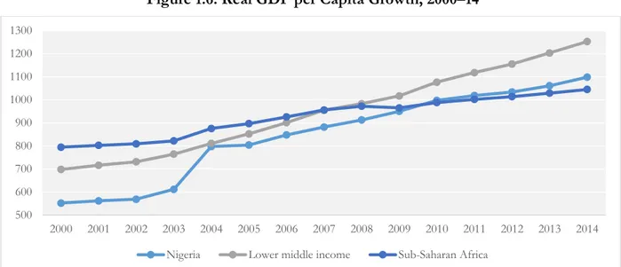
Similar GDP growth but diverging population trajectories are widening Nigeria’s gap with other lower-middle-income countries. Although GDP per capita doubled between 2000 and 2014,
Nigeria has been lagging other lower-middle-income countries since the outbreak of the financial crisis
4 The population growth registered by comparing the GHS surveys is even larger, almost 4 percent annually in 2011– 13. -5 0 5 10 15 20 25 30 35 40
Nigeria Sub-Saharan Africa (developing only) Lower middle income
1.00 1.20 1.40 1.60 1.80 2.00 2.20 2.40 2.60 2.80 3.00
in 2008 and growing more or less at the same pace as the rest of Sub-Saharan Africa (figure 1.6). Population growth rates make a substantial difference. To narrow the gap with other lower-middle-income countries, Nigeria’s GDP should grow at least 1.3 percentage points more every year.
Figure 1.6. Real GDP per Capita Growth, 2000–14
Source: WDI (World Development Indicators) (database), World Bank, Washington, DC (accessed January–April 2016),
http://databank.worldbank.org/data/reports.aspx?source=world-development-indicators.
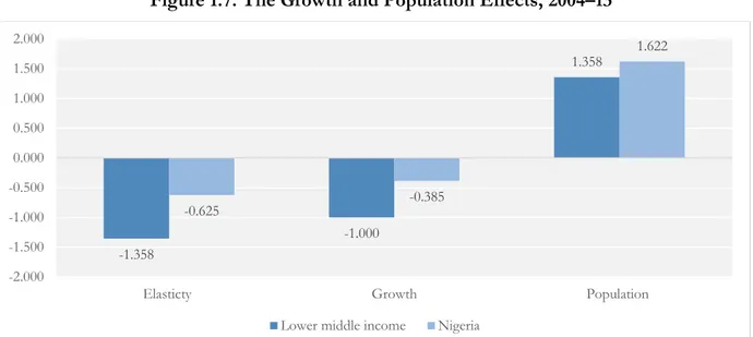
Population growth had a direct impact on slowing the pace of poverty reduction. A simple
decomposition of GEP shows how population increase reduced the impact of growth on poverty. as follows: 𝜀𝑃𝑂𝑉 = − (∆𝐺𝐷𝑃∆𝑃𝑂𝑉 𝑝𝑐) = − ( ∆𝑃𝑂𝑉 ∆𝐺𝐷𝑃) ∗ ( ∆𝐺𝐷𝑃 ∆𝐺𝐷𝑃𝑃𝐶). (1.1)
Figure 1.7 presents the GEP decomposed into the growth effect, that is, the elasticity of poverty to GDP (∆𝑃𝑂𝑉∆𝐺𝐷𝑃), and the population effect, that is, the variation in GDP over the variation in GDP per capita (∆𝐺𝐷𝑃∆𝐺𝐷𝑃
𝑃𝐶) . The low elasticity in Nigeria relative to lower-middle-income countries is a
consequence of a lower growth effect and a comparatively larger population effect. Whereas the population effect in lower-middle-income countries is around 1.3, meaning that the gap between GDP growth and GDP per capita growth is an average 0.358 percent; in Nigeria, the gap is almost double, 0.622 percent. In contrast, the growth effect or the impact of growth alone on poverty is more than two times higher in lower-middle-income countries (−1) than in Nigeria (−.385), suggesting much more inclusive growth even without discounting for population growth.
500 600 700 800 900 1000 1100 1200 1300 2000 2001 2002 2003 2004 2005 2006 2007 2008 2009 2010 2011 2012 2013 2014 Nigeria Lower middle income Sub-Saharan Africa
Figure 1.7. The Growth and Population Effects, 2004–13
Source: WDI (World Development Indicators) (database), World Bank, Washington, DC (accessed January–April 2016),
http://databank.worldbank.org/data/reports.aspx?source=world-development-indicators.
The rapid population growth is driven by a high fertility rate.5 Nigeria’s fertility rate is
significantly higher than the average rate in lower-middle-income countries and above the Sub-Saharan African average (figure 1.8); as a consequence, population is increasing at a much more rapid pace. Fertility rates in Sub-Saharan Africa are still high (5 children per woman in 2014) and have decreased little in the past quarter of a century. With an annual average of 5.5 children per woman, Nigeria has the 10th-highest fertility rate in the world and double the average of lower-middle-income countries.6
Nigeria’s fertility rate is substantially higher than that of Sudan (4.3) and Ghana (4.1), but similar to the fertility rates in other Sub-Saharan African countries with much lower GDP per capita such as Rwanda and Tanzania.
5 High fertility rates are associated with high under-5 mortality rates. Demographic theories hold that a large number of children in a household may reflect a rational decision in places where under-5 mortality is still a concrete risk, as in the case of Sub-Saharan Africa. In such contexts, the decision to have a large number of children will anticipate the risk of under-5 mortality, leading to high fertility (Palloni and Rafalimanana 1999). Nigeria has the seventh-highest under-5 mortality rate in the world (108.8 per 1,000 births in 2015), 50 percent higher than the average rate among lower-middle-income countries and 30 percent higher than the rate in other Sub-Saharan African countries.
6 WDI (World Development Indicators) (database), World Bank, Washington, DC (accessed January–April 2016), http://databank.worldbank.org/data/reports.aspx?source=world-development-indicators. -1.358 -1.000 1.358 -0.625 -0.385 1.622 -2.000 -1.500 -1.000 -0.500 0.000 0.500 1.000 1.500 2.000
Elasticty Growth Population
Figure 1.8. Fertility Rate, 1990–2014 (Births per Woman)
Source: WDI (World Development Indicators) (database), World Bank, Washington, DC (accessed January–April 2016),
http://databank.worldbank.org/data/reports.aspx?source=world-development-indicators.
Recent estimates suggest there is some reason for optimism, however. Nigeria, or at least its
southern states, is on the verge of a demographic transition whereby the ratio of youth to other age-groups is increasing, and population is beginning to grow at a slower pace. This youth bulge is expected to stimulate growth and development, otherwise known as the demographic dividend. This has played an important role in the growth of East Asian and other economies. Furthermore, total fertility, which is estimated at 5.7 in 2015, is projected to decline to 5.1 by 2030. The current demographic structure of the country exhibits a growing youth population with an estimated median age of 17.9 years. Of the population, 42 percent is less than 14 years of age; 29 percent is in the 15–19 year age-group; and 24 percent is the 30–59 year age-group (NPC and ICF International 2014). The population expansion would mean that the working-age population will grow from the current 97 million in 2015 to 151 million in 2030, representing almost 16 percent of Africa’s labor force.
The pace of poverty reduction was also negatively affected by the persistent high level of inflation. Nigerian consumers are highly vulnerable to inflation, particularly those living in urban
areas. Because population is highly concentrated around the poverty line, rapid and unexpected price increases that are not offset by commensurate increases in nominal incomes or consumption can quickly push large shares of the population into poverty. Nigeria has a history of high inflation since the 1980s. Persistent shortages of consumer goods resulting from a scarcity of foreign exchange, high levels of monetary expansion, and periodic sharp increases in the price of electricity and gasoline all contributed to extremely high rates of inflation. From 2000, following the tightening of fiscal and monetary policy and the improvement in the logistics of food supply, inflation started to decline.
Despite the improvements, inflation remained almost always at two digits, much higher than in comparable countries (figure 1.9). The persistently high levels of inflation were partly a
consequence of substantial government spending and partly caused by periodic rises in food and domestic fuel prices. Even in comparison with other oil-exporting developing countries, which are typically affected by high inflation rates, the Nigerian performance was worse: the second highest inflation rate in the group after Angola (IMF 2011).
0 2 4 6 8 1990 1992 1994 1996 1998 2000 2002 2004 2006 2008 2010 2012 2014
Figure 1.9. Inflation Rate, 1990–2014
Source: WDI (World Development Indicators) (database), World Bank, Washington, DC (accessed January–April 2016),
http://databank.worldbank.org/data/reports.aspx?source=world-development-indicators.
GDP per capita did not entirely trickle down to household consumption and job creation Per capita growth did not translate into an increase in real per capita consumption of the same proportion. Converting the data reported in figure 1.6 into 2011 naira-equivalent prices shows that
GDP per capita increased by about 46.0 percent between 2004 and 2013, while the variation in mean consumption per capita estimated on household surveys was around 33.0 percent (table 1.2).7 Thus,
on an annual basis, GDP per capita grew at about 4.3 percent, while average consumption grew at 3.2 percent. Therefore, for each 1 percent increase in per capita GDP, mean per capita consumption rose by only 0.74 percent. If we look at the median to reduce the contribution of the tails of the distribution, the per capita GDP growth elasticity of mean per capita consumption was even lower, at around 0.4.
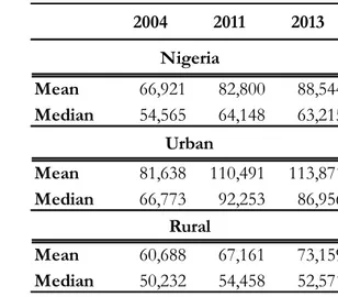
Table 1.2. Mean and Median per Capita Expenditure in Nigerian Naira, by Location, 2004, 2011, 2013
7 The two surveys cover 2003–04 and 2012–13. To reproduce the GDP per capita variations in the same periods, we averaged the values of 2003 and 2004 and of 2012 and 2013.
0 10 20 30 40 50 60 70 80
Nigeria Lower middle income Sub-Saharan Africa (developing only)
2004 2011 2013 Mean 66,921 82,800 88,544 Median 54,565 64,148 63,215 Mean 81,638 110,491 113,871 Median 66,773 92,253 86,956 Mean 60,688 67,161 73,159 Median 50,232 54,458 52,571 Rural Nigeria Urban
Source: World Bank calculations based on NLSS 2003–04 (reestimated) and GHS 2010–11, 2012–13.
The increase in consumption was mainly driven by urban areas. Between 2004 and 2013, mean
consumption rose in urban areas at an average annual rate of 3.8 percent, which is about 40.0 percent overall, while growth was at half that level in rural areas. At the median, rural areas have not significantly improved, whereas average consumption in urban areas rose by 21 percent. Particularly worrying is the situation at the end of the period: the median worsened in both urban and rural areas.
The discrepancy between per capita consumption growth and GDP per capita growth is partially explained by the structure of the Nigerian economy, which is unable to trickle down growth to the entire population through more job creation. The oil and mining sector accounted
for more than 30 percent of GDP during most of the period, and the oil sector accounts for about 70 percent of government revenues and 85 percent of exports (Ajakaiye et al. 2015) (figure 1.10). Traditionally, this is a sector that does not generate many jobs and often resorts to a foreign labor force. The performance of more labor-intensive sectors up to 2010 was not encouraging; the contribution of manufacturing has been negligible, while agriculture, although it accounted for about 30 percent of the value added, did not see relevant productivity improvement and continued to grow largely because of greater land use (Treichel 2010).
Figure 1.10. GDP, by Industry, Nigeria, 2004–13 (%)
Source: WDI (World Development Indicators) (database), World Bank, Washington, DC (accessed January–April 2016),
http://databank.worldbank.org/data/reports.aspx?source=world-development-indicators.
Since 2009, the nonoil sectors have driven the economy forward, but it is premature to conclude that growth became more pro-poor. The change in the composition of the economy
suggests that potentially more labor-intensive sectors such as services are taking the lead.8 The service
sector boom is driven, however, by modern and highly productive sectors such as finance and insurance, real estate, and information and communication technology that generate substantial returns, but are highly concentrated geographically and have a limited impact on employment.
8 Since 2006, the oil sector in the Delta experienced vast disruptions as consequence of the ongoing insurgency. This caused a large drop in oil production and, consequently, a decline in the share of the oil sector in the overall economy.
49 33 39 32 21 16 0 10 20 30 40 50 60 70 80 90 100 2000 2003 2006 2009 2011 2013
Construction and trade were doing well until 2013, but agriculture, for instance, continued to grow slowly, and, in employment rates, manufacturing lost ground (World Bank 2015b).
Empirical analysis over the last decade indicates the Nigerian economy both at aggregate and sectoral levels is characterized by low labor absorptive capacity. The most recent estimate
of employment elasticity is 0.11, which implies that, with every 1 percentage point in GDP growth, employment increases by only 0.11 percent (Ajakaiye et al. 2015). The implication is that the relatively high growth has not led to an appreciable increase in employment. The results of the sectoral analysis indicates that agriculture has an elasticity of 0.48, while services have generally been employment-intensive at 0.85. The employment elasticity of manufacturing, at 0.30, is insignificant. Comparative studies looking at the 1980s and 1990s confirm that Nigeria had one of the lowest levels of employment elasticity in Sub-Saharan Africa (ILO 2005).
Widening inequality cut the gains from consumption growth in half
Growth was not inclusive, and not every Nigerian benefited from it. The growth incidence curve
in figure 1.11 shows the variation in consumption between 2004 and 2013 across percentiles of the distribution. Based on their performance, three subgroups stand out: the top 10 percent of the distribution, the bottom 10 percent, and the percentiles in between. The top percentiles grew consistently more rapidly than the national average, and this contributed to a widening in inequality. The bottom 10 percentile performed relatively better than the rest over the whole period, but its performance worsened, in relative terms, during the last two years: it continued to grow at about 3 percent a year, which, in the last two years, was slightly below the mean. The middle percentiles grew at rates consistently below the mean (between 2.1 and 1.9), but still at sufficiently high rates to improve their situation over 2004.
Figure 1.11. Growth Incidence Curve, Nigeria, 2004–13
Inequality in household consumption widened substantially in 2004–13. The picture that
emerges is consistent across different indicators of inequality (table 1.3). Inequality in household consumption widened in 2004–13 by about 15 percent based on the Gini coefficient and by 82 percent based on the Theil index. The consumption share of the top decile of the population (the top 10) increased from 26.6 percent to 33.7 percent at the expense of all other deciles. The only exception was the bottom 10 percent, which increased its share, but not substantially.
Table 1.3. The Gini, the Theil, and Decile Distribution, Nigeria, 2004, 2013
Source: World Bank calculations based on NLSS 2003–04 (reestimated) and GHS 2012–13.
The rapid widening in inequality slowed poverty reduction appreciably. To identify the changes
in poverty that may be attributed to income growth and to inequality, the analysis relies on a Shapley value decomposition (Kolenikov and Shorrocks 2003). This is a nonparametric procedure that decomposes poverty reduction into growth and inequality components without any unexplained residual. It is first assumed that all the change is derived from consumption growth, while inequality remains unchanged. Alternatively, it is assumed that all the change is derived from changes in consumption redistribution, while there is no growth in consumption. Table 1.4 shows the results of this exercise in Nigeria.
Table 1.4. Shapley Decomposition, Poverty Rate Variation, by Location, Nigeria, 2004, 2013
Source: World Bank calculations based on NLSS 2003–04 (reestimated) and GHS 2012–13.
2004 2013 Gini 0.356 0.41 Theil 0.217 0.395 Consumption shares Decile_01 2.56% 2.71% Decile_02 4.10% 3.93% Decile_03 5.25% 4.79% Decile_04 6.36% 5.70% Decile_05 7.53% 6.69% Decile_06 8.85% 7.65% Decile_07 10.43% 9.10% Decile_08 12.52% 11.14% Decile_09 15.81% 14.56% Decile_10 26.59% 33.72%
Nigeria Rural Urban
2004 0.464 0.515 0.347
2013 0.361 0.485 0.159
Difference -0.103 -0.03 -0.188
Growth -0.183 -0.131 -0.195
Only half the per capita consumption growth translated into poverty reduction. Should
inequality not have widened, poverty would have dropped 18 points rather than 10 (see table 1.4, second row). The increase in inequality was particularly detrimental to poverty reduction in rural areas. Without the inequality increase, poverty could have gone down 13 points rather than only 3. Meanwhile, growth translated almost entirely into poverty reduction in urban areas: inequality chipped off only a small 1 percent.
Lower poverty rates and a growing middle class, but also more vulnerable households
An analysis of the entire consumption distribution sidesteps the potential disadvantages of considering only one measure of welfare, the poverty line, to the exclusion of the rest of the consumption distribution. In this section, we introduce an additional cutoff, the middle-class line,
and gauge trends in consumption between 2004 and 2013 by looking at shifts in the cumulative distribution. Figure 1.12 presents the full distribution of consumption in real terms in 2004, 2011, and 2013. The horizontal axis represents consumption measured as a percentage of the poverty line. The vertical axis represents the share of the population. Each point on the distribution function thus shows consumption relative to population share and the poverty line. The poverty levels in each of the three survey years can be read from the distribution functions at the point where the function crosses the vertical line that indicates 100 percent of the poverty line. The distribution can also be compared in welfare terms: any distribution appearing to the right of another is statistically dominant and can be considered a welfare improvement.
Figure 1.12. Per Capita Consumption, Cumulative Curves, Nigeria, 2004, 2011, 2013