Analytical options for single-case experimental designs:
Review and application to brain impairment
Rumen Manolov and Antonio Solanas
Department of Social Psychology and Quantitative Psychology, Faculty of Psychology,
University of Barcelona, Spain
Author Note
Correspondence concerning this article should be addressed to Rumen Manolov, Departament de Psicologia Social i Psicologia Quantitativa (Secció de Psicologia Quantitativa), Facultat de Psicologia, Universitat de Barcelona, Passeig de la Vall d’Hebron, 171, 08035-Barcelona, Spain.
Abstract
Single-case experimental designs meeting evidence standards are useful for identifying empirically-supported practices. Part of the research process entails data analysis, which can be performed both visually and numerically. In the current text we discuss several statistical techniques focusing on the descriptive quantifications that they provide on aspects such as overlap, difference in level and in slope. In both cases, the numerical results are interpreted in light of the characteristics of the data as identified via visual inspection. Two previously published data sets from patients with traumatic brain injury are re-analyzed, illustrating several analytical options and the data patterns for which each of these analytical techniques is especially useful, considering their assumptions and limitations. In order to make the current review maximally informative for applied researchers, we point to free user-friendly web applications of the analytical techniques. Moreover, we offer up-to-date references to the potentially useful analytical techniques not illustrated in the article. Finally, we point to some analytical challenges and offer tentative recommendations about how to deal with them.
Single-case experimental designs (SCEDs) are strategies capable of meeting criteria for experimental quality (Smith, 2012) and useful for identifying evidence-based practices (Schlosser, 2009). SCEDs entail the study of a single participant in different conditions,
manipulated by the researcher, and gathering repeated measurements in each of these conditions. However, it should be noted that most SCED studies involve studying separately more than one participant (Shadish & Sullivan, 2011; Smith, 2012), especially in relation to the importance of replicating the effects of the intervention (Kratochwill et al., 2010). The data obtained are
represented graphically and the assessment of the difference between conditions has traditionally been performed visually (e.g., Parker & Brossart, 2003; Smith, 2012). The continued use of visual analysis is likely due to the amount of data features that need to be taken into account (Kratochwill et al., 2010; Parker, Cryer, & Byrns, 2006) and the need to understand well the behavioral process (Fahmie & Hanley, 2008). However, statistical analyses are already part of neuropsychological rehabilitation SCED studies (Perdices & Tate, 2009), probably in relation to the evidence of insufficient interrater agreement between visual analysts (Ninci, Vannest, Willson, & Zhang, 2015), the need to take into account spontaneous improvement during the baseline and/or excessive variability (Kazdin, 1978), and the importance of objectively documenting intervention effectiveness and making SCD studies eligible for meta-analyses (Jenson, Clark, Kircher, & Kristjansson, 2007).
In order to illustrate the application and interpretation of several analytical techniques, we re-analyze the data from two SCEDs studies, including a variety of data features, such as baseline stability vs. variability vs. spontaneous improvement. We show that it is possible to express the results in the same metric as the outcome variable, as a percentage, or in standard deviations. Additionally, we will also rely heavily on visual representations of the data to enhance the
interpretation of the numerical results. Finally, we provide references to analytical techniques not covered here. (Note that the Special Issue in which the current text is included also covers
structured visual analysis and the meta-analytical integration of individual studies).
A Comment on Terminology
Rationale for the comment on terminology. We consider that the readers of Brain
Impairment are likely to be familiar with the Risk of Bias in N-of-1 Trials (RoBiNT)
methodological quality scale (Tate et al., 2013) and with the fact that in its data analysis item the terms “statistical and quasi-statistical” techniques are used. In that sense, we would like to provide a brief discussion of these terms and the ones we used in throughout the paper (i.e., descriptive and inferential).
Available examples. In the expanded manual of the RoBiNT scale (Tate et al., 2015), the
examples of statistical analyses include randomization tests and effect size indices, whereas the examples of quasi-statistical techniques include the two-standard deviations (2 SD) method and celeration (trend) lines with Bayesian probability analysis. In relation to these examples, trend lines and the 2 SD method are referred to as “visual aids” (rather than “quasi-statistical
techniques”) by Fisher, Kelley, and Lomas (2003), who propose one of the supported (Young &
Daly, 2016) methods for performing structured visual analysis. Additionally, the 2 SD bands are based on the normal probability model and are part of “statistical process control” (Callahan & Barisa, 2005), which suggests that they can be called a “statistical technique”. Analogously,
split-middle trend line has been used with binomial (rather than Bayesian) probability analysis (Crosbie, 1987) and referring to a probability model indicates that such a use of the trend line is
“statistical” in nature. Finally, regarding nonoverlap indices, there have been arguments for
considering them as “effect size” measures (Carter, 2013) and thus “statistical” according to the RoBiNT scale or for including them in the steps outlined for visual analysis (Lane & Gast, 2014), which can be interpreted as nonoverlap indices being part of “systematic visual analysis” in terms of the RoBiNT scale.
Terminology in the current text. According to the distinction we establish here, “statistical
techniques” are the ones that are based on statistical theory and make possible obtaining
confidence intervals and p values on the basis of the knowledge of the sampling distribution of the statistic, whereas “quasi-statistical techniques” are the descriptive measures or ad hoc
quantifications for which the precision of the quantifications cannot be assessed, as there is no expression available for estimating their standard error.
In summary, keeping the terms used in the RoBiNT scale, we do not claim that our distinction is flawless, because it can also be argued that according to our definition “statistical techniques” refer to inferential statistics, whereas “quasi-statistical techniques” refer to descriptive statistics, with both being “statistical”. Moreover, an “effect size” may not be clearly classifiable,
considering that the definition and facets of effect size provided by Kelly and Preacher (2012) potentially includes a variety of descriptive (“quasi-statistical”) indices, but these authors also stress the importance of having appropriate indicators of measurement error or uncertainty and reporting confidence intervals (as for “statistical techniques”). In any case, we remark that the use of terms such as “visual aid”, “effect size”, “quasi-statistical techniques” and “statistical analysis” may not have a universally accepted meaning and it is therefore necessary that in each
Description of a Selection of Techniques
Table 1 includes a simplified description of several analytical techniques applicable to SCED data, specifically focusing on the techniques mentioned in the current text. Nevertheless, it is necessary to underscore that we do not present a comprehensive list of techniques and we do not claim that the techniques illustrated are the optimal ones for all data sets. Different applied researchers, methodologists, and statisticians may choose different analytical techniques as optimal ones. We suggest that the reader interested in further options should consult the list available in the Appendix to the SCRIBE explanation and elaboration document (Tate et al., 2016); more references for an in-depth study of the analytical alternatives are provided in the “Analytical Challenges and Recommendations” section.
Table 1. Summary of the main features of several analytical techniques applicable to single-case
experimental designs data
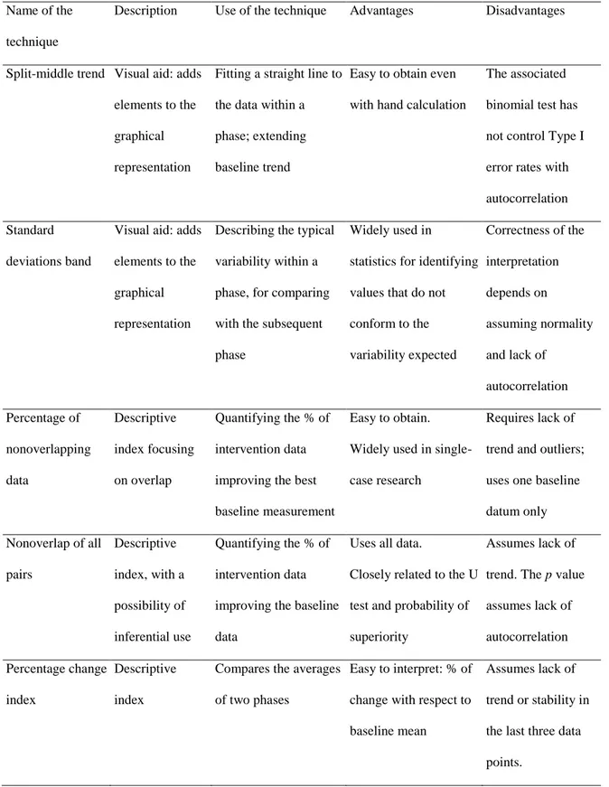
Name of the technique
Description Use of the technique Advantages Disadvantages
Split-middle trend Visual aid: adds elements to the graphical representation
Fitting a straight line to the data within a phase; extending baseline trend
Easy to obtain even with hand calculation
The associated binomial test has not control Type I error rates with autocorrelation Standard
deviations band
Visual aid: adds elements to the graphical representation
Describing the typical variability within a phase, for comparing with the subsequent phase
Widely used in
statistics for identifying values that do not conform to the variability expected Correctness of the interpretation depends on assuming normality and lack of autocorrelation Percentage of nonoverlapping data Descriptive index focusing on overlap Quantifying the % of intervention data improving the best baseline measurement
Easy to obtain. Widely used in single-case research
Requires lack of trend and outliers; uses one baseline datum only Nonoverlap of all pairs Descriptive index, with a possibility of inferential use Quantifying the % of intervention data improving the baseline data
Uses all data.
Closely related to the U test and probability of superiority
Assumes lack of trend. The p value assumes lack of autocorrelation Percentage change index Descriptive index
Compares the averages of two phases
Easy to interpret: % of change with respect to baseline mean
Assumes lack of trend or stability in the last three data points.
Slope and level change
Two descriptive indices
Quantifies the change in slope and the net average change in level
Controls for baseline trend; two separate quantifications
Only useful for linear trends; does not model autocorrelation Generalized least squares regression Descriptive index Quantification of the difference between baseline and
intervention fitted data
Controls for baseline trend and autocorrelation More complex; May require iterative application Piecewise regression Descriptive estimates of regression coefficients
Quantifies the change in slope and the immediate change in level
Controls for baseline trend; two separate quantifications
Only useful for linear trends; does not model autocorrelation Between-cases standardized mean difference Descriptive index with a possibility of inferential use (p value)
Quantifies the average difference between baseline and intervention data for several participants
Applicable beyond AB designs; controls for autocorrelation Assumes lack of trend; requires several participants Multilevel analysis Descriptive procedure with a possibility of inferential use
May quantify average different in level or in slope
Applicable beyond AB designs; Flexibility in modelling several data aspects (e.g., variance, trend, autocorrelation) More complex; requires several participants Randomization test Inferential technique Quantifies the probability of the difference being observed by chance Applicable beyond AB designs; Flexible choice of test statistic
Requires randomization in the design
The reasons for choosing the techniques were to illustrate (a) the variety of data aspects modelled: level, trend, overlap, immediacy, all mentioned as relevant when performing visual analysis (Kratochwill et al., 2010); (b) the variety of ways of estimating trend: ordinary least squares regression, split-middle, average of the differences between consecutive measurements; and (c) the fact that both descriptive and inferential techniques can be used. In absence of a clearly stated expectation about whether the effect should be an immediate change in the average performance or a progressive or delayed change, we followed the idea (Manolov & Moeyaert, 2017b) that the analytical technique can be chosen in such a way as to represent better the features of the data at hand. Therefore, for each example we further justify the choice of the techniques.
Quantifications of Overlap
Nonoverlap of all pairs (NAP). A technique that is not easily classifiable as quasi-statistical
or statistical is NAP (Parker & Vannest, 2009). Given that the result is expressed as a percentage of nonoverlap between conditions, NAP is apparently similar to the Percentage of
nonoverlapping data (PND; Scruggs & Matropieri, 2013) for which the sampling distribution is not known, but it is also possible to derive the standard error for NAP on the basis of its
equivalence with the Mann-Whitney U test or the probability of superiority (Grissom & Kim, 2001). In the current text we focus on the descriptive (not inferential) use of NAP. The strengths of NAP are: (a) it uses all data unlike the PND, which is one of the reasons for its proposal; (b) it is not based on representing the data via a mean or a trend line; (c) under the assumption of independent data it is possible to obtain a p value; (d) among the techniques mentioned here,
NAP, is the only one applicable to ordinal data; and (e) it can be applied using a website http://www.singlecaseresearch.org/calculators/nap. As limitations, NAP does not control for baseline trend and does not quantify the amount of difference once complete nonoverlap is achieved: it may present ceiling effects, not distinguishing between treatments with different degree of effectiveness.
Other nonoverlap indices. Parker, Vannest, and Davis (2011) compare several nonoverlap
measures and conclude that NAP is among the most powerful ones and it also yields similar results to other nonoverlap indices. Nonoverlap indices can be computed via
https://jepusto.shinyapps.io/SCD-effect-sizes/, http://manolov.shinyapps.io/Overlap/ and http://ktarlow.com/stats/.
Quantifications of the Difference in Level
Percentage change index (PCI). A numerical summary expressed as the average difference
between conditions in relation to the baseline level has been named “mean baseline difference” (Campbell & Herzinger, 2010), “percent reduction” (Olive & Smith, 2005), or “percentage change” index (Pustejovsky, 2015). The mean baseline difference usually refers to the difference between the intervention phase mean and the baseline phase mean, expressed as a percentage of the baseline phase mean. The PCI is usually computed following the same logic, but using only the last three baseline measurements and the last three intervention phase measurements. For the latter case, Hershberger, Wallace, Green, and Marquis (1999) present an expression for
estimating its variance. According to whether such an expression is accepted as valid or not, the PCI could be considered a statistical or quasi-statistical technique. It is mainly useful when a
mean line represents well the data (i.e., there are no trends and the variability is not excessive) and when the baseline data are not all equal to zero (as it would impede obtaining a
quantification). The PCI can be computed using https://manolov.shinyapps.io/Change/.
Between-cases standardized mean difference (BC-SMD). A statistical technique
developed specifically for SCEDs is the BC-SMD or d-statistic (Shadish, Hedges, &
Pustejovsky, 2014). The BC-SMD was developed to provide a quantification comparable to the ones from group-comparison studies, making possible the meta-analytical integration of results from different designs, given that the within-case SMD does not allow for that (Beretvas & Chung, 2008). Other strengths of the BC-SMD include taking autocorrelation into account, the attainment of an overall quantification of intervention effect across cases, the comparability across studies measuring outcomes in different measurement units, and the possibility to obtain confidence intervals and to use inverse variance weight in meta-analysis. Moreover, note that the BC-SMD takes into account both the variability of the data within a case and between-cases, whereas the PCI is based only on quantifications of the average level. The BC-SMD can be applied via the website https://jepusto.shinyapps.io/scdhlm/. The BC-SMD is only applicable when there are several cases in the same study and it is also mainly applicable to stable data (although detrending is possible, Shadish et al., 2014) and when the intervention effect is an immediate change in level. In order to illustrate this assumption, we refer to two data sets presented later in the text. For instance, the data depicted on the upper panel of Figure 1 can be considered to represent stable data (no trend in the baseline or in the intervention phase) and the intervention effect can be understood as immediate1, because difference between the two
conditions takes place already in the beginning of the intervention phase. These data would fit
1 Kratochwill et al. (2010) refer to the assessment of immediacy as a comparison between the last three baseline measurements and the first three intervention phase measurements.
the assumptions of the BC-SMD. As a different example, Figure 2 also shows an immediate difference, but the data is not stable and the trends are not comparable (i.e., there is both a change in level and in slope). These data would not fit the assumptions of the BC-SMD. Additional assumptions include the homogeneity of the effect across cases, the normal
distribution of within-case errors and the autocorrelation process being first-order autoregressive, although the estimates of effect are robust to violating these assumptions, which are mostly important for its small-sample correction (Valentine, Tanner-Smith, & Pustejovsky, 2016).
Figure 1. Application of the percentage change index (PCI, computed on the last three measurements per phase;
dotted horizontal line) and the mean baseline difference (computed on all measurements; solid horizontal line). The upper panel refers to Samantha and the lower panel to Thomas; data gathered by Douglas et al. (2014). Graphs obtained from https://manolov.shinyapps.ioChange/. For each of the two plots, the data to the left of the vertical line belong to the baseline (A) phase and the data to the right belong to the intervention (B) phase.
Figure 2. Application of Piecewise regression (upper panel) and generalized least squares regression (GLS; lower
panel) to the data gathered by Ownsworth et al. (2006) on the frequency of errors in a cooking task. Graphs obtained from https://manolov.shinyapps.io/Regression/. For each of the two plots, the data to the left of the vertical line belong to the baseline (A) phase, and the data to the right belong to the intervention (B) phase. On the upper panel, for both phases, b0 denotes the within-phase intercept and b1 the within-phase slope.
Quantifications of the Differences in Level and in Slope
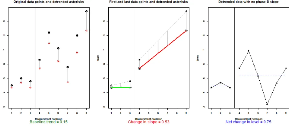
Slope and level change (SLC). The SLC (Solanas, Manolov, & Onghena, 2010) is a
descriptive technique not based on statistical theory. It entails: (1) quantifying baseline trend: how much spontaneous improvement is there per measurement occasion; (2) removing baseline trend from the baseline and intervention phase data: how would the data look like without the spontaneous improvement; (3) quantifying the amount of change in slope: to what extent is the progressive change in the intervention greater than the spontaneous change in the baseline; and (4) quantifying the amount of net change in level: apart from the difference in trends, how much is the average difference between conditions. The SLC presents the following strengths: (a) it provides a quantification in the same measurement units as the outcome variable, which aids the interpretation in meaningful terms; (b) it allows taking into account linear baseline trend; (c) it quantifies change in slope (as the average change between consecutive measurements) and change in level (as a mean difference, once change in slope is taken into account) separately, which is the reason for its development, following the recommendation by Beretvas and Chung (2008); (d) its descriptive purpose entails that there are no assumptions regarding normality or lack of serial dependence; and (e) it can be applied using a website
(http://manolov.shinyapps.io/Change/) which offers both numerical and graphical output. Among the limitations of the SLC, its quantifications are: (a) mostly meaningful when the data are stable or present linear trends; (b) not comparable across studies using different outcome variables; and (c) not accompanied by indicators of precision such as confidence intervals.
Piecewise regression. Piecewise regression (Center, Skiba, & Casey, 1985-1986) offers the
possibility to quantify separately the immediate effect of the intervention and the difference in slopes. The descriptive quantification of these data aspects does not require the parametric
assumptions of regression analysis (normally, homogeneously, and independently distributed residual), but the interpretation of their statistical significance is subjected to these assumptions. Note that Piecewise regression can be applied beyond AB-comparisons, as described in
Moeyaert, Ugille, Ferron, Beretvas, and Van Den Noortgate (2014). In order to deal with autocorrelation, a regression-based analysis using generalized least squares estimation (GLS; Swaminathan, Rogers, Horner, Sugai, & Smolkowski, 2014) was proposed. In GLS, an overall quantification of the difference between conditions is obtained after fitting trend lines separately to the baseline and intervention phase data; this quantification can be raw or standardized. These regression techniques are mainly applicable when the data in the two conditions compared are either stable or exhibiting an approximately linear trend. Moreover, the tests2 for autocorrelation
performed by the GLS require that the autocorrelation and the error variances are homogeneous across the conditions being compared. Both regression approaches can be applied via a website https://manolov.shinyapps.io/Regression/.
Other Analytical Options
The list of techniques presented is not comprehensive. Further options for statistical analysis include: (a) randomization tests (Heyvaert & Onghena, 2014), if randomization is present in the design and a p value is desired; (b) log response ratio measures (Pustejovsky, 2015) for data gathered via direct observation and interpretations desired in terms of percentage change; and (c) multilevel models (Moeyaert, Ferron, Beretvas, & Van Den Noortgate, 2014), if data are
2 Swaminathan et al. (2014) propose performing iteratively the Durbin-Watson test for autocorrelation and data transformation, if necessary, until not significant autocorrelation is obtained; the GLS implemented in the
available for several participants and average estimates of effect are of interest, besides quantifying the amount of variation across individuals.
Illustrations in the Context of Brain Impairment
First Example: Stable Baselines and Replication
Data. Douglas,Knox, De Maio, and Bridge (2014) report a study on two participants (Samantha and Thomas) with traumatic brain injury, treated with Communication-specific coping intervention. The design is referred to asan “A–B–A design with follow-up using multiple probes” (Douglas et al., 2014, p. 194). Nevertheless, there are three reasons for
assuming that the design is probably better conceptualized as an AB design with a follow-up: (a) the time intervals in the last phase are farther apart in time, (b) the intervention is not strictly speaking withdrawable; and (c) the performance is not expected (or desired) to revert to the initial baseline levels. Among the outcomes of interest, quantifications were obtained using a visual analogue scale, ranging from 0 to 10 cm with greater values representing better
communicative performance.
Visual inspection. Figures 3 and 4 present, in their left panels and with filled black dots, the
original data for Samantha and Thomas, respectively. The asterisks in the left panels show how the data look like when removing baseline trend, which is done in the context of the SLC in order to represent how much of an improvement is there with the introduction of the
intervention, beyond the improvement already taking place during the baseline. The middle panels of Figures 3 and 4, show the trends in the original data (thin dashed lines) and the trends in the transformed data (thick solid lines). Given that the slope of baseline trend is close to zero
(i.e., almost flat), the baselines are relatively stable. Therefore, detrending does not affect greatly the values. The intervention phase measurements are more variable and show certain increasing trend, indicative of change in slope (which can also be called change in trend). The right panels of Figures 3 and 4 show the net (pure) change in level, after controlling for the intervention phase trend. The amount of vertical distance between the dashed lines representing the within-phase means is indicative of a change in level.
Figure 3. Application of the percentage change index to the data gathered by Douglas et al. (2014): participant called Samantha. Graphs obtained from
https://manolov.shinyapps.io/Change/. For each of the three plots, the data to the left of the vertical line belong to the baseline (A) phase and the data to the right belong to the intervention (B) phase.
Figure 4. Application of the percentage change index to the data gathered by Douglas et al. (2014): participant called Thomas. Graphs obtained from
https://manolov.shinyapps.io/Change/. For each of the three plots, the data to the left of the vertical line belong to the baseline (A) phase and the data to the right belong to the intervention (B) phase.
Justification of the choice of the analytical techniques. The absence of clear baseline trend
makes applicable the PCI and the BC-SMD, as both compare mean levels. The possible presence of intervention phase trend makes useful the application of the SLC in order to quantify the progressive change (i.e., the slope change). Moreover, the SLC is more meaningful when the baseline data are well represented by the trend line. We did not use NAP, for instance, given that the result would be 100% in both cases, therefore, not distinguishing between the different distances between the baseline and intervention phase measurements for the two participants.
Slope and level change. The application of the SLC to Samantha’s data (Figure 3) shows that
there is a slightly improving baseline trend (0.15), and that beyond this initial trend, after the intervention there is an average increase of the communication score of 0.53 per measurement occasion (i.e., a gradual 1cm increase for each two sessions). Additionally, there is an average difference increase in level of 0.75cm in the intervention phase. Considering that the scale ranges from 0 to 10 cm, that baseline values are around 4-5cm, and that by the end of the intervention Samantha’s scores are near 9cm, the improvement seems relevant.
For Thomas (Figure 4), the baseline data are practically stable (trend=−0.03) and the average
gradual increase appears to be quantitatively small (0.19) due to the fact that the there is a marked decrease from the first to the second measurement in the intervention phase. However, from the second intervention phase data point onwards a marked gradual improvement is visually clear. In that sense, we recommend using visual analysis to help interpreting the
quantitative results. The net average difference is considerable: almost 3.5cm, with the final two measurements being close to 10cm, indicative of the effectiveness of the intervention. Note that in this example the interpretability is not necessarily aided by the fact that the SLC summarizes the results in the same measurement units as the outcome variable, because the centimeters of the
visual analogue scale are not as readily interpreted as would be, for instance, the number of errors in a speech. For that reason, we offer further quantifications.
Percentage change index. Figure 1 focuses on the within-phase means, with a solid
horizontal line representing the mean of all the measurements in each phase and the dashed horizontal line representing the mean of only the last three measurements per phase. For
Samantha (upper panel of Figure 1), the percentage increase for Samantha is approximately 60% regardless of whether all data or only the last three measurements per phase are considered. For Thomas (Figure 1; lower panel), PCI=73.66% considering all data and 91.39% focusing on the last three data points per condition. For both participants, NAP=100%. However, as shown using the PCI, for Thomas the difference between conditions is larger than for Samantha, despite the fact that there is complete nonoverlap for both, illustrating one of NAP’s limitations.
Between-cases standardized mean difference. Apart from obtaining separate quantifications
for each participant, another analytical option would be to obtain an overall quantification computing the BC-SMD. According to Zelinsky and Shadish (2016, p. 5) “one case allows computing the numerator of d, two cases allow computing the denominator, and three cases are needed to compute the standard error of d” and thus we would obtain d = 3.51, which can be interpreted as the communication score being, on average for both participants, three and a half standard deviations better during the intervention than before. On the basis of the graphical representation3 that can be obtained from https://jepusto.shinyapps.io/scdhlm/, it can be visually
assessed to what extent the effect can be considered homogeneous for both participants.
Additionally, the aforementioned website provides the standard error (SE=1.26), despite having only two cases, and a 95% confidence interval ranging from 1.65 to 6.16 and illustrating the low
precision of the estimate. Nevertheless, Valentine et al. (2016) recommend applying the BC-SMD when there is a minimum of three cases. Thus, the result of d and especially its standard error reported should be interpreted with caution.
Overall assessment of intervention effectiveness. All the quantifications reflect the
effectiveness of the intervention. Beyond the current (quasi)statistical analyses, the qualitative feedback provided by both participants and reported in Douglas et al. (2014) is crucial for a comprehensive assessment of intervention effectiveness. In general, the numerical results provided here agree with Douglas et al.’s (2014, p. 199) conclusion of “clinically significant
improvements on expression and comprehension discourse tasks in participants”.
Second Example: Spontaneous Improvement and Unstable Baseline
Data. Ownsworth, Fleming, Desbois, Strong, and Kuipers (2006) report a study on a
participant with traumatic brain injury, presenting long-term awareness deficits and treated with a metacognitive contextual intervention. The outcomes included the numbers of errors in a cooking task (AB plus maintenance design) and in volunteering work (AB design), with lower values being more desirable.
Cooking task: visual inspection and justification of the choice of the analytical
techniques. For the cooking task, visually there is a clear improving baseline trend. Therefore,
this trend has to be taken into account when performing the analysis, in order to explore to what extent the intervention exceeds the spontaneous improvement. In that sense, the SLC is
applicable to these data, but we want to illustrate further analytical options here: Piecewise and GLS regression. Both analytical options fit trend lines separately to each phase and in case the serial dependence is not statistically significant (and GLS does not lead to transforming the data)
these trend lines are the same; that is, Piecewise and GLS yield identical results4. What is
different is the focus of the analysis. In Piecewise regression the main quantifications are the immediate change (difference between the last predicted baseline measurement and the first predicted intervention phase measurement) and the change in slope (difference between the slopes of the trend lines). In GLS the baseline trend line is extrapolated into the intervention phase and is compared to the trend line fitted to the intervention phase data; a comparison between the two sets of predicted data points is performed.
Regarding alternative analytical approaches, the PCI is not meaningfully applicable here, given that mean differences are less informative when trend is present in both phases. NAP is also not appropriate, because it does not control for baseline trend.
Cooking task: regression analyses. According to Piecewise regression (see Figure 4; upper
panel), the initial baseline level is 23.5 and, more importantly, baseline trend is equal to −1.5 (i.e., there are three errors less every two measurement occasions). After the intervention, Piecewise regression indicates an immediate decrease of 3.4 errors, but the improving trend is not as steep as in the baseline (−0.87, which is 0.63 less than −1.5). According to GLS, the
overall average difference, considering the different levels (intercepts by b1) and slopes (denoted by b0), would be a reduction of almost three errors as indicated in the foot of Figure 4 (lower panel). Therefore, both analytical options suggest a considerable reduction in the target behavior, beyond the spontaneous improvement.
INSERT FIGURE 4 ABOUT HERE
4 Note that the intercept estimate for the baseline phase is different only because for Piecewise regression the intercept refers to the first baseline measurement occasion, whereas for GLS it refers to the (imaginary) previous measurement occasion: 25−1.5=23.5.
Volunteering work: visual inspection, justification of the choice of the analytical
techniques, and numerical results. For volunteering work, the baseline data are more variable
and not readily represented by a mean line (see the solid horizontal line in the upper panel of Figure 5) or by a trend line5 (see the solid line in the lower panel of Figure 5). Therefore, the
application of the SLC and regression analysis is less justified. The PCI, focusing on the last three measurements per phase, is more meaningful than the mean baseline difference, given that the last three measurements are better represented by their mean (dashed lines) than the whole of the baseline data (Figure 5, upper panel). The PCI indicates a reduction of more than 40%. NAP is also especially useful for the volunteering work data, given that it does not require the data to be summarized by a mean or a trend line; NAP=100%. Additionally, the assessment of trend stability (Lane & Gast, 2014, using split middle trend ±20% within-phase median; Figure 5,
lower panel) suggests that the performance became more stable after the intervention.
Overall assessment of intervention effectiveness. Considering all numerical results, the
intervention seems effective in reducing the frequency of errors. However, the global evaluation of the effectiveness of the intervention, as performed by Ownsworth et al. (2006), also includes the assessment of awareness of deficits via a questionnaire and an interview, for which the results were not clinically significant. In that sense, the (quasi)statistical information obtained on directly observable behaviors is only part of the evidence when assessing intervention
effectiveness.
5 When fitting a regression line to the baseline data for volunteering we obtained R2=.038 (suggesting very poor fit), whereas for cooking task the fit was clearly better: baseline data R2=.882 and intervention phase data R2=.453.
Figure 5. Upper panel obtained via https://manolov.shinyapps.io/Change: application of the percentage change
index (PCI; based on the dotted horizontal line representing the mean of the last three measurements per phase) and the mean baseline difference (based on the solid horizontal line representing the phase means). Lower panel obtained via https://manolov.shinyapps.io/Overlap: trend stability envelope, with the solid line representing split-middle trend. Data gathered by Ownsworth et al. (2006) on the frequency of errors in volunteering work. For each of the two plots, the data to the left of the vertical line belong to the baseline (A) phase and the data to the right belong to the intervention (B) phase.
Additional Remarks
Ideally, statistical analysis should focus on quantifying the type of change (in level, trend, or variability) expected for the intervention. In absence of explicitly stated expectations, looking for a change in level (e.g., using BC-SMD, SLC, PCI) seems most parsimonious and we proceeded accordingly with the Douglas et al. (2014) data. However, the obtained data pattern needs to be considered as well, which is why we took into account the spontaneous improvement and the variable baseline in the Ownsworth et al. (2006) data when selecting the analytical techniques.
It has to be noted that we relied on descriptive measures in our analyses, given that p values are not readily interpretable in terms of population inference, because it is not justified in absence of random sampling and the articles whose data is re-analyzed here did not sample the participants at random from a population of individuals with similar characteristics. Moreover, tentative causal inference on the basis of a randomization test (Edgington & Onghena, 2007) is not possible for the data re-analyzed here, given the absence of random assignment of
measurement times to conditions. Nevertheless, we encourage researchers to implement
randomization and replication to enhance internal and external validity (Kratochwill et al., 2010; Tate et al., 2013).
Analytical Challenges and Recommendations
Lack of a Gold Standard
The number of analytical techniques reviewed and the absence of a specific requirement about data analysis in the RoBiNT scale (Tate et al., 2013) illustrate the lack of consensus on a data
analytical gold standard. This can be seen both as a limitation (any kind of analysis can be criticized by a reviewer more in favor of an alternative analytical approach) and as an advantage (several analytical options are acceptable if duly justified). Actually, there have already been efforts to summarize the variety of alternatives available (Campbell & Herzinger, 2010; Gage & Lewis, 2013; Manolov & Moeyaert, 2017a; Perdices & Tate, 2009), to offer criteria that
researchers can use when deciding which technique to use (Manolov, Gast, Perdices, & Evans, 2014; Wolery, Busick, Reichow, & Barton, 2010), and to provide guidance regarding the choice of analytical techniques (Manolov & Moeyaert, 2017b). Regardless of the choice made, in order to make possible future analysis with different analytical techniques and future meta-analysis, it is recommended (Tate et al., 2013) to make raw data available in either tabular or graphical form.
Different Techniques for Different Aims and Data Patterns
The lack of a gold standard is arguably due to the fact that there is no single data analytical technique appropriate for all aims, treatment effects, and datasets. A myriad of factors may affect the adequacy of a technique, such as the use of randomization in the design, the amount of cases and measurements per case available, the presence of trend, the amount of variability around a mean or a trend line, the presence of autocorrelation or of a floor or ceiling effect in the outcome. Ideally, the way in which the data are to be analyzed depends on the type of effect expected (Edgington & Onghena, 2007): for instance, compute a mean difference when an immediate change in level is expected or use Piecewise regression when progressive change or change in slope is expected, after a possible spontaneous improvement. Also relevant are the measurement
units used: if they are directly meaningful such as the number of behaviors exhibited, a raw quantifications such as the ones provided by the SLC are reasonable. However, an analytical technique determined prior to gathering the data may provide misleading results for the specific data at hand. In such situations, visual analysis is recommended as a validation tool (Parker et al., 2006) in order to assess how meaningful a quantification is. As a consequence, all illustrations provided here include visual representation of the specific data features included in the
quantification.
Looking for Meaningful Comparisons
It is much clearer how to analyze an AB pair of phases when they belong to a multiple baseline design than exactly how to integrate the information from withdrawal designs (ABAB) and designs that do not include the same number and sequence of A and B phases (e.g., ABA, ABCB). Methodological proposals for the ABAB design include: to use only the A1-B1
comparison (Strain, Kohler, & Gresham, 1998), to compare A1-B2 (Olive & Smith, 2005), and to
compare adjacent phases (Lane & Gast, 2014).As an applied example of the difficulty, Zelinsky and Shadish (2016) describe the decisions made when applying the BC-SMD to different
designs: “[b]ecause the SPSS macro required pairs of baseline and treatment phases, we
excluded any extra nonpaired baseline or maintenance phases at the end of studies (e.g., excluding the last A-phase from an ABA design). Finally, if the case started with a treatment phase, we paired that treatment phase with the final baseline phase from the end of that case.” (p.
Due to the importance of transparent reporting (Tate et al., 2016), we recommend that researchers: (a) clearly specify which phases are compared in every quantification provided; (b) provide a justification for the choice of phase (e.g., compare A1-B1, B1-A2, and A2-B2 instead of
A1-B2 due to the phases being adjacent; compare only A1-B1 and A2-B2 without including B1-A2
in order to avoid using the data from the same B1 phase more than once and assigning a greater
weight to them); (c) provide the quantification for all separate comparisons performed; (d) clearly specify how an overall quantification is obtained from the separate quantifications; and (e) reflect, if possible, whether the comparisons and the integration method chosen are similar or different from previous studies on the same substantive topic.
Formal Criteria for All Data Features
Kratochwill et al. (2010) mention six data features object of visual analysis. However, there have been more statistical developments for level (BC-SMD, SLC, PCI), trend (SLC, regression analyses), and overlap (NAP) than for assessing (changes in) variability, the immediacy of effect, and the consistency of data patterns across similar conditions. Kratochwill et al. (2010) suggest evaluating the presence of an immediate change as the difference in level between the last three data points in one phase and the first three data points of the next, which could be extended to considering the slopes in these same measurements. Regarding the assessment of the (change in) variability, proposals such as the stability envelope (Lane & Gast, 2014) become useful, but more research is necessary to assess their performance. Finally, for evaluating the consistency of data patterns, for ABAB designs, the examples provided by Moeyaert, Ugille, et al. (2014; design matrices 5, 6, and 7) are relevant. For multiple-baseline designs, the quantification of the
proportion of between-case variance incorporated in the BC-SMD (Shadish et al., 2014) is a useful indicator.
Concluding Remarks
Applied researchers should feel encouraged by the amount of analytical options and software implementations available (see https://osf.io/t6ws6/ for a list of tools), as they are intended to bring statistical developments closer to the professionals gathering SCED data. Until applied researchers start feeling comfortable choosing an analytical technique, performing the analysis, and interpreting the output by themselves, they can collaborate with methodologists and
statisticians. In our experience, such collaborations are the best possible way to make the available statistical contributions practically (and not only academically) useful and to prompt future developments tackling the challenges encountered in real-life data.
Financial Support
This research received no specific grant from any funding agency, commercial or not-for-profit sectors.
Conflict of interest
None.
References
Beretvas, S. N., & Chung, H. (2008). A review of meta-analyses of single-subject experimental designs: Methodological issues and practice. Evidence-Based Communication Assessment and Intervention, 2, 129−141.
Callahan, C. D., & Barisa, M. T. (2005). Statistical process control and rehabilitation outcome: The single-subject design reconsidered. Rehabilitation Psychology, 50, 24−33.
Campbell, J. M., & Herzinger, C. V. (2010). Statistics and single subject research methodology. In D. L. Gast (Ed.), Single subject research methodology in behavioral sciences (pp.
417−453). London, UK: Routledge.
Carter, M. (2013). Reconsidering overlap-based measures for quantitative synthesis of single-subject data what they tell us and what they don’t. Behavior Modification, 37, 378−390.
Center, B. A., Skiba, R. J., & Casey, A. (1985-1986). A methodology for the quantitative synthesis of intra-subject design research. The Journal of Special Education, 19, 387−400.
Crosbie, J. (1987). The inability of the binomial test to control Type I error with single-subject data. Behavioral Assessment, 9, 141−150.
Douglas, J. M., Knox, L., De Maio, C., & Bridge, H. (2014). Improving communication-specific coping after traumatic brain injury: Evaluation of a new treatment using single-case
experimental design. Brain Impairment, 15, 190−201.
Edgington, E. S., & Onghena, P. (2007). Randomization tests (4th ed.). London: Chapman & Hall/CRC.
Fahmie, T. A., & Hanley, G. P. (2008). Progressing toward data intimacy: A review of within-session data analysis. Journal of Applied Behavior Analysis, 41, 319−331.
Fisher, W. W., Kelley, M. E., & Lomas, J. E. (2003). Visual aids and structured criteria for improving visual inspection and interpretation of single-case designs. Journal of Applied Behavior Analysis, 36, 387−406.
Gage, N. A., & Lewis, T. J. (2013). Analysis of effect for single-case design research. Journal of Applied Sport Psychology, 25, 46−60.
Grissom, R. J., & Kim, J. J. (2001). Review of assumptions and problems in the appropriate conceptualization of effect size. Psychological Methods, 6, 135−146.
Hershberger, S. L., Wallace, D. D., Green, S. B., & Marquis, J. G. (1999). Meta-analysis of single-case data. In R. H. Hoyle (Ed.), Statistical strategies for small sample research (pp. 107−132). London, UK: Sage.
Heyvaert, M., & Onghena, P. (2014). Analysis of single-case data: Randomisation tests for measures of effect size. Neuropsychological Rehabilitation, 24, 507−527.
Jenson, W. R., Clark, E., Kircher, J. C., & Kristjansson, S. D. (2007). Statistical reform: Evidence-based practice, meta-analyses, and single subject designs. Psychology in the Schools, 44, 483−493.
Kazdin, A. E. (1978). Methodological and interpretive problems of single-case experimental designs. Journal of Consulting and Clinical Psychology, 46, 629−642.
Kratochwill, T. R., Hitchcock, J., Horner, R. H., Levin, J. R., Odom, S. L., Rindskopf, D. M. & Shadish, W. R. (2010). Single-case designs technical documentation. Retrieved from What Works Clearinghouse website: https://ies.ed.gov/ncee/wwc/Document/229
Lane, J. D., & Gast, D. L. (2014). Visual analysis in single case experimental design studies: Brief review and guidelines. Neuropsychological Rehabilitation, 24, 445−463.
Manolov, R., Gast, D. L., Perdices, M., & Evans, J. J. (2014). Single-case experimental designs: Reflections on conduct and analysis. Neuropsychological Rehabilitation, 24, 634−660.
Manolov, R., & Moeyaert, M. (2017a). How can single-case data be analyzed? Software resources, tutorial, and reflections on analysis. Behavior Modification, 41, 179−228.
Manolov, R., & Moeyaert, M. (2017b). Recommendations for choosing single-case data analytical techniques. Behavior Therapy, 48, 97−114.
Moeyaert, M., Ferron, J., Beretvas, S., & Van Den Noortgate, W. (2014). From a single-level analysis to a multilevel analysis of since-case experimental designs. Journal of School Psychology, 52, 191–211.
Moeyaert, M., Ugille, M., Ferron, J., Beretvas, S. N., & Van Den Noortgate, W. (2014). The influence of the design matrix on treatment effect estimates in the quantitative analyses of single-case experimental designs research. Behavior Modification, 38, 665–704.
Ninci, J., Vannest, K. J., Willson, V., & Zhang, N. (2015). Interrater agreement between visual analysts of single-case data: A meta-analysis. Behavior Modification, 39, 510–541.
Olive, M. L., & Smith, B. W. (2005). Effect size calculations and single subject designs. Educational Psychology, 25, 313–324.
Ownsworth, T., Fleming, J., Desbois, J., Strong, J., & Kuipers, P. I. M. (2006). A metacognitive contextual intervention to enhance error awareness and functional outcome following traumatic brain injury: a single-case experimental design. Journal of the International Neuropsychological Society, 12, 54–63.
Parker, R. I., & Brossart, D. F. (2003). Evaluating single-case research data: A comparison of seven statistical methods. Behavior Therapy, 34, 189−211.
Parker, R. I., Cryer, J., & Byrns, G. (2006). Controlling baseline trend in single-case research. School Psychology Quarterly, 21, 418−443.
Parker, R. I., & Vannest, K. J. (2009). An improved effect size for single-case research: Nonoverlap of all pairs. Behavior Therapy, 40, 357−367.
Parker, R. I., Vannest, K. J., & Davis, J. L. (2011). Effect size in single-case research: A review of nine nonoverlap techniques. Behavior Modification, 35, 303–322.
Perdices, M., & Tate, R. L. (2009). Single-subject designs as a tool for evidence-based clinical practice: Are they unrecognised and undervalued? Neuropsychological Rehabilitation, 19, 904–927.
Pustejovsky, J. E. (2015). Measurement-comparable effect sizes for single-case studies of free-operant behavior. Psychological Methods, 20, 342–359.
Schlosser, R. W. (2009). The role of single-subject experimental designs in evidence-based practice times. (FOCUS: Technical Brief 22). National Center for the Dissemination of
Disability Research (NCDDR). Retrieved on June 29, 2016 from
Scruggs, T. E., & Mastropieri, M. A. (2013). PND at 25: Past, present, and future trends in summarizing single-subject research. Remedial and Special Education, 34, 9–19.
Shadish, W. R., Hedges, L. V., & Pustejovsky, J. E. (2014). Analysis and meta-analysis of single-case designs with a standardized mean difference statistic: A primer and applications. Journal of School Psychology, 52, 123−147.
Shadish, W. R., & Sullivan, K. J. (2011). Characteristics of single-case designs used to assess intervention effects in 2008. Behavior Research Methods, 43, 971−980.
Smith, J. D. (2012). Single-case experimental designs: A systematic review of published research and current standards. Psychological Methods, 17, 510−550.
Solanas, A., Manolov, R., & Onghena, P. (2010). Estimating slope and level change in N=1 designs. Behavior Modification, 34, 195−218.
Strain, P. S., Kohler, F. W., & Gresham, F. (1998). Problems in logic and interpretation with quantitative syntheses of single-case research: Mathur and colleagues (1998) as a case in point. Behavioral Disorders, 24, 74–85.
Swaminathan, H., Rogers, H. J., Horner, R., Sugai, G., & Smolkowski, K. (2014). Regression models for the analysis of single case designs. Neuropsychological Rehabilitation, 24, 554−571.
Tate, R. L., Perdices, M., Rosenkoetter, U., McDonald, S., Togher, L., …, Vohra, S. (2016). The
Single-Case Reporting Guideline In BEhavioural Interventions (SCRIBE) 2016: Explanation and elaboration. Archives of Scientific Psychology, 4, 10−31.
Tate, R. L., Perdices, M., Rosenkoetter, U., Wakima, D., Godbee, K., Togher, L., & McDonald, S. (2013). Revision of a method quality rating scale for single-case experimental designs and n-of-1 trials: The 15-item Risk of Bias in N-of-1 Trials (RoBiNT) Scale. Neuropsychological Rehabilitation, 23, 619−638.
Tate, R. L., Rosenkoetter, U., Wakim, D., Sigmundsdottir, L., Doubleday, J., Togher, L., McDonald, S., & Perdices, M. (2015). The risk-of-bias in N-of-1 trials (RoBiNT) scale: An expanded manual for the critical appraisal of single-case reports. Sydney, Australia: Author.
Valentine, J. C., Tanner-Smith, E. E., & Pustejovsky, J. E. (2016). Between-case standardized mean difference effect sizes for single-case designs: A primer and tutorial using the scdhlm web application. Oslo, Norway: The Campbell Collaboration. DOI: 10.4073/cmpn.2016.3. Retrieved January 22, 2017 from
https://campbellcollaboration.org/media/k2/attachments/effect_sizes_single_case_designs.pdf
Wolery, M., Busick, M., Reichow, B., & Barton, E. E. (2010). Comparison of overlap methods for quantitatively synthesizing single-subject data. Journal of Special Education, 44, 18−29.
Young, N. D., & Daly III, E. J. (2016). An evaluation of prompting and reinforcement for training visual analysis skills. Journal of Behavioral Education, 25, 95−119.
Zelinsky, N. A. M., & Shadish, W. R. (2016, January 25): A demonstration of how to do a meta-analysis that combines single-case designs with between-groups experiments: The effects of choice making on challenging behaviors performed by people with disabilities. Developmental Neurorehabilitation. Advance online publication. doi: 10.3109/17518423.2015.1100690