Universit`
a degli Studi di Catania
DIPARTIMENTO DI MATEMATICA E INFORMATICAData Mining and Visual Analytics
Techniques
A dissertation submitted to the Department of Mathematics and Computer Science and the committee on graduate studies of University of Catania, in partial fulfillment of the requirements for the degree of doctorate in computer science.
Candidato:
Lorenzo Di Silvestro
Supervisore:
Chiar.mo Prof. Giovanni Gallo
Coordinatore:
Chiar.mo Prof. Vincenzo Cutello
Abstract
With the beginning of the Information Age and the following spread of the
infor-mation overload phenomenon, it has been mandatory to develop a means to simply
explore, analyze and summarize large quantity of data. To achieve this purposes a
data mining techniques and information visualization methods are used since decades.
In the last years a new research field is gaining importance: Visual Analytics, an out-growth of the fields of scientific and information visualization but includes technolo-gies from many other fields, including knowledge management, statistical analysis, cognitive science and decision science. In this dissertation the combined effort of the mentioned research fields will be analyzed, pointing out different way to combine them following the best practice according to several application cases.
Contents
Abstract ii
Introduction 1
Dissertation outline . . . 8
1 Social Network Analysis of Criminal Sentences 11 1.1 Introduction . . . 11
1.2 Data Collection . . . 13
1.3 The Codebook . . . 14
1.4 Information Extraction . . . 16
1.4.1 Background . . . 16
1.4.2 Information extraction for criminal sentences . . . 16
1.4.3 Standard structure of an Italian criminal sentence . . . 17
1.4.4 The finite state transducers . . . 18
1.5 Social Network Analysis . . . 19
1.5.1 Background . . . 19
1.5.2 Social network analysis for criminal sentences . . . 20
1.6 Conclusion . . . 25
2 Information Visualization on Organized Crime Trials 26 2.1 Introduction . . . 26
2.2 Case study . . . 27
2.2.2 Dataset description . . . 28 2.2.3 Information extraction . . . 29 2.2.4 Finding associations . . . 30 2.2.5 Visualizing data . . . 31 2.2.6 Clusters . . . 32 2.3 Results . . . 34 2.4 Conclusion . . . 35
3 Visual Analysis of Multivariate Data from Dairy Industry 36 3.1 Introduction . . . 36
3.2 Related Work . . . 38
3.2.1 Animal Research and Dairy Industry Domain . . . 38
3.2.2 Multivariate Data Visualization . . . 40
3.2.3 Time-Varying Data Visualization . . . 41
3.2.4 Interaction . . . 41
3.3 Application Background . . . 42
3.3.1 305-Days Lactation Yield . . . 43
3.3.2 Test-Day Models . . . 44
3.3.3 Means for Hypothesis Building . . . 45
3.3.4 Multiple Timelines . . . 46
3.4 System Overview . . . 47
3.4.1 Data Conversion and Pre-Processing . . . 48
3.4.2 Scatter Plots . . . 48
3.4.3 Statistic Metrics and Density Plots . . . 49
3.4.4 Multiple Timelines View . . . 50
3.5 Case Study . . . 52
3.5.1 Datasets Description . . . 53
3.5.2 Analysis Process . . . 54
3.5.3 Suggested Features . . . 56
3.6.1 Study Procedure . . . 58
3.6.2 Participants . . . 59
3.6.3 Study Results . . . 60
3.7 Conclusion and Future Work . . . 62
4 Visual Analytics System for Multiple Textual Data Sources 63 4.1 Introduction . . . 63
4.2 Word Clouds . . . 64
4.2.1 Single Clouds Layout Algorithms . . . 66
4.3 RadCloud . . . 70
4.3.1 Previous Works . . . 71
4.3.2 Novel Technique . . . 73
4.4 A Visual Analytics System . . . 76
4.4.1 Input Data Processing . . . 76
4.4.2 Clouds Viewer . . . 77
4.4.3 Entity Exploration . . . 80
4.5 Case Studies . . . 82
4.5.1 Metals Description . . . 82
4.5.2 Jules Verne Selection . . . 84
4.5.3 Wes Andersons’ Actors . . . 85
4.6 Conclusions . . . 86
5 Generalized Pythagoras Trees for Visualizing Hierarchies 87 5.1 Introduction . . . 87
5.2 Related Work . . . 89
5.3 Visualization Technique . . . 91
5.3.1 Data Model . . . 92
5.3.2 Traditional Pythagoras Tree . . . 92
5.3.3 Generalized Pythagoras Tree . . . 95
5.3.4 Excursus: Fractal Dimension . . . 99
5.3.6 Analogy to Node-Link Diagrams . . . 103
5.4 Case Studies . . . 104
5.4.1 Phylogenetic Tree . . . 104
5.5 Discussion . . . 106
5.5.1 Geometry and Perception . . . 107
5.5.2 Readability and Scalability . . . 109
5.5.3 Aesthetics . . . 110
List of Figures
I - 1 Rise of the digital information age . . . 2
I - 2 The visualization pipeline . . . 4
I - 3 Visual analytics as a highly interdisciplinary field of research. . . 6
I - 4 The visual analytics process. . . 7
2 - 1 Pie diagram for people divided by their roles. . . 30
2 - 2 Histogram showing number of arches for weight’s value. . . 31
2 - 3 Complete social network from data of sentences. . . 32
2 - 4 Clusters in boxes. . . 33
2 - 5 A cluster in detail. . . 34
3 - 1 Statistics on time-varying multivariate data. . . 47
3 - 2 System overview. . . 49
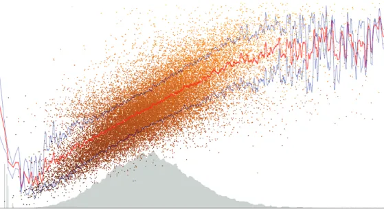
3 - 3 Relation between the quantity of milk and the percentage of protein. 50 3 - 4 The value of produced milk for each day-in-milk (relative timeline). . 52
3 - 5 Differences in lactation curve and fat contents. . . 56
3 - 6 Fat content for day-in-milk during fall. . . 61
3 - 7 Scatter plots show the relation between quantity of milk and fat. . . . 62
4 - 1 The effect of missing space space between words . . . 65
4 - 2 Ebbinghaus Illusion . . . 66
4 - 3 Sample result of the spiral layout algorithm. . . 68
4 - 4 Placing words at selected points on a spiral leads to gaps. . . 68
4 - 6 Sample result of the space station layout algorithm. . . 69
4 - 7 Vertical stack layout and synchronized word selection. . . 70
4 - 8 Examples of merged clouds . . . 72
4 - 9 Intended position of a word in a 4-categories RadCloud. . . 75
4 - 10 Ambiguity of positions in RadCloud . . . 75
4 - 11 Merged view, default visualization. . . 78
4 - 12 RadCloud with details . . . 79
4 - 13 The RadCloud with (b) and without (a) intended position indicators. 80 4 - 14 MuWoC’s entity explorer. . . 81
4 - 15 The source viewer with extracts from a single file. . . 81
4 - 16 RadCloud of metals’ information data, 40 words per category. . . 83
4 - 17 RadCloud of Jules Verne’s novels. . . 84
4 - 18 RadCloud of actors that worked in Wes Anderson’s movies. . . 85
5 - 1 Extending Pythagoras Trees for encoding information hierarchies. . . 88
5 - 2 Illustration of the traditional Pythagoras Tree approach. . . 93
5 - 3 Fractal Pythagoras Tree using alternating 35◦and 55◦ angles. . . 94
5 - 4 Random binary hierarchy visualized as a Pythagoras Tree. . . 96
5 - 5 Split of Generalized Pythagoras Trees creating an n-ary branch. . . . 97
5 - 6 Showing n-ary hierarchy: constant width; length stretch function. . . 99
5 - 7 Illustrating the fractal dimension of an n-ary branching hierarchy . . 100
5 - 8 Generalized Pythagoras Trees and node-link diagrams. . . 103
List of Tables
1.1 Collected Sentences. . . 14
1.2 JUNG Clustering. Top 5 clusters of initial graph - 204 clusters . . . . 21
1.3 JUNG Clustering. Top 5 clusters of final graph - 219 clusters . . . 22
1.4 NodeXL Clustering. Top 5 clusters - 212 clusters . . . 23
1.5 Cluster Tree [Metric 01]. Top 5 clusters - 30 clusters . . . 23
1.6 Cluster Tree [Metric 01]. Top 5 clusters - 210 clusters . . . 24
1.7 Cluster Tree [Metric 02]. Top 5 clusters - 30 clusters . . . 24
1.8 Cluster Tree [Metric 02]. Top 5 clusters - 210 clusters . . . 24
5.1 Exploring different parameter settings. . . 102
Introduction
“Just because I cannot see it, doesn’t mean I can’t believe it!”
- Jack Skellington [The Nightmare Before Christmas]
Since 1960 thanks to Miller’s psychological studies [90] the term information
over-load has been used to refer to the difficulty that a person faces understanding an issue
or taking a decision because of the availability of too much information.
As stated by Keim et al. in [71] this issue increase the probability of getting lost in data which may be:
• irrelevant to the current task at hand; • processed in an inappropriate way; • presented in an inappropriate way.
Although computer processing and storage capacity continuously increase, people that have to use the information do not improve their capabilities: human users act as a bottleneck in the process.
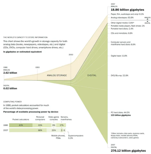
The information overload phenomenon has widely spread since the beginning of the so called Information Age that finds its roots in the digital revolution. Despite the production of digital data increased from the advent of the personal computer in the late 1970, according to Hilbert and L´opez in [58] only in 2002 digital data storage surpassed non-digital for the first time. In 2007, at least 94% of all information on the planet is in digital form. They estimated the world’s technological capacity to store, communicate, and compute information, tracking 60 analog and digital technologies during the period from 1986 to 2007. These results have been summarized in Figure I - 1 designed for an article published on The Washington Post in February 2011.
Figure I - 1: Rise of the digital information age. Hilbert and L´opez (University of Southern California) took four years (1986, 1993, 2000 and 2007) and extrapolated numbers from roughly 1,100 sources of information. Credits: Todd Lindeman and Brian Vastag / The Washington Post
It is hence mandatory to develop a means to explore large quantity of data, ana-lyzing them from different perspectives and summarizing it into useful information. The process that allows the user to achieve a better understanding of raw data as been labeled as data mining. Data mining is a research field that takes inspiration and techniques from machine learning but it differs from it in the intended goal. Machine learning focuses on prediction, based on known properties learned from the training data. Data mining focuses on the discovery of unknown properties in the data. Machine learning has been defined in 1959 by Arthur Samuel as a “Field of study that gives computers the ability to learn without being explicitly programmed”. Some years later a new research field has emerged: Information Visualization is the study of visual representations of abstract data to reinforce human cognition. The modern study of visualization started with computer graphics, however in its early days the lack of graphics power often limited its usefulness. The recent emphasis on visualization started in 1987 with the special issue of Computer Graphics on
Visualization in Scientific Computing [87].
Information visualization is visualization of abstract data. This is data that has no inherent mapping to space. According to this definition information visualization should be seen in contrast to Scientific Visualization, which deals with physically-based data. This kind of data is defined in reference to space coordinates, which makes it relatively easy to visualize in an intuitive way. The space coordinates in the dataset are mapped to screen coordinates. On the other hand visualization of abstract data is not straightforward. One has to find a good way to map data values to screen space [124].
Information and scientific visualization refer to any technique involving the trans-formation of data into visual intrans-formation, using a well understood, reproducible pro-cess. It characterizes the technology of using computer graphics techniques to explore results from numerical analysis and extract meaning from complex datasets. Visual-ization is an important tool often used by researchers to understand the features and trends represented in the large datasets.
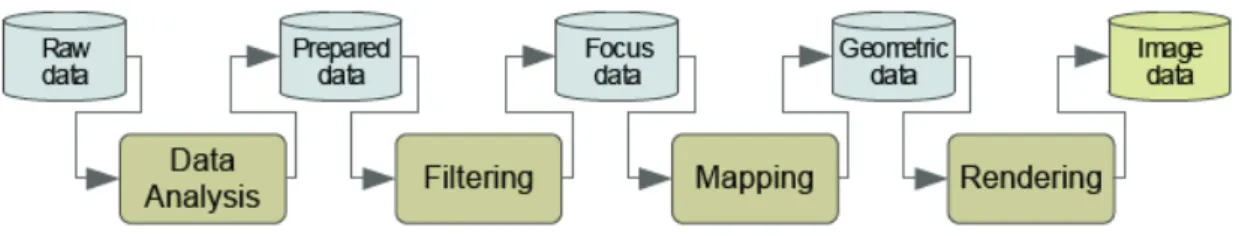
The process to create a valuable visualization from raw data is called visualization
pipeline and it’s shown in Figure I - 2.
Figure I - 2: The visualization pipeline describes the process of creating visual representa-tions of data.
According to the first formalization of the visualization pipeline by Card et al. [22], the process is made up by four subsequent phases:
1. Data Analysis: data are prepared for visualization by applying filters, interpo-lating missing values, or correcting erroneous measurements. This is the typical preprocessing phase that occurs in every data mining task. Usually there is no user interaction;
2. Filtering: selection of data portions to be visualized;
3. Mapping: focus data are mapped to geometric primitives (e.g. points or lines) and their attributes (e.g. color, position or size). This is the heart of the visualization process;
4. Rendering: geometric data are transformed to image data.
The mapping phase usually represents the most critical step for achieving
expressive-ness and effectiveexpressive-ness.
As stated by Card in [21] a visualization is said to be expressive if and only if it encodes all the data relations intended and no other data relations. In other words the expressiveness is achieved if the relevant information of a dataset (and only this) is expressed by the visualization. The term “relevant” implies that expressiveness of a visualization can only be assessed regarding a particular user working with the visual representation to achieve certain goals.
According to Mackinlay [84] the effectiveness criteria identify which graphical lan-guage, in a given situation, is the most effective at exploiting the capabilities of the
output medium and the human visual system. Since perception, and hence the mental image of a visual representation, varies among users, effectiveness is user-dependent. Nonetheless, some general rules for effective visualization have been established in the visualization community.
As defined by Cook et al. in [33] visual analytics is an outgrowth of the fields of scientific and information visualization but includes technologies from many other fields, including knowledge management, statistical analysis, cognitive science and decision science. The term “visual analytics” gained importance shortly after the publication of Illuminating the Path: The Research and Development Agenda for
Visual Analytics by Cook and Thomas in 2005 [120], in which visual analytics was
initially proposed as a means to help United States intelligence analysts meet the challenge of dealing with the masses of security-related information made available to them following the terrorist attacks on September 11, 2001, on the World Trade Center and Pentagon. In [120] visual analytics is defined as the science of analytical reasoning facilitated by interactive visual interfaces. Furthermore, the authors describe the main motivations of using this approach:
“People use visual analytics tools and techniques to synthesize infor-mation and derive insight from massive, dynamic, ambiguous, and often conflicting data; detect the expected and discover the unexpected; provide timely, defensible, and understandable assessments; and communicate as-sessment effectively for action.”
Then they describe visual analytics as a multidisciplinary field that include the fol-lowing focus areas:
1. analytical reasoning techniques that let users obtain deep insights that directly support assessment, planning, and decision making;
2. visual representations and interaction techniques that exploit the human eye’s broad bandwidth pathway into the mind to let users see, explore, and under-stand large amounts of information simultaneously;
3. data representations and transformations that convert all types of conflicting and dynamic data in ways that support visualization and analysis;
4. techniques to support production, presentation, and dissemination of analytical results to communicate information in the appropriate context to a variety of audiences.
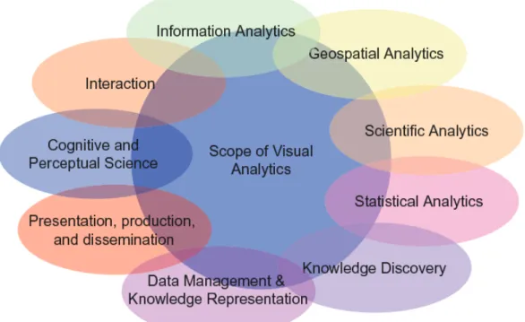
According to the assertions by Keim et al. [74] visual analytics is more than just vi-sualization and can rather be seen as an integrated approach combining vivi-sualization, human factors and data analysis (Figure I - 3). With respect to the field of visualiza-tion, visual analytics integrates methodology from information analytics, geospatial analytics, and scientific analytics. Human factors (e.g. interaction, cognition, per-ception, collaboration, presentation and dissemination) especially play a key role in the communication between human and computer, as well as in the decision making process.
Figure I - 3: Visual analytics as a highly interdisciplinary field of research.
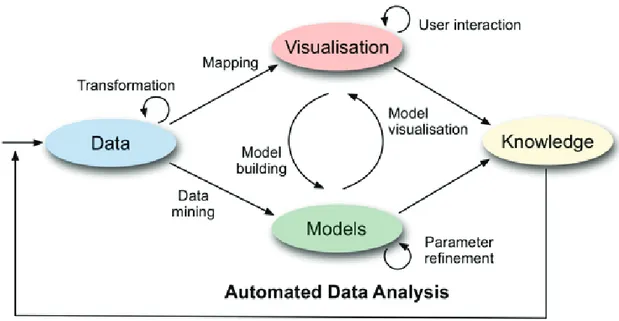
The visual analytics process combines automatic and visual analysis methods with a tight coupling through human interaction in order to gain knowledge from data [73].
Analyst applies visual or automatic analysis methods. Automated analysis uses data mining techniques to generate models of the original data that can be visualized for evaluation and refinement. Alternating between visual and automatic methods is typical for the visual analytics process. Findings in the visualizations can be used to steer model building in the automatic analysis (Figure I - 4).
Figure I - 4: The visual analytics process.
As previously explained visual analytics builds on a variety of related scientific fields. At its heart, Visual Analytics integrates Information and Scientific Visual-ization with Data Management and Data Analysis Technology, as well as Human Perception and Cognition research [71].
Following this definition visual analytics can be seen as an evolution of the well-established cooperation of data mining and visualization since their first application in the modern digital era. In this dissertation the combined effort of the mentioned research fields will be analyzed, pointing out different way to combine them following the best practice according to several application cases, as explained in the following section.
Dissertation outline
In this dissertation we used different approach to face several real-world data prob-lems. In this outline each approach will be summarized by identifying which technique has been used. We combined methods from Data Mining (DM) and Visualization (VIS) to exploit, then, the Visual Analytics process (VA).
Information Extraction and Social Network Analysis of Criminal Sentences [DM]
The first chapter reports a research based on analyzing criminal sentences on orga-nized crime activities in Sicily pronounced from 2000 through 2006. For this case study we perform the analysis of the textual corpus by means of pure data mining techniques. Information have been extracted from text files obtained by OCR on the original papers collected in different Sicilian courthouses. The text files were parsed in order to extract the names of the actors involved in the facts and the relation-ships between them. The actors have been labeled with their role: judge, members of the court, prosecutor, defendants, lawyers. Relationships between actors were also extracted. Then, we modeled in a social network like style the information obtained in the previous stage. The social network has been analyzed using the JUNG Java library. In particular, the network has been inspected, in order to detect central nodes and sub-communities.
Information Visualization on Organized Crime Trials [DM for VIS]
In this chapter we report of our initial experiments and efforts to use InfoVis to make a specialized corpus of textual information more accessible and useful. In particular we apply graph visualization to a collection of organized crime sentences. The final objective of this research is to provide to the crime analysts a tool to pool existing information into an organized database in order to gain a better understanding and forecasting of crimes. Data mining has been used on the crime trials dataset to prepare data for a visualization phase performed to understand and to manage large
amounts of textual data. We report the results obtained in so far clustering and visualizing data.
Visual Analysis of Time-Dependent Multivariate Data from Dairy Farming Industry [VIS for DM]
The third chapter addresses the problem of analyzing data collected by the dairy industry with the aim of optimizing the cattle-breeding management and maximizing profit in the production of milk. Interactive information visualization solution are used to improve and simplify any further data mining approach on this kind of data. The amount of multivariate data from daily records constantly increases due to the employment of modern systems in farm management, requiring a method to show trends and insights in data for a rapid analysis. We have designed a visual analytics system to analyze time-varying data. Well-known visualization techniques for multi-variate data are used next to novel methods that show the intrinsic multiple timeline nature of these data as well as the linear and cyclic time behavior. A qualitative expert user study conducted with animal researchers shows that the system is an important means to identify anomalies in data collected and to understand dominant data patterns, such as clusters of samples and outliers. The evaluation is comple-mented by a case study with two datasets from the field of dairy science.
Analyzing Textual Data by Multiple Word Clouds [VIS+DM=VA]
In the fourth chapter a complete visual analytics approach is presented. This section contains the fundamental ideas and provides insight into the development of a system for advanced text analysis. The visual analytics system MuWoC (Multiple Word Clouds) is based on a novel technique for the creation and visualization of word clouds. Word clouds are a good way to represent textual data with meta information. However, when multiple data sources have to be analyzed, word clouds suffer of poor comparability. To face this problem we propose a novel approach to create and visualize multiple word cloud. The so called RadCloud (Radial Cloud) merges multiple standard clouds into a single one, while retaining the information about
the origin of the words. This is the core of our visual analytics approach, the novel visualization is used to access in an interactive environment to the original text that are processed with well-known data mining methods.
Generalized Pythagoras Trees for Visualizing Hierarchies [VIS]
The last chapter a novel information visualization technique is presented. Pythagoras trees are fractals that have been used to visually encode binary hierarchies. This visual encoding is a restriction for arbitrary branching hierarchies such as file systems or phylogenetic trees that are also branching into n subhierarchies. Although each hierarchy can be modeled as a binary one by subsequently dividing n-ary branches into a sequence of n−1 binary branches we follow a different strategy. In our approach we only allow a unique visual element for the n-ary branching instead of spreading the single binary branches along a major strand. Our novel technique extends the Pythagoras tree metaphor to arbitrarily branching trees by using convex polygons where the sides are used for placing subhierarchies in a recursive manner. We compare our approach with existing tree visual metaphors.
Chapter 1
Social Network Analysis of
Criminal Sentences
“Leave the gun. Take the cannoli.”
- Peter Clemenza [The Godfather]
The following contents are object of the paper Information Extraction and Social
Network Analysis of Criminal Sentences by D. De Felice, L. Di Silvestro, G. Gallo, G.
Giuffrida, G. Giura, C. Pennisi and C. Zarba, presented at the Social Media: Risks
and Opportunities in Military Applications (HFM-201) 2011.
1.1
Introduction
In this chapter we study the juridical response to organized crime activities in Sicily, by analyzing a corpus of criminal sentences using techniques of information extraction and social network analysis. In particular, the analyzed criminal sentences were pro-nounced in the four courthouses of Sicily from 2000 through 2006, and were declared irrevocable for at least one defendant.
Although the corpus of criminal sentences is limited in both time and space, the results of the analysis are significant for three main reasons:
• there is not yet in the literature a comparative analysis of criminal sentences pronounced at the four Sicilian courthouses or in the rest of Italy: the present one is hence at the best of our knowledge a seminal work;
• there is not yet a digital database collecting data on the institutional response to the phenomenon of organized crime activities in Sicily: the present work may hence be used as a starting experience toward the creation of such knowledge base;
• in the case of organized crime activities, the Sicilian jurisprudence de-facto orients the Italian jurisprudence and it is hence relevant to better investigate the internal working of this activity.
The main objective of the analysis is to obtain a description of the socio-economic environment characterizing the trial leading to the criminal sentence, as well of the differences in the conduct of the trial between the different courthouses. Our research is composed of three main stages. In the first stage, we collected the criminal sentences from the courthouses of Sicily. Since there is not yet a digital archive of criminal sentences in Sicily, all sentences had to be collected in their paper format. The paper sentences have been scanned into PDF files, and then converted into TXT files by means of OCR technology. Furthermore, we have identified a codebook, which is basically a collection of well-thought variables to be devised from the text of each criminal sentence. In the second stage, the text files were analyzed using information extraction technology, in order to extract from the text of the sentences the actors involved in the facts and the relationships between them. In particular we extracted the judge, the members of the court, the prosecutor, the defendants, the lawyers, and the other people involved in the sentence facts. Relationships between actors were also extracted. The information extraction has been performed by implementing opportune finite state transducers (FST), which are automatons capable to recognize specific patterns in an input string. In the third stage, we constructed a social network using the information obtained in so far. The social network consists of a set of nodes and a set of edges. A node is any actor extracted in the second stage of the research.
An edge is a relationship between actors. The social network has been analyzed using the JUNG Java library . In particular, the network has been inspected in order to detect central nodes with high betweenness centrality. A node has high betweenness centrality if there are many shortest paths in the network that intersect the node. These nodes should be relative to pivotal character of the trials. Finally, the network has been inspected using a specialized clustering algorithm in order to detect community structures.
1.2
Data Collection
This research restricts in the analysis of criminal sentences to those sentences satis-fying the following criteria:
• the sentences are relative only to mafia crimes: these are those encompassed by the Italian criminal procedure code, article 51, comma 3 bis;
• all sentences were declared final and irrevocable for at least one defendant;
• all sentences have been pronounced by Sicilian judicial authorities from January 1, 2000 to December 31, 2006.
Since in Italy there is not yet a unified digital database of criminal sentences, we needed to perform a complex and time-consuming data collection activity in order to gather the criminal sentences required for our analysis. Specifically a preliminary interrogation to the Italian computerized archive RE.GE. has been performed. This interrogation has been parameterized with the criteria above and produced a list of about 1,200 criminal sentences satisfying our query. Then a formal request to the applicable Sicilian courthouses has been made in order to gain physical access to the paper printed criminal sentences. After the authorizations were granted, we went physically to the various Sicilian courthouses, and xeroxed the files. Eventualy we collected 1,147 sentences; we performed an extensive manual data quality verification process. Due to misleading classification in the RE.GE. archive, only 726 criminal sentences really satisfied all our criteria. For instance, about 90% of the non-pertinent
criminal sentences were initially recorded in the RE.GE. as concerning illicit drug smuggling. These sentences were later assessed as concerning the less grave crime of art. 73 of the same DPR, but without this correction being made in the RE.GE. The entire set of criminal sentences is made of about 55,000 pages, and the sentence length varies from a minimum of 2 pages to a maximum of 3,268 pages. Every page has been scanned producing PDF files, and processed with OCR technology in order to produce TXT files suitable to automatic computerized analysis. The entire process described was extremely time consuming, and it took more than two man-years work. The result of the process represents the first example in Italy of a large digital archive of criminal sentences. The collected sentences can be classified according to degree of judgment and proceedings format, as shown in the following table, where the rows indicate the degrees of judgments in the Italian judicial system, while the columns indicate the proceedings format.
Authority Standard Abbreviated Plea Total
GIP/GUP 23 135 118 276
Tribunale 122 9 7 138
Corte d’Assise 90 10 59 161
Corte d’Appello 5 1 0 6
Corte d’Assise d’Appello 71 4 70 145
Total 311 159 254 726
Table 1.1: Collected Sentences.
1.3
The Codebook
While analyzing the collected criminal sentences, we specified a codebook, which is a tabular tool whose purpose is to organize the results of the analysis. More precisely, the codebook consists of a table that contains one row for each criminal sentence. The columns denote classificatory variables that describe the features of the criminal sentences that are important for the analysis [15]. The process leading to the
specifi-cation of the codebook started with an initial apriori definition of the variables. Then, each sentence has been read by human experts and analyzed in order to fill the code-book. While the criminal sentences were analyzed, the specification of the variables of the codebook has been gradually refined. Many sentences had to be reanalyzed several times. This manual approach is satisfactory to meet the designed goals, but it definitively limits additional analysis based on different variables. The lesson learned at this stage has been, hence, that an automatic process to harvest variables from free text is imperative in order to avoid long repetitive manual processes. At the end of the analysis, the final codebook is made of 44 variables belonging to four dimensions: temporal, procedural, social, and environmental. The temporal dimension includes variables describing the durations of each phase of the trial process, starting from the registration to the RE.GE., including the pronouncements of the verdicts at each degree of judgment, and terminating with the final declaration of irrevocability of the sentence. Therefore, the total duration of the trial process can be ascertained. The procedural dimension includes variables describing the legal events occurring during the temporal dimension. These events include custody measures, proceed-ings formats, contested crimes, modifications and integration of contested crimes, recognition of extenuating circumstances, and the final verdict. The social dimen-sion includes variables describing the occupation or profesdimen-sion of the defendants, as well as their social and economic conditions. The environmental dimension includes variables describing the geographic, political, institutional, and political aspects of the events discussed in the sentence. They also identify the economic sector that is harmed by the contested crimes, and report the official quantification of the economic cost suffered because of the contested crimes.
1.4
Information Extraction
1.4.1
Background
Information extraction is generally the process of extracting structured data from unstructured ones. In this research it has been mostly the extraction of relational data from natural language documents [106]. Typically, given a document written in natural language, there are four kinds of information that can be extracted: entities, attributes, relations, and events. Entities can be individuals, things, dates, or mea-surements. Attributes are features associated to entities. For instance, an individual has attributes like birthdate, birthplace, profession, education, title, telephone num-ber, email address. Relations are associations between entities. Events are relations where time is of primary importance. There are two main approaches to informa-tion extracinforma-tion: deep and shallow. Deep informainforma-tion extracinforma-tion is based on natural language processing. Information is extracted from the document by lexical analysis, semantic analysis, and the interpretation of the discourse [64]. Deep information ex-traction is quite effective, but too slow computationally. Furthermore, the (manual) construction of the model necessary to carry out the interpretation of the discourse is complex and laborious. Shallow information extraction does not aim at a human-like comprehension of the document, but aims only at the filling of the relational tables. This is done using a pipeline consisting of a finite number of finite state transducers (FSTs). A finite state transducer takes a sequential input and, if some conditions are verified, returns an output that depends on the input and on the internal state of the transducer [13]. Essentially, a finite state transducer performs a simple linguistic task. The idea is that a finite number of simple linguistic tasks is sufficient in order to fill the relational tables.
1.4.2
Information extraction for criminal sentences
We have implemented an automated analyzer that performs information extraction from our corpus of criminal sentences. Given a criminal sentence, our analyzer
ex-tracts the following entities representing individuals: judges, members of the court, defendants, lawyers, prosecutors, and other people involved. Our analyzer also ex-tracts the crimes mentioned in the criminal sentence. Furthermore, it exex-tracts, for each defendant, the lawyers(s) that represent them, and whether the defendant is convicted or acquitted. Finally, our analyzer extracts associations between entities representing individuals, by detecting when two distinct individuals co-occur in the same phrase of a criminal sentence. The extraction is performed by means of a pipeline of finite state transducers, and exploits the fact that Italian criminal sentences are written following a standard structure. We next describe this standard structure, and afterwards we describe the finite state transducers implemented.
1.4.3
Standard structure of an Italian criminal sentence
An Italian criminal sentence always start with the denomination of the legal authority, and the wording “Repubblica Italiana”’, followed by “In nome del popolo italiano”. The names of the members of the court follow. The first name mentioned is always that of the judge. The other names are the other members of the court. Then another section starts, where the defendants are listed. Each defendant has to be properly identified by his/her biographical data such as birthplace and birthday. In the criminal sentence, the defendant name is always followed by the wording “nato a” (i.e., born in). The name of each defendant is followed by the name(s) of the defending lawyer(s). The name of each lawyer is preceded by the title “avv.”. The name of the prosecutor is preceded by the acronym “PM”. The first name that is not preceded by “avv.” or “PM”, and is not followed by “nato a” indicates the end of the defendant list, and this name is an involved part in the events discussed by the sentence (for instance, it could be an injured party or a witness). The verdict of the sentence is always preceded by the acronym “PQM” or “PTM”. For first-degree sentences (GIP/GUP), each defendant is either convicted or acquitted. In second-degree sentences, before the acronym PQM/PTM and after the defendant list, the first-degree verdict is described. Then, after the acronym PQM/PTM, it is explained how the first-degree verdict is modified.
1.4.4
The finite state transducers
We now list and describe the finite state transducers implemented in order to per-form inper-formation extraction on our corpus of criminal sentences. People-FST. This transducers uses a dictionary of Italian first names and family names in order to rec-ognize individuals. If necessary, the user can extend the dictionary. An individual is considered as a sequence of at least two names, or as a capital letter followed by a point, a space, and a name. Defendants-FST. Each defendant is always accom-panied by its birthplace and birthday. If an individual is followed by the wording “nato a”, then we assume that he/she is a defendant. Lawyers-FST. Lawyers are individuals preceded by their title “avv.”. Judge-FST. It at this point the first indi-vidual appearing in the text of the sentence is not a defendant, then it must be the judge. If the first individual is a defendant, then the information about the judge is unavailable. Court-FST. If the name of the judge has been extracted, then all indi-viduals comprised between the judge and the first defendant must be members of the court. Prosecutor-FST. The prosecutor is an individual preceded by the abbreviation “PM”. Other-FST. At this point, all individuals that are not the judge, members of the court, assistants, defendants, or lawyers, are categorized as “other people in-volved”. Defendants-lawyers-FST. This transducer associates each defendant to the list of lawyers that represent him/her. Crimes-FST. This transducer recognizes the crimes disputed in the trial using regular expressions. Verdict-FST. This transducer attempts to the deduce if a defendant has been condemned or absolved. This is done by analyzing the text of the sentence following the acronym “PQM” or “PTM”, and looking for words such as “condonna” or “assolve” written before the name of the defendant. Associations-FST. This transducer detects when two individuals co-occur in the same phrase of a criminal sentence. When this happens, we say that there is an association between the two individuals. These associations are then used in order to construct a graph, which will be then analyzed using techniques of social network analysis, as described in the next section.
1.5
Social Network Analysis
1.5.1
Background
A social network is a graph whose nodes are actors, and whose edges represent social relationships. The actors can be individuals or organizations. The social relationships are ties of various nature, such as friendship, kinship, or business connections. The study of social networks is useful in order to explain various social phenomena, such as the role of husband and wife in a household, causes of diffusion of epidemic illnesses, organization and behavior of terrorist cells. Social network analysis is modelled using the mathematical theory of graphs, in order to define and quantify various measures of social capital that show the benefit obtained and the role taken by the individuals in the social networks to which they belong [42]. These measures of social capital are, in general, centrality measures: they measure the importance of the individual and their capability to connect the network. In general, the term “centrality” can be interpreted as influence, prestige, or control. It is possible to highlight the centrality of an actor in a specific context simply using the various centrality measures. A node in the network has a certain importance depending of which centrality measure is used. The importance of the role of an actor in a social network can for instance be quantified by measuring the number of connections of the node (degree centrality), the proximity of the node to all the other nodes (closeness centrality), or the potentiality that the node has to intermediate the knowledge flow of the network (betweenness centrality). The last definition of centrality is among the most expressive. Nodes of a social network with high betweenness, commonly denoted as brokers, have great influence on the information flow travelling through the network. Formally, the degree of a node n in a graph G is the number of edges incident in n. The proximity of a node n in a graph G is the average distance between n and all nodes of G reachable from n. The betweenness centrality of a node n in a graph G is obtained by summing, for each pair of distinct nodes s, t, the ratio between the following quantities: (a) the number of minimal length paths between s and t that pass through n, and (b) the number of minimal length paths between s and t. An important task performed by
social network analysis is the discovery and analysis of community structure inside a social network [28]. This task is the division of the network into disjoint or possibly overlapping groups, such that the groups found have a high clustering coefficient. The clustering coefficient of a group is given by the average of the local clustering coefficients of the actors in the group. The local clustering coefficient of an actor is the fraction of the actor’s neighbors that are also neighbors of each other. Several practical applications of social network analysis are useful in order to explain different social phenomena, such as the diffusion of epidemic illnesses, the study of the behavior and roles of terroristic cells (a research supported by the government of the United States), and the study of the behavior of the employees of private companies in order to predict the performance of the company itself.
1.5.2
Social network analysis for criminal sentences
We have performed social network analysis to our corpus of criminal sentences. More precisely, we have analyzed a network graph generated using the information extracted with our finite state transducers. The network graph generated consists of a set of nodes and a set of edges. The nodes are the individuals extracted with the People-FST, Defendants-People-FST, Lawyers-People-FST, Judge-People-FST, Court-People-FST, Prosecutor-People-FST, and Other-FST finite state transducers. The edges are the associations extracted with the Association-FST finite state transducer. We recall that the Association-FST finite state transducer detects an association between two individuals when they co-occur within the same phrase of a criminal sentence. The generated graph contains 3,370 nodes and 30,489 edges. Each edge has a weight. More precisely, an edge between two individuals has a weight equal to the number of times that the two individuals co-occur in the same phrase. In the generated graph, the weight of edges varies from a minimum of 1 to a maximum of 613. The generated graph is very large, and this makes the social network analysis challenging, and the graphical visualization of the graph even more challenging. In order to ease the analysis, we have pruned the graph by removing those edges whose weight is smaller than 5. Removing these edges eases the social network analysis, and is a reasonable choice. In fact, if two individuals are
not together in a phrase more than few times, we can assume that the co-occurrence is not significant for our analysis. The pruned edges represent 86.57% of the total number of edges. After pruning the edges and retaining only the nodes connected by the remaining edges, the graph consists of 1,390 nodes and 4,095 edges. We used three different clustering algorithms to highlight groups of entities closely connected. At first we have analyzed the pruned graph using the JUNG Java library. JUNG, which stands for Java Universal Network/Graph Framework, provides implementations of a number of algorithms from graph theory, data mining, and social network analysis, such as routines for clustering and computation of centrality measures. One of the clustering algorithms implemented in JUNG is an iterative algorithm based on edge betweenness [47]. At each iteration, the algorithm computes the edge betweenness for all edges in the graph, and then removes the edge with the highest edge betweenness. At the end of the process, the clusters detected are the connected components of the final graph. We have applied this clustering algorithm to our pruned graph, using 50 iterations. In the initial graph we find out 204 clusters while after the last iteration of the algorithm there are 219 clusters. The results of the clustering analysis are summarized in the following tables, where the first table contains the sizes and clustering coefficients of the largest five clusters in the initial graph, and the second table contains the sizes and clustering coefficients of the largest five clusters after removing 50 edges with highest betweenness centrality from the initial graph.
Size Clustering Coefficient
186 0.7184
183 0.6287
34 0.6063
34 0.8365
32 0.7814
Size Clustering Coefficient 58 0.6927 56 0.7101 38 0.8618 36 0.7629 34 0.6063
Table 1.3: JUNG Clustering. Top 5 clusters of final graph (50 edges removed) - 219 clusters
Note that the initial graph contains clusters that are larger than the ones in the final graphs. Moreover, in general, as the edges are removed by the clustering algorithm, the clusters become more cohesive. The cohesion of a cluster is measured by its clustering coefficient, defined as the average of the local clustering coefficient of each node of the cluster. The local clustering coefficient of a node is defined as the fraction of the node’s neighbors that are also neighbors of each other. For the second clustering algorithm we used a powerful free and open-source tool developed by the Social Media Research Foundation. NodeXL was created by Marc Smith’s team while he was at Microsoft Research [116]. It is a template for Excel that allows to easily build a graph entering a network edge list. We used Clauset-Newman-Moore algorithm [28]. It is widely used in the community of complex network researchers, and was originally designed to analyze the community structure of extremely large networks. It is a hierarchical algorithm based on the modularity measure. Modularity is a quality index for clustering [12]. Modularity represents the number of edges falling within groups minus the expected number in an equivalent network with edges placed at random [93]. At each step the algorithm calculates the modularity increase for every possible join in the network then select the join that maximizes the increase in modularity and merge both communities. We have to repeat these steps until there’s only one community. In this case we find out 212 clusters. Details of this clustering analysis is shown in the following table.
Size Clustering Coefficient 101 0.6426 61 0.7177 51 0.8234 45 0.7250 40 0.5033
Table 1.4: NodeXL Clustering. Top 5 clusters - 212 clusters
For the third experiment we use a MATLAB implementation of an agglomerative hierarchical cluster tree. We use the complete linkage function, also called furthest neighbour, to build the cluster tree. It uses the largest distance between objects. So we had to calculate the distance between every entities in our dataset. We use two different metrics. In our first approach we calculate the distance considering the phrase location inside the text of the criminal sentence and counting the number of paragraphs that occurs between two entities. If two entities co-occur in the same phrase their distance is set to 0, while if they occur in two different criminal sentences the distance is set to a maximum value of 400 (we empirically find out that the number of phrases in a sentence is always lower than this value). We built a symmetric square matrix with 1390 rows. In the table below clustering results are shown.
Size Clustering Coefficient
861 0.6387
38 0.5603
34 0.6949
29 0.8525
27 0.8581
Table 1.5: Cluster Tree [Metric 01]. Top 5 clusters - 30 clusters
The algorithm identifies 30 clusters in our network. The number of clusters is very small in comparison with the number of clusters highlighted by other algorithms we used. So we decide to force the algorithm to find out 210 clusters to make results more readable and easy to compare with our previous results.
Size Clustering Coefficient 184 0.3206 27 0.8416 26 0.5968 23 0.8953 23 0.8830
Table 1.6: Cluster Tree [Metric 01]. Top 5 clusters - 210 clusters
We then used another approach to calculate distances between entities. We chose a similar method to the one used in text mining to represent a text in a very light form, called bag-of-word representation. In our model every entities is represented by a vector containing information on occurrences of the individuals. We extract a subset of phrases from our dataset, considering only paragraph in which occurs one or more entity. In this way we built 1390 vectors of 15865 cells filled with 0 if the entity is not present in the related paragraph otherwise is filled with the number of occurrences of the entity. Then we compute a pairwise euclidean distance between every couple of vector. In the tables below we report results for 30 and 210 clusters.
Size Clustering Coefficient
1335 1.0000
5 1.0000
4 1.0000
3 1.0000
3 0.4929
Table 1.7: Cluster Tree [Metric 02]. Top 5 clusters - 30 clusters
Size Clustering Coefficient
889 0.5841
21 0.6833
17 0.9811
11 0.7863
10 0.8382
Using this particular representation of entities and occurrences in phrases the agglomerative hierarchical tree is able to highlight a very large cluster of 1335 nodes with a maximum clustering coefficient. When we force the algorithm to find out more clusters we don’t obtain the same results but they are comparable to previous execution of the same algorithm. This show that the simpler representation we used speeds up the algorithm execution maintaining reliability in results.
1.6
Conclusion
We have presented an analysis of criminal sentences on criminal trials on organized crime activity in Sicily pronounced from 2000 through 2006. The analysis was com-posed of three main stages. In the first stage we collected the criminal sentences in their paper format, and converted them in digital format by means of OCR technol-ogy. In the second stage we performed information extraction, in order to extract from the text of the sentences the actors involved in the sentences, and the relation-ships between them. In the third stage we used the information extracted in the second stage in order to build a social network. The social network was then anayl-ized in order to detect community structure. The main challenge of this research is the difficulty to perform information extraction on the corpus of available sentences. The difficulty stem mainly from the presence in the corpus of many errors done by the OCR software. Moreover, some of the sentences contain not only typed text, but also some handwriting, and the OCR is unable to satisfactorily process the handwriting. Future progress of this research will therefore need to use more sophisticated OCR tools, specifically tailored to the kind of criminal sentences that need to be analyzed.
Chapter 2
Information Visualization on
Organized Crime Trials
“Every shadow no matter how deep is threatened by morning light.”
- Izzi Creo [The Fountain]
The following contents are object of the paper Information Visualization on
Orga-nized Crime Trials by L.Di Silvestro, G. Gallo, G. Giuffrida and C. Zarba, presented
at the Eurographics Italian Chapter Conference 2011.
2.1
Introduction
Since 1960 thanks to Miller’s psychological studies [90] the term information overload has been used to refer to the difficulty a person faces understanding an issue or taking a decision because of the availability of too much information. In digital age an in-creasing number of people are connected to the Internet, they can use data and create news as well. They become active writers and produce more data for other viewers. Thousands of pages of text data are produced daily: now more than ever information overload is becoming a serious problem. It is easy to access information but too much of it is hard to manage and to understand and this can lead to misinformation. We need to find out efficient systems to manage large amount of information, exploring and analyzing the huge flow of new data gathered so far. Managing, exploring, and
analyzing the flow of data are among the most important tasks for scholars of various disciplines.
One of the most efficient method to handle large amount of data and make them simpler to understand for people is using the visuo-spatial reasoning abilities of hu-mans. [122] It is clear that visualization is the key for content analysis. In this scenario a new field of research has been developed, to design and study interac-tive visual representation of abstract data. Information Visualization (InfoVis) is a rapidly growing field that is emerging from research in human-computer interaction, computer science, graphics, visual design and psychology [114]. Text visualization is considered one of the big challenges of the newly defined field of visual analytics [56] [96] [55].
In this chapter we report of our initial experiments and efforts to use InfoVis to make a specialized corpus of textual information more accessible and useful. In par-ticular we apply graph visualization to a collection of organized crime sentences. The final objective of this research is to provide to the crime analysts a tool to pool exist-ing information into an organized database in order to gain a better understandexist-ing and forecasting of crimes. However, since we are still at the begin of this project our aim for the present is to gain some know-how about the major issues related to this specialized field.
2.2
Case study
Our data come from the legal domain. Legal scholars and social scientists are often interested in information extraction from a large number of texts. They need to analyze a very large amount of data to find out useful information to formulate and to verify social theories.
A valuable source of information about organized crime are the official trials’ documentation. Empirical studies on whole trials are not, up today, practical, due to the huge size of the complete trials’ documentation. It is hence wise to restrict the analysis only to the final sentences. This is reasonable because a sentence contains
all relevant elements that allow judges to take a decision. Indeed reading it, we can reconstruct the decision process. From sentences moreover, we can extract data to find out statistical results on age, genders, locations, etc. on criminal activities.
2.2.1
Collecting data
Sociologists are interested in studying organized crime. In Sicily organized crime is largely connected to mafia affairs. Italy has yet no central digital database of past sentences. This makes expensive and difficult to gather this kind of data. Since sociologists’ interest in this topic is high, a research group in Catania decided to invest into this data gathering activity.
It took about 30 months/man to get together all the information to create the dataset used in this study. The gathering of sentences have been done in the archives of all the major appellate justice courts in Sicily where the trials have been conducted. Every paper sheet of the sentences has been xeroxed. The entire set is made of about 55000 pages (sentences length goes from 2 to 3268 pages). Every page has been scanned producing PDFs files; after that, an OCR system has been used to extract textual information. A set of (unchecked) text files has been produced [34].
This expensive work makes the dataset very interesting and important to use for social studies, because it represent the only example in Italy of digitalized crime sentences corpus on mafia topics.
2.2.2
Dataset description
Our dataset collects all criminal sentences of trials on crime activities in Sicily pro-nounced from 2000 to 2006. In this set are included only crime sentences that became definitive in that years, about mafia and drug dealing cases. According to these prin-ciples, 721 sentences have been included in our study.
These text are obtained by using OCR system on a PDF copy of the original papers of sentences. Those papers are often written using typewriters, so some characters are difficult to read and to recognize. Sometimes there are handwritten notes on
the sheets that are obviously not recognized. For these reasons there are a lot of characters with no meaning in our digital text. This makes our work for automatic information extraction harder.
2.2.3
Information extraction
Information extraction is a method to obtain structured data from unstructured nat-ural language texts. With these techniques we can extract four type of information: entity, attributes, associations, and events. Entities can be persons, objects, dates and measures. Attributes are characteristics of entities, like birthday and birthplace of people, or their job. Associations are relationships between two entities that link them to each other. Events are associations for which temporal dimension is impor-tant.
For this preliminary work about visualization data to make easier the work of sociologists and jurists we decide to use mainly entities. Among entities we decide to extract only those that represent people, leaving out places and other entity types. During extraction we use context to understand the role of the person we have just found in the text. Four kinds of roles are recognized: ”prosecutor”, ”judge”, ”lawyer” and ”defendant”.
Several finite state transducers (FST) are used to scan every document in sentences corpus. An FST is an automaton able to recognize specific patterns in an input string [10]. An automaton is build for each role we wish to identify in the text. For example layers are simple to recognize because their name come after an exact string that in Italian language denote their qualification (i.e. ”avv.”, ”avv.to”, ”avv.ti”, ”avvocato”, etc.).
During data extraction some important information about name’s position is saved. For every occurrence of a name we know the unique id of the paragraph in which the name is found and the id of the sentence.
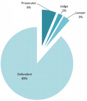
In the whole dataset there are 2475 entities referring to people. A pie chart of the four roles for persons is shown in Figure 2 - 1.
Figure 2 - 1: Pie diagram for people divided by their roles.
2.2.4
Finding associations
We use data on entities and their location to find out a correlation among them. For our experiments a co-occurrence relationship is defined. Two entities are related if they appear in the same paragraph or in the same sentence. A Python script is used to identify associations. If a couple of entities co-occurs more than one time, the association between them is weighted accordingly. There are 32537 association. The weight for an association go from 1 to 613. The simplest way to show entities and their relationships is to create a graph in which vertices represent entities and arches between vertices represent the relationship of co-occurrences.
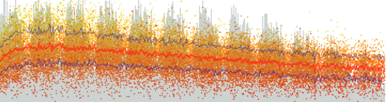
It is very tricky to build and to show a readable and easy to handle graph with more than ten thousand arch, so we choose to prune arches with lesser relevance. As diagram in Figure 2 - 2 shows, the arches with weight smaller than 5 are about 87,12%. Those arches represent a weak relation between entities, representing a very rare co-occurrence of names in the same sentence; if two person are not together in a paragraph more than few times, we can assume that the co-occurrence is not significative for our goals.
Figure 2 - 2: Histogram showing number of arches for weight’s value.
If we maintain only arches with a weight grater or equal to 5, we have 4191 arches and 1436 entities connected in our graph.
2.2.5
Visualizing data
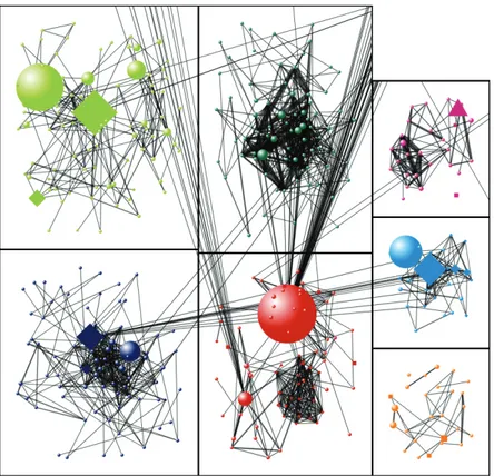
To build a graph with entities extracted from sentences in this initial study, we used a powerful free and open-source tool developed by the Social Media Research Foundation. NodeXL was created by Marc Smith’s team while he was at Microsoft Research [115]. It is a template for Excel that allows to easily build a graph entering a network edge list. With this tool it is not difficult to filter vertices and edges or calculate some graph metrics. We use this tool to obtain a clustering on our data. To identify vertices that are clustered together into subgroups of interest is indeed of great help. In this case clusters could identify important aggregates among offenders. We report anecdotally a correlation between network’s clusters and mafia families, and considering the nature of connections among clusters sociologists have been able to infer some new knowledge.
Figure 2 - 3: Complete social network from data of sentences.
2.2.6
Clusters
Clustering is among the main tasks of explorative data mining, and a common tech-nique for statistical data analysis. NodeXL implements three clustering algorithms One of those is generally used to find community structure in very large networks: Clauset-Newman-Moore algorithm [29]. Using this algorithm we have assigned a dif-ferent color to each cluster and bound every cluster in a box.
As is shown in Figure 2 - 4, each box has an area proportional to the number of vertices that are contained in the cluster.
Figure 2 - 4: The diagram shows a portion of the whole graph. The seven rectangles bound seven clusters of persons. Bigger icons denote a higher betweenness centrality. The shape of a vertex represents the role of the corresponding person. See text for details.
We use different shapes to specify the role of person: circles for defendant, squares for lawyers, triangles for judges and diamonds for prosecutors.
The size of vertices depends on the betweenness centrality of the node [43]. Between-ness centrality is defined as follows:
g(v) =
∑
s6=v6=tσst(v) σst
(2.1)
where σst is total number of shortest paths from node s to node t and σst(v) is the number of those paths that pass trough v.
A vertex with high betweenness centrality often acts like a bridge between two clusters, perhaps indicating a key role of the person in the small society depicted by our sentences data.
It is possible to zoom in and visualize a cluster. In the example in Figure 2 - 5 we can see a cluster of defendants only labeled with their names.
Figure 2 - 5: A cluster in detail.
They are connected to a lawyer with very high betweenness centrality. This shows that almost all people in this small group use to be defended in court by the same lawyer. This lawyer is, moreover, representative of another cluster of people, he acts like a link between two group of offenders.
2.3
Results
Working on this case study, we have been able to experiment on classic principles of information visualization. We have worked on data to achieve the five advantages defined in 2004 by Ware [125]:
1. Comprehension: Visualization provides an ability to comprehend huge amounts of data.
2. Perception: Visualization reveals properties of the data that were not antici-pated.
3. Quality Control: Visualization makes problems in the data (or in the data collection methods) immediately apparent.
4. Focus + Context: Visualization facilitates understanding of small-scale features in the context of the large-scale picture of the data.
5. Interpretation: Visualization supports hypothesis formation, leading to further investigation.
Simple information extraction from sentences produces a rough network from the data (Figure 2 - 3). This is nearly useless. It is a way to represent data, but it is not readable: we can’t understand data and it does provide very little insight in the structure that it wish to represent. We have tried several combinations of graphical accessory elements like color, size, shape, location, thickness, to code as much information as possible in a single image. By trial and errors we believe that we obtained a graphical representation that at a quick glance may help scholars to roughly grab many important information otherwise very hidden in our data.
Although a rigorous usability test of the proposed graphical layouts are still in progress, we may safely claim that these elements are of great help to navigate and understand network data. Definitive data about the testing will be produced soon.
2.4
Conclusion
This work has to be considered an attempt to realize a more powerful tool to handle large collections of data extracted from texts. Clustering is our first approach to data visualization because it appears to be the natural choice for our particular dataset. Working with person type entities is desirable to find out classes and groups reflecting those in the real world. With simple tools we have a way to visualize data and help scholars to manage thousands of entities and relationships, to identify cluster of people and highlight who of them is more important for his role in the small mafia sentences society. We intend to continue our study on information visualization adopting methods and knowledge we have learned during this work.
Future work will focus on: testing and improving the suggested graph layout; test-ing the proposed technique on other text collections; compare the proposed technique with other published methods.
Chapter 3
Visual Analysis of Multivariate
Data from Dairy Industry
“Most days of the year are unremarkable. They begin, and they end, with no lasting memories made in between. Most days have no impact on the course of a life. May 23rd was a Wednesday.”
- Narrator [(500) Days of Summer]
The following contents are object of the paper Visual Analysis of Time-Dependent
Multivariate Data from Dairy Farming Industry by L. Di Silvestro, M. Burch, M.
Cac-camo, D. Weiskopf, F. Beck and G. Gallo, presented at the Conference on Information
Visualization Theory and Applications (IVAPP) 2014.
3.1
Introduction
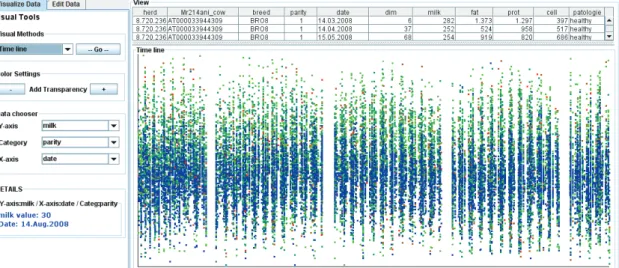
This chapter addresses the problem of analyzing data collected by the dairy industry with the aim of optimizing the cattle-breeding management and maximizing profit in the production of milk. The amount of multivariate data from daily records constantly increases due to the employment of modern systems in farm management, requiring a method to show trends and other insights in data for a rapid analysis. To this end, we have designed a visual analytics system for animal researchers to analyze
time-varying data. Well-known visualization techniques for multivariate data are used next to novel methods that show the intrinsic multiple timeline nature of these data as well as the linear and cyclic time behavior. Seasonal and monthly effects on production of milk and milk components (e.g. fat and protein) are displayed by aggregating data values on a cow-relative timeline according to the day of calving. Basic statistics on data values are dynamically calculated and a density plot is used to show how many samples are taken for each day, quantifying the reliability of a particular dataset. Dynamic filters are offered to the user for data exploration. A qualitative expert user study conducted with animal researchers shows that the system is an important means to identify anomalies in data collected and to understand dominant data patterns, such as clusters of samples, outliers, and trends. The evaluation is complemented by a case study with two datasets from the field of dairy science.
To increase the competitiveness of the dairy sector in the national economy, the dairy industry focuses on improving farm management. The information on farm productivity to support management on dairy farms is often collected by Dairy Herd Improvements agencies. Dairy farmers are usually visited once per month, during a day called test-day. Information on the herd such as breeding events, gender, and weight of new-born calves is collected. In addition, the milk production of each cow is measured and a milk sample is gathered to determine the fat and protein content, as well as somatic cell count.
Test-day records represent a valuable resource for animal researchers, but as data sources become larger, the analysis and exploration of patterns in data becomes more complex, representing a critical bottleneck in analytic reasoning. To address these problems, a visual analytics approach can be used to let users explore their data and interact with them with the aim to find interesting insights and eventually data anomalies and formulate hypothesis. Techniques that support the production and dissemination of analysis results may help researchers communicate to a variety of audiences.
We present an interactive system to analyze time-dependent multivariate data. A suite of visual analytics tools is designed for animal researchers, allowing them to