http://siba-ese.unisalento.it/index.php/ejasa/index
e-ISSN: 2070-5948
DOI: 10.1285/i20705948v10n3p809
Spatio-temporal movements in team sports: a visualization approach using motion charts
By Metulini
Published: 15 November 2017
This work is copyrighted by Universit`a del Salento, and is licensed un-der a Creative Commons Attribuzione - Non commerciale - Non opere un-derivate 3.0 Italia License.
For more information see:
DOI: 10.1285/i20705948v10n3p809
Spatio-temporal movements in team
sports: a visualization approach using
motion charts
Rodolfo Metulini
∗Department of Economics and Management, University of Brescia
Published: 15 November 2017
A new approach to performance analysis in team sports consists in study-ing movements and trajectories of players durstudy-ing the game. State of the art tracking systems produce spatio-temporal traces of players that have fa-cilitated a variety of research aimed to to extract insight from trajectories. Several methods borrowed from machine learning, network and complex sys-tems, geographic information system, computer vision and statistics have been proposed. However, the use of an effective and easy-to-use visual tool in support to these methods is of major importance. To this scope this pa-per suggests the use of motion charts, built by means of the open-source gvisMotionChart function in googleVis package in R, a user-friendly pro-cedure that also allows to easily import data. A basketball case study is presented. Data refers to a match played by an italian team militant in C-gold league on March 22nd, 2016. Analyses show that motion charts give insights on different spacing structures among offensive and defensive actions, corroborating evidences from other supporting analyses.
keywords: Sport Science; Sport Statistics; GPS; Trajectories; Motion Charts; GoogleVis.
1 Introduction
Studying the interaction between players in the court, in relation to team performance, is one of the most important issues in sport science. State of the art sport science liter-ature borrowed methods from many disciplines, such as machine learning, network and
∗
Corresponding author: [email protected]
c
Universit`a del Salento ISSN: 2070-5948
complex systems, geographic information systems, computational geometry, computer vision and statistics. In recent years, the advent of information technology systems, made it possible to collect a large amount of different types of spatio-temporal data, which are, basically, of two kinds. On the one hand, play-by-play data report a sequence of significant events that occur during a match. Events can be broadly categorized as player events such as passes and shots; and technical events, for example fouls, time-outs, and start/end of period. Data-driven analyses using play-by-play have been performed. Carpita et al. (2013, 2015) used cluster analysis and principal component analysis in order to identify the drivers that affect the probability to win a football match. So-cial network analysis has also been used to capture the interactions between players. Wasserman and Faust (1994) mainly focuses on passing networks and transition net-works1. Passos et al. (2011) used centrality measures with the aim of identifying central (or key) players, and to estimate the interaction and the cooperation between team members in water polo. On the other hand, object trajectories capture the movement of players (with or without data about the ball). Players trajectories are retrieved using optical- or device-tracking and processing systems. Optical tracking systems use fixed cameras to collect the player movement, and the images are then processed to compute the trajectories (Bradley et al., 2007). There are several commercial vendors who supply tracking services to professional sports teams and leagues (Corporation, 2015; Impire, 2015). Tracking systems rely on devices that infer their location, and are attached to the players’ clothing or embedded in the ball or puck. These systems are based on Global Positioning Systems (GPS) (Catapult, 2015). The adoption of this technology and the availability to researchers of the resulting data depends on various factors, particularly commercial and technical such as, for example, the costs of installation and mainte-nance and the legislation adopted by the sports associations. This data acquisition may be partially restricted in some invasive team sports (as it was for example in soccer until 2015) while allowed for others. Even once trajectories data become available, explaining movement patterns remains a complex task, as the trajectory of a single player depends on a large amount of factors and on the trajectories of all other players in the court, both teammates and rivals. Because of these interdependencies, in every single moment, a player action causes a reaction. A promising niche of sport science literature, borrow-ing from the concept of physical psychology (Turvey et al., 1995), expresses players in the court as agents who face with external factors (Travassos et al., 2013; Ara´ujo and Davids, 2016). In addition, typically, players’ movements are determined by their role in the game. Predefined plays are used in many team sports to achieve some specific objec-tive; moreover, teammates who are familiar with each other’s playing style may develop ad-hoc productive interactions that are used repeatedly. On the one hand, experts want to explain why, when and how specific movement behavior is expressed because of tacti-cal behavior. Brillinger (2007) addressed the question of how to analytitacti-cally describe the spatio-temporal movement of particular sequences of passes (i.e. the last 25 passes before
1A passing network is a graph where each player is modelled as a vertex and successful passes to the
player represents links among vertex. Transition networks can be constructed directly from event logs, and corresponds to a passing network where play-by-play data are attached
a score). Moreover, segmenting a match into phases is a common task in sports analysis, as it facilitates the retrieval of important phases for further analysis. On the other hand, analysts want to explain and observe cooperative movement patterns in reaction to a variety of factors. An open issue in this respect regards tracking external influences as, for example: coach advices and the corresponding team reactions, characteristics of the stadium (capacity, open/closed roof), historical and current weather records (high/low temperatures, air humidity). Another key factor in relation to teams’ performance is how players control space. Many works are devoted to analyse how the space is occupied by players - when attacking and when defending - or in crucial moments of the match. Examples can be found in football (Couceiro et al., 2014; Moura et al., 2012) or in futsal (Fonseca et al., 2012; Travassos et al., 2012).
In order to communicate the information extracted from the spatio-temporal data, visualization tools are required. Basole and Saupe (2016) highlight the growing interest in applying novel visual tools to a range of sports contexts. Analysts from leading outlets such as the New York Times use visualization to tell basketball and football stories (Aisch and Quealy, 2016; Goldsberry, 2013). The increasing popularity of sports data visualization is also reflected in greater academic interest. Perin et al. (2013) developed a system for visual exploration of phases in football, Sacha et al. (2014) present a visual analysis system for interactive recognition of football patterns and situations. Notable works include data visualization in ice hockey (Pileggi et al., 2012) and tennis (Polk et al., 2014). In basketball, Losada et al. (2016) developed ‘BKViz”, a visual analytics system to reveal how players perform together and as individuals. Years ago, Ther´on and Casares (2010) employed tools for the analysis of players’ movements in the court. For visualizing aggregated information the most common approach is to use heat maps, simple and intuitive tools that can be used to visualize various types of data. Typical examples in the literature are showing the spread and range of a shooter (Goldsberry, 2012) or counting how many times a player lies in specific court zones. Motion charts outperform visualization tools such as heat maps as they permit to trace players’ movements displaying the time dimension. However, to the best of our knowledge, academic papers using motion charts in the sport science discipline do not exist. A motion chart is a dynamic representation which adds a third dimension to bubble charts, allowing simple interactive visualization of multivariate data. Motion charts map variables into time, 2D coordinate axes, size and colors, and facilitate the interactive display of spatio-temporal data. This paper suggests the use of motion charts to visualize the synchronized spatio-temporal movements and to characterize the spatial pattern of players around the court. Having available trajectories, extracted from GPS tracking systems, the paper applies this strategy to a basketball case study. The aim is to supply experts and analysts with a useful tool in addition to traditional statistics, as well as in corroborating the interpretation of evidences from other methods of analysis. In our application to basketball, gvisMotionChart is used because it outperforms alternative methods in terms of open source, friendliness, and because they allow to import data. Section 2 introduces motion charts and their use in relation to team sports movements. Section 3 presents the case study based on basketball and discusses the results obtained from the motion charts. Section 4 concludes and suggests future research challenges.
2 Methods
2.1 Motion charts
A motion chart can be considered as a dynamic bubble chart. A Bubble chart displays three-dimensional data. Each object is plotted by expressing two of the three values through the xy-axes and the third through its size. Bubble charts can facilitate the understanding of social, economical, medical, and other scientific relationships. Bubble charts can be considered a variation of the scatter plot, in which the data points are replaced with bubbles. Motion chart allows efficient and interactive exploration and visualization of space-time multivariate data and provides mechanisms for mapping or-dinal, nominal and quantitative variables into time, 2D coordinate axes, size and colours. Motion charts provide a dynamic data visualization that facilitates the representation and understanding of large and multivariate data with thousands of records and allow for interactive visualization using additional dimensions like time, size and colour. The central object of a motion chart is a bubble. Bubbles are characterized by size, posi-tion and appearance. Using variable mapping, moposi-tion charts allow to control over the appearance of the bubble at different time points. This mechanism enhances the dy-namic appearance of the data in the motion chart and facilitates the visual inspection of associations, patterns and trends in space-time data.
Motion charts are used in a wide range of topics, such as students learning processes. Santos et al. (2012) in order to compare the activity of a sample of engineering students in developing a software with their peers, used a motion chart where the x-axis is the activity of the students and the y-axis is the peers average activity; Hilpert (2011) used motion charts to visualize the dynamic of linguistic change over the time; in detail the paper analysed how ambicategorical words such as work, hope, use, and look, which can be used as either nouns or verbs, have changed in their respective proportions of nominal and verbal usages. Motion charts are applied to different sub-fields of economics, for example in finance, to visualize sales data in an insurance context, Heinz (2014) represents insurance products (bubbles) in terms of the sales volume (x-axis) and the products’ premium (y-axis). Saka and Jimichi (2015) shed light on the inequality among countries and firms through motion charts accounting from listed firms of a panel of 140 countries. In Santori (2014) a new model of web-based interactive motion charts was applied to aggregated liver transplantation data obtained from a consecutive 28-year series of liver transplantation performed in a single Italian center. Moreover, in Bolt (2015), stream and coastal water quality is explored in space (longitude, x-axis and latitude, y-axis) and time by means of motion charts.
There are several softwares providing the possibility to reproduce motion charts, more or less intuitive, open source or requiring a license. On the one hand, software-based vi-sualization tools are generally simple to use. Some software packages capable of creating motion charts are Gapminder world, Google docs gadget, Trend compass, and JMP from SAS institute. The data are prepared in a designated format readable by the software. The software acquires, parses, and represents the data depending on its functionalities. Most visualizations enable interaction and control from the user to customize the
dis-play of the information, though in some of the software packages, the disdis-play control is somewhat limited. For example, Gapminder ’s motion charts are limited to selected international social and economic series though these series cover an extremely wide range of data that can be chosen by the user.
Table 1: List of tools to create Motion Charts
Name of tool Format Availability Data input Skill level Google motion
charts
Software Free You can input your own data
Low, fairly intuitive Gapminder
world
Software Free Several publicly col-lected data series, unable to input your own data
Low, very intuitive
Trend compass Software License You can input your own data
Low, fairly intuitive JMP by the
SAS institute
Software License You can input your own data
Low, fairly intuitive Flash and
simi-lars
Web Varies You can input your
own data
High,
pro-gram in
various languages Google API Web Mostly free You can input your
own data
High,
pro-gram in
various languages
Tableau Public Web Free You can input your
own data
Low, very intuitive
On the other hand, web-based visualization tools offer the flexibility for developing interactive controls and displaying customized graphics. Motion charts created through web programming languages are often displayed directly on web pages. In general, creating web-based motion charts requires computer technical skills such as web page authorizing, computer language programming, and graphic design; the skills to develop programming based visualization might be far beyond a statistician’s toolkit. Examples of web-based motion charts are Google application programming interface (Google API), Flash, and HTML5. In recent years, some statistical software permit to draw motion chart. For example SAS use JMP technology, while Phyton’s plotly function adopts pan-das technology. R makes available gvisMotionChart, a function of googleVis package (Gesmann and de Castillo, 2013). gvisMotionChart reads a data.frame object and cre-ates text output referring to the Google API. It can be included into a web page, or as
a stand-alone page. The actual chart is rendered by the web browser in Flash2.
Based on pros and cons reported in Table 1, Google gvisMotionChart is used, because it is an easy-to-use free tool and allows to inport one’s own data. gvisMotionChart has been popularized by Hans Rosling in his TED talks (https://www.ted.com/speakers/ hans\_rosling).
Analytically, the gvisMotionChart function reads as follow:
gvisMotionChart(data, idvar = "id", timevar = "time", xvar = " ", yvar = " ", colorvar = " ", sizevar = " ",date.format = "Y/m/d", options = list(), chartid)
where data is a data.frame object that should contains at least four columns. The first (idvar) column represents the subject name (e.g. a column of strings representing people, firms, regions, and so on and so forth). The second column (timevar) identifies the time dimension (e.g. a column showing the time dimension, that can be either years, month, days, milliseconds, etc.). This information has to be either numeric, of class date or a character. The combination of idvar and timevar has to describe a unique record in the data.frame. The data.frame has to contain other two columns of numeric values (xvar and yvar) that correspond to the information to be plotted, respectively, in the x- and the y- axes (e.g. numeric data corresponding to an economic aggregate, to the positioning on the space, to a student’s vote, etc.). Moreover, colorvar and sizevar serve to fix, respectively, the colour and the size of the bubbles. Options permit to further personalize the motion chart as documented in detail at https://developers.google.com/chart/ interactive/docs/gallery/motionchart#Configuration_Options
2.2 Motion charts for players movements
Let us suppose to have space-time trajectories data for the five players in a basketball court: the data.frame object should have a variable that uniquely identifies these players. This is the idvar variable. The data.frame should also contain a variable uniquely iden-tifying the time dimension in which players’ movements are tracked; this is the timevar variable. A record in the data.frame should be uniquely identified by the combination of idvar and timevar. Moreover, our data.frame should contain two additional vari-ables containing the input for the x-axis and the y-axis. For the x-axis the data.frame contains the position of the player along the court length and for the y-axis the position along the court width. These are, respectively, xvar and yvar. The plot function can be used to represent the googleVis motion chart using Google browser. Options com-mand can be used to define the court size when displaying it in the browser: by default, gvisMotionChart displays a squared chart (i.e. same length and width). With Options it is possible to transform the court to be rectangular and with the right proportions between court width and court height. Summarizing, a data.frame containing the four
2
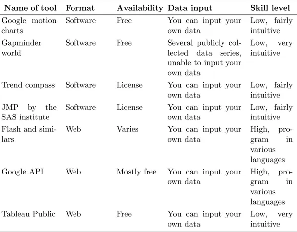
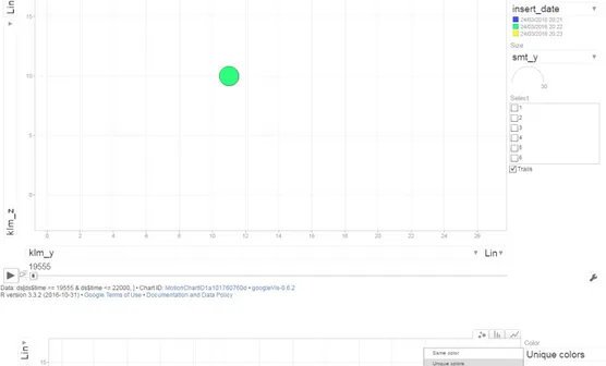
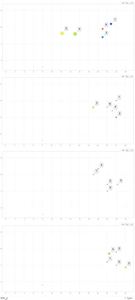
variables above described permits to visualize, in space and in time, the trajectory of a single player as well as the synchronized movements of all the players together. A specific player could be displayed with a specific (unique) colour (see the middle chart in Figure 1). Other variables should be supplied to the function in order to, for ex-ample, set the bubbles’ size. By means of the x-axis and y-axis coordinates recorded in successive moments of time, it is easy to compute the speed. A speed variable may characterize the bubbles’ size (see the bottom chart in Figure 1, where the bubble size are set in terms of speed). It is possible to visualize the movement of a single player or the movements of more players together by ticking them in the appropriate box in the browser (top chart of Figure 2). In the same vein, it is possible to activate players’ trails: it will leave a line in the chart as bubbles play over time (middle chart of Figure 2). Finally, it is possible to set the motion chart speed by regulating the playback speed key (please refer to bottom chart of Figure 2).
3 Case study
Basketball is a sport generally played by two teams of five players each on a rectangular court. The objective is to shoot a ball through a hoop 18 inches (46 centimeters) in diameter and mounted at a height of 10 feet (3.05 meters) to backboards at each end of the court. This sport was invented in Springfield (Canada) in 1891 by Dr. James Naismith. Rules of International Basketball Federation (FIBA, www.fiba.com) differ from the rules of the United States first league, National Basketball Association (NBA, www.nba.com). For FIBA, the match lasts 40 minutes, divided into four periods of 10 minutes each. There is a 2-minutes break after the first quarter and after the third quarter of the match. After the first half, there is a 10 to 20 minutes half-time break.
This case study refers to a friendly match played on March 22th, 2016 by a team based in the city of Pavia (Italy) called Winterass Omnia Basket Pavia. This team, in the season 2015-2016, played in the C-gold league, the fourth league in Italy. This league is organized in 8 divisions in which teams geographically close by play together. Each division is composed by 14 teams that play twice with every other team of the same division (one as a guest and one as a host team) for a total of 26 games in the regular season. At the end of the regular season, the top 8 teams in the final rank play a post season (also called playoff) that serves to declare the winning team as well as to determine the team that qualifies to the upper league in the next season.
3.1 Dataset description
On March 22th, 2016, six Winterass players took part in the friendly match. All those players were wearing microchips in their clothings. The microchip tracks the player’s movements in the court. The court length measures 28 meters while the court width equals to 15 meters. The microchip collects the position (in pixels of 1 squared meters) in both the x-axis and the y-axis. The players’ positioning has been detected at millisecond level. Considering that the six players took turn in the court, the system recorded a total of 133,662 space-time records. Observations have been collected into a dataset and
kindly provided to us by MYagonism (https://www.myagonism.com/). In more detail, in the dataset, tagid uniquely identifies the player, timestamp ms reports the exact moment in which the player position has been observed in terms of milliseconds, klm x and klm y represent the x-axis (length) and y-axis (width) coordinates, filtered with a Kalman approach; klv x and klv y reports the speed along, respectively, the x-axis and the y-axis, based on filtered data described above. A measure of player’s speed (in meters/seconds), speed.mtr.sec is computed as pklv x2+ klv y2.
After having dropped the warm-up, the half-time break and the post-match periods from the full dataset, the final dataset consists of 96,323 records. The game lasts for 3,945,413 milliseconds, which equals about 66 minutes. This also means that, on av-erage, the system collects players’ positions about 41 times every second (3,945,413 / 96,323). Since the dataset contains records that belong to six players, the position of each single player is collected, on average, 6.8 times every second, or, equivalently, every 147 milliseconds. The variation in the system detection frequency is quantified by count-ing the number of records in each second. The system detects coordinates, on average, 25.66 times per second, with the first quartile that stands to 25 and the third quartile that stands to 28. These values express a strong homogeneity in the system detection’s frequency. Further data inspections found that, out of 96,323 records, 16,574 report the position of player 1 (P1), 15,296 report the position of player 2 (P2), 12,966 belong to player 3 (P3) while 17,180 belong to player 4 (P4). Player 5’s and player 6’s (P5, P6) positions are collected, respectively, 17,467 and 16,840 times3.
3.2 Results
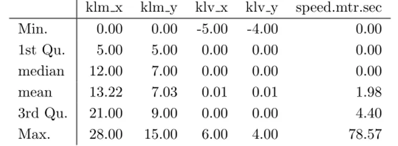
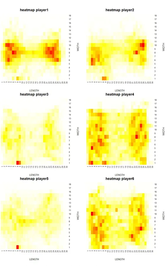
Table 2 displays the summary statistics of the variables in use, based on the filtered dataset made of 96,323 records. Min/max, mean and relevant quartiles of both the coordinates on the x- and y-axes (variables klm x and klm y), and of the speed along the x- and y-axes (variables klv x and klv y) are reported. The average position in the court length stands to 13.22, with a min/max respectively of 0 and 28 and the 1st/3rd quartiles respectively equal to 5 and 21. The average position in the court width stands to 7.03; corresponding min/max stand to 0 and 15, while the 1st and the 3rd quartiles equal to 5 and 9. These values show that players move along the court covering all the 1 squared meters cells in which the court has been divided. To better describe the extent to which players are located in the court we make use of heat maps. A heat map is a graphical representation of data where the individual values contained in a matrix are represented as colours. In our use, individual values represent the count of the number of times a certain player lies in a particular cell of a matrix, where the matrix is represented by the court. In order to account for the heterogeneity in the locational pattern among players, a heat map is drawn for each of them separately. The court has been subdivided into squares of equal size (1 squared meters) and the number of times a player lies in that square is counted. The heat maps is drawn using heatmap function within stats package in R. Heat maps are reported in Figure 3; court length is reported in the x-axis
3
This does not mean that the last three players remained in the court more than the others, but only that sensors detected their positions more times than the others.
Table 2: Summary statistics for the relevant variables in the dataset klm x klm y klv x klv y speed.mtr.sec Min. 0.00 0.00 -5.00 -4.00 0.00 1st Qu. 5.00 5.00 0.00 0.00 0.00 median 12.00 7.00 0.00 0.00 0.00 mean 13.22 7.03 0.01 0.01 1.98 3rd Qu. 21.00 9.00 0.00 0.00 4.40 Max. 28.00 15.00 6.00 4.00 78.57
and the court width is reported in the y-axis. Colours range from white (lowest intensity, i.e. the player rarely locates in that cell) to red (highest intensity, i.e. the player often locates in that cell). A comparison of the heat maps shows differences among players (Figure 3). Heat maps of P1 and P2 are similar: both players locate more often close to the basket4. P4 and P6 show a different locational pattern: their heat maps present a higher level of dispersion around the court.5
Despite heat maps give some hints about the locational pattern of players, they com-pletely disregard the time dimension. In fact, nothing is possible to assert about the location of players in a specific moment in time, or to examine their trajectories. More-over, heat maps do not shed light on the interaction among players. Motion charts account for the time dimension and trace the trajectories of players. This tool allows to analyse the movement of a single player as well as the interaction of all the players together. A video showing how motion charts work in our dataset can be found at: http://bodai.unibs.it/BDSports/Ricerca2\%20-%20DataInn.htm.
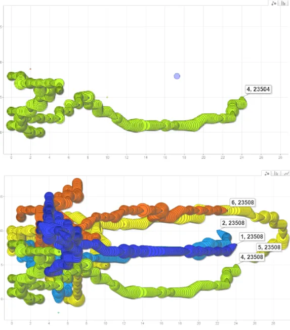
To demonstrate the potential of motion charts, top chart of Figure 4 reported the trajectory of P4 during an offensive play. In doing so, gvisMotionChart function is used, replacing to data the name of our data.frame, replacing idvar with tagid and timevar with timestamp ms. In these charts, the bubble size is defined in terms of speed (sizevar = speed.mtr.sec). Variables klv x and klv y are used to compute the speed, reporting the number of meters in the x- and the y- axes at successive instants6. Looking to Table 2, speed (speed.mtr.sec) reports a mean of 1.98 meters/seconds, a 1st/3rd quartile of, respectively, 0 and 4.40, and a min/max of, respectively, 0 and 78.577. In this example, P4 starts from the defensive region of the court (right) and it moves straight to the offensive region (left). Subsequently, he moves to the bottom and then close to the
4
The basket is positioned at the coordinate (1,8).
5
Heat maps of P3 and P5 present a red cell close to the bench. Even if observations presenting coordinates outside the court have been removed, it can be the case that the system erroneously track them into the court.
6
As players move in both the directions, these two variables also report negative variables.
7The speed is calculated based on the player location in successive instants. Accordingly, speed is often
detected equal to zero, because the player has been detected in the same cell of the previous instant. At the same way, when the player is detected in a different cell from the previous instant, but the two time instants are very close each other, an artificial very high speed is computed. All in all, the average speed makes sense (1.98 meters/seconds, or 7.1 kilometers/hours).
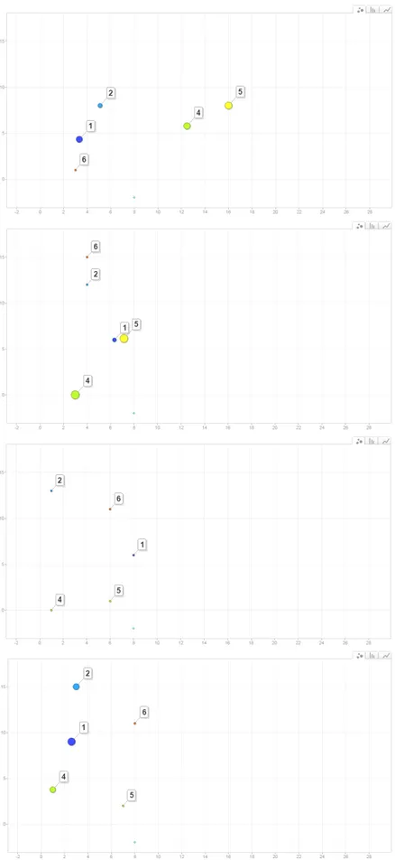
basket. P4 ends his play moving a couple of meters far away from the basket. Bottom chart of Figure 4 highlights the interaction among players during the same offensive play. Motion charts are used to highlight the spacing structure of the players in the court. Figure 5 and Figure 6 report selected snapshots representing, respectively, the spacing structure during the first offensive play and the first defensive play of the game. In the first chart of Figure 5 players are in transition from defence to offence, in the second chart P1 is performing a block for P5. Then, in the third chart, players are equally spaced among each other in order to allow P1 to get close to the basket and shot. In the defensive play (Figure 6), first chart depicts players in transition from offence to defence, then, players position close to each others to defend the basket. It is possible to note lower speeds during the defensive play (smaller bubbles) compared to the offensive play. Moreover, looking to the charts, what strongly emerges is that players are more spread around the court during the offensive play rather than during the defensive one.
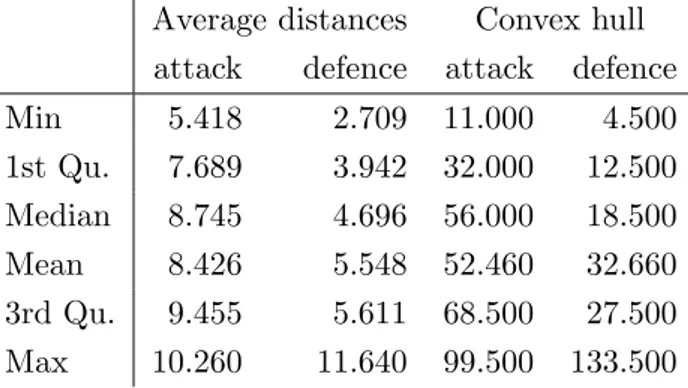
In order to confirm the results obtained from motion charts some relevant statistics are computed. Table 3 displays summary statistics for the average distances among the five players in the court and for the area of the convex hull defined by their position8, for both the offensive and the defensive plays depicted in Tables 5 and 6. Mean, min/max and relevant quartiles are reported. Average distance (column 1-2) is higher for the offensive play (mean: 8.43 meters) compared to that of the defensive play (mean: 5.55 meters). Convex hull area also differs in the offensive and in the defensive play: on average, the five players occupy 52.46 squared meters in the offensive play and 32.66 squared meters in the defensive play.
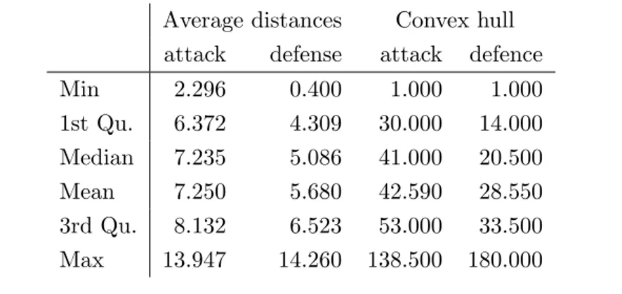
Table 3: Average distances for the offensive and for the defensive plays depicted in Tables 5 and 6
Average distances Convex hull attack defence attack defence
Min 5.418 2.709 11.000 4.500 1st Qu. 7.689 3.942 32.000 12.500 Median 8.745 4.696 56.000 18.500 Mean 8.426 5.548 52.460 32.660 3rd Qu. 9.455 5.611 68.500 27.500 Max 10.260 11.640 99.500 133.500
To better support the results obtained with motion charts, Figures 7 and 8 depict the convex hull related to the selected snapshots reported in Figures 5 and 6. The figures provide the corresponding convex hull area (in squared meters) and the average distances among the five players in the court. Bigger areas and average distances in the snapshots of the offensive play are founded. In detail, area stands to 57 squared meters in the
8
Figure 4: Motion chart. Trajectory of player 4 (top) and of the five players together (bottom) during an offensive play
Figure 5: Selected snapshots representing the spacing structure during the first offensive play of the game
first snapshot, 34 squared meters in the second snapshot, 56 squared meters in the third and 68 in the fourth. Average distance stands to 9.15 meters in snapshot 1, 7.85 in the second, 8.45 in the third and 8.74 in the fourth. Looking to the defensive play, area stands to, respectively, 18.5, 12.5, 14.5 and 11 squared meters in the fourth snapshots; average distance is equal to, respectively, 6.03, 3.66, 4.40 and 3.78 meters.
Summary statistics for the average distance and for the convex hull area are considered in relation to the entire match. Table 4 reports mean, min/max and relevant quartiles divided between offensive and defensive plays. Statistics for the entire match reflect those of the first offensive and the first defensive play. Average distance for offensive plays (columns 1-2) stands to 7.25 meters, while average distance for defensive plays (columns 3-4) stands to 5.09 meters. Convex hull area, in the offensive plays report an average of 42.59, while the five players occupy an average of 28.55 meters in the defensive plays.
To summarise, motion chart showed differences in the spacing structure of players among offensive and defensive action. These evidences have been confirmed by the analysis of convex hull and throughout the distances, both at single play and entire game levels.
Table 4: Averages for the full match, for defensive and offensive actions. Average distances Convex hull
attack defense attack defence
Min 2.296 0.400 1.000 1.000 1st Qu. 6.372 4.309 30.000 14.000 Median 7.235 5.086 41.000 20.500 Mean 7.250 5.680 42.590 28.550 3rd Qu. 8.132 6.523 53.000 33.500 Max 13.947 14.260 138.500 180.000
4 Conclusions, discussions and future developments
In recent years, experts, analysts and coaches have received benefits from the availability of large amounts of data in the sport science discipline, which increased the possibility to extract insights from matches in relation to teams’ performance. In particular, with the advent of information technology systems, players’ trajectories permit to analyse the space-time movements with a variety of approaches. Methods and models used in this field borrow from many research communities, including machine learning, network science, geographic information systems, computational geometry, computer vision, com-plex systems science and statistics. Moreover, as remarked by Basole and Saupe (2016) in their Guest Editors’ introduction to Sport Data Visualization special issue in IEEE Computer Society journal, applying visual tools in Sport Science is of growing interest.
In this paper motion charts have been employed as a visual tool to display the synchro-nized trajectories of players in space and time. We consider motion charts useful to experts and analysts in support to traditional statistics. In our application to basket-ball, motion charts suggest the presence of interactions among players as well as specific patterns of movements. Specifically, evidences of different spacing structure have been found among offensive and defensive actions, which are corroborated by the computation of convex hulls and average distances.
Further research can be carried out, with the aim of finding regularities between trajectories and players (and team) performance. In lights of the emerging discipline of ecological dynamics applied to sport science (Travassos et al., 2013), that assumes players as agents that are each other affected by reciprocal movements and by several external factors, matching trajectories with other data is essential. On the one hand, match events data could be collected using play-by-play; in this regard, it is worthwhile to investigate, for example, whether specific pattern of movements are positively corre-lated with the shooting percentage, or whether the presence of a specific player in the court improves the team performance. In this regard, the availability of trajectories data of both teammates, rivals and the ball for multiple games is essential to better explore the multivariate and complex structure of trajectories and its association with teams’ performance. On the other hand, historical data such as prior match results between the teams, final standings of leagues and career records, that can be obtain freely or from commercial providers, environmental data, such as characteristics of the stadium (capacity, open/closed roof) and historical and current weather records (high/low tem-peratures, air humidity) can be used to measure their impact on players performances and trajectories. Moreover, community-generated reports about games, gathered from social media platforms such as Twitter or Facebook could be used to investigate, for example, the relation of players’ popularities and their performance based on visits to their social networks. Future challenges also aim to experiment the potential of spatial statistics and spatial econometrics techniques applied to trajectory analysis (Brillinger, 2008), also in view of the similarities between sport players and economic agents in terms of exogenous and endogenous (external) factors that impact on locational choices, as illustrated in Arbia et al. (2016).
5 Acknowledgments
Research carried out in collaboration with the Big&Open Data Innovation Laboratory (BODaI-Lab), University of Brescia (project nr. 03-2016, title Big Data Analytics in Sports, www.bodai.unibs.it/BDSports/), granted by Fondazione Cariplo and Regione Lombardia. The author would like to thanks Paola Zuccolotto and Marica Manisera (University of Brescia) for the suggestions during the preparation of the paper. Further-more, he thanks Tullio Facchinetti and Federico Bianchi (University of Pavia) for the help with the data interpretation.
Figure 6: Selected snapshots representing the spacing structure during the first defensive play of the game
Figure 7: Convex hull for selected snapshots representing the first offensive play of the game
Figure 8: Convex hull for selected snapshots representing the first defensive play of the game
References
Aisch, G. and Quealy, K. (2016). Stephen curry 3-point record in context: Off the charts. New York Times.
Ara´ujo, D. and Davids, K. (2016). Team synergies in sport: Theory and measures. Frontiers in Psychology, 7.
Arbia, G. et al. (2016). Spatial econometrics: A broad view. Foundations and Trends R
in Econometrics, 8(3–4):145–265.
Basole, R. C. and Saupe, D. (2016). Sports data visualization [guest editors’ introduc-tion]. IEEE Computer Graphics and Applications, 36(5):24–26.
Bolt, M. (2015). Visualizing water quality sampling-events in florida. ISPRS Annals of the Photogrammetry, Remote Sensing and Spatial Information Sciences, 2(4):73. Bradley, P., O’Donoghue, P., Wooster, B., and Tordoff, P. (2007). The reliability of
pro-zone matchviewer: a video-based technical performance analysis system. International Journal of Performance Analysis in Sport, 7(3):117–129.
Brillinger, D. R. (2007). A potential function approach to the flow of play in soccer. Journal of Quantitative Analysis in Sports, 3(1).
Brillinger, D. R. (2008). Modelling spatial trajectories. pages 463–475.
Carpita, M., Sandri, M., Simonetto, A., and Zuccolotto, P. (2013). Football mining with r. Data Mining Applications with R.
Carpita, M., Sandri, M., Simonetto, A., and Zuccolotto, P. (2015). Discovering the drivers of football match outcomes with data mining. Quality Technology & Quanti-tative Management, 12(4):561–577.
Catapult, S. L. (2015). Wearable technology for elite sports. url http://www.catapultsports.com/.
Corporation, T. (2015). Tracab player tracking system. url http://chyronhego.com/sports-data/player-tracking.
Couceiro, M. S., Clemente, F. M., Martins, F. M., and Machado, J. A. T. (2014). Dynamical stability and predictability of football players: the study of one match. Entropy, 16(2):645–674.
Fonseca, S., Milho, J., Travassos, B., and Ara´ujo, D. (2012). Spatial dynamics of team sports exposed by voronoi diagrams. Human movement science, 31(6):1652–1659. Gesmann, M. and de Castillo, D. (2013). Package googlevis. Interface between R and
the Google Chart Tools.
Goldsberry, K. (2012). Courtvision: New visual and spatial analytics for the nba. In 2012 MIT Sloan Sports Analytics Conference.
Goldsberry, K. (2013). Pass atlas: A map of where nfl quarterbacks throw the ball. Grantland.
Heinz, S. (2014). Practical application of motion charts in insurance. Available at SSRN 2459263.
basis of bivariate and multivariate data from diachronic corpora. International Journal of Corpus Linguistics, 16(4):435–461.
Impire (2015). Impire ag. url http://www.bundesliga-datenbank.de/en/products/. Losada, A. G., Theron, R., and Benito, A. (2016). Bkviz: A basketball visual analysis
tool. IEEE Computer Graphics and Applications, 36(6):58–68.
Moura, F. A., Martins, L. E. B., Anido, R. D. O., De Barros, R. M. L., and Cunha, S. A. (2012). Quantitative analysis of brazilian football players’ organisation on the pitch. Sports Biomechanics, 11(1):85–96.
Passos, P., Davids, K., Ara´ujo, D., Paz, N., Mingu´ens, J., and Mendes, J. (2011). Networks as a novel tool for studying team ball sports as complex social systems. Journal of Science and Medicine in Sport, 14(2):170–176.
Perin, C., Vuillemot, R., and Fekete, J.-D. (2013). Soccerstories: A kick-off for visual soc-cer analysis. IEEE transactions on visualization and computer graphics, 19(12):2506– 2515.
Pileggi, H., Stolper, C. D., Boyle, J. M., and Stasko, J. T. (2012). Snapshot: Visualiza-tion to propel ice hockey analytics. IEEE TransacVisualiza-tions on VisualizaVisualiza-tion and Computer Graphics, 18(12):2819–2828.
Polk, T., Yang, J., Hu, Y., and Zhao, Y. (2014). Tennivis: Visualization for tennis match analysis. IEEE transactions on visualization and computer graphics, 20(12):2339–2348. Sacha, D., Stein, M., Schreck, T., Keim, D. A., Deussen, O., et al. (2014). Feature-driven visual analytics of soccer data. In Visual Analytics Science and Technology (VAST), 2014 IEEE Conference on, pages 13–22. IEEE.
Saka, C. and Jimichi, M. (2015). Inequality evidence from accounting data visualisation. Available at SSRN 2549400.
Santori, G. (2014). Application of interactive motion charts for displaying liver trans-plantation data in public websites. In Transtrans-plantation proceedings, volume 46, pages 2283–2286. Elsevier.
Santos, J. L., Govaerts, S., Verbert, K., and Duval, E. (2012). Goal-oriented visualiza-tions of activity tracking: a case study with engineering students. In Proceedings of the 2nd international conference on learning analytics and knowledge, pages 143–152. ACM.
Ther´on, R. and Casares, L. (2010). Visual analysis of time-motion in basketball games. In International Symposium on Smart Graphics, pages 196–207. Springer.
Travassos, B., Ara´ujo, D., Duarte, R., and McGarry, T. (2012). Spatiotemporal co-ordination behaviors in futsal (indoor football) are guided by informational game constraints. Human Movement Science, 31(4):932–945.
Travassos, B., Davids, K., Ara´ujo, D., and Esteves, P. T. (2013). Performance analysis in team sports: Advances from an ecological dynamics approach. International Journal of Performance Analysis in Sport, 13(1):83–95.
Turvey, M., Shaw, R. E., Solso, R., and Massaro, D. (1995). Toward an ecological physics and a physical psychology. The science of the mind: 2001 and beyond, pages 144–169.
Wasserman, S. and Faust, K. (1994). Social network analysis: Methods and applications, volume 8. Cambridge university press.