Visualizing the Intrinsic Geometry of the
Human Brain Connectome
Tesi di Laurea Magistrale in Ingegneria Informatica Giorgio Conte
815641
Advisor: Prof.ssa Letizia Tanca (Politecnico di Milano)
Co-Advisor: Prof. Angus G. Forbes (University of Illinois at Chicago) Dipartimento di Elettronica, Informazione e Bioingegneria
Politecnico di Milano A.A. 2014 - 2015
To my family and my friends.
I want to thank my advisor at University of Illinois at Chicago (UIC) Angus Forbes who introduced me to this project and gave me many advice along the path and a thanks goes to all the folks who are part of the Creative Coding Research Group and of the Electronic Visualization Lab with whom I had the pleasure to collaborate. I want to thank Alex Leow and all the people belonging to her research group at the Department of Psychiatry at UIC for the effort and the help they always gave me.
I want to express my sincere gratitude to my advisor at Politecnico di Milano Letizia Tanca who always supported me, her precious suggestions lead me to this moment.
I will not forget all my mates who shared with me these five years at Politecnico di Milano and the time spent abroad in Chicago as well as all my friends who always believed in me and pushed me to do my best.
Finally, I want to thank my parents, Roberta and Gianni, and my brother Edoardo for giving me the opportunity to spend nine months in Chicago and for supporting me in all decisions I had to face. Many thanks to all of you.
TABLE OF CONTENTS
CHAPTER PAGE
1 INTRODUCTION . . . 1
2 THE IMPORTANCE OF BEING VISUAL . . . 4
3 DOMAIN . . . 11
3.1 Connectome . . . 11
3.2 Intrinsic Geometry . . . 15
4 PREVIOUS WORK . . . 19
4.1 Graph Visualization . . . 19
4.2 Visualizing the Connectome . . . 23
4.2.1 Node-link diagrams . . . 24
4.2.2 Matrix-based Representation . . . 25
4.2.3 Connectograms . . . 26
4.3 Virtual Reality Environment . . . 28
4.4 Discussion . . . 29 5 MAIN TASKS . . . 30 5.1 Exploration . . . 31 5.2 Comparison . . . 31 5.3 Identification . . . 32 5.4 Discussion . . . 33 6 BRAINTRINSIC APPLICATION . . . 34
6.1 Design Decisions: Visual Encodings . . . 34
6.2 Analytics Features . . . 38
6.3 System Details . . . 44
7 BUILDING THE INTRINSIC GEOMETRY AND CASE STUD-IES . . . 47
7.1 Data Acquisition and Intrinsic Geometry Reconstruction . . . 47
7.1.1 Data Dimensionality Reduction. . . 50
7.2 Structural Connectome - Case Study 1 . . . 53
7.3 Functional Connectome - Healthy vs Depressed - Case Study 2 58 8 RESULTS DISCUSSION . . . 61
CHAPTER PAGE
9 CONCLUSION AND FUTURE WORKS . . . 64 CITED LITERATURE . . . 67
LIST OF FIGURES
FIGURE PAGE
1 This visualization has been drawn by Charles Joseph Minard to illustrate
the Napoleon’s Russian campaign. . . 6 2 This figure represents Snow’s map. Technically it is a dot map where
each dot represents a diseased patient. . . 7 3 Anscombe’s Quartet. Visual inspection immediately shows how the
na-ture of the four datasets is different although they have the same mean,
variance, correlation, and linear regression. . . 9 4 A DTI-based structural connectome. . . 13 5 The typical result of fMRI inspections. . . 14 6 Although Primary Auditory Cortex (PAC) is located bilaterally within
the neuroanatomy (Figure a), it is strongly connected functionally and structurally. Thus, within the topological space of the intrinsic geometry (Figure b), PAC regions are grouped together and the highly
intercon-nected relationship is mapped in greater proximity. . . 18 7 This picture shows an example of fisheye effect applied at graphs
visu-alization. Image has been taken from (1). . . 21 8 This picture shows two parallel lines drawn in the classical euclidean
space (left) and in the hyperbolic space (right). Image taken from (2). 23 9 This picture shows a graph composed by 4000 nodes within an hyperbolic
space. Image taken from (2). . . 24 10 Matrix-based representation of the connectome . . . 25 11 This figure shows two examples of connectograms. In Figure (b), it is
worth noticing the usage of different degrees of transparency to visually
encode the strength of links between regions. . . 27 12 BIGEexplore: main view . . . 39
FIGURE PAGE
13 This figure visualizes the intrinsic geometry of the tractography-derived structural and the resting-state fMRI connectome (middle and right panel, respectively), as well as the locations of rich-club regions in these spaces (second row). For comparison, their corresponding locations in
the original neuroanatomical space are also shown (left panel). . . 40
14 MDS Space . . . 41
15 Isomap Space . . . 42
16 tSNE space . . . 42
17 This figure shows all the adjacency matrices taken from the raw data and their transformed version when the shortest paths are computed. . 52
18 This figure represents a simple graph where nodes belonging to the rich-club set (orange nodes) are highlighted. . . 55
19 This figure shows the location of nodes belonging to the rich-club set (colored nodes) within the neuroanatomy. . . 56
20 Case Study 1: Targeted rich-club removal compared with randomly re-moved connectome. . . 58
21 Case Study 2: contolled and diseased patients connectomes in comparison. 60 22 Psychiatrist navigating through the connectome within the immersive virtual reality environment. . . 62
23 Exploring connectome data using BRAINtrinsic within the Oculus Rift environment. . . 63
24 This picture represents a possible combination of Oculus Rift and Leap Motion devices. . . 65
LIST OF ABBREVIATIONS
AIR Automatic Image Registration
CSF Cerebro Spinal Fluid
DTI Diffusion Tensor Imaging
DMN Default Mode Network
DW Diffusion Weighted
EEG Electroencephalography
EPI Echo-Planar Imaging
fMRI Functional Magnetic Resonance Imaging HARDI High Angular Resolution Diffusion Imaging
HDM Head Mounted Display
MDS Multi Dimensional Scaling
OR Oculus Rift
PCA Principal Component Analysis
t-SNE t-distributed Stochastic Neighbor Embedding
VR Virtual Reality
Understanding how brain regions are interconnected is an important topic within the do-main of neuroimaging. Thanks to the advances in non-invasive technologies such as functional Magnetic Resonance Imaging (fMRI) and Diffusion Tensor Imaging (DTI), highly-detailed maps of brain structure and function can now be collected more quickly. These data contribute to create what is usually referred to as a connectome, that is, the comprehensive map of neural connections. In this context, brain connectomics have emerged as a fast growing field that aims at understanding these comprehensive maps of brain connectivity using sophisticated compu-tational models. As it happens, the availability of connectome data allows for more interesting questions to be asked and more complex analyses to be conducted. In this thesis work I present BRAINtrinsic, a novel web-based 3D visual analytics tool that allows user to interactively ex-plore the intrinsic geometry of the connectome. The brain’s intrinsic geometry is the result of brain data that has been transformed through a dimensionality reduction step, such as mul-tidimensional scaling (MDS), isomap, or t-distributed stochastic neighbor embedding (t-SNE) techniques. BRAINtrinsic is implemented with virtual reality in mind and is fully compati-ble with the Oculus Rift technology. The BRAINtrinsic visualization tool has been evaluated through a series of real-world case studies, demonstrating its effectiveness in aiding domain experts for a range of neuroimaging tasks. Particularly, a visualization tool for these datasets would help neuroradiologist to have a deeper understanding of the meaning of graph-based metrics when applied to the connectome network as well as to provide more accurate diagnosis
SUMMARY (continued)
in the clinical cohorts of neurological and psychiatric disease such as Alzheimer’s disease and bipolar depression.
Capire come le regioni del cervello siano interconnesse `e un tema importante all’interno del dominio di neuroradiologia (neuroimaging). Grazie ai progressi nelle tecnologie non in-vasive come la risonanza magnetica funzionale (fMRI) e la Diffusion Tensor Imaging (DTI), possono essere raccolte pi`u rapidamente mappe strutturali e funzionali altamente dettagliate del cervello. Questi dati contribuiscono a creare quello che viene normalmente indicato come un connettoma, ovvero, la mappa completa delle connessioni neurali. In questo contesto, lo studio della connettivit`a cerebrale emerge come un settore in rapida crescita che mira a comprendere queste mappe complete di connettivit`a cerebrale utilizzando sofisticati modelli di calcolo. Come naturale conseguenza, la disponibilit`a di dati del connettoma consente di porsi domande pi`u in-teressanti e di effettuare analisi pi`u complesse. In questo lavoro di tesi presento BRAINtrinsic, un nuovo strumento 3D di analisi visiva basata sul web che permette all’utente l’esplorazione interattiva della geometria intrinseca del connettoma. La geometria intrinseca del cervello `e il risultato di una fase di riduzione dimensionale dei dati ottenuti precedentemente. Tra le tecniche di riduzione dimensionale si ricordano la riduzione multidimensionale (MDS), isomap, o la ”t-distributed stochastic neighbor embedding (t-SNE)”. BRAINtrinsic `e stato sviluppato avendo come obiettivo la realt`a virtuale e, per questo, lo strumento `e completamente com-patibile con la tecnologia Oculus Rift. L’applicazione di visualizzazione BRAINtrinsic `e stato valutato attraverso una serie di casi di studio reali, dimostrando la sua efficacia nel facilitare i neuroradiologi nell’eseguire particolari analisi rilevanti all’interno del campo di neuroimaging.
Ampio Estratto (continued)
In particolare, uno strumento di visualizzazione per questo tipo di dati potr`a aiutare gli esperti di settore ad avere una comprensione pi`u approfondita del significato di alcune metriche basate sulla teoria dei grafi quando applicato alla rete connettoma, nonch`e fornire nelle sue applicazioni cliniche una diagnosi pi`u accurata di malattie neurologiche e psichiatriche, quali la sindrome di Alzheimer e la depressione bipolare.
BRAINtrinsic `e il risultato di una collaborazione tra ingegneri informatici e psichiatri. Per la parte tecnica, il lavoro `e stato supervisionato dal professor Angus Forbes che direttore del ”Creative Coding Research Group”, parte del ”Electronic Visualization Lab (EVL)” presso la ”University of Illinois at Chicago”, Chicago, USA. I professori Alex Leow e Olusola Ajilore con l’aiuto del dottor Allen Ye, che appartengono tutti al Dipartimento di Psichiatria di UIC, hanno contribuito con la loro essenziale conoscenza medica durante tutto lo sviluppo dello strumento di visualizzazione. BRAINtrinsic `e un componente di ricerca importante per ”CoNECt@UIC”, un gruppo di ricerca interdisciplinare di ricercatori e medici dell’universit`a dell’Illinois volto a migliorare la comprensione della connettivit`a cerebrale preso.
Il lavoro `e strutturato come segue. Il Capitolo 2 discute il ruolo della visualizzazione dei dati fornendo esempi ben noti in letteratura volti a evidenziarne la sua importanza. Il Capitolo 3 descrive nel dettaglio il dominio e il contesto in cui questo lavoro si colloca, descrivendo la fonte dei dati utilizzati e il concetti di connettoma e di geometria intrinseca. Un’analisi approfondita dello stato dell’arte si trova nel Capitolo 4. I requisiti principali che l’applicazione sviluppata deve soddisfare sono discussi nel Capitolo 5, mentre le scelte progettuali e le funzionalit`a di BRAINtrinsic sono descritte nel Capitolo 6. Alcuni casi di studio sono proposti nel Capitolo 7,
mentre i principali risultati dell’intero lavoro sono presentati nel Capitolo 8. Infine, alcune conclusioni sono tratte nel Capitolo 9.
CHAPTER 1
INTRODUCTION
The problem of establishing a deeper understanding of the interconnectedness of the hu-man brain is a primary focus in the neuroscience community. Recently introduced imaging techniques, such as functional Magnetic Resonance Imaging (fMRI), Diffusion Tensor Imaging (DTI) and High Angular Resolution Diffusion Imaging (HARDI), enable neuroimagers to col-lect and derive data about how different brain regions connect from both a functional and a structural point of view (3). Analogous to the genome for genetic data, the connectome con-stitutes the map of neural connections and it describes how brain regions interact among each other (4).
Complex functional and structural interactions between different regions of the brain have necessitated the development and growth of the field of connectomics. The brain connectome at the macro-scale is typically mathematically represented using connectivity matrices that describe the interaction among different brain regions. Most current connectome study designs use brain connectivity matrices to compute summarizing statistics of either a global or a nodal level (5). In fact, the connectome is usually abstractly represented as a graph. By using this mathematical abstraction, it is now possible to apply new kind of procedures to better understand such complex network.
In the current work, there is an introduction of the potential utility of deriving and analyzing the intrinsic geometry of brain data, that is, the topological space defined using derived
nectomic metrics rather than anatomical features. The utility of this intrinsic geometry could lead to a greater distinction of differences not only in clinical cohorts, but possibly in the future to monitor longitudinal changes in individual brains in order to better deliver individualized precision medicine.
The visual exploration of the connectome in the topological space as well as in the anatomy space constitutes a key role. To that end, BRAINtrinsic, a web-based 3D tool developed to visualize the intrinsic geometry of the brain, is proposed in this work and it enables such visual exploration to be easily performed. Its interactive approach to presenting detailed information about particular nodes and edges is effective at displaying highly interconnected networks such as the connectome. BRAINtrinsic provides neuroimagers with the ability to perform visual analytics tasks related to the exploration of the intrinsic geometry of a dataset and the com-parison of how the dataset looks when embedded within different topological spaces. Moreover, it also allows to compare connectomes generated from both controlled and diseased patients with the aim to highlight different meaningful structural or functional patterns. BRAINtrinsic is fully compatible with Head Mounted Display (HDM) such as Oculus Rift in order to enable the connectome exploration in an immersive virtual reality environment. The portability and the easiness of use make BRAINtrinsic an interesting tool for the neuroimaging community. By design, BRAINtrinsic tries to comply with all the main standard de facto present in this community in order to achieve a degree of compatibility as high as possible. To the best of the author’s knowledge, no such tool currently exists that effectively addresses all these needs.
3
BRAINtrinsic is the result of collaboration between computer scientists and psychiatrists under the supervision of Dr. Angus Forbes, who belongs to Creative Coding Research Group which is part of Electronic Visualization Lab (EVL) at University of Illinois of Chicago (UIC). Dr. Alex Leow, Dr. Olusola Ajilore and Dr. Allen Ye, who all belong to UIC Department of Psychiatry, gave their essential medical support along all the steps of the development. BRAINtrinsic is an integral research component of the CoNECt@UIC, an interdisciplinary team of researchers and clinicians devoted to improving the understanding of brain connectivity.
The work is structured as follows. Chapter 2 debates the role of data visualization providing well-known examples to support its importance. Chapter 3 will detail the domain and the context in which this work is acting, describing the source of the data used and the concept of connectome as well as of intrinsic geometry. A deep analysis of the state of the art is provided in Chapter 4. The main tasks that the application developed should be achieved are discussed in Chapter 5, while the design choices and the functionality of BRAINtrinsic are described in Chapter 6. Some case studies are proposed in Chapter 7, while the main results of the entire work are presented in Chapter 8. Finally, conclusions are drawn in Chapter 9.
THE IMPORTANCE OF BEING VISUAL
This chapter aims to emphasize the importance of information visualization as a set of techniques and methodologies allowing to better understand the intrinsic semantic of data. Information visualization has recently emerged as a important research whose main goals are to understand how humans perceive data and how to visually convey information. Creating effective infographics would allow people to analyze data more quickly making it easier to discover and verify hypothesis on scientific or business datasets. To that end, the chapter will present some well-known examples proposed by the academic literature that make evident how a visual inspection is crucial in the activity of data exploration. Data exploration or data analysis is an activity that has been introduced by Tukey in (6). In this work the author introduced an informal study of the data and he presented a wide range of methods such as plotting picture-drawing techniques and elaborate numerical summaries. This work constitutes a bedrock in this area.
More recently in the frame of big data, the field of information visualization has quickly gained more and more relevance. Being able to represent and to effectively explore big datasets is a key activity that can make the difference in business cohorts as well as in a more research-related area. Although this field could be considered a young branch within the computer science research area, meaning that more structured studies have been only performed in the last 10-20 years, we can find meaningful examples of clever use of infographics even in the 19th
5
century. Particularly, two main illustrations are always reported in literature making people reconsider how the visual representation could be helpful in the analysis and comprehension of data.
Before showing the mentioned examples, it is worth clearing the meaning of the word infor-mation graphics or infographics very often used by experts in this area. Infographics are drawn illustration of information, data or knowledge and their principal aim is to display information rapidly and plainly (7). By making use of infographics, humans can have a better perception of data and of their meaning thus improving both the accuracy and the quickness of performing particular tasks.
The first infographics, depicted in Figure 1, was drawn by the French civil engineer Charles Joseph Minard (1781 - 1870). In this illustration the Napoleon’s disastrous Russian campaign he took in 1812 is represented. This infographic is so important because Minard was able to visually encode six data types in a two-dimension picture. In fact, the visualization encodes the following dimensions: the number of Napoleon’s troops, distance, temperature, the latitude and longitude, direction of travel, and location relative to specific dates. In a relatively small area it is possible to retrieve many relevant information. For example, it is very easy to see the number of soldier in the Napoleon’s army as well as how it reduces along time and locations. Thus, the infographics makes it easy to visually interpret and discover trends over time as well as learn correlations between differences dimensions such as temperature and number of soldiers in the troops.
Figure 1. This visualization has been drawn by Charles Joseph Minard to illustrate the Napoleon’s Russian campaign.
A second fundamental example also belonging to the same century is the map drawn by the English physician John Snow. Snow was studying the diffusion of cholera disease among the London population. In that period, around 1854, the mechanism by which the cholera was spread among people was not certainly known and he was doubtful about the most accredited miasma theory according to which the disease was transmitted through foul air. Snow had evidence that led him to believe that this theory was not true and in 1855 he presented a detailed investigation explaining his theory claiming that the water was the mean by which the disease was transmitted. To support his theory he showed the map of Soho, a neighbor of London, depicted in Figure 2, drawing the position of all the patients that were suffering of cholera. Thanks to this infographics, Snow was not only able to understand that water was
7
the mean of transmission of the disease, but also to identify the beginning source of the disease as the public water pump on Broad Street. The reason why that public water pump was the original source of such a disaster relies on the fact the London government decided to dump the waste into the River Thames and this act contaminated the water supply, leading to a cholera outbreak.
Figure 2. This figure represents Snow’s map. Technically it is a dot map where each dot represents a diseased patient.
Finally, to emphasize the role of data visualization we should mention a more recent example proposed by the English statistician John Anscombe in (8). Anscombe presented four artificial datasets which have identical simple statistical properties: mean, variance, correlation, and lin-ear regression. However, everyone can easily notice that this four datasets present very different structures when they are plotted in a scatterplot as it is in Figure 3. This example is usually referred to as ”Anscombe’s Quartet”. By making use of this as simple as effective example, Anscombe showed that a single statistical inspection of data could be a oversimplification that may hide the real form of datasets even though they are small as they are the ones proposed (11 elements each). This concept applies even more when we consider larger and more complex datasets.
These three examples aimed at making it easier for the reader to understand the importance of information visualization techniques. Although the field may seem not as useful as it is at a first glance, the above mentioned examples and the associated illustrations show that an effective visual inspection of data is not only a complementary but also a necessary activity when exploring data. This concept is immediately evident in the Anscombe’s Quartet where very simple statistical measures would have lead to wrong conclusions, while a visual representation clearly shows the different structures of the four datasets. However, the visual encoding design choices are very important to maximize the visualization effectiveness. Each kind of data should be encoded in reasonable way in order to avoid the occurrence of visual clutter and not to convey misleading information. Within this field of research many studies have been conducted aiming to find the best matches between visual channels and kind of information
9
Figure 3. Anscombe’s Quartet. Visual inspection immediately shows how the nature of the four datasets is different although they have the same mean, variance, correlation, and linear
regression.
that should be represented. In fact, a wrong combinations between data and visual channel would lower the quality of the information itself while a good match will help the comprehension of complex datasets. A complete review of all these examples and many others is proposed by Tufte and Graves-Morris in (9). Their work can be considered a pioneering example of the importance of data visual exploration and visualization.
To date, the main relevant issues faced among researchers are the following:
• how to match correctly visual channels and data dimensions; • the effectiveness of visual channels;
• the right use of technology (3D vs 2D); • the role of interactivity;
• how to drive data exploration;
All these topics hide a huge amount of work and many of them fall out the context of this work. However, topics such as the one about technology and about the human perception ability are debated in Chapter 4 and Chapter 6, respectively. However, more details about all the main points listed and a basic knowledge of information visualization can be found in the very recent book ”Visualization and Analysis and Design” by T. Munzner (10).
CHAPTER 3
DOMAIN
This chapter provides a detailed description of the domain. The concept of ”Connectome” is detailed as well as the main technologies used to gather data from patients and reconstruct it are described. Then, the idea behind the intrinsic geometry of the human brain is explained. 3.1 Connectome
The human brain connectome has been always considered by neuroimagers a very interesting and challenging topic. However, it is only in the last few ten years, when more powerful and more accurate technologies took place firmly in the research area, that more detailed studies have been conducted. In 2009, the Human Connectome Project 1 has been started and its aim is to build a virtual map of human brain’s structural and functional connectivity by collecting a high amount of data from both health and diseased subjects. This project was funded by the National Institutes of Health (NIH) which awarded two grants of $30 million over five years and $8.5 million over three years. More recently, the European Commission has started the Human Brain Project supported by e1 billion over 10 years 2. This project is one of the
so-1http://www.humanconnectomeproject.org/
2The paper ”BRAINtrinsic: A Virtual Reality-Compatible Tool for Exploring Intrinsic Topologies of
the Human Brain Connectome” describing the work discussed in this thesis has been accepted in the proceedings of Brain Informatics and Health which is supported by the Human Brain Project and will be held in London in August 2015.
called flagship projects and, in this frame, the connectome field is relevant. Indeed, only thanks to new technologies it is now possible to get data from living human subject, that is why those technologies are also addressed as in vivo techniques. To date, through very advanced procedures and algorithms, experts can easily collect data about the functional and structural connectivity of the brain in vivo. As it is reported by Behrens and Sporns in (11), among all the methodologies there are two main approaches to collect data and they rely on very different principles.
On the one hand, Diffusion Tensor Imaging (DTI), or tractography, infers the path of neuronal axons as they go across the brain’s white matter by the measure of the water molecules movements in and around the axons. By applying different gradients to the patients (usually 32 directions) is possible to reconstruct all the fibers that constitute the human brain. The DTI creates a 3D image in which each volumetric pixel (voxel) is described by two parameters:
• a rate of diffusion;
• a preferred direction of diffusion for which the diffusion itself is valid;
By knowing this piece of information voxel by voxel, as said before, it is possible to rebuild the directions of neuroanomical fibers as well as the strength of the connections. Figure 4 represents a complete structural DTI-based connectome.
On the other hand, resting-state functional Magnetic Resonance Imaging (fMRI) measures the fluctuation in the blood-oxigenation-level-dependent signal in brain’s grey matter regions.
2Picture taken from
http://www.mathworks.com/matlabcentral/fileexchange/ 41876-dti-gradient-table
13
Figure 4. A DTI-based structural connectome.1
More in details, fMRI does not measure directly the connections, but its aim is to find activity patterns and it expresses connectivity as statistical dependencies in the grey matter activity. The fact that cerebral blood flow and neuronal activation are coupled together makes this technique able to work. To date, this technique is mainly used for research purposes, but it has recently becoming more and more popular in clinical practice too. Once the activation images are produced a pre-processing step is applied in order to understand which regions are correlated and how strength the connection is. To that end, techniques such as Principal Component Analysis (PCA) (12) are usually applied to compute how much two regions are correlated. As for now, it is not possible to understand how the correlation is directed, that is,
it is not possible to understand a causality relationship. Figure 5 depicts the result of a fMRI scan.
Figure 5. The typical result of fMRI inspections.1
Although the meanings of the datasets collected are quite different, the neuroimagers can obtain a parcelation of the brain into smaller subregions as well as the strength of the connec-tions, whether structural or functional, that link together brain’s regions. So, going to an higher level of abstraction, the entire connectome could be seen as a very dense and highly intercon-nected graph, where nodes correspond to neural elements (brain’s regions) and edges define their interconnections. Bullmore and Sporns in (13) were the first authors who consider the human connectome as a graph and in turns Rubinov and Sporns in (14) described and applied
1Picture taken from:
http:commons.wikimedia.org/wiki_File:FMRI_scan_during_working_ memory_tasks.jpg
15
many graph-based metrics to the connectome. Since, as aforementioned, the networks obtained are highly dense, the main challenge to address is the task of ”creating intuitive, informative and candid images” as it is highlighted by Margulies et al. in (15).
3.2 Intrinsic Geometry
The intrinsic geometry represents the human brain connectome after non-linear multidimen-sional data reduction techniques are applied. This means that the position of each node does not correspond to its anatomical location, as it does in the original brain geometry. Instead, its position is based on the strength of the interaction that each region has with the others, whether structural or functional. The stronger the connectivity between two regions, the closer they are in the intrinsic geometry. To put into context why intrinsic geometry may be a better space to understand brain connectivity data, for decades cartographers have mapped quantitative data onto world maps to create unique, informative visualizations. For example, by resizing coun-tries according the Gross Domestic Product (GDP), the viewer can easily appreciate that the United States has the largest GDP. Similarly, dimensionality reduction techniques remap the brain according to network properties. In the intrinsic geometry we are more interested in the shape the brain connectome assumes independent of the anatomical distances between nodes. Thus, the space in which the intrinsic geometry is plotted in is called topological space (16).
Through using a variety of dimensionality reduction techniques such as isomap (17) and t-distributed stochastic neighbor embedding (t-SNE) (18), a brain’s connectivity matrix can be directly embedded into topographical spaces. Linear dimensionality reduction techniques such as multidimensional scaling (MDS) (19) and principal component analysis (PCA) (12) have
been previously used in unrelated fields of medicine as a way to distinguish clinical cohorts through biomarkers, although it can be argued that they are not suitable for complex high-dimensional connectome data (20; 21). To our knowledge our approach represents the first comprehensive application of dimensionality reduction techniques in the ever-expanding field of brain connectomics.
The basic idea behind all the data dimensionality reduction techniques is to find a new em-bedding (target space) from the original N-dimensional space preserving the distances between objects. For this reason, it is necessary to pre-process the connectome data collected trans-forming the adjacency matrices available when pertrans-forming fMRI or DTI, which describe the functional correlation and the strength of structural fibers between brain regions respectively, into graph distance matrices, that are, matrices which contain distances between nodes. This process will be described in detail in Chapter 7. By making use of different data dimensionality reduction techniques the location of nodes within the new embedding usually change and, at the best of the author’s knowledge, there is still no way to measure the quality of the resulting low-dimensional map and compare the topological spaces with each other, at least within the connectome domain.
This intrinsic geometry concept provides an underlying connectomic visualization that is not obscured by the standard anatomical structure. That is, visualizing connectivity information within an anatomical representation of the brain can potentially limit one’s ability to clearly understand the complexity of a human brain connectome; some meaningful structural patterns may be much easier to see in topological space. The intrinsic geometry approach relies on the
17
intuition that the brain’s intrinsic geometry should reflect graph properties of the corresponding brain connectivity matrix, rather than the inter-regional Euclidean distances in the brain’s anatomical space.
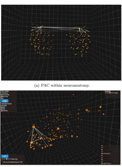
To better understand the concept of intrinsic geometry of the connectome, we can consider the Primary Auditory Cortex (PAC) which is a part of the auditory system and it performs basic and higher functions in hearing. Although PAC is located bilaterally, roughly at the upper sides of the temporal lobes quite far one from each other, it is strongly connected functionally and structurally. The PAC’s intrinsic geometric representation however, points out this highly interconnected relationship by redefining the geometry of the entire connectome. Representing strong interconnectedness by greater proximity to connected regions and vice versa. Figure 6 better shows this relationship.
(a) PAC within neuroanatomy.
(b) PAC within topological space.
Figure 6. Although Primary Auditory Cortex (PAC) is located bilaterally within the neuroanatomy (Figure a), it is strongly connected functionally and structurally. Thus, within
the topological space of the intrinsic geometry (Figure b), PAC regions are grouped together and the highly interconnected relationship is mapped in greater proximity.
CHAPTER 4
PREVIOUS WORK
How to visually represent graphs has been considered a very challenging and engaging problem among visualization researchers since the beginning of this relatively new discipline. The complexity of this problem pushed researchers to spend a considerable amount of time trying to find reasonable solutions. The final goal was to find visualization techniques able to provide as much information as possible as well as to avoid the potential visual clutter that may easily occur when displaying highly interconnected graphs. Firstly, this chapter aims at providing a simple review of the main techniques suggested in the literature. Secondly, it will examine and describe the main tools recently developed able to visualize connectome datasets. 4.1 Graph Visualization
The aim of this section is to provide a general overview about the problem of graph drawing taking the point of view of information visualization, that is, when the graphs are the crucial structural representation of the data (22). Graph visualization has been perceived as a very important visualization issue. Particularly, the size of a graph, that is, the number of nodes and edges is a key factor in the visualization and raises several challenging issues. In fact, when displaying very large networks usability may be limited and there is the potential of visual clutter. When it is the case, the readability of the data displayed is reduced making the visualization useless for a deeper comprehension of the dataset. In other words, the problem
that should be solved is the following: given a set of nodes and edges, how can we compute the position of nodes and edges in order to minimize the overlapping?
To that end, the academic literature has developed many techniques aiming at reducing the potential visual clutter and they can be classified: the first one tries to minimize to overlapping of nodes and links by optimizing the space that they cover, the second one tries to minimize occlusion by making use of distortion or, more in general, a different geometric space.
Among the first category, one of the most interesting example is represented by the force-directed layout introduced by Holtern et al. in (23). Within this work, the authors suggested to consider nodes as they are linked together by a spring. Given that, they apply the physical laws that rule this world by creating attracting or repulsing forces respectively. By applying this technique and by tuning the parameters carefully, people can reduce the overlapping problem remarkably as well as can control the spread of the graph itself. Of course, computing all the forces can be computationally expensive as the size of graph increases, however many optimizations on the computation of trajectories can be introduced such as the so called Velvet integration (24). Although nodes usually do not overlap since the repulsive force take them away one from each other, we can still witness crossing edges. A way to reduce this bad behavior is to introduce techniques such as confluent graph drawing. It reduces the visual clutter by allowing groups of edges to be merged and drawn together (25), especially edges ingoing or outgoing from the same node. A main drawback of this method is that every time the graph is displayed, the layout is different. Thus, users are confused when they look at the visualization since every
21
time they should spend some time to reorient themself. However, the force-directed layout is very often adopted and the advantages usually exceed the drawbacks.
Among the techniques that try to modify the space or the view we have on the graph, two main techniques emerged and, to the author’s knowledge, they are the most exploited so far. Particularly, they are the fish-eye distortion and the hyperbolic space.
Figure 7. This picture shows an example of fisheye effect applied at graphs visualization. Image has been taken from (1).
The fish-eye effect applied to graph visualization was introduced by Sarkar and Brown in (1; 26) and they proposed to reproduce the visual distortion obtained in photography with the so-called fisheye lenses which cause the barrel distortion to happen. In barrel distortion, image magnification decreases with distance from the optical axis. The actual visible effect
is that of an image which has been drawn on a sphere (or barrel). In other words, when the technique is applied to graph drawing, it consists in generating a view that magnifies the vertices of higher interest and at the same time it demagnifies the vertices of lower interest. By enabling this kind of interaction, users can focus on given area of the graphs being able to retrieve the information they need. Figure 7 shows an example of fisheye effect.
Following the same idea of distortion, the hyperbolic space has been widely adopted and it has been introduced in (2; 27; 28). This methodology aims to map the entire graph network to an hyperbolic space. In fact, this layout is computed by making use of the hyperbolic distances instead of the more familiar euclidean distance measure. The hyperbolic metric has been chosen in order to take advantage of the interesting property that this space has. More in details, the hyperbolic space has more room than our familiar euclidean space. Thus, it enables a more sparse visualization and limit the overlapping between nodes and edges. To make it clearer, if in the euclidean space two parallel lines are always at same distance, this is not the case in the hyperbolic space as it is shown in Figure 8. The more distant they are from the origin, the higher is the gap between the two lines. In that sense, the authors claimed that the hyperbolic space has more room than the euclidean space. Figure 9 shows an example of a graph depicted in the hyperbolic space.
One of the main advantage of applying the fisheye effect to the view is that the running al-gorithm is locally computed in real-time (only if needed) and a pre-processing phase to compute the exact position of each node is not required. However, the distortion may solve partially the
23
Figure 8. This picture shows two parallel lines drawn in the classical euclidean space (left) and in the hyperbolic space (right). Image taken from (2).
overlapping problem and it can be the case that nodes or edges are still overlapping although the fisheye effect is applied in a particular subregion.
4.2 Visualizing the Connectome
Many approaches to visualizing the connectome have been presented and, broadly speak-ing, three main types have emerged: node-link diagrams, matrix representations, and circular layouts. Particularly, three main tools have been analyzed and they are: the Connectome Vi-sualization Utility (29), the Brain Net Viewer (30), and the Connectome Viewer Toolkit (31). Although each of them is focused to visualize the connectome, they present different visual-ization techniques. In this section, a description and a comparison between the most popular visualization tools and techniques mentioned above are given as well as a discussion about the importance of virtual reality when visualizing complex datasets.
Figure 9. This picture shows a graph composed by 4000 nodes within an hyperbolic space. Image taken from (2).
4.2.1 Node-link diagrams
Node-link diagrams are one of the most used approach to represent graphs in general, and in particular to visualize the connectome. The node-link diagrams could be based on 3D rendering or in a simple and flat 2D view. Recent visualization softwares like Connectome Visualization Utility (29), Brain Net Viewer (30) and Connectome Viewer Toolkit (31) provide this kind of 3D visualization. Usually, the dimension of the nodes is bound to some graph-based metrics, like nodal strength or nodal degree, while the weight of the edges is displayed using different colors or by changing the diameter of the cylindrical link. Older studies on functional brain connectivity like the one proposed by Salvador et al. in (32), instead, show a plain flat 2D
25
node-link diagrams. Moreover, in this particular case, classical circular nodes are replaced by the name of the regions they stand for.
The main advantage of this approach is that it is possible to have a good overview of the entire graph and it is quite easy to understand which nodes are indirectly connected. With 3D rendering it is also possible to give a spatial information and the tools mentioned above usually locate the nodes following the real anatomical position. However, when the graph and the number of edges increase, the cleanness of the visualization is affected and the view becomes less engaging and less understandable. Nonetheless, despite the usage of different dimensions to display the weight of the edges, their representation is not the most intuitive one.
4.2.2 Matrix-based Representation
The other well-known approach in graph visualization is the matrix-based representation. With this kind of visualization, based on a squared matrix, each row and column represents a specific node of the network; each cell contains a value which describes the strength of the link. This value is usually encoded using a linear colormap scale. Among all the software surveyed the only two of them proposing this methodology are the Connectome Visualization Utility (29) and the Connectome Viewer Toolkit (31). The main advantage of this methodology is the clarity conserved when displaying information about relatively big graphs (more than 20-30 nodes). It is also effective the color encoding to display the weight of the links. However, this approach hides the information about the indirect connections there are between nodes. For this reason very often the matrix-based diagram and node-link diagram are combined together. A possible reason why only two tools proposed this approach is that experts do not want to lose the spatial information embedded natively in the dataset usually collected. Although in these tools it is possible to reorder columns and rows using the anatomical order or the alphabetical one, still it is very difficult to provide a more familiar and easy accessible context. Figure 10 shows a typical matrix-based visualization within the context of connectome visualization tools. 4.2.3 Connectograms
A quite innovative representation is the one very often addressed as circle view or connec-tograms. This kind of view was firstly introduced by Irimia et al. in (33) in 2012. A circle view has been also re-proposed in the Connectome Visualization Utility (29) two years later. With circle view, all the regions are displayed along a circle and the interconnections are rep-resented as edges that go from region to another inside the circle. Quite effective is the usage
27
of transparency to represent the weight of the edges in (33). The transparency reduces the visual disorder and attract the user attention only on strong links, while weak edges fade into the background smoothly. Moreover, connectograms can contain more than one nested circles showing different sources of information. As an example, the outermost circle may represent the cortical parcellations, while the other innermost circles could stand for an ”heat map” which displays different structural measures associated with the corresponding region.
(a) Connectome Visualization Uitlity (b) Irimia et al. (33)
Figure 11. This figure shows two examples of connectograms. In Figure (b), it is worth noticing the usage of different degrees of transparency to visually encode the strength of links
between regions.
The Connectome Visualization Utility allows two ways of organizing the position of the regions. In fact, it is possible to order them according to their names (alphabetically) or according to the real anatomical position in the brain.
This approach is quite effective and clear even with the increase of the number of edges and nodes. Still, the heat maps can be ineffective especially when the number of nodes becomes higher. The main drawback of this technique is the static nature of the visualization. At the moment the author is writing, there are no implemented examples of dynamic and interactive connectograms. Figure 11 depicts two examples of static connectograms.
4.3 Virtual Reality Environment
Since the advent of Virtual Reality (VR) technology, VR-based systems have been used for visualizing empirical datasets (34). Moreover, modern VR tools have provided valid alternative ways to navigate and explore complex datasets effectively. For example, Ware et al. evaluates the effectiveness of 3D graph visualization when high resolution stereoscopic displays are de-ployed (35). More recently, Forbes et al. present a stereoscopic system to visualize temporal data of the brain activity when the brain itself is excited by external stimuli (36). This work provides new interesting insights when dealing with the temporal dimension in a 3D environ-ment. Broadly speaking, multi-purpose immersive VR settings, such as the CAVE2 (37), enable a more attractive and effective exploration of complex datasets.
The effectiveness of utilizing 3D for representing data has been debated (38) deeply and Munzner suggests to find strong motivations to support a 3D design. Many different studies such as the one proposed by St. John in (39) shows that a 3D environment can introduce different biases in the visualization. Very simply, the dimensions are not linearly scaled in depth due to the perspective rule. This concept is not understood completely by our perception who tends to think every dimension linearly scaled. Thus, when users are asked to compare lengths
29
usually fail when the comparison involves objects in planar and depth dimension. However, a very recent work by Alper et al. (40) has shown that in some situations visualizing 3D networks can outperform 2D static visualization, especially when considering complex tasks. So, the effectiveness of a 3D environment is still debated, but as a good rule of thumb 3D space should be avoided unless the depth dimension is particularly needed by the context. To the best of the author’s knowledge, BRAINtrinsic presents the first dynamic and interactive VR-compatible visualization platform for connectome representation and exploration.
4.4 Discussion
Each of the tools mentioned and the approaches they adopted to representing the connec-tome have their own strengths and weaknesses. A main drawback of each of them is their static nature. As far as the author knows, there are no effective tools that enable a user to interactively investigate the intrinsic geometry of connectome dataset, and none that allow a user to apply and visualize complex transformations to connectome datasets.
MAIN TASKS
This chapter describes the main tasks that the visual analytics tool should satisfy. All the requirements presented here are the result of a close and intense collaboration with a group of psychiatrists. Specifically, I worked with the research group leaded by professor Alex Leow and by professor Olusola Ajilore, both belonging to the department of Psychiatry at University of Illinois at Chicago. Thus, the requirements elicitation has been an important and taught phase of the work. All the requisites reported here have been collected in a first approaching phase as well as in a daily-based collaboration with neuroscientists through all the steps of the development.
Broadly speaking, visual analysis tasks are an important component of research in scientific and medical domains that make use of neuroimaging. It emerged that a cardinal rule amongst neuroimaging researchers is to “always inspect your data visually” (41). As it is reported by Alper et al. in (42) there are many directions to which a deeper comprehension of the connectome can be useful. The set of possible goals/tasks they proposed is as follows:
• Identify network structures that are responsible for a specific cognitive function; • Identify effects of anatomical structure on functional connectivity;
• Identify alterations in brain connectivity;
31
• Identify the existence or the loss of patterns in brain connectivity that are associated with anomalous conditions;
• Identify deviation of an individual’s connectivity from a population mean; • Analyze the effective brain parcellation and multimodal connectivity; • Identify effects of local injury.
This list points out a wide set of main possible tasks that neuroimagers may want to perform on connectome datasets in order to gain more accurate knowledge and a profound comprehension of the dynamics of the human brain. Given this set of possible actions and by specializing our analysis to the context we are considering, tasks relevant to the visualization of connectome data can be said to fall into three main areas: exploration, comparison, and identification. These concepts are detailed more accurately in the following sections.
5.1 Exploration
Due to the high complexity of the human connectome, simply being able to explore the data to support ”sensemaking” is a fundamental task. However, a researcher typically has a well defined assumption about the contents of their data and a clear idea about which aspects of the data he or she wants to explore. Effective exploration involves being able to find relevant information quickly, filtering the data in order to identify patterns, to assist in the generation of new hypotheses, or to confirm or to invalidate expected results.
5.2 Comparison
At the same time, researchers often need to examine multiple datasets in order to com-pare the structure or activity of one region of a brain with another, or to comcom-pare different
populations or experimental conditions. For example, a psychiatric researcher could be inter-ested in understanding the differences between the functional connectivity of healthy people of control versus depressed participants. This way of testing medical experiments is the typical scheme medical doctors follow to understand if there are statistically relevant group effect on a particular aspect. Both groups are subjected to the same protocols or exams and the results are averaged, compared and statistically validated. It had been shown that individuals with depression show a higher functional connectivity between the regions within the Default Mode Network (DMN) than in healthy controls (43). In the DMN, fMRI tests are performed on patients when no external stimuli are given to the patient. Being able to visually distinguish details about the different activity levels within specific brain regions is necessary to support a deeper understanding of these pathologies, as well as to verify experimental results and to enable the generation of new hypotheses. To sum up, the comparison task is essential for neu-roimagers to find, understand and support possible meaningful differences between different groups of patients. The visualization is the easiest and fastest way for such an appreciation. 5.3 Identification
Neuroimagers may also need to identify the importance of regions that can be directly or indirectly affected by damage to the brain, such as in the case of traumatic brain injury (44). It is also important to understand the structural and functional implications of neurosurgical interventions such as temporal lobotomy (45), or as a predictive measure towards behavioral therapy outcomes for use in aphasia treatment (46; 47). Lastly, experts are interested in identi-fying culpable regions when investigating neuro-degenerative diseases and neuro-psychological
33
disorders such as Alzheimer’s (48; 49) and schizophrenia (50) among several others. Experts argue that having both neuroanatomical and intrinsic structure/function topological represen-tations allows researchers to more comprehensively address these complex issues.
5.4 Discussion
The three main tasks described in previous sections drove all the development process. These components broadly explore the main activities and goals neuroimagers want to achieve by making use of the visualization tool that it is going to be detailed. The requirements elicitation activity tried to be as much impartial as possible. Although the main goal of this work is to develop an application fitting the neuroimagers specific requirements, the application aims at being as general as possible to enable possible reuse in different domains.
BRAINTRINSIC APPLICATION
This chapter provides a description of the BRAINtrinsic application for exploring the in-trinsic geometry of the human brain connectome, both in terms of the visual design choices taken as well as of the main functionality provided with.
6.1 Design Decisions: Visual Encodings
The visual design choices have been driven by the the close interaction with the psychiatrist group the author was working with. Thus, each of the main design decisions are influenced by the need to effectively enable the domain tasks delineated in the previous chapter. The primary layout for the application is a 3D node-link diagram, motivated by the interest of researchers in understanding the brain’s intrinsic geometry. As a matter of fact, the position of each region in the topological space is highly relevant in this context. Although many visualization researchers have noted some potential pitfalls in making use of 3D representations for visual analysis tasks, the importance of being able to compare the anatomical geometry with the different intrinsic geometries necessitates this layout. When viewing the intrinsic geometry, the individual nodes represent different brain regions and are represented with circular glyphs, while edges representing a functional or a structural connection between these regions are displayed using lines depending on the kind of dataset loaded in the system.
35
A main concern with the use of node-link diagrams is the potential for visual clutter when displaying a highly interconnected graph, such as the human brain connectome. To overcome this possible obstacle, instead of showing all the connections simultaneously, by default BRAIN-trinsic only shows nodes, hiding all links unless explicitly required. Through interaction, users are able to display or hide connections according to their preferences and current needs. By going over a region with the mouse, the user is able to see the connections that start from the pointed node. By implementing this functionality, neuroimagers are able to understand very quickly whether the region selected is interesting to their goal. Additionally, the user can pin the connections in the scene just by clicking on the node itself if he is interested in keeping the sub-network highlighted for a more detailed exploration. If he is not interested, all the connections just disappear when the mouse is not pointing the region selected.
I refer to the implementation described in the previous paragraph as edges-on-demand tech-nique. It allows exploration tasks to be performed by showing only the connections starting from a specific region that is currently being interrogated. In fact, it helps neuroimagers to perform the exploration task very quickly. This feature is very important especially in this context where the domain is quite innovative and sometimes experts do not know what they are looking for a priori.
As said previously when detailing the connectome domain, weighted graphs describe the connections of the connectome. Thus, finding a way to visualize effectively the edge weights was of primarily importance and it was necessary not to hide this piece of information. In particular, BRAINtrinsic uses varying degrees of transparency to visually encode the strength
of edge weights. Stronger connections are then represented using opaque lines, while weaker edges are more transparent. Transparency is scaled relative to only the currently displayed edges. The reason why this channel has been chosen relies on the fact that stronger links literally pop out the screen, while weaker ones fade away in the background.
Information about which hemisphere a node belongs to can be meaningful for particular tasks. Being able to understand quickly whether or not global right/left symmetric patterns are still present in the intrinsic geometry also helps the domain experts by providing an anatomical reference during the exploration of the intrinsic geometry. We represent nodes from hemispheres using two different glyphs, circular and toroidal. The choice of using a circular and toroidal glyphs aims at maximizing the difference between the two. Thanks to this choice, users are able to recognize the two different glyphs also when they are looking at the entire connectome, that is, from a distant point of view. Making use of two full glyphs would have made this observation more difficult to be conducted. This visual encoding provides users with a more familiar context and it is extremely important because it helps neuroimagers not to get lost when navigating the connectome in the topological space.
Colors are used to highlight the neuroanatomical membership of each node in the brain. In our application, each glyph belongs to one of the 82 neuroanatomical regions as defined by Freesurfer (51). However, the data structure is flexible enough to accept any membership or affiliation structure. Currently, these affiliations are hard-coded by default, but BRAINtrinsic has the ability to compute affiliations on the fly according to specific graph metrics.
37
BRAINtrinsic allows the user to use fine-grained tools in order to highlight very specific sub-graphs. To that end, BRAINtrinsic implements two main filters that users can tune to obtain the most relevant visualization. As for now, links can be filtered out according their weight in two main ways. The user can:
• choose the minimum weight that links should have to be displayed;
• select the maximum number of links that should be visualized when interrogating a node;
With the second feature, all the links starting from the interrogated node are sorted according to their weight and only the top-n edges are visualized.
Moreover, being able to select regions is also important. Since the number of nodes displayed could affect the visual clutter of the display, we let the user choose whether to display or not groups of nodes depending on their affiliations. As for now, users can dynamically select group of regions to be displayed according to their color affiliations. Particularly, nodes can be displayed in three different ways:
• Fully visible; • Semi-transparent; • Fully hided;
While in the first two modalities it is possible to see all the incoming and outgoing edges, when a set of nodes is hided, all the connections going through those nodes are always hided. Thus, neuroimagers can choose to view the connections only within a particular sub-graph that is
relevant for a particular task and can explore only the regions that are strictly relevant to their research goals.
Figure 12 shows the main view of BRAINtrinsic. On the upper left a simple menu allows users to choose the way nodes are grouped (color encodings) and the topological space in which we visualize connectome data. On the upper right a slider sets the minimum edge weights for an edge to be visible. On the bottom left the name of the node selected and its nodal strength are showed. We also allow users to change the size of the glyphs and to hide/show the 3D grid in the background. On the lower right, a figure legend mapping each color to its neuroanatomical label is shown. The connectome visualization is displayed at the center of the scene.
Figure 13 presents both the structural and the functional connectome represented in both the neuroanatomy space and the topological space. The shape of the connectomes differs in a very significant way. Such an appreciation can be better understood when looking at Figure 14, Figure 15, Figure 16.
6.2 Analytics Features
BRAINtrinsic implements some analytics feature tools in order to allow neuroexperts a more complete analysis and exploration of the connectome datasets, based on quantitive parameters. More specifically, BRAINtrinsic allows to:
• compute the shortest path tree given a root node
• filter the shortest path according to two different measures • compute the nodal strength on the fly
39
Figure 12. BIGEexplore: main view
To create the shortest path tree, BRAINtrinsic makes use of Dijkstra’s algorithm (52). Specifically in structural connectomes, since the adjacency matrix defines the number of recon-structed white matter tracts connecting two regions, the edge length is set to the inverse of
Figure 13. This figure visualizes the intrinsic geometry of the tractography-derived structural and the resting-state fMRI connectome (middle and right panel, respectively), as well as the
locations of rich-club regions in these spaces (second row). For comparison, their corresponding locations in the original neuroanatomical space are also shown (left panel).
the fiber count (the higher the number of tracts, the more coupled two nodes are and thus the shorter their distance is). From a mathematical point of view:
d(i, j) = 1 wij
(6.1)
where d(i, y) is the distance between node i and node j and wij is the weight of the edge which links i and j contained in the adjacency matrix. This is a novel feature for a connectome viewer tool; at the time of this writing, no tools provide this functionality. The user can filter the shortest path tree according to two different measures: graph distance and number
41
(a) Front View (b) Lateral View
Figure 14. MDS Space
of intermediate nodes or “hops.” In the first case the user can filter the tree according to the relative distance with respect to its farthest node. Given a threshold t, all the nodes that satisfy the following inequality are drawn:
d(r, i) ≤ maxDistance(r) · t 0 ≤ t ≤ 1 (6.2)
where r is the root node, i is the node considered, maxDistance(r) is the distance between the root node and the farthest node, and t is the threshold chosen by the user. If t = 0 then only the root node is displayed, while if t = 1 the entire shortest path tree is drawn. In the latter case, the user is able to filter out nodes that are not reachable within a certain number of nodes from the root.
(a) Front View (b) Lateral View
Figure 15. Isomap Space
(a) Front View
(b) Lateral View
43
According to the psychiatrist group, the shortest route between nodes is relevant as well. This feature enables the user to select two specific nodes in order to show the shortest path between them. In this case, the tool displays all the nodes in the network to provide the overall context of this sub-graph.
A main feature of BRAINtrinsic is the ability to switch between geometries. The application provides a menu to select the space to explore. Switching between geometries can be done with just one click, allowing the users to see how the connectome data appears embedded in different topological spaces. Being able to perform this task very quickly allows experts to go back and forth between the different spaces. It is worth noticing that once the user selects a subgraph in a particular space, the same selected nodes are highlighted in the different embeddings. As an example, a neuroimager can select regions in the anatomical space he is more familiar with and then see how the selected network changes within the different spaces.
Nodal strength is a graph-based metric which defines the centrality of a node. The nodal strength is defined as follows:
nodalstrengthi = N X
j=0
wij (6.3)
where N is the number of nodes in the graph and wij is the weight of the link between i and j (14). This graph-based metric helps experts to understand the relevance of a node in the network. This value is presented in a numerical label that appears when a node is interacted with; the user can filter out nodes below a particular threshold according to this measure.
6.3 System Details
BRAINtrinsic is written in Javascript using the threejs library,1 an open source wrapper for the hardware accelerated graphics functionality provided by WebGL.2 The choice of using a web-based technology was due to overcome the lack of portability the tools analyzed in the related work chapter suffer from. The web-based nature of BRAINtrinsic allows such a portability needed to be available as well as allows users to easily use the tool, avoiding any kind of installation phase. BRAINtrinsic also provides a ”loading page” so that experts can very quickly upload their data and exploit all the functionality developed in the tool.
To enhance the performances of the tool proposed, a billboarding technique has been used (53). The billboarding technique consists in rendering 2D glyphs instead of 3D ones without loosing the 3D perception. On a frame base, the 2D glyphs are re-oriented to face the camera and, by doing this, the user perceives the glyphs as 3D ones, although it is note case. Secondly, the other main advantage is possible to have when adopting this technique is to let the user always appreciate the differences between the glyphs chosen. In fact, independently of the camera orientation, users can always appreciate the toroidal shape since all the glyphs always appear in front of the camera (the user’s point of view).
From an architectural point view, BRAINtrinsic is mainly build on three different modules as follows:
1http://threejs.org 2http://webgl.com
45
• Data Module; • Graphic Module; • Analytical Module;
The data module has been designed to handle and to manage the data that are uploaded in the system. The data parsing operation and the allocation in memory are performed in this module. The graphic module gathers data from the previous one and creates the visualization itself and displays the data to the user. Actions such as the billboarding technique are executed at this stage. Finally, the analytical module implements all the analytical features described above. For example, the computation of the shortest path as well as the computation of nodal strength can be found at this stage.
BRAINtrinsic was designed to be fully compatible within a virtual reality environment. The initial investigations lead the author to believe that a more interactive and engaging immersive environment could help neuroimagers to understand connectome datasets more deeply and more effectively. For this reason, BRAINtrinsic can also be used with the Oculus Rift device.1 To make BRAINtrinsic Oculus Rift-compatible and, generally speaking, with every Head Mounted Display (HMD), the stereoscopic technique is exploited. To this end, once the position of each object in the scene is computed, the scene itself is rendered using two different points of view (also referred to as camera). The two cameras from which the scene is depicted represent the point of view of the human eyes. The two scenes created are then sent to the HDM device,
which in turn automatically dispatches the two images to the right and left screen. By creating two unique and coherent images of the same scene, it is possible to emulate the way human eyes perceive the real world, being able to create a natural and pleasant navigation for the user. The code developed is open source and publicly available at the author’s code repository 1.
1
CHAPTER 7
BUILDING THE INTRINSIC GEOMETRY AND CASE STUDIES
This chapter gives some detail on data acquisition and intrinsic geometry construction and then presents real-world case studies for both the functional and the structural connectome. The aim is to validate the usefulness of BRAINtrinsic and showcase what kind of analysis can be performed by means of the tool itself as well as its usefulness in the medical research and practice. The following examples make use of real data previously anonymized and aggregated. A first example deals with the structural connectome and aims at showing the relevance of graph-based metrics (such as the rich-club property which will be described later) in the context of the human brain’s connectome. To understand its relevance, many different simulated lesions were performed and visually compared.
Secondly, an example about the functional connectome is detailed. Particularly, it is shown how neuroimagers could easily compare the functional connectomes of both healthy and de-pressed participants. Through the exploration of these two datasets, interesting differences in the shape of the two connectomes emerged. A plausible explanation is provided as well. 7.1 Data Acquisition and Intrinsic Geometry Reconstruction
The data we used for the development of BRAINtrinsic were collected from 46 healthy control subjects (HC, mean age: 59.7±14.6, 20 males). The study was approved by the In-stitutional Review Board of the University of Illinois at Chicago and conducted in accordance