UNIVERSITÀ DEGLI STUDI
ROMA
TRE
Roma Tre University
Ph.D. in Computer Science and Engineering
Dynamic Visualization of Service
Performance and Routing on the
Internet
Claudio Squarcella
XXVI cycle
Candidate: Claudio Squarcella
Advisor: Prof. Giuseppe Di Battista
i i
“main” — 2014/4/27 — 19:37 — page ii — #2
i i
Dynamic Visualization of Service Performance and Routing on
the Internet
A thesis presented by Claudio Squarcella
in partial fulfillment of the requirements for the degree of Doctor of Philosophy
in Computer Science and Engineering Roma Tre University
Dept. of Engineering June 2014
i i “main” — 2014/4/27 — 19:37 — page iv — #4 i i Committee:
Prof. Giuseppe Di Battista Reviewers:
Prof. Ulrik Brandes Prof. Antonios Symvonis
Les trois quarts du mal des gens intelligents viennent de leur intelligence.
i i
“main” — 2014/4/27 — 19:37 — page vi — #6
i i
Acknowledgments
I would like to thank my advisor, Giuseppe Di Battista, for his continued support during these years. It all started back in 2009, when he proposed me to complete the work for my Master’s thesis in Amsterdam. Since then he inspired me with his brilliance, discipline, patience, clarity, and humility.
I extend my gratitude to Maurizio Patrignani, Maurizio Pizzonia, and all the past and current members of the Compunet Research Group at Roma Tre University that I had the pleasure to meet and engage in fruitful research ac-tivity during the past three years: Patrizio Angelini, Massimo Candela, Marco Chiesa, Luca Cittadini, Giordano Da Lozzo, Marco Di Bartolomeo, Valentino Di Donato, Fabrizio Frati, Gabriele Lospoto, Bernardo Palazzi, Marco Pas-sariello, Massimo Rimondini, Vincenzo Roselli, Giorgio Sadolfo, and Stefano Vissicchio.
I am grateful to folks at the RIPE NCC in Amsterdam and at the Microsoft Skype Division in Tallinn for opening their doors and exposing me to challeng-ing and addictive real-world problems that deeply inspired a big portion of my research activity and helped me find a balance between theory and practice.
I thank all my co-authors from universities and organizations around the world for sharing their ideas and supporting mine: Emile Aben, Lukas Barth, Till Bruckdorfer, Kimberly C. Claffy, Alberto Dainotti, Sara Irina Fabrikant, Michael Kaufmann, Stephen Kobourov, Anna Lubiw, Tamara Mchedlidze, Wolfgang Nagele, Martin N¨ollenburg, Yoshio Okamoto, Antonio Pescap´e, Sergey Pupyrev, Michele Russo, Torsten Ueckerdt, and Alexander Wolff.
I warmly thank the reviewers of this thesis, Ulrik Brandes and Antonios Symvonis, for their precious work.
Finally, and most importantly, I thank my loved ones. Thank you for all you did in good and bad times.
i i
“main” — 2014/4/27 — 19:37 — page viii — #8
i i
Contents
Contents viii 1 Introduction 1I
Preliminaries
7
2 Visualization of Graphs and Networks 9
2.1 Graph Theory: Basic Definitions . . . 9
2.2 Graph Drawing and Network Visualization . . . 10
3 Our Reference Scenario: Computer Networks 13 3.1 Networks, Protocols, and Tools . . . 13
3.2 Organizations and Datasets . . . 16
II Visualizing Service Performance
19
4 Exploring Flow Metrics in Dense Geographical Networks 21 4.1 Introduction . . . 214.2 Related Work . . . 22
4.3 Data Abstraction . . . 23
4.4 Interface and Interaction Design . . . 25
4.5 Evaluation . . . 31
4.6 Algorithms and Technical Details . . . 34
4.7 Conclusions and Future Work . . . 35 5 Monitoring the Load of an Anycast Root Name Server 37
CONTENTS ix
5.1 Introduction . . . 37
5.2 User Requirements . . . 38
5.3 Defining a Suitable Metaphor . . . 41
5.4 User Feedback . . . 45
5.5 Algorithms . . . 48
5.6 Technical Details . . . 55
5.7 Related Work . . . 58
5.8 Conclusions and Future Work . . . 59
III Visualizing Internet Routing
61
6 Designing a Web-based Framework for the Visualization of Inter-domain Routing Events 63 6.1 Introduction . . . 636.2 Related Work . . . 64
6.3 User Requirements and Interface Design . . . 66
6.4 Visualizing Internet Outages Caused by Censorship . . . 70
6.5 Technical and Algorithmic Details . . . 72
6.6 Conclusions and Future Work . . . 74
7 Dynamic Visualization of Traceroutes at Multiple Abstrac-tion Levels 75 7.1 Introduction and State of the Art . . . 75
7.2 Metaphor and User Interaction . . . 77
7.3 Algorithms . . . 82
7.4 Technical Details . . . 87
7.5 Conclusions and Future Work . . . 88
IV Mixing Up
89
8 Automating the Analysis of the Impact of Routing Changes on Round-trip Delay 91 8.1 Introduction . . . 91 8.2 Related Work . . . 92 8.3 Methodology . . . 93 8.4 Experimental Results . . . 97 8.5 Analyses . . . 101i i “main” — 2014/4/27 — 19:37 — page x — #10 i i x CONTENTS
8.6 Conclusions and Future Work . . . 106
9 Visualizing the Correlation between Inter-domain Routing Changes and Active Probing 107 9.1 Introduction and State of the Art . . . 107
9.2 Requirements and Interface Design . . . 109
9.3 Algorithms and Technical Details . . . 113
9.4 Conclusions and Future Work . . . 116
V Publications and Bibliography
117
10 Other Research Activities 119 10.1 Analysis of Country-wide Internet Outages caused by Censorship 119 10.2 Universal Point Sets for Classes of Planar Graphs . . . 12010.3 Area Requirements of Euclidean Minimum Spanning Trees . . . 120
10.4 Semantic Word Cloud Representations . . . 121
11 Publications 123
Chapter 1
Introduction
The Internet has become a crucial tool in many activities of everyday life. These range from social and recreational efforts to critical tasks dealing with health, science, money, and politics. All such activities are supported by In-ternet services that grow at a fast pace to serve the needs of users from all over the world. The size of networks and customer bases is indeed exploding with the help of new technologies, e.g. mobile data connections. Given the distributed and decentralized nature of the Internet, all services are exposed to a number of potential technical issues: router disconnections, changes in routing policies between Internet service providers, network attacks, and other unexpected events. The goal of guaranteeing an acceptable quality of service for global users therefore implies the adoption of prompt countermeasures in case of failing portions of the network, as well as long-term planning for the progressive improvement of the service.
It is relatively easy to collect huge quantities of data that contain key in-dicators on the performance and reliability of a distributed system. However, the real challenge consists in interpreting data and using it for actual decisions. The visualization of the Internet is therefore becoming a crucial research topic for many stakeholders. A dynamic, interactive interface can make the differ-ence and unveil the potential of so called “big data”. We identify three main actors that help us shape the main requirements to address: network engineers, managers, and researchers.
First of all, network engineers need powerful tools to support the mainte-nance and monitoring of complex and heterogeneous networks. In particular, it is crucial to promptly react to unexpected failures or technical problems,
es-i i “main” — 2014/4/27 — 19:37 — page 2 — #12 i i 2 CHAPTER 1. INTRODUCTION
pecially when these may result in the disruption of critical, real-time Internet services. It is therefore essential to build graphical interfaces that can fill the gap for more efficient network administration and troubleshooting.
Further, the analysis of long-term trends on the Internet is equally impor-tant at the management level. Managers and policy makers are eager to use dashboards that simplify the analysis of big quantities of data collected over extended periods of time. These interfaces should allow to build hypotheses for major decisions, including architectural redesign and service improvement. Note that the focus is shifted from near real-time and targeted monitoring to a multifaceted and intuitive exploration of aggregate, historical data.
Finally, the observation of the Internet phenomenon is relevant from a purely scientific point of view. New research activity can find inspiration from the usage of interactive tools that reveal meaningful patterns or unexpected be-havior. Visualization becomes the bridge for “serendipitous” discoveries that pave the way for innovation in crucial aspects of the Internet.
The first aspect to take into account when designing network visualiza-tion tools consists in guaranteeing that the expectavisualiza-tions of prospective users are met. The requirements should be collected at the beginning and verified throughout the design process. The metaphors used for the interface and the available interactions should be carefully tested with prospective users, ideally in real-world scenarios. In case the output of the design process consists of more than one alternative, a good option is to let the users compare different alternatives weighting their strengths and weaknesses.
The drawing algorithms that constitute the main building blocks of the proposed solutions are also a crucial topic to address. Several techniques for the efficient representation of evolving graphs and networks are available in lit-erature, as well as results detailing the limited tractability of specific problems. A mature network visualization framework should strive for a perfect balance between the beauty of theoretical algorithmic solutions and the constraints imposed by user requirements. For example, a real-time graph visualization system should rely on optimized layout algorithms, whereas an interactive in-terface should be responsive and therefore the computation time needed to update the visualization should be negligible.
Last but not least, technical issues are equally important when designing any kind of software. This holds in particular for data-driven visualizations with a focus on user interaction. The Web is a perfect target platform for the development of powerful graphical tools. However, it is filled with different standards, frameworks, and design patterns that evolve at a very fast pace together with the underlying technologies. Each visualization system should
3
be designed keeping in mind the different alternatives, in order to meet as many non-functional requirements as possible. Efficiency is often the most important of such requirements, especially when dealing with large datasets or highly responsive interfaces. Cross-browser compatibility is also a recurring issue that every Web developer needs to take into account. Reliability and testability are requirements proper of standard software development that are becoming more and more crucial for Web applications. Finally, it is preferable to use frameworks that allow to build scalable and reusable components, in particular when the reference scenario is narrow and well established.
In this thesis we present several approaches to the problem of visualizing Internet service performance and routing data. We first consider them as two independent topics, proposing interactive tools for both. In a second phase, we introduce the possibility to correlate datasets of both types in order to obtain a combined visualization. All the proposed approaches are preceded by an infor-mative description of the context in which the visualization is needed and the tasks that prospective users would need to perform when using the tool. Design decisions are then illustrated and motivated based on user requirements. The algorithms used for the visualization and animation of graphs and networks are described thoroughly, in particular when they clearly improve on alterna-tives found in the literature. Technological aspects are always mentioned and highlighted when they represent a key quality of the work. Where available, user studies and feedback collected during the development are reported and discussed. Finally, given the interactive and dynamic nature of our work, we provide the reader with support material (animations, videos, images) accessi-ble through the Web.
Part I introduces the reader to key definitions and concepts that are essen-tial to the understanding of the following chapters.
Chapter 2 is focused on the general field of graph drawing and information visualization applied to networks. We start with preliminary notions on graphs and related data structures. We follow up with an introduction to the problem of visualizing graphs under specific constraints and aesthetic criteria. Fur-ther, we briefly present standard algorithmic approaches for the computation of graph layouts that are relevant to our work.
Chapter 3 contains a brief introduction to the real-world scenario under investigation, i.e. the Internet. First, the general notion of “computer network” is explored, with the main entities composing it and the protocols that regulate the transmission of information between endpoints. A few network diagnostic tools that are crucial to our work are briefly mentioned. Finally, the focus is shifted towards a small number of organizations that have a crucial role in the
i i “main” — 2014/4/27 — 19:37 — page 4 — #14 i i 4 CHAPTER 1. INTRODUCTION
analysis of the Internet and publish their datasets on the Web.
Part II deals with visualization metaphors conceived to monitor the perfor-mance of Internet services. We tackle the question from two different perspec-tives. First, we observe performance metrics observed in the communication between pairs of hosts in a dense geographical network. Secondly, we focus on the traffic load experienced by the servers of a distributed service and its evolution over time.
In Chapter 4 we tackle the problem of exploring the traffic flow in dense ge-ographical networks where links between nodes are characterized by multiple, time-labeled quantitative metrics. We presentFlowcliqr, a prototype frame-work that allows to interactively visualize arbitrarily huge datasets by means of a dual visualization based on a matrix and a geographical map. Users are presented with a concise visualization in which all the information is aggregated at the coarsest level (i.e., macro-regions of the world). By means of intuitive interaction steps, it is possible to explore the flow between specific geograph-ical regions, allowing to distinguish patterns and build initial hypotheses on the underlying data. We evaluate our work with a qualitative study conducted with prospective users and give details on the algorithmic and technical aspects of the framework.
Chapter 5 presents Visual-K, a near real-time monitoring system for the K-root name server, one of 13 root name servers in the world. Given their crucial importance these name servers are “anycast”, i.e. their service is of-fered through many identical replicas (or instances) distributed geographically to cover the needs of millions of clients. Visual-K helps network operators monitor how the traffic load is distributed amongst all available instances, fo-cusing on unexpected migrations of clients between instances. We propose two different visualization metaphors that are well-suited for the scope, both based on the visualization of a graph in the form of a geographical map. We let prospective users compare them highlighting strengths and weaknesses of both. We also insist on the algorithms needed to dynamically update the two types of visualization. Finally, we report the challenges of dealing with data coming from a distributed cluster of servers in near real-time.
Part III is focused on the exploration of Internet routing and its effect on network topology. In particular, this can be achieved by either probing the Internet with active measurements or directly accessing the control information available at one or more routers. We show examples of visualization based on both approaches.
Chapter 6 is dedicated toBGPlay.js, a Web-based framework designed for the visualization of evolving routing graphs. It improves over its acclaimed
pre-5
decessor, BGPlay, used by network operators to visualize inter-domain routing updates concerning the Internet reachability of specific IP prefixes over ex-tended periods of time. BGPlay.js brings a fresh and renovated implementa-tion that is based on modern Web technologies. The interface is enhanced with advanced controls that help users pinpoint individual routing events. Further, our framework can be easily reused to build new tools for the visualization of graphs and network that evolve over time. We detail all the new requirements collected with the help of experienced users of BGPlay, and explain how our new design addresses them. We also prove the effectiveness of our tool borrow-ing a use case from a recent research activity on country-wide Internet outages caused by censorship. Finally, given the nature of the framework, we explain in detail the technical and algorithmic aspects of our work.
Chapter 7 deals with the visualization of router paths originated with the traceroute command, i.e. a network utility that allows to discover how a com-puter connected to the Internet reaches a certain target. We presentTPlay, a tool for the dynamic visualization of traceroutes at multiple abstraction levels. It gives the user a high-level, hierarchical overview of how a portion of the Internet is connected to a specified target, and allows to interactively expand specific subnetworks to reveal greater details on how the traffic is routed inside them. TPlay is based on BGPlay.js, proving the great degree of abstraction and reusability of the framework in Chapter 6. We describe in great detail the algorithms that allow to efficiently compute the initial drawing as well as the updated views, in response to user interaction. The technical side is also explored, with a focus on the implementation of the layout algorithms.
Part IV represents a meeting point between Parts II and III. The focus is on the combined visualization of the correlation between active measurements (e.g. the output of the ping network diagnostic tool) and routing information. In Chapter 8 we present a methodology to automatically assess the impact of inter-domain routing changes on the round-trip delay measured to reach spe-cific targets on the Internet. Such effort is motivated by the growing number of Internet services that are characterized by strict performance requirements. Therefore it becomes crucial to constantly monitor the performance of the network, as well as to analyze recurring routing behaviors for long-term im-provements (e.g. changes in the agreements with Internet service providers). We detail a matching methodology that helps us identify correlations between routing updates and variations in the measured performance. We also present experiments to validate our methodology and post-hoc analysis on the quanti-tative impact of routing changes on round-trip delay.
i i “main” — 2014/4/27 — 19:37 — page 6 — #16 i i 6 CHAPTER 1. INTRODUCTION
exploit the concepts and results presented in Chapter 8. Our goal consists in graphically exploring the correlation between active Internet measurements and inter-domain routing information, driven by the same requirements of near real-time monitoring and long-term strategic planning. We detail the specific user needs and the corresponding interface design, based on a mixed geographical and abstract metaphor. Further, we introduce the reader to the algorithmic challenges that we faced and the adopted solutions. Finally, technical aspects of the implemented prototype are briefly explored.
Part V contains further research work and a list of articles, papers and technical reports that were completed during the Doctorate Program.
Chapter 10 focuses on additional research activity that has little or no overlap with the network visualization topics presented in Parts II, III and IV, but still gave rise to interesting results and publications.
Chapter 11 concludes our work with a list of journal articles, conference papers, and technical reports that were published (or accepted for publication) during the past three years. Each publication is the tangible result of a research topic explored in one of the previous chapters of the thesis.
Part I
i i
“main” — 2014/4/27 — 19:37 — page 8 — #18
i i
Chapter 2
Visualization of Graphs and
Networks
We start by giving an overview on basic definitions and entities in graph theory, followed by an introduction to graph drawing and network visualization. The reader can refer to more advanced literature (see, e.g., [DETT98]) for further information.
2.1
Graph Theory: Basic Definitions
A graph G = (V, E) is a structure composed of a set V of vertices (or nodes) and a multiset E of unordered pairs of vertices called edges (or arcs). A graph is said to be directed if the pairs of vertices in E are ordered. Given an edge e = (u, v) ∈ E, we say that u and v are incident to e and that e is incident to u and v. Two vertices are adjacent if they are incident to a common edge. Two edges are adjacent if they are incident to the same vertex.
Given a graph G = (V, E), a self loop is an edge (u, u)∈ E, while a set of multiple edges is a set of edges incident to the same pair of vertices u, v ∈ V . A graph without self loops or multiple edges is called simple. Unless otherwise specified, in the following we assume all given graphs are simple.
A graph G = (V, E) is complete if there is an edge (u, v)∈ E for each pair of vertices u, v∈ V . A graph G0= (V0, E0) is a subgraph of a graph G = (V, E) if V0⊆ V and E0 ⊆ E. The degree of a vertex is the number of edges incident to it. The degree of a graph is the maximum among the degrees of its vertices.
i i
“main” — 2014/4/27 — 19:37 — page 10 — #20
i i
10 CHAPTER 2. VISUALIZATION OF GRAPHS AND NETWORKS
A path in a graph is a sequence of edges connecting a sequence of vertices. A path with no repeated vertices is called simple; in the following we assume all paths are simple. In an undirected graph G = (V, E), two vertices u, v∈ V are connected if there is a path from u to v. G is said to be connected if every pair of vertices in V is connected. A connected component of a graph G is a maximal connected subgraph of G.
Some special classes of graphs are heavily used in this work. A cycle is a connected graph such that each vertex has degree exactly two. A tree is a connected acyclic graph. A leaf of a tree is a vertex with degree one, while a leaf edge is an edge incident to a leaf. A star is a tree such that removing all the leaves and leaf edges yields an isolated vertex. A rooted tree is a tree with one distinguished vertex, called root. In a rooted tree, the depth of a vertex v is the length of the unique path between v and the root. The depth of a rooted tree is the maximum depth among all the vertices.
2.2
Graph Drawing and Network Visualization
Graph drawing is an area of mathematics and computer science that combines methods from geometric graph theory and information visualization, with the goal of deriving useful and informative representations of graphs. Applications of such discipline traditionally included cartography, circuit design, and biology. Further, new topics are gaining momentum with the rise of new technologies: these include, for example, the analysis of social network and the visualization of computer networks. In this context, the term Network visualization can be used as a more general definition encompassing different techniques, not necessarily limited to formal and geometrical approaches.
A drawing of a graph G = (V, E) is a mapping of each vertex in V to a distinct point of the two-dimensional plane and of each edge (u, v)∈ E to a simple open Jordan curve between the points assigned to u and v. A drawing is planar if no two edges intersect except, possibly, at common endpoints. A planar graph is a graph admitting a planar drawing. A planar drawing of a graph determines a rotation scheme for each vertex, i.e. the circular ordering of the edges incident to that vertex. Two drawings are equivalent if they determine the same rotation scheme. A combinatorial embedding (or simply embedding) is an equivalence class of planar drawings.
An embedding partitions the plane into topologically connected regions called faces. Vertices and edges are incident to a face if they belong to the cycle that delimits it. All the faces are bounded by a cycle except for one face
2.2. GRAPH DRAWING AND NETWORK VISUALIZATION 11
called external face (or outer face). The other faces are called internal faces. A drawing convention for graphs is a set of rules that the drawing must satisfy. These rules usually depend on the context and the type of usage asso-ciated with the drawing. For example, UML diagrams in software engineering represent vertices as boxes and edges as polygonal chains consisting of alternat-ing horizontal and vertical segments. Some typical drawalternat-ing conventions follow. In polyline drawings each edge is drawn as a polygonal chain. Straight-line drawings and orthogonal drawings are special cases of polyline drawings, with edges represented respectively as straight line segments and polygonal chains of alternating horizontal and vertical segments. For acyclic directed graphs, upward drawings represent edges as curves monotonically non-decreasing in the vertical direction. In contact representations of planar graphs, each vertex is pictured as a bounded shape and each edge is implicitly represented by the contact between pairs of vertex shapes.
The aesthetics in graph drawings are usually measured in terms of specific properties that we would like to preserve and highlight in the final depiction, to achieve better readability. The minimization of edge crossings is a standard example, based on the fact that planar drawings of graphs are easier to follow and understand. The area of the drawing is also a crucial property: standard techniques generally allow to minimize the total area occupied by the drawing, or to assign prescribed areas to elements in the drawing (e.g. faces, shapes rep-resenting vertices, etc). Edge length can give a visual clue on specific properties of the graph (e.g. the shortest distance between pairs of vertices), therefore the minimization of the variance of the lengths of edges is often taken into account. Many more criteria are available, depending on specific needs.
Like every optimization problem, the computation of a drawing for a graph usually involves a set of constraints related to specific subgraphs or subdraw-ings. For example, we may require a specific vertex to be placed at the center of the drawing, or on the outer boundary. Vertices may also be required to be drawn close together to form a cluster. Specific subgraphs may be required to fit a given “shape”. Further constraints apply based on the context.
There are many algorithms and formal approaches to produce drawings of graphs under different drawing conventions, aesthetic criteria, and constraints. We focus on two main techniques that are particularly relevant in our work.
Hierarchical approaches are a common choice for drawings of directed graphs that represent dependency relationships between entities. Examples include PERT diagrams and organizational charts. The goal in such drawings is to highlight the ordered structure of the underlying graph, so that viewers can immediately appreciate dependencies and relationships between vertices.
As-i i
“main” — 2014/4/27 — 19:37 — page 12 — #22
i i
12 CHAPTER 2. VISUALIZATION OF GRAPHS AND NETWORKS
suming for simplicity that the input graph G = (V, E) is directed and acyclic, hierarchical drawings are usually computed in four steps: 1. vertices in V are assigned to layers L1, . . . , Ln such that for each edge (u, v) ∈ E with u ∈ Li
and v ∈ Lj we have i > j; 2. the graph is transformed into a proper layered
graph by inserting dummy vertices along the edges that span more than two layers; 3. the order of vertices on each layer is determined with a procedure that minimizes the number of crossings between adjacent layers; 4. the actual coor-dinates are computed for each vertex. We detail examples of such techniques in Chapters 7 and 9.
Force-directed algorithms are among the most intuitive methods to create straight-line drawings of graphs. In its simplest form, a force-directed layout evolves from an initial configuration in a simulated environment where a system of forces influences the positions of vertices. The typical example consists of assigning a positive charge to each vertex and an elastic force to each edge, then running a fixed number of iterations in which the position of each vertex is updated based on the forces that interact with it. In Chapters 5 and 6 we show two examples of algorithms that adapt force-directed layout techniques to specific and partially constrained scenarios.
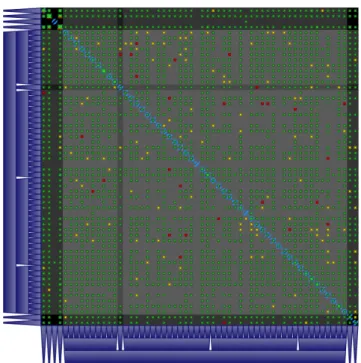
Finally, a more general technique not strictly related to graph drawing is that of matrix visualization. It simply consists of representing a graph in tabular format, thus using a number of graphical elements that is quadratic with respect to the number of vertices. Each element can be enriched with colors and patterns to reveal special properties of the underlying graph. For this reason, matrix visualization is particularly effective for (almost) complete graphs with properties assigned to each edge. In Chapter 4 we show how to combine such technique with standard geographical visualization for very dense networks.
Chapter 3
Our Reference Scenario:
Computer Networks
This chapter gives a very high level introduction to the basic concepts of Inter-net communication and routing. We focus on key topics that are later explored throughout our work. The reader can refer to one of the many available surveys and textbooks (see, e.g., [Tan02]) for a more detailed background.
3.1
Networks, Protocols, and Tools
The Internet is a collection of computers that can communicate using different physical channels, from optical fiber cables to WiFi and mobile connections. Computers are organized in simple hierarchical networks, and the interaction between any pair of computers is regulated by a number of routing protocols that operate at different levels of abstraction. Networks are grouped into in-dependent domains called Autonomous Systems (ASes), i.e. portions of the Internet that belong to specific real-world organizations. Typical examples of AS owners are Internet Service Providers (ISPs), private companies, or pub-lic organizations (e.g. universities). Neighboring ASes interact each other by means of a defined set of rules for the transmission of information.
Each computer in a network is identified with an IP address (or simply IP ). IPs can be unique locally (i.e. in the network hosting the computer) or globally (i.e. in the entire Internet). In its simplest form, a computer transmits information by splitting it into data packets labeled with the IP address of the target. Some computers are highly specialized for the transmission of
informa-i i “main” — 2014/4/27 — 19:37 — page 14 — #24 i i 14
CHAPTER 3. OUR REFERENCE SCENARIO: COMPUTER NETWORKS tion between end hosts. In particular, routers are responsible for forwarding data packets between computer networks. The transmission of a data packet hence follows a router path starting at the source computer and ending at the target computer.
Data packets can theoretically come in any format, size, and encoding, as long as the source and target computers agree beforehand on the rules to fol-low. In practice, however, most computer applications transmit information using standard Internet protocols. For the purposes of our work, some proto-cols deserve to be mentioned. The Internet Control Message Protocol (ICMP) is a protocol typically used for diagnostic or control purposes, or to generate packets in response to errors in IP operations. It underlies important net-work diagnostic tools like ping and traceroute, both used extensively in our work. The Transmission Control Protocol (TCP) and the User Datagram Pro-tocol (UDP) are the two proPro-tocols used in the vast majority of Internet-based applications. They allow concurrent streams between pairs of computers by enriching their IPs with additional numeric identifiers called port. TCP is a rather structured protocol that provides reliable, ordered, and error-checked delivery of packets. Example usages include connecting to Web pages, deliver-ing email, and transferrdeliver-ing files between computers. UDP, on the other hand, is a “barebone” container that does not provide mechanisms to guarantee the delivery or the ordering of packets. It is preferred for time-sensitive communi-cations (e.g. real-time video streaming) where losing packets is preferable to waiting for them. Both protocols are founding blocks of the Internet and thus they have a role in nearly all the chapters of our work.
The policy by which a router decides what is the next hop (i.e. the router topologically closer to the target to which packets should be sent) depends on the adopted routing protocol. Pairs of routers in a network instantiate sessions to exchange control messages that allow to understand the topology of the network and to make the best choice in terms of transmission speed and reliability. Routers therefore operate at two different levels: the control plane is the stage where control information coming from different routers is evaluated to compute the best route to reach any possible destination; the forwarding plane is the stage where packets are simply forwarded to the appropriate router, based on previous computation.
Border Gateway Protocol (BGP) is the protocol that regulates the routing of packets traversing networks that belong to different Autonomous Systems. The routers that “speak” BGP are usually placed at the edge of their net-work and are therefore called border gateways. BGP is based on TCP sessions instantiated between pairs of BGP-capable routers, called peers. It allows
net-3.1. NETWORKS, PROTOCOLS, AND TOOLS 15
work operators to define expressive sets of policies to influence the routing, based on commercial agreements between ASes and traffic optimization rules. For example, the owner of an AS that is connected to the rest of the Internet through two different ISPs can selectively configure either of the two as the default route provider depending on the target to reach. We take into account several research topics related to BGP in Chapters 6, 8 and 9.
The traffic inside each AS is regulated with simpler routing protocols called Interior Gateway Protocols (IGPs), usually based on the computation of the shortest path between any pair of destinations within the network. In Chapter 7 we show a framework for the visualization of router paths that are the combined result of IGP and BGP protocols.
One last important mechanism of the Internet is the Domain Name System (DNS), a hierarchical naming system for computers on a network. Domain names (e.g. www.uniroma3.it) represent an easier way to identify computers as opposed to IPs and therefore are heavily used by common users on the Web. Computers send DNS queries to name servers every time a domain name has to be mapped to the corresponding IP address. All ISPs provide their customers with one or more name servers in order to answer their requests. Upon receiving a query, each name server executes a process called resolution, during which an answer is computed for the query by iteratively querying other name servers. This often implies querying special name servers called root name servers (or simply root servers). Currently there are 13 root servers, each identified by a letter from A to M and operated by different organizations: e.g. A by VeriSign, B by USC, and C by Cogent. We explain how to monitor the performance of a root name server in Chapter 5.
Many standard networking tools are available for researchers, network op-erators, and common users to get insights on different aspects of the Internet. The ping command is a simple utility that is used to test the reachability of a host on a network and to measure the round-trip time (RTT) of messages sent from the source computer to the selected host. It works by sending ICMP “Echo Request” packets to the selected destination and waiting for the ICMP response. We employ ping for our research on the correlation between differ-ent network data sources in Chapters 8 and 9. A more complex diagnostic tool, traceroute, is used to display the path and measure round-trip times of packets across a network. It works by sending ICMP packets with gradually increasing time-to-live (TTL) value, that determines the number of allowed intermediate hops before the packet is discarded by the router receiving it. For example, the first ICMP packet has TTL equal to 1: the first router receives the packet, decrements the TTL value to zero, drops the packet because it
ex-i i “main” — 2014/4/27 — 19:37 — page 16 — #26 i i 16
CHAPTER 3. OUR REFERENCE SCENARIO: COMPUTER NETWORKS pired, and sends an ICMP “Time Exceeded” message back to the source. The process stops when the final target sends a response. Traceroute outputs are the main data source used in Chapter 7, and they also have a role in Chapter 8.
3.2
Organizations and Datasets
The task of designing compelling visualizations for Internet traffic and topol-ogy would not make sense without a wide array of datasets and organizations curating them. Some of these organizations regularly publish their data for a wide audience of network operators and researchers. This section presents the main examples that recur often in our work.
The R´eseaux IP Europ´eens Network Coordination Centre (RIPE NCC) is an independent, not-for-profit membership organisation that supports the infrastructure of the Internet in Europe, the Middle East, and parts of central Asia. The most prominent activity of the RIPE NCC is to act as the Regional Internet Registry providing global Internet resources and related services (IPv4, IPv6 and AS Number resources) to members in the RIPE NCC service region. Further, the RIPE NCC provides databases and monitoring tools that support stable, reliable and secure Internet operations.
RIPE Atlas [RIP10] is an Internet measurement network. It consists of globally distributed probes that measure Internet connectivity and reachabil-ity with standard networking tools like ping and traceroute. Researchers and network operators can schedule measurements towards custom Internet targets to satisfy different use cases, e.g. verifying the reachability of an Internet service or discovering the different ISPs that route traffic towards a certain destina-tion. Atlas probes also run default “static” measurements towards interesting Internet services including all the root name servers. Most measurements are publicly available for statistical analysis and research. We detail the usage of RIPE Atlas data in Chapters 7 and 8.
The Routing Information Service [RIP01] (RIS) collects and stores BGP routing data from several locations around the globe. It is based on Remote Route Collectors, i.e. software routers typically placed inside Internet Ex-change Points to collect routing information from other routers. In particular each route collector instantiates BGP sessions with collector peers, i.e. border gateways belonging to real world ISPs and organizations, and collect all their BGP updates. The University of Oregon maintains a similar project worth to mention, called Route Views [Uni97]. The datasets coming from both projects are often used in conjunction to perform various studies on the AS-level
Inter-3.2. ORGANIZATIONS AND DATASETS 17
net topology. We cite numerous examples of previous studies and detail our own findings in Chapters 6, 8 and 9.
Finally, it is worth to mention RIPEstat [RIP11], a Web toolbox that makes it easier to access the various datasets maintained by the RIPE NCC. For example, these include geolocation and registration records that allow to build a mapping between IP addresses and ASes owning them. We mention RIPEstat in Chapters 6, 7 and 8.
MaxMind [Max02] is a provider of geolocation and online fraud detection tools. They regularly update and publish databases containing information related to IP addresses publicly announced on the Internet. Examples of such information include the geolocation of IPs and the mapping to the Autonomous Systems that announce them. MaxMind databases are used by researchers in many different projects. In Chapter 4 we describe how to use their geolocation database to aggregate flow data based on the geography of source and target hosts.
Other organizations collect Internet measurements from various sources and share their results on the Web. The Cooperative Association for Internet Data Analysis (CAIDA) investigates practical and theoretical aspects of the Inter-net, providing insights into its infrastructure, behavior, usage, and evolution. One of their main projects, Archipelago [CAI07], is an active measurement in-frastructure composed of geographically distributed monitors that can perform coordinated Internet probing. CAIDA is also very active in the topic of Internet visualization; we will detail some examples in Chapter 6. SamKnows [Sam08] is a company specialized in providing an accurate picture of global broadband performance. Their goal is accomplished with “whiteboxes” installed in houses and offices around the world to get an indication of the quality perceived at the user end. The collected data and related statistics are published online.
i i
“main” — 2014/4/27 — 19:37 — page 18 — #28
i i
Part II
i i
“main” — 2014/4/27 — 19:37 — page 20 — #30
i i
Chapter 4
Exploring Flow Metrics in Dense
Geographical Networks
The visualization framework described in this chapter was designed and de-veloped during a three-month internship at the Microsoft Skype Division in Tallinn, Estonia. Microsoft Corporation owns the original intellectual prop-erty rights. The datasets used during the development were de-identified before producing material for this publication.
4.1
Introduction
In recent years there has been a considerable growth in the availability of mas-sive datasets describing bidirectional flow of information between end hosts in dense networks. This poses new challenges to researchers and network opera-tors that are eager to use such information for business intelligence, decision making, and service optimization. Skype, the popular VoIP service with more than 300 million active users, makes no exception: the cloud infrastructure supporting its core services is a potential source of crucial information, but it cannot turn useful without proper ways to make sense of it. What is needed is a general purpose tool that allows users to build initial hypotheses by looking at raw data, discovering the extent of knowledge hidden behind the surface.
The main difficulty lies in the density of the networks under examination. The elevated number of interconnections makes it practically impossible to adopt any standard technique for the rendering and interactive exploration of graphs. Simple tabular visualizations of matrices do not work either, as soon
i i “main” — 2014/4/27 — 19:37 — page 22 — #32 i i 22
CHAPTER 4. EXPLORING FLOW METRICS IN DENSE GEOGRAPHICAL NETWORKS as the size of the input grows beyond few dozens of vertices. On top of that, the input data becomes more interesting when put in a historical perspective and enriched with many different facets and key indicators. The combination of all these elements can be tackled reasonably well for highly specific studies and analyses. However, it is very challenging to build general purpose tools aimed at exploring raw data with the naked eye.
In this chapter we present a framework, Flowcliqr, designed for the in-teractive exploration of time-labeled multivariate flow datasets. Flowcliqr offers a dual visualization that allows for both quick lookups and general pat-tern recognition. The input data is automatically aggregated and the user can navigate forth and back between different levels of detail, while keeping an eye on the general picture. The design of our framework privileges the execution of a number of simple tasks: assessing the volume and features of the flow between pairs of locations, enumerating destinations with poor performance, sorting flow streams based on their volume, and so on. These tasks can be easily combined based on user needs, leading to useful insights about the underlying data. In a broader sense,Flowcliqr can visualize arbitrarily dense directed graphs with quantitative attributes on the edges between pairs of vertices. Our work, however, is primarily focused on the visualization of quantitative network metrics between pairs of geographical locations and their evolution over time. Section 4.2 presents the latest techniques for the visualization and explo-ration of flows and dense graphs or matrices. Section 4.3 introduces the reader to the simple data structures expected as input and some preliminary opera-tions that we perform on the data. In Section 4.4 we describe the interface of our framework and explain how users can interact with it. Section 4.5 contains the details of the qualitative study we performed to validate our user inter-face. Algorithmic and technical details are presented in Section 4.6. Finally, conclusions and ideas for future improvements are in Section 4.7.
4.2
Related Work
The visualization of flow in graphs and geographical networks is a recurrent topic in the field of graph drawing. Edge bundling [Hol06] is a well-known tech-nique for the visualization of compounds graphs. It applies to any graph and any mapping of its vertices to arbitrary positions on the plane. The technique consists of bending adjacent edges to reduce visual clutter and highlight the implicit structure of the connectivity between vertices. We discarded this op-tion in our framework because it does not solve clutter in very dense networks
4.3. DATA ABSTRACTION 23
and drawings of bended edges can be misleading. Buchin et al. [BSV11] build flow maps using spiral trees to induce a clustering on the targets and smoothly bundle lines. In a more recent work [NB13] similar maps are obtained with a new edge bundling technique that avoids ambiguous connections between pairs of vertices. Both techniques are visually compelling when describing the flow from a single source to many targets, but are not adequate for dense graphs.
A number of solutions can also be found in the field of information visualiza-tion. Andrienko et al. [AAD+08] present a taxonomy of the possible approaches available for the geovisualization of dynamics, movement, and change. They identify three alternatives: 1. direct depiction of data, which can easily lead to clutter and slow rendering; 2. use of summaries like aggregation, generalization and sampling; 3. use of statistical methods to extract patterns before visualizing them. The authors claim that such visualizations can generally be evaluated by small numbers of experts, and that usual evaluation tools like error rate and task completion time are not sufficient. Guo [Guo09] proposes an interface to render large spacial interaction data, consisting of multiple views: a geo-graphical map with arrows representing flow between regions, a self-organizing map, and a parallel coordinate plot. The tool is based on a precomputed hier-archical regionalization based on the volume of flow between pairs of regions. Although reasonable, such precondition is too strict for our purposes. Boyandin et al. [BBBL11] present Flowstrates, a visualization approach in which the ori-gins and the destinations of the flows are displayed in two separate maps, and the changes of flow magnitudes over time are represented in a separate heatmap view in the middle. Wood et al. [WDS10] divide the geographical space with a grid and draw in each cell a replica of the original map that shows inbound flow from all the other regions. Their idea is further expanded in [WSD11], where replicas show approximate flow patterns by means of time series plots. All the above three approaches, however, can lead to cluttered views when the input dataset grows in size. Elmqvist et al. [EDG+08] present a matrix
visualiza-tion that features fast reordering of rows and columns, data aggregavisualiza-tion with explicit representation, and GPU acceleration to optimize the rendering on screen. Their approach inspired part of our work while constructing a dynamic matrix optimized for pattern recognition.
4.3
Data Abstraction
Our work would not make sense without the availability of great quantities of flow data. This section presents a formal description of the type of input and
i i “main” — 2014/4/27 — 19:37 — page 24 — #34 i i 24
CHAPTER 4. EXPLORING FLOW METRICS IN DENSE GEOGRAPHICAL NETWORKS
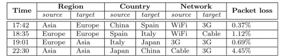
Time Region Country Network Packet loss source target source target source target
17:42 Asia Europe China Spain WiFi 3G 0.37% 18:35 Europe Europe Spain Italy WiFi Cable 1.12% 19:01 Europe Asia Italy Japan 3G 3G 0.69% 22:30 Asia Asia Japan China Cable 3G 4.45%
Table 4.1: Example input records for our visualization framework. Each record features three dimensions (region, country, and network) and one quantitative metric (packet loss).
the simple precomputation required to appreciate the power of our framework. We call record each building block of data in our reference scenario. Each record is labeled with a timestamp and contains attributes extracted from a single unit of flow between a source host and a target host (e.g. a stream of packets between two hosts, an ICMP echo request, etc). A metric is a feature in the dataset, proper of each record and typically belonging either to a continuous or discrete domain. In the field of computer networks, for example, the first group includes percentage of packet loss and round-trip delay, while the second includes the network protocol used for the connection (e.g. UDP or TCP). In our work we focus on the analysis and representation of quantitative metrics with a continuous domain. A dimension is an attribute proper of both source and target hosts in each record. It is typically characterized by a discrete domain. Common examples in a networking scenario include the country and the type of Internet access (e.g. cable, WiFi or 3G). An example list of records is presented in Table 4.1.
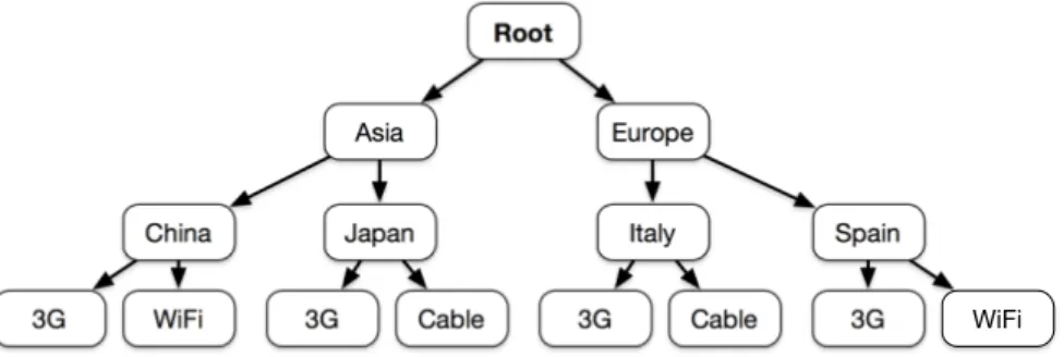
Dimensions are crucial to make sense of data by means of aggregation. Our visualization metaphor makes heavy use of grouping, allowing the user to inter-actively explore dimensions on request. More formally, we define a dimension path to be the rule by which individual records are recursively grouped into larger sets, from the finest to the coarsest level of aggregation. Figure 4.1 presents an example dimension path based on the records in Table 4.1. Given
Root Region Country Network
4.4. INTERFACE AND INTERACTION DESIGN 25 Root Asia Europe China Japan 3G WiFi Italy Spain
3G Cable 3G Cable 3G WiFi
Figure 4.2: Example navigation hierarchy built with the records in Table 4.1 and the dimension path in Figure 4.1.
a set of records and a compatible dimension path, we define the navigation hi-erarchy as the tree that is constructed with the actual values of dimensions in each record, following the structure imposed by the dimension path. Figure 4.2 shows the navigation hierarchy obtained using the records in Table 4.1 and the dimension path in Figure 4.1. A navigation frontier is a subtree obtained from a navigation hierarchy, where for each node all its children are either pruned or kept in the tree. The number of navigation frontiers available for a sin-gle navigation hierarchy is exponential. Given a navigation frontier, we call frontier node each of its nodes. We also refer to each leaf as frontier leaf for convenience. We will use the navigation frontier as an abstraction to describe the mechanism of interactive exploration that is built into our framework.
4.4
Interface and Interaction Design
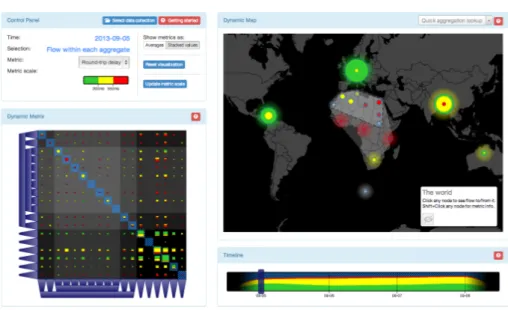
The interface of Flowcliqr is presented in Fig. 4.3. It is split into four main views: the control panel (upper left corner), the timeline (lower right corner), the dynamic matrix (lower left corner), and the dynamic map (upper right corner). The example dataset used for this section has three dimensions that are directly translated into a navigation path, from the coarsest to the finest: region, sub-region, and country. The two available metrics are round-trip delay and packet loss.
The control panel contains basic information on the current state of the visualization and some controls to change the representation of metric values.
i i “main” — 2014/4/27 — 19:37 — page 26 — #36 i i 26
CHAPTER 4. EXPLORING FLOW METRICS IN DENSE GEOGRAPHICAL NETWORKS
Figure 4.3: Overview of the main interface of our framework.
In Fig. 4.3 the focus is on a specific day (5 September 2013) and each view is highlighting the flow “within each aggregate”, i.e. having both source and target hosts within any of the current frontier leaves (e.g. flow within Europe, within Americas, etc). The selected metric is round-trip delay. The three colors used in the other views (green, yellow, red) identify three different classes of values for each metric, reported in the metric scale that is visible just below the metric name. In the above example green means “below 300ms”, yellow means “between 300ms and 550ms”, and red means “above 550ms”. The right side of the control panel contains additional controls. The user can choose between two different types of metric representation for each pair of frontier leaves: 1. averages, i.e. only one average value; or 2. stacked values, i.e. the weighted distribution of metric values in the three different classes, identified with corresponding colors. The two threshold values in the metric scale that determine the three corresponding classes of values can be dynamically adjusted by clicking the appropriate button. Finally, a button allows the user to bring the visualization back to the original state before any interaction.
The timeline contains a time series with aggregate information for each date available in the data collection. More specifically, a stacked graph shows
4.4. INTERFACE AND INTERACTION DESIGN 27
the volume of flow over time for each of the three classes of metric values, as defined in the control panel. Detailed information for the closest date is shown when the mouse pointer is placed over the graph. The user can either drag the slider or directly click the timeline to pick a different date. Upon interaction, all the views are updated accordingly to show the corresponding data.
The dynamic matrix shows metric values for all possible pairs of frontier leaves on the selected date. It is a square matrix, where rows and columns respectively represent source and target frontier leaves. Each square in the matrix represents a pair of frontier leaves, with size logarithmically proportional to the total volume of flow and colors reflecting the metric values in the current representation. The trapezoids on the left and bottom sides of the matrix represent the full navigation frontier. The hierarchy is explicitly represented by means of side contact between parents and children. All matrix elements are left intentionally unlabelled, so that the user can focus on discovering patterns by looking at the colors of the squares. Hovering any element with the mouse reveals aggregate information for the corresponding entity (either a frontier node or a pair of frontier leaves).
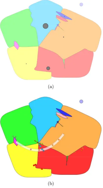
The dynamic map shows a circle for each frontier leaf in the current naviga-tion frontier, posinaviga-tioned at a meaningful locanaviga-tion (e.g. for regions of the world, circles are placed at the centroid of corresponding regions). At any time, each of such circles shows the same volume and metric values as one of the squares in the matrix. The dynamic map, therefore, only shows a portion of the data contained in the dynamic matrix: such portion can change based on user in-teraction. In the initial state, circles in the map are in correspondence with squares on the diagonal of the matrix, i.e. each of them represents the flow with both source and target hosts within the corresponding frontier leaf. The regions with dashed borders that enclose groups of circles represent the same hierarchy of frontier nodes that is pictured with trapezoids in the dynamic matrix. The information panel at the bottom right corner shows information depending on interaction. The user can also hover individual circles and dashed regions to get related metric and volume information.
We designed our framework with a focus on interactivity and responsive-ness. The two main operations that the user can perform are the following: 1. data selection, i.e. narrowing the analysis to the flow originating from a fron-tier node, targeted at a fronfron-tier node, or between two fronfron-tier nodes; 2. fronfron-tier expansion, i.e. updating the navigation frontier, by either exploring the chil-dren of frontier leaves or collapsing sibling frontier leaves into their parent frontier node. Both operations can be achieved by interacting indifferently with the dynamic matrix, the dynamic map, or a combination of both. Upon
i i “main” — 2014/4/27 — 19:37 — page 28 — #38 i i 28
CHAPTER 4. EXPLORING FLOW METRICS IN DENSE GEOGRAPHICAL NETWORKS
(a)
(b)
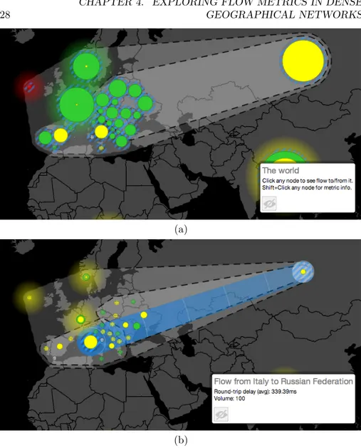
Figure 4.4: Sequence of user interactions needed to study the flow from Italy to Russia. (a) The dynamic map is zoomed on Europe, where two sub-regions (Southern and Eastern Europe) are expanded to reveal their respective coun-tries. The size of each circle is proportional to the volume of flow within the corresponding country. (b) The dynamic map is focused on the flow from Italy to Russia.
4.4. INTERFACE AND INTERACTION DESIGN 29
user interaction, all the views in the interface are automatically updated to reflect the new state of the visualization. The following subsections give some examples on how to use Flowcliqr to solve specific user needs.
Finding the total volume of flow and the average round-trip delay from Italy to Russia on 8 September 2013
First of all, we select the correct date on the timeline and we choose to represent metrics with average values through the control panel. We then locate the circle that represents Europe in the dynamic map and double-click it. The interaction has the effect of updating the navigation frontier by adding all the sub-regions within Europe to the current representation: therefore both the dynamic map and the dynamic matrix are updated accordingly. We repeat the same step with the two circles representing Southern Europe and Eastern Europe, with the ef-fect of enriching the navigation frontier with all associated countries, including Italy and Russia. The current state of the map is in Fig. 4.4(a). Note that the circles representing countries lack the semi-transparent “glow” effect, meaning that they cannot be further expanded to reveal more detailed information (i.e. we reached leaves in the navigation hierarchy). We click the circle representing Italy, triggering the following updates: 1. the row representing the flow from Italy in the dynamic matrix is highlighted; 2. the size and color of each circle in the dynamic map represents the flow from Italy to the corresponding frontier node, and the flow itself is pictured with animated concentric circles centered at the clicked circle; 3. the stacked graph in the timeline shows aggregate data for the flow from Italy to all other destinations. We can achieve the same result by looking up Italy with the search box positioned at the upper right corner of the dynamic map (see Fig. 4.3). Finally, we hold the Shift key and click the circle representing Russia. New updates are triggered: 1. the square in the dynamic matrix representing the flow from Italy to Russia is highlighted; 2. the flow in the dynamic map is represented with “waves” from Italy to Russia, as shown in Fig. 4.4(b); 3. the stacked graph in the timeline shows aggregate data for the flow from Italy to Russia. The requested information can be found in the info panel on the dynamic map.
Counting how many country pairs in Europe have average packet loss greater than 10% on 6 September 2013
First of all we focus on the control panel, choosing the right metric and updating the range of values such that flows with packet loss greater than 10% are
i i “main” — 2014/4/27 — 19:37 — page 30 — #40 i i 30
CHAPTER 4. EXPLORING FLOW METRICS IN DENSE GEOGRAPHICAL NETWORKS
Figure 4.5: Dynamic matrix showing country pairs with average packet loss greater than 10% in red.
identified with the red color. We select the right date and metric representation. We then proceed to interact with the dynamic map, first double-clicking the circle representing Europe and then all the circles representing sub-regions in Europe, until we reach the country level. We can finally focus on the dynamic matrix and simply count all the occurrences of red squares that fall within the portion of matrix related to European countries, as visible in Fig. 4.5.
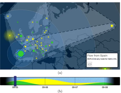
Finding out what European country receives the highest volume of flow from Spain on 5 September 2013 and which day sees the highest volume of flow between the same pair of countries
We select the right date on the timeline. Since we focus on the volume, the selected metric is irrelevant. We interact again with the dynamic map to show circles for all European countries and click the circle representing Spain. Apart
4.5. EVALUATION 31
(a)
(b)
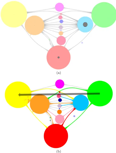
Figure 4.6: Views showing details for the third example task. (a) The flow from Spain is pictured with concentric blue circles. The size of each circle is proportional to the volume of flow from Spain to the corresponding country. (b) The stacked graph in the timeline reaches its peak on 6 September 2013.
from Spain itself, the biggest circle in Europe is the one representing United Kingdom, as visible in Fig. 4.6(a). To answer the second question we hold the Shift key, click the second circle, and focus on the timeline (see Fig. 4.6(b)): the day with the highest volume of flow from Spain to United Kingdom is 6 September 2013.
4.5
Evaluation
Flowcliqr was born with the goal of creating a general purpose framework, targeted at users previously exposed to the underlying data, allowing them to
i i “main” — 2014/4/27 — 19:37 — page 32 — #42 i i 32
CHAPTER 4. EXPLORING FLOW METRICS IN DENSE GEOGRAPHICAL NETWORKS get quick insights and build initial hypotheses before starting deeper investi-gations. Since any interaction with the tool can be decomposed into recurring tasks, it becomes crucial to verify that these can be correctly and quickly accomplished by prospective users. This section presents the results of the evaluation study we conducted after implementing the initial prototype.
We initially thought of conducting a comparative study, where participants would need to solve a list of tasks both with our framework and with standard tools (e.g. database queries). However, we quickly discarded this option be-cause even expert users did not have experience with a standard, unified set of tools for the purpose of accessing and analyzing the same dataset. Therefore any comparison would have suffered from potential bias, depending on the rel-ative experience of the participant. We opted instead for a qualitrel-ative study, where participants were given a set of tasks and feedback was collected at the end of each task.
In preparation for the study we fed our prototype with a precomputed dataset, structured like the one used for the figures in Section 4.4 and featuring four days of flow data from 5 September 2013 to 8 September 2013. The study was conducted with ten participants (nine male, one female) between 25 and 35 years old. They are all domain experts with a background in computer science, statistics, telecommunications, or electronics. At the time of the study, they were already familiar with the data collection from which we derived the dataset used as test input. More than half of the participants had worked with the same data collection before, accessing its content by means of database queries or simple time series plots.
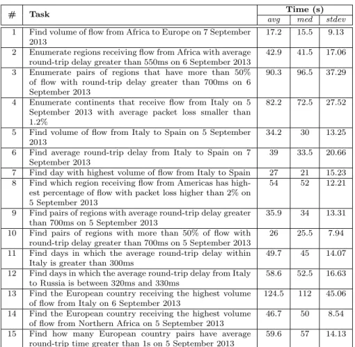
Each participant was initially tested for color blindness. A thorough intro-duction to the framework followed, with a focus on each of the views and all the available user interactions. A couple of example tasks were illustrated step by step. After that, each participant was asked to solve the 15 tasks listed in Table 4.2. The first four were treated as training tasks, i.e. the participant had the possibility to ask for help. For each task the examiner recorded the completion time with a stopwatch, gathered feedback afterwards, and showed a quicker way to achieve the same result in case the strategy adopted by the participant was clearly suboptimal. General feedback was asked from each par-ticipant as a final step after the last task. The average time required by each participant to complete the study was 50 minutes.
All the participants successfully completed the proposed tasks, adopting different strategies. The statistics on task completion times are reported in Table 4.2. It is evident that users quickly learned from mistakes done in pre-vious tasks. For example, 60% of participants had an instinctive preference
4.5. EVALUATION 33
# Task Time (s)
avg med stdev 1 Find volume of flow from Africa to Europe on 7 September
2013
17.2 15.5 9.13 2 Enumerate regions receiving flow from Africa with average
round-trip delay greater than 550ms on 6 September 2013
42.9 41.5 17.06 3 Enumerate pairs of regions that have more than 50%
of flow with round-trip delay greater than 700ms on 6 September 2013
90.3 96.5 37.29
4 Enumerate continents that receive flow from Italy on 5 September 2013 with average packet loss smaller than 1.2%
82.2 72.5 27.52
5 Find volume of flow from Italy to Spain on 5 September 2013
34.2 30 13.25 6 Find average round-trip delay from Italy to Spain on 7
September 2013
39 33.5 20.66 7 Find day with highest volume of flow from Italy to Spain 27 21 15.23 8 Find which region receiving flow from Americas has
high-est percentage of flow with packet loss higher than 2% on 5 September 2013
54 52 12.21
9 Find pairs of regions with average round-trip delay greater than 700ms on 5 September 2013
35.9 34 13.31 10 Find pairs of regions with more than 50% of flow with
round-trip delay greater than 700ms on 5 September 2013
26 25.5 7.94 11 Find days in which the average round-trip delay within
Italy is greater than 300ms
49.7 45 14.07 12 Find days in which the average round-trip delay from Italy
to Russia is between 320ms and 330ms
58.6 52.5 16.63 13 Find the European country receiving the highest volume
of flow from Italy on 6 September 2013
124.5 112 45.06 14 Find the European country receiving the highest volume
of flow from Northern Africa on 5 September 2013
46.7 50 8.54 15 Find how many European country pairs have average
round-trip time greater than 1s on 5 September 2013
59.6 57 14.13
Table 4.2: List of tasks and results of our qualitative study. For each task the average (avg), median (med ) and standard deviation (stdev ) values for completion times are listed.
for the dynamic matrix when solving Task #13 (i.e. they updated the nav-igation frontier and compared the size of different squares without using the dynamic map). After being shown a faster solution with the dynamic map, they quickly changed their strategy and performed much better with Task #14 and Task #15. This is confirmed by the relatively small standard deviation for
i i “main” — 2014/4/27 — 19:37 — page 34 — #44 i i 34
CHAPTER 4. EXPLORING FLOW METRICS IN DENSE GEOGRAPHICAL NETWORKS the completion time of both tasks, which suggests that users knew precisely what steps where needed to complete them. Note also how the median comple-tion time is smaller than the average time for most of the tasks, which suggests that the outliers can be interpreted as occasional difficulties or distractions experienced by individual users.
The feedback was overall very positive and enthusiastic. All participants were particularly impressed by the possibility to finally “see” the data they had only been able to access with database queries and simple two-dimensional charts. They also appreciated the power of exploring data both on the dynamic map and the dynamic matrix at the same time, depending on the specific use case. Many important suggestions for improvement were collected during the study. 80% of participants found the timeline to be not enough intuitive to compare the volume of flow on different days. 50% would have appreciated the possibility to expand frontier nodes straight to the finest level of aggregation, without intermediate levels (e.g. sub-regions in the specific example). 50% had trouble to come up with the right sequence of interactions to highlight the flow within a specific frontier node on the dynamic map (i.e. click followed by shift-click on the same circle). 50% overlooked smaller squares in the dynamic matrix at first sight and 20% suggested to add a “full-screen” capability to each view as a solution. 50% spent a non-negligible amount of time wondering where to find the actual answer for some tasks, after completing all the right interactions. 40% suggested to add a smarter search box to programmatically specify a query in the form “flow from A to B”. 40% complained that the size of circles in the dynamic map is not a sufficient clue to estimate the volume. Further minor observations were related to the specific dataset (e.g. 40% were not sure whether Russia was to be found under Europe or Asia) and to the lack of experience with the interface (e.g. 70% of users needed some time before appreciating the distinction between average and stacked metric values).
4.6
Algorithms and Technical Details
The algorithmic background of Flowcliqr is pretty straightforward. The drawing of circles in the dynamic map is achieved with a force-directed graph layout algorithm (see Section 2.2 for a general introduction) including collision detection. Each circle is represented with two vertices connected by one edge: the first vertex is fixed at the ideal position for the center of the circle, while the second is subject to forces and represents the actual position of the visualized circle. The areas with dashed borders that enclose circles in the dynamic map