Data visualization tools for web applications - a survey
Descrittori
Tipologia de] documento: Rapporto tecnico
Argomenti trattati: Software, Grafica ed elaborazione immagini
Sommario
A survey has been conducted here to investigate the state-of-the-art of data visualization tools for web applications. There are hundreds of well-developed data visualization tools, many others are under development, and a survey can help to make an infomed choice for the more appropriate software to be used, when starting websites for different topics: open data, smart city platforins,
illustrated statistics or data analytics on specific issues.
In this report, the main goals of data visualization are described, as well as the main types of charts. A selection of software tools is briefly outlined, with a focus on fl.ee license tools. Moreover, some examples of websites are reported, showing the opportunities of data visualization tools in different
contexts.
Copia n. In carico a:
C. Petrovich C. Novelli M. Amunziato EMISSIONE
DESCRIZIONE REDAZI0NE CONVALIDA APPROVAZIONE
Table of Contents 1 Introduction ...3 2 Chart types...5 3 Visualization tools ... 11 3.1 Tableau ... 12 3.2 D3.js... 13 3.3 Highcharts ... 15 3.4 Google Charts ... 16 3.5 Chart.js ... 17 3.6 Matplotlib... 18 3.7 Dash–Plotly ... 19 3.8 Grafana ... 20 3.9 JfreeChart ... 21 3.10 Snap4city ... 22 3.11 KIBANA ... 23
3.12 Other visualization tools ... 24
4 Websites examples... 26 4.1 OECD ... 26 4.2 EIGE ... 27 4.3 Flightradar24 ... 28 4.4 Singapore ... 29 4.5 EUROSTAT ... 30 4.6 ISTAT ... 31
4.7 OPEN DATA Campania... 32
4.8 Bristol ... 33
4.9 Municipality of Bologna ... 34
4.10 Municipality of Florence ... 35
4.11 Dashboards for Covid-19 ... 36
5 Conclusions ... 37
1 Introduction
In the last 10 years there has been an incredibly growing production of data, driven by the strong technological innovations of telecommunication systems, the spread of smartphones and of social networks, not to mention the several user services (e.g. traffic) and the websites on Open Data1,2. Also the need for more sustainable energy management and the availability of more effective sensors at reduced prices have contributed to increase the amount of available data. This great amount of data has also led to an increasing number of projects on Smart Cities3. For this reason too, hundreds of software tools and services enabling data visualizations have been developed and are under development.
Together with the visualization tools, the choice of suitable KPIs (Key Performance Indicators), describing and representing the phenomenona in a significant way, remains crucial. The KPIs may refer to different units of measurement and to different quantities (relative or absolute). In order to obtain a comprehensive picture it is often effective:
a. to observe the time variation (also in order to monitor the path towards fixed objectives); b. to observe the spatial variation through the use of maps (in particular in Smart Cities); c. to display different indicators simultaneously in the same chart (e.g. spider web charts).
As a matter of fact, different indicators can be in conflict with each others;
d. to compare indicators belonging to one territory with others referring to similar sites, or to compare with reference values, with legal limits, with averages (e.g. comparison of energy consumption per inhabitant in a city with other cities).
The types of data visualizations can be different:
- single charts of a few variables and/or KPIs vs. a set of charts and panels (histograms, pie charts, percentages, infographics, etc.) representing different aspects of a phenomenon (dashboards);
- fixed or interactive maps. In the latter case, the user has the possibility of exploring different areas of interest (options: zoom in / zoom out / move), activating and disabling different variables, or focusing on different scales;
1https://www.europeandataportal.eu/elearning/en/module1/#/id/co-01
2 The spread of open data has also been pushed by many laws, such as the European Commission Decision
2011/833/EU and the Directive 2013/37/EU of the European Parliament and of the Council. For Italy, for example, see Decreto Legge 18.10.2012, n. 179.
- charts with static or dynamic variables, i.e. values that can be updated automatically at established time intervals or even in real-time, taking advantage of the connectivity of some sensors (e.g. car traffic or positions of airplanes).
The main objectives of the data visualization tools/services can be summarized as follows: 1. to synthesize and show a great amount of information in a single image and therefore in a
single glance ("a picture is worth a thousand words");
2. to monitor the evolution of a variable and therefore the trend of a phenomenon;
3. to increase knowledge: to explore, to develop and evaluate hypotheses, to discover errors and outliers in the data, to "extract value" from the data and find patterns, to highlight the relative contribution of different parts, to discover correlations between different variables, to obtain new information and allow to create new interpretations of the phenomena (insights);
4. to facilitate access to information, easing data dissemination and information communication in a clear, intuitive and effective way. Efficient communication can increase citizens' awareness and participation, sharing and collaboration, as well as stimulating engagement and attention [Viegas et al., 2011]
5. to offer awareness and basis for decisions, for example for policy makers.
Data visualization can be considered together "an art and a science": it belongs to the scientific community, but it also implies some subjective and arbitrary choices, such as the selection of the types of chart and the variables to be represented, the correlations to be highlighted, the extremes of the axis scales, linear or log scale, the text used, the colors, etc. All these alternatives may influence and change the understanding of the phenomenon to be represented. One can be more or less aware of all these choices and, in any case, it is worth mentioning the fact that data visualization is never a fully neutral activity, even when these alternatives are managed by a software. Even some automations, as a matter of facts, involve implicit choices.
The survey of this report aims to present, without presuming to be exhaustive, the most popular software tools for graphic representation, with a focus on chart images, on freeware and open source codes developed for web applications, having the possibility of dynamic update of the variables and of applications for smartphones.
The best practices in this field are also reported by showing several websites examples. In this way, it will be possible to explore some of the best available technological solutions for ICT platforms.
2 Chart types
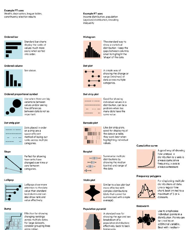
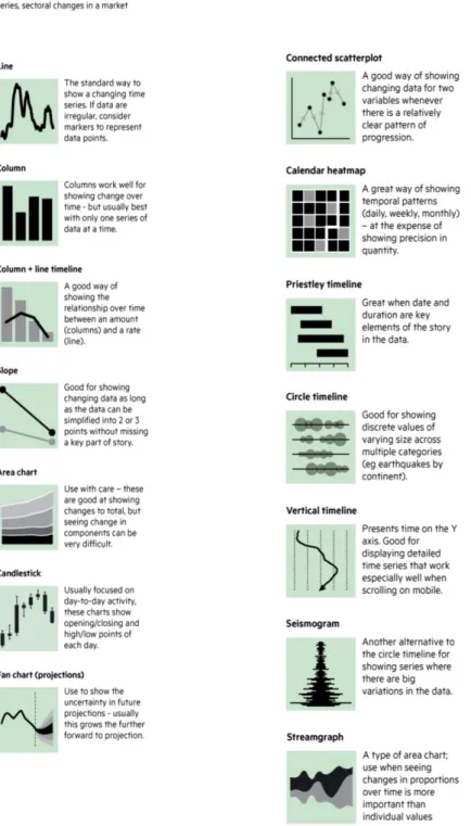
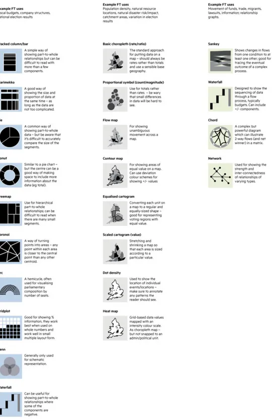
It is not possible to report a comprehensive and thorough list of chart types for data visualization because new types of data representation constantly emerge, such as the effective animated histograms which, recently, have become even viral in social media4. A gallery of chart examples, also innovative and original, is provided by the D3.js software5. Notwithstanding that, a popular classification for chart types and data visualization is the one provided by the Financial Times: the Financial Times Visual Vocabulary6. This has been created mainly for the journalistic sector but it is also mentioned at European level in the EU Open Data Portal7 and can be applied also in other areas.
This vocabulary classifies the charts into 9 types, as shown in the following figures 1-5.
4 The video “Top 10 Richest People In The World (1995-2019)” shows, by means of animated histograms, how
the assets of the richest people evolve with time. It has obtained more than 7 millions visualizations on YouTube. With the same visualization technique, the video “Best Selling Music Artists from 1969 to 2019” has gained 6 millions visualizations (5 december 2019). These animated histograms have been created by means of the R language and of the packages: ggplot2 and gganimate.
5 https://github.com/d3/d3/wiki/Gallery.
6 “Financial Times Visual Vocabulary”,
https://github.com/ft-interactive/chart-doctor/tree/master/visual-vocabulary https://ft-interactive.github.io/visual-vocabulary/
1. Deviation: emphasizes variations from a fixed reference value (e.g. a target or an average); 2. Correlation: shows the relationship between two or more variables.
DEVIATION CORRELATION
3. Ranking: shows, in an ordered list, position and importance of one item compared to the others. 4. Distribution: shows values and frequencies of some variables.
RANKING DISTRIBUTION
5. Change over time: emphasizes changing trends.
6. Magnitude: Shows comparison between different sizes (relative or absolute).
7. Part-to-whole: shows how a single entity can be broken down into its component elements. 8. Spatial: shows spatial variations, mainly in maps.
9. Flow. Show volumes and intensities of movement between two states or conditions (e.g. between two logical sequences or geographical locations).
In order to choose the suitable visualization tool, starting from a desired specific chart type, it is possible to consult the "ChartmakerDirectory" map8, which connects about 50 types of graphs and plots with about 40 different software tools (the map therefore shows which charts each software can manage).
Some guidelines, to suitably format the charts and to better show "the history that the data want to tell", can be consulted: the "Data Visualization Checklist"9 indicates 24 guidelines to properly format the text, the axes, the scales, the colors, the symbols for data, etc.
An interesting aspect of the graphic representation is the “engagement” and “gaming”, i.e. those techniques which, addressing citizens and therefore a wider audience, increase the capacity for attraction, "dialogue" and involvement with those who read the data (e.g. charts communicated to citizens to encourage the use of sustainable mobility).
3 Visualization tools
This section describes very briefly the main visualization tools10, with some of their main features.
The different softwares differ, among other things, by: - being free or accessible by payment11;
- the type of license; - being open source or not;
- the number and types of charts which are available;
- the number and types of connectors to input data files (e.g. .json, postgreSQL, .csv, etc.); - being structured as a dynamic web-tool which can be updated in real-time or being designed as a post-processing software;
- allowing an autonomous local installation or only remote managed services; - the degree of autonomy towards external updates or variations by the developers;
- the possibility left to the user to change and choose the type of chart to be used (the type of chart can be prefixed a priori or not);
- the presence or absence of analytics;
8https://chartmaker.visualisingdata.com/ 9datavizchecklist.stephanieevergreen.com
10 In the web there are hundreds of reviews about visualization tools. See for example:
http://selection.datavisualization.ch/ or https://medium.com/sciforce/best-libraries-and-platforms-for-data-visualization-b986a43aee3f. In literature, see for example [Gupta, 2019].
11 There are also many intermediate options, with versions of the software being free only for few users, or free
- being oriented or not towards the manipulation of Big Data;
- the type of device they are oriented to (e.g. smartphones or only PC).
Some free software (or those which, even if commercial, include a free license version) are listed here, selected for the richness of features, for the popularity and other characteristics described hereafter. As already mentioned, this list does not claim to be exhaustive, as hundreds of different visualization software exist, some of which are rapidly evolving.
3.1 Tableau
Tableau12 is one of the best existing data visualization tools [Kemal, 2019], with a professional platform used by many companies and industries, highly developed and specialized in business intelligence, user-friendly in the interactive interface, appropriate also for machine learning and Big Data. It is also used, among others, by the Italian ISTAT13. It allows to describe the data in an extremely in-depth way, it allows the use of analytics and server solutions without requiring on-site installation. Actually, Tableau is free only in its basic version Tableau public, but it is mentioned here, because, at least in its commercial version, represents one of the most popular and powerful visualization tools, including also a large gallery of graphics14. It integrates well with mySQL, Hadoop, Amazon AWS, SAP and Teradata. An example of application is shown in figure 6.
12 https://public.tableau.com/en-us/s/
13
https://public.tableau.com/views/noiItalia2019Confrontoeuropeo/Confrontoeuropeo-sintesi?:embed=y&:display_count=yes?:showVizHome=no#2
Figure 6. Example of dashboard with Tableau Public.
3.2 D3.js
D315 stands fo Data-DrivenDocument and combines very powerful visualization components with data-driven manipulation methods DOM (Document Object Model).
D3 is a JavaScript library attentive to web standards, allowing to use all the capabilities of modern browsers without bonds to a specific proprietary framework. It uses Javascript, HTML, SVG and CSS. D3 is a very technical and developer-oriented tool. It owns a huge gallery with several hundred of charts, maps, besides interactive and innovative diagrams. These are provided with examples and are ready to be reused in different contexts16,17. Figure 7 shows an application by using maps.
15 https://d3js.org/
16 Some galleries can be found in: https://github.com/d3/d3/wiki/Gallery,
http://techslides.com/over-1000-d3-js-examples-and-demos https://www.d3-graph-gallery.com/index.html
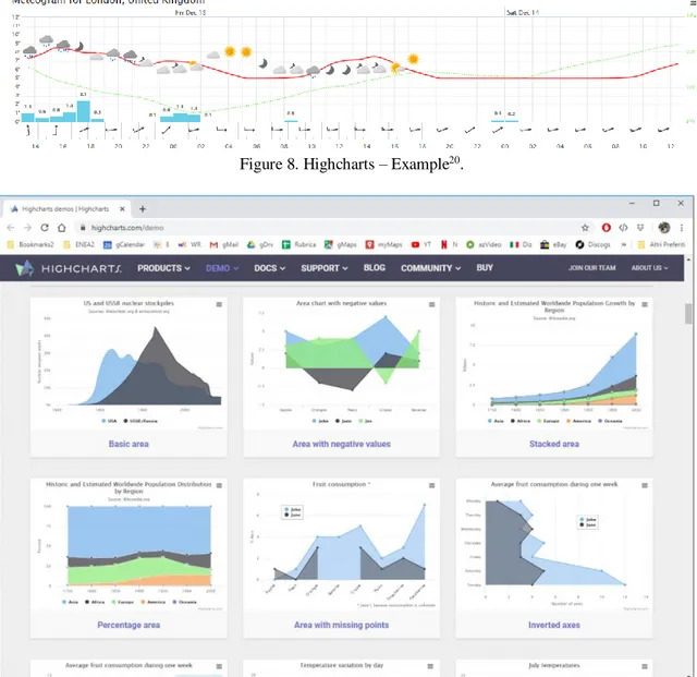
3.3 Highcharts
Highchart18 is a very powerful software library, written in pure JavaScript and released since 2009 in Norway, designed especially for websites and smartphones. It has been developed for charts, maps and also visualization tools for the finance field. It is a commercial product but it is free for non-commercial organizations, having Attribution-NonCommercial 3.0 Unported license (CC BY-NC 3.0). A gallery19, including about forty charts, already in code format and
ready for utilization, is provided on the official website (examples are provided in Figure 8-9).
Figure8. Highcharts – Example20.
Figure 9. Highcharts website.
18 www.highcharts.com
19https://www.highcharts.com/demo 20
3.4 Google Charts
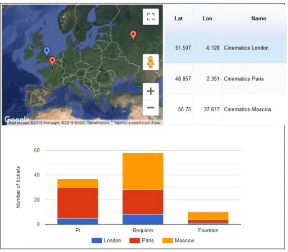
Google Charts21 is a free license software based on pure HTML5/SVG technology (no plugins are required). It uses a simple Javascript integrated in the web page and has a wide compatibility with different browsers. It works on Android, iOS or other platforms. It is a very user-friendly tool and includes a gallery of around 30 types of different visualizations and charts22.
Google Chart offers the possibility to use interactive charts, dynamic data and dashboards. In addition, there is a large number of connectors, tools and protocols allowing the use of Google Charts with different data formats. A dashboard example23 is shown in the following figure.
Figure 10. Google Charts – Statistics of a cinema enterprise.
21 https://developers.google.com/chart
22 https://developers.google.com/chart/interactive/docs/gallery 23 https://developers.google.com/chart/interactive/docs/examples?hl=it
3.5 Chart.js
Chart.js24 is an open-source Javascript library, free and available through an MIT license. It is aimed mainly at developers, but it is also used by designers. Created in 2013, it consists of a library maintained by the community itself and it is considered to be of simple application, for example of a much simpler use with respect to D3.js. On the other hand, it is less suitable for customization.
Chart.js uses the potential of HTML5 Canvas25. A gallery of types of charts can be found on the official website26. An example of dashboard27 is shown in the following figure.
Figure 11. Chart.js – Example of dashboard.
24https://www.chartjs.org/
25https://www.w3schools.com/html/html5_canvas.asp 26https://www.chartjs.org/samples/latest/
3.6 Matplotlib
Matplotlib28 is the historical Python library, also suitable for web applications, and it contains hundreds of ready-made interactive graphics and animations. A gallery plenty of examples can be found on the official website29.
Some graphs are shown in the following figure30.
Figure 12. Matplotlib – Examples.
28 https://matplotlib.org/
29 https://matplotlib.org/gallery/index.html
30
3.7 Dash–Plotly
Dash31 is a Python framework for web applications. It is built around Flask, Plotly.js and React.js.
It is aimed at building data visualization apps, especially those with interactive graphics, flexible and customizable interfaces. It is particularly suitable for those who process data with Python.
It is a very simple application to use, already incorporating the technologies and protocols required to build an interactive web application. Dash is an open source library, released under MIT license. It includes the design of dashboards, of which we report an example in the figure.
Figure 13. Dash - Dashboard example32.
31 https://dash.plot.ly/?_ga=2.265487942.852944674.1573218018-320457490.1573218018 32 https://dash-gallery.plotly.host/dash-manufacture-spc-dashboard/
3.8 Grafana
Grafana33 is a free, open source software, conceived as "monitoring tool" for internet infrastructures and software analysis. Its use has also widened to other sectors, such as industrial sensor monitoring, home automation, weather applications and process control. Grafana is able to interface with Graphite, Elasticsearch, postgreSQL, Cloudwatch, Prometheus, InfluxDB and other databases.
It is a software of immediate and simple use, above all for the construction of dashboards. It can exploit the high performances of SQL language for data queries. On the other hand, it provides a limited number of charts and customization options. An example of application is provided in the following figure.
Figure 14. Grafana – Dashboard example34.
33https://grafana.com/
3.9 JfreeChart
JfreeChart35 is a free and open source Java library, conceived for graphics and data visualization. The graphs are interactive and can be edited by the user.
It has the advantage of being highly flexible, adaptable and editable, as it uses the great power of the Java code. On the other hand, it does not present a particularly rich range of charts, with respect to other software, and it is a project which does not seem to be anymore developed by a strong community.
Examples of graphs36 are shown in the following figure.
Figure 15. JfreeChart – Examples.
35 http://www.jfree.org/jfreechart/
3.10 Snap4city
Snap4city37 (scalable Smart aNalytic APplication builder for sentient Cities and IOT) is a platform designed to be applied to Smart Cities and it is developed by DISIT (DIstributed Systems and Internet Technologies Lab) of the University of Florence [Nesi et al., 2018]. It is open source, scalable, on cloud, secure and flexible and created with micro-services and replaceable tools. Snap4city is able to analyze and aggregate a large amount of data and, through the use of Artificial Intelligence, offers services such as risk assessments, the detection of anomalies and alerts. Snap4city has already been applied in several cities (Florence, Helsinki, Antwerp, Santiago di Compostela, Pisa, Prato, Cagliari) and regions (Tuscany, Emilia-Romagna). It allows to build customized dashboards. An example of dashboard is shown in the following figure.
Figure 16. Snap4city – Dashboard for event monitoring and alerts in Florence38.
37 https://www.snap4city.org
3.11 KIBANA
Kibana is an open source software developed for the visualization of data indexed in Elasticsearch (a search engine with Full Text capability), by means of dynamic dashboards. Kibana is able to manage and monitor a large amount of data and to create different types of tables and charts (scatter charts, pie charts, histograms, maps, time series, etc.). It also allows advanced data analyses, interactive visualizations, graph and cloud label representations. It is also now part of the commercial product Elastick Stack, a combination of Elasticsearch, Logstash and Kibana39. An example of a dashboard is shown in the following figure.
Figura 24. Example of a dashboard created with Kibana40.
39https://www.elastic.co/kibana
3.12 Other visualization tools
There are hundreds of other softwares for data visualization, which, for reasons of space, have not been described here. Anyhow, here is a list of other visualization tools for web applications:
- Echarts (Javascript tool), - Datawrapper,
- Imply Pivot, - Gapminder,
- Gephi (for network visualization), - ChartBlocks (for on line charts), - Chartbuilder,
- NetData (for monitoring by means of dashboards), - NVD3 (exploiting the power of D3.js),
- ManyEyes (of IBM),
- Graphite (for system monitoring), - RawGraph,
- Vega (reads also JSON formats) and Vegas (Scala library), - R Shiny (for interacting statistic visualization with R), - Google Data Studio (also for dynamic dashboards), - Infogram (developed also for dashboard and maps), - TimeLineJS (per time series),
- Breeze-viz (Scala library).
Other softwares, worth to be mentioned:
- Not free: FineReport, Fusion Charts, PowerBi, QlikSense, QlikView, Tapclicks, Chartio, ClicData, Visme, Klipfolio (includes a section for dashboard), Looker, Splunk, Sisense, Zoho Analytics (Business Intelligence and data analytics), Gnuplot; - Specialized in creation and use of maps: Leaflet, ArcGIS, CARTODB,
- interesting PYTHON libraries: seaborn, ggplot, plotnine, Bokeh, Pandas;
- other R libraries: Ggplot2, Base graphics, Gridgraphics, Lattice, ggvis, Rgl (with also 3D interactive plots);
- other libraries and API Java: Java2D, Java3D, Prefuse, Java advancedimaging, VisAD.
4 Websites examples
In this section a selection of some particularly interesting websites is reported. These websites utilize different visualization tools and describe successfully different phenomena by means of effective charts, KPIs and dashboards with dynamic values.
4.1 OECD
The OECD (Organization for Economic Cooperation and Development) website quantifies the well-being of different regions through 10 indicators, shown simultaneously with different colors and with scores ranging from 0 to 10. The comparison with similar regions is also highlighted (see the following figure).
Figure 17. OECD – Well-being in Emilia-Romagna (Italy) and comparison with other regions41.
4.2 EIGE
The EIGE42 (European Institute for Gender Equality) website shows the levels of Gender Equality by means of seven indicators. At the same time, it compares the performance of Italy with respect to other countries (see the following figure).
Figure 18. EIGE- Gender Equality Index43.
42 https://eige.europa.eu/
4.3 Flightradar24
Some websites aim to monitor traffic in real-time, exploiting the power of the network connectivity and of detailed maps. See as an example the air traffic monitoring of the Flightradar24 website in the following figure.
Figure 19. Flightradar24 – Air traffic monitoring44.
4.4 Singapore
Some Open Data websites supported by municipalities already incorporate data visualization, such as the website of Singapore45, showing five key charts to describe and summarize performances and phenomena in different sectors (economy, education, environment, etc.). See the example in the following figure, describing the environmental sector.
Figure 20. Singapore – Example of Open Data website.
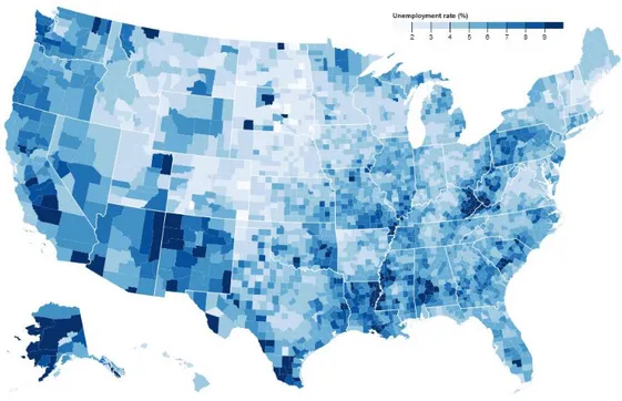
4.5 EUROSTAT
An extremely rich and professional website with plenty of data visualization and interactive charts is certainly the one of EUROSTAT. The website collects a large amount of data from the countries of the European Union, regarding a large range of indicators in different sectors, with sections entirely dedicated to illustrated statistics46 and data visualization47.
EUROSTAT also promoted several seminars and webinars48 on data visualization, in particular highlighting the use of the tools D3.js and QlikSense49.
An example of data visualization applied to European cities50 is shown in the following figure.
Figure 21. Eurostat- Unemployment rate in European towns.
46 https://ec.europa.eu/eurostat/web/regions/statistics-illustrated 47 https://ec.europa.eu/eurostat/help/first-visit/tools 48 https://data.europa.eu/euodp/en/visualisation-home 49 http://data.europa.eu/euodp/en/node/8011 50 https://ec.europa.eu/eurostat/cache/RCI/#?vis=city.statistics&lang=en
4.6 ISTAT
Another very advanced website with regards to data visualization is the one of ISTAT51. It presents a great of variety of interactive graphics, dynamic maps, historical series, comparisons with other European countries and descriptions of different phenomena (population, health, economy) with a multiplicity of infographics.
ISTAT uses several tools:
- JavaScript libraries (Highcharts, D3),
- Business Intelligence / Visual Analytics platforms (MicroStrategy, Tableau)52 and - map software (OpenStreetMap).
Figure 22. ISTAT - Fatalities in road accidents (15-34 years).
51 https://www.istat.it/it/dati-analisi-e-prodotti/visualizzazioni 52https://www4.istat.it/it/files/2015/05/Annunziata-Fiore.pdf
4.7 OPEN DATA Campania
An interesting Italian website on Open Data is the one developed by the Campania Region53, which allows the user to browse all the available data (generally left as raw data in .csv format, .json, etc.) and to choose the variables to be represented, the labels and the type of charts.
An example is shown in the following figure.
Figure 23. Open Data Campania – Polluting emissions in Benevento (Italy) in January54.
53 https://dati.regione.campania.it/opendata
4.8 Bristol
The Open Data website of the city of Bristol55 is also very interesting, because it provides different data visualizations regarding different sectors (transport, health and social care, environment, education, etc.) and it shows some dashboards of the city identifying some KPIs. An example56 is shown in the following figure.
Figure 24. Air quality in Bristol.
55 https://opendata.bristol.gov.uk/pages/homepage/
4.9 Municipality of Bologna
A municipal map particularly abundant of data is the interactive Open Map of the Municipality of Bologna57, which is connected with even 56 different datasets (data on schools, drugstores, charging stations for electric vehicles, even single trees, etc.).
The display of these datasets can be activated and disabled by the user.
Figure 25. City of Bologna – Interactive map.
4.10 Municipality of Florence
Another example of application for Snap4city is the dashboard of the municipality of Florence58, which shows the cultural events of the city, the free parking spaces, the weather conditions, the transport lines, together with the most used hashtags in social networks.
See the following figure as an example.
Figure 26. City of Florence – Dashboard.
4.11 Dashboards for Covid-19
With the spread of the pandemic Covid-19, the use of dashboards have become more common: many online newpapers adopted a dashboard, updating daily the number of new active cases and deaths (e.g. Financial Times59, The New York Times60, La Repubblica61, Il Sole 24 Ore62). The reason for that obviously was the high importance of monitoring the evolution of the disease also after the interventions of the governments, which imposed the social distance.
In the following figure the dashboard of the Johns Hopkins University & Medicine is reported.
Figure 27. Dashboard for Covid-19. John Hopkins University & Medicine63.
59https://www.ft.com/content/a26fbf7e-48f8-11ea-aeb3-955839e06441 60 https://www.nytimes.com/interactive/2020/us/coronavirus-us-cases.html?action=click&module=Top%20Stories&pgtype=Homepage 61https://lab24.ilsole24ore.com/coronavirus/ 62 https://lab.gedidigital.it/gedi-visual/2020/coronavirus-i-contagi-in-italia/?ref=RHPPLF-VU-I257343052-C8-P4-S1.4-T1
Both “Il Sole 24 ore” and “La Repubblica” (Italy) adopted the Flourish software (https://flourish.studio/).
5 Conclusions
A survey has been performed to investigate the main data visualization tools for web applications.
These tools are very rapidly spreading and there are hundreds of software developed with this goal. A comprehensive and thorough list is therefore not possible. Anyhow, this review selected some of the most relevant free license tools and hopefully can help to make a more informed choice for development designers of ICT platforms in the Smart City area, for Open Data websites, in the environmental branch, statistical governmental agencies and all the other sectors where visualization tools can be applied.
Different opportunities have been shown also reporting many examples of advanced websites, implementing and showing many features of these tools, applied in different contexts.
Acknowledgements
The author is grateful to Cristiano Novelli for proposing and reviewing this report.
6 References
[Badii et al., 2017] C. Badii, P. Bellini, D. Cenni, A. Difino, P. Nesi, M. Paolucci, Analysis and assessment of a knowledge based smart city architecture providing service APIs, Future Generation Computer Systems 75 (2017) 14–29.
[Gupta, 2019] Vijay Gupta, An Analysis of Data Visualization Tools, International Journal of Computer Applications (0975–8887), Volume 178 – No. 10, May 2019.
[Kemal, 2019] Mohammed Kemal, Data Visualization Tools In Action Choosing a
Visualization Software, Technical report April 2019, DOI:
10.13140/RG.2.2.11690.26560.
[Nesi et al., 2018] Paolo Nesi, Michela Paolucci, Supporting Living Lab with Life Cycle and Tools for Smart City Environments (S), Computer Science, Engineering, Published in DMSVIVA 2018, DOI:10.18293/seke2018-019.
[Viegas et al., 2011] Fernanda Viegas and Martin Wattenberg "How To Make Data Look Sexy", (April 19, 2011). CNN.com. Archived from the original on May 6, 2011.
https://web.archive.org/web/20110506065701/http://articles.cnn.com/2011-04-19/opinion/sexy.data_1_visualization-21st-century-engagement?_s=PM%3AOPINION