UNIVERSITÀ DEGLI STUDI DI URBINO CARLO BO Dipartimento di Scienze Pure e Applicate Scuola di Scienze e Tecnologie dell’Informazione
Ph.D. thesis
ON USABILITY OF DATA AND SERVICES
THROUGH MOBILE MULTITOUCH INTERFACES
Tutor: Candidate:
Chiar.mo Prof. Alessandro Bogliolo Silvia Malatini
Dottorato in Scienze di base e applicazioni Curriculum Scienza della Complessità
Ciclo XXIX ciclo- A.A. 2015 - 2016 Settore Scientifico Disciplinare INF/01
To Simone
“Forever with me ’till the end of time”
Contents
Abstract 1
Introduction 3
1 Mobile Usability 8
1.1 Usability definitions: scope . . . 9
1.2 Evaluation methods . . . 15
1.2.1 10 heuristics of Nielsen (and Molich) . . . 21
1.2.2 Web usability guidelines . . . 24
1.3 Web vs. mobile: mobile limitations and strengths . . . 30
1.3.1 Limitations . . . 30
1.3.2 Strengths . . . 32
1.4 The mobile apps spread and usage: problem definition . . . . 32
2 A gamification approach to usability measures 36 2.1 Gamification, crowd-produced data and field trials . . . 37
2.2 Gamification elements . . . 39
2.2.1 Players . . . 40
2.2.2 Game mechanics . . . 43
2.2.3 Fields of applications . . . 47
2.2.4 Pros. and cons . . . 50
2.3 Reachability problem . . . 53
2.3.1 Smartphones evolution . . . 54
2.3.2 Literature review . . . 56
3 Usability game 63 3.1 Application design . . . 64
3.2 Game design elements . . . 67
3.2.1 Identity . . . 67
3.2.2 Points, levels, achievements and scoreboard . . . 68
3.2.3 Bonus . . . 69
3.3 Data collection - The web-server . . . 70
3.3.1 Architecture . . . 70
3.3.2 Database . . . 72
3.3.3 Web application - server side . . . 73
4 Results and discussion 78 4.1 Deployment and usage . . . 78
4.2 Evaluation . . . 80
4.2.1 Device grips . . . 81
4.2.2 Screen size and distance . . . 85
4.3 Discussion . . . 88
4.3.1 Limitations and future work . . . 89
5 Beyond mobile interfaces 91 5.1 Evolution of user interfaces . . . 92
5.1.1 Physical Devices . . . 92
5.1.2 Input/output devices . . . 94
5.1.3 Graphical interfaces . . . 95
5.1.4 Outline . . . 96
5.2 A deeper look at conversational interfaces . . . 96
5.3 History of conversational interfaces . . . 99
5.3.1 The dawn of “intelligent agents” . . . 99
5.3.2 Spoken interaction . . . 102
5.3.3 Virtual private assistants . . . 104
5.3.4 Bot platforms . . . 106
5.4 Modern bots . . . 107
5.5 Overview of bot platforms . . . 112
5.5.1 Interface features . . . 117
5.5.2 Advantages of Bots for users . . . 120
5.5.3 Advantages of Bots for developers . . . 122
5.6 Apps vs Bots . . . 123
5.7 Usability in the third wave of HCI . . . 125
5.7.1 Can traditional Usability metrics and guidelines be used for bots? . . . 127
5.7.2 Applying traditional metrics . . . 128 5.7.3 New issues beyond usability . . . 140 5.7.4 Discussion . . . 142
Conclusions 144
Online references 147
Acknowledgments 165
List of Figures
1.1 Learning curves . . . 11
1.2 Most used mobile apps . . . 12
1.3 Lab studies . . . 17
2.1 A screenshot of Foursquare. . . 47
2.2 IBM Simon . . . 55
3.1 Usability game logo . . . 63
3.2 Application screenshots . . . 65
3.3 Hand postures . . . 66
3.4 More app screenshots . . . 68
3.5 More app screenshots . . . 69
3.6 Claiming bonus . . . 70
3.7 The communication scheme between app and server . . . 71
3.8 Delay heatmap on the web server . . . 74
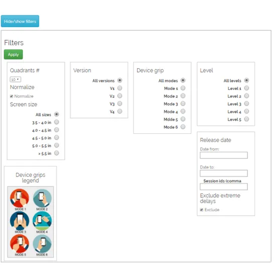
3.9 The possible filters. . . 75
3.10 Mobile version of the user website . . . 77
4.1 Distribution of game sessions by game mode. . . 79
4.2 Total collected data points by device screen size. . . 80
4.3 Delay heatmaps . . . 81
4.4 Average delay by position on screen. . . 83
4.5 Average distance from target by position on screen. . . 84
4.6 Delay by screen size. . . 86
4.7 Delay by distance between subsequent taps. . . 87
4.8 Average delay and average distance from target by target size. 88 5.1 Nokia communicator . . . 93
5.2 Microsoft surface . . . 94
5.3 Users of online messaging applications . . . 97
5.4 A.L.I.C.E. brain . . . 101
5.5 Main VPA logos . . . 105
5.6 Main bot platforms . . . 106
5.7 Quick replies . . . 117
5.8 Structured commands . . . 118
5.9 Structured messages . . . 119
5.10 Telegram command list . . . 129
5.11 Visibility of system status . . . 132
5.12 Speak user language . . . 133
5.13 Delayed message . . . 135
5.14 Clear preferences . . . 136
5.15 WeatherBot buttons inconsistency . . . 136
5.16 Weatherbot . . . 137
5.17 Hipmunk flexibility . . . 138
5.18 Chatty bots . . . 139
5.19 Hipmunks lack of errors indication . . . 139
5.20 Helpful bots . . . 140
Abstract
Usability of digital interfaces is a crucial point for their success, but, if a lot of efforts have been devoted to the development of usable desktop Web in the last decades, more has to be done for mobile environment. Mobile apps, mobile web sites, conversational interfaces, wearable devices, ubiq-uitous computing: a lot of new technologies are rapidly emerging and tra-ditional usability studies are barely able to adapt to them, addressing the new challenges that arise because of fragmentation. The aim of this work is to investigate the state of the art in mobile usability techniques and re-searches, and try to address the problem of a lack of suitable approaches to usability studies. In this work, the application of game mechanics to non-gaming contexts—such as usability evaluation—is investigated. A simple mo-bile game application has been developed in order to collect a large amount of usage performance data produced by end-users in real world contexts. An analysis of the collected data is presented, comparing them with previ-ous studies, and clarifying unexplored effects of device grip and screen size on usability metrics. Results show, as expected, that the increasing screen size negatively affects users performance in terms of speed and accuracy, and that device grips should be taken into consideration when designing interfaces. Results demonstrate that this data collection approach can be used to validate existing guidelines and renew them according to changes due to the evolution of hardware and software trends. Further studies have been conducted to understand what the emerging trends of mobile inter-faces are, in order to figure out which new challenges usability studies will have to face up. Among the plethora of emerging hardware and software interfaces, a great, increasing, and renewed interest has been observed for
2
conversational interfaces, notably bots. Hence this old, yet new, kind of in-terface has been chosen as an example of technology that would need de-tailed studies of usability, in order to be fully exploitable. Conversely to bots developed over the last decades, in the last couple of years, bots have been acquiring increasing capabilities and purposes more related with everyday tasks. The possibility of using online messaging applications as real devel-opment environments is one of the main reasons for the current spread of bots. Bots reside inside these messaging applications instead of being stan-dalone systems with their own interface, letting users interact with them by means of already known interfaces. An overview of these online messaging platforms, highlighting bot characteristics, advantages, and disadvantages, is also provided, comparing them with mobile applications, in order to under-stand whether or not bots could possibly be a replacement of apps. Dis-cussing the different characteristics of these technologies, it can be argued that bots will not substitute apps in the near future, but that for now they can be a valuable alternative in some cases, and that in the future of mobile and ubiquitous computing, additional interface changes will undoubtedly have to be faced by designers and developers. An example of usability study of modern bots is presented, using a heuristic evaluation, in order to under-stand advantages and lacks of traditional methods, when related to emerg-ing technologies. Both the study of interaction modes for mobile apps and the study of textual bots on messaging platforms prompt the development of new approaches to usability, tailored to emerging trends and technolo-gies, in order to capture their peculiarities. In this context, gamification can be an effective way of gathering large amounts of data to support usability studies.
Introduction
Over more than thirty years of Internet, personal computers, mobile phones, and social networks, the way in which people get access to data and services has radically changed. From mere working tools, technological devices have acquired a predominant position in people everyday life and tasks. What has become evident is the centrality of the user in the process of technology commoditization: the possibilities offered by this evolution should be easily accessible to users in order to be fully valuable. Nowadays, the importance of the development of usable digital interfaces is largely renowned by web designers, developers, and human-computer interaction experts [94].
Another fact in this panorama is the continuous and rapid change of these technologies, besides the emergence of new ones. Not just hard-ware and softhard-ware interfaces have been changing over the years, but also the user’s propensity towards technology and the needs that technology has to satisfy have transformed. Because of the pervasiveness of the Web, users ex-pectations have changed: people expect to find whatever they search, pre-tend that web sites work, and are generally less tolerant to faults and bad design [94]. Hence, challenges for usability studies have been abundantly increasing, are still growing, and will continue to grow, as this evolution is far from stopping [10], .
After the emergence of a new technology trend, some time is needed before it becomes mature, usable, and accepted by users. Several studies and efforts are needed for the technology improvement and to understand the real users desires. For instance, smartphones have been out there since more than twenty years, but only ten years ago, with the iPhone, they have gained their success: at that time, technologies for the devices were mature, the use of digital devices in everyday tasks was already accepted, and us-ing a phone for purposes different—and far—from simply callus-ing or textus-ing
4
someone have become fairly normal [122]. How was the iPhone different from other smartphones in order to persuade people to spend hundreds of euros (or dollars) for something not so fundamental in a person’s life? Not just the more charming design of Apple’s iPhone, if compared with existing smartphones, has ratified its success, but most of all, Apple’s conception of the mobile Internet as being another modality of the existing wired Inter-net, and its leveraging of existing systems competencies [122]. Apple and the iPhone, have created in the people the need of owning a smartphone— especially that one—opening the doors to the spread of smartphones how we know them today [11].
Touchscreens, before that time, were not so popular too, whereas now it is difficult to find a smartphone with a physical keyboard. Resistive touch-screens of older PDAs (Personal Digital Assistants) could register only a sin-gle touch event at a time and needed significant more pressure than modern capacitive ones, making the use of a stylus almost necessary, and different kind of gestures very impractical [57].
In contrast to most screens of 2007, the iPhone’s capacitive touchscreen was much more accurate, cheaper and multi-touch: different and more “natural” types of gestures—such as swiping for sliding—were possible, mak-ing it much more pleasant and easier for users to interact with the device. A more mature touchscreen technology, together with a set of dedicated ap-plications, specifically oriented to the Web—unlike most other smartphones, the iPhone required a mobile data plan—and entertainment—with the iTunes music and video service—made Apple’s strategy successful in turning the smartphone market into the most valuable in digital technologies in the last decade [122].
Hence, it is comprehensible how the usability of an interface can decree its success and how the importance of good and modern usability studies cannot be forgotten. Usability studies should follow emerging technologies and possibly be suitable for the new ones, easily adapting to them.
A lot of efforts to help designers and developers to build usable inter-faces have been made through the years: usability guidelines and studies have covered ample areas of usability issues, resulting in improvements on different technologies, primarily web sites [66]. However, the time and ef-forts needed to have a deep knowledge of web usability have been huge so far, and are still not sufficient: not all the websites built today are usable,
5
even though the necessary tools are highly available.
The process that has brought to have an acceptable degree of usability of web sites, is being gone through by mobile applications since their spread, over the last ten years. The time needed to reach a good level of usability in mobile applications has been lower than the time needed by web sites to accomplish a similar level. One of the reason is that previous studies, re-garding desktop web sites, have been adapted to mobile applications, hence existing knowledge has been reused, having more clear which aspects need to be investigated. However, as all with new technologies, the mobile envi-ronment has originated new challenges to be addressed, making necessary further studies, that are far from being completed [93]. Mobile devices have inherent physical limitations, that need to be taken into consideration when designing for mobile [18].
Even though existing usability studies can be adapted to emerging trends, efforts needed to have a deep knowledge of the technology, and to make it usable, mature, and successful are still quite high. Considering the rapid changes in users needs and interfaces, these efforts can become unafford-able and the time needed unbearably long. Traditional study methods, used to collect user data, to validate existing guidelines, and to develop new ones, need to be supported by new techniques, in order to minimize the efforts and time needed to make mature the new technologies [46]. Traditional lab-oratory experiments on usability are still the preferred method to research on guidelines [62], but new trends in the last ten years, have been increas-ingly focusing on field trials, collecting data from users in everyday life con-texts [17].
A promising and still partially exploited technique to collect large amounts of data, from users in real contexts, is the use of game mechanics in non-gaming contexts, known with the term of gamification [30]. In the last cou-ple of years, gamification has drawn the attention in academia and research and is being increasingly used in scientific contexts [123]. The development of small mobile games, in order to study users behavior while using mobile devices, seems a cheap and fairly fast way to collect large sets of meaningful data, that can be used in mobile guidelines studies [47].
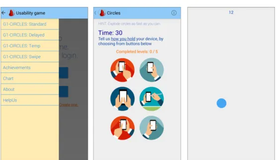
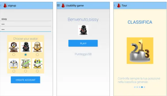
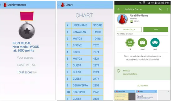
In this work, a mobile application game—Usability game—we developed in order to study the influence of smartphone screen size and hand pos-ture, used to hold the device, on users performance. Initially collected data,
6
on a two months basis, have been analyzed and results are presented and discussed.
Further studies have been conducted to investigate what the emerging trends in terms of interfaces are, and how traditional inspection and us-ability evaluation techniques are able to adapt to these new trends is also discussed.
Several emerging wearable devices—such as smart-watches, smart-glasses, wristband/armband fitness trackers, sensing jackets and so forth—have gained popularity, supported also by advances made in virtual and augmented re-ality, and in general what is called natural and ubiquitous computing, which are slowly advancing and gaining more interest in scientific research. A faster emerging—or re-emerging—trend, in the last couple of years, is repre-sented by the renewed interest for older chatterbots. Over the last decades, conversational interfaces have received different degrees of interest: from the idea of developing intelligent devices, able to converse with real peo-ple, while fooling them into believing to interact with another human, today, “modern” bots are overtly artificial [76].
Indeed, one of the main differences between modern bots and tradi-tional ones is their changed purpose: from mere research ambitions, now most of them are more focused on information tasks, and in general to sup-ply users with useful data and services about diverse contexts, from weather forecast, to trip organization.
In the last couple of years, the mobile applications spread has suffered an abrupt trend reversal: most used apps are online messaging apps and users do not download tons of new apps as it was in the beginning [123]. Moreover, the main online messaging applications, have turned into real development environments, giving developers facilities for fast and easily develop bots that are able to access the more diverse sets of data and offer diverse ser-vices to users. This scenario of the re-birth of bots has raised the question whether modern bots could possibly be a replacement for traditional apps. In this work, the emergence of this new application-like bots has been investigated, their strength and limitations and their usability has been stud-ied, in order to determine whether traditional methods can be easily applied to new technologies.
7
Research questions
From the aforementioned open challenges and questions about mobile in-terfaces usability, and the future of software inin-terfaces, the aim of this thesis is to investigate in these directions.
The research questions that the next chapters will try to address are:
RQ1 - Exploring new techniques for usability studies: is it possible to
eval-uate and expand usability guidelines by means of large amounts of crowd-produced data, with the support of gamification?
RQ2 - Validating the proposed approach by investigating the mobile screen
reachability problem. How device grip and screen size affect user per-formance?
RQ3 - Beyond conversational interfaces: what are the trends of evolution
of mobile interfaces? Are traditional usability study methods suitable for new emerging trends?
Outline
In Chapter 1 an overview of state of the art web usability findings and tech-niques will be given. A specific highlights is given to the differences between web and mobile environments.
In Chapter 2 the proposed approach to evaluate and expand existing us-ability guidelines using gamification is examined. Some basic aspects of gamification and crowd-sourcing are introduced, together with an expla-nation of the reachability problem, and the existing solutions.
In Chapter 3 and 4 the developed mobile game is presented, followed by the analysis and presentation of the collected data.
Finally, in Chapter 5 a survey on hardware and software interfaces is pro-vided, with particular care for conversational interfaces. The new trends on conversational interfaces—modern bots—are presented, and a comparison with traditional mobile applications is explained. Ultimately, an attempt to use traditional usability methods with modern bots is given, investigating new challenges and limitations of existing approaches.
Chapter 1
Mobile Usability
In their 2006 book, Hoa Loringer cited Nielsen’s book “Designing web usabil-ity: The practice of simplicity”, as the usability manifesto: the turning point in which websites’ designers and developers finally understood that the suc-cess of a website was much more tied to its usability than to its coolness ([89], [94]).
Nielsen - Norman group is one the main and acknowledged companies studying web usability since the dawn of the web and websites. Until 2006, Nielsen Norman Group had published about 5,000 pages of reports from its usability researches, running experiments with thousands of users inter-acting with websites. Their usability guidelines have strongly influenced the web, and given a great pulse to abandon bad usability practices in favor of correct ones.
Since the publication of the “9 heuristics of Nielsen and Molich” [95], in 1990, almost thirty years ago, websites have greatly improved, but other technologies have taken hold. Mobile devices, and most of all, mobile ap-plications —generally referred as apps—have become the predominant way in which users interact with digital technologies, according to recent statis-tics [67].
Thus, the attention has much more increased on mobile applications, but since the first App Store has been launched, in 2008, even though a lot has been done, much remains to do to improve apps usability.
Regarding websites, literature is full of studies and guidelines for any of their aspects; catalogues of those can be found anywhere and are also spread by the main players of the web, from Google to Microsoft. However, for
1.1 Usability definitions: scope 9
mobile applications and mobile websites, the situation is still fragmented and unclear.
This is also due to inherent reasons: mobile devices are much more vari-able than desktop ones among each others, thus highly rising the necessity for up to date and specialized mobile usability findings.
In the remainder of this chapter, the main aspects and techniques em-ployed in web usability studies, will be depicted. A comparison between web and mobile will be introduced, with an analysis of apps usage, and an overview of state of the art of mobile usability techniques.
1.1 Usability definitions: scope
Since the beginning of studies in Human - Computer Interaction, their key goal has been to maximize the usability of interfaces, and several defini-tions of this term have been given and used over time. Initially thought for software systems, the same concepts have then been adapted to websites, and later to mobile applications.
ISO, the International Standard Organization defines usability as “the extent to which a product can be used with effectiveness, efficiency, and satisfaction in a specified context of use”
as a broader concept that can be applied to other fields not directly related to digital interfaces [56].
Nielsen, with a more specific definition, talks about usability in terms of five parameters: learnability, efficiency, memorability, errors, and satisfac-tion, adding the concept of utility, as the extent to which a design’s function-ality is needed by users [91].
As usual, with term definitions, confusion arises when several differ-ent definitions are used, causing assorted strands of research, Also sim-ilar terms, with different meanings increase the difficulty of fully analyz-ing a topic: user experience, accessibility, are different words with different meanings, but often associated to usability.
In this work, the second aforementioned interpretation will be used, in order to define the topic. An explanation of the listed attributes is given in the following sections.
1.1 Usability definitions: scope 10
Learnability
Concerns how fast users can understand how to use the system in an effi-cient and profieffi-cient way, meaning how long it takes a user to accomplish a useful task the first time they approach the system [88].
Even though for certain systems users are more inclined to face a slow learning process, because systems are perceived as complicated to use, in other cases users do not stand to spend large amounts of time to accomplish certain tasks. A famous example comes from Donald Norman’s book “The design of everyday things”, talking about Norman doors [99]:
My problems with doors have become so well known that con-fusing doors are often called “Norman doors.” Imagine becoming famous for doors that don’t work right. I’m pretty sure that’s not what my parents planned for me.
Basically the author explains how disappointing it is for users to find dif-ficulties in understanding easy systems, as doors are: a user trying to learn how to use a cockpit of a modern jet airliner, would not have a bad feeling in wasting several minutes to find how to switch-on the system, but what if for opening a door, one has to use more than some seconds? Fairly certainly they would feel angry, or disappointed, trying, for instance, to open a door by pushing instead of pulling.
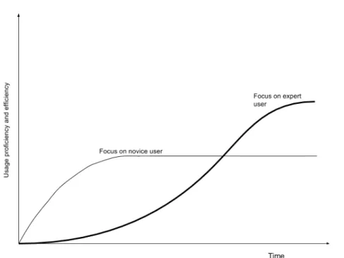
In Figure 1.1 the curves show two different types of systems: a system with high learnability, focusing on novice users, and a more complex to learn, especially thought for expert users: a trade-off between learnability and proficiency of use should be carefully chosen.
Hence, it should be considered that certain systems require higher amounts of time than others to be understood, and be started to use with proficiency.
Trying to apply this concept to digital interfaces, the context of use and target users of a system are fundamental. Low learnability can be acceptable in “complex” software systems, but it has been shown not to be tolerable in websites: the average time after which a user gets disappointed and leaves a web page because of dissatisfaction is a question of seconds [72]. Thus, the web is generally perceived as an “easy” task, and learnability is probably the crucial aspect to be considered. As Krug’s famous motto says, resuming all these attributes in one sentence, from the user’s point of view: “Don’t make me think” [65].
1.1 Usability definitions: scope 11
Figure 1.1: Learning curves: a system with fast growing learning curve, can be successful among novice users, but possibly suffers in terms of efficiency over time, limiting it to a certain extent; systems with slow growing curve, require more time to be understood, but allow expert users to reach higher efficiency with the system. Source [88]
When thinking of mobile apps, it has been shown that still a little part of users use them for complex or sensitive tasks, such as purchasing clothes, or online banking. The most used mobile apps are still focused on entertainment— i.e. social networking, music listening, gaming, as shown in Figure 1.2—hence, these should not be too complex tasks [68]. Moreover, the context of use of mobile devices is much more fragmented and diverse than desktop, as they can be used anywhere: apps should be highly learnable.
Efficiency
Efficiency is more focused on experienced users, indicating how well a user can reach their goal with the system, given they know the system.
As noted by Nielsen, it should be considered that not all systems can be fully known by their users: complicated software programs are likely to re-main highly unexplored by average users, and partly by expert ones. Hence, efficiency could be measured as how many tasks can be performed by a
1.1 Usability definitions: scope 12
Figure 1.2: In the Figure are shown the 25 top used apps, ranked by number of unique visitors. The most used apps are about social networking and entertainment in general. Source: [68]
user.
On the other hand, an expert user could be considered the one that, knowing some advanced features, can perform a task quicker than average users.
There exists a steady-state level of proficiency, in which users feel them-selves to have acquired enough expertise to use the system, and quit learn-ing and improvlearn-ing their efficiency: it corresponds to the curve flattenlearn-ing in Figure 1.1.
Thus, the definition of efficiency of use, is fairly tricky and should be defined according to the context of use, using some metrics to measure the users’ expertise.
As for learnability a distinction has to be made between the type of sys-tems: the measure of efficiency in a software system should be fairly clear when comparing a novice with an expert user, differently for what can hap-pen with web sites, and more with mobile applications. Tasks performed with web sites and apps, are generally easier than the ones performed with a software program, hence efficiency among users can be barely measured. In many studies regarding mobile devices, tested with users, an expertise term often used is the period of time in which a user has owned some device. In the next chapters some studies will be introduced. See section on 2.3
1.1 Usability definitions: scope 13
Memorability
This attribute refers to casual users, meaning how well a user is able to use the system when returning to it after some time of non - usage [88].
Once a user has experienced a system for some amount of time, they can possibly temporarily go away from it: thinking of apps, it is sufficient to compare the number of installed apps in mobile devices, and the number of daily used apps. According to recent researches, considering an average of 60 installed apps, only an average of 3 to 4 are daily used [67]. Hence, the use of apps, and websites is mostly intermittent, more than it can be with a software used for work reasons.
As noted before, the chance to find users prone to spend fairly large amounts of time to learn web sites and apps is generally low. Thus, mem-orability should be highly boosted when designing such interfaces, possibly through learnability improvements. Nevertheless, a lack of learnability does not always means a lack of memorability, because, for instance, users can remember some features just because of their appeal, even if at first sight they are not so understandable.
Indeed, in these last 30 years of usability studies, one lesson comes from the increased understanding that a good part of the success, of any product including digital ones, comes from emotional design and individual factors, not just from its technical merits [98]. Hence, even though prioritizing “cool-ness” above usability is a step backward in the usability improvements gath-ered over decades of studies, it should not be forgotten that interfaces are for humans, and psychological aspects should always be taken into consid-eration, as a good practice of human-centric design. The emotional side of interfaces is further enforced in the attribute of satisfaction.
Errors
Failing is frustrating. System failures are frustrating too. Nevertheless, there are different levels of frustration, and different ways to mitigate it in users.
A bug-free system is yet to be seen, because even assuming a system free from programming bugs, designers and developers should always keep in mind that users are going to use it in unexpected ways, thus generating unexpected system behaviors and possible breakdowns. In first instance, particular care must be put in avoiding serious errors, causing loss of ac-complishment in delicate tasks, or loss of user data.
1.1 Usability definitions: scope 14
Smaller errors, such as a broken link, can be sometimes tolerated, pro-vided the respect of two conditions: it must be clear to users that an error has occurred, and they have a visible way to recover from it, possibly avoid-ing to make them feelavoid-ing ashamed or guilty for what has happened. For in-stance, if during the registration process, a user types an incorrect password confirmation and the sign up process cannot be completed, a clear message with a suggestion should be shown in order to help the user finish their task. Undo, back and home buttons, also, for instance, in apps should always be present and visible, in order to never let the user feel lost to accomplish their goals.
Satisfaction
As mentioned while talking about memorability, simply taking into account technical features of a digital system, in order to decree its success, has be-come progressively more constraining. The emotional side of using a prod-uct should be also taken into consideration, when designing a digital sys-tem [98] According to Nielsen, satisfaction indicates how pleasant it is for a user to use the system, and he highlights how this becomes more crucial for systems with an entertainment purpose, as subjective aspects become more important. A more general and user-centric approach is generally the field study of user experience.
A quantitative approach in satisfaction measure is obviously not feasible: in fact, it is often addressed with questionnaires in which users are asked to expose their opinions and rate the system according to some numeric or semantic scale. However, even with personal questionnaires, understand-ing users’ satisfaction is tricky, because it can to be related to different as-pects: sometimes users find it pleasant to use systems that are “easy” to use, whereas others can find good-looking interfaces pleasant and so on.
Even for satisfaction, the context in which the system is used is crucial: when talking about web and mobile sites and apps, the fact that they are intended mostly for entertaining purposes, user satisfaction is considerably more important than for systems with working functionalities.
For mobile applications, app stores make directly available a system of rating and reviewing, as it is for the Google Play Store, or the Apple Store. According to Henze et al. studies on publishing apps in the stores, these reviews are generally less powerful than it can be thought [46]. Generally,
1.2 Evaluation methods 15
comments and reviews are more concerned to complain about malfunc-tioning or missing features, or about a broad appreciation, than as a true expression of users’ opinions, hence poorly valuable to improve critical is-sues.
1.2 Evaluation methods
Once defined the term usability, which are the most used techniques used to first develop and then evaluate usable digital interfaces, should be analyzed. From this point, when talking about systems or interfaces, we refer to web and mobile websites, and to mobile apps, if not differentely specified.
The process of designing usable and successful digital interfaces, in fact, could intervene at any of the steps of interface design and development: from evaluating non-functional mock ups, to user testing an up and running interface, with successive re-design and correction, it is an iterative process. Usability interface problems have started to decrease when program-mers and designers have stopped considering users as obstacles, and started to think of them as a resource [94].
Usable systems and interfaces generally require fairly large amounts of effort, in terms of time and money, hence the general trend of companies is to save these resources for other phases of product development, some-times going towards failure.
The main types of usability analysis can be differentiated principally ac-cording to two different factors: who runs the evaluation and when the eval-uation is run.
For the first aspect, the evaluation can be done from experts or with the aid of users; the other variable can vary if it is run on a functioning system, or on a not yet implemented one. A good set of possible different types of usability evaluation methods is given in the book of usability guidelines col-lected by the U.S. Department of Health and Human Services (HHS) [66]. In HHS study, studies conducted by experts are addressed as usability evalu-ation, whereas the term usability testing is used for studies conducted with users.
In the following sections a brief classification and description of the dif-ferent techniques is given.
1.2 Evaluation methods 16
Run by users
User testing is generally made to evaluate a running system, and after a user testing session, data must be collected and analyzed by usability ex-perts. It is possible anyway, to run testing at early stages of the design, and it is advisable to follow an iterative approach: after a user test has been run and corrections are made, the system should be tested again to evaluate im-provements [66].
When running tests with users, a series of tasks to be fulfilled must be specifically designed by evaluators, and notified to users. After the test has been run, quantitative and/or qualitative data have to be collected and an-alyzed by experts. After summarizing the data, these have to be communi-cated to designers and developers in order to perform necessary changes.
Laboratory studies: a limited number of users is called in a proper location,
adequately set up (see Nielsen for proper lab conditions), with proper equipment—depending on the type of device on which the interface has to be tested—and they are asked to run a set of tasks. Facilitators give users tasks to be run and indications about what is to be tested, while observers take notes on what users do, collecting data. Facilita-tors and observers can be in the same room with users, or in a separate room, observing video streaming (or recordings) of what users are do-ing.
Setting up a proper location for lab studies can be expensive, and not all companies have enough room to host users. Moreover, much care has to be taken, as observed by Sonderegger and Sauer, the presence of observers and facilitators can influence user performance: psycholog-ical stress responses, decrease of performance on some measures and affection on the emotional state of test participants, have been high-lighted [115]. Unwanted bias on testing results are undeniably a deep drawback of this kind of evaluations, even though the interface with real users is an essential element in building its usability.
Thinking aloud testing: is a particular type of lab study, in which users are
asked to talk, giving their opinions, impressions, and expressing their feelings while performing the test. The audio and video of testing ses-sions can be recorded and analyzed by experts, or they can stand near
1.2 Evaluation methods 17
Figure 1.3: A user running a lab experiment for a usability problem with smartphone devices. Source: [83]
the user taking notes. Another possible way is to ask the user to ver-balize what they think. As with typical lab experiments, results are collected and analyzed, and then sent to practitioners.
However, drawbacks of this type of evaluation can possibly be even worse than “normal” lab studies, besides its undoubtedly benefits. As observed by Nielsen, thinking aloud seems very unnatural to most people, and many users find it difficult to speak and express their ideas while using the system [88]. Moreover, asking to verbalize their thoughts can slow down user performances, or even change their behavior be-cause of the writing.
Nørgaard and Hornbæk also highlighted altered observers’ behaviors: in a specific study, when testing, evaluators seem to seek confirmation of problems that they are already aware of, and the immediate analysis of the think-aloud sessions are rarely done. Rather than asking about experienced problems, evaluators often ask users about their expecta-tions and about hypothetical situaexpecta-tions, learning little about the utility
1.2 Evaluation methods 18
of the tested system [96].
Remote testing: the user and the expert are not in the same location. User
evaluation can be done via a post-hoc questionnaire, or via a webinar, or with video recording, and tracking of what users have done.
Another kind of remote testing, that has gained popularity in more re-cent years, is the field trial: people use the system in real conditions for some amount of time and can collect data via diary reports, or with questionnaires. These kind of testing is also referred as into-the-wild studies [15]. A more particular type of remote testing, is the one in which users are recruited with crowdsourcing. A deeper look on these user testing methods will be given in the next chapter, where the ap-proach used in this work will be presented.
Recommended iterative testing, with test on the before and after, is one of the good practices to always be kept in mind [66].
Run by expert
These are called inspection methods and beside the advantages com-ing from money and time savcom-ings—as they can be run directly inside the company from employee practitioners and not necessarily from usability experts, with low advance planning—, they have possible drawbacks.
Sometimes they identify usability problems without directly providing solutions to solve them [95].
Moreover, several studies have shown that far more problems than ac-tually exist are often detected, whereas others are missed. On average, for every hit there will be about 1.3 false positives and 0.5 misses [66].
Inspection methods can better be used in order to identify problems to be further examined with user testing.
Cognitive walkthrough: designers and developers imagine the steps
per-formed by a user to complete a specific task and then evaluate the system responses to those tasks.
After identifying tasks the user may want to perform, the participants in the evaluations typically ask for questions related to the steps they
1.2 Evaluation methods 19
imagine the user will need to complete the task. During the walk-through, usability is measured according to if and how well a user could perform the task, collecting data about potential problems. Par-ticular care should be put in designing the tasks and simulating the users’ behavior.
Cognitive walkthrough is much about the interface learnability and memory workload, as evaluators do not know how the system is struc-tured, so they act as a user approaching it for the first time.
Automatic evaluation methods: dedicated software are able to produce
in-sights about different metrics of an interface: just simply with Google Analytics it is possible to know which are the most clicked areas in a given web page.
Automatic tools were not feasible in the early 90s [88], but whereas now there are fairly famous examples for the web, few tools can be found for apps, because of technical difficulties ([63], [69]).
Automatic tools for usability measures collect data with user clicking and navigation, some advanced ones can use eyetracking (e.g. Eye-quant [u1] ). Others are libraries to be inserted in interface code to log events generated by different users’ actions (e.g. FLUD - Framework for Logging Usability Data developed by the Visualization and Usabil-ity Group in National Institute of Standards and Technology, from US Department of Commerce [u2] ).
Data are collected in web servers and can be visualized with heatmaps or in human-readable file formats, or other images formats. Later on they have to be analyzed and evaluated by experts.
Heuristic evaluation: this method will be explained in the dedicated later
section 1.2.1, with an analysis of a set of possible heuristics.
Beside annoyance caused by non-usable systems, it should be taken into account that the impact of usability in everyday life can have severe conse-quences.
As in the example of Norman doors, interfaces with usability issues have been demonstrated to possibly make the difference between life and death: Norman also cites the Three Mile Island in 1979, a partial nuclear meltdown
1.2 Evaluation methods 20
happened in the nuclear power plant on the same name island, that caused the emission of radioactive gas in the environment. Even though the prob-lem was said to be caused by “human errors”, Norman, who was asked to investigate on the accident, highlighted several usability problems in the su-pervising system [97].
Similar to this one, potential threatening problems have been shown in interfaces of health systems: system for dosing medicines to hospital’s pa-tients with a numerical keyboard was given to nurses, changing from an in-terface with up and down arrows used before. With the numerical key-board, nurses were shown to make mistakes of several orders of magnitude in dosing medicines, potentially seriously damaging patients’ health [97].
Even if such severe threats are not so likely to happen with common digital interfaces, these examples just reinforce the assumption that usability is crucial in many fields.
Thus, even though the importance of designing usable systems has been understood in years of experience and studies, still many companies do not apply the necessary techniques because of the necessary high efforts for running such studies, as previously mentioned. On the flip side, Nielsen propose the application of discount usability methods, as the application of simplified usability testing techniques, in order to lower costs and attracting companies to run usability studies [86]. According to Nielsen, just by apply-ing simplified usability techniques, instead of complete ones, usability can be improved by a good extent and can be adopted by every company.
The importance of usability in commercial systems, either web sites or apps, has been also shown in many studies: usable websites have been shown to be perceived more trustworthy, with increased loyalty of their users ([94], [36]). Improved usability has a positive influence on user sat-isfaction, hence on product success. The same benefits can be observed on mobile apps.
Thus, the base rule for usability success is a user-centric design: when developing interfaces, this has to be done trying to understand users’ needs and prioritize them. Bad design has been shown often to be due to design-ers designing for not real targets: as Nielsen often outlines, designdesign-ers and developers are not target users of their product, hence they should not be the ones evaluating their usability.
1.2 Evaluation methods 21
1.2.1 10 heuristics of Nielsen (and Molich)
Originally this set of heuristics was composed of only 9 items, and was de-veloped by Nielsen and Molich, in order to lower the complexity of the big amount of available guidelines, and to give experts a quick way to evaluate the usability of an interface [95]. Subsequently the set was enlarged to 10, by Nielsen, and the heuristic evaluation better explained and tested as a usabil-ity evaluation method, that can be used by experts to analyze an interface and rate its usability, using this general principle, without using long time to select a good and complete amount of guidelines from the thousands avail-able [85]. The term experts does not necessarily imply it should be usability experts, but it is used just to distinguish practitioners from users.
In heuristic evaluation, a small set of experts using a limited set of recog-nized usability principles—“heuristics”—judges how an interface is compliant to this set of heuristics. The best number of evaluators ranges from three to five (according to Nielsen [87]), since in previous studies with Molich, on dif-ferent projects, evaluation made by only one evaluator, only found about the 35% of usability problems. Thus, it is advisable to run this analysis with mul-tiple experts, and the indicated number, can increase the percent of found problems, maintaining a good trade-off with costs. Nevertheless this re-mains a cheap and quick method of evaluation, compared to usability test-ings conducted with users. Another advantage of heuristic evaluation is that it can be run at any time of the process of design and implementation, and with small advance in planning [95].
On the flip side, drawbacks of this method should also be considered, be-cause other studies have shown a low problem detection, and the need for large numbers of evaluators: 16 evaluators have been needed to uncover the 75% of problems in other studies [66]. Other problems can come from the fact that evaluators frequently apply wrong heuristics or guidelines, which can be misleading for designers asked to solve the problem.
This set of heuristics is probably the most known and used ones by us-ability experts for their reviews; following a description of the heuristics will be given, and for each one, the original heuristic can be found between parenthesis.
1.2 Evaluation methods 22
the interface, it should be clear what is happening, after reasonable amount of time. At every action of the user, a feedback should always be provided, to inform them what is the effect of such action. If, for instance, a user clicks a search button, and the research takes several seconds to the system in order to perform it, a loader could inform the user to wait for the result to be provided. If the user is not informed on what the system is doing, it is likely they will feel lost, and likely to abandon the web site or the app.
Match between system and the real world (Speak the user’s language): in
or-der to make the user feeling comfortable with the interface, the in-formation should not be provided with technical language, but rather with human expressions. Error messages, menu items, buttons’ text, should be familiar and straightforward to the user to understand. More-over, depending on the target users, the type of user that is likely to use the system, a different language should be used. Depending on ethno-graphic characteristics, system purposes and contexts of use, the sys-tem could change its way of expressing, always trying to keep a natural and logical order of the given information.
User control and freedom (Clearly marked exits): support for
undo-cancel-redo-go back-home links is essential for users finding themselves in unwanted situations. It often happens that users find themselves in a different situation from the desired one, because of wrong steps: they should find an easy way to exit from that situation and go back to a more comfortable one.
The lack of such “emergency exit” can cause some kind of panic in users who find themselves stuck at some undesired point.
Consistency and standards (Be consistent): same words should mean the
same concept, and different ones should mean different concepts too. If this distinction is not respected, users get confused and are prone to errors.
Furthermore, consistency with the external “world” should be respected: there is no need to re-invent existing and well-known terms, concepts and procedures: using familiar expressions and conventions, lets users feel more confident in using the system avoiding errors.
1.2 Evaluation methods 23
Error prevention (Prevent errors): as also mentioned while explaining
us-ability definition, failures are frustrating, hence, preventing errors oc-currence is important. Much attention should be put on severe errors, but any possible recognized error should be considered. Clearly, not all possible errors can be detected before the system is deployed to users, because users can perform unexpected actions with the system, but preventing known errors is crucial.
For instance, in a registration form requiring a password with special characters, password validation could happen while the user is typing, instead of on submission.
Recognition rather than recall (Minimize user memory load): while talking
about memorability, in usability definition, it has been said that it should be easy for casual users to remember where to find what they look for. In addition, it must be said that also while using the interface, users should not be asked to remember previous executed steps or chosen options: objects and actions should be visible, and the user has to be able to carry on their tasks without remembering what they already did.
Flexibility and efficiency of use (Provide shortcuts): as previously seen while
talking about learnability, when designing a system, both novice and expert users must be kept in mind. Without compromising the inter-face learnability, shortcuts for usual users should be provided, in order to increase their efficiency in using the system.
For instance, in an e-commerce web site or app, a registered user should be able to conclude an order without always re-inserting their address or payment information.
Aesthetic and minimalist design (Simple and natural dialogue): even though
an interface should be aesthetically pleasant for users, unnecessary in-formation should be avoided at any step of the interaction. A clean design, supplying concise and necessary information to the user, in-creases users satisfaction and lowers frustration in searching for ele-ments.
Interfaces with redundant information do not allow users to easily find desired elements and appear difficult to use.
1.2 Evaluation methods 24
Help users recognize, diagnose, and recover from errors (Good error messages):
where error prevention is not possible—as previously said, not all the possible errors can be detected before deploying a system to users— errors should be clearly shown to users, together with a possible way to recover. Users’ behavior and interface use is not predictable, hence, any possible exception should be highlighted and explained to users, and wherever possible, a recovery should be offered.
Help and documentation (new): even though a manual should not be
nec-essary for a user to favorably use an interface, at some point help could be needed, hence a visible way to access documentation about the sys-tem, should be supplied.
Help, support, and documentation, to avoid the users feeling lost, should be visible and effective, focused on users’ questions and task, and also completely but not too largely expressed.
1.2.2 Web usability guidelines
Nielsen claims to have developed the 10 heuristics in order to provide de-signers and developers a quick way to design and evaluate usable interfaces, without struggling with thousands of guidelines [88].
As previously mentioned, there exists indeed several sets of structured guidelines for web sites, organized in categories and heuristics, covering all the main aspects of the interface. These guidelines are the result of specific researches on peculiar aspects of the interface and each addresses a specific interface issue.
Examples of structured guidelines for web usability have been developed from different types of institutions, such as governments, private compa-nies, or public authorities. HHS, part of the US government [66] has devel-oped and maintains organized and up-to-date, what is probably the largest set of these guidelines [66]. The W3C (World Wide Web Consortium) has several Working Groups that are developing standards and guidelines for us-ability and accessibility [26]. The Nielsen-Norman Group periodically pub-lishes reports concerning their usability experiments to update already ex-isting guidelines and disclose changes happening on the Web ([92], [94]).
These guidelines are generally divided into categories, each one address-ing a macro-issue of interfaces, which is then detailed by saddress-ingle guidelines.
1.2 Evaluation methods 25
Beside differences among categories of different sets of guidelines, typ-ical macro-areas of interfaces are similar:
Layout: recommendations regarding the pages structure, thus how to place
elements on single pages in order to make it easy for users to find, read, and understand the content, and to perform their tasks. Pages lay-out deeply influences learnability for users approaching the web site, helping them to fast understand where to find what they are looking for.
Indeed, it is recommended to give the right emphasis to important page objects, following an order that reflects their importance: objects needing more visibility should be placed on the top or in the center of the page, where users’ attention is firstly attracted.
Anyhow, the layout should not be messy, or too crowded: pages with high elements density, make it difficult for users to find the searched content, lowering memorability and also efficiency for expert users. One of the most important aspects concerning layouts, is compatibil-ity with different screen resolutions. Using fixed or absolute layouts, using fixed dimensions for objects is one of the worst practices to be used. Implementing fluid and responsive layouts, that adapt elements dimensions to diverse screen resolutions, requires great efforts to de-velopers, but it is a necessary requirement for usable web sites. Luck-ily, this good practice has been increasingly adopted with the web evo-lution, and several frameworks supporting developers to implement responsive design, have been emerging through years [66].
Guidelines suggest also to minimize pages’ length, thus limiting vertical scrolling; horizontal scrolling should be attentively avoided.
Navigation: refers to the way users move inside the web site, hence all the
elements providing hyperlinking, such as menus, buttons, links and so forth.
Navigation items have the aim to indicate to users their destination pages and how to reach them. Thus, navigation element labels should be descriptive, and menus clearly organized, with proper hierarchies and grouped elements. Main menus should be on the left panel, be-cause it is the place where users generally expect to find them, or on
1.2 Evaluation methods 26
the top of the page. It should always be clear the difference between active and visited links, using different graphical effects, such as dif-ferent colors, or underline.
Guidelines concerning navigation have the aim of helping users to eas-ily identify the necessary steps to accomplish their tasks, without feel-ing lost, or without an exit. Users should always have clear where they are on the web site and where they should go successively: bread-crumbs and site maps are necessary tools to help users in their tasks. In order to always offer an emergency exit, also back and home but-tons should be present, together with a search box in case some links cannot be found.
Information organization: in order to help users to find useful
informa-tion, this has to be clearly organized and grouped, with proper order and hierarchy, with different web site and page levels: the informa-tion structure should reflect user needs and site’s goals. Developers have to ensure that necessary information is displayed and important one is highlighted, avoiding unnecessary content. Indeed, users are known to spend more time scanning content instead of really reading it, hence this process should be supported using meaningful, unique and descriptive headings—with appropriate HTML order—and mean-ingful page titles.
It is also recommended, regarding the quantity of provided informa-tion, to minimize the number of pages and clicks.
Common pages: this category contains recommendations regarding web
pages that are generally common to all web sites. Obviously the home page is always present, but also other useful pages, like FAQ (Frequently Asked Questions) and site map should also be present, to help users find help whenever they feel lost. Probably the home page has the highest importance among the pages composing a web site, but it is not uncommon people that land to other internal pages, after a web search with search engines.
In first instance, the home page design should clearly communicate site’s purposes, giving a positive first impression of the web site. It should visually clearly appear as a home page, with limited written
1.2 Evaluation methods 27
content, and by any means showing all major web site’s available op-tions. Moreover, it should be reachable from any part of the web site, maybe through a clickable logo on the top of all pages.
On the other side, site maps should provide access to all the features of the web site, being up-to-date to reflect the current state of the web site. Not every possible link has to be provided, nor the web direc-tory structure has to necessarily be respected, but all hierarchies and relationships should be clear.
Concerning FAQ page, it should reflect actual frequently asked ques-tions from real users, not just additional information not fitting any-where else in the web site. Questions should be grouped together if numerous, either by topic, or by popularity, or other types of catego-rization. If numerous, all the questions should be provided on the top of the page, and answered either on separate pages, or on the remain-ing part of the page.
Site map and FAQ page, like the home page, should be reachable from all other pages of the web site, but their links are generally placed in the footer part, at the bottom of the page.
Design: this set of guidelines concerns the global appearance of the web
site, as well as the graphical and multimedia elements employed in web pages. In a general way, as recommended by one of the Nielsen’s heuristics, even though the aesthetic appearance should be pleasant, an overloaded design can be confusing, hence also images, and other graphical elements should be carefully used. A lightweight design should be prioritized in order not to slow the download and response time of the web site.
Background should use simple images, or plain colors; images should be optimized for the web in terms of weight, and if large images have to be served, thumbnails could be used. Moreover, clickable images should be clearly indicated and above all, the use of images and mul-timedia in general—-mainly audio and video—should be limited to the real need of using them in meaningful ways: graphics should facilitate learning and not just be aesthetic embellishments, or a way to convey user attention.
1.2 Evaluation methods 28
Audio, video, and animations starting without the explicit request of the user, and without a meaningful reason, have to be avoided, because they are generally annoying for users.
One image that should be always clear and visible, is the web site owner logo, possibly clickable, linking to the home page, in order to provide users with an always present emergency exit, and recognizability. An important aspect of the general design is coherence, both inter-nal, amongst the graphical web site’s element, and exterinter-nal, with other existing similar graphical elements, such as icons or graphic buttons.
Content: recommendations about writing text for the web sites, from taglines,
to articles, or products descriptions.
As mentioned for others sets of guidelines, users do not generally read the full content, but are more likely to scan it: users do not spend much time to understand a web site, sessions of use are fast, hence texts have to be clear and concise, avoiding unnecessary information, deferring less important ones to secondary pages or expandable paragraphs. By any means, text has to reflect the users’ language, avoiding technical terms, and using appropriate language depending on its target users, but also avoiding jargon. Also abbreviations and acronyms should be moderately used and always be explained
The first sentence of each paragraph should be descriptive, when writ-ing prose, for the rest of the paragraph, helpwrit-ing users to understand what they need. Text appearance should also be bore in mind: read-ing on a digital screen requires more attention to the user, and it is generally more difficult to understand. Hence, graphical text char-acteristics have to be exploited to minimize the user cognitive load, and help them to easily differentiate words. Text-background color contrast should be high—black text on white background is generally a winning idea, font size should be appropriate and readable, and also font family should be familiar to users: researches demonstrate that there is no difference in speed reading serif or sans-serif fonts, but using unfamiliar fonts can slow down user performance [66].
Other suggested techniques to increase readability in long texts are the cautious use of mixed-case, using appropriate capitalization, and the
1.2 Evaluation methods 29
highlight of important information, with bold or underlined words or phrases, sparingly used.
Accessibility: special guidelines for people with disabilities. W3C has a
spe-cial initiative called WAI [u3]—Web Accessibility Initiative—that devel-ops guidelines and other material to help make the web accessible to people with limited viewing and hearing capabilities. WAI is com-posed of 3 working groups developing guidelines regarding web con-tent, authoring tools and user agents, all of which are standards (ATAG - Authoring Tool Accessibility Guidelines, WCAG - Web Content Ac-cessibility Guidelines, UUAG - User Agent AcAc-cessibility Guideline). According to W3C, improving accessibility, also helps usability in mo-bile devices, as generally highly accessible web sites, easily adapt to different browsers and are highly usable. Whereas UUAG and ATAG regard the development of technical tools—notably more accessible user agents and authoring tools—WCAG indicate how to produce ac-cessible web sites, based on principles that resemble the usability at-tributes developed by Nielsen: operability, perceivability, understand-ability and robustness.
In general, accessibility of web sites is based on the concept that the content should be available also if users do not have full capabilities of fruition. Limited possibilities could not be just physical impairments: slow connections, limited screen resolutions, malfunctioning devices, and other technical limitations could possibly be present too.
Thus, in order to produce highly accessible content, careful attention has to be put in using multimedia content: alternative texts or captions should be provided instead of images, or videos, or audio, and where not possible, substituting elements with the same meaning should be served.
All functionalities should be made available even in absence of a point-ing device. Guidelines regardpoint-ing text should be more stressed: con-ciseness, high-contrast, and correct font size and family should be studied in deeper way. Compatibility with different browsers and other tools should be also maximized.
1.3 Web vs. mobile: mobile limitations and strengths 30
1.3 Web vs. mobile: mobile limitations and strengths
When talking about mobile usability, inherent device limitations should be taken into deep consideration, because they strongly influence users expe-rience of use [19].With mobile also different types of interfaces are possible, the first choice is between a mobile web site or an app. Moreover, in the first case, another choice that has to be made is whether to design a responsive full website, or a dedicated mobile web site.
According to Nielsen it is generally better to have a separate web site, and even better, a dedicated app, mostly for complex tasks [84].
Furthermore it is necessary to know for which mobile device the app has to be designed: depending on which device is considered—a smartphone, rather than a tablet, or other—-apps should have different interfaces and purposes. Indeed smartphones are more personal devices, whereas tablets are shared between people. The size of the touchscreen is different and tablets are generally used for easier tasks: playing games, checking email, social networking, watching videos, reading news or books.
Some limitations are common to all mobile devices, and whatever is the choice of having a mobile web site or an app, designers have to deal with them.
1.3.1 Limitations
Small screen size
In mobile devices the content view is much more limited than on desktop computers, as the available screen area is much smaller. Hence a limited amount of information can be displayed at any time to the user: small fonts often make reading on small devices an awkward experience.
Moreover, multiple windows cannot be displayed at the same time, mak-ing multi-taskmak-ing not possible. Users are forced to close and re-open the app whenever they need to temporarily switch task. Hence, a design should be self-sufficient: any mobile task should be possible within a single app o web site, in order to help users to fully understand needed actions [19]
Scrolling around, to have a complete and general view of the content is also necessary, increasing the cognitive load required to users: interaction is more complex and error prone.
1.3 Web vs. mobile: mobile limitations and strengths 31
Context of use/environment
The main difference of mobile devices is their portability. They can be used in any location, indoor or outdoor, with different weather conditions, sur-rounded by other people.
This conditions and context variability makes the attention on mobile often fragmented and generally sessions of use are pretty short. The aver-age mobile session duration is 72 seconds, compared to the 150 seconds of desktop [18].
While using mobile, people are likely to be interrupted, and forced to temporarily give attention to other external factors, and go back later to finish their task. Hence designers should put much care in saving user’s progress in their tasks, and make it easy to retrieve the context of interrupted tasks.
Furthermore it is even more important to minimize the information given to users: it is necessary to identify important information and give them as soon as possible, prioritizing essential yet complete design.
Touchscreen
Nowadays the largest part of mobile devices totally relies on this technol-ogy, and many are totally free of physical buttons. If several gestures, differ-ent from the single click, are efficidiffer-ently exploited, the experience of use of touchscreen can be fluid and faster than with physical keyboards.
On the flip side, gestures suffer of low memorability and discoverability, they are sometimes hidden and fairly complex to remember [18].
Probably the biggest problem is for typing: using soft-keyboards requires the user to continuously split their attention between the keyboard and the writing area. Target buttons are pretty small and are subject to the so-called fat finger problem: whenever target sizes are smaller than the size of the person’s finger, the tapping can lead to misleading actions, because of the wrong touched area. This problem is worsened because, while tapping, the clickable area is occluded to the user and tapping feedback are not always present, nor clear [53].
There exists a contrast between the reduced screen area and the target size of interface objects: it is necessary to find a good trade-off between this two needs has to be found, in order to minimize errors coming from mistyping, and avoid it.