UNIVERSITÀ DEGLI STUDI DI SALERNO
SCUOLA DI DOTTORATO
PhD in Scienze e tecnologie dell’informazione, dei sistemi complessi e
dell’ambiente – XIII ciclo
Tesi di Dottorato
Enhancing Data Warehouse
management through
semi-automatic data integration
and complex graph generation
Mădălina Georgeta Ciobanu
Tutor Coordinatore del corso di dottorato
Prof.ssa Genny Tortora Prof. Roberto Scarpa
To my family
"Understand well as I may, my comprehension can only be an infinitesimal fraction of all I want to understand." -Ada
Lovelace-Summary
Strategic information is one of the main assets for many organizations and, in the next future, it will become increasingly more important to enable the decision-makers answer questions about their business, such as how to increase their prof-itability. A proper decision-making process is benefited by information that is frequently scattered among several heterogeneous databases. Such databases may come from several organization systems and even from external sources. As a result, organization managers have to deal with the issue of integrating several databases from independent data sources containing semantic differences and no specific or canonical concept description.
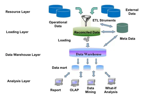
Data Warehouse Systems were born to integrate such kind of heterogeneous data in order to be successively extracted and analyzed according to the manager’s needs and business plans.
Besides being difficult and onerous to design, integrate and build, Data Ware-house Systems present another issue related to the difficulty to represent multidi-mensional information typical of the result of OLAP operations, such as aggrega-tions on data cubes, extraction of sub-cubes or rotaaggrega-tions of the data axis, through easy to understand views.
In this thesis, I present a visual language based on a logic paradigm, named Complexity Design (CoDe) language, and propose a semi-automatic approach to support the manager in the automatic generation of a Data Warehouse answering
tions in natural language and selects the needed information among different data sources. The selected data are imported from the databases, a data tuning process is enacted, and an association rule mining algorithm is run to extract the concep-tual model underneath the data. Successively, the CoDe models are provided and the Data Mart is generated from the models. Finally, the CoDe model and the DW data are used to generate a graphical report of the required information. To shows the information the manager needs to make his decision according to the strategic questions, the report adopts Complex Graphs.
In this thesis, I also evaluate the effectiveness of the proposed approach, in terms of comprehensibility of the produced visual representation of the data ex-tracted from the data warehouse. In particular, an empirical evaluation has been designed and conducted to assess the comprehension of graphical representations to enable instantaneous and informed decisions. The study was conducted at the Uni-versity of Salerno, Italy, and involved 47 participants from the Computer Science Master degree having management, information systems and advanced database systems and data warehouse) knowledge. Participants were asked to comprehend the semantic of data using traditional dashboard and complex graph diagrams. The effort required to answer an evaluation questionnaire has been assessed to-gether with the comprehension of the data representations and the outcome has been presented and discussed.
The achieved results suggest that people reached a higher comprehension when using Complex Graphs like the ones produced by our approach as compared to standard Dashboard Graphs. Furthermore, the analysis of the time needed to comprehend the data semantic shows that the participants spent significantly less time to understand the representation adopting a Complex Graphs visualization as compared to the standard Dashboard Graphs.
representation in term of comprehension and effort, with most skilled participants taking a greater advantage in comprehension time. This finding could be very relevant for the decision maker. Indeed, complex graphs represent an effective visualization approach that enables a quicker and higher comprehension of data, improving the appropriateness of the decisions and reducing the decision making effort.
Based on this result, an automatic generation of data warehouse has been pre-sented that uses complex graphs to visualize the main facts that a decision maker should use for strategic decisions. In particular, the CoDe language has been adopter to represent such information.
When assessing the automatic generation of data warehouse, the most critical phase of the process has been the data integration, due to the need of an important contribution from the manager. So, to encourage the implementation of the process in a real setting, a semi-automatic data integration process has been proposed and tested on 4 case studies to assess the goodness of the approach. The results, indicate that, despite some limitations, in three of the four case studies we obtained encouraging results.
Acknowledgements
I am grateful to my supervisor Professor Genny Tortora because this thesis would not have been possible without her support, understanding, patience and encour-agement and for pushing me farther than I thought I could go.
It is a pleasure to thank Dr. Michele Risi for his great support during these years.
Finally, I would like to acknowledge with gratitude, the support and love of my family for believing in me. A big thank you goes to my mother who allowed me to get where I am and a special thanks to my husband Fausto for his patience.
I thank all the people dear to me, my old and new friends and the Marconi’s management staff.
I dedicate this thesis to my children, Elisa and Rosario, who are my life, my joy, my everything and I hope one day they will live experiences like those of mum and dad and even better!
Contents
Summary iii Acknowledgements vii 1 Introduction 1 1.1 Thesis organisation . . . 4 2 Related Work 5 2.1 Data warehouse conceptual design . . . 52.2 The evaluation of graph . . . 7
3 Complex Graph modeling with CoDe 11 3.1 CoDe language overview . . . 14
3.2 The Complex Graph Generation tool . . . 20
4 Comprehension of Complex Graphs 25 4.1 Design of the Empirical Evaluation . . . 25
4.1.1 Context Selection. . . 25
4.1.2 Variable Selection . . . 26
4.1.3 Hypothesis Formulation . . . 28
4.1.4 Experiment Design, Material, and Procedure . . . 29
4.1.5 Analysis Procedure . . . 31
4.2 Results of the Empirical Evaluation . . . 33
4.2.1 Effect of Method . . . 33
4.2.2 Analysis of Cofactors. . . 35
4.2.2.1 Effect of Subjects Ability . . . 35
4.2.2.2 Effect of the Section . . . 35
4.2.3 Post-Questionnaire Results . . . 35
4.3 Discussion . . . 39
4.3.1 Implications. . . 39
5.2 Strategic Question Definition . . . 47
5.3 Data Source Selection . . . 48
5.4 Concept Identification . . . 48
5.5 Complex Graphs Generated by CoDe. . . 52
5.6 CoDe Modeling . . . 56
5.7 Data Mart Generation . . . 60
5.7.1 Data Model Generation . . . 60
5.7.2 Logical/Physical Model Generation. . . 67
5.7.3 Data integration . . . 67
5.8 Reporting Tool . . . 70
6 Semi Automatic Data Integration 73 6.1 Semiautomatic Data Integration Process . . . 73
6.2 Integration process: from data sources to OLAP schema . . . 75
6.3 Data extraction and integration and construction of reconciled scheme 76 6.3.1 Data Sources . . . 76
6.3.2 Data preprocessing . . . 77
6.3.2.1 Preprocessing Data in R . . . 81
6.3.3 Syntactic analysis . . . 82
6.3.3.1 Computation of the Levenshtein distance . . . 82
6.3.3.2 Cluster analysis . . . 82
6.3.3.3 Advantages and disadvantages . . . 84
6.3.3.4 Syntactic analysis implementaion . . . 85
6.3.4 Semantic analysis. . . 87
6.3.4.1 Advantages and disadvantages . . . 88
6.3.4.2 Semantic analysis implementation . . . 89
6.3.5 Comparison of analysis results . . . 93
6.3.6 Data cleansing . . . 94
6.3.7 Data source Integration . . . 98
6.3.8 Reconciliation scheme . . . 100
6.3.9 A special case. . . 101
6.4 OLAP Schema Generation. . . 103
6.4.1 Conceptual design of the Data Warehouse . . . 103
6.4.1.1 Selection of the facts. . . 104
6.4.1.2 Attribute tree construction . . . 108
6.4.1.3 Definition of dimensions and measures. . . 108
6.4.1.4 Creation of the fact scheme . . . 110
6.4.2 Logical design of the Data Warehouse . . . 111
6.4.3 Implementation of the Data Warehouse . . . 114
6.4.3.2 Mondrian schema . . . 115
6.4.3.3 Population of the Data Warehouse . . . 119
6.5 OLAP analysis of the cube and strategic reports . . . 121
6.5.1 Multi-dimensional scheme queries. . . 122
7 Case studies 127 7.1 First case study: PANDA . . . 128
7.1.1 Data preprocessing . . . 129
7.1.2 Syntactic and semantic analysis. . . 130
7.1.3 Comparison of analysis results . . . 131
7.1.4 Source Integration . . . 132
7.2 Second case study: Vivaio . . . 132
7.2.1 Data preprocessing . . . 134
7.2.2 Syntactic and semantic analysis. . . 134
7.3 Third case Study: Ricette . . . 136
7.3.1 Data preprocessing . . . 137
7.3.2 Syntactic and semantic analysis. . . 137
7.4 Results. . . 138
8 Conclusion 141
4.1 Experimental Design . . . 29
4.2 An excerpt of the Comprehension Questionnaire . . . 30
4.3 PostExperiment Questionnaire . . . 31
4.4 Likert scale adopted during the post-experiment questionnaire. . . 31
4.5 Descriptive statistics for Dependent Variables . . . 33
4.6 Results of the analyses on method . . . 35
5.1 Output of the Apriori algorithm in Weka . . . 52
5.2 A comparison between extraction rules algorithms . . . 54
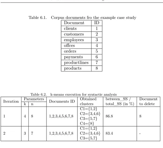
6.1 Corpus documents fro the example case study . . . 86
6.2 k-means execution for syntactic analysis . . . 86
6.3 Correspondence matrix for tables S and T . . . 97
6.4 Attributes used to identify fact measures. . . 111
7.1 PANDA case study: k-means execution for syntactic analysis . . . 131
7.2 PANDA case study: k-means execution for semantic analysis . . . 131
7.3 Vivaio case study: k-means execution for syntactic analysis . . . . 135
7.4 Vivaio case study: k-means execution for semantic analysis . . . . 135
7.5 Ricette case study: k-means execution for syntactic analysis . . . . 137
7.6 Ricette case study: k-means execution for semantic analysis . . . . 137
List of Figures
3.1 Examples of dashboard diagrams . . . 12
3.2 Example of a complex graph . . . 13
3.3 The SUM function and its representation . . . 15
3.4 The NEST function and its representation . . . 16
3.5 Example of a complex graph . . . 16
3.6 Terms and functions of the CoDe notation . . . 17
3.7 The AGGREGATION function . . . 17
3.8 The AGGREGATION function corresponding graph . . . 18
3.9 The LINK relation in Code . . . 19
3.10 Visualization of the LINK relation . . . 19
3.11 The CoDe model . . . 20
3.12 The Complex Graph Generation tool architecture. . . 21
4.1 BoxPlots of the empirical analysis . . . 34
4.2 Interaction plots of Comprehension (a) and Effort (b) for Ability level 36 4.3 Interaction plots of learning effects for Comprehension (a) and Effort (b) . . . 37
4.4 PostExperiment Questionnaire results . . . 38
5.1 Data Models associated to the Case Study . . . 44
5.2 CoDe Conceptual Model for the Case Study . . . 45
5.3 The overall process to generate a DW from the strategic questions 46 5.4 An example of extracted rules and relationships identified from the conceptual models . . . 49
5.5 The CoDe model . . . 60
5.6 Tree attributes for the fact orders and elimination of cycles . . . . 63
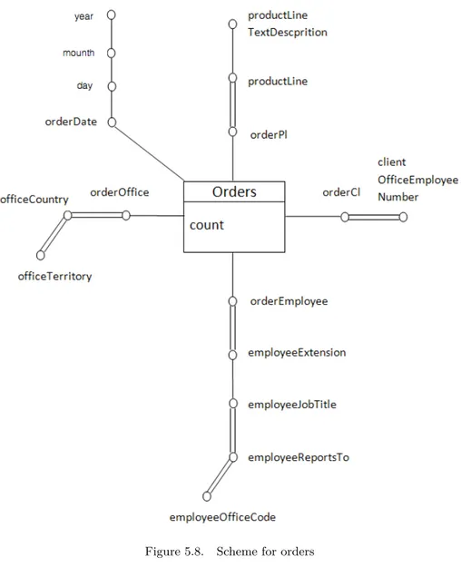
5.7 Tree attributes for the fact productlines and elimination of cycles . 64 5.8 Scheme for orders . . . 65
5.9 Fact scheme for product lines . . . 66
5.10 The data integration transformation for the fact Orders . . . 68
5.11 Data Integration Engine example . . . 69
5.12 Graphical representation of the CoDe model generated . . . 71
6.4 Snippet of the code to build the terms-documents matrix . . . 81
6.5 An example cluster dendrogram. . . 83
6.6 Code snippet to build the SOM network . . . 90
6.7 SOM lattice (64 unit SOM) . . . 91
6.8 Code snippet to derive the covariances matrix . . . 92
6.9 Semantic analysis dendrogram. . . 92
6.10 Sample correspondence matrix . . . 97
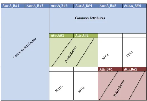
6.11 Integrated table. Common attributes are shown in blue, attributes in A not matching in B are shown in green, while attributes in B not matching in A are shown in red . . . 99
6.12 Schema integration . . . 100
6.13 Three-tier data warehouse architecture . . . 101
6.14 Reconciled schema . . . 102
6.15 Intefgration strategy in case of even (left side) or odd (right side) tables to integrate . . . 102
6.16 Similarity matrix of the sample case study . . . 107
6.17 Error curve . . . 107
6.18 Algorithm used to build the attribute tree . . . 109
6.19 Scheme for the orders fact . . . 112
6.20 Logical snowflake scheme for the orders fact . . . 114
6.21 SQL script fragment for the DW creation . . . 116
6.22 Snowflake schema. . . 117
6.23 XML file fragment for orders_cube . . . 118
6.24 Example of ETL transformation that populates the Data Warehouse120 6.25 Visualization of the orders_cube cube schema. . . 122
6.26 Managed orders for each business area query . . . 123
6.27 Third business rule report . . . 124
6.28 Analysis of the sales trend between 2003 and 2005 . . . 125
6.29 Year 2003 orders . . . 125
6.30 Year 2005 orders . . . 126
6.31 Customer’s costs during the last three years . . . 126
7.1 E/R diagrams of PANDA case study data sources . . . 129
7.2 E/R diagram of the Vivaio E-Commerce database . . . 133
Chapter 1
Introduction
In modern organizations strategic information is becoming increasingly important for their health and survival of the business [1]. Data Warehouse Systems (DWSs) provide the decision-makers answers to questions about their business and how to increase their profitability. For a proper decision-making, a DWS has to contain a vast amount of heterogeneous data coming from several organizational operational systems and external data sources [2]. However, it is very difficult and onerous to integrate several data from independent databases containing semantic differences and no specific or canonical concept description [3]. Moreover, the costs to develop a DW are usually high and the results are often unpredictable. Furthermore, it frequently happens that both customers and developers are dissatisfied with the results of a DW project because of a long delay in system delivery and as well as a large number of missing or inadequate requirements [4].
Due to the different competencies and behaviors of managers and system devel-opers, the requirement elicitation activities of a DW are very onerous and wasteful. As a consequence, developers usually need to iterate the requirement elicitation phase several times to obtain a stable and reliable requirements specification.
This complexity is also increased by the awareness that not only DWSs should support actual information needs but also have to meet future, at present unknown,
requirements [5] that will cause their evolution. For these reasons, there is the need to improve the DW development process by empowering and supporting the DW end-user, i.e., the manager, during his work. In the last decade, a great effort has been devoted to the development of DWs, mainly focusing on the system design. In particular, given the data needs, the main addressed topic regards the necessity to define what is the logical structure of the DW. Even assuming that the conceptual objects can be determined, the question about which are the useful conceptual objects for a DW and how these have to be determined is still an open issue. To address this issue, we need an explicit Requirements Engineering (RE) phase within the DW development [6]. Similarly, the necessity to rapidly update DWSs is faced in several related works [7], [8], [9], but little attention has been paid to individuate a simple and rapid methodology for capturing and comprehension of DWSs requirements. Another issue to address when dealing with complex DWSs is the comprehensibility and legibility of the results of queries, that are often represented using graph notations.
As a first contribution, in this thesis I will address the latter issue, i.e., the user comprehension of complex graphs produced during the design of a data warehouse and the corresponding visualization of a complex query that a manager needs to extract from a data warehouse system. In particular, I focus on a special visual language based on a logic paradigm, named Complexity Design (CoDe) language [10].
A CoDe model provides a high-level cognitive map of the complex information underlying the data within a DW. Information is extracted in tabular form using
the OnLine Analytical Processing (OLAP) operations1. The resulting model repre-sents data and their interrelationships through different graphs that are aggregated simultaneously. It is worth mentioning that the CoDe model enables the user to specify the relationships among data and is independent of the chart type that can be freely selected by the manager.
The first contribution is to evaluate the effectiveness of the proposed approach, specifically concerning the comprehension of the produced visual representation of the data extracted from the data warehouse. To this aim, an empirical evalua-tion has been designed and conducted to assess the comprehension of graphical representations as a support to instantaneous and informed decisions. The study was conducted at the University of Salerno, Italy, and involved 47 participants from the Computer Science Master degree having management, information sys-tems and advanced database syssys-tems and data warehouse) knowledge. Participants were asked to comprehend the semantic of data using traditional dashboard and complex graph diagrams. The effort required to answer an evaluation questionnaire has been assessed together with the comprehension of the data representations and the outcome has been presented and discussed.
Based on this finding, in this thesis I describe a semi-automatic approach to support the manager in the definition of the strategic questions he wants to ask to the data, the selection of the data source, the concept identification, the modeling of the data warehouse with CoDe, the Data Mart generation, and the reporting of the answers to his queries.
The automatic generation of data warehouse uses complex graphs to visualize
1The most popular OLAP operations are: Roll-up, performs aggregation on a data cube;
Drill-down, that is the opposite of roll-up, i.e. it summarizes data at a lower level of a dimension hierarchy; Slice, performs a selection on one of the dimensions of the given cube, resulting in a sub-cube; Dice, selects two or more dimensions from a given cube and provides a new sub-cube; Pivot (or rotate), rotates the data axis to view the data from different perspectives; Drill-across combines cubes that share one or more dimensions; Drill-through drills down to the bottom level of a data cube down to its back-end relational tables; and Cross-tab aggregates rows or columns.
the main facts that a decision maker should use for strategic decisions. However, when assessing the automatic generation of data warehouse, we noticed that the most critical phase of the process was the data integration. In fact, this phase needs of a major contribution from the manager.
Thus, as a further contribution, to encourage the implementation of the process in a real setting, a semi-automatic data integration process has been presented. Fi-nally, the proposed process has been tested on 4 case studies to assess the goodness of the approach. The results, indicate that, in three of the four case studies, results are promising.
1.1
Thesis organisation
The rest of the thesis is organized as follows. In Chapter2 the related work in the field of data warehouse is reported. Research concerning the evaluation of graph visualization through empirical evaluations is also presented. In Chapter 3 the CoDe language adopted to model complex graph is presented. An evaluation of the comprehension of the produced visual representation is reported and discussed in Chapter 4. In Chapter 5 the overall process of the proposed approach for the generation of complex graph using the CoDe modeling is outlined and illustrated by using a sample case study. A semi-automatic data integration process in presented in Chapter 6 and applied to some case studies in Chapter 7. Finally Chapter 8
Chapter 2
Related Work
2.1
Data warehouse conceptual design
The state of the art related to the proposed research mainly concerns DW concep-tual design, that aims at proving an implementation-independent and expressive conceptual schema for the DW. The schema is designed by considering both the user requirements and the structure of the source databases, following a specific conceptual model [11]. Conceptual modeling generally is based on a graphical nota-tion that is easy to understand by both designers and users. Conceptual modeling of DWs has been investigating considering two main approaches [11]:
• Multidimensional modeling
• Modeling of ETL (Extraction-Transformation-Loading)
ELT processes extract data from heterogeneous operational data sources, perform data transformation (conversion, cleaning, etc.) and load them into the DW. In approach, this is split into:
• the selection of the data, among the available heterogeneous databases, needed to the manager to answer his/her query
• the source joining, aiming at joining the different sources to group the data in a unique target.
Trujillo and Luján-Mora [12] presented a conceptual model based on UML supporting the design of ETL processes.
A data flow approach that can be applied to model any data transformation, from OLAP to data mining, has been proposed by Pardillo et al. [13]. The data warehousing data flows have been deeply investigated in the literature [14], [15], [16],[17],[18],[19] and in [20], [21], [22], [23], [19], [20], [21], [22].
Vassiliadis et al. [14] propose a solution that enables efficient continuous data integration in data warehouses, while allowing OLAP execution simultaneously. The issues focused in their work concern the DW end of the system, concerning how to perform loading of ETL processes and the DWs data area usage to support continuous data integration. Simitsis et al. [15] use code based ETL to continuously load data into an active data warehouse. The authors present the corresponding procedures and tables triggers for the active data warehouse in SQL and PL/SQL. Anfurrutia et al. [16], propose the ARKTOS ETL tool, that aims at modeling and enacting practical ETL scenarios by providing explicit primitives to capture com-mon tasks. Russell and Norvig [24] describe the design and the implementation of a meteorological data warehouse by using Microsoft SQL Server. In particular, the proposed systems create process of meteorological data warehousing based on SQL Server Analysis Services and use SQL Server Reporting Services to design, exe-cute, and manage multidimensional data reports. Hsu et al. [17] apply a clustering analysis on OLAP reports to automatically discover the grouping knowledge be-tween different OLAP reports. Su et al. [18] propose a technique to connect several different data sources and uses a statistical calculation process to integrate them. Wojciechowski et al. [25] present a web based data warehouse application designed and developed for data entry, data management as well as reporting purposes. The same goal is addressed by Kulkarni et al. [19], Habich et al. [20], and Lehner et
2.2 – The evaluation of graph
al. [21], who introduces specific reporting functions. Finally, Du and Li [22] dis-cuss a novel and efficient information integration technology aiming at information isolated island, based on data warehouse theory and other existing systems. In particular, the approach realizes data analysis on the basis of integration through physical views and a self-definition sampling strategy.
By the analysis all the above mentioned works we can observe that no one use DW loading and schema extraction methodologies during the requirement analysis phase. Similarly, to the best of my knowledge, application of techniques and tools to relate and display information extracted from a data warehouse supporting the requirement definition is still missing. Finally, the proposed approach differs from the existing ones for its capability to give an intuitive graphical representation of the semantic relationships between the data, also considering visualizations that can involve more than one type of graph. In particular, the approach proposed in this thesis allows to compose, aggregate, and change the different visualizations in a way that is simple to understand also by non-expert users.
2.2
The evaluation of graph
In the scientific literature, several research works have been devoted to the evalu-ation of graph notevalu-ations, measuring the effects of different design aspects on user performance and preferences. However, there is very few works that investigate how different graphs can be related and can affect the way managers interpret information.
In this direction, Levy et al. [26] investigate people’s preferences for graphical displays in which two-dimensional data sets are rendered as dots, lines, or bars with or without three-dimensional depth cues. A questionnaire was used to assess participants’ attitudes towards a set of graph formats. Schonlau and Peters [27] assess that adding the third dimension to a visual representation does not affect
the accuracy of the answers for the bar chart. Moreover, they find that it causes a small but significant negative effect for the pie chart. The evaluation was conducted proposing to the subjects a series of graphs through the web. Participants accessed the graph on the PC monitors and answered several questions to assess the graph recall.
Inbar et al. [28] compared minimalist and non-minimalist versions of bar and pie charts to assess the appealing of the notations. The evaluation was based on a questionnaire aiming at collecting the preferences expressed by the participants. Results revealed a clear preference for non-minimalist bar-graphs, suggesting low acceptance of minimalist design principles.
Bateman et al. [29] evaluated whether visual embellishments and chart junk cause interpretation problems to understand whether they could be removed from information charts. To this aim, they compared interpretation accuracy and long-term recall for plain and Holmes-style charts (minimalist and embellished, respec-tively). Results revealed that people’s accuracy in describing the embellished charts was similar to plain charts, while that their recall after a two-to-three week gap was significantly better.
Quispela and Maes [30] investigated the user perceptions of newspaper graphics differing in construction type. They considered two different kinds of users, namely graphic design professionals and laypeople. Participants rated the attractiveness and clarity of data visualizations. Also, the comprehension of graphics based on two-alternative forced-choice tasks was assessed.
Santos et al. [31] propose a dashboard with visualizations of activity data. The aim of the dashboard is to enable students to reflect on their own activity and compare it with their peers. This dashboard applies different visualization techniques. Three evaluations have been performed with engineering students, and aimed at assess the user perceptions of the considered approach. However, no comparison with the use of traditional dashboard or tabular data has been
2.2 – The evaluation of graph
conducted.
Fish et al. [32] evaluated whether the adoption of syntactic constraints called Well Formedness Conditions (WFCs) in Eulero Diagrams reduces comprehension errors. The participants had to fill in a questionnaire showing several diagrams together with a number of related assertions. The comprehension was assessed considering the number of correct answers provided.
Chapter 3
Complex Graph modeling
with CoDe
In this Chapter the Complexity Design (CoDe) language is presented and a sample real scenario is used to describe the notation. In particular, the basic concepts of the complex graphs will be presented and illustrated in terms of the syntactic rules offered by the CoDe graphical language.
In many situations managers take decisions considering data related to key per-formance indicators represented in terms of graphs, combining categorical (nomi-nal) and quantitative data. These data are usually extracted through OLAP oper-ations from data warehouses and are represented adopting dashboard (standard) graphs, such as bars and pie charts. In particular, a bar chart enables the com-parison of the values of each category by examining the lengths of the bars. A pie chart enables the comparison of the proportions of each category to the whole, by observing the angles of the segments. Generally, different aspects of the same prob-lem are represented through separated graphs. This approach does not explicitly visualize relationships between information contained in different reports.
On the other hand, information should be provided to the managers in an effective way, to enable them to take quick and efficient decisions. In particular,
Figure 3.1. Examples of dashboard diagrams
following the suggestion by Bertin [33], the graph should answer the manager question with a single image. To this aim, we construct a Complex Graph, i.e., a graph connecting standard graphs through graphical relationships. With this approach, conceptual links between data become evident and the interpretability of the data should be improved.
The problem of formally describing complex graphs has been addressed by Risi et al. [34], where a logic paradigm to conceptually organize the visualization of reports, named CoDe language, has been proposed.
A CoDe model can be considered a high-level cognitive map of the complex information underlying the raw data stored into a data warehouse. Information is extracted in tabular form using the Online Analytical Processing (OLAP) oper-ations. This model represents data and their interrelationships through different graphs that are aggregated simultaneously. It is worth mentioning that the CoDe model enables to specify the relationships among data and is independent on the
Figure 3.2. Example of a complex graph
chart type that can be freely selected by the manager. The complex graph gen-erated by a CoDe model is also well-formed. The numerical proportion among data is maintained in related sub-diagrams, similarly to the different sectors of pie charts. Moreover, the disposition of the sub-graphs and their relationships has to avoid overlapping, whenever possible.
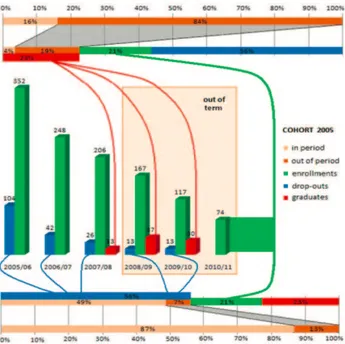
Figure 3.1 shows an example of data visualization of the students enrolled at the University of Salerno through the traditional dashboards diagrams, while Figure3.2depicts the complex graph generated from the CoDe model on the same data warehouse. The data source is composed of three data-marts concerning staff, students and accounting. In particular, the focus is on the students’ careers, including information on: enrollments grouped by academic year, faculty, course of study, geographical source, gender, secondary school type and grade, and so on;
drop-outs; monitoring on exams and credits obtained per academic year, grades, duration of studies.
Figure 3.2 shows the trend of a Computer Science student cohort (i.e., all students enrolled in the 2005 academic year) subdivided into three categories (i.e., enrollments, graduates and dropouts) during six years after the enrollment to the Bachelor degree (the first three years concern the course degree period and the remaining the out-of-term period). In particular, the pie chart shows the status of the cohort 2005 in the year 2010 (56% of the students dropped out the study, 21% is still enrolled and 23% got the degree). The vertical bar chart shows the details on how these categories evolved during the considered six years. Links among the dropout sector of the pie depict how the 56% of the total number of student drop-out has been distributed along the considered time period. Moreover, the link between the enrollment sector of the pie and the enrollment bar of the histogram in the bottom left side of Figure 3.2 denotes that the enrollments represented in the pie are referred to ones of the year 2010. Similarly, the other charts provide further details.
3.1
CoDe language overview
In this Section, I resume the main CoDe rules and describe how they can be applied to model the students’ enrollment complex graph in Figure 3.2. Further details about the CoDe language can be found in [34].
A standard graph depicts the information related to a data table. In the CoDe language a standard graph is described by a Term, represented by a rectangle and having n components. For example, Figure3.6shows the term graduates, with the six components {2005, 2006, . . . , 2010}.
It is important to note that the CoDe model focuses on the abstraction of the information items and the relations between them rather than on the specific
3.1 – CoDe language overview
shapes selected for the corresponding graphs and relationship links.
A complex graph is a graph connecting standard graphs represented by terms through the following relationships and compositions offered by the CoDe notation:
• SU M _i. Given two terms T1 and T2 where the value of i-th component in
the second term is the sum of the components in the first one, the function
SU M _i generates a complex graphs composed of the two terms T1 and T2
graphically related. An example of the SU M _i is provided in Figure3.3.
Figure 3.3. The SUM function and its representation
• N EST _i. While SU M _i is an aggregation function, N EST _i disaggre-gates the i-th component into refined sub-categories. An example of N EST _i is provides in Figure3.4
• SHARE_i. Given the following terms:
Tname[C1, . . . , Cn], S1[A1, . . . , Ai, Ai+1, . . . , Ak], . . . , Sn[Z1, . . . , Zi, Zi+1, . . . , Zh], the function SHARE_i constructs a complex graph by sharing all the n components of the report Tname on the ithposition of n reports S1, . . . , Sn, respectively.
Figure 3.4. The NEST function and its representation
Figure 3.5. Example of a complex graph
As an example, Figure3.5 shows the CoDe model of the complex graph in Fig. 3.6
• AGGREGAT ION is a function used to group several reports
T1[C1, . . . , Cn], . . . , Tk[C1, . . . , Cn] having the same components. They are grouped in a single term preserving the distinct identities of the related data series. The output term includes both the involved terms and the AGGR label which denotes the applied function. An example is shown in Fig. 3.7
3.1 – CoDe language overview
Figure 3.6. Terms and functions of the CoDe notation
chart and their links in Fig. 3.8.
Figure 3.7. The AGGREGATION function
• EQU AL_i_j. This function relates the i-th component of term
T1[D1, . . . , Di, . . . , Dh] with the j-th component of term T2[C1, . . . , Cj, . . . , Cn]. In particular, these two component are equal and they have the same asso-ciated value.
• The P LU S operator adds graphic symbols and the ICON operator allows to metaphorically visualize input components with suitable icons.
As an example, these operators allow to add vertical or horizontal lines with labels or represent data with bitmaps that are proportionally related to the
Figure 3.8. The AGGREGATION function corresponding graph
component values associated to them. These operators can be used both to improve the aesthetic impact of the final visualization and to add auxiliary information not given in the represented raw-data.
• LIN K. This relation states the existence of a logical relationship between terms.
The LIN K relation between input reports T1[C1, . . . , Cn] and T2[D1, . . . , Dk] generates a complex graph composed of the two terms T1and T2whose each
couple of components (Ci, Dj) ∀i, j is graphically related if there exists a valid value among them. Figure 3.9 illustrates the LIN K relation between the complex terms and the further terms corresponding to the considered impact reports (i.e., grad IMPACT and drop outs IMPACT terms). A graphical representation of the CoDe model is shown in Figure3.10
The complete CoDe model of the students’ enrollment complex graph is de-picted in Fig. 3.11.
3.1 – CoDe language overview
Figure 3.9. The LINK relation in Code
Figure 3.11. The CoDe model
3.2
The Complex Graph Generation tool
A graphical tool to model and visualize the complex graphs has been developed as an Eclipse plug-in [34]. In this thesis the focus is on the process to generate and visualize complex graphs through the Web browser. In the future it will be possible to improve the user interaction by adding new features, such as animations and handling more sophisticated interactions (e.g., overlays, tooltip, data information). In the following, details will be provided concerning the structuring of complex graph layout taking into account the size and the numerical proportion among data, and trying to avoid overlapping. The graphical tool architecture, depicted in Fig. 3.12, consists of the following components:
3.2 – The Complex Graph Generation tool
• The CoDe Editor is a graphical environment that enables the manager to de-sign the CoDe model, the visualization layout of the complex graph including the standard graph types, and other visualization details.
• The Data Manager accesses to the DW schema and provides the CoDe Editor with the terms needed to design a CoDe model. The CoDe Editor outputs the XML description of the CoDe model. In particular, the XML provides information about the logical coordinates (i.e., the xy-position of the term in the editing area of the CoDe model, the ratio scale, the standard graph type associated to each term in the CoDe model, and the OLAP query to extract data from DW.
• The Report Generator takes the XML description in input and uses the OLAP queries to obtain the multidimensional data from the Data Manager. The Report Generator converts these data into a JSON format and saves them into a file. Moreover, it creates a file containing the rendering procedure (coded in Javascript) for drawing the complex graph. To this aim, it exploits the features (i.e., graphical primitives and charts) of the Graphic Library. An HTML file is also created. All these files are provided to the browser (i.e., the Viewer) that loads the HTML file and executes a rendering procedure to visualize the complex graph starting from the data file.
Figure 3.12. The Complex Graph Generation tool architecture
The procedure draws the charts and the relations between them performing the following6 steps.
1. For each term in the CoDe model, compute the size of each single graph exploiting data extracted by the OLAP query and the ratio scale associated to it. To this aim the key-points of a chart are computed (e.g., the vertexes of a bar in an histogram) in order to represent its sub-parts. These points are used to determine the bounding box of the graph.
a. Each AGGREGATION function in the CoDe model is considered as a single term.
b. If a SHARE function is applied among two terms, the shared sub-part is added to the chart of the second term. The size and the bounding box are updated accordingly.
c. The bounding boxes are arranged taking into account the logical coordi-nates of the terms in the CoDe model.
2. For each relation EQUAL, SUM or NEST between two terms in the CoDe model, the dimensions of the charts representing the terms are computed as follows:
a. A ratio between the charts is computed by considering the areas of the sub-parts involved in the relation. In particular, the area of the chart in the right side of the relation becomes equivalent to the area of the chart in the left side of the relation. If different ratios are computed for the same chart, the ratio relative to the EQUAL relation is considered, otherwise the average ratio value is used.
b. The bounding boxes and the key-points are resized by considering the computed ratios.
3.2 – The Complex Graph Generation tool
3. If overlapping charts exist, the center of the complex graph is computed taking into account all the bounding boxes. All the charts are moved along the radial direction with respect to the center until charts do not overlap anymore.
4. The charts are drawn.
5. The relations among the related sub-parts (i.e., EQUAL, NEST, SUM, and LINK) are drawn by adopting B-spline functions on the key-points of the charts. In particular, a path detection algorithm avoids (or minimizes) the overlap among charts or other relations.
6. Graphical symbols and icons (specified for the PLUS and ICON operators) are added to the complex graph taking into account the terms they are related to.
Chapter 4
Comprehension of Complex
Graphs
This chapter provides the design and planning of the experiment, structured ac-cording to the guidelines of Juristo and Moreno [35], Kitchenham et al. [36], and Wohlin et al. [37]. The results of the empirical evaluation are also presented end discussed.
4.1
Design of the Empirical Evaluation
Applying the Goal Question Metric (GQM) template [38], the goal can be defined as: analyze dashboard and complex graph for the purpose of evaluating their use
with respect to the comprehension of data correlation from the point of view of a
decision maker in the context of university students with management knowledge and real data warehouses.
4.1.1
Context Selection
The context of the experiment is the comprehension of graphical representations to enable instantaneous and informed decisions. The study was executed at the
University of Salerno, Italy. Participants were 47 Computer Science Master stu-dents having passed the exams of Management, Information Systems and advanced Database Systems and Data Warehouse.
All of them were from the same class with a comparable background, but differ-ent abilities. Before conducting the experimdiffer-ent, the studdiffer-ents were asked to fill in a pre-questionnaire aiming at collecting their demographic information. A quantita-tive assessment of the ability level of the students was obtained by considering the average grades obtained in the three exams cited above. In particular, students with average grades below a fixed threshold, i.e., 24/301 were classified as Low Ability (Low ) subjects, while the other students were classified as High Ability (High ) subjects. It is important to note that other criteria could be used to assess the subjects’ ability. However, the focus of our experiments is on notations for data visualization, thus, considering the grades achieved by the students in courses on this topic where several dashboard diagrams are used is a reasonable choice.
The diagrams proposed during the evaluation are related to two datasets ex-tracted from the following real data warehouses:
DW1. The data warehouse of the University of Salerno.
DW2. The Foodmart data warehouse, providing information about customers and sales of food products carried out in the various category of shops (super-market, grocery stores, etc.) in the United States, Mexico and Canada between 1997 and 1998.
4.1.2
Variable Selection
We considered the following independent variables:
1In Italy, the exam grades are expressed as integers and assume values between 18 and 30.
4.1 – Design of the Empirical Evaluation
Method: this variable indicates the factor the studies are focused on.
Partic-ipants had to fill-in the evaluation questionnaire, composed of two sections, con-sisting in the comprehension of a graphic visualization of data. As we wanted to investigate the comprehension of the complex graph, the experiment foresaw two possible treatments, referred to two data representation views:
• Dashboard Graph (DG). Participants try to comprehend the data semantic represented using traditional Dashboard diagrams;
• Complex Graphs (CG). Participants try to comprehend the data semantic represented using complex graph diagrams.
To analyze the participants’ performances, we selected the following two de-pendent variables:
• Effort: the time a participant took for fill in a section of the questionnaire;
• Comprehension: we asked the participants to answer a comprehension ques-tionnaire, composed of two sections. The answers were assessed using an Information Retrieval metric.
In particular, comprehension is evaluated in terms of F-Measure [39], adopt-ing Precision and Recall measures to evaluate the comprehension level of data visualization techniques. Given:
– n: the number of questions composing a given section of the question-naire.
– ms: the number of answers provided by the participant s.
– ks: the number of correct answers provided by the participants s.
we can compute the information retrieval metrics as follows:
precisions= ks ms
recalls= ks
n (4.2)
Precision and recall measure two different concerns, namely correctness and completeness of the answers, respectively. To balance them, we adopted their harmonic mean
F − M easures=
2 · precisions· recalls precisions+ recalls
(4.3)
This means has been used to measure the Comprehension variable. All the measures above assume values in the range [0,1].
Other factors may influence both the directly dependent variables or interact with the main factor For this reason, the following co-factors have been taken into account:
• Ability. The participants having a different ability could produce different results.
• Section. As better detailed in Section 4.1.4, the participants had to fill in two questionnaire sections. Although we designed the experiment to limit the learning effect, it is still important to investigate whether subjects perform differently across subsequent sections.
4.1.3
Hypothesis Formulation
The objective of our study is to investigate the effectiveness of complex graphs on the user comprehension. In particular, since complex graphs add graphical rela-tionships and proportionality related to the data among the sub-graphs composing it, we are interested in investigating whether such additional details increase the comprehension level.
4.1 – Design of the Empirical Evaluation
• Hn1: there is no significant difference in the Comprehension when using CG or DG;
• Hn2: there is no significant difference in the Effort when comprehending a CG or a DG;
The hypothesis Hn1and Hn2are two-tailed because we did not expect a positive or a negative effect on the comprehension of the data correlation on the experiment tasks.
4.1.4
Experiment Design, Material, and Procedure
Participants were split into four groups, making sure that High and Low ability participants were equally distributed across groups. Each group was composed of participants receiving the same treatments in the questionnaire. The experiment design is of the type “one factor with two treatments”, where the factor in this experiment is the graph type and the treatments are the CG and the DG. We assign the treatments so that each treatment has equal number of participants (balanced design). The experiment design is shown in Table4.1.
Table 4.1. Experimental Design
Group 1
Group 2
Group 3
Group 4
Section 1
T
1-DG
T
1-CG
T
2-DG
T
2-CG
Section 2
T
2-CG
T
2-DG
T
1-CG
T
1-DG
The design ensured that each participant worked on a different task in a single session, receiving a different treatment for each task. Also, the design allowed us to 1) consider different combinations of task and treatment in different order across the first two sections and 2) the use of statistical tests for studying the effect of multiple factors.
Table 4.2. An excerpt of the Comprehension Questionnaire
ID Question
Q1 How many students enrolled in 2005?
Q2 Which is the percentage of students graduated outside the prescribed amount of time over the total amount of graduates?
Q3 How many students enrolled in 2010/11?
Q4 How many students dropped-out between 2005 and 2011? Q5 How many students obtain the degree within the prescribed time?
Q6 Which is the percentage of students that obtain the degree within the prescribed time over the total amount of graduates?
dashboard graphic notations. The introduction to these notations required ten minutes.
During the experiment, we assigned the following two comprehension tasks to each participant, designed in such a way to reflect the typical analyses that a manager has to perform. In particular, participants had to fill in a comprehension questionnaire composed of 2 parts:
• T1. Comprehension of graphs related to DW1 ;
• T2. Comprehension of diagrams related to DW2.
In these two tasks the users were presented a graphical description of real data, extracted by the selected data warehouses by using OLAP operation. The coherence and completeness of the proposed graphs were validated by a data anal-ysis expert of the University of Salerno. Each task proposed a number of related multiple-choice questions. Participants had to indicate the choices that they be-lieved to be correct. The participants filled their questionnaire and annotated, for each section, the starting and ending time.
An example of the section associated to the task T1 is reported in Table 4.2,
related to the graphs shown in Figures 3.1 and 3.2for the method DG and CG, respectively.
At the end of each section, participants annotated the ending time. Section have been completed sequentially. At the end of the experiment, the participants
4.1 – Design of the Empirical Evaluation
Table 4.3. PostExperiment Questionnaire ID Question
P1 The questions of the evaluation questionnaire were clear to me. P2 The goal of the experiment was clear to me.
P3 I found useful the relationships of the CG representation to comprehend data.
P4 The understanding of the data semantic was problematic when they are represented using CG. P5 The proportion among sub-graphs of CG is useful to comprehend data.
P6 The arrangement of sub-graphs of CG helps to comprehend data.
Table 4.4. Likert scale adopted during the post-experiment questionnaire 1.Fully agree 2.Weakly agree 3.Neutral 4.Weakly disagree 5.Strongly disagree
filled in a post-experiment questionnaire (see Table4.3). composed of 6 questions expecting closed answers scored using the following Likert scale [40] (see Table4.4). The purpose of the post-experiment questionnaire is to assess whether the ques-tions and the experiment objectives were clear, and the gather the subject’s opinion on the usefulness of the CG and its characteristics.
4.1.5
Analysis Procedure
To test the defined null hypotheses, parametric statistical tests have been used. To apply parametric test the normality of data is verified by means of the Shapiro & Wilk test [41]. This test is necessary to be sure that the sample is drawn from a normally distributed population. A p-value smaller than a specific threshold (α) allows us to reject the null hypotheses and conclude that the distribution is not normal. This normality test has been adopted because of its good power properties as compared to a wide range of alternative tests. In case the p-value returned by the Shapiro-Wilk test is larger than α, we used an unpaired t-test. Unpaired teats are exploited due to the experiment design (participants experimented CG and DG on two different experiment objects). In the statistical tests we decided to accept a probability of 5 percent of committing Type I errors, i.e., of rejecting the null
appropriate statistical tests provide a p-value less than the standard α-level of 5 percent (0.05).
In addition to the tests for the hypotheses formulated in Section4.1.2, we also evaluated the magnitude of performance difference achieved with the same user group with different methods. To this aim, we evaluated the effect size.
The effect size can be computed in several ways. In case of parametric analyses, we used Cohen’s d [42] to measure the difference between two groups. It is worth noting that the effect size can be considered negligible for d < 0.2, small for 0.2 ≤
d ≤ 0.5, medium for 0.5 ≤ d ≤ 0.8, and large for d > 0.8 [43]. On the other hand, for non-parametric analysis we used the Cliff’s Delta effect size (or d) [42]. In this case, according to the literature, the effect size is considered small for d < 0.33 (positive as well as negative values), medium for 0.33 < d < 0.474 and large for
d > 0.474.
For parametric tests, the statistical power (i.e., post hoc or retrospective power analysis) has been analyzed. To compute the power, the type of hypothesis tested (one-tailed vs. two-tailed) has been considered . Whatever is the kind of test, statistical power represents the probability that a test will reject a null hypothesis when it is actually false. Then, it is worthy to be analyzed only in case a null
hypothesis is rejected. The statistical power value rage is [0,1] where 1 is the highest value and 0 is the lowest. Note that the higher the statistical power, the higher the probability to reject a null hypothesis when it is actually false. A value greater than or equals to 0.80 is considered as a standard for adequacy [44]
Finally, interaction plots have been used to study the presence of possible in-teractions between the main factor and the ability co-factor. Interaction plots are line graphs in which the means of the dependent variables for each level of one factor are plotted over all the levels of the second factor. If the lines are almost parallel no interaction is present, otherwise an interaction is present. Cross lines indicate a clear evidence of an interaction between factors.
4.2 – Results of the Empirical Evaluation
Table 4.5. Descriptive statistics for Dependent Variables
Dependent
variable Method median mean st. dev. min max
Comprehension CG 0.83 0.83 0.16 0.33 1 DG 0.83 0.78 0.17 0.36 1 Effort CG 10 10.38 3.44 4 21 DG 12 12.21 3.03 7 20
We show the distribution of the data of the post-experiment survey question-naire using histograms. They provide a quick visual representation to summarize the data.
4.2
Results of the Empirical Evaluation
In the following subsections, the results of this experiment are reported and dis-cussed.
4.2.1
Effect of Method
Firstly, the effect of Method on the dependent variables is analyzed. Table 4.5
reports descriptive statistics of the dependent variables Comprehension and Effort, grouped by treatment (DG, CG). The results achieved are also summarized as boxplots in Fig. 4.1. These statistics show that the average Comprehension was higher in case of CG (6% more on average), while users took on average 1 minute and 43 seconds (15%) less to comprehend the same problem when using a DG with respect to a CG.
By applying Shapiro-Wilk normality test to the F-measure DG and CG samples it results p−value < 0.001 for both the samples. Since all p-values are less than 0.05 the samples are not normally distributed and we have to adopt a non-parametric test. Applying the Wilcoxon Rank-Sum Test we determine the p-values reported in
Table4.6. Concerning the Time performance, by applying Shapiro-Wilk normality test we get p − value = 0.317 and p − value = 0.022 for DG and CG, respectively. Since all p-values are greater than 0.05, both the samples are normally distributed and we can adopt a parametric test (t-test). Table 4.6 summarizes the results of the hypotheses tests for Hn1 and Hn2 and reports the values of effect size and statistical power. This table also shows the number of people that reached a higher Comprehension with CG and DG. Similarly, the results on Effort are reported.
The Wilcoxon Rank-Sum Test revealed that there exists a significant difference on comprehension in terms of Comprehension (p − value = 0.045) in case partici-pants that used CG and DG (i.e., Hn1 can be rejected). The effect size is small. Concerning Hn2, the Wilcoxon Rank-Sum Test revealed that it (i.e., the null hy-pothesis used to assess the influence of Method on Effort) can be rejected since p − value = 0.007. This value is highlighted in bold. The effect size was medium
and negative (i.e., -0.564) and the statistical power was 0.772.
(a) (b)
4.2 – Results of the Empirical Evaluation
Table 4.6. Results of the analyses on method
Hypotheses p-value Effect size Stat. Power
Hn1(Comprehension) Yes (0.045) 0.234 (Cliff’s delta small) -Hn2(Effort) Yes (0.007) -0.564 (Cohen medium) 0.772
4.2.2
Analysis of Cofactors
4.2.2.1 Effect of Subjects Ability
The analysis of the interaction plots in Fig. 4.2(a)highlights that participants with
High ability achieved better Comprehension than Low ability subjects in both the CG and DG treatments. The analysis also revealed that there is no interaction
between Method and Ability: the gap remain the same with the two methods, with a performance improvement for CG.
We also analysed the influence of the participants’ Ability on Effort. Fig. 4.2(b)
shows that the gap between Low and High Ability participants increments in favor of CG.
4.2.2.2 Effect of the Section
To investigate if there is a learning effect when the participants answered successive sections of the questionnaire, we analyzed the Interaction Plots in Fig. 4.3. In particular, it is possible to observe that for both Comprehension and Effort there is a learning effect. This is due to the task type (a comprehension task) that is similar in the two sections, except for the task domain and for the graph notation. However, this little learning effect has been mitigated by the balanced experiment design.
4.2.3
Post-Questionnaire Results
The data collected from the post-experiment survey questionnaires are visually summarized in Fig. 4.4.
(a)
(b)
Figure 4.2. Interaction plots of Comprehension(a)and Effort(b)for Ability level
P1 suggests that many participants considered the questions of the comprehen-sion tasks clear (10 expressed a very positive judgment and 29 a positive judgment).
4.2 – Results of the Empirical Evaluation
(a)
(b)
Figure 4.3. Interaction plots of learning effects for Comprehension(a)and Effort(b)
The histogram of P2 shows that the participants found the objectives of the exper-iment clear (11 expressed a very positive judgment and 27 a positive judgment).
The participants found useful the relationships of the CG representation for com-prehending data (P3), 14 expressed a very positive judgment and 22 a positive judgment. By looking at the answers to questions P4, many participants did not considered problematic understanding the semantic of data represented using CG (14 scored 5 and 22 scored 4). 11 participants considered the proportion among sub-graphs of CG very useful for comprehending data, while it was considered useful for 19 of them (P5). Concerning the help provided by the arrangement of sub-graphs of CG for comprehending data (P6), the participants were less satisfied. Indeed, 8 expressed a very positive judgment, while 17 expressed a negative.
4.3 – Discussion
4.3
Discussion
In the following, the achieved results and their possible practical implications will be discussed. Obviously, a discussion on the threats that could affect the validity of our results is always necessary in this kind of empirical investigations.
4.3.1
Implications
The results of the data analysis conducted on the proposed experiment indicate a high average comprehension with both the two treatments and a significant differ-ence between the comprehension of a CG and of a DG diagram, with a small effect size. Also, the results related to the comprehension time indicated that the partic-ipants spent significantly less time to understand a problem adopting a CG, with a medium effect size. This suggests that the two kinds of diagrams correctly describe the data, with a little advantage for CG, and that the comprehension requires less time in the CG case. Both High and Low ability users took advantages of the com-plex graph representation in term of both comprehension and effort. High ability participants performed better in both cases, but the gap increases when analyzing the effort. This suggests that High ability participants took a greater advantage in comprehension time. This finding is relevant for the decision maker. Indeed, complex graphs represent an effective visualization approach that enables a quicker and higher comprehension of data, improving the appropriateness of the decisions and reducing the decision making effort.
4.3.2
Threats to Validity
In this Section the threats to validity that could affect the study results will be discussed. In particular, we focus here on construct, internal, conclusion, and external validity threats.
Internal Validity threats concern factors that may affect our dependent
vari-ables and are relevant in studies that try to establish a causal relationship. They can be due to the learning effect experienced by subjects between sections. As shown in Section4.2.2.2, there is a little learning effect between the two sections. To mitigated this effect, the experiment design has been balanced. In particular, subjects worked by permuting two sections, on different tasks and using two differ-ent graphical approaches. The fatigue effect is not relevant, since the experimdiffer-ent lasts at most 38 minutes and 22.6 minutes on average. Another issue concerns the possible information exchanged among the participants while performing the tasks. This threat has been prevented by observing participant during the ques-tionnaire compiling. Finally, the participants did not know the hypotheses of the experiments and were not evaluated on their results.
Construct Validity threats concern the possibility that the relationship between
cause and effect is causal. This validity was mitigated by the experiment design used. Selection and measurements of the dependent variables could threaten con-struct validity. Comprehension was measured using an information retrieval based approach. The comprehension of the questions were also assessed by the post-experiment questionnaire (see Table4.3), whose results are provided in Figure4.4. The collected answers revealed that the questions and the experiment objective were clear. Regarding the variable time, we asked the participants to note down the start and the stop time when they filled in a questionnaire section. This information was also validated by supervisors. The comprehension was assessed answering questions based on data related on real databases. In addition, the DG and CG graphs proposed in the experiment were validated by a data analysis expert for verifying whether the graphs were appropriate for answering the questionnaire requests.
Conclusion validity concerns the relationship between the treatment and the
4.3 – Discussion
Conclusion Validity threats. In the conducted experiment, the selection of the population may have affected this experimental validity. To reject the null
hy-potheses, we used statistical tests and power analyses. In case differences were
present but not significant, this was explicitly mentioned, analyzed, and discussed. The conclusion validity could be also affected by the sample size, consisting of 47 participants. To this aim, the statistical power of the tests was evaluated. Fi-nally, the used post-experiment survey questionnaire was designed using standard metrics and scales [40].
External validity concerns the possibility of generalizing our findings within
different contexts. This threat may present when experiments are conducted with students, since they could not be representative of decision makers. This threat is partially mitigated by the fact that students involved in the experiment passed specific exams of the computer science masters degree. Their ability to interpret dashboard graphs has been assessed, as also the f-measure performances revealed. In addition, working with students implies various advantages, such as the fact the students’ prior knowledge is rather homogeneous, and there is the availability of a large number of participants [45]. Obviously, to increase our awareness in the achieved results, case studies within industrial contexts are needed. Other external validity threats are represented by the tasks assigned to the participants. The tasks we selected were taken from real databases. Thus, they are representative of the typical decision activities.
Chapter 5
Automatic Generation of
Data Warehouse
In the previous Chapter, the results of an empirical study have been presented to demonstrate that Complex Graphs can be effective in the comprehension of data semantic. In this Chapter, I will present an approach to automatically generate visual representations of data, coming from a data warehouse, to answer specific questions submitted by a decision maker.
5.1
The proposed approach
First of all, the approach to support the manager in the automatic generation of a Data Warehouse answering to his/her specific requirements will be presented.
For clarity reasons, the following scenario will be considered: the manager (decision maker) expressed one or more questions concerning data contained in several data sources; the manager selected the data sources from internal data sources; at this point, the concepts are extracted in a semi-automatic way starting from the data sources; a data mart has to be generated and presented to the manager based of the complex graph based representation of the data; the manager
Figure 5.1. Data Models associated to the Case Study
takes his decisions.
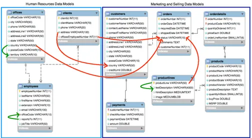
The selected sources are i) Sales and Marketing and ii) Human Resources data warehouses. The data models associated to these two databases are shown in Figure6.3.8.
Note that the selected data are imported from the different databases. As so there is the need to perform a data tuning. After the tuning the Apriori Associa-tion Rule Mining algorithms implemented in the WEKA toolkit is used to extract association rules. Figure5.2shows an excerpt of the conceptual models of the case study, and how their entities are related through relationships representing the minimal set of rules identified by our approach. The Apriori algorithm identified 21 relationships between the attributes of database.
Figure5.3 shows the generation process, which is articulated in the following phases:
• Strategic Question Definition. The manager proposes one or more strategic questions in natural language. It is in charge of the manager verifying if the