Dipartimento di Informatica
Dottorato di Ricerca in Informatica XII Ciclo - Nuova Serie
Tesi di Dottorato in
3D data visualization techniques and
applications for visual multidimensional
data mining
Fabrizio Torre
Ph.D. Program Chair Supervisors
Ch.mo Prof. Giuseppe Persiano Ch.mo Prof. Gennaro Costagliola
Dott. Vittorio Fuccella
lovingli preserve and grow... the little Angels who surely watch over me from the sky...
Despite modern technology provide new tools to measure the world around us, we are quickly generating massive amounts of high-dimensional, spatial-temporal data. In this work, I deal with two types of datasets: one in which the spatial characteristics are relatively dynamic and the data are sampled at different periods of time, and the other where many dimensions prevail, although the spatial characteristics are relatively static.
The first dataset refers to a peculiar aspect of uncertainty arising from contractual relationships that regulate a project execution: the dispute management. In recent years there has been a growth in size and complexity of the projects managed by public or private organizations. This leads to increased probability of project failures, frequently due to the difficulty and the ability to achieve the objectives such as on-time delivery, cost containment, expected quality achievement. In particular, one of the most common causes of project failure is the very high degree of uncertainty that affects the expected performance of the project, especially when different stakeholders with divergent aims and goals are involved in the project.
The second data set refers to a novel display of Digital Libraries (DL). DL allow to easily share the contribution of each individual researcher in the scientific community. Unfortunately, the webpage-based paradigm is a limit to the inquiry of current digital libraries. In recent years, in order to allow the user to quickly collect a set of documents judged as useful for his/her research, several visual approaches have been proposed.
This thesis deals with two main issues. The first regards the anal-ysis of the possibilities offered by a 3D novel visualization technique
3DRC to represent and analyze the problem of diverging stakehold-ers views during a project execution and to addresses the prevention and proactive handling of the potential controversies among project stakeholders. The approach is based on the 3D radar charts, to allow easier and more immediate analysis and management of the project views giving a contribution in reducing the project uncertainty and, consequently, the risk of project failure. A prototype software tool implementing the 3DRC visualization technique has been developed to support the 3DRC approach validation with real data. The second issue regards the enhancement of CyBiS, a novel 3D analytical interface for a Bibliographic Visualization Tool with the objective of improving scientific paper search.
The benefits of using 3D techniques combined with techniques for multidimensional visual data mining will be also illustrated, as well as indications on how to overcome the drawbacks that afflict 3d visual representations of data.
Thank you! Ten times thank you!
In this brief but intense experience there are few people with whom I interacted, and whom I owe a ”Thank you”, no matter whether small or big but still a ”Thank you!”
To Prof. Gennaro Costagliola. For his friendship, availability, and especially for his infinite patience. For giving me the opportunity to work in the field of visualization, for his expert guidance and for his encouragement and support at all levels.
To my parents, who grew me lovingly; always urging me to do more and better, without ever invading my freedom.
To Antonietta, with whom I shared the joys and sufferings during these years and who has given me the two most precious jewels.
To the President of C.S.I. Prof. Gugliemo Tamburrini who allowed the start of this unforgettable experience.
To my Technical Director Antonella who supported me before and during the doctorate, and even after my work return.
To Mattia with whom I shared this entire experience from the ex-aminations at nights in the hotel and for the friendship shown to me.
To Vittorio for the friendship and the support provided in the writ-ing of the thesis.
To Prof. Giancarlo Nota and Dott.sa Rossella Aiello with whom we have given life to 3DRC.
To Prof. Giuseppe Persiano for his efforts in organizing this doctor-ate.
And last but obviously not least, the Good God, who always accom-panied me in life as well as in my studies.
Abstract i
Acknowledgement iii
Contents v
1 Introduction 1
1.1 Introduction to Data Mining . . . 2
1.2 Information Visualization . . . 4
1.3 From Data Mining to Visual Data Mining . . . 5
1.4 2D vs 3D Representations . . . 6
1.5 Objectives of the thesis . . . 8
1.5.1 Bibliographic Visualization Tools drawbacks . . 8
1.5.2 Evaluation of Stakeholders Project Views drawbacks 9 1.5.3 The goals . . . 9
1.6 Outline of the thesis . . . 10
2 Data Visualization in Data Mining 12 2.1 Taxonomy of visualization techniques . . . 13
2.1.1 Data types to be visualized . . . 14
2.1.2 Visualization Techniques . . . 15
2.1.3 Interaction and Distortion Techniques . . . 18
2.2 Visualization in Statistics . . . 20
2.2.1 Dispersal graphs . . . 20
2.2.2 Histograms . . . 20 v
2.2.3 Box plots . . . 22
2.3 Visualization in the Machine Learning domain . . . 24
2.3.1 Visualization in model description . . . 25
2.3.2 Visualization in model testing . . . 28
2.4 Multidimensional data visualization . . . 30
2.4.1 Scatter Plot . . . 31
2.4.2 Multiple Line Graph and Survey plots . . . 32
2.4.3 Parallel Coordinates . . . 32
2.4.4 Andrews’ Curves . . . 34
2.4.5 Using Principal Component Analysis for Visual-ization . . . 35
2.4.6 Kohonen neural network . . . 37
2.4.7 RadViz . . . 38
2.4.8 Star Coordinates . . . 39
2.4.9 2D and 3D Radar Chart . . . 41
3 CyBiS 2 43 3.1 Introduction . . . 43
3.2 Related Work . . . 44
3.3 The revised design . . . 45
3.3.1 The previous CyBiS . . . 46
3.3.2 The improvements of the new interface . . . 46
3.3.3 The problem of occlusion . . . 48
3.4 Discussion and Future Work . . . 49
4 3DRC 50 4.1 Introduction . . . 50
4.2 The Pursuit of Project Stakeholders Consonance . . . 51
4.2.1 Definition of Project . . . 52
4.2.2 Definition of View . . . 53
4.2.3 Definition of Gap . . . 54
4.3 Background . . . 55
4.3.1 Yuhua and Kerren 3D Kiviat diagram . . . 55
4.3.2 Kiviat tubes . . . 55
4.3.3 3D Parallel coordinates . . . 56
4.3.5 Wakame . . . 58
4.4 3DRC . . . 59
4.4.1 3D Shape Perception: learning by observing . . 63
5 The 3DRC Tool 67 5.1 System Architecture . . . 68 5.1.1 UACM Module . . . 68 5.1.2 EDM Module . . . 69 5.1.3 PPM Module . . . 69 5.1.4 3DRCM Module . . . 69 5.2 Interacting with 3DRCs . . . 70
5.2.1 The GUI: FLUID or WIMP? . . . 70
5.2.2 The operations . . . 70
5.3 The case study . . . 74
6 Conclusions 78
Chapter
1
Introduction
Yahweh spoke to Moses: ≪Take a census of the whole community of
Israelites by clans and families, taking a count of the names of all the males, head by head. You and Aaron will register all those in Israel,
twenty years of age and over, fit to bear arms, company by company.≫
— Numbers 1: 2-3, The Holy Bible
Thanks to the progress made in hardware technology, modern in-formation systems are capable of storing large amounts of data. For example, according to a survey conducted in 2003 by researchers from the University of Berkeley, about 1-2 Exabyte (= 1 million terabytes) of unique information were generated each year, of which a large part is available in digital format. These data, including simple tasks of daily life such as paying by credit card, using the phone, accessing e-mail servers, are generally recorded on business databases via sensors or monitoring systems [1, 2, 3].
This continuous recording tends to generate an information overload. Exploring and analyzing the vast volumes of data becomes increasingly complex and difficult. Besides, due to the number and heterogeneity of the recorded parameters we are forced to interact with multidimensional data with high dimensionality.
What encourages us to collect such data is the idea that they are a potential source of valuable information not to be missed. Unfortunately, the task of finding information hidden in such a big amount of data is very difficult. In this context, data analysis is the only way to build
knowledge from them in order to successively take important decisions. In fact, this precious information can not be used until it remains locked in its “container”, and the time, the relationships and the rules that govern it are not shown in a “readable” and understandable way.
In addition, many of the existing data management systems can only view “rather small portions” of data. Besides, if the data is presented textually, the amount that one can see is in the range of about 100 items, which is of no help when we have to interact with collections containing millions of data items.
Information visualization or InfoVis (IV) and Visual Data Mining (VDM) can be a valuable help to manage big amounts of data.
1.1
Introduction to Data Mining
Data Mining (DM) [2, 4, 5, 6] is a generic term that covers a variety of techniques to extract useful information from (large) amounts of data, without necessarily having knowledge of what will be discovered, and the scientific, industrial or operating use of this knowledge. The term “useful information” refers to the discovery of patterns and relationships in the data that were previously unknown or even unexpected. Data mining is also sometimes called Knowledge Discovery in Databases (KDD) [6].
A common mistake is to identify DM with the use of intelligent technologies that can detect, magically, models and solutions to busi-ness problems. Furthermore, this idea is false even in the presence of techniques, more and more frequent, that allow to automate the use of traditional statistical applications.
Data Mining is an interactive and iterative process. In fact, it requires the cooperation of business experts and advanced technologies in order to identify relationships and hidden features in the data. It is through this process that the discovery of an apparently useless model can often be transformed into a valuable source of information. Many of the techniques used in DM are also referred to as “machine learning” or “modelling” (see Sec. 2.3).
have been developed, but only in 2000 the important goal of establishing the Cross-Industry Standard Process for Data Mining (CRISP-DM) (Chapman et al. [7]) has been achieved.
The CRISP-DM methodology breaks the data mining process into six main phases [8]:
1. Business Understanding - identify project objectives, 2. Data Understanding - collect and review data,
3. Data Preparation - select and cleanse data,
4. Modelling - manipulate data and draw conclusions, 5. Evaluation - evaluate model and conclusions, 6. Deployment - apply conclusions to business.
The six phases fit together in a cyclical process and cover the entire data mining process, including how to incorporate data mining in the largest business practices. These phases are listed in detail in the diagram in figure 1.1.
Phases
a visual guide to CRISP-DM methodology
SOURCE CRISP-DM 1.0
http://www.crisp-dm.org/download.htm
DESIGN Nicole Leaper
http://www.nicoleleaper.com Generic Tasks Specialized Tasks (Process Instances) Determine Business Objectives Background Business Objectives Business Success Criteria
(Log and Report Process)
Assess Situation Inventory of Resources,
Requirements, Assumptions, and Constraints Risks and Contingencies Terminology Costs and Benefits
(Log and Report Process)
Determine Data Mining Goals Data Mining Goals Data Mining Success Criteria
(Log and Report Process)
Produce Project Plan Project Plan Initial Assessment of Tools and
Techniques
(Log and Report Process)
Collect Initial Data Initial Data Collection Report
(Log and Report Process)
Describe Data Data Description Report
(Log and Report Process)
Explore Data Data Exploration Report
(Log and Report Process)
Verify Data Quality Data Quality Report
(Log and Report Process)
Data Set Data Set Description
(Log and Report Process)
Select Data Rationale for Inclusion/
Exclusion
(Log and Report Process)
Clean Data Data Cleaning Report
(Log and Report Process)
Construct Data Derived Attributes Generated Records
(Log and Report Process)
Integrate Data Merged Data
(Log and Report Process)
Format Data Reformatted Data
(Log and Report Process)
Select Modeling Technique Modeling Technique Modeling Assumptions
(Log and Report Process)
Generate Test Design Test Design
(Log and Report Process)
Build Model Parameter Settings Models Model Description
(Log and Report Process)
Assess Model Model Assessment Revised Parameter
(Log and Report Process)
Evaluate Results Align Assessment of Data
Mining Results with Business Success Criteria
(Log and Report Process)
Approved Models Review Process Review of Process
(Log and Report Process)
Determine Next Steps List of Possible Actions Decision
(Log and Report Process)
Plan Deployment Deployment Plan
(Log and Report Process)
Plan Monitoring and Maintenance Monitoring and Maintenance Plan
(Log and Report Process)
Produce Final Report Final Report Final Presentation
(Log and Report Process)
Review Project Experience Documentation
(Log and Report Process)
Modeling
manipulate data and draw conclusions
Evaluation
evaluate model and conclusions
Deployment
apply conclusions to business
Business Understanding
identify project objectives
Data Understanding
collect and review data
Data Preparation
select and cleanse data
Data Mining Life Cycle
Figure 1.1: a visual guide to CRISP-DM methodology (image taken from [9])
1.2
Information Visualization
The field of information visualization has emerged “from research in human-computer interaction, computer science, graphics, visual design, psychology, and business methods. It is increasingly applied as a critical component in scientific research, digital libraries, data mining, financial data analysis, market studies, manufacturing production control, and drug discovery”. [10]
In the literature there are several definitions for “IV”. Here are some examples ordered by year:
• “A method of presenting data or information in non-traditional, interactive graphical forms. By using 2-D or 3-D color graphics and animation, these visualizations can show the structure of information, allow one to navigate through it, and modify it with graphical interactions.” - 1998 [11]
• “The use of computer-supported, interactive, visual representa-tions of abstract data to amplify cognition.” 1999 [12]
• “Information visualization is a set of technologies that use visual computing to amplify human cognition with abstract information.” 2002 [13]
• “Visual representations of the semantics, or meaning, of infor-mation. In contrast to scientific visualization, information visu-alization typically deals with nonnumeric, nonspatial, and high-dimensional data.” 2005 [14]
• “Information visualization (InfoVis) is the communication of ab-stract data through the use of interactive visual interfaces.” 2006 [15]
A common misconception is to confuse IV with scientific visualization or SciVis [16]. In fact, InfoVis implies that the spatial representation is chosen, while SciVis implies that the spatial representation is given.
In conclusion thanks to the use of IV we can reduce large data sets to a more readable graphical form compared to a direct analysis of the
numbers. In this way human perception can detect patterns revealing the underlying structures of the data [17].
1.3
From Data Mining to Visual Data Mining
Visual data mining [18, 2] is a new approach to data mining by presenting data in visual form (or graphics). The basic idea is to use, through IV methods, the latest technologies to combine the phenomenal abilities of human intuition and the ability of the mind to visually distinguish patterns and trends in a large amount of data with traditional data mining techniques. This, to allow the data miner to “enter” in the data, get insight, draw conclusions and interact directly with them. For these reasons information visualization techniques have been considered from the outset as a valid alternative to the analytical methods based on statistical and artificial intelligence techniques.
VDM techniques have proven to be of great help in exploratory data analysis showing a particularly high potential when exploring large databases, in the case of vague knowledge about data and exploration goals, and in the presence of highly inhomogeneous and noisy data.
In [19], qualifying characteristics for VDM systems are identified as follows:
• Simplicity - they should be intuitive and easy to use, while providing effective and powerful techniques.
• User autonomy - they should guide and assist the data miner through the data mining process to draw conclusions, but also keep it under control.
• Reliability - They should provide estimated error or accuracy of the information provided for each stage of the extraction process. • Reusability - A VDM system must be adaptable to various
environments and scenarios in order to reduce the efforts of cus-tomization and improve the portability between systems.
• Availability - Since the search for new knowledge can not be planned, access to VDM systems should be generally and widely
available. This implies the availability of portable and distributed solutions.
• Security - Such systems should provide an appropriate level of security to prevent unauthorized access in order to protect data, the newly discovered knowledge, and the identity of users.
1.4
2D vs 3D Representations
The real world is three-dimensional when considering the spatial dimen-sions and it becomes even “four-dimensional” when we include the time. With the advent of PC graphical interfaces most of the methods of graphical visualization that required a transposition of data on sheets of paper have become obsolete. Moreover we are now also able to represent three-dimensional space (3D) on the screen of a PC. In the last decade there has been great ferment about the creation of new techniques for 3D data visualization.
Since there are obvious advantages in the use of traditional techniques (2D), some considerations are required [20]:
• the science of cognition indicates that the most powerful pattern-finding mechanisms of the brain work in 2D and not 3D;
• there is already a robust and effective methodology about the design of diagrams and the data representation in two dimensions; • 2D diagrams can be easily included in books and reports;
• it is easy to come across an abundance of ill-conceived 3D design. In light of the above considerations, why it is worth to study three-dimensional approach?
A quite convincing reason for an interest in 3D space perception and hence searching for new methodologies for the 3D data representation is the explosive growth of studies on 3D computer graphics. Today there are several software libraries that allow programmers to rapidly develop interactive three-dimensional virtual spaces.
Moreover a 3D representation has several advantages [21, 22, 23, 24, 25]:
• Shape constancy: it is the property that allows us to recognize from several points of view, irrespective of the particular 2D image projected onto the retina, the 3D shape of an object (or part of it);
• Shape Perception: unfamiliar shapes stand out immediately. This is done “unconsciously” and requires minimal cognitive effort; • The use of 3D shapes enable us to encode more information than
other visual properties such as scale, weight, and color;
• Users can take advantage of 3D displays to visualize large sets of hierarchical data;
• It possible to show more objects in a single screen thanks the perspective nature of 3D representations, objects shrink along the dimension of depth;
• If more information is visible at the same time, users gain a global view of the data structure;
Unfortunately there are also disadvantages that must be taken into account when designing 3D visual interfaces:
• The problem of occlusion: in a 3D scene, foreground objects necessarily block the view of the background objects.
• A lower data/pixel ratio than 2D visualizations: this significantly limits the quantity of visible data.
Since “In medio stat virtus” the best choice, used in this thesis, is to employ both approaches. It is likely that a system that allows the user to easily switch from a 2D to a 3D display, and vice versa, would be beneficial for the user. In fact, this would enable us to extend the plethora of tools at our disposal for understanding data sets.
In developing both the new version of CyBiS [26] and 3DRC [27] a thorough study has been made on the techniques and to maximize the benefits and reduce the problems regarding the usage of a 3D representation, and to create a visual representation of the semantics that is not ambiguous.
1.5
Objectives of the thesis
In literature there are a great number of information visualization techniques developed over the last decade to support the exploration of large data sets, and this thesis wants to be a small contribution in this direction.
The thesis focuses on how to apply Information Visualization and the use of 3D data visualization techniques to overcome the drawbacks of two specific domains: Bibliographic Visualization Tools and Evaluation of Stakeholders Project Views. In the following I will describe the
drawbacks and the proposed solution for each of the two domains. 1.5.1 Bibliographic Visualization Tools drawbacks
Description: one of the key tasks of scientific research is the study and management of existing work in a given field of inquiry [28]. Digital Libraries (DLs) are generally referred to as “collections of informa-tion that are both digitized and organized” [29]. Digital Libraries are content-rich, multimedia, multilingual collections of documents that are distributed and accessed worldwide. The traditional functions of search and navigation of bibliographic databases, digital libraries, be-come day by day more and less appropriate to assist users in efficiently managing the growing number of scientific publications. Unfortunately, the webpage-based paradigm is a limit to the inquiry of current digital libraries. In fact, it is well known how difficult it is to retrieve relevant literature through traditional textual search tools. The limited num-ber of shown items, the lack of adequate means for evaluating paper chronology, influence on future work, relevance to given terms of the query are some of the main drawbacks.
Proposed solution: a proposed solution for some of these aspects is CyBiS [26], which stands for Cylindrical Biplot System, an analytical 3D interface developed for a Bibliographic Visualization Tool with the objective of improving the search for scientific articles. Unfortunately CyBiS has some limitations regarding the choice of the data to be dis-played and its corresponding 3D presentation, and presents the problem
of occlusion. For these reasons, and to continue on the work undertaken on the previous version, it was necessary the realization of CyBiS2 in order to extend and emphasize strengths of CyBiS and to improve it by also adding new and useful features and operations.
1.5.2 Evaluation of Stakeholders Project Views drawbacks Description: in order to be effective, organizations need to deal with un-certainty especially when they are involved in the realization of projects [30]. Moreover, the growth in size and complexity of the projects managed by public or private organizations leads to an increase in the degree of uncertainty. This is reflected in an increasing risk of disputes, which in turn have the potential to produce additional uncer-tainty and therefore may seriously threaten the success of the project. Among the most common causes of failure there are the difficulties in achieving targets, such as on-time delivery, cost containment, quality objectives planned and the lack of involvement in the project of the vari-ous stakeholders (especially when the points of view are not concordant). Proposed solution : starting from the fundamental definition of view that a contractor has at a given time on the progress of a project and the related concept of Consonance, Project, Delta and Gap, the 3DRC representation is proposed for the management of potential disputes between parties that should help the reconciliation of diverging views. The 3DRC representation has been developed to allow easier and more immediate analysis and management of the project views giving a con-tribution in reducing the project uncertainty and, consequently, the risk of project failure.
1.5.3 The goals
The work done on CyBiS has been very useful for the realization of 3DRC, in fact some of the ideas used to improve CyBiS were of great help to the design of 3DRC. For example, the 3D information visualization combined with the salient radar-chart features taken from the metaphor of a cylindrical three-dimensional space, present in CyBiS, were the
sparks of inspiration for the design and subsequent implementation of 3DRC.
In light of the foregoing my thesis aims to achieve a number of objectives:
1. describe some of the design choices that allow to remedy some of the disadvantages of 3D interfaces;
2. apply the techniques of IV and VDM to the context of project man-agement in order to provide new tools for dealing with uncertainty in the management of complex projects;
3. present a new visualization technique, called 3DRC that addresses the prevention and proactive handling of the controversies among potential project stakeholders;
4. show, through case studies, how the salient features of a 3D representation are able to:
(a) in the case of CyBiS: find the relevance of documents with respect to the search query or affine terms; show the influ-ence given by the number of citations per year; highlight the correlations among documents, such as references and citations.
(b) in the case of 3DCR: increase the analysis capability of project managers and other stakeholders; highlight the points of divergence or convergence between two or more stakeholders; compare multiple trends over time; understand how different stakeholders interact with each other across the time on the same activity; compare different activities and eventually discover some hidden correlations between them.
To support experiments towards these goals and to display the 3DRC features the 3DRC Tool was developed.
1.6
Outline of the thesis
Chapter 2 provides an introduction to the principles of Data Visu-alization. It presents a detailed taxonomy of visualization techniques. Furthermore, the principles of multidimensional data visualization tech-niques and how they can be used for Data Mining are illustrated.
Chapter 3 presents CyBys2, its previous version CyBiS, related works and the improvements provided by the new interface.
Chapter 4 describes the 3DRC visualization technique and its appli-cation domain. At first the definitions of Consonance, Project, User view, Delta and Gap and then the 3DRC specific properties and operations are provided.
Chapter 5 explains the architecture of the 3DRC Tool together with the user operations needed to interact with 3DRC. Furthermore a case study is provided in order to validate the model.
Finally Chapter 6 contains the final discussion, concluding remarks and future directions.
Chapter
2
Data Visualization in Data Mining
All nations will be assembled before him and he will separate people one from another as the shepherd separates sheep from goats. He will place the sheep on his right hand and the goats on his left.
— Matthew 25: 32-33, The Holy Bible
In order for data mining to be effective, it is important to combine human creativity and pattern recognition abilities with the enormous storage capacity and computational power of today’s computers.
The basic idea of data visualization is to present data in some visual human understandable form. Visualization is important especially when the exploration objectives are still uncertain at the beginning of the data analysis process.
According to the Visual lnformation-Seeking Mantra, visual data exploration usually follows a three step process: “overview first, zoom and filter, and then details-on-demand” [31].
Overview: gains an overview of the entire collection. An overview of the data helps DM experts to identify interesting patterns. This corresponds to the data understanding phase of CRISP-DM (CRoss Industry Standard Process for Data Mining) methodology.
Zoom: users typically have an interest in some portion of a col-lection, and they need tools to enable them to control the zoom focus and the zoom factor [31]. For this reason zooming is one of the basic interaction techniques of information visualizations. Since the maximum amount of information can be limited by the resolution and color depth
of a display, zooming is a crucial technique to overcome this limitation [32].
Filter: filtering is used to limit the amount of displayed information through filter criteria [32] and allows users to control the contents of the display. As a consequence, users can eliminate unwanted items and quickly focus on their interests [31].
Details-on-demand: as described in [33], “the details-on-demand technique provides additional information on a point-by-point basis, without requiring a change of view. This can be useful for relating the detailed information to the rest of the data set or for quickly solving particular tasks, such as identifying a specific data element amongst many, or relating attributes of two or more data points. Providing these details by a simple action, such as a mouse-over or selection (the on-demand feature) allows this information to be revealed without changing
the representational context in which the data artifact is situated” [33]. This chapter is divided into four sections. The first section describes the classification of visualization techniques based on Daniel Keim’s ar-ticle [2]. The second section presents the basic graphs used in statistics mainly for exploratory analysis. The third section shows the visual-ization of trees and rules, which is useful for visualizing association rules and decision trees in the Machine Learning domain. The last section shows basic types of multidimensional graphs. Most of these visualization techniques are tested on the following data sets: the Iris Flower data set, which can be found at the UCI machine learning repos-itory [34]; the total number of recorded tornadoes in 2000, arranged alphabetically by State and including the District of Columbia [35]; the Titanic data set [36].
2.1
Taxonomy of visualization techniques
The basic well known techniques are x-y plots, line plots and histograms. These techniques are useful for relatively small and low-dimensional data sets. In the last two decades, a large number of novel information visualization techniques have been developed, allowing visualization of extensive and even multidimensional data. These techniques can be
classified based on three criteria [2]: the type of data to be visualized, the visualization technique and the interaction and distortion technique used, see Fig. 2.1.
Standard
Data to Be Visualized
Interaction and Distortion Technique Visualization Technique StandardH:DENDHDisplay GeometricallyHTransformedHDisplay IconicHDisplay DenseHPixelHDisplay StackedHDisplay ThemeRiver PixelMap Hemisphere LinkBrush Starlcon AlgorithmEsoftware HierarchiesHGraphs TextHWeb Multidimensional TwoZdimensional OneZdimensional
Projection Filtering Zoom Distortion LinkHwHBrush
LE FT HV ER TI C A LH IM A G ES 6HP R O C EE D IN G SH O FH IE EE HIN FO R M A TI O N HV IS U A LI ZA TI O N H: V V V H O R IZ O N TA LH LI N K Hw HB R U SH HIM A G ES 6HA M ER IC A N HS TA TI ST IC A LH A SS O C IA TI O N FHC 9 9 K
Figure 2.1: Classification of information visualization techniques (image taken from [2])
2.1.1 Data types to be visualized
The data usually consists of a large number of records each consisting of a list of values denominated data mining attributes or visualization dimensions. We call the number of variables the dimensionality of the data set. Data sets may be one-dimensional, such as temporal data; two-dimensional, such as geographical maps; multidimensional, such as tables from relational database. In this thesis we will focus mainly on these data types. Other data types are text/hypertext and hierarchies/graphs. The text data type cannot be easily described directly by numbers and therefore text has to be firstly transformed into describing vectors, for example word counts. Graphs types are widely used to represent relations between data, not only data alone. The last
types are about algorithms and software, and their goal is to support software development by highlighting the structure of a program, the flow of information, etc.
Figure 2.2: Illustration of Bar graph, Pie graph, X-Y plots
2.1.2 Visualization Techniques The standard 2D/3D techniques
Fig. 2.2 shows some of the basic standard 2D/3D techniques: bar graph, pie graph, x − y or x − y − z plots and other business diagrams. A bar graph is usually used to compare the values in several time intervals, for example the progress of traffic accidents for the last 10 years. A pie graph is ideal for the visualization of a rate of value in data. The whole pie is 100%. This type of graph is used for example to visualize the rate of some type of product in the market basket. There exists a rectangle variant of this graph. A x − y or x − y − z plots is a common 2D/3D graph, it shows the relation between two/three attributes. This type of graph exists in two common variants, line graph for continuous variable and point graph for discrete variable.
Geometrically-Transformed Displays
The basis of geometric transformations is the mapping of one coordinate system onto another. In particular, geometrically-transformed displays techniques aim at finding transformations of multidimensional data sets, which geometrically project data from a n-dimensional space to a 2D/3D space. The typical representation for this group is the Parallel Coordinates visualization technique [37]. Some of these visualization techniques will be described more precisely in section 2.4.
Iconic Displays
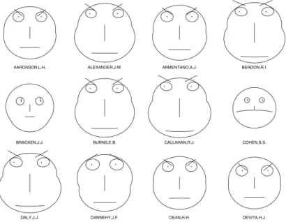
The basic idea of iconic displays techniques is to map the attribute values of a multidimensional data item to the features of an icon. The Chernoff faces [38] (see Fig. 2.3) is one of the most famous application, where data dimensions are mapped to facial features such as the shape of the head and the width of the nose.
Figure 2.3: Illustration example of Chernoff Faces
Dense Pixel Displays
In dense pixel techniques we map each dimension value to a coloured pixel and group these pixels belonging to each dimension into adjacent areas. These techniques allow to visualize up to about 1.000.000 data values, the largest amount of data possible on current displays, since, in general, dense pixel displays use one pixel per data value. The main question is how to arrange the pixels on the screen. To do this, the recursive pattern and the circle segments techniques [39] are used. An example of the circle segments technique application is illustrated in Fig. 2.4, where each segment shows all the values of one attribute and each circle represents the record.
Figure 2.4: Dense Pixel Displays: Circle Segments Technique. (Image taken from [40])
Stacked Displays
Stacked display techniques are designed to present data partitioned in a hierarchical structure. The basic idea is to insert one coordinate system inside another coordinate system, i.e. two attributes form the outer coordinate system, two other attributes are embedded into the outer coordinate system, and so on. A contraindication of this technique is that we have to select the coordinate system carefully since the utility of the resulting visualization largely depends on the data distribution of the outer coordinates. Mosaic Plots [41] and Treemap [42] (see Fig. 2.5) are typical examples of use of these techniques. Mosaic Plots will be described in section 2.3.1.
Figure 2.5: Treemap of votes by county, state and locally predominant recipient in the US Presidential Elections of 2012. (Image taken from [43])
2.1.3 Interaction and Distortion Techniques
The interaction and cooperation of different types of graphical techniques are important properties for the data analyst in visualization for an effective data exploration. Interaction techniques enable to directly interact with the visualizations, dynamically change the visualizations and facilitate the combination of multiple independent visualizations. The basic interaction techniques are dynamic projections, interactive filtering and zooming. Distortion techniques help in focusing on details while preserving data overview.
Dynamic Projections
Dynamic projections allows to automatically and dynamically change the projections in order to explore a multidimensional data set. The main difference between dynamic and interactive, where the change is made by user, is the automatic change of the projection. The sequence
of projections can be random, manual, precomputed or data driven. Interactive Filtering
Filtering facilitates the user to focus on interesting subsets of the data set by a direct selection of the subset (browsing) or by a specification of properties of the subset (querying). An example of this method for an interactive filtering is Magic Lenses [44]. The basic idea of Magic Lenses is to use a tool like a magnifying glass to support data filtering directly in the visualization. The data under the glass is processed by the filter and the result is displayed differently than the rest.
Interactive Zooming
Zooming, a well-known technique, allows to present the data in a highly compressed form that provides both overview of the data and in more detailed form depending on different resolutions. Zooming does not only mean enlarging the data object view but it also means that the data representation automatically changes to present more details on higher zoom levels. For example, the objects may be represented as single pixels, as icons or as labelled objects depending on the zoom level: low, intermediate or high resolution.
Interactive Distortion
Interactive distortion techniques assist the data exploration process by preserving an overview of the data during drill-down operations. Unlike the interactive zooming, that shows all the data in one detailed level in a single image, the idea is to show portions of the data with a lower level of detail while other parts are shown with a higher level of detail. Popular distortion techniques are hyperbolic and spherical distortion. Interactive Linking and Brushing
Since the various techniques previously analysed have some strength and some weaknesses, the idea of linking and brushing is to combine different visualization methods to overcome the individual shortcomings.
Interactive changes made in one visualization are automatically reflected in the other, for example colouring points in one visualization is reflected to other.
2.2
Visualization in Statistics
In this section we will discuss the main graphical methods used in statistics for the exploratory analysis. Usually this analysis is the first step to take when dealing with statistical data. The goal is to find or check, for each attribute, the basic statistical characteristics such as: density, “gaps” of data, or outliers (i.e., observations that do not fit the general nature of the data), etc. To exemplify statistics graphical methods we will use the total number of tornadoes recorded in the USA grouped by State from 2000 [35], as shown in Table 2.1.
2.2.1 Dispersal graphs
Dispersal graphs (also called dot plots) are an example of one kind of graphical summary. Their construction is very simple, we draw only the data values along an axis through graphical elements such as points, thus representing the position of each data value compared to all the others. Figure 2.6 shows a dispersion graph of the tornado data from Table 2.1. The x-axis keep track of the number of tornadoes and each point corresponds to a State.
Figure 2.6: A dispersal graph of the tornado data from Table 2.1. (Image taken from [45])
2.2.2 Histograms
Histograms are another kind of graph for the evaluation of the prob-ability density of an attribute. They are a variant of the bar graph and are produced by splitting the data range into bins of equal size.
State Number State Number of Tornadoes of Tornadoes
Alabama 44 Montana 10
Alaska 0 Nebraska 60
Arizona 0 Nevada 2
Arkansas 37 New Hampshire 0
California 9 New Jersey 0
Colorado 60 New Mexico 5
Connecticut 1 New York 5
Delaware 0 North Carolina 23
District of Columbia 0 North Dakota 28
Florida 77 Ohio 25
Georgia 28 Oklahoma 44
Hawaii 0 Oregon 3
Idaho 13 Pennsylvania 5
Illinois 55 Rhode Island 1
Indiana 13 South Carolina 20
Iowa 45 South Dakota 18
Kansas 59 Tennessee 27 Kentucky 23 Texas 147 Louisiana 43 Utah 3 Maine 2 Vermont 0 Maryland 8 Virginia 11 Massachusetts 1 Washington 3
Michigan 4 West Virginia 4
Minnesota 32 Wisconsin 18
Mississippi 27 Wyoming 5
Missouri 28
Table 2.1: The total number of recorded tornadoes in 2000, arranged alphabet-ically by State (Source: National Oceanic and Atmospheric Administration’s National Climatic Data Center).
They combine data into classes or groups as a manner to generalize the details of a data set while at the same time illustrating the data’s overall pattern. If the attribute has a categorical type, the x-axis represents the categories while the y-axis shows their frequencies. The tabulated frequencies are plot as adjacent rectangles, called bins, erected over discrete intervals. The height of a rectangle is equal to the frequency divided by the width of the interval. The area is equal to the frequency of the observations in the interval. The total area of an histogram is equal to the number of data. As with dispersal graphs, histograms can reveal gaps where no data values exist Fig. 2.7 (the 100-119 class).
Figure 2.7: A histogram showing the tornado data from Table 2.1. (Image taken from [45])
2.2.3 Box plots
In statistics the box plots (Figures 2.8, 2.9), also called box-and-whisker plot, are a graphical representation used to describe the distribution of a sample, through simple measures of dispersion and position, and information about outliers usually plotted as individual points. Box plots are also an excellent tool for detecting and illustrating location and variation changes between different groups of data. For drawing this
graph we need a 5-number summary of the data: M in X, M ax X, Q1
(lower quartile), Q3 (upper quartile) and m (median).
Let X = {x1, x2, · · · , xn} be a data set. The steps to create a
box-and-whisker plot (see Fig. 2.8) are as follows:
Figure 2.8
1. Arrange the data from the smallest value to the largest value: xp(1)≤ xp(2)≤ · · · ≤ xp(n), with p the corresponding permutation
function;
2. Find M in X: the least value and M ax X: the greatest value; 3. Find the median m of the data (second quartile or Q2):
Q2 = xp((n+1)/2), if (n + 1)/2 is a whole number. If it is not, the
median is Q2 =
xp(n/2)+xp(n/2+1)
2 ;
4. Find the median of the lower half of the data (lower quartile or Q1);
5. Find the median of the upper half of the data (upper quartile or Q3);
6. Draw a number line and mark the points for the values found in steps 2-5 above the line;
7. Draw a box from Q1 to m and from m to Q3 marks. The length
of the box is important, but the width can be any convenient size; 8. Draw a whisker from Q3 mark to the maximum value. Then draw
Figure 2.9: A box-plot showing the tornado data from Table 2.1. (Image taken from [45])
2.3
Visualization in the Machine Learning domain
In 1959, Arthur Samuel defined machine learning as the “Field of study that gives computers the ability to learn without being explicitly programmed” [46].
Machine learning is one of the key areas of artificial intelligence and deals with the realization of systems and algorithms that are based on observations as data for the synthesis of new knowledge. Learning can take place by capturing features of interest from sensors, data structures or examples to analyse and evaluate the relationships between the observed variables. One of the main goals of researchers in this field is to automatically learn to recognize complex patterns and make intelligent decisions based on data; the difficulty lies from the fact that the set of all possible behaviours given from all possible inputs is too large to be covered by sets of observed examples (training data). For this reason it is necessary the use of techniques to generalize the cited examples, in order to be able to produce a useful yield for new cases.
Data visualization in machine learning is usually applied to two main activities:
• model description: “decision tree” and “association rules” tech-niques;
• model testing: “learning curve” and “Receiver Operating Charac-teristic (ROC) curve” techniques.
All images in this section show data from the Titanic data set that can be downloaded from [36]. The survival status of individual
passengers on the Titanic is summarized in table 2.2.
Passenger Number Number Number Percentage Percentage category aboard saved lost saved lost
Women, Third Class 165 76 89 46% 54%
Women, Second Class 93 80 13 86% 14%
Women, First Class 144 140 4 97% 3%
Women, Crew 23 20 3 87% 13%
Men, Third Class 462 75 387 16% 84%
Men, Second Class 168 14 154 8% 92%
Men, First Class 175 57 118 33% 67%
Men, Crew 885 192 693 22% 78%
Children, Third Class 79 27 52 34% 66% Children, Second Class 24 24 0 100% 0% Children, First Class 6 5 1 83.4% 16.6%
Total 2224 710 1514 0,32 0,68
Table 2.2: The contingency table of Titanic data set
2.3.1 Visualization in model description Decision trees
In machine learning a decision tree is a predictive model, where each internal node denotes a test on an attribute; each arc to a child node represents a possible value for that property (the outcome of a test); each leaf (or terminal node) represents the predicted value of the target variable given the values of the input variables that in the tree are represented by the path from the root to the leaf.
Normally a decision tree is constructed using learning techniques to the data from the initial (data set), which can be divided into two subsets: the “training set” on which the structure of the tree is created and the “test set” that is used to test the accuracy of the predictive model created. Each leaf is assigned to one class representing the most appropriate target value. Alternatively, the leaf may hold a probability vector indicating the probability of the target attribute having a certain value.
Instances are classified through the navigation of the nodes from the root of the tree to a leaf, along the route according to the outcome of the tests.
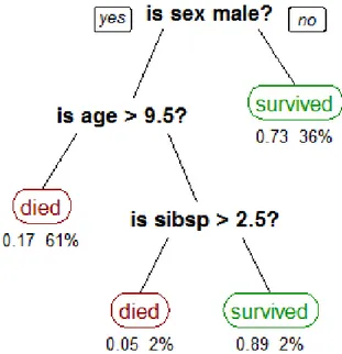
step is to draw the root of the tree, this node forms the layer 0. The second step is to draw all edges from this root to new nodes, which form a new layer. We have to repeat this drawing, until we draw whole tree. The height of the tree is equal to the number of layers. An example of decision tree is shown in Fig. 2.10.
Figure 2.10: A tree showing survival of passengers on the Titanic (“sibsp” is the number of spouses or siblings aboard). The figures under the leaves show the probability of survival and the percentage of observations in the leaf. (Image taken from [47])
Visualization of association rules
The visualization of rules is an important step for subgroup discovery. The most used techniques include Pie charts and Mosaic plots.
Pie charts One of the most common way of visualizing parts of a whole are slices of pie charts. According to [48] a rule can be easily visualized through the use of two pie charts. This approach consists of a two-level pie for each subgroup. The distribution of the entire
population, in terms of the property of interest of the entire example set, is represented by the base pie. The inner pie shows the division in some subgroup, which is characteristic for the rule. An example is shown in Fig. 2.11. The base pies show in both cases the relation between survived (dark blue) and non-survived (light blue) adult passengers of the Titanic. The inner pies show two subgroups, in Fig. 2.11.a the inner pie shows only data related to females, in Fig. 2.11.b the inner pie shows only data related to the crew.
Figure 2.11: The visualization of the Titanic data set comparing the whole group of survived and non-survived adult passengers of the Titanic and the female (a) and crew (b) subgroups
Unluckily the pie graph can visualize only one selected subgroup at a time, so if we need to display multiple subgroups simultaneously we can use the mosaic plot tecnique.
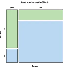
Mosaic plots Through a mosaic plot [49, 50] it is possible to examine the relationship between two categorical, nominal or ordinal variables. To build a mosaic plot we must proceed according to the following steps: 1) draw a square with length one; 2) divide the square into horizontal stripes whose widths are proportional to the probabilities associated to the first categorical variable; 3) split each stripe vertically into stripes whose widths are proportional to the conditional probabilities of the second categorical variable. Additional splits can be made if the use of a third, fourth variable, etc. is necessary.
Fig. 2.12 shows the mosaic plot of the Titanic data set for two variables. It is possible to compare the relation between females and
males and between survivors and non-survivors in one picture. Fig. 2.13 shows the mosaic plot of Titanic data set for three variables: Class, Gender and Survived.
Adult survival on the Titanic
Gender Su rv iv ed Female Male Ye s N o
Figure 2.12: Mosaic plot of the Ti-tanic data set for two variables: Gen-der and Survived
Adult survival on the Titanic
G
en
de
r
1st Class 2nd Class 3rd Class Crew
M al e Fe m al e
Yes No Yes No Yes No Yes No
Figure 2.13: Mosaic plot of the Ti-tanic data set for three variables: Class, Gender and Survived
2.3.2 Visualization in model testing
Visualization in model testing is mainly used in the visualization of test results. Among the most used visualization there are the learning curve and the receiver operating characteristic (ROC) curve.
Learning curve
In computer science, the term learning curve (Fig. 2.14) indicates the ratio of time required for learning (vertical axis) and amount of information correctly learned or experience (horizontal axis) and is particularly used in e-learning and in relation to software. The machine learning curve can be helpful in many aims including: choosing model parameters during design, comparing different algorithms, determining the quantity of data used for training and adjusting optimization to enhance convergence. Usually what we expect from the analysis of the learning curve is that when a machine learning algorithm has more examples for learning, the results will be more accurate.
Figure 2.14: Examples of learning curves
ROC curve
The receiver operating characteristic (ROC) curve has long been used in signal detection theory. The machine learning community most often uses the ROC AUC (area under the curve) statistic for model comparison in order to select the best model.
The first step is to define an experiment from P positive instances and N negative instances for some condition and the relative confusion matrix, see table 2.3, for each model.
Actual positives Actual negatives Predicted positives True positive
TP
False positive FP Predicted negatives False negative
FN
False positive TN Table 2.3: A confusion matrix
Where P = T P + F N and N = T N + F P
The second step is to draw an ROC curve where only the true positive rate (TPR) and false positive rate (FPR) are needed, with: T P R = T PP = T P +F NT P and F P R = F PN = T N +F PF P .
An ROC space is defined by FPR and TPR as x and y axes respec-tively, which depicts relative trade-offs between true positive (benefits) and false positive (costs). Since TPR is equivalent to sensitivity and FPR is equal to 1 − specif ity (with specif ity = SP C = T NN = T N +F PT N ), each prediction result or instance of a confusion matrix represents one point in the ROC space, see the Fig. 2.15.
Figure 2.15: Illustration example of ROC curve
The best possible prediction method (perfect classification) would yield a point in the upper left corner or coordinate (0, 1) of the ROC space, representing 100% sensitivity (no false negatives) and 100% specificity (no false positives).
A model is better than another when the area under the curve for the model is larger than the one for the other model.
The diagonal line y = x represents the strategy of randomly guessing a class. The diagonal divides the ROC space. Points above the diagonal represent good classification results (better than random), points below the line represent poor results (worse than random).
2.4
Multidimensional data visualization
In this section, we will examine in detail some of the techniques for the visualization of multidimensional data. We will illustrate the methods that allow the data projection from n-dimensional space to 2 or 3-dimensional space.
2.4.1 Scatter Plot
A scatter plot is useful to illustrate the relation or association between two or three variables. The positions of data points represent the corresponding dimension values. We can display directly two or three dimensions, while additional dimensions can be mapped to the colour, size or shape of the plotting symbol. For example in a 2d scatter plot each point has the value of one variable determining the position on the horizontal x-axis and the value of the other variable determining the position on the vertical y axis. The axis range varies always between the minimum and the maximum of the attribute values.
Scatter Plot matrix
Scatter plot matrices are a great way to visualize multivariate data and to roughly determine if there is a linear correlation between multiple variables. Given a dataset with N dimensions, the matrix consists of N2 scatter plots arranged in N rows and N columns. So, each scatter
plot, identified by the row i and column j in the matrix, is based on the dimensions i and j.
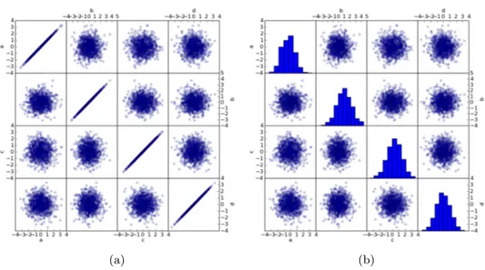
Since the diagonal scatter plots use the same dimensions for the x-axis and y-axis, the data points form a straight line of dots in these scatter plots (see Fig. 2.16a) showing the distribution of data points in one dimension, although its usefulness is very limited. It is also possible, to overcome this weakness, to utilize an histogram to obtain a graphical representation of the distribution of data for that specific dimension or attribute as depicted in see Fig. 2.16b.
3D Scatter Plot
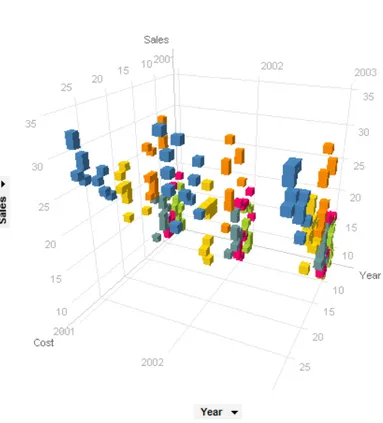
3D scatter plots are used to draw data points on three axes in order to show the relationship between three variables. Each row in the data table is represented by a sketch whose position depends on its values in the columns set on the x, y, and z axes; again, additional dimensions can be mapped to the colour, size or shape of the plotting symbol. They are useful when we want to relate two attributes with respect to their temporal trend, Fig. 2.17.
(a) (b)
Figure 2.16: Scatter plot matrices
2.4.2 Multiple Line Graph and Survey plots
Multiple Line Graph is a multidimensional variant of Bar graph. The x-axis typically represents the ordering of records in the data set or time and the y-axis represents the values of attributes, see Fig. 2.18a. The graph’s colour may depict the class of record. This method can be useful for finding constant attributes or attributes exhibiting linear behaviour. Survey plot is only a similar variant of Multiple Line Graph, in this case a bar of the record is centered around the x-axis, see Fig. 2.18b. This graph allows to see correlations between any two attributes especially when the data is sorted. The graph colour can again show the class or some other information about the data.
2.4.3 Parallel Coordinates
The parallel coordinate systems (see Fig. 2.19) are commonly used to visualize n-dimensional spaces and analyze multivariate data. To show a set of points in a space of n dimensions, n parallel lines are drawn, usually vertical lines, and placed at equal distance from each other. Vertical lines represent all the considered attributes. A point in n-dimensional space is represented as a poly line with vertices on the parallel axes. The position of the vertex on the i-th axis corresponds to
Figure 2.17: A 3D scatter plot where sales, cost, and year are plotted against each other for a number of different products (colored by product)
the i-th coordinate of the point. The maximum and minimum values of each dimension are scaled to the upper and lower point of these vertical lines.
3D Parallel Coordinates
Although parallel coordinates are a powerful method for visualizing multidimensional data they have a weakness: when applied to large data sets, they become cluttered and difficult to read. To overcome these difficulties, researchers have found different solutions. For example Fanea et al. [51] combine parallel coordinates and star glyphs into a 3D representation (see Fig. 2.20a, this technique will be further explained in 4.3.3); Streit et al. [52], as in Fig. 2.20b, assign a color vector, running from dark blue to dark red, to the plot and create an isosurface where
(a) (b)
Figure 2.18: a) Multiple Line Graph and b) Survey plots of Iris Flower data set, created by SumatraTT
the x/y-plane represents the 2D version of the parallel coordinates, while the z-dimension represents the density of the measured data events; Johansson et al. [53] propose a clustered 3D multi-relational parallel coordinates technique (Fig. 2.20c).
2.4.4 Andrews’ Curves
In data visualization, an Andrews plot or Andrews curve is a visual-ization method which plots each N -dimensional point as a curved line using the function:
f (t) = √x1
2 + x2sin(t) + x3cos(t) + x4sin(2t) + x5cos(2t) + · · · ,
where x ∈ {x1, . . . , xn} are values of individual attributes. This
function is plotted for −π < t < π, see Fig. 2.21. Thus each data point may be viewed as a line between −π and π. This method is similar to a Fourier transformation of a data point. The drawback of this method is given by the high computation time when displaying each n-dimensional point for large data sets.
Figure 2.19: Parallel coordinate plot of Fisher Iris data
2.4.5 Using Principal Component Analysis for Visualization Principal component analysis (PCA) [55, 56], Pearson (1901) and Hotelling (1933), is a quite old statistical technique of exploration analysis but still one of the most used multivariate techniques today. PCA is a way of identifying patterns and expressing the data in a manner to emphasize their similarities and differences. In PCA we use orthogonal transformations to convert a set of observations of possibly correlated variables x1, · · · , xninto a new set y1, · · · , ym (where m is less
than or equal to the number of original variables n) of values of linearly uncorrelated variables called principal components. This new set of attributes describes data better. Correlation between attributes is an important precondition of this transformation, if there is no correlation the new set has same size of the original.
Main idea:
• Start with variables x1, · · · , xn
(a)
(b)
(c)
Figure 2.20: Examples of 3D Parallel Coordinates
components) where m is from the interval [1, n], so that:
– y1, · · · , ym are uncorrelated. Idea: They measure different
dimensions of the data.
– V ar(y1) ≥ V ar(y2) ≥ · · · ≥ V ar(ym). Idea: y1 is more
important than y2, etc.
Figure 2.21: Andrews’ curves of Iris Flower data set
Figure 2.22: An illustration of PCA. a) A data set given as 3-dimensional points. b) The three orthogonal Principal Components (PCs) for the data, ordered by variance. c) The projection of the data set into the first two PCs, discarding the third one. (image taken from [54])
visualize data from 3D to a 2D space. 2.4.6 Kohonen neural network
Kohonen neural network, or self-organizing map (SOM), [57] is a type of artificial neural networks with two layers of nodes (or neurons) that is trained using unsupervised learning to produce a low-dimensional (typically two-dimensional) and discredited representation of the input
space of the training samples. The n dimensions are used as n-input nodes to the net since the input layer has a node for each input. The output nodes of the net are arranged in a hexagonal or rectangular two-dimensional grid. All input nodes are connected to all output nodes, and these connections are associated with weights or intensity. Initially, all weights are random. When a unit wins a record, its weights (and those of other nearby units, collectively called proximity) are adjusted to better match the pattern of predictor values for that record. All input records are displayed and the weights are updated accordingly. This process is repeated several times to obtain extremely small variations. As the training progresses, the weights on the grid units are adjusted in order to form a “map” of the two-dimensional clusters, hence the term self-organizing map. At the end of the learning of the network, records similar should be close on the output map, while the very different record will be at a considerable distance. An example of Kohonen Maps is shown in the Fig. 2.23.
2.4.7 RadViz
RadViz (Radial Coordinate visualization) [59, 60] is a useful method, which uses physical Hooke law for visualization, to map in nonlinear way a set of n-dimensional points onto two dimensional space (see Fig. 2.24a) and to point to existence of natural clusters in some data sets (see Fig. 2.24b).
We need to place n points around a circle in the plain to draw a RadViz plot, this points are called dimensional anchors. In RadViz the relational value of a data record is represented through spring constants, where each line is associated with one attribute. One end of each spring is attached to each dimensional anchor, the other one to the data point. Each data point is displayed at the point, where the sum of all spring forces equals zero according to Hooke’s law (F = Kx): i.e. where the force is proportional to the distance x to the anchor point and K is the value of the variable for the data point for each spring. The values of each dimension are normalized to [0, 1] range. Data points with approximately equal or similar dimensional values are plotted closer to the center.
Figure 2.23: Self organizing map of Fisher’s Iris flower data set: Neurons (40 x 40 square grid) are trained for 250 iterations with a learning rate of 0.1 using the normalized Iris flower data set which has four dimensional data vectors. A colour image formed by the first three dimensions of the four dimensional SOM weight vectors (top left), the pseudo-colour image of the magnitude of the SOM weight vectors (top right), the U-Matrix (Euclidean distance between weight vectors of neighboring cells) of the SOM (bottom left) and the overlay of data points (red: I. setosa, green: I. versicolor and blue: I. verginica) on the U-Matrix based on the minimum Euclidean distance between data vectors and SOM weight vectors (bottom right). (image taken from [58])
2.4.8 Star Coordinates
Star coordinates [61] are a multi-dimensional visualization technique with uniform treatment of dimensions. Suppose to have eight attributes: to create this plot (Fig. 2.25a) we have to arrange the coordinate axes, one for each attribute labelled C1 through C8, on a circle on a
two-dimensional plane with equal (initially) angles between the axes with an origin at the center of the circle. Initially the length of all axes is the same. The d-labelled vectors are computed for each attribute
(a)
(b)
Figure 2.24: RadViz: a) calculation of data point for an 6-dimensional data set, b) visualization of Iris Flower data set
based on the orientation of the axes and the mapping of values. Data points are scaled to the length of the axis, where the smallest value in the set for an attribute is mapped to the origin and the largest is mapped to the end of the attributes axis. In this way, no data values are “out of range”. By computing the sum of the d vectors, star coordinates determines the location of star P . An example is shown in Fig. 2.25b
C1 C2 C3 C4 C5 C6 C7 C8 P dj1 dj2 dj3 dj4 dj5 dj7 dj6 dj8 (a) (b)
Figure 2.25: Star coordinates: a) Calculation of data point for an 8-dimensional data set [61], b) Two-8-dimensional star coordinates performing cluster analysis on car specification, revealing four clusters [62]
Star Coordinates into three dimensions
Three-dimensional star coordinates [62] extends Kandogan’s intuitive and easy-to-use transformations. In this new approach the axes may extend into three cartesian dimensions instead of just two. Now it is possible to use three-dimensional interactions and to maintain the two-dimensional display, i.e. the system rotation is introduced as a powerful new transformation. The users, see Fig. 2.26 have more space to exploit because stars are distributed in a volume instead of a plane, while the addition of the depth allow users to include more meaningful variables simultaneously in an analysis.
Figure 2.26: Three-dimensional star coordinates performing cluster analysis on car specification, revealing five clusters. (image taken from [62])
2.4.9 2D and 3D Radar Chart
A 2D radar chart (also known as Kiviat diagram) is a two-dimensional graphical representation of multivariate data with one spoke for each variable, and a line is drawn connecting the data values for each spoke. Radar charts are useful to find the dominant variables for a given observation, to discover which observations are most similar, to point out outliers.
time-dependent data. Some examples include: Kiviat Tube, 3D Parallel coordinates, Wakame (see Fig. 2.27), etc. A full survey of these techniques is proposed in section 4.3.
Chapter
3
CyBiS 2
There was much else that Jesus did; if it were written down in detail, I do not suppose the world itself would hold all the books that would be written.
— John 21: 25, The Holy Bible
This chapter briefly describes the work on CyBiS2, an enhanced version of the tool CyBiS [64], acronym of Cylindrical Biplot System, which is a new interface for the representation of the salient data of searched documents in a single view. This experience has been of great help to move my first steps in the field of IV. Some of the ideas derived from both the study of CyBiS and its further development were of use both to define the 3DRC technique and to realize the related tool.
3.1
Introduction
Even before the advent of the Web, it was possible to access digi-tal libraries through cumbersome proprietary textual interfaces [65]. Nowadays DLs are equipped with a special search engine (for example: http://ieeexplore.ieee.org/, http://dl.acm.org/) where users can retrieve scientific documents.
Unfortunately, textual views can be considered ineffective from different points of view [66, 67]. For example, it is difficult to straight-forwardly present users with search results grouped by specific topics
related to their research themes. Other drawbacks are the limited num-ber of shown items, the lack of adequate means for evaluating paper chronology, influence on future work, relevance to given terms of the query. To overcome the above drawbacks Information Visualization (IV) is often used. In literature, several visual interfaces for Bibliographic Visualization Tools (BVTs) have already been proposed and actually there are no standards in this field and there is not even a well estab-lished terminology. Many visual tools described in the literature provide different features in order to evaluate if a document meets his/her needs like its relevance with respect to the query terms, influence over the field, “age” and relation with other documents. Nevertheless, it is rare that all of them are shown in a single view at the same time: e.g., some systems use different views to show relevance to terms and citation relations.
The rest of the chapter is organized as follows: the next section contains a brief survey on BVTs; section 3.3 presents the revised design and the improvements of the new interface; some final remarks and a brief discussion on possible future work conclude the chapter.
3.2
Related Work
In [28], the authors identified the main objectives of BVTs. BVTs can also be useful for activities related to paper search: finding authors or topics and tasks that give an overview of the research in an area, such as the study of citation network, chronology or collaboration. Following the model presented in [68], we classify the interfaces of BVTs depending on the way in which they present the results of a search query:
• analytical : an individual document is represented by an informa-tion item;
• holistic: groups of documents sharing the same value of a catego-rization attribute are represented by information items;
• hybrid : aggregated and detailed aspects of a search result are presented simultaneously.
![Figure 1.1: a visual guide to CRISP-DM methodology (image taken from [9])](https://thumb-eu.123doks.com/thumbv2/123dokorg/5705353.73835/12.892.206.689.682.1005/figure-visual-guide-crisp-dm-methodology-image-taken.webp)


![Figure 2.7: A histogram showing the tornado data from Table 2.1. (Image taken from [45])](https://thumb-eu.123doks.com/thumbv2/123dokorg/5705353.73835/31.892.233.663.462.781/figure-histogram-showing-tornado-data-table-image-taken.webp)