Alma Mater Studiorum ¨ Universit`a di Bologna
Scuola di Scienze
Corso di Laurea Magistrale in Fisica del Sistema Terra
Daily temperature trends in
Trentino Alto Adige over the last century
Relatore:
Prof. Michele Brunetti
Presentata da:
Antonello Angelo Squintu
Sessione III
” ...per la scienza
di un uomo saggio.”
(Z.B.)
ABSTRACT
Numerosi lavori apparsi sulla letteratura scientifica negli ultimi decenni hanno evidenziato come, dall’inizio del XX secolo, la temperatura media globale sia aumen-tata. Tale fenomeno si è fatto più evidente dagli anni ’80, infatti ognuno degli ultimi tre decenni risulta più caldo dei precedenti. L’Europa e l’area mediterranea sono fra le regioni in cui il riscaldamento risulta più marcato, soprattutto per le temperature mas-sime (dal 1951 sono cresciute di+0.39 °C per decennio) che hanno mostrato trend mag-giori delle minime. Questo comportamento è stato osservato anche a scala nazionale (+0.25°C/dec per le massime e +0.20°C/dec per le minime). Accanto all’aumento dei valori medi è stato osservato un aumento (diminuzione) degli eventi di caldo (freddo) estremo, studiati attraverso la definizione di alcuni indici basati sui percentili delle dis-tribuzioni. Resta aperto il dibattito su quali siano le cause delle variazioni negli eventi estremi: se le variazioni siano da attribuire unicamente ad un cambiamento nei valori medi, quindi ad uno shift rigido della distribuzione, o se parte del segnale sia dovuto ad una variazione nella forma della stessa, con un conseguente cambiamento nella variabilità. In questo contesto si inserisce la presente tesi con l’obiettivo di studiare l’andamento delle temperature giornaliere sul Trentino-Alto-Adige a partire dal 1926, ricercando cambiamenti nella media e negli eventi estremi in due fasce altimetriche. I valori medi delle temperature massime e minime hanno mostrato un evidente riscal-damento sull’intero periodo specialmente per le massime a bassa quota (`0.13 ˘ 0.03 °C/dec), con valori più alti per la primavera (`0.22˘0.05 °C/dec) e l’estate (`0.17˘0.05 °C/dec). Questi trends sono maggiori dopo il 1980 e non significativi in precedenza. L’andamento del numero di giorni con temperature al di sopra e al di sotto delle soglie dei percentili più estremi (stimate sull’intero periodo) indica un chiaro aumento degli estremi caldi, con valori più alti per le massime ad alta quota ( fino a +26.8% per il 99-esimo percentile) e una diminuzione degli estremi freddi (fino a -8.5% per il primo percentile delle minime a bassa quota). Inoltre, stimando anno per anno le soglie di un set di percentili e confrontando i loro trend con quelli della mediana, si è osservato, unicamente per le massime, un trend non uniforme verso temperature più alte, con i percentili più bassi (alti) caratterizzati da trend inferiori (superiori) rispetto a quello della mediana, suggerendo un allargamento della PDF.
ABSTRACT
In last decades several works appeared in scientific literature highlighted, since the beginning of 20th century, an increase of the mean global temperature. This phe-nomenon has been more evident since 1980’s, effectively each of the last three decades has been warmer than the previous ones. Europe and mediterranean area showed to be among the regions with stronger warming trends, especially for maximum temper-atures (since 1951 tempertemper-atures have increased with a trend of +0.39°C per decade, higher than what observed for minimum temperatures). This behaviour have been observed at Italian scale (+0.25°C/dec and +0.20°C/dec. for maximum and minimum temperatures respectively). Together with the increase of mean values it has been ob-served an increase (decrease) in the number of warm (cold) events. These have been studied through the definition of some indices based on distribution percentiles. De-bate is still open on the causes determining changes in extreme events: whether they are due changes in the mean values (therefore linked to a rigid shift of the distribution) or if part of this signal is due to changes in the distribution shape (with consequent changes in variability). In this context this thesis is aimed at studying tendencies of daily temperatures in Trentino-Alto-Adige over the 1926-2013 period, searching for changes in the mean and in extreme events in two altitudinal bands. Average minimum and maximum temperatures have shown an evident warming trend over the whole pe-riod especially for maximum temperatures at low elevations (`0.13˘0.03 °C/dec), with higher values for Spring (`0.22˘0.05 °C/dec) and Summer (`0.17˘0.05 °C/dec). These trends have higher values since 1980 and generally non-significant before. Trends in exceedance probabilities over and below more extreme percentile thresholds (estimated over the entire period) indicate a clear increase in warm extremes, with highest values for maximum temperatures at highest elevations (up to+26.8% for 99th percentile) and a decrease of cold extremes (down to -8.5% for 1st percentile of minimum tempera-ture at low elevation). Furthermore, estimating year by year thresholds of a percentile set and comparing their tendencies with the median trend it has been observed, only for maximum temperatures, a non-uniform trend towards higher temperatures, where lower (higher) percentiles are characterized by lower (higher) trends than the median trend, suggesting a widening of the PDF.
Contents
1 Global warming and statistical interpretation. 1
1.1 Trends in the mean temperature . . . 1
1.2 Distribution of anomalies and indices . . . 4
1.3 Evidences of strengthening extreme events at global scale . . . 6
1.4 European warming climate trends . . . 13
1.5 Warming trends over Italy . . . 17
2 Data collection and quality check 23 2.1 Trentino Alto Adige and its geographical features . . . 23
2.2 Data collection . . . 23
2.3 Quality check . . . 27
2.3.1 Removal of gross errors . . . 27
2.3.2 Splitting of yearbook series . . . 27
2.3.3 Calculation of observed anomalies . . . 28
2.3.4 Calculation of synthetic anomalies . . . 35
2.3.5 Selection of thresholds and removal of suspect data . . . 38
2.4 Merging . . . 47
3 Homogenization 49 3.1 Craddock Test . . . 49
3.2 Correction of the series . . . 50
3.3 Series of the correction . . . 57
4 Data analysis 59 4.1 Principal Component Analysis . . . 59
4.1.1 PC calculation and truncation . . . 59
4.1.2 Rotation of the PCs and Regionalization . . . 62
4.2 Series interpolation on a grid . . . 66
4.3 Trends on the grid-points . . . 68
4.4 Trends in regional seasonal series . . . 71
4.5 Comparison with ISAC-CNR data set . . . 81
4.6 Exceedance probability trends . . . 86
4.7 Trends in the moving percentiles . . . 96
5 Conclusions and Open Issues 105
5.1 Summary and conclusions . . . 105 5.2 Is increased variability due to instrumental changes? An open issue . . . 106
Chapter 1
Global warming and statistical
interpretation.
Occurring of extreme events and unusual cold or warm days stimulated attention of mass media and public opinion on climate issues. A large quantity of works published in last years pointed out how, during twentieth century, land surface air temperature (LSAT) underwent a significant increase that has become more evident since the 1970’s.
1.1
Trends in the mean temperature
IPCC [2013] assessed that it is certain that Global Mean Surface Temperature has in-creased since 19th century and, furthermore, last decades appear to be warmer than the previous ones. In particular the first decade of 21st century has been the warmest since observations are available.
The average of air temperature over land has been observed to be affected by warming trends at different scales and over various time ranges. Calculation of trends depends on the considered periods due to natural variability. This happens in particular when trends are calculated over short periods so that the choosing of extremal years may affect the results. Trends might also be calculated not with linear behaviour in time but might be given by higher orders. Nevertheless linear trends are found to be nicely consistent with data and, furthermore, they may be treated and understood more easily.
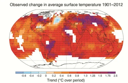
Studies on temperature trends are performed analyzing recorded data from samples whose geographical coverage can vary from global to national or sub-national (regional) level. These changes has been observed especially since 1950 ([Vose et al., 2005], [Alexander et al., 2006], [Rohde et al., 2012], [Donat et al., 2013] ). Estimated trends over the entire globe are displayed in figure 1.1.
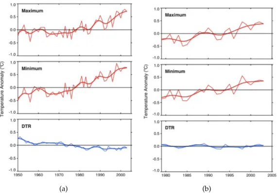
Studies have found that, at global scale, the distribution shifts look to be larger for minimum temperatures [Alexander et al., 2006]. Vose et al. [2005] observed trend for minimum temperatures in the 1951-2004 period to be nearly 1.5 times the one
Figure 1.1. Map of global observed trends in surface temperature over the 1901-2012 period. [IPCC,
2013]
observed for maximum (0,204 vs. 0,141 °C/dec) (figure 1.2 (a)). Consequently diurnal temperature range (DTR) showed a significant decrease, evidence not found for the 1979-2004 period, where Vose et al. [2005] observed coherent trends for maximum and minimum temperature (see figure 1.2 (b)).
In order to deeper inspect warming climate features, analyses performed by great part of the studies look first of all at the entire series and then focus on single seasons. In these cases the year is divided into four periods composed as usual:
• SPRING: March, April and May; • SUMMER: June, July and August;
• AUTUMN: September, October and November; • WINTER: December, January and February.
An animated debate is taking place among scientific community whether climate changes are linked only to rigid shift in the mean or to changes in higher moments of the distributions, since variations in some of them may affect significantly tail probabilities ([Mearns et al., 1984],[Katz and Brown, 1992]) .
Some works have studied the role of possible increase of distribution width in the occurring of extreme events ([Schär et al., 2004],[Della-Marta et al., 2007]). Effect on extremes due to changes of distribution tails were modeled by some authors and compared to observed data. These analyses suggested the presence of changes in width
1.1. TRENDS IN THE MEAN TEMPERATURE 3
(a) (b)
Figure 1.2. Observed trends for maximum, minimum temperatures and DTR for 1951-2004 (a) and
1979-2004 (b) periods. [Vose et al., 2005]
and asymmetry of PDFs. Such changes in variability were effectively found, observing widening of the distribution during warming periods and narrowing during cooling periods ([Klein Tank and Können, 2003],[Klein Tank et al., 2002]).
On the other hand, as discussed forward in the text, a large number of studies assess that changes in higher moments of temperature distributions are not relevant when compared with the effects of changes in the mean.
Therefore scientific community still debates whether higher moments and their changes will still remain negligible or they will become dominant, even if in last decades there have not been evidences in such direction [Scherrer et al., 2005].
1.2
Distribution of anomalies and indices
Changing climate has been observed to be characterized also by the frequency increase of extremal events. Analytical treatment of these events may be afforded:
• fitting data with theoretical probability density functions and studying their evo-lution through time;
• analyzing the distributions of extremes through the Generalized Extreme Values (GEV) or Generalized Pareto Distribution(GPD);
• looking at particular indices that describe some features of the distributions, as the ones introduced by the CLIVAR (Research Programme on Climate Variability and Predictability) Expert Team on Climate Change Detection and Indices (ETCCDI). First two methods try to describe with analytical tools the behaviours of available data. But some problems occur in these cases, since the choice of the parameter values and the selection of the shape of distributions (gaussian, skew-normal, etc.) are not univocally determined.
Providing an objective definition of extreme events and clear criteria to identify them is not simple, indeed. For these reasons, in great part of works, surveys on temperature series are effectuated through calculation of several kinds of indices that can relate to characteristics of temperatures themselves or to features of their proba-bility distribution. In latter case more common indices are the median and various fixed or moving thresholds calculated looking at percentiles of the considered distri-butions. These indices have been defined by CLIVAR, in order to provide an indices set universally comparable.
Hereafter are some examples of CLIVAR indices (and their definition found on the ETCCDI web site) that will be mentioned in this text:
• FD, Number of frost days: Annual count of days when TN (daily minimum temperature)< 0°C;
• SU, Number of summer days: Annual count of days when TX (daily maximum temperature)> 25°C;
• TR, Number of tropical nights: Annual count of days when TN (daily minimum temperature)> 20°C.
• TN10p: percentage of days of the sub-sample having minimum temperature lower than the 10th percentile. That is: let TNi jbe the daily minimum temperature
on day i in period j and let TNin10 be the 10th percentile of that calendar day
(calculated in a reference window of days before and after the selected date) . The percentage of days of the sub-sample is determined by all TNi j that satisfy the
condition: TNi j< TNin10. Same for maximum temperatures (TX) and for different
1.2. DISTRIBUTION OF ANOMALIES AND INDICES 5
• TN90p: percentage of days of the sub-sample having minimum temperature higher than the 90th percentile. That is: let TNi jbe the daily minimum
tempera-ture on day i in period j and let TNin90 be the 90th percentile of that calendar day
(calculated in a reference window of days before and after the selected date) . The percentage of days of the sub-sample is determined by all TNi j that satisfy the
condition: TNi j>TNin90. Same for maximum temperatures (TX) and for different
values of the percentile (99, 98, 95, 80, etc.).
Percentiles are important indicators in the analysis of changing in the behaviour of extreme values. Effectively they allow to individuate how a distribution shifts or modifies its shape. Following the definition provided above, value of the xthpercentile is empirically determined sorting data of a selected period in increasing order and individuating the temperature having x% of sample with lower values. For example, having a 5000-elements sorted data set, 5th percentile is that temperature which appears in the 250th position; this means that 5% of data have lower value than the considered one.
Percentiles may be object of two different analysis:
• estimating percentile thresholds year by year and studying their temporal be-haviour;
• estimating percentile thresholds over a reference period and counting, for each year and for each season, the number of exceedances.
1.3
Evidences of strengthening extreme events at global
scale
Coherently with evidences found for trends in the temperature mean, second half of twentieth century has shown to be the period with highest increase of warm extreme events and decrease of cool events.
Analyzing trends in the parameters of GPD, Brown et al. [2008] found that the only parameter that appears to change in time is parameter that describes the position of the distribution, that acts like the mean. This variation is more marked for minimum tem-peratures than maximum and in particular concerns cold tail of minimum temperature distributions. Analogous results were obtained by Nogaj et al. [2006] analyzing North Atlantic region. These results strengthen the hypothesis of variations in the mean to be dominant in global warming.
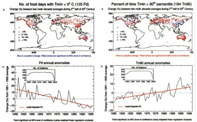
Frich et al. [2002], analyzing an intercontinental data set coming from Nothern Hemisphere and Australia, found a clear reduction of the number of frost days and an evident increase of the percentage of events above the 90th percentile of minimum temperatures (figure 1.3).
Figure 1.3. Left: Number of frost days. Trend for each analyzed station (top) and annual percentage
change (bottom). Right: Percentage of days with minimum temperature above the 90th percentile. Trends for each station (top) and annual percentage variation (bottom). In both bottom plots percentage are calculated with respect to the 1961-1990 period. [Frich et al., 2002]
1.3. EVIDENCES OF STRENGTHENING EXTREME EVENTS AT GLOBAL SCALE 7
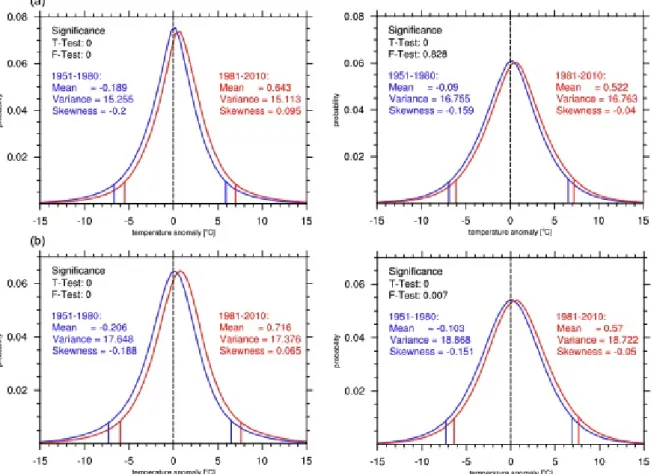
Donat and Alexander [2012] conjugated inspection on indices and threshold with an analysis on distribution moments. They looked for changes in distribution features separating global sample (anomaly temperatures calculated with respect to 1961-1990 period) into two data-sets, first one from 1951 to 1980 and second one from 1981 to 2010. Ranking and arranging in gaussian-like distribution these daily data sets, they found a clear shift toward higher temperatures in the probability density function. Plots in figure 1.4 allow to see how distributions of temperature shifted towards warmer values, both for minimum and maximum temperatures. On global sample (upper panels) mean of minimum temperatures increased by 0.8°C and maximum ones by 0.6°C, these variations were checked with a t-student test, demonstrating the significance of the results.
Figure 1.4. Probability density functions of anomalies of daily temperatures for the 1951-1980 period
(blue) and the 1981-2010 period(red). On the left column anomalies for minimum temperatures are displayed, on the right column same for maximum temperature. Upper plots refer to global sample, while lower ones are for northern hempisphere extratropical latitudes (more than 30°N). Vertical lines represent, for each distribution, 5th and 95th percentiles. [Donat and Alexander, 2012]
In the same plots changes in position of percentiles are clear. There they appear to move to warmer values. Effectively lower threshold (5th percentile) of the older data-set for minimum (maximum) have become the 3.2nd (3rd) percentile, while upper percentile (95th percentile) have moved to 92.7th (93rd). This evidences were linked with the outcomes that for minimum temperatures (whose changes were more marked) number of events above older 95th percentile in 1981-2010 was greater by 40% than that observed for 1951-1980 period.
In spit of what found in some other studies, Donat and Alexander [2012] observed variations in higher moments. Variance showed different behaviours on the analyzed stations, but appeared to describe wider distribution in particular over tropical areas. Nonetheless variance gave very heterogeneous results that didn’t allow the identifica-tion of a clear trend. On the other hand, in this study, outcomes have shown a clear variation in skewness to higher values, bringing asymmetry to warmer events.
Furthermore Donat and Alexander [2012] took same conclusions for different lati-tudinal bands. Distribution behaviour they found showed approximately same time evolution for the mean and skewness and heterogeneous outcomes for variance. In figure 1.4 distributions for northern extratropical band are displayed.
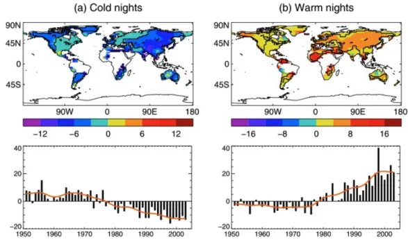
Alexander et al. [2006] and, more recently, Donat et al. [2013] analyzed behaviour in time of minimum and maximum global anomaly considering the number of events above or below defined thresholds in a gridded data set.
Alexander et al. [2006] analyzed separately global gridded data set for 1901-1950, 1951-1978 and 1979-2003 periods and found a pronounced warming especially in the last period. In particular, gathering second and third period, they found a large part of global surface involved by a larger warming in minimum temperatures than maximum ones, as already observed in other studies on global scale. In fact 74% of land area sampled showed a decrease in the number of cold nights, with a reduction of 20 days of these events since 1951. Similarly warm night have increased for 73% of considered land area surface, observing that in 2004 number of warm nights reached 25 days more than 1951.
Turning point of fluxes of events was found to be around mid 1970’s. Effectively since 1979 every year has been above the long term average for warm nights, and since 1977 every year stood below the long term average for cold nights (see figure 1.5). Similar behaviours have been found for seasonal data set, where since 1985 (1988) spring showed to have a number of warm (cold) night higher (lower) than the long term average. This warming has been observed to be marked in particular over Asian regions.
Donat et al. [2013], looking in particular at minimum temperatures and at event below colder thresholds, found a decrease of cool nights. In figure 1.6 decrease of the number of cool nights in comparison with reference period (1961-1990) is clear. It can bee seen that frequency of cold nights decreased by 18 days, while warm nights have increased by 20 days since 1980 (figure 1.7).
1.3. EVIDENCES OF STRENGTHENING EXTREME EVENTS AT GLOBAL SCALE 9
Figure 1.5. Map of fluxes of events for cold and warm nights (top). Bottom panels: annual anomalies,
with respect to 1961-1990 average, of number of days whose minimum temperature layed below 10th percentile (left) and above 90th percentile (right). [Alexander et al., 2006] .
Simultaneously analyses on maximum temperatures revealed a decrease of cool days and growth of number of warm days, but showing a less marked intensity compar-ing to minimum temperatures (see figures 1.8, 1.9). Trends of maximum temperature showed at the same time a less homogenous spatial structure, since north-american east coast and south-american west coast revealed to have a slight cooling trend [Donat et al., 2013]. These local cooling trends resulted to be linked in particular to the de-crease of maximum temperatures in summer season, in spite of decreasing of cold days observed over all land surface of the planet in other seasons (figure 1.10, 1.11). Studies on precipitation in those areas permitted to infer that this cooling was correlated with an increase of rainfall [Donat et al., 2013].
Trends for minimum and maximum temperatures flows of events were calculated fitting fluxes obtained over the entire sample (1901-2010) and over the last 60 years. In both cases trends in the second part of 20th century and first decade of 21st century have shown a higher value for minimum temperatures.
Donat et al. [2013] looked also at flows of events for seasonal data-sets. Maximum temperatures showed, coherently with the rest of the work, positive trends for almost all regions for every season. These trends appeared to be stronger during winter (DJF for northern hemisphere, JJA for southern hemisphere). Seasonal minimum tempera-tures average revealed warming trends too. Furthermore cool nights appeared to be less frequent in cold month for Asia, while Europe showed a decrease of cold night especially during spring and summer.
Figure 1.6. Trends (in annual days per decade) of number of days whose minimum temperature stays
below the 10th percentile of the entire data set. On top-right trends for 1901-2010 are displayed, while on the left same but for 1951-2010. On the bottom plot one may see the number of days (with respect to 1961-1990 mean) below the chosen threshold [Donat et al., 2013].
Figure 1.7. Trends (in annual days per decade) of number of days whose minimum temperature stays
above the 90th percentile of the entire data set. On top-right trends for 1901-2010 are displayed, while on the left same but for 1951-2010. On the bottom plot one may see the number of days (with respect to 1961-1990 mean) above the chosen threshold [Donat et al., 2013].
1.3. EVIDENCES OF STRENGTHENING EXTREME EVENTS AT GLOBAL SCALE11
Figure 1.8. Trends (in annual days per decade) of number of days whose maximum temperature stays
below the 10th percentile. On top-right trends for 1901-2010 are displayed, while on the left same but for 1951-2010. On the bottom plot one may see the number of days (with respect to 1961-1990 mean) below the chosen threshold [Donat et al., 2013].
Figure 1.9. Trends (in annual days per decade) of number of days whose maximum temperature stays
above the 90th percentile. On top-right trends for 1901-2010 are displayed, while on the left same but for 1951-2010. On the bottom plot one may see the number of days (with respect to 1961-1990 mean) above the chosen threshold [Donat et al., 2013].
Figure 1.10. Same as previous figures but lookin at each season separately for warm days (maximum
temperatures above 90 percentile) [Donat et al., 2013].
Figure 1.11. Same as figure 1.10, but for cool nights (minimum temperatures below 10 percentile)
1.4. EUROPEAN WARMING CLIMATE TRENDS 13
1.4
European warming climate trends
Increasing of frequency and duration of warm spells during early 21st century have aroused interest in focusing studies over Europe, that appears, together with Mediter-ranean Area to be more sensible to warming climate than other regions of the globe and where number of extreme events is predicted to increase in the near future ([Giorgi, 2006] [Ballester et al., 2010]).
Yan et al. [2002] studied absolute extreme temperatures (coldest and warmest) over Europe, finding a slight decrease of cold extremes since the end of 19th century and a significant increase of warm extreme events beginning from 1960, with a rate of approximately 10 % in a century. Analysis of seasonal data set revealed that yearly lowest temperature have increased since 18th century for all seasons but summer. In particular since 1961 annual lowest temperature underwent a strong warming, an example is the trend of 0.7° C per decade recorded in St Petersburg. At the same time highest seasonal temperatures showed to be stationary until 1960 and since then these ones have undergone a less marked warming than lowest ones, with a consistent reduction in seasonal temperature range. It was also noticed that variability concerned especially lowest winter records and highest summer records.
As far as fluxes of events through fixed threshold are concerned, analyses on Euro-pean context were performed by Simolo et al. [2011] over the 1960-2010 period. Oper-ating a Principal Component Analysis (see section 4.1) they individuated three zones: Alpine and Carpatian Region, Atlantic and Northern Sea, and searched for changes of distribution parameters in each region. Changes in temperature have shown to be mostly due to a rigid shift of the whole distribution. Unlike what found in previous works on global range, this shift has been observed to be more marked on maximum temperature rather than on minimum ones, especially over the Atlantic Region (see figure 1.12). In particular this area shows +0.39 ˘ 0.07 °C/decade(dec) for maximum temperatures and+0.37 ˘ 0.05 °C/dec for minimum ones, while Alpine-Carpatian has +0.36 ˘ 0.07 °C/dec and +0.39 ˘ 0.07 °C/dec and Northern Sea has +0.34 ˘ 0.09 °C/dec and+0.32 ˘ 0.08 °C/dec
Occurrence of extreme events and their exceedance probabilities were modelled linking them to shift in the mean of a skew-normal distribution ( see equation 1.1) that best fitted available data.
fpzq “ 2φpzqΦpαzq (1.1) Where: φpzq “ ?1 2πe ´z22 (1.2) Φpαzq “ żαz ´8 φpyqdy (1.3)
In this model fluxes of events through thresholds located in zpand ´zpare calculated as follows: Ftptq “ ż¯zp ´8 dz f pz, tq (1.4) Ftptq “ ż`8 1´¯zp dz f pz, tq (1.5)
where p is a given probability threshold. Obtained fluxes are then larger through the warmer threshold and the ratio of flux of events in the warmer threshold respect to the colder one is described by an exponential law.
This model fitted nicely recorded data (figure 1.13), so that the hypothesis that conferred changes in extreme events to shift of the mean was backed up.
Comparison among european sub-regions revealed that in particular data about western Europe underwent warming for temperature indices. This happened both for lower and higher percentiles in record distributions. Moberg et al. [2006] looked at which regions in Europe had been affected by stronger warming. They found a more evident increasing of maximum temperatures (on yearly range) on southern Europe (Iberian Peninsula in particular). Looking at seasonal scale they also observed a more marked warming in summer records over central and western Europe for both maximum and minimum temperatures, with a significant change in summer daily maximum temperature range over Germany and Alpine region [Moberg et al., 2006] .
Moberg et al. [2006] made also studies on percentiles. They looked at linear trends over the 1901-2000 period for a data-set of European station west of 60°E. In partic-ular they found no relevant differences between minimum and maximum trends (as confirmed by Makowski et al. [2008]) on the overall context, but some differences on certain percentiles over limited regions. Western Europe, especially Iberian Peninsula showed steeper warming for all indices. Looking at figure 1.14 one may see comparison for lower and upper percentiles (2nd, 5th, 10th and complementary). As already said, warming involves all indices for all seasons.
Focusing on winter trends of percentiles: relevant trends appear for maximum temperature upper percentiles (98th: 1.6 °C/100yr, 95th: 1.5°C/100yr), while minimum temperature show more marked trends for coldest tails rather than warmest tails. Looking at summer they found weaker changes, in particular the median revealed a trend of 0.8°C/100yr, less than what found for winter (1°C/100yr). In both season 10th and 90th percentiles showed to be highly correlated with the mean, suggesting a rigid shift of the distribution. Concentrating on particular areas of the continent, Moberg et al. [2006] observed significant increase in indices for winter (98th percentile of maximum temperatures and 2nd percentile of minimum ones) on Iberian Peninsula and southern Europe. While summer showed an increase over central and western Europe for 98th percentile of both minimum and maximum temperatures.
1.4. EUROPEAN WARMING CLIMATE TRENDS 15
Figure 1.12. Anomalies of annual mean with respect to 1961-1990 period for the three selected
regions for maximum (left) and minimum (right) temperatures. Dashed lines represent second order polynomial fits [Simolo et al., 2011].
Figure 1.13. Observed exceedance probabilities for maximum temperatures in Atlantic Region for
three different thresholds and complementary ones. Black lines stand for observed data, red solid lines are the theoretical EPs and gray shaded areas represent uncertainties in the PDF’s shape. [Simolo et al., 2011].
Figure 1.14. Trends of percentiles of maximum and minimum seasonal mean temperatures in winter
and summer calculated over the 20th century. Label on horizontal axis refers to 2nd, 5th, 10th percentiles, median, 90th, 95th and 98th percentiles. On vertical axis trends are shown in unity of °C/100 yr. Confidence of 95% is indicated by the shaded grey area. [Moberg et al., 2006]
Some works have been focused on single countries. Brunet et al. [2007] (and, before, Brunet et al. [2006]) analyzed temperature trends in Spain over the period 1850-2005, finding clear warming trends especially in the 1973-2005 period. Coherently with other works for Europe they observed larger trends for maximum temperatures rather than minimum temperatures. Looking at seasonal trends they found high signals on extreme percentiles for winter and autumn but, for medium percentiles, trends have shown to be stronger for summer and spring.
Studies on Alpine Region and countries of that area revealed positive trends during second half of twentieth century (in particular after 1950) for yearly and seasonal series [Böhm et al., 2001]. Analysis for Switzerland(1864-2000 period, monthly series) showed some distinctions between northern and southern zones with respect to the main alpine ridge and differences between higher and lower stations. Northern stations showed a larger trend in mean temperatures (about 1°C/100yr vs 0.6 °C/100yr ). On the other hand Begert et al. [2005] found that higher stations presented a larger increase for autumn data, while lower stations increased their temperature especially in winter.
1.5. WARMING TRENDS OVER ITALY 17
1.5
Warming trends over Italy
Italy has been object of several works in recent years.
Trends in extreme temperature have been searched in absolute values (i.e. values not converted into anomalies or arranged into distributions). This was done, for instance, by Toreti and Desiato [2008] on the Italian context using the already introduced indices:
• frost days; • summer days; • tropical nights.
These indices were calculated with arithmetic averages extracted from 49 italian stations (with an homogenous spatial coverage). They showed significant trends during second half of twentieth century as displayed in figure 1.15. Frost days resulted to reduce with a rate of about -0.25 day/y; summer days showed a decrease from 1961 to 1978 (-0.98 days/y) and then an increase since 2004 of 0.73 days/y; tropical nights revealed a downward trend from 1961 to 1981 ( -0.42 days/y) and from 1982 to 2004 an upward trend (0.62 days/y). These results are coherent with the weak decrease in temperature observed until the end of 1970’s and a stronger increase beginning from 1979.
Looking at monthly series over Italy for 19th and 20th century Brunetti et al. [2006] observed a gradual positive trend with a secondary maximum in 1950. As already found in other works, from 1951 to approximately 1979, there was a slight decreasing trend and since then a strong positive trend with maximum values in the last decades. Gathering monthly data into seasonal series, trends were found to be mostly due to summer and spring trends, while winter showed less steep slopes. Such behaviours may be observed in figure 1.16. Brunetti et al. [2006] found a more marked trend for minimum temperatures over the whole period (since 1800) and, coherently with other studies, calculated trends from 1950 appeared to be more intense for maximum temperatures.
Another study over Italy was done by Simolo et al. [2010], that analyzed daily temperature series on the whole italian territory for the 1951-2008 period. Obtained anomalies have been fitted by skew normal distribution as described in equation 1.1 and it resulted that no significant changes in higher moments occurred. Only the distri-bution mean value revealed a clear shift towards warmer temperatures, as showed in figure 1.17. In the same figure is possible to notice differences between mean trends for minimum and maximum temperature. Here, contrasting what seen for global context, but coherently with works effectuated on european sample, maximum temperatures show stronger trends than minimum ones. Furthermore observed trends appeared to
Figure 1.15. Trends observed in frost days (top), summer days (centre), tropical nights (bottom).
1.5. WARMING TRENDS OVER ITALY 19
Figure 1.16. Plots for mean maximum (left column) and minimum temperatures (right column)
from 1800 to 2000. From top to bottom the five rows indicate: yearly series, winter, spring, summer, autumn. [Brunet et al., 2006]
be almost homogeneous over the two regions of Northern and Southern Italy (individ-uated with a Principal Component Analysis). In particular, beginning from 1980, as found for global and european trends, warming appeared stronger. So that a simple linear trend did not represent nicely the temperature behaviour, because until 1979 data showed a weak decrease in their values (see 1.18) [Simolo et al., 2010].
Figure 1.17. Observed trends in mean of temperature for maxima (TX) and minima (TN) distribution.
On vertical label trends in °C/10years are displayed. On horizontal labels plots are split in five frames, one for the entire year and one for each season. [Simolo et al., 2010]
Rigid shift of the distribution was also demonstrated through the calculation of a set of 19 percentiles for each year and searching for relative trends of these indices with respect to the median. As shown in figure 1.19 each percentile, for each sub-region did not appear to have relative trends, both for maximum and minimum temperatures [Simolo et al., 2010].
Simolo et al. [2010] looked also at the exceedance probabilities (EPs) over fixed threshold and found relevant fluxes of events. These EPs, as can be seen in figure 1.20, showed to be coherent with a rigid shift of the PDF characterized by a weak decrease of temperature before 1979 and with the stronger warming found in the 1980-2008 period. From figure 1.20 it is clear that exceedance probabilities decreased in the colder tails with a weaker rate than the one observed on warmer tails. This phenomenon has been introduced above when discussing fluxes of events with a skew normal distribution and can be easily understood looking at figure 1.21. Here it is clear how the rigid shift of a gaussian (there’s no skewness in this example) distribution implies greater flows through upper thresholds than lower ones.
In this context this thesis work has the aim to analyze, keeping in mind what found by other studies and focusing on the still ongoing debate, a temperature data-set over the italian region of Trentino Alto Adige. The particular position in the center of the Alps allows to inspect warming climate at different elevations and to analyze trends in the mean and in the frequency of extreme events. All this with the goal to understand whether the latter ones belong only to shifts in the mean or to variability changes.
1.5. WARMING TRENDS OVER ITALY 21
Figure 1.18. Annual mean of maximum temperature for whole italian sample. Dashed line represents
a first order linear regression, solid line a second order polynomial regression. In the little top-left window one can see the comparison between minimum and maximum temperatures. [Simolo et al., 2010]
Figure 1.19. Relative trends for each percentile with respect to the trend of the median. On vertical
Figure 1.20. Observed counts of maximum temperatures (for the whole italian data set) below the
10th threshold (left) and above the 90th percentile (right). Dashed lines represent the linear fit. Dotted, dash-dotted and solid lines represent different fits effectuated with three different skew normal distributions (changing shape parameter).[Simolo et al., 2010]
Figure 1.21. Probability of exceeding fixed thresholds for a shifting distribution. Probabilities are
identified with shaded grey areas. Here it’s simple to notice consequences of rigid shift of a gaussian-like distribution and different flows through the thresholds [Simolo et al., 2010]
Chapter 2
Data collection and quality check
2.1
Trentino Alto Adige and its geographical features
Aim of this study was then to analyze variability and changes of climate on the italian region of Trentino Alto Adige. This region is entirely located in the central-eastern Alps and its topography is characterized by high mountains (up to 3905 m, Ortles mountain) and a high number of valleys originated by the flow of creeks and rivers towards the main river: the Adige. These geographical features allowed to have a data set of station with relevant height differences. As seen in figure 2.1 and figure 2.2 stations are homogeneously distributed on the region’s territory. In particular electronic series had good coverage of high mountain areas, as shown in figure 2.3.
Having data related to a high range of altitudes permitted to study how changes in climate relate to mountain regions topography, looking at valleys and steep ridges. In fact all steps of this work were done considering this features, especially when some stations were used as references for calculating anomalies and for testing inhomo-geneities.
2.2
Data collection
Trentino Alto Adige is divided into two autonomous provinces (Provincia Autonoma di Trento or Trentino and Provincia Autonoma di Bolzano or Alto Adige/Sudtirol), so that they have two separated agro-meteorological services. This implied data collection to be effectuated in two steps, one for each administrative division.
Temperature series for Trentino were downloaded from Meteotrentino web site (http://www.meteotrentino.it/dati-meteo/stazioni/elenco-staz-hydstra.aspx?ID=168).
In this website, for each station present in the list, it was possible to choose the variable to download. It was also allowed to indicate time range and frequency of sample (monthly, daily).
Figure 2.1. Yearbook stations in the initial data set. Tones of gray indicate altitudes of points on the
map.
2.2. DATA COLLECTION 25
Figure 2.3. Number of stations vs altitude bands. Bin width is 100 m. Blue columns represent
number of yearbook series, red columns represent number of electronic series.
The downloaded files were in .csv format and were converted into a defined stan-dard format required for data elaboration thanks to a MATLAB program. Data from Alto Adige were provided by Ufficio Idrografico Provincia di Bolzano in .zrx (ASCII) format and were converted in the standard format looking at esa-decimal codes that indicated the kind and the quality of measurements.
Standard format consisted of a sequence of rows, one per each month. The structure of rows was as follows:
• the year (integer value in columns 1-5); • the month (integer value in columns 6-8);
• the sequence of recorded temperature for each day expressed as N F7.1 floating-point variable, where N id the number of days in the month.
Downloaded series were not characterized by the same observation rules. In fact until second half of 1980’s the measurements taken by each station were uniquely done with the so called yearbook method. This procedure consists in recording data each morning at 9 a.m, so that minimum and maximum temperature assigned to day i are referred to the 24 hours interval running from 9 a.m. of day i-1 to 9 a.m of day i. Such a system (from now on called ”0909”) causes that in general recorded maximum temperature refers to the previous day. An exception are those days in which maximum temperatures happen in the early morning (before 9 a.m.) For this reason during the ”merging procedure” (see section 2.4) every maximum temperature recorded whit yearbook technique has been shifted by one day.
Starting from approximately 1985, electronic stations began to spread and replace old stations. These automatic devices record temperatures each night at midnight, avoiding doubts on the day whom the temperature refers. From now on this temporal aggregation will be called ”0024”.
For most of analyzed stations, at the beginning of 0024 series, yearbook series finished their record, maybe after a superimposition that could last for some months or some years. But it’s also frequent to find at the same time for many years (in some case until our days) 0909 series and 0024 series together. In these cases 0909 series have been probably composed by data recorded with electronic devices, but, in order to maintain homogeneity with historical data, temperatures are stored with old temporal aggregation criteria.
After being converted to the standard format, files were renamed keeping in mind following criteria. Each name was composed by some fields separated by underscores. The fields were:
• TMND or TMXD, indicating daily minimum temperatures (TMND) or daily max-imum temperatures (TMXD);
• 0909 or 0024, indicating whether records were taken with yearbook technique (0909) or electronical devices (0024);
• ITA_TAA_: indicating nation and region; • TN o BZ: indicating the province;
• station code: (original MeteoTrentino or IdroBolzano code); • name of the station with words separated by dashes;
Alto Adige series had been given already divided in two cathegories: first one including mechanical series (yearbook technique), the other one electronic series.
However electronic series given by IdroBolzano had been already merged with corresponding mechanical series. Since Quality Check procedure would have required to compare data from all stations related to a certain day, keeping particular attention to simultaneity of events, it was necessary to create separated data-set belonging to different record methods. Therefore, in order to check series with homogeneous ones, it became indispensable to split these electronic series into two series.
This problem was solved thanks to recording time, indicated for each data. Effec-tively IdroBolzano gave also, for each day of each station, exact hour of measurement. These times were recorded as 09:00 in case of mechanical station, in other cases dis-played hour was the effective time of occurring of the recorded temperature (i.e. if maximum temperature were recorded at 3:45 p.m., the displayed hour was 15:45) or a generic 00:01, indicating 0024 temporal aggregation measurement. It is important to point out that in case electronic measurement began in second half of the year, IdroBolzano completed that year with yearbook-like aggregation (i.e. 0909): so elec-tronic measurements referred to 0024 series appear from 1st January of following year. Otherwise if electronic data began before 30th June, previous mechanical data of that year had been adapted to electronic series shifting maximum temperatures to previous day.
2.3. QUALITY CHECK 27
These recording-hour informations were helpful in splitting the series but they fell into ambiguity when some minimum or maximum temperatures of a day happened at exactly 9 o’clock in the morning. At the end the solution to this issue was found individuating, thanks to hour information, the break-year between mechanical and electronic records. Furthermore this process was complicated by the fact that some series, due to technical problems in electronic measurements, went back to mechanical techniques for some periods until the retake of electronic series.
Obtained files were then ready to undergo quality check. They were renamed keeping the same station name and same code but giving different name in second field (0909/0024).
2.3
Quality check
Quality check was performed in two phases. Most important step was the second one, in which each station were compared to surrounding ones. In this process, in order to preserve simultaneity of events, comparison was made keeping separated in every step mechanical/yearbook and electronic series.
2.3.1
Removal of gross errors
The goal of the first one was to eliminate the gross errors, i.e. data clearly wrong. These outliers were discovered with a MATLAB program searching for:
• minimum and maximum temperatures above 50°C or below -50°C;
• minimum and maximum temperatures below -30°C from 1st of may to 31st of october;
• minimum and maximum temperatures above 35°C from 1st of october to 31st of march.
These wrong data were eliminated and replaced with a -90, code for a no-data. Looking into series of Trentino, sequences of days with temperature -30°C were found. To identify all these sequences the previous program for gross errors was updated inserting criteria able to find sequences of at least 3 consecutive daily temper-atures of -30°C. Results of this first step of quality check were then renamed changing first field of file names in TMNG and TMXG.
2.3.2
Splitting of yearbook series
Before proceeding with second step, a preliminary homogeneity check was made to test longest series for large inhomogeneities. These stations often had undergone modifications in their location and instruments, so corresponding temperature series
presented significant inhomogeneities that affected the mean and consequently could create problems in the following steps, when anomaly temperatures are compared to synthetic series. Effectively anomaly temperatures are calculated taking the 1976-2005 period as reference for calculating climatological averages. This implies that strong inhomogeneities appearing in 0909 series before 1975 would present large anomalies that could be labeled as suspect during quality check and then large portion of temporal series invalidated (these kinds of error may be corrected in the next homogenization step, see chapter 3). In electronic stations, beginning after 1985, inhomogeneities occur in most cases in the reference period and consequently present less large non-climatic anomalies.
For these reasons each yearbook series was analyzed with the Craddock Test (for detailed description of Craddock Test see section 3.1) to identify large inhomogeneities and to split it into ”almost homogenous” sub-series, that were then checked indepen-dently. An example of Craddock Test and individuated break-points in this preliminary step is reported in figure 2.4.
The individuated breaks allowed to separate the series into almost-homogeneous sub-series. These almost homogeneous series are recognizable in Craddock Test with similar slopes. In figure 2.4 it’s important to notice different slopes of the individuated sections. It may also be seen in figure 2.5 how these section correspond to series with nearly coherent annual mean. Indeed in this representative case sub-series 01 collected very overestimated temperatures, while sub-sub-series 02 collected very underestimated temperatures. Even though slopes of sections included in sub-series 03 were positive, it was necessary not to gather this section to sub-series 01, since the slopes were very different.
2.3.3
Calculation of observed anomalies
Second step of quality check consisted in the comparison between values recorded in a station and values recorded in the surrounding ones. This comparison was done calculating, for each station, the temperature anomalies. These are the result of the subtraction of the annual mean cycle from daily data set. Mean annual cycle was calculated following some steps and basing on monthly means. Use of monthly data was chosen since daily temperatures presented a large number of missing data and it is more simple to reconstruct the first ones than latter ones.
Since some months presented missing daily data, a threshold of maximum 20% of no-data in a month was chosen, in order to avoid to calculate averages with few available days. Obtained series showed, as expected, many monthly missing data and only series with at least five years of data were accepted for the next steps. Series whose monthly series were created (175 ”0024” series and 188 ”0909” series, counting splitted series as one) are shown in figures 2.6 and 2.7, where it is shown that coverage of territory and of mountain areas was maintained (see also figure 2.8). Monthly series were named writing the prefix mes before the series name.
2.3. QUALITY CHECK 29
Figure 2.4. Craddock test effectuated on maximum temperatures series of Passo Tonale . Vertical lines
indicate chosen breaks and numbers stand for the separated series that section is associated.
Figure 2.5. Annual mean maximum temperature of Passo Tonale (0909). Vertical lines indicate
Figure 2.6. Yearbook stations whose montlhy series was calculated. Tones of gray indicate altitudes
of points on the map.
2.3. QUALITY CHECK 31
Figure 2.8. Number of stations for altitude bands after selection made in monthly series completion.
Bin width is 100 m. Blue columns represent number of yearbook series, red columns represent number of electronic series.
Second, all monthly series were completed in their missing values over the 1976-2005 period, chosen as reference period for the estimation of anomalies, being the most complete 30-year sub-period. In fact electronic series began mostly around 1985. This would have required 1985-2014 to be the chosen range, but great part of yearbook series ended in 2005/2010. For these reasons and knowing that yearbook series were the longest ones and that long series are fundamental in this study, the choice was done in favor of the latest 30-year time range that would have included a significant part of yearbook series: i.e. 1976-2005. Reasons of this choice can be seen in figure 2.9
Gap-filling (in the 1976-2005 period) of a series was made reconstructing a synthetic monthly series of anomaly temperatures (i.e. difference from the monthly climato-logical mean) representative of the station location. This series was reconstructed as weighted average (see section 2.3.4) of surrounding stations not belonging to this work’s data set but already homogenized.
Once synthetic series was calculated, gap-filling was made as follows (in these equations T stands for anomaly temperature):
Tmissingm,y “Tsyntm,y `C (2.1)
Where m and y are the month and year whose temperature mean is missing, and C is calculated as:
C “ Tobsm ´Tsyntm (2.2) Where Tobsm and Tsyntm are obtained performing arithmetic averages of all data related to the selected month, available for observed and syntetic series. Therefore, recon-struction of missing data is made under the hypothesys of constant difference between observed and synthetic series.
Figure 2.9. Number of stations (whose climatology was calculated) for each year. Blue line represents
annal series, here it’s clear the reduction of the number of annal series after 2005. Steep increase of stations in half 1950’s occurs because all series provided by Alto Adige begin in 1956. Red line represents electronic series that have been installed from 1984 to our days.
The gap-filled monthly series were utilized to calculate the monthly climatologies overt the 1976-2005 reference period.
Daily climatologies (i.e. daily mean annual cycles) could then be calculated from monthly climatologies by means of a trigonometric smoothing. Given the 12 monthly mean, each of them was associated to the 15th day of the relative month in a 366-bin array (for example: january mean was associated to point 15, february mean to day 46, march mean to day 75 etc.). Then these points underwent a second order trigonometric regression, searching the function:
trpdq “ a0`a1 cos ˆ 2πd Y ˙ `b1 sin ˆ 2πd Y ˙ `a2 cos ˆ 4πd Y ˙ `b2 sin ˆ 4πd Y ˙ (2.3) whose coefficients (a0, a1, a2, b1, b2) best fitted the monthly climatology. a0is clearly
the mean of the 12 points. Oscillation due to a1 and b1 can spread from the minimum
(min) to the maximum(max) points so the two first-order coefficient were imposed to lay in the range pmin ´ a0´0.5, max ´ a0 `0.5q. At the same time a2 and b2 were
allowed to be between -2° and 2°, since the oscillation due to second order should be less relevant than the one of first order.
Regression was done keeping fixed values for three coefficients and varying the remaining one in its range with a 0.01 °C resolution. First regression was performed on a1, giving 0 value to the other coefficients, calculating least square for the results of
each possible value of a1 and choosing the minimum among them.
lspa1q “ 12 ÿ m“1 „ a0`a1 cos ˆ 2πcmpmq Y ˙ ´Cpmq 2 ; (2.4)
2.3. QUALITY CHECK 33
Where:
• a1 P pmin ´ a0´0.5, max ´ a0`0.5q with 0.01 intervals;
• cm(m) is a 12-elements array indicating, for each month, the ”center of the month” as number of days from the beginning of the year;
• Y “ 366, length of the year (not chosen equal to 365 in order to have different values for 28th, 29th February when dealing with leap years);
• C(m) is the climatology of the month m.
When found the value a1for which ls(a1) is minimized, the same process was done
for b1, imposing a1“a1: lspb1q “ 12 ÿ m“1 „ a0`a1 cos ˆ 2πcmpmq Y ˙ `b1 sin ˆ 2πcmpmq Y ˙ ´Cpmq 2 ; (2.5)
where b1 P pmin ´ a0´0.5, max ´ a0`0.5q with 0.01 intervals.
After individuating b1, the same was done for a2 and b2:
lspa2q “ 12 ÿ m“1 „ a0`a1 cos ˆ 2πcmpmq Y ˙ `b1 sin ˆ 2πcmpmq Y ˙ `a2 cos ˆ 2πcmpmq Y ˙ ´Cpmq 2 ; (2.6) And: lspb2q “ 12 ÿ m“1 „ a0`a1 cos ˆ 2πcmpmq Y ˙ `b1 sin ˆ 2πcmpmq Y ˙ ` `a2 cos ˆ 2πcmpmq Y ˙ `b2 cos ˆ 2πcmpmq Y ˙ ´Cpmq 2 ; (2.7)
This 4-step regression was re-iterated until difference between new and old coef-ficients was found to be less than 0.01 for all of them (for first iteration old values utilized are 0 for every coefficient). Generally the program required two iterations to reach convergence. Obtained coefficients were then substituted in equation 2.3 and plotted with monthly climatologies, as seen in figure 2.10.
Figure 2.10. Trigonometric regression for maximum temperatures of Pergine Valsugana (top) and
Centa San Nicolò (bottom). On x-label days of the year appear, while on y-label temperature in Celsius degrees. Green circles represent monthly climatologies, blue line is the result of trigonometric regression
2.3. QUALITY CHECK 35
2.3.4
Calculation of synthetic anomalies
Quality check was mainly based on the comparison between observed anomalies and synthetic anomalies.
The selection of reference series to construct the synthetic series was done among the anomaly series resulted from the gross-error removal, choosing those that showed less inhomogeneities and less number of missing data. In some cases it was necessary to delete from reference series some years of data, recognized as deeply different from the rest of the series (for example years that showed a significant higher or lower mean temperatures). At the end, together with these reference series, an additional series already homogenized, having data since 1920, was considered (Cortina d’Ampezzo, provided by ARPA Veneto)
Synthetic series were reconstructed as weighted averages of surrounding reference series having the same temporal aggregation of the site, where weights depended by horizontal and vertical distance of reference series from the site the synthetic series was referred to.
If pφ1, θ1, h1q are the coordinates of the synthetic series site and pφ2, θ2, h2q
coordi-nates of the reference series:
d “ R∆α (2.8)
where R is the radius of the Earth (6371 km) . ∆α is the angular distance of the two points in the latitude-longitude grid, and is calculated doing:
cosp∆αq “ sinpθ1qsinpθ2q `cospθ1qcospθ2qcospφ1´φ2q (2.9)
At this point, known d and known∆h (∆h “ h1´h2), weight might be calculated
using following expression:
wr1,2“e´d2cr (2.10) wh1,2“e´∆h2ch (2.11) w1,2“wr1,2wh1,2 (2.12) cr“ ´ d20 ln 2 (2.13) ch “ ´ h20 ln 2 (2.14)
d0 and h0 are the horizontal and vertical distances at which the corresponding
These parameters have been searched running several time the program and looking for the combination of the two parameters that minimized the root mean square error (RMSE) (synthetic minus observed anomalies). The chosen values were d0 “ 30 km
and h0 “700 m, found with an iterative process. It consisted in keeping one parameter
as constant (and equal to its optimized value of the previous step) and varying the other one, searching for the minimum RMSE of the synthetic series. This process was stopped when the two parameters converged. Report of this research can be seen in table 2.1.
To avoid using stations at very different height, only stations whose difference in altitude from the site was lower than the maximum between 500 m and half of the site elevation were considered among reference series. For example: if a station was 655 m high, reference series had altitudes ranging from 155 m to 1155 m; while if a station was 1200 high, the range went from 600 m to 1800 m.
Synthetic series might then be built thanks to a MATLAB program. Starting from the first day of the observed series, the program searched among the reference series the ones with data available for that day. Collected data were then ranked from highest to lowest observed anomalies, the highest and the lowest were removed in order to avoid synthetic anomaly to be affected by outliers. Remaining values underwent a weighted mean, in which each anomaly temperature had the weight relative to the reference series it belonged to. If the removal of highest and lowest valued had deleted the only available data for that day, synthetic series would have had, for the considered day, a -90°C value. This procedure was repeated for each day of the checked series until its end.
2.3. QUALITY CHECK 37
Table 2.1. Iterations of height scale and distance scale optimization. For each iteration, optimum
value is indicated by five stars. Note that the value emphasized by the stars is that used in the following iteration, as explicated in text.
2.3.5
Selection of thresholds and removal of suspect data
Most important part of quality check was the comparison of observed anomalies and synthetic anomalies. The basic concept in this phase of quality check was that ob-served anomaly should not differ too much from synthetic anomaly. This "too-much" was quantified through the calculation of variance of each series. For this reason, be-fore proceeding with analysis of single daily data, using a MATLAB program, it was necessary to determine standard deviations of both synthetic and observed anomalies series.
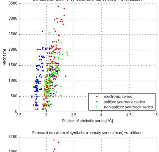
Figure 2.11 shows behaviours of observed anomaly variance with respect to the elevation of the stations. Here it may be observed how high mountain stations present higher standard deviation (the ”main sequence” is slightly sloped to the right) both for maximum and minimum temperatures. Group of electronic stations have a more narrow range of standard deviation than the one observed for yearbook series. Even if distribution of st. dev. of yearbook is wider, it is possible to assess that the median value of st. dev. of these series is lower than that obtained for electronic series. This is probably due to the splitting process that avoided yearbook series to have extremely high variances.
Standard deviations of synthetic series (see figure 2.12), as expected, had lower values than observed anomaly standard deviations. While st. dev. of electronic series did not show great differences between maximum and minimum temperatures, differences observed for yearbook series are relevant. In particular splitted yearbook series present significantly lower st. dev. for minimum temperatures. This is probably an effect of the splitting of yearbook series that didn’t affect in the same way st. dev. of yearbook maximum temperatures .
For each examined day, observed and synthetic daily anomalies were then normal-ized with respect to standard deviation and the following index was estimated:
ind “ anobs σanobs
´ansyn σansyn
(2.15)
Where anobs is the observed anomaly, ansyn is the synthetic anomaly, σanobs is the
standard deviation of observed anomalies series andσansyn is the standard deviation of
synthetic anomalies series. If absolute value of the indicator was larger than a chosen threshold (in this work selected threshold was 1.5), the value was labeled as suspect.
Each suspect classified daily anomaly of test series was compared to all neighboring series of that day, keeping in mind to consider only reference series of the same temporal aggregation (i.e. 0909 series compared with 0909 series and 0024 series compare with 0024 series). Series utilized in these steps will be called ”reference series” from now on, but it is important not to confuse them with those used for creation of synthetic series, which are a sub-set of them with a higher quality in terms of homogeneity and data availability.
2.3. QUALITY CHECK 39
Figure 2.11. Standard deviation of anomaly series for minimum (top) and maximum temperatures
Figure 2.12. Sigma of synthetic anomaly series for minimum (top) and maximum temperatures
2.3. QUALITY CHECK 41
Therefore reference data were collected, considering only those stations whose dif-ference in elevation from the checked was lower than the maximum between 500 m and half of the site elevation. Then these reference anomalies were ranked, excluding the highest and the lowest values, in order to avoid outliers to affect the range. Remaining data were then analyzed, taking note of maximum, minimum and variance of their distribution.
In order to be considered acceptable, observed anomaly of the test series should not overcome by a chosen quantity the maximum and the minimum values of the reference range. This quantity varied day by day depending on the variance of reference data and on the elevation of the checked station. If altitude was lower than 1500 m, anomaly should lay in the range pmin ´σ, max ` σq; while, for higher altitudes the range was pmin ´ 1.5σ, max ` 1.5σq, where σ is the standard deviation of the reference series anomalies for the day under consideration.
Different ranges for different altitudes showed to be necessary since different tem-perature profiles would have affected in different ways the quality check process. Three representative cases are displayed in figures 2.13, 2.14 and 2.15.
In the first case (figure 2.13) it is possible to observe a profile that probably is due to thermal inversion. Here normalized difference between observed and synthetic anomaly is above the chosen threshold, as displayed by the large distance between red and green dots. If all stations would be taken as references, this temperature would not be labeled as suspect. Though it is clear that the red dot is outside of the main sequence. So it appears necessary to focus reference series in a limited elevation range, in order to better represent the anomaly profile close to the test station elevation.
Second case (figure 2.14) is a clear example of a climatological profile. All anomalies have nearly same values and, consequently, absolute temperature follows approxi-mately the climatological profile, with some shifts. Here the normalized difference would be sufficient to determine the suspect values.
In the third case profile is probably interested by a more-adiabatic-than-climatology behavior and the checked point, even if distant from its corresponding synthetic value, is clearly inside the main sequence and, thanks to the reference range check, is not deleted from data-set.
Particular treatments were necessary for days with observed suspect anomalies but without available synthetic anomalies. In these cases the indicator introduced in equation 2.15 could not be utilized and the only available parameter was the observed anomaly itself. It was chosen that a datum without synthetic anomaly was to be considered suspect if absolute value of observed anomaly was larger than 3 times relative standard deviation and simultaneously occurred conditions of laying outside range of surrounding data. If there were no data available among reference series or these had been deleted in the removal of highest and lower values, data were not to be considered suspect and were not eliminated. This circumstance occurs when reference series are less than 3.
Figure 2.13. Scatter plot of observed anomalies vs height. Empty dots represent reference series, red
dot is the observed anomaly of the checked series, green dot represent the synthetic anomaly calculated as described above. Here lowest stations present ”more negative” anomalies than highest ones.
2.3. QUALITY CHECK 43
Figure 2.15. Same as figure 2.13. Here high stations presents ”more negative” anomaly than low
ones.
Summarizing, data were removed:
• if synthetic anomaly existed and reference series had data: ind < p´1.5, `1.5q
AND
anobs < pmin ´ c ¨ σrange, max ` c ¨ σrangeq
Where
c “ #
1.5 height ą 1500m 1 height ď 1500m
• if synthetic anomaly did not exist but reference series had data: anobs < p´3σseries, 3σseriesq
AND
anobs < pmin ´ 1.5σ, max ` 1.5σq
In figures 2.16, 2.17, 2.18 it is possible to see other three examples of possible situations occurred during quality check. These examples represent cases of clearly wrong data, false positive and clearly right data.
First plot is related to a clearly wrong datum whose indicator is equal to 3.4 (note the distance between green and red dots) and whose anomaly (red dot) is without doubt not included in the main sequence .
Second plot describes a case in which indicator (ind=2.2) is greater than the threshold but some reference series have greater anomalies, furthermore the main sequence is not well defined as in the other cases; for these reasons the suspect data cannot be deleted. Last plot is related to a clearly right data: red and green dots are very close one to the other, indicator has a very low value and the main sequence is defined, showing values above and below the checked one.
Figure 2.16. Same as 2.13.
Data individuated as suspect with these criteria were removed and replaced, in the original temperature series, by a -90°C. Since there exists the possibility that in the same day more than one station presented some problems, quality check was effectuated twice. In second iteration the new series, results of first iteration, were utilized as reference series. This second quality check allowed to find anomalous data that in the first check were masked by other wrong data with higher anomalies.
2.3. QUALITY CHECK 45
Figure 2.17. Same as 2.13.
At this point new series were compared with old ones in order to individuate months whose data underwent a significant removal. When it was found that a certain month had lost more than five daily data after the two quality check iterations , it was chosen to invalidate the whole month. Therefore every datum from first to last day of that month was removed and substituted by a -90°C. Percentage of data removed after simple quality check and after monthly invalidation can be examined in figures 2.19 and 2.20.
Figure 2.19. Percentage of minimum temperatures removed by quality check (green lines) and by
monthly removal (yellow lines).
Figure 2.20. Percentage of maximum temperatures removed by quality check (green lines) and by
![Figure 1.10. Same as previous figures but lookin at each season separately for warm days (maximum temperatures above 90 percentile) [Donat et al., 2013].](https://thumb-eu.123doks.com/thumbv2/123dokorg/7451703.101077/22.892.182.698.193.554/figure-previous-figures-lookin-separately-maximum-temperatures-percentile.webp)